A selection of interesting CSS recipes "Naked Fridays # 3"

Hello, dear reader Habra!
Today we will talk about gradient borders, blending modes, how to more rationally create a standard menu icon. And also let's re-discover the old css-property visibility and consider the new media expression @Supports.
Pure CSS gradient borders
Finally, we moved into a new era. An era in which you can use beautiful gradients instead of boring monochrome borders.

')
This is done relatively simply:
.gradient-block-vertical { border-top: 20px solid orange; /* */ border-bottom: 20px solid red; background-image: linear-gradient(to bottom, #5c5fa5 0%, #893f60 100%), linear-gradient(to bottom, #5c5fa5 0%, #893f60 100%); /* 2 */ background-position: 0 0, 100% 0; /* */ background-size: 20px 100%; /* */ background-repeat: no-repeat; /* */ } We do the same with the horizontal gradient:
.gradient-block-horizontal { border-left: 20px solid #5c5fa5; border-right: 20px solid #893f60; background-image: linear-gradient(to right, #5c5fa5 0%, #893f60 100%), linear-gradient(to right, #5c5fa5 0%, #893f60 100%); background-position: 0 0, 0 100%; background-size: 100% 20px; background-repeat: no-repeat; } But to create a diagonal gradient, you will have to tinker a bit and introduce pseudo-elements:
.gradient-block-diagonal:before, .gradient-block-diagonal:after { content: ""; position: absolute; width: 100%; height: 100%; } .gradient-block-diagonal:before { background-position: 0 0, 0 100% ; background-repeat: no-repeat; background-size: 100% 20px; background-image: linear-gradient(to right, #5c5fa5 0%, #893f60 100%), linear-gradient(to left, #5c5fa5 0%, #893f60 100%); } .gradient-block-diagonal:after { background-position: 0 0, 100% 0; background-repeat: no-repeat; background-size: 20px 100%; background-image: linear-gradient(to bottom, #5c5fa5 0%, #893f60 100%), linear-gradient(to top, #5c5fa5 0%, #893f60 100%); } Here we set only the dimensions for the block itself, no boundaries. After that, we hang on the horizontal and vertical gradient for each pseudo-element. Feel the code here .
UPD. Aingis offered a more optimized version with background-clip and background-origin properties. Example
Someday, in a bright future (when the whole world gives up on IE10 and below) we will be able to use the border-image property for this purpose. Like this:
.gradient-block { border-image: linear-gradient(to bottom, #3acfd5 0%, #3a4ed5 100%); /* /*/ border-image-slice: 1; /* */ } Menu icon without background images
Remember how often you had to add a standard menu icon to a page, in common called “hamburger”?
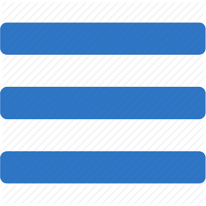
As a rule, this icon is simply inserted into the background image. But these are only 3 rectangular stripes, are there really no better ways? There are at least 3.
1. Shadow.
.shadow-icon { position: relative; } .shadow-icon:after { content: ""; position: absolute; left: 0; top: -50px; height: 100%; width: 100%; box-shadow: 0 5px 0 #000, 0 15px 0 #fff, 0 25px 0 #000, 0 35px 0 #fff, 0 45px 0 #000; } The solution is simple, though not very obvious. Just set 3 rectangular shadows, each with a different offset.
2. Gradient.
.gradient-icon { background: linear-gradient(to bottom, #000 0%, #000 20%, transparent 20%, transparent 40%, #000 40%, #000 60%, transparent 60%, transparent 80%, #000 80%, #000 100%); } It's still easier here: draw 3 stripes with a gradient.
3. UTF-8 character.
Simply copy and paste the ☰ character (Unicode number: U + 2630, HTML code: & # 9776;). Obviously, this is the simplest and most concise method. However, the flexibility to configure it will not work. In fact, you can only customize the color, and also specify the font and resize it.
An example of using all three methods .
These are not the only methods for creating such an icon. To do this, you can use SVG, a suitable icon font, or it is banal to use borders in conjunction with pseudo-elements.
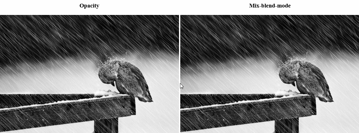
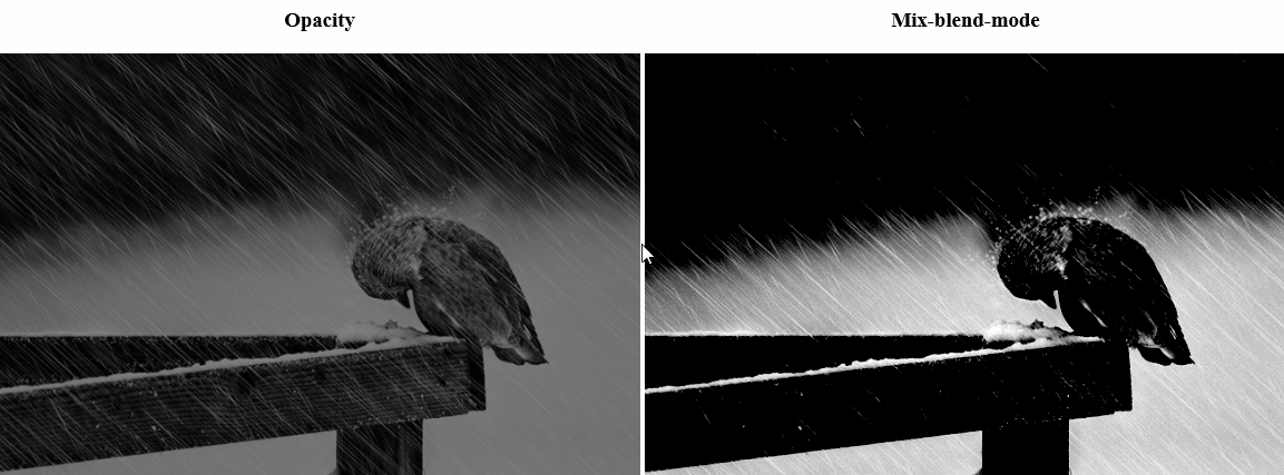
Layer Layers in CSS
Another good news: more recently, Firefox and Safari support blending modes similar to blending modes in Photoshop
They are also under the flags, but they already work in Chrome and Opera. This means that full support in these browsers will be enabled soon. Therefore, you can begin to use them for non-critical functionality. For example, for styling hover effects. You have a unique opportunity to make it one of the first, giving a gloss to your site.
For example:
or so:
Use options and styling weight. A person with good taste (unlike the author) can create really chic effects.
The code for all this beauty is quite simple:
/* , */ .blend { background: #fff; /* */ } .blend:hover { background: #000; } /* */ .blend img { mix-blend-mode: darken; /* */ } You can enable the display of mix-blend-mode in Chrome and Opera using the flags:
chrome: // flags / # enable-experimental-web-platform-features
opera: // flags / # enable-experimental-web-platform-features
An example .
In more detail to read about blending modes I recommend here .
And how to find out whether the browser supports mix-blending-mode, and what kind of strange media expression in the example, read below.
@Supports
In CSS, a new media expression, @supports , finally appeared, which was sorely lacking. As you can guess from the name, it
serves to determine the properties supported by the browser. So far, it is not supported by all browsers, but for testing non-critical functionality, it is already quite suitable.
@supports (display: flex) { div { display: flex; } } /* */ @supports (display: -webkit-flex) or (display: -moz-flex) or (display: flex) { section { display: -webkit-flex; display: -moz-flex; display: flex; float: none; } } Visibility: visible
What do you think will happen if a block with the visibility: visible property is placed in the visibility: hidden block?
.hidden { visibility: hidden; } .hidden .visible { visibility: visible; } It would seem that the parent should block the property of the child and make it invisible. But it's not at all like that. The parent unit will hide everything except the child.

You can try it yourself.
I think this feature can be interesting to beat in the interface of the page when interacting with the user.
That's all for today. We hope this collection will be useful for someone. See you soon.
Source: https://habr.com/ru/post/241903/
All Articles