We design information architecture for e-commerce. Part 2
We continue our study of information architecture and its importance for e-commerce. In the first chapter, we briefly familiarized ourselves with the concept of an information architecture (hereinafter referred to as IA ), the meaning and approaches to working on it within the framework of interaction design.
Now, from the question “Why design an information architecture?” We turn to the question “What are the features of its design?”
So: features of working with IA in e-commerce and three aspects of its design:
- Principles of building quality IA. Their use in e-commerce;
- Template IA Schemes. Which templates are best to use;
- The process of researching IA in e-commerce and their profitability.
As usual, a brief summary of the chapter at the end of the post.
I am sure some readers wonder:
“ Why write about IA in e-commerce as a separate article? After all, is the scope of e-commerce very different from others? "
It will be honest of me to answer this question before moving on to patterns, principles, and research. I bring to your attention the second batch of evidence.
')
What is the specificity of e-commerce?
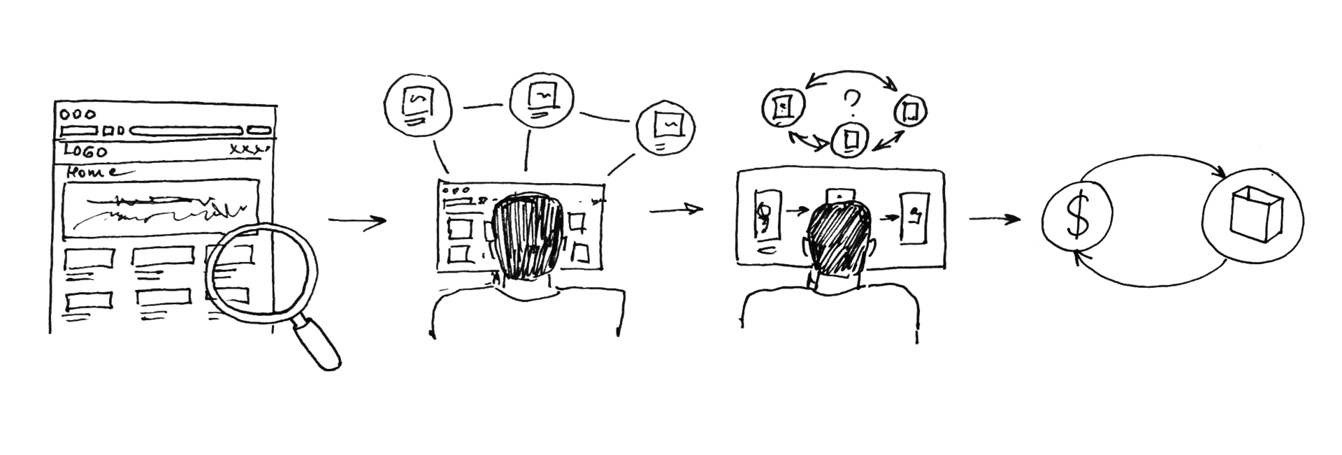
As a rule, in e-commerce the user is involved in the following processes to one degree or another:
- Looks for where all the products may be, approximately suitable for him ( Search );
- Searches and reads information about products. Based on it selects the appropriate ones ( Sort );
- Compare selected goods and make the final choice ( Selection );
- Buys a product ( Buying ).
Items 1 and 2 can be found in any area of Internet activity: searching for the latest news, reading the social networks feed, etc. Make the final choice from the person is not required.
Items from 1 to 3 inclusive, for example, can occur when a person chooses a photo for publication in social networks (and which one is better?) And writing an article (and which verbal circulation is better to choose?). It is necessary to make a choice, which entails mental stress.
But the whole process from 1 to 4 points is peculiar only to e-commerce projects. During this process, the user is required to perform several obvious actions that may have unobvious consequences. So:
Evidence number 1. The user needs to find a product.
A specific product or several products suitable for it in parameters. The faster the user finds it, the better. And, as a result, sensitivity to any kind of hitch increases in the process of finding a product in the store.
"This is true for everything on the Internet," you say, and you will be right. But the fact is that only in e-commerce the number of user hitches in the process of interaction and the drop in store revenue are directly dependent parameters.
Our task: to provide the user with convenient tools for searching, minimizing his time costs.
After the user has found several products that meet his requirements, he must decide which product to buy. Here comes the next moment:
Evidence number 2. User needs information
How much is? When and how to deliver? Is it a quality product? What does he look like? And if you look at the side? Do they give him a guarantee? And what guarantee is given? Is there any discount for it, and what do people say ... - only a small part of the questions that the average buyer asks during the purchase process. The existing answer to each of the questions can be vital and critical to the user's decision. As a result, the lack of a response is highly likely to lead to the user's departure.
Our task: to provide the user with all the necessary and high-quality information in a convenient way and in a timely manner.
Finally, when the user has found several suitable products, has received all the information of interest to him, a critical moment comes:
Evidence number 3. User need to make a selection
Sometimes the user's choice is irrational. Or it is so complicated with an excess of options that the user postpones the selection process until better times (often - not in this store).
Our task: to offer the user the most convenient approach to the selection and the optimal number of options (I will mention this in more detail in the third chapter).
Finally, the decision is made. Our user is already in the status of the buyer must solve the final problem - to make a purchase.
Evidence number 4. User needs to buy product
Just pay the money and buy. At this stage, the user no longer wants to make decisions and waste time. Even less, he is eager to provide his data and fill out a bunch of forms.
Our task: to contribute to the user and guide him through the checkout process as quickly and comfortably as possible.
And in all the tasks that concern the supply of information to the user, we are dealing with an information architecture.
In the next two parts of this chapter, we will look at both the information architecture design schemes and the principles of its construction.
You may notice the following discrepancy: if the information architecture schemes deal exclusively with the relationship between the pages of the site, the principles mostly relate directly to the content of the pages.
Inaccuracy? By no means. The fact is that the information architecture, in its essence, concerns both aspects. The nuance lies only in the fact that working on the information architecture at the “strategic” interstitial level and the “tactical” in-page one requires different approaches.
What schemes can we supply the user with information?
Template information architecture schemes used in e-commerce
Consider the template schema information architecture. Most fully, in my opinion, they were classified by Donna Spencer . We use some of the schemes given by her. Just in case, I note that in the vast majority of cases the information architecture will have the properties of several templates at the same time.
Linear information architecture
Normal linear process. No options and choices.
Characterized by the sale of a single product or service.
Example: Google AdSense
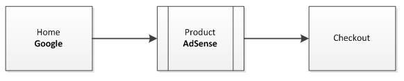
Features:
- Focus on one product;
- The ability to lay out a large amount of specialized or marketing information;
- “By default” is an obvious process of buying a product that can be designed based on the specifics of the product;
Hierarchy + Database
The most common and easily customizable template. For each category of goods and information there can be its own scheme of providing information (title, image and price - for goods, title and description - for the article, etc.).
Example: Amazon
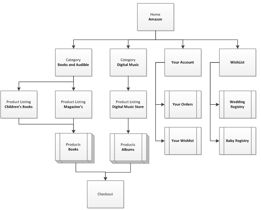
Features:
- Standardized description of categories and products;
- You can use different schemes for presenting information for different categories of goods (books and digital music, for example);
- You can use a large number of non-product pages (News, Articles, Promotional Materials, Videos).
Catalog
The second most common pattern scheme is an IA. Unlike the previous one, the presentation of information in all categories is uniform. The hierarchy of categories is also uniform.
Classical hierarchy: Homepage, category page, product list, product details.
As a rule, up to three levels of hierarchy are used.
Example: Google Play

Features:
- The highest structured approach to the withdrawal of categories and products
- Products must be homogeneous (only applications, only furniture, only cars).
Tags
There is no hierarchy, all products are organized by tags.
Example: Steam
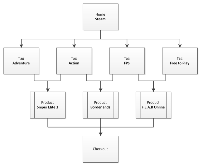
Features:
- Flexibility in organizing and reorganizing the information architecture scheme as the product range expands.
The principles of IA, and their application for e-commerce
I would like to draw your attention to the remarkable presentation of the principles of building the information architecture given by D. Brown. By and large, they can be used as a checklist when checking any existing or designed IA. Consider these principles in the context of e-commerce.
Principle of objectification
Content or product (in e-commerce) is perceived as an object, with its life cycle, properties and user interaction.
Suppose we sell the book How to Build a House in 80 Days. Innovative technologies ” (fictional book).
What is its life cycle? With the same external factors (our marketing efforts, objective demand), it will not be in special demand in winter, interest in it will increase in spring, will stay in summer, fall to autumn-winter. After several years, new technologies will appear, and the book will begin to lose its relevance.
Book properties: 255 pages, with beautiful color illustrations and diagrams, in soft binding, it is written in simple language.
And finally, her behavior / interaction . It interacts in a certain way with a potential buyer. Creates images, causes associations and ideas, forms a certain idea about the topic.
Awareness of these aspects allows us to understand how to structure and present product information to the user. In the case of e-commerce - for subsequent sale and income.
The greatest importance should be given to the observance of this principle when selling a small number of niche products or services.
The principle of optimal choice
We create pages, their content, which offer a meaningful choice to users, while retaining the optimal number of options for the current task.
The prerequisites of this principle lie in the phenomenon of the “paradox of choice,” which we will examine in more detail in the next chapter. The essence of the paradox: the more options for choosing at the same time we offer the user, the more difficult the decision is given.
For e-commerce the logical conclusion from this paradox is the following: it would be nice to provide the user at each step with a limited number of options (similar products or services). Ideally, no more than 7 .
Principle of disclosure
At each stage (step) we give the user an idea of what information he can find if he “digs” further in this direction.
In most cases, we cannot provide all the information on all products to the user in the very first step (in the case of e-commerce, the main page of the store). But we must consider what information is critical for our user. And allow the user to understand whether the product meets its needs or not.
In various cases, the most important criteria can be: product price, appearance, name, specifications or reviews of other users.
The principle of clarity
We describe the contents of categories by demonstrating sample content.
In e-commerce, due to the differences in the thesaurus among users, the names of categories may not be obvious to everyone equally. For example, the name of the category “Everything for the Home” can cause completely different associations among users. Some will look for tools there, others - building materials, the third - household appliances.
The problem becomes even more obvious if the store is “international” and with several localizations, but with a single information architecture for all. Understanding "Homeware" of a citizen of our area will be different from the understanding of a Vietnamese.
Therefore, according to this principle, in addition to the name or even the image of a category, it is desirable to indicate a few examples of products in this category.
The principle of the front doors
We assume that at least half of the visitors will enter the site through pages other than the main one.
With the increasing role and functionality of search engines, many users go around the store’s main page directly to the product categories or product pages.
Due to this circumstance, it will be nice, in addition to solving the main task (to allow the user to quickly buy what you need) to provide him with information, both on similar products and on the capabilities of the store as a whole. Recommended products, extensive general navigation and additional contextual information to help.
The principle of multiple classification
We offer users several different content classification schemes on the site.
The classification scheme - the names of product categories.
Different people search for information or product in different ways. And they have different ideas about what they are looking for. Therefore, the use of several classification schemes instead of one increases the chance for a large number of users to quickly find the desired product.
Example: Suppose you need to find a wall panel to repair an apartment. In which category, of the following three, would you look for it first?
" Floor coverings ", " Building materials " or " Finishing materials "?
And now, as you believe, have the other readers selected the same category as you?
Principle of focused navigation
We do not interfere with the name and purpose of the navigation elements in the process of constructing navigation schemes.
Each navigation mechanism should focus on its goal. Global menu - demonstrates categories and subcategories, filters allow sorting products into categories by desired properties, the top menu provides access to customer's personal options (office, order tracking, communication with customer support), and so on.
Growth principle
We take into account that the existing content is only a small fraction of the content of the future.
The information architecture we design should have a substantial margin of safety and scalability. If today we sell only paper books, it is far from a fact that tomorrow we will not have to sell audiobooks or electronic formats. And the day after tomorrow - devices for reading. Proven Amazon.
It is advisable to provide for the growth of content in three directions:
- New products in existing categories;
- New subcategories and types of products in existing categories;
- New categories.
Research in the design of information architecture e-commerce
Today, less has to convince interested parties (manager, customer, colleagues) of the need to conduct research in the design of interaction. And this is a plus. Therefore, first I will talk about the approach, then about the argument for the rest in favor of conducting research (I would have told the first thing a year earlier about the argumentation of the research).
Part of the research relates directly to the design of information architecture. A global review of the methods was made by Jim Ross ( article UXMatters ), we consider one of the research scenarios, which, in my opinion, is in most cases optimal (the ratio of elapsed time - information received) when working on e-commerce projects.
Imagine that we are working on a furniture store website ...
User research
At the first stage of the research we collect information about the target audience:
- Ethnographic Details ( Google Analytics );
- Behavior ( Google Analytics for e-commerce );
- Preferences ( Polls ).
On the third point, please pay special attention. Here, for the first time in our work on a project, we encounter user informational priorities . To my regret, this aspect is rarely mentioned in the literature, therefore, in short, the problem from two sides:
User. Imagine a huge canvas of various information about the product: name, price, rating, delivery terms, images, videos, reviews, recommendations ... Two questions: What information for you as a user has maximum value when choosing a product? And what will happen if you do not find it or not notice?
Designer. How to get information about user priorities? Captain Evidences to the rescue - ask users. We offer him a list of information blocks and ask to specify from one to three points important, in his opinion, information. It is enough to interview users 20-30 to understand the overall picture.
After the stage of gathering information, the stage of generating input data begins for further work.
How can it look like in practice?
1. Create a person on the basis of information received about the target audience (up to three people);
Example:

Ippolit Matveyevich.
52 years old.
Registrar registry office.
Collector of furniture produced by master Gambs.
The character is uncommunicative.
Not married.
2. We schedule scenarios of their behavior on the site;
Example:
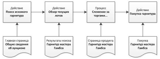
3. According to the results of the polls, we formalize the preferences of our target audience, represented by persona Ippolit Matveyevich.
Example (in order of priority):
- Furniture category (chairs);
- Production workshop;
- Price.
The rest of the information is of little interest to our person.
After we have thus received all the input data about our target audience, we proceed to the next study.
Open card sorting
We write on pieces of paper or their electronic analogues names describing the content of interest to us (for example, a product). It is desirable to be limited to two or three words.
Example:
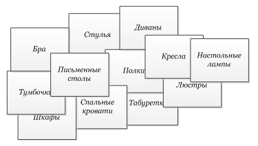
We offer their users a request to group them into several categories, and give categories their names. It is advisable to put a restriction for this case that the category should not be less than 2 and not more than 4 proposed products. If some products, according to users, are not grouped with other proposed products, leave them alone.
Thus, we test at least 10 people. To start this amount is enough. (Later, with the availability of funds and time, you can improve the accuracy of the study by increasing the number of respondents).
We summarize the statistics, summarize and get the following output:
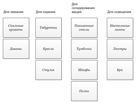
At this stage, we are quite happy with this, we can proceed to testing.
Tree testing
Our users in the previous study have already generated some categories. Now we can ask the next group of users to test the already existing high-level information architecture.
We do this with the help of tasks and a minimized information architecture diagram.
Example: Please find in the current scheme where Madame Petukhova’s diamonds can be.

First select the category that you think is correct, then the subcategory.
The output also provides statistics, which, with a clear conscience, can be considered the result of this round of research.
Results of research
In the statistics of the previous study, we are most interested in the ratio of successfully completing the tasks of users to the total number of users who took part.
Our tasks vary in criticality / priority. If many users cannot find the most important product or information for them the third time - “something must be corrected at the conservatory” (c).
Example:
Task 1. Find the chairs of the master Gambs on the site of the store.
Priority - maximum.
78% of users have successfully completed;
Task 2. Find the conditions for the delivery of chairs.
Priority is medium.
60% of users have successfully completed;
Task 3. Find the biography of the master Gambs.
Priority is low.
40% of users have successfully completed.
The following questions arise: 78% in the first case - is it good or bad? And 40% - in the third?
To answer these questions at least as a first approximation, we will try to evaluate the satisfactory results.
Calculation of the profitability of research
Suppose the Gambs master set of 10 chairs costs, say, $ 750.00.
The target audience that visited the store site that day is 100 people.
According to tree testing research, only about 78% of those who wish can find it and, as a result, buy it.
Thus, the under-received potential income is
(100 * 750) - (0.78 * 100 * 750) = $ 16,500 / day
It is clear that in practice it is unlikely to bring the success rate of finding a product to 100%, but it is possible to minimize losses.
Demonstrated figures give us the opportunity to argue the feasibility of the costs of large-scale research of information architecture. We did not have this argument in the first round of the study, so we had to do with the minimum allowable number of participants and research approaches.
Therefore, we go to the second round of research and testing of information architecture, only this time with a large number of participants and a large "arsenal" of research methods.
Note: the complexity of users with solving IA problems should always be correlated with the costs of conducting a new round of research. If 10% of users cannot find the 2011 article on the biography of Grandma Master Gambs’s biography, this is not a reason to carry out a large-scale reorganization of the information architecture. Even if it would additionally sell a dozen headsets per year.
Well, I suggest summing up the intermediate results of the chapter (those who read can skip them or look at them for a “repetition of the past”).
Results, or in short for those who are too lazy
1. The user needs to find the product.
Our task: to provide the user with convenient tools for searching, minimizing his time costs;
2. The user needs information.
Our task: to provide the user with all the necessary and high-quality information in a convenient form;
3. The user needs to make a choice.
Our task: to offer the user the most convenient approach to the selection and the optimal number of options;
4. The user needs to buy this product.
Our task: to carry it through the checkout process as quickly and comfortably as possible.
1) The principle of objectification
Content or product (in e-commerce) is perceived as an object, with its life cycle, properties and user interaction.
2) The principle of optimal choice
We create pages, their content, which offer a meaningful choice to users, while retaining the optimal number of options for the current task.
3) Principle of disclosure
At each stage (step) we give the user an idea of what information he can find if he “digs” further in this direction.
4) The principle of clarity
We describe the contents of categories by demonstrating sample content.
5) The principle of front doors
We assume that at least half of the visitors will enter the site through pages other than the main one.
6) The principle of multiple classification
We offer users several different content classification schemes on the site.
7) The principle of focused navigation
We do not interfere with the concepts and purpose of navigation elements in the process of constructing navigation schemes.
8 Growth Principle
We take into account that the existing content today is only a small fraction of the content of the future.
In the statistics of the previous study, we are most interested in the ratio of successfully completing the tasks of users to the total number of users who took part.
Our tasks vary in criticality / priority. If many users cannot find the most important product or information for them the third time - something in the conservatory must be corrected (c).
Results, or in short for those who are too lazy
E-commerce specifics
1. The user needs to find the product.
Our task: to provide the user with convenient tools for searching, minimizing his time costs;
2. The user needs information.
Our task: to provide the user with all the necessary and high-quality information in a convenient form;
3. The user needs to make a choice.
Our task: to offer the user the most convenient approach to the selection and the optimal number of options;
4. The user needs to buy this product.
Our task: to carry it through the checkout process as quickly and comfortably as possible.
Template IA Schemes
Linear IA
Hierarchy + DB
Catalog
Tags
8 principles of building an IA
1) The principle of objectification
Content or product (in e-commerce) is perceived as an object, with its life cycle, properties and user interaction.
2) The principle of optimal choice
We create pages, their content, which offer a meaningful choice to users, while retaining the optimal number of options for the current task.
3) Principle of disclosure
At each stage (step) we give the user an idea of what information he can find if he “digs” further in this direction.
4) The principle of clarity
We describe the contents of categories by demonstrating sample content.
5) The principle of front doors
We assume that at least half of the visitors will enter the site through pages other than the main one.
6) The principle of multiple classification
We offer users several different content classification schemes on the site.
7) The principle of focused navigation
We do not interfere with the concepts and purpose of navigation elements in the process of constructing navigation schemes.
8 Growth Principle
We take into account that the existing content today is only a small fraction of the content of the future.
EA-commerce study
- We collect information about the target audience;
- Select 10 study participants from the target audience;
- We write on pieces of paper or their electronic counterparts the names describing the content of interest to us;
- We offer them to users with the request to group them into several categories, and give the categories their names;
- We ask the following group of users to test the already existing high-level information architecture by performing the tasks set to find this or that information;
- We reduce the information in the general statistics, we subject it to the analysis.
In the statistics of the previous study, we are most interested in the ratio of successfully completing the tasks of users to the total number of users who took part.
Our tasks vary in criticality / priority. If many users cannot find the most important product or information for them the third time - something in the conservatory must be corrected (c).
What's next?
In the next chapter, we will look at how users behave (patterns of behavior), how they search for information, make choices and make purchasing decisions.
What to read?
Eight Principles of Information Architecture , D. Brown (English, PDF)
Comparing Information Architecture Research Methods , D. Ross (eng.)
Effectively simplifying navigation , A. Karafillis (English)
Exploring ecommerce information architecture (English, Lynda.com course)
I would be grateful for comments and comments.
Thanks for attention!
We design information architecture for e-commerce. Part 1
Source: https://habr.com/ru/post/241748/
All Articles