Moscow region under Probkoskom

Based on the Yandex.Traffic service, we drew beautiful moving pictures on the map of the Moscow region. In our Probkoskop (tm) you can see what the traffic situation for the week looks like in the Moscow region as a whole and for each specific point in a square 200 x 200 km around Moscow.
Wise Yandex taught us to learn about traffic jams when we hit the road.
')
But what if we want to find a place free from traffic jams on the map? Or almost free. Or to see how difficult it is to get to where it is offered to us to buy a summer cottage near Moscow. Or choose the best day when you can go to visit your grandmother in the village of Durnyha or your aunt in the village of Chulkovo-Club. Now on Yandex.Traffic the way there looks good, and what happens on Friday night? On Sunday?
To do this, look at the map of the Moscow region a little from a different angle. And this will help us Probkoskop.
We mapped the color of the distance in time from the center of Moscow. Taking into account traffic jams, at different times of the day, on different days of the week. And that's what happened with us:
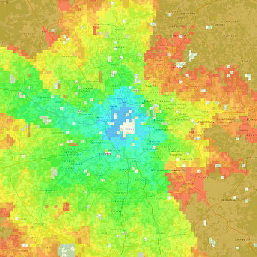
To get the initial data, we simply asked Yandex how long it would take on the road from the center of Moscow to each point on the map, and painted each point in the corresponding color. Of course, if we asked 10,000 routes from Yandex (namely, we painted so many points on the map), we would have been banned long ago. We acted somewhat more cautiously: on every highway going from Moscow, we dotted every 10 kilometers. Then they politely asked the Yandex.Maps API to build a route 120 km from the center of Moscow through these points and carefully noted how long the road between these points would take.

But if we showed only the reference points (one for every 10 km of main highways from Moscow), the picture would be extremely boring. So we still needed to find out how long it took to get to each of the 10 thousand points of the considered square.
We take points, one after another. For each, we look for three nearest reference points in the database (of those that were initially placed 10 km along each highway). According to the graph of roads from OSM, we consider the distance from this point to each of the three reference points. The OSM column shows the maximum speed on each edge-road. We believe that from the reference point to the desired one can be reached without traffic jams (bold, but acceptable simplification). Of the three options (the time on Yandex to the reference point + the time on OSM from it to the point in question) we find the best one and put it on the map. And so 10 thousand times. Now, of course, it is interesting to look at it in dynamics. Well, the hypnotic picture of the "breathing" of the Moscow region traffic jams, resulting in:
What we used to build such beautiful images:
- Beloved Yandex.Maps API,
- Remarkable JavaScript-library for displaying data and maps - Leaflet,
- Wonderful map rendering server - Mapnik,
- PostgreSQL as storage,
- Backend - Django,
- Data - OSM.
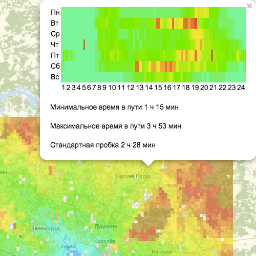
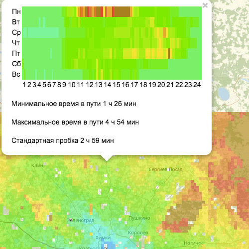
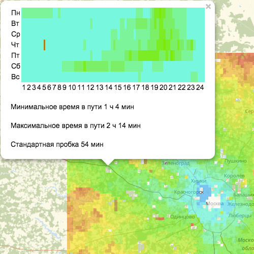
We also made it possible to see the “Cork profile” of each point of our suburban square.
Sergiev Posad
Dmitrov - an accident on Monday
Volokolamsk
What we want to do more. Pictures showing the time to go to the center (now shows the time to go from the center of Moscow).
Draw similar pictures and collect data for other cities (if users are interested).
Show more extensive statistics for the point, and not just for the last few weeks.
You can try it yourself on the site created by us. Your comments?
Source: https://habr.com/ru/post/241624/
All Articles