Taming Interfaces or One Report on Wake Up Province
 On October 25, the second Saratov Web Developers Conference, Wake Up Province , took place, where I was fortunate enough to speak. Today I decided to tell the habrasoobshchestvu about his report on it - I think it might be interesting to someone. The theme, in general, is simple and clumsy: Why computers cause suffering and how to explain it to the customer. Ways of designing interfaces and principles of "transparent" development.
The report is based on his own experience in the actual development of the thoughts and conclusions of one very famous person - Alan Cooper. At the same time, many of the ideas are “cultivated” by me, and some are borrowed from Habr.
Under the cut a somewhat refined text of the report and almost a dozen slides (~ 660Kb). In order not to break the text, the slides are hidden in spoilers.
Overall plan
- Interface problem.
Pain in the eyes of users and attitudes towards this developer. Thesis "user is drunk." - Outdated perception.
The perception of IT development by the standards of the industrial age, why it is bad and how to convince the customer of the need to design interfaces. - Interface design.
A few words about the design itself on the example of the average website (link diagrams, prototypes). - Transparent design.
"Transparent" development. Conduct customer by hand through all stages. Why it is important and how to avoid negativity. - Conclusion, the main theses.
Interface problem
Pain in the eyes of users and attitudes towards this developer. Thesis "user is drunk."
Title slide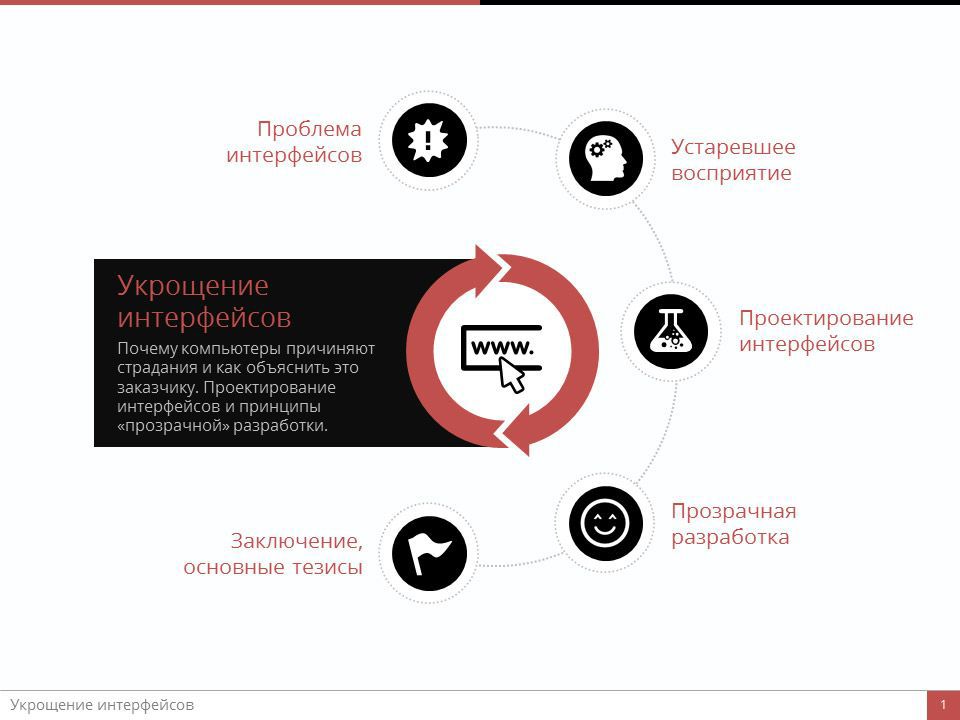
I will not say anything new if I remind you that with each passing day the IT industry is penetrating deeper and deeper into our lives. Smartphones, tablets, watches, navigators, laptops and computers, terminals. And this applies not only to geeks and IT people - this applies to most of the population. These are the realities of the developing world.
')
At the same time, we are still surrounded by terribly inconvenient, contradictory interfaces. We "grind in", stop noticing these inconveniences, but they do not disappear from this. Someone will disagree with me now, and will be partly right. For us IT pros and sympathizers, there are no particular problems with interfaces (or almost). However, each of us has a relative / friend / neighbor, whose task is more difficult than registering with classmates causes an intellectual stupor. And, like, intelligent, normal people, but at some point they simply cease to understand what the car wants from them. And this is a problem. One may speak about the difference in perceptions, the level of technical training, generations, and so on. The essence does not change: the untrained user in some cases, the interface becomes the enemy. Of course, the example given is very polar. And most often the problem is not so pronounced. But it exists. And the reason for this problem, in most cases - we are with you, IT specialists.
The problem of user interface interaction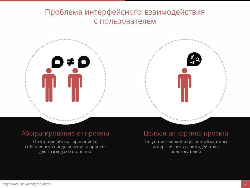
It is we, most often, who cannot completely abstract ourselves from our understanding of the project in order to understand what the user will experience when they first meet him.
Even more popular is the situation when the customer or project manager does not have a complete picture of the project in his head. By complete picture, I mean interface interactions, logical sequences, user actions, and so on. And this is completely normal. Even the most intelligent person is not able to keep more than 10-15 sequences in his head.
However, this, like the previous reason, leads to the fact that the creation of the project becomes "ragged", and the interfaces, respectively, - "detached" from each other. In the best case, there is a need for “edits” that are so “loved” by all of us, the project architecture, the interaction of employees, their motivation decreases, and so on. At worst, the project is sent to production as it is. What happens to a raw product when you try to shove it onto the market under the guise of a ready-made product, I think everyone understands. A classic example is a hypothetical web-based control panel for some abstract corporate service. We will proceed from the fact that the service itself is perfect. It works without complaints, but it has (for any of the reasons stated above) an inconvenient, incomprehensible and ugly control panel. So what happens when a buying company presents a new tool to its employees? Immediately increases the threshold of entry. Managers who have the misfortune to work with this panel quietly curse. The productivity of work with the panel decreases, which immediately affects the overall efficiency of the team. As a result, the management, instead of a performance gain, sees its decline (well, or quite a slight increase). The manufacturer of the service will receive nothing but negative in this case. No regular customer, no positive feedback.
So what to do? How to determine whether the correct approach is used by the manufacturer in building interactions with the end user? There is no universal answer, everything is too individual for each project. However, in my work I proceed from one simple thesis, which you have probably heard. This is a metaphor proposed by the designer Will Dable from Australia and already mentioned on these pages by the ilya42 habrovichin : "user is drunk."
Thesis "user is drunk"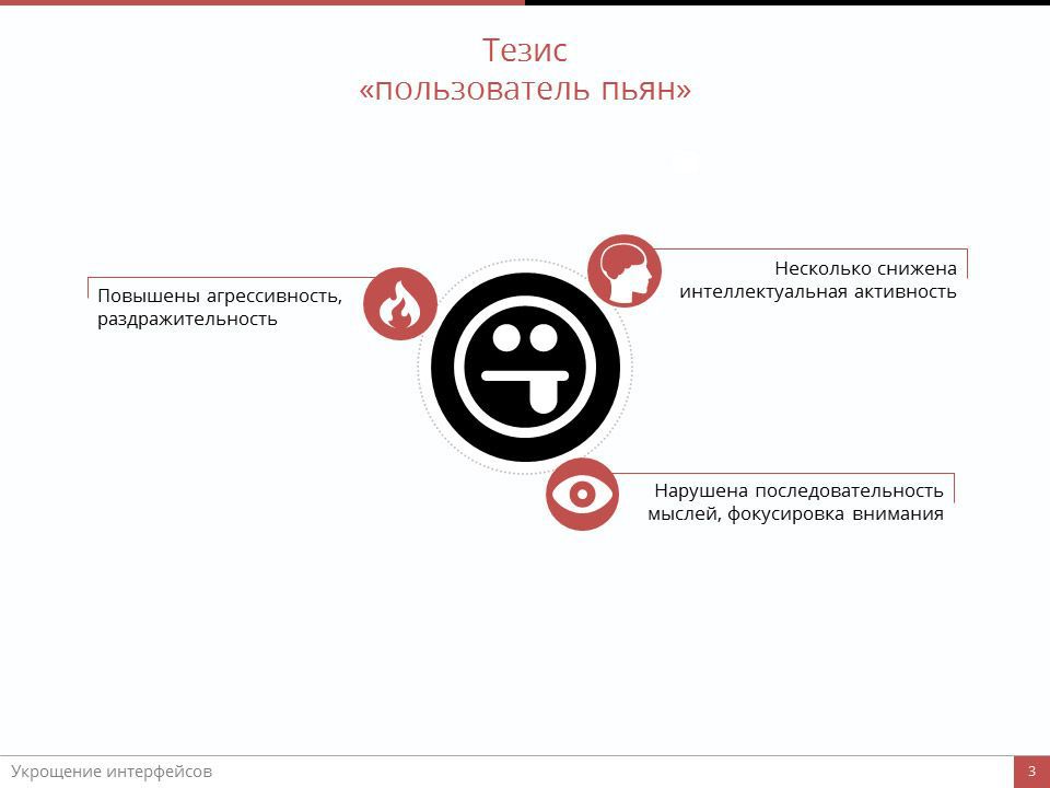
For a drunken user, intellectual activity is reduced, he is irritable, angry, sometimes even inconsistent. He has a problem with focusing, distracted attention. If a drunk user is able to deal with your interface, then for a sober user it will not be any problem at all.
Outdated perception
The perception of IT development by the standards of the industrial age, why it is bad and how to convince the customer of the need to design interfaces.
So. Two main reasons why interfaces become the enemy of users and, accordingly, business. I emphasize: the main ones, because in fact there can be more such reasons.
The problem of user interface interaction
The first is the lack of abstraction from the project for the “side view”. The second is the lack of a clear understanding of the integrity of the interface interaction by both the customer and managers with developers. I specifically share the developers of the project and its leaders. Now I will explain why.
Actually, the two reasons that I have just mentioned are not causes at all, but consequences. Consequences of a lack of awareness of the importance of designing user interfaces and interactions prior to development.
The essence of the problem is that now many, very many managers perceive IT development by measures not of informational, but of industrial age, when products consisted of real materials, and their manufacture required a large number of variable costs: the purchase of raw materials, its transportation, the manufacture of a product and transportation again. To increase the profits from the sale of each unit, it was necessary to increase the cost of the product or reduce these very variable costs. Naturally, the most popular solution was cost reduction.
Erroneous perception of IT development by industrial schemes
Even now, many managers are working according to this scheme, saving on design and programming, and completely forgetting that the realities have changed and now the variable costs are not so great - new products do not need raw materials, expensive transportation; that the most successful growth scheme here will be an increase in the value or quantity of sales.
I quote Cooper: “The source of economic growth is an increase in the quality and, as a result, the attractiveness of a product or service, and it cannot be achieved by reducing the costs of design and programming.”
This is very well demonstrated by the example of bona fide pharmaceutical companies. Research and the creation of a new medicine can go on for years and require millions, but no one would ever think to launch a medicine on the market that could harm the consumer - because it will be a death for the business.
Of course, in the IT-production appeared its own items of expenditure, which was not in the production of physical. However, an IT product or service created once can be sold a million times, which is not the case with the usual, “material” counterpart.
So, everything is clear. You give more money in design and programming - you get a better product and you avoid heaps of problems in the team. Everything is logical and simple. For us, IT specialists. But not for customers.
It’s not so easy for an average customer to explain why a designer cannot immediately draw his website, and a programmer with a coder is not able to recreate this design on the web. And such a customer can be understood.
And now attention, a question. How to convince the customer of the need for preliminary design? The simplest answer, which suggests itself: tell him everything. That's all what I just told, take - and tell. Well, add something that still tell today. Sometimes it works. The customer is imbued, ignited by the desire to get the site, created "according to all the rules" and so on. Perfectly. Everyone is happy.
But this is not always the case.
I tried a lot of ways and the most effective was the report to the customer of the material benefits of the design. Here it is important to understand for yourself that in fact you are not extorting additional loot, but want to create a truly high-quality product. Moreover, while reducing the final budget of the project. Now I will try to explain, due to what.
Material Benefit Design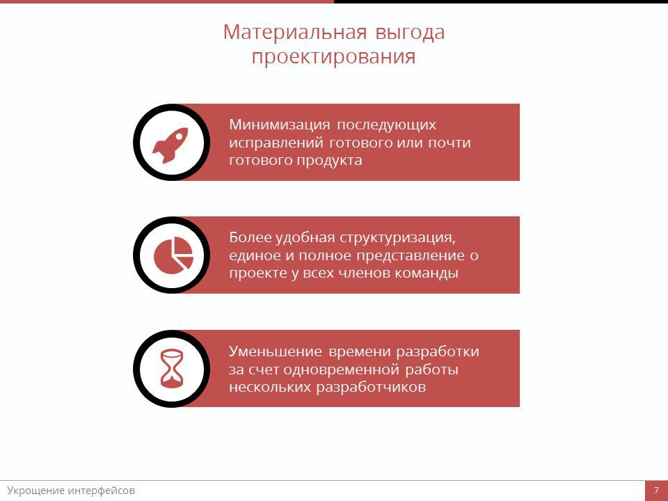
Everyone knows the phrase "edits on the layout." Everyone knows that sometimes the completion of an existing design or functionality takes almost as much time as it took the original version. It is unprofitable to anyone. It is unprofitable for a designer who spends a month on “finishing touch” without being able to completely switch to another project or continue working on it. It is unprofitable for programmers who sometimes have to break the architecture in order to plug in the functionality that someone once forgot to add to the TOR. It is not profitable for the leadership and the timlids, because due to the edits, the deadlines are broken, people work more than planned and full heartburn begins. Well, it is unprofitable, first of all, to the customer - because he is wasting his time, examining the unfinished site for the hundredth time, and his money, which he pays for these improvements.
The preliminary interaction design allows you to minimize the number of subsequent product fixes.
It is also worth noting that the design provide enormous assistance in the structuring of work. With its help, it is possible not only to break up the project into stages with minimal effort, but also to be sure that all team members have a single, unambiguous understanding of the project itself. And this is also a very considerable saving of time and, accordingly, of the budget.
Another useful point in having prototypes at the start of a project is speed. Usually the site is done in stages: first, designers draw a layout, then programmers take over. In our case, they almost always can start at the same time: while the design is being created, the programmer can start working on the backend - because by this moment all the logic of the project is already clear and understandable to the developers.
In addition, a simple analogy makes sense: a software product, be it a website or some kind of native application, is still a product. Moreover, in terms of sales, it is sometimes more complicated than what ordinary, “physical” factories and workshops produce. Doesn't it occur to anyone to start building centrifugal pumps without having detailed schemes and plans for this unit?
Well, the control argument always works. “You don't want your users to suffer?” Do you need a high conversion and an intuitive, holistic interface? So this is all impossible to implement without competent prototyping. "
Interface Design
A few words about the design itself on the example of the average website (link diagrams, prototypes).
But here I repeat “prototyping”, “designing” ... So what is it? What a panacea that saves the eyes of users from bloody tears? Most of you know this very well without me, and yet I cannot miss the opportunity to tell in general about the scheme itself. In fact, this is a separate topic, and very, very voluminous. Therefore, today I will touch it in passing, only the main points.
Design: a preliminary study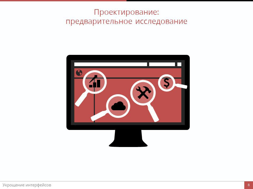
For example, let's take some average site. Any design begins with research. Research of the market, competitors, target audience of the product and so on. To do this, there are many ways and only depends on the level of the product, which of them you will use. There is no definite data presentation format here - everything is too individual for each project. As a result, you should get the most complete picture of what you and the customer want to realize, how this is best done and who needs it.
Design: characters
Next, the characters are made up - such “reference” representatives of their class, which are most appropriate for the description of this very audience. The more fully described the characters, the more qualitative and thoughtful will be the interaction of the product with the user.
I will be frank, sometimes I myself neglect the creation of characters, immediately moving on to the next stage. As a rule, this is permissible in small sample projects, where, in an amicable way, everything is known in advance. For example, such is a simple application-encyclopedia, where typical pages are five in total. In other cases, character creation is extremely important; it allows you to concentrate on the needs and characteristics of your future users, without losing sight of your own goals.
Design: communication diagrams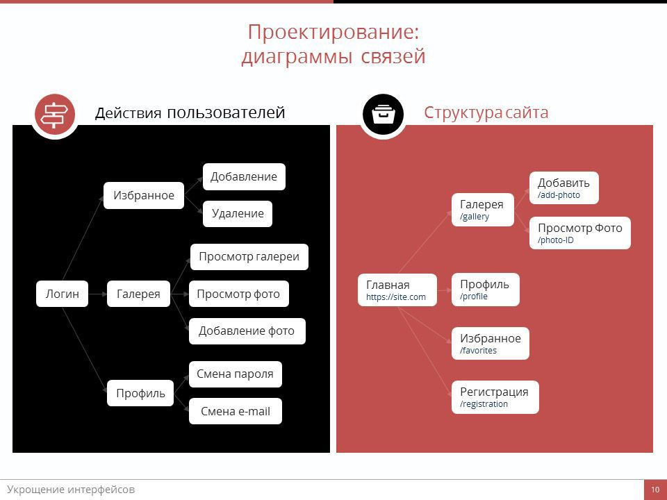
Based on the intended behavior of these characters, sequences of actions, a kind of logical interface chains, are lined up. The most convenient way to present this is through link diagrams (or, as they are also called, mind maps). Here - all user actions, from the first visit to the site and create an account, to direct use of the service.
With the help of the same communication diagrams, a detailed site structure is compiled, which includes absolutely all pages, including service pages, such as 404 errors. There can be only the names of pages and sections, and maybe - a complete description of each element, up to program classes. This is necessary to create a single view of the project at the customer, designer, programmer and coder. Without such a diagram (by the way, not necessarily in this form), not one serious project can be done. This may be a sheet of text, divided into sections and subsections. There may be a simple set of pictures. Some craftsmen even use excel tables for this. But my personal opinion is that mind maps are most convenient in this respect.
Design: prototypes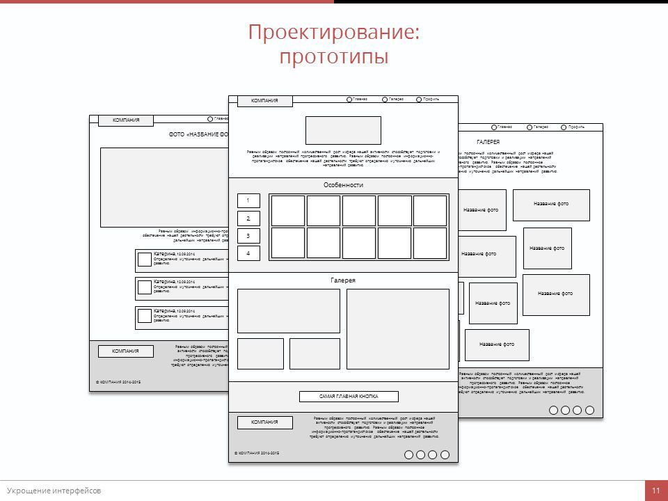
Once the maidmaps are ready, the time comes for the prototypes. Never neglect prototypes. If possible, always do besides simple, graphic prototypes, interactive prototypes. Fortunately, a special software has been developed for this purpose long ago. Prototypes allow you to create a visual representation of the site or application, they provide an opportunity to correct shortcomings at a very early stage, when designers and programmers have not entered into the business, using prototypes you can hone customer interactions and much, much more. It is necessary to ensure that you yourself perlo already from simple black and white interface prototypes. Well, when prototypes are created in conjunction with the project designer. Even better when the designer himself is a designer. But this is not often seen. In any case, prototypes are our everything.
And only when communication diagrams and prototypes are ready, you can proceed to design, programming, layout and so on. It is then that the designer will clearly understand the task, the programmers will be able to build the architecture in the most optimal way, and the coder will make the most concise layout. Visitors to this site are much more likely to save their vision and sanity, and the entire development team and customer will save a lot of time and effort.
Here are the tools I use to design interface interactions:
- Mindjet is a simple and convenient mind map creation tool. It is possible to flexibly change and customize the connection, in a couple of clicks to change the design of the entire document, use third-party add-ons and so on. An excellent tool to bring to a common denominator all directions and modules of the project, a visual representation of its structure.
- Balsamiq Mockups - the essence of the program is clear from the title. A simple, elegant solution for sketching mokapov site or application. It features an impressive and expandable library of tools. It is convenient and intuitive to manage.
- Axure RP is the most powerful of the programs presented. It can also be used to sketch mockups, but it’s like shooting an howitzer at ants — it's much easier, faster, and more appropriate to use a specialized tool for this. Axure RP is good because with its help you can create an interactive prototype for html + css + js in half an hour, in which you can already walk between the pages, click the link buttons.
Transparent design
"Transparent" development. Conduct customer by hand through all stages. Why it is important and how to avoid negativity.
Of course, even the most ideal design will not give you the assurance that the development will take place like clockwork. Moreover, design alone is not enough. There are always difficulties associated with a sudden change in business logic (in the case of “protracted construction”, for example), entering the market of a new competitor, implicit problems in the beginning with software implementation, and so on. However, in my memory the most frequent reason for the subsequent changes in the structure and logic of the project in one degree or another was the customer himself.
It is difficult for an outsider to believe a person, but there are cases when the customer simply forgot about some decisions taken together. In the end, this resulted in a repeated and pointless discussion.
In addition, the customer may simply change his mind - after all, between the last meeting with the project at the prototyping stage and the alpha presented to it may take weeks.
So, there is a solution that not only avoids these problems, but also gives the customer full control over the development. Well, or a sense of control - it is already up to you.
The name of this solution is “transparent” development.
"Transparent" development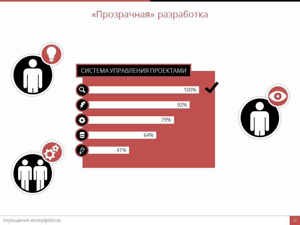
The essence of it is simple and clear from the title. The whole process of creating a product is fully controlled by the customer. At any moment he can go in and see at what stage his brainchild is now, and in some cases even “feel” him. This approach should be used at the design stage of the project, which will greatly simplify the understanding of the process by the customer and save a lot of time for developers.
I use the Redmine project management web application for these purposes. There are analogues like YouTrack or JIRA - I am sure that many have known them for a long time. So it costs nothing to start a project, distribute tasks to developers - and give access to the customer there. At some key moments - send the customer an e-mail notification of the new stage, attaching screenshots or links to the working pages of the future site, design layouts or prototypes. In fact, it takes some time only for the first time, then everything goes "on the thumb" and does not cause any difficulties or delays. Moreover, sometimes it allows you to avoid long trips to the other end of the city to coordinate the next "features".
Of course, a lot depends on the specific project and customer. Most often, there is no need to give the client access to the software tasks, sometimes it is generally necessary to separate programmers from designers as much as possible from the customer. This is all done calmly at the level of access control.
Each team can calmly expand these ways in their own way, based on their own needs and capabilities.
The advantages of this approach are many, from clear structuring of work to content as an elephant of a client.
Conclusion, the main theses
Conclusion Summary of the above, theses.
Basic Theses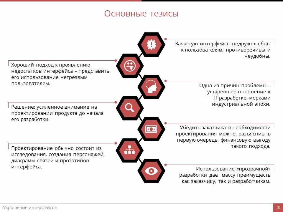
So, to summarize, we come to such basic points:
- Often, the interfaces are unfriendly to users, contradictory and inconvenient. This is a serious problem.
- A good approach to the manifestation of interface flaws is to present its use by a drunk user .
- One of the main reasons for the poor interaction of interfaces is the attitude towards IT-development by the measures of the industrial era, when growth was achieved by reducing variable costs.
- Solution: increased attention to the design of the product before the start of its development.
- You can convince the customer of the need for design, explaining, first of all, the financial benefits of this approach.
- The design itself consists of initial research, character creation, communication diagrams, and interface prototypes.
- The use of "transparent development" makes it possible to minimize subsequent refinements of the product and the negative on the part of the customer due to the complete control on his part of the development process.
I do not pretend to the discovery of the Americas, and at least to some extent the finality of the approaches described here. On the contrary, my working methods are constantly evolving and I will be glad to any valid criticism and advice.
And for those who are close to the report and who would like to modify it for themselves, I post the presentation here.
Source: https://habr.com/ru/post/241593/
All Articles