AppCompat v21 - Material Design for Pre-Lollipop Devices
On October 17, the Android 5.0 SDK was published, which brought new widgets and material design. We have expanded support libraries so that you can use your latest designs on previous versions of Android. These changes include a major update for AppCompat , as well as the RecyclerView , CardView and Palette libraries.
In this post, we take a look at what's new in AppCompat and how to use it to support material design in your applications.
What's new in AppCompat?
The AppCompat library (aka ActionBarCompat) appeared as the port of the new ActionBar API from Android 4.0 to devices with Gingerbread. She introduced a generic API layer on top of a backported or standard implementation. AppCompat v21 also brings API and feature set from Android 5.0
This version of Android has a new Toolbar widget. It is a summary of the ActionBar pattern and gives more control and flexibility. A toolbar is a view element in a common hierarchy, which simplifies the implementation of its interaction with other widgets, animations, and reactions to scroll events. You can also use it as an Actionbar of your activity, which means that the standard elements of the action menu will be displayed in it.
')
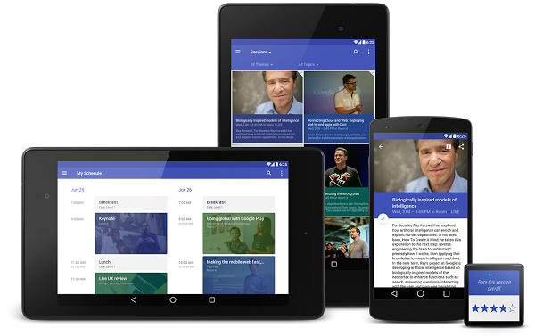
You have probably already used an updated version of AppCompat for some time. This library has been incorporated into various Google software updates that have been released in recent weeks, including the Play Store and the Play Press. In addition, it was integrated into the Google I / O application, shown above, which is open source .
Installation
If you are using Gradle, simply add appcompat as a dependency in your build.gradle file:
dependencies { compile "com.android.support:appcompat-v7:21.0.+" } New integration
If you are not yet using AppCompat or starting from scratch, here’s how to connect it:
- All your activities should be inherited from ActionBarActivity , which in turn is inherited from FragmentActivity from the v4 support library, so you can continue to use fragments.
- All your themes (which include Action Bar / Toolbar) should inherit from Theme.AppCompat. There are several options for topics, including light (Light) and the theme without the action bar (NoActionBar).
- When you embed something to display in the panel (for example, SpinnerAdater for navigation), make sure that you use the context with the panel theme obtained with getSupportActionBar (). GetThemedContext () .
- You must use the static methods of the MenuItemCompat class to invoke MenuItem related actions.
For more information, refer to the Action Bar API Guide , which is a comprehensive guide to AppCompat.
Migration from previous versions
For most applications, now you only need one declaration of the theme in values / :
values/themes.xml: <style name="Theme.MyTheme" parent="Theme.AppCompat.Light"> <!-- Set AppCompat's actionBarStyle --> <item name="actionBarStyle">@style/MyActionBarStyle</item> <!-- Set AppCompat's color theming attrs --> <item name="colorPrimary">@color/my_awesome_red</item> <item name="colorPrimaryDark">@color/my_awesome_darker_red</item> <!-- The rest of your attributes --> </style> Now you can remove all ActionBar styles from values-v14 + .
Themes
AppCompat supports new color palette attributes that allow you to customize your theme to your brand using primary and accent colors . For example:
values/themes.xml: <style name="Theme.MyTheme" parent="Theme.AppCompat.Light"> <!-- colorPrimary is used for the default action bar background --> <item name="colorPrimary">@color/my_awesome_color</item> <!-- colorPrimaryDark is used for the status bar --> <item name="colorPrimaryDark">@color/my_awesome_darker_color</item> <!-- colorAccent is used as the default value for colorControlActivated, which is used to tint widgets --> <item name="colorAccent">@color/accent</item> <!-- You can also set colorControlNormal, colorControlActivated colorControlHighlight, and colorSwitchThumbNormal. --> </style> When you define these attributes, AppCompat automatically applies them as attribute values from API 21+. And this, in turn, will color the status bar and the item in the list of recent tasks.
On older platforms, AppCompat emulates color themes when possible. Currently, this is limited to coloring the action bar and some widgets.
Toning Widgets
When you run the application on a device with Android 5.0, all widgets are tinted with the color specified in the theme attributes. There are two main features that allow you to do this on Lollipop: tinted drawable and links to the attributes of those (in the format ? Attr / foo ) inside the drawable.
AppCompat offers similar behavior on earlier versions of Android for the following UI widgets:
- All that is offered in the AppCompat toolbar (action modes, etc.)
- Edittext
- Spinner
- Checkbox
- Radiobutton
- Switch (use the new android.support.v7.widget.SwitchCompat class)
- CheckedTextView
You do not need to do anything specifically to make it work. Use these elements in your markup as usual, and AppCompat does the rest (with some reservations, see the FAQ below).
Toolbar widget
The toolbar is fully supported by the AppCompat library and is fully consistent with both the capabilities and the API calls, the widget from the SDK. In AppCompat, the toolbar is implemented using the android.support.v7.widget.Toolbar class. There are two ways to use it:
- Use as ActionBar if you want to use the existing Action Bar features (such as menu insertion, selection, ActionBarDrawerToggle , etc.), but at the same time want more control over its appearance.
- Use a standalone panel in situations where the usual ActionBar does not fit. For example, to show several panels on the screen, to occupy only a part of the screen in width, etc.
Action bar
To use the Toolbar as an ActionBar, first, disable the normal ActionBar. The easiest way to do this is to inherit your theme from Theme.AppCompat.NoActionBar (or its bright version)
Second, create an instance of the toolbar. For example, include it in your xml markup file
<android.support.v7.widget.Toolbar android:id="@+id/my_awesome_toolbar" android:layout_height="wrap_content" android:layout_width="match_parent" android:minHeight="?attr/actionBarSize" android:background="?attr/colorPrimary" /> Height, width, background and stuff are now completely dependent on you, this is just a good example. Since the Toolbar is just a ViewGourp, you can style and position it to your liking.
Finally, set the Toolbar as the ActionBar in your activity or snippet:
@Override public void onCreate(Bundle savedInstanceState) { super.onCreate(savedInstanceState); setContentView(R.layout.blah); Toolbar toolbar = (Toolbar) findViewById(R.id.my_awesome_toolbar); setSupportActionBar(toolbar); } From this point on, all menu items will be displayed in your toolbar, being filled using standard menu setting calls.
Offline use
The difference in offline mode is that you do not set the Toolbar as an ActionBar. Therefore, you can use any AppCompat theme and you do not need to disable the normal ActionBar.
In offline mode, you can populate the Toolbar with content or actions. For example, if you want to show actions, you need to embed a menu:
@Override public void onCreate(Bundle savedInstanceState) { super.onCreate(savedInstanceState); setContentView(R.layout.blah); Toolbar toolbar = (Toolbar) findViewById(R.id.my_awesome_toolbar); // Set an OnMenuItemClickListener to handle menu item clicks toolbar.setOnMenuItemClickListener(new Toolbar.OnMenuItemClickListener() { @Override public boolean onMenuItemClick(MenuItem item) { // Handle the menu item return true; } }); // Inflate a menu to be displayed in the toolbar toolbar.inflateMenu(R.menu.your_toolbar_menu); } There are many other things you can do with the toolbar. For more information, see the Toolbar API description.
Styles
Setting the toolbar style is different from how it was done for the standard action bar. The style applies directly to the widget itself.
Here is the basic style you should use when you use the Toolbar as an ActionBar:
<android.support.v7.widget.Toolbar android:layout_height="wrap_content" android:layout_width="match_parent" android:minHeight="?attr/actionBarSize" app:theme="@style/ThemeOverlay.AppCompat.ActionBar" /> The app: theme ad will ensure that the font and elements use a solid color (for example, 100% opaque white).
Dark action bar
You can customize the toolbar directly using markup attributes. To make the Toolbar look like “DarkActionBar” (dark content, bright overflow menu), specify the theme and popupTheme attributes :
<android.support.v7.widget.Toolbar android:layout_height="wrap_content" android:layout_width="match_parent" android:minHeight="@dimen/triple_height_toolbar" app:theme="@style/ThemeOverlay.AppCompat.Dark.ActionBar" app:popupTheme="@style/ThemeOverlay.AppCompat.Light" /> Search widget (SearchView)
AppCompat offers an updated API for the search widget, which is more customizable and styled. We now use the style structure from Lollipop instead of the old searchView * theme attributes.
Here is how you can customize SearchView style:
values/themes.xml: <style name="Theme.MyTheme" parent="Theme.AppCompat"> <item name="searchViewStyle">@style/MySearchViewStyle</item> </style> <style name="MySearchViewStyle" parent="Widget.AppCompat.SearchView"> <!-- Background for the search query section (eg EditText) --> <item name="queryBackground">...</item> <!-- Background for the actions section (eg voice, submit) --> <item name="submitBackground">...</item> <!-- Close button icon --> <item name="closeIcon">...</item> <!-- Search button icon --> <item name="searchIcon">...</item> <!-- Go/commit button icon --> <item name="goIcon">...</item> <!-- Voice search button icon --> <item name="voiceIcon">...</item> <!-- Commit icon shown in the query suggestion row --> <item name="commitIcon">...</item> <!-- Layout for query suggestion rows --> <item name="suggestionRowLayout">...</item> </style> You do not need to specify all (or even some) of the attributes. Default values should fit most applications.
Toolbar on the way ...
I hope this article will help you get started with AppCompat and will allow you to create amazing material-style applications. Let us know in the comments to the original article / Google + / Twitter if you have questions about AppCompat or about any of the supported libraries, or where we can provide more documentation.
FAQ
Why is my EditText (or another widget from the list above) not colored correctly on an Android device prior to Lollipop?
Toning widgets in AppCompat works by intercepting the implementation of markup and pasting special toned versions of the widgets. For most people, this will work correctly. But there are several scenarios when this does not work, including:
- You have a customized version of the widget (you inherited EditText)
- You create an EditText without using LayoutInflater (for example, by calling new EditText () )
Special tinted versions of widgets are still hidden, as they are in an unfinished state. This may change in the future.
Why doesn't widget X have a material style on non-Lollipop devices?
So far, only some of the most common widgets have been updated. In future releases, others will be added.
Why does my Action Bar have a shadow on Android Lollipop? I set the android: windowContentOverlay equal to null.
On Lollipop, the shadow under the panel is created using the new lifting API. To remove it, you need to call getSupportActionBar (). SetElevation (0) or set the value of the elevation attribute in the Actionbar style description.
Why is there no ripple animation on devices before Lollipop?
The main thing that allows RippleDrawable to animate smoothly in Android 5.0 is the new RenderThread. To optimize performance on previous versions of Android, we have left RippleDrawable behind.
How do I use AppCompat with Preferences?
You can continue to use the PreferenceFragment in ActionBarActivity when running the application on a device with the v11 + API. For devices with a previous version of the API, you will have to use PreferenceActivity, which is not styled for material design.
PS This is my first translation, please write in a personal about all inaccuracies (especially with regard to Russian terms)
Source: https://habr.com/ru/post/241479/
All Articles