Money, goods and some statistics. Addition
In the article “Money, goods and some statistics” I described the method of statistical analysis of long-term price dynamics and building a diversified product — a basket of goods for which the standard deviation of its relative price for a certain period of time is minimal.
Let me remind you that at the beginning the relative prices of the goods are calculated, then their covariance matrix and using the Lagrange multipliers method, the conditional minimum is calculated.
In this article I will try to explore a few more dependencies.
Under the cut graphics.
First of all, I tried to build two DPs (diversified products).
DP1 - fuel and metals (crude oil, natural gas, gold, platinum, silver, aluminum, copper, zinc, nickel, tin, lead, iron ore).
DP2 - renewable resources (food products: barley, corn, rice, sorghum, soybean, wheat, beef, chicken, as well as logs, cotton, cocoa, coffee, sugar, tobacco and tea).
Charts - prices DP1 and DP2 in dollars (normalized to the average of time), as well as the relative price:
')
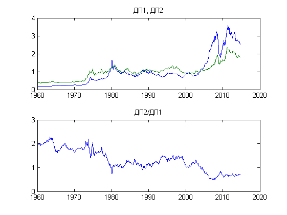
As we can see, from 1960 to the present, there has been a steady trend towards cheaper food and other renewable resources in relation to fuel and metals.
Next, we will try to compare the value of DP1 and the volumes of the dollar mass - monetary aggregates M1 and M2.
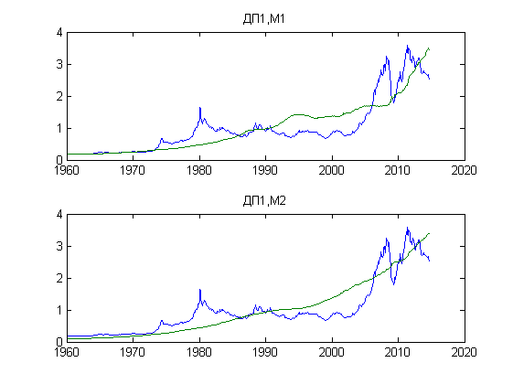
The graphs are normalized to the time average, the correlation coefficients are 85.18% and 89.67%, respectively.
Further. DP1 and the index of property prices in the US (taken here ).

As can be seen from the graph, before the mortgage crisis in the United States and the global economic crisis provoked by it, real estate prices (relative to fuel and metals) grew, then dropped to the level of the 70s.
I also tried to build DP from HiTech shares of companies - Apple, Ford Motor, General Electric, Google, Microsoft, Intel and Yahoo.
Data taken from the Nasdaq, unfortunately, in just 10 years.
On the top chart, prices for DP1 and DP-HiTech, normalized by the time average.
At the bottom - their ratio.
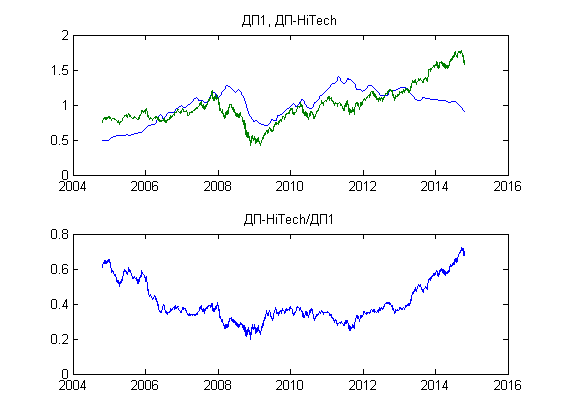
From the graph it is clear that at present there is a trend for a relative rise in prices for high technology stocks.
That's all for now.
Scripts and data files here: github.com/tabatsky/jatx/tree/master/prices
Let me remind you that at the beginning the relative prices of the goods are calculated, then their covariance matrix and using the Lagrange multipliers method, the conditional minimum is calculated.
In this article I will try to explore a few more dependencies.
Under the cut graphics.
First of all, I tried to build two DPs (diversified products).
DP1 - fuel and metals (crude oil, natural gas, gold, platinum, silver, aluminum, copper, zinc, nickel, tin, lead, iron ore).
DP2 - renewable resources (food products: barley, corn, rice, sorghum, soybean, wheat, beef, chicken, as well as logs, cotton, cocoa, coffee, sugar, tobacco and tea).
Charts - prices DP1 and DP2 in dollars (normalized to the average of time), as well as the relative price:
')
As we can see, from 1960 to the present, there has been a steady trend towards cheaper food and other renewable resources in relation to fuel and metals.
Next, we will try to compare the value of DP1 and the volumes of the dollar mass - monetary aggregates M1 and M2.
The graphs are normalized to the time average, the correlation coefficients are 85.18% and 89.67%, respectively.
Further. DP1 and the index of property prices in the US (taken here ).
As can be seen from the graph, before the mortgage crisis in the United States and the global economic crisis provoked by it, real estate prices (relative to fuel and metals) grew, then dropped to the level of the 70s.
I also tried to build DP from HiTech shares of companies - Apple, Ford Motor, General Electric, Google, Microsoft, Intel and Yahoo.
Data taken from the Nasdaq, unfortunately, in just 10 years.
On the top chart, prices for DP1 and DP-HiTech, normalized by the time average.
At the bottom - their ratio.
From the graph it is clear that at present there is a trend for a relative rise in prices for high technology stocks.
That's all for now.
Scripts and data files here: github.com/tabatsky/jatx/tree/master/prices
Source: https://habr.com/ru/post/241393/
All Articles