Simple dogma when working with color in interfaces

Hi, username!
I wanted to write a great article about the biology of color perception, but decided to start with simple rules for a beginner / continuing interface designer. Unfortunately, competent work with color is not even present in all products of large companies, so this text has a goal not only to train newbies, but also to remind more experienced designers about all the intricacies of this issue. The issue of color blindness is not covered in the article.
')
Color is a method of creating a balance of elements.
While thinking about the interaction scenario and the perception of the interface, it should be remembered at every stage that the user sees the screen as work areas.
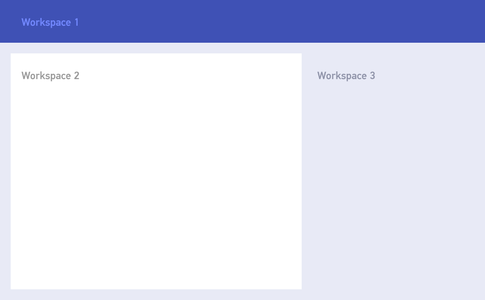
It is characteristic that the perception sequence, for most users, will be somewhat different from the numbering of the work areas, namely: workspace 2 → workspace 1 → workspace 3, while workspace 2 and 3 will obviously be perceived as the main and secondary part of the same scenario.
The user seeks to ignore elements that are in another work area while working with the current — subconsciously he imagines that somewhere there are a number of functions that he may need, but consciously he “does not see them”. From this we can conclude that the elements inside the areas should be at the same intensity level relative to other areas. For example:
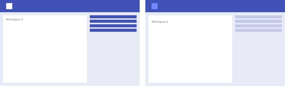
Obviously, in the first version, the initially specified balance is lost: the elements of the list on the right conflict with the horizontal header. In the second version it is saved: attention is primarily directed to the title Workspace 1
Let us repeat once again the positive perception scenario by the user of workspaces: first find the global element, then find the specific function in it
Use only consciously chosen colors.
This is the main mistake of a very large number of designers. You can often see an example of when a designer takes an element based on abstract ideas about what “confirm” should be green, and “undo” - red. In addition to the obvious limitations of this approach, there is also the problem that not everyone understands that if you used a certain green color, you can only use strictly defined red for it. Random colors do not exist at all: the human eye is able to catch the smallest differences and subconsciously always perceives color dissonance. Moreover, it should be remembered that most modern screens have very limited color spaces, and the dissonances on them appear to be much more coarse than, say, on a canvas.
A couple of examples and fixes of a similar relationship:
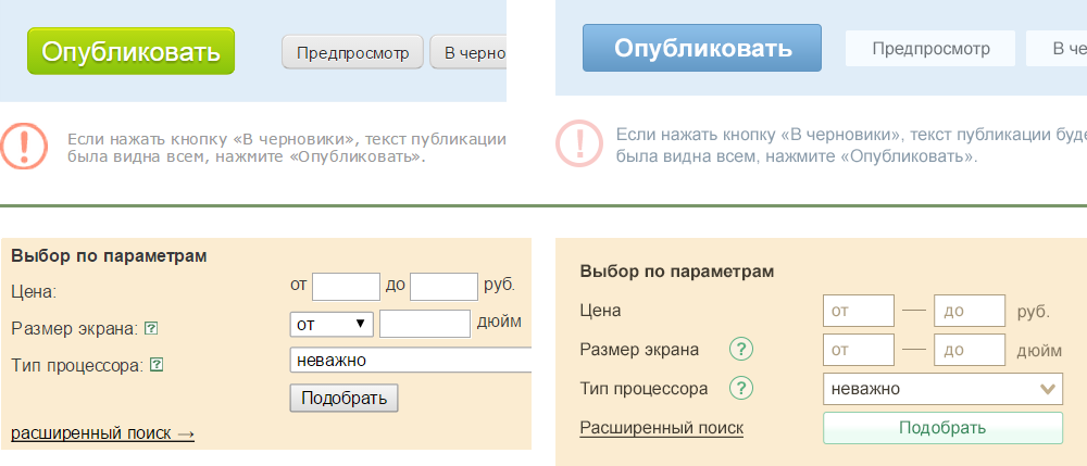
Pay attention to the fact that not a single component of the element, be it the text color, the input color, the button color, is not ignored - it creates wholeness and harmony. The hue of the button does not necessarily have to be green, it is important that if it is green, then it is not accidental.
There are a few limitations that you should always keep in mind:
- Never use black and gray text on a colored background. It creates a feeling of dirty. On a white background, by the way, pure black can also not be used in all cases.
- Do not use deaf gray for backgrounds. If the layout has at least one color element, you should always paint the gray elements in its shade.
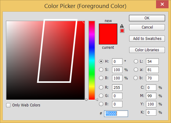
- Do not use the right extreme corner of the colourbicker for primary colors. Below is the acceptable area for choosing a clear color (but not pale shades):
By the way, web colors are also strongly discouraged, especially considering the modern development of browsers. Web colors are just the optimization of values, they are surprisingly coarse and do not fit well together.
Use the Kuler, Luke!
During the development of the interface palette, you should always have Kuler open (which Adobe, by the way, recently just renamed to color) or its equivalent. Of course, there are people with increased sensitivity to color, who can create a palette of 4-5 contrasting colors, but most develop a similar skill over the years.
In fact, after choosing the primary color, the space for maneuver is immediately limited by these rules of color relations:
There are several recommendations for working with the cooler:
- The best second color to the already selected main one is either on the Complementary or on the right side of the Triad.
- “Gray” shades to the main color should be selected in Monochromatic, a contrasting faded background is to the left of the main color, although usually it has to either lower the opacity or make it even more gray by hand (by default it is too active)
- Accents are on the left side of Triad
- A dry, dark shade for contrasting text is usually to the left of the Compound.
Of course, all of the above should be taken wisely and not head-on. In order to correctly select almost any color, as a rule, you have to move the slider tone, because pure relative colors are usually not enough / overly contrasting for their tasks.
By the way, it’s better for a novice designer not to “invent colors” at all, but to use the palette proposed by Google.
Make contrast thinner
Human vision is very well able to adapt to the conditions of different contrast, for example, its static contrast is about 100: 1, and dynamic can reach 1.000.000: 1, so you should not be afraid of its decrease inside the elements. At the same time, the perception of contrast increases with decreasing cycles (roughly speaking, multi-colored elements). Unlike the real world, the computer interface has a very primitive structure of contrasts, a small number of colors and types of elements. A good example of a well-built contrast is the current version of Facebook:

Note that slight contrasts between areas nevertheless separate them well from each other. Even heredity is visually preserved (the comments area clearly belongs to the general area of the post), and this is not only a stroke of merit.
Do naturally
A good indicator that the palette in the interface was a success if it creates a “taste” feeling of a single light. This is achieved through the use of natural contrasts, saturated with a shade of shadows. For example, it is not recommended to use cold on heat as an accent. This is unnatural, in nature this does not happen. Even matched by color relationships, blue in red looks worse than red in blue:

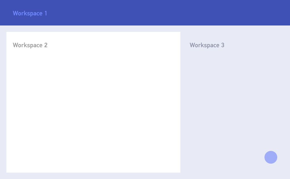
One accent
This recommendation also intersects with recommendations from general marketing: you should give the user a clear focus on one primary scenario and make the other scenarios clearly secondary. Hence the textbook call-to-action. However, it should be understood that in 90% of cases, call-to-action is a button and is preceded by some informative part. This means that it should be easy to find, but not be evident first. This is achieved, for example, by using a bright, active color in a small element.
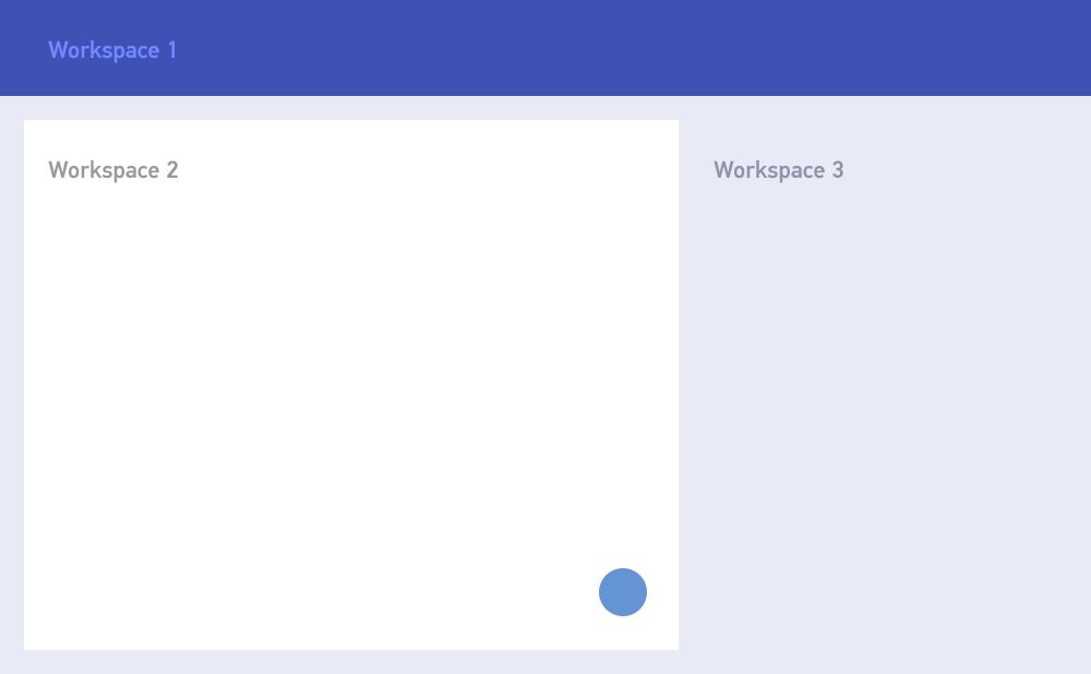
Call-to-action as part of the workspace 2 script
Call-to-action as part of the workspace 3 script
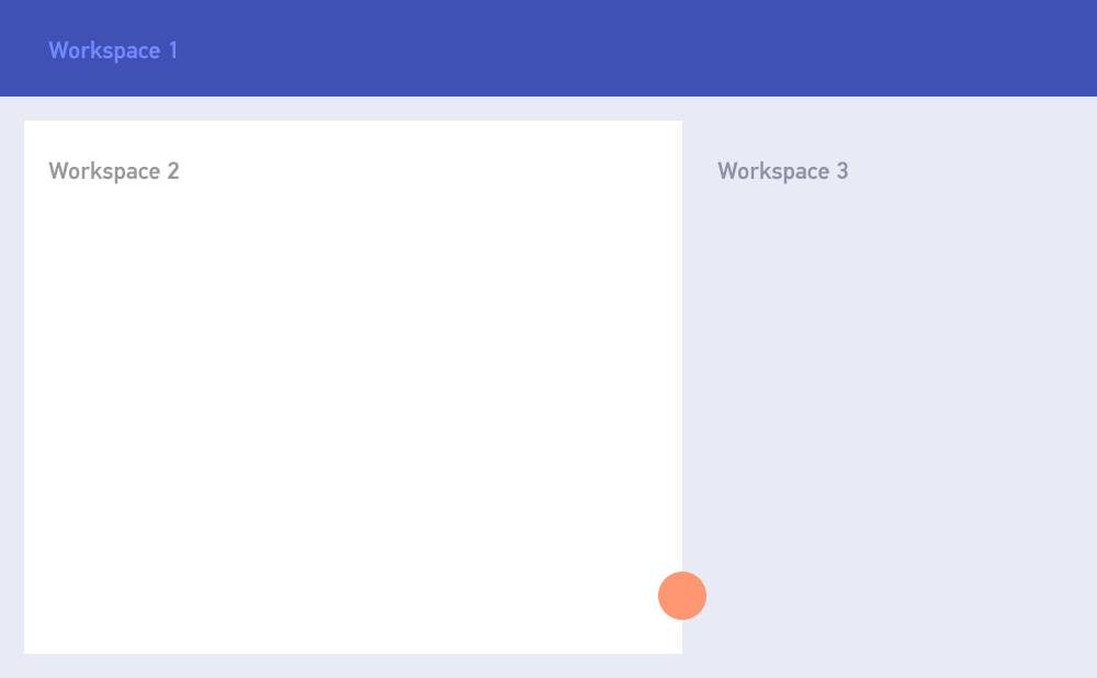
Call-to-action as a separate script. It could also be made the same color with a cap.
In general, in academic painting, there is an idea that there can be only one point of the greatest visual activity in a picture. If there are two equally bright points, then there is no accent in the picture at all, and this is most likely a landscape or still life. However, there are certain tricks, such as using contrasting work areas.

An example from real life.
These are the most general recommendations, based on which you can make a nice palette of the interface. If desired, habrayuzerov, in further publications can parse more specific cases.
PS On bad monitors and monitors and with reduced brightness, the examples given may not look contrast.
Source: https://habr.com/ru/post/240693/
All Articles