Layouts in Silverlight2
Welcome to my cozy bluzhek newly created blog on technology Silverlight.
This article is 3 in a loop. Here is the beginning and continuation .
When building any GUI application containing more than 5-6 controls, the question of their correct positioning and control of their placement within the parent control sharply arises.
To solve this problem, there are several approaches. Silverlight inherits from WPF a variant using layouts (sometimes they are called layouts, sometimes even worse). The flexibility of the layout system allows you to create fancy combinations of controls, combining both absolute and relative methods of positioning and controlling component sizes.
The composition of the current beta version of Silverlight2 includes 3 component layouts that allow you to solve almost the entire range of tasks.
- Canvas
- Stack
- Grid
')
When a control is placed in a container, attached properties are most often added to it, which allow for more flexible customization of its placement.
A small digression: I do not know the correct translation of some terms (including attached properties, layout, etc.). Therefore, I picked up Russian counterparts, which seemed to me the most appropriate, and when I first use, I indicate the English version. If someone offers better options - I will be very grateful.
Canvas
In principle, probably the easiest-to-action layout manager. It allows absolute positioning of the child components within itself by specifying the coordinates of their upper left corners in pixels. It also allows you to change the order of objects in the "Z-index", that is, to determine "what lies on top of that."
Here is a simple example for this case.
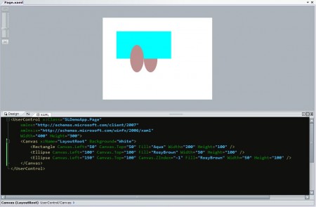
We placed 3 controls on our canvas. A rectangle and two ovals, and their additional properties Canvas.Left and Canvas.Top set the coordinates of their left and upper boundaries relative to the parent control. For the third ellipse, we set its Canvas.ZIndex property equal to -1, which led to the fact that it is “under” a rectangle, unlike its “colleague”.
Stackpanel
StackPanel is very convenient for automatically placing a large number of similar elements. He, as can be easily understood from the name (and even easier from the figure), is engaged in placing the children in a neat column, vertically or horizontally. In principle, one small example is worth a thousand words, therefore, without further ado, I quote it. Here is the code.
Here is the corresponding layout.

Here is the second option for the horizontal placement of controls.
This is how it looks.
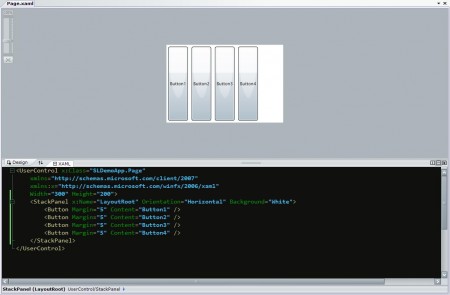
The only thing worth mentioning in these examples is a very useful Margin property; it allows you to set the indent by which the element will be selected when placing it in the layout manager.
Grid
Grid is the most difficult of the three basic layout managers used by default in Silverlight 2. In part, it is similar to HTML spreadsheets, in part, with GridLayout in Java, in part, unlike anything. Let's first take a look at an example, and then analyze it by bone.
Here is the source code.
It will all look like this.

Let's go in order.
The ShowGridLines property, set to True, helps a lot when designing an application, since it allows you to see the lines of our table, and it's easier to navigate. Then it is better to disable this property, since it does not add beauty in most cases :).
After that, it is necessary to describe the rows and columns of the future table. For this purpose, special sections <Grid.RowDefinitions> and <Grid.ColumnDefinitions> are assigned, which contain records that are responsible, respectively, for the rows and columns. The format of them, as you can see in the example, is very simple. Their main attribute is height and width. If a specific number is specified, then this is the absolute size in pixels. “*” Means “to occupy all free space. It is also possible to set the relative sizes, but more on that another time.
After the description of the "layout" of the table, it is possible to place elements into it. “Fastener” attributes are also defined for them. Grid.Row sets the row in which the control will be placed, Grid.Column, respectively, the column.
If necessary, using the Grid.ColumnSpan and Grid.RowSpan properties, you can “occupy” more than one cell.
That's all there is to say in brief about the main layout controls in Silverlight. To build a really flexible and convenient UI, of course, they will have to be combined and combined. But I will tell you about this next time with some convenient example.
This article is 3 in a loop. Here is the beginning and continuation .
When building any GUI application containing more than 5-6 controls, the question of their correct positioning and control of their placement within the parent control sharply arises.
To solve this problem, there are several approaches. Silverlight inherits from WPF a variant using layouts (sometimes they are called layouts, sometimes even worse). The flexibility of the layout system allows you to create fancy combinations of controls, combining both absolute and relative methods of positioning and controlling component sizes.
The composition of the current beta version of Silverlight2 includes 3 component layouts that allow you to solve almost the entire range of tasks.
- Canvas
- Stack
- Grid
')
When a control is placed in a container, attached properties are most often added to it, which allow for more flexible customization of its placement.
A small digression: I do not know the correct translation of some terms (including attached properties, layout, etc.). Therefore, I picked up Russian counterparts, which seemed to me the most appropriate, and when I first use, I indicate the English version. If someone offers better options - I will be very grateful.
Canvas
In principle, probably the easiest-to-action layout manager. It allows absolute positioning of the child components within itself by specifying the coordinates of their upper left corners in pixels. It also allows you to change the order of objects in the "Z-index", that is, to determine "what lies on top of that."
Here is a simple example for this case.
 <UserControl x: Class = "SLDemoApp.Page"
     xmlns = "http://schemas.microsoft.com/client/2007"
     xmlns: x = "http://schemas.microsoft.com/winfx/2006/xaml"
     Width = "400" Height = "300">
     <Canvas x: Name = "LayoutRoot" Background = "White">
         <Rectangle Canvas.Left = "50" Canvas.Top = "50" Fill = "Aqua" Width = "200" Height = "100" />
         <Ellipse Canvas.Left = "100" Canvas.Top = "100" Fill = "RosyBrown" Width = "50" Height = "100" />
         <Ellipse Canvas.Left = "150" Canvas.Top = "100" Canvas.ZIndex = "- 1" Fill = "RosyBrown" Width = "50" Height = "100" />
     </ Canvas>
 </ UserControl>
We placed 3 controls on our canvas. A rectangle and two ovals, and their additional properties Canvas.Left and Canvas.Top set the coordinates of their left and upper boundaries relative to the parent control. For the third ellipse, we set its Canvas.ZIndex property equal to -1, which led to the fact that it is “under” a rectangle, unlike its “colleague”.
Stackpanel
StackPanel is very convenient for automatically placing a large number of similar elements. He, as can be easily understood from the name (and even easier from the figure), is engaged in placing the children in a neat column, vertically or horizontally. In principle, one small example is worth a thousand words, therefore, without further ado, I quote it. Here is the code.
 <UserControl x: Class = "SLDemoApp.Page"
     xmlns = "http://schemas.microsoft.com/client/2007"
     xmlns: x = "http://schemas.microsoft.com/winfx/2006/xaml"
     Width = "200" Height = "300">
     <StackPanel x: Name = "LayoutRoot" Background = "White">
         <Button Margin = "5" Content = "Button1" />
         <Button Margin = "5" Content = "Button2" />
         <Button Margin = "5" Content = "Button3" />
         <Button Margin = "5" Content = "Button4" />
     </ StackPanel>
 </ UserControl>
Here is the corresponding layout.
Here is the second option for the horizontal placement of controls.
 <UserControl x: Class = "SLDemoApp.Page"
     xmlns = "http://schemas.microsoft.com/client/2007"
     xmlns: x = "http://schemas.microsoft.com/winfx/2006/xaml"
     Width = "300" Height = "200">
     <StackPanel x: Name = "LayoutRoot" Orientation = "Horizontal" Background = "White">
         <Button Margin = "5" Content = "Button1" />
         <Button Margin = "5" Content = "Button2" />
         <Button Margin = "5" Content = "Button3" />
         <Button Margin = "5" Content = "Button4" />
     </ StackPanel>
 </ UserControl>
This is how it looks.
The only thing worth mentioning in these examples is a very useful Margin property; it allows you to set the indent by which the element will be selected when placing it in the layout manager.
Grid
Grid is the most difficult of the three basic layout managers used by default in Silverlight 2. In part, it is similar to HTML spreadsheets, in part, with GridLayout in Java, in part, unlike anything. Let's first take a look at an example, and then analyze it by bone.
Here is the source code.
 <UserControl x: Class = "SLDemoApp.Page"
     xmlns = "http://schemas.microsoft.com/client/2007"
     xmlns: x = "http://schemas.microsoft.com/winfx/2006/xaml"
     Width = "300" Height = "300">
     <Grid x: Name = "LayoutRoot" Background = "White" ShowGridLines = "True">
         <Grid.RowDefinitions>
             <RowDefinition Height = "20" />
             <RowDefinition Height = "*" />
             <RowDefinition Height = "25" />
         </Grid.RowDefinitions>
         <Grid.ColumnDefinitions>
             <ColumnDefinition Width = "100" />
             <ColumnDefinition Width = "50" />
             <ColumnDefinition Width = "*" />
         </Grid.ColumnDefinitions>
         <Rectangle Grid.Column = "0" Grid.Row = "0" Fill = "Coral" RadiusX = "15" RadiusY = "15" />
         <Rectangle Grid.Column = "2" Grid.Row = "1" Fill = "DarkMagenta" Margin = "5" />
         <Rectangle Grid.Column = "1" Grid.Row = "2" Grid.ColumnSpan = "2" Fill = "LightSkyBlue" />
     </ Grid>
 </ UserControl>
It will all look like this.
Let's go in order.
The ShowGridLines property, set to True, helps a lot when designing an application, since it allows you to see the lines of our table, and it's easier to navigate. Then it is better to disable this property, since it does not add beauty in most cases :).
After that, it is necessary to describe the rows and columns of the future table. For this purpose, special sections <Grid.RowDefinitions> and <Grid.ColumnDefinitions> are assigned, which contain records that are responsible, respectively, for the rows and columns. The format of them, as you can see in the example, is very simple. Their main attribute is height and width. If a specific number is specified, then this is the absolute size in pixels. “*” Means “to occupy all free space. It is also possible to set the relative sizes, but more on that another time.
After the description of the "layout" of the table, it is possible to place elements into it. “Fastener” attributes are also defined for them. Grid.Row sets the row in which the control will be placed, Grid.Column, respectively, the column.
If necessary, using the Grid.ColumnSpan and Grid.RowSpan properties, you can “occupy” more than one cell.
That's all there is to say in brief about the main layout controls in Silverlight. To build a really flexible and convenient UI, of course, they will have to be combined and combined. But I will tell you about this next time with some convenient example.
Source: https://habr.com/ru/post/24022/
All Articles