Icon hamburger
Translation of the article “ The Hamburger Icon ” by Michelle Ferreira’s website designer on September 23, 2014.
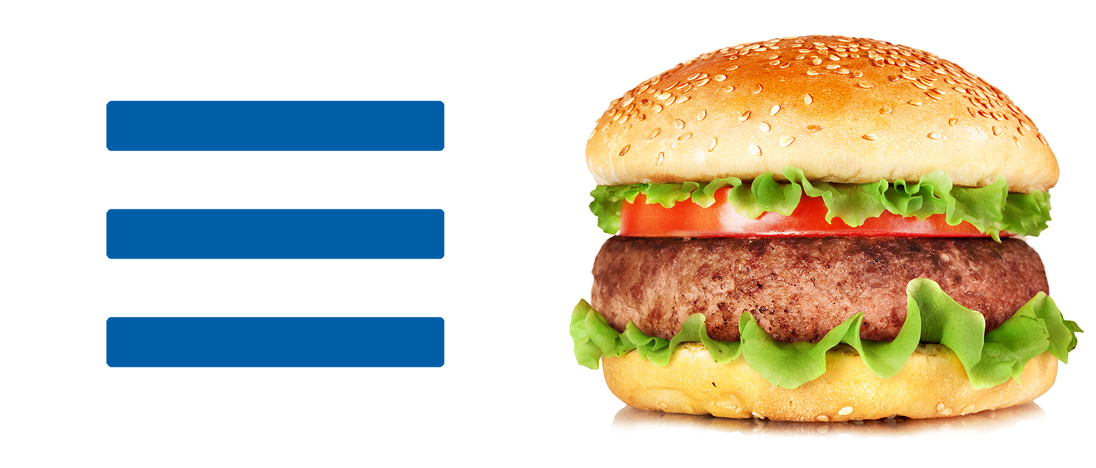
The hamburger icon is everywhere. Everywhere around us. In web applications, on mobile and desktop sites, in software. This three-line omnipresent icon is now so common that it seems as if it is uniquely associated with the navigation menu. But is it?
Recently, discussions about the effectiveness of the hamburger icons have reached new heights. In articles of outstanding designers, and on several sites, including The Atlantic , TechCrunch , The Next Web and the Nielsen Norman Group come to the conclusion that this is a UX-antipattern, a trendy and easy-to-implement icon, which is a regression from simpler and more expressive alternatives . But whether or not the antipattern, the use of the icon has grown so much that it makes it almost an indispensable attribute on most websites, especially on small screens.
Given my position as a designer on the team at m.booking.com , and our use of this icon to show the pull-down menu, I decided to explore this object. And I began by studying the origin of the icon, to try to understand its path to shame.
')
That sounds promising. But even though the icon is classic and has always been around, web designers were less consistent in its use. The icon was used for lists, dragging and reordering, alignment, and more. Perhaps this misuse explains his criticism as a menu icon. Perhaps due to the widespread and diverse use of this icon has lost the ability to convey a single metaphor and, in turn, puts users in confusion.
This whole story led me to ask questions: “Are we wrong, and everyone else is right? Does this inconvenience our users? Are there people who really understand what these three little lines are on our site? ”
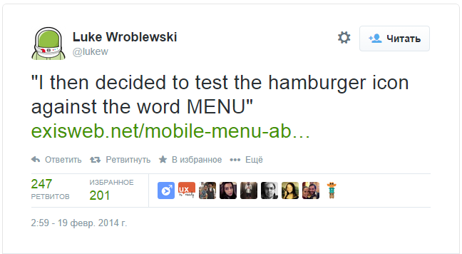
Regular readers of this blog will not be surprised to learn that our next step was to ask these questions in the form of an A / B test. Like everything else, the hamburger icon was exposed to our many customers, who, by interacting with the menu, should determine if this icon was the best solution. By this time, I had read enough articles and informational data to make sure that the lack of consensus or other results were not the result of the behavior of customers for whom the design was developed. I decided to follow the method described by James Foster , which many refer to, including one of our best mobile experts, Luke Wroblewski .
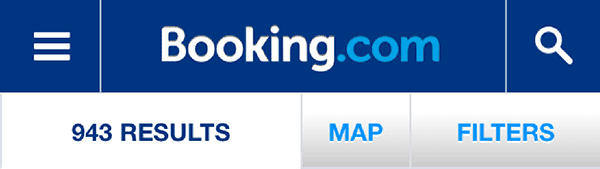
Previously, we tested several placements and icon styles (with frame, without frame, with icon, different colors, and so on), but we never tested the word “Menu” - due to difficulties associated with our desire to test in forty-one languages supported by us. However, we moved forward, finding translations with the help of our team of language experts and running the test:
We run an experiment for our entire user base. And also, given the fame and omnipresence of this user interface element, it was hoped that it would not take long to test millions of our customers around the world, in each of the supported languages and a large number of devices.
So what is the end result? The word won fast food, as it was in the experiment of James Foster, or will the bun with the cutlet win?
During this experiment, replacing the icon with the word “Menu” did not have a significant impact on the behavior of our users. With the help of our huge user base, we can, with a very high degree of probability, state that, in particular, for Booking.com visitors, the hamburger icon plays its role in the same way as the text description version.
Of course, we cannot extrapolate this data to anything. In some countries, in some languages or devices, this may have worked better or worse. But on a global scale, we can conclude that the hamburger was ridiculed too much. Overall, he was as recognizable as the word "Menu." In the spirit of managing the promotion of the design, we should probably consider other options, and maybe try adding cheese, a slice of bacon and French fries to our hamburger icon, but now we are pleased to announce that our “three-line friend” is stuck everywhere. Its actual placement, shape, size, position and color is, of course, a subject for future tests.
Undoubtedly, this is a lesson for all of us about the essence of A / B testing. You never test elements of the UI, model or function as a whole. You test these things for a very specific user audience under certain and specific scenarios. What works for Booking.com may not work for you or your users. This is one of the reasons why we conducted our A / B testing. The conclusions of other experts, data from other sites or hypotheses, invented in a pub, eating a hamburger, will all be unproved until they are tested on our clients and on our platform.
Not to get lost in our own metaphor, but this is like a recipe for a good hamburger. Even if you wrote down all the ingredients for me, you will end up with a completely different hamburger. This will, of course, be affected by the quality of the meat available on the market, the flour used for bread and thousands of other factors. For us personally, the idea is good if it is good for Booking.com . If we can repeat it on our website, and if it will work for all our customers.
The hamburger icon is everywhere. Everywhere around us. In web applications, on mobile and desktop sites, in software. This three-line omnipresent icon is now so common that it seems as if it is uniquely associated with the navigation menu. But is it?
Recently, discussions about the effectiveness of the hamburger icons have reached new heights. In articles of outstanding designers, and on several sites, including The Atlantic , TechCrunch , The Next Web and the Nielsen Norman Group come to the conclusion that this is a UX-antipattern, a trendy and easy-to-implement icon, which is a regression from simpler and more expressive alternatives . But whether or not the antipattern, the use of the icon has grown so much that it makes it almost an indispensable attribute on most websites, especially on small screens.
Given my position as a designer on the team at m.booking.com , and our use of this icon to show the pull-down menu, I decided to explore this object. And I began by studying the origin of the icon, to try to understand its path to shame.
')
The hamburger icon is classic. Even if you are not familiar with its name, then the three black bars are as familiar as the mouse cursor - the constant companion of our Internet surfing from day one, as you became the owner of your computer.
Gizmodo
That sounds promising. But even though the icon is classic and has always been around, web designers were less consistent in its use. The icon was used for lists, dragging and reordering, alignment, and more. Perhaps this misuse explains his criticism as a menu icon. Perhaps due to the widespread and diverse use of this icon has lost the ability to convey a single metaphor and, in turn, puts users in confusion.
This whole story led me to ask questions: “Are we wrong, and everyone else is right? Does this inconvenience our users? Are there people who really understand what these three little lines are on our site? ”
Regular readers of this blog will not be surprised to learn that our next step was to ask these questions in the form of an A / B test. Like everything else, the hamburger icon was exposed to our many customers, who, by interacting with the menu, should determine if this icon was the best solution. By this time, I had read enough articles and informational data to make sure that the lack of consensus or other results were not the result of the behavior of customers for whom the design was developed. I decided to follow the method described by James Foster , which many refer to, including one of our best mobile experts, Luke Wroblewski .
Previously, we tested several placements and icon styles (with frame, without frame, with icon, different colors, and so on), but we never tested the word “Menu” - due to difficulties associated with our desire to test in forty-one languages supported by us. However, we moved forward, finding translations with the help of our team of language experts and running the test:
Base case
Our original hamburger menu icon is to the left of the title and with a white dash to the right.Alternative option
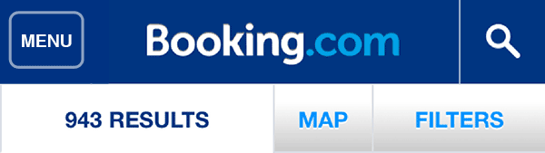
The word "Menu" inside the block with a white frame with rounded corners, is also aligned to the left.We run an experiment for our entire user base. And also, given the fame and omnipresence of this user interface element, it was hoped that it would not take long to test millions of our customers around the world, in each of the supported languages and a large number of devices.
So what is the end result? The word won fast food, as it was in the experiment of James Foster, or will the bun with the cutlet win?
results
During this experiment, replacing the icon with the word “Menu” did not have a significant impact on the behavior of our users. With the help of our huge user base, we can, with a very high degree of probability, state that, in particular, for Booking.com visitors, the hamburger icon plays its role in the same way as the text description version.
Of course, we cannot extrapolate this data to anything. In some countries, in some languages or devices, this may have worked better or worse. But on a global scale, we can conclude that the hamburger was ridiculed too much. Overall, he was as recognizable as the word "Menu." In the spirit of managing the promotion of the design, we should probably consider other options, and maybe try adding cheese, a slice of bacon and French fries to our hamburger icon, but now we are pleased to announce that our “three-line friend” is stuck everywhere. Its actual placement, shape, size, position and color is, of course, a subject for future tests.
Undoubtedly, this is a lesson for all of us about the essence of A / B testing. You never test elements of the UI, model or function as a whole. You test these things for a very specific user audience under certain and specific scenarios. What works for Booking.com may not work for you or your users. This is one of the reasons why we conducted our A / B testing. The conclusions of other experts, data from other sites or hypotheses, invented in a pub, eating a hamburger, will all be unproved until they are tested on our clients and on our platform.
Not to get lost in our own metaphor, but this is like a recipe for a good hamburger. Even if you wrote down all the ingredients for me, you will end up with a completely different hamburger. This will, of course, be affected by the quality of the meat available on the market, the flour used for bread and thousands of other factors. For us personally, the idea is good if it is good for Booking.com . If we can repeat it on our website, and if it will work for all our customers.
Our opinion
You should always test your ideas and see what the data tells you and what questions arise. My advice? Take a bite and see what happens.Source: https://habr.com/ru/post/239517/
All Articles