Animating Flexbox with CSS Transition
Everyone already knows about the Flexbox. Someone tests it in production, someone only studies, and someone wonders how he is better than tables. While you are doing this, I will share with you the good news: flexible containers are animated well with the help of CSS transition.
I'll tell you how to use it and what you can do with this joy.
By animation, I mean container resizing. It would seem surprising, because there is a
Watch demo on Codepen.io
')
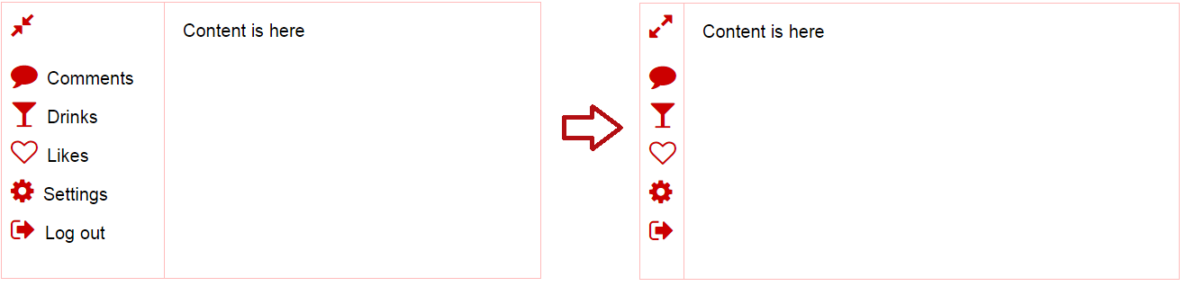
To make such a menu with familiar containers, it is necessary to simultaneously synchronize the change in width of two containers. On the other hand, if we discard theconventions of the need to support old browsers, we can do the same markup using the Flexbox. Then you can use the following code to animate:
The code for animating resizing fits in one line. As a CSS property that will be animated, we transfer “flex”.
A bit strange here is the value of flex-grow. This is the extensibility factor, which indicates how well the container will stretch relative to other containers if the parent element has free space after calculating the basic sizes of the nested elements. The smaller this value is relative to others, the smaller the container will expand. If you use the value 0, the width (or height) of the element will be fixed. If the width is fixed, then there is a problem with the animation: the older version of Google Chrome completely refused to animate the resizing when the flex-grow value is zero. There is a possibility that in some versions of browsers this problem still exists.
Let's go a little further: take 5 photos, arrange them in one line.

When you hover the cursor will show the selected photo in an enlarged format.

For the location of the photos, we will use the Flexbox, and insert the images through background-image:
All elements of a flex-container initially occupy 20% of the width and equally expand / contract. To increase the active element when you hover the cursor, add a rule that sets a fixed width of 400 pixels and reduces the extensibility / compressibility of the element to almost zero:
Now, when you hover the cursor, all inactive elements will shrink, because they have the value of flow-shrink: 1, and the active element will remain 400 pixels wide, because it is almost incompressible.
The final touch is adding animation:
Watch demo on Codepen.io
If you go further, you can take several rows of photos and when you hover the cursor, increase not only the width, but also the height. To do this, repeat the same thing, but with

But what will happen if you hover over the photo

Watch demo on Codepen.io
A rare discussion of animation does not talk about FPS. Therefore, on my leisurely computer, I measured the FPS for the last demo. And that's what I got:

Yes, it looks quite good. And in general, I somehow measured the speed of drawing the interface made using Flexbox and the same made on floats. Interfaces included 1500 elements each. The difference in rendering was about 10 ms on the desktop and about 15-20 ms on the mobile device. Therefore, if performance is a decisive factor for you, you will lose a little.
Unfortunately, this is not a cross-browser joy.Since Flexbox works in IE10 +, respectively, and its animation will work no less than from the 10th version. As Reon correctly noted, the above code will not work in IE at all. It remains to hope that Microsoft will follow the example of other browsers and will eventually support this animation. On the other hand, for the given example it is easy to make a fallback, which will more or less decently display photos in a small size and increase them with the help of some kind of extension.
I'll tell you how to use it and what you can do with this joy.
By animation, I mean container resizing. It would seem surprising, because there is a
transition: width 0.3s ease . However, the animation of flexible-elements implies that the sizes of several containers change simultaneously. This gives just unlimited space for animating changes in the size of the layout. For example, now the menu is very popular, which collapses, leaving only the icons visible.Watch demo on Codepen.io
')
To make such a menu with familiar containers, it is necessary to simultaneously synchronize the change in width of two containers. On the other hand, if we discard the
.menu { flex: 0.0001 1 180px; transition: flex 0.3s ease; } .collapsed .menu { flex: 0.0001 1 48px; } The code for animating resizing fits in one line. As a CSS property that will be animated, we transfer “flex”.
A bit strange here is the value of flex-grow. This is the extensibility factor, which indicates how well the container will stretch relative to other containers if the parent element has free space after calculating the basic sizes of the nested elements. The smaller this value is relative to others, the smaller the container will expand. If you use the value 0, the width (or height) of the element will be fixed. If the width is fixed, then there is a problem with the animation: the older version of Google Chrome completely refused to animate the resizing when the flex-grow value is zero. There is a possibility that in some versions of browsers this problem still exists.
Photo Gallery
Let's go a little further: take 5 photos, arrange them in one line.
When you hover the cursor will show the selected photo in an enlarged format.
For the location of the photos, we will use the Flexbox, and insert the images through background-image:
<div class="items-row"> <div class="item img1"></div> <div class="item img2"></div> <div class="item img3"></div> <div class="item img4"></div> <div class="item img5"></div> </div> .items-row { display: flex; flex-flow: row nowrap; } .item { flex: 1 1 20%; } .img1 { background-image: url('http://lorempixel.com/400/400/?1'); background-repeat: no-repeat; } All elements of a flex-container initially occupy 20% of the width and equally expand / contract. To increase the active element when you hover the cursor, add a rule that sets a fixed width of 400 pixels and reduces the extensibility / compressibility of the element to almost zero:
.item:hover { flex: 0.000000001 0.00000001 400px; } Now, when you hover the cursor, all inactive elements will shrink, because they have the value of flow-shrink: 1, and the active element will remain 400 pixels wide, because it is almost incompressible.
The final touch is adding animation:
.item { transition: flex 0.4s ease; } Watch demo on Codepen.io
If you go further, you can take several rows of photos and when you hover the cursor, increase not only the width, but also the height. To do this, repeat the same thing, but with
flex-flow: column nowrap; .But what will happen if you hover over the photo
Watch demo on Codepen.io
Performance
A rare discussion of animation does not talk about FPS. Therefore, on my leisurely computer, I measured the FPS for the last demo. And that's what I got:
Yes, it looks quite good. And in general, I somehow measured the speed of drawing the interface made using Flexbox and the same made on floats. Interfaces included 1500 elements each. The difference in rendering was about 10 ms on the desktop and about 15-20 ms on the mobile device. Therefore, if performance is a decisive factor for you, you will lose a little.
Browser Support
Unfortunately, this is not a cross-browser joy.
findings
- Animate resizing flexbox elements is easy:
transition: flex 0.4s ease;; - Non-zero (0.000001) flex-grow and flex-shrink values can fix everything if the animation is not working;
- The performance of Flexbox container animation is almost as good as the animation of div elements with float;
- This is a very fresh solution, so you should use it with caution, and test as much as possible.
Useful materials
Source: https://habr.com/ru/post/238607/
All Articles