Bad metaphor
In his blog, Ilya Birman recently wrote about the interface of the standard table control in Windows, about how best to show sorting.
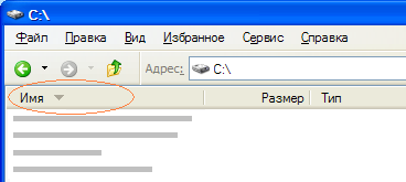
I was very impressed with how I perceived (or, more precisely, did not perceive) this sign (▲ ▼) all these years and conducted a small survey, trying to understand how other people perceive it. I showed them the following picture and asked how the respondent expects to see files on it - sorted alphabetically or in reverse order.
')
Of the 11 people, only one gave the correct answer . The majority saw in this symbol not a “filled figure” (as the developers believed), but an arrow, rightly pointing in the “wrong” direction. And how to call such a metaphor? Unsuccessful? It does not exactly describe the effect produced - in my opinion it is “just” a failure.
(The commission included a young lady from the accounting department, male vulgaris and 9 professional programmers - all but one spend eight hours at the computer on a working day. In those cases when I, after the experiment, directly asked what character it was, I was mostly told that it was Arrow.)
I myself have never perceived these signs that Windows gives me - either I clicked on the table header twice or three times, or evaluated the order in which the files were sorted. The only useful information from this "triangle" was that the data was sorted by this column, but in what direction, it was necessary to find out the most.
By the way, the rest of the usual GUI interface contradicts these "triangles" - in Windows 95 they (exactly the same in appearance) are just arrows, and not figures like "it's empty here, it's thick there."
I think the usual arrows (↓) would rather reach the goal ...
Source: https://habr.com/ru/post/23804/
All Articles