DPI designer guide
This guide is an introduction to cross-DPI and cross-platform design for beginners and intermediate designers who want to learn about it from the very beginning or to get more knowledge. Without complex mathematical and incomprehensible diagrams, only direct explanations, arranged in small sections, for understanding and applying them directly to your design work.
The author is Sebastien Gabriel .
')
I don’t know everything, so if you think I’m wrong somewhere or you need to clarify something, or you have suggestions or questions for improving this guide, send a letter (in English) to sgabriel.contact@gmail.com . You can also find me on Twitter , G + or Facebook .
What are DPI and PPI
DPI or (Dots Per Inch) "dots per inch" is a measure of the spatial density of points originally used in printing. This is the amount of ink droplets your printer can hold one inch. A smaller DPI gives a less detailed image.
This concept applies to computer screens called PPI (pixels per inch). The same principle: count the number of pixels that the screen can display per inch. The name DPI is also used in screens.
Windows computers have a default of 96 PPI. Mac uses 72, although this value has not been accurate since the 80s. Regular, non-retina PCs (Macs as well) will have a minimum of 72 PPI to about 120 maximum. Designing with a PPI between 72 and 120 will ensure that your work is about the same size ratio everywhere.
Here is an application example: a 27-inch Mac Cinema screen has 109 PPI, which means it displays 109 pixels per inch of screen. Width with frame is 25.7 inches (65 cm). The width of the actual screen is approximately 23.5 inches, so 23.5 * 109 ~ 2560, which makes the physical screen resolution 2560x1440px. * I know that 23.5 * 109 is not exactly exactly 2560. It is actually +23.486238532 inches. It would be more accurate pixels per centimeter, but you understand me.

Impact on your design
Suppose you draw a blue square 109 * 109 px on the screen specified above. This square will have a physical size on the screen of 1 * 1 inch. But if your user has a screen with 72 PPI, the blue square will look physically larger, since for 72 PPI the screen will take approximately one and a half inches to display your blue square 109px. See the effect modeling below.

Remember: leaving aside the differences of color and resolution, keep in mind that everyone will see your design in different ways. You should strive for the best compromise and create for the largest percentage of users. Do not think that the user has the same screen as yours.
Screen resolution (and native resolution)
Screen resolution can have a huge impact on how the user perceives your design. Fortunately, since LCD monitors have replaced CRTs, now users tend to have native screen resolutions with a good ratio of screen size to PPI.
The resolution determines the number of pixels displayed on the screen (for example: 2560 * 1440px for a 27-inch Cinema screen) 2560 width, 1440 height. Now, of course, when you know what PPI means, you realize that this cannot be a unit of measurement for physical size. You can have a screen of 2560x1440 the size of your wall and another size of your head.
Modern LCD monitors have a resolution defined by default, it is native, which will handle the exact number of pixels that the screen is capable of displaying. Older CRT monitors are a bit different, but since they can be considered dead, let's not go into details (and not touch upon my partial understanding of good old TVs).
Take our 27 inch Cinema screen, which can display 109 PPI in the native resolution of 2560 * 1440 px. If you reduce the resolution, the elements will appear larger. In the end, you only have 23.5 horizontal inches to fill with virtually fewer pixels.

I said virtually, because in this case it will be so. The screen has a native resolution of 2560 * 1440 px. If the resolution decreases, then the pixels are also displayed in 109 PPI. To fill this space and the entire screen, your OS will stretch everything, your GPU / CPU will take all the pixels and calculate them with the new ratio.
If you want to make a resolution of 1280 * 720 (half the width, half the height from the previous one) by 27 inches, then your GPU will have to simulate a double pixel to fill the screen. What will be the result? So - blur. So far, the division into two aspect ratios will look pretty good, because of a simple divider, but if you want 1/3 or 3/4 of the aspect ratio, then you will end up with numbers with decimal places, and you CAN'T divide a pixel. . See the example below.

Note: left: OSX window rendering in native resolution (1400 * 900px): OSX window rendering on the right in a simulated lower resolution (1024 * 640px retina).
Consider below another example. Take a line of 1 pixel on the screen with a native resolution. Now we’ll make the resolution 50% smaller. To fill the screen, the CPU will have to generate 150% of the image, multiplying everything by 1.5, 1 * 1.5 = 1.5, but you cannot divide the pixels in half. And there will be the following: it will fill the surrounding pixels with fractions of color (by a fraction of the color), creating a blur.

Note: the left line is 1 pixel thick at any resolution by default, the right line is 1 pixel thick at less than 150% resolution.
Therefore, if you have a Macbook Pro Retina and you want to change the resolution, it will show the window below, letting you know (in the screenshot below) how this resolution will “look” 1280 * 800px. He uses the experience of the user perception of screen resolution to express the ratio of sizes.

This is a very subjective idea, because it uses the pixel resolution as a unit of physical size, but this is true, at least from their point of view.
Remember: if you want to always see your design (or any design) pixel perfect, never use a resolution other than the native one for your screen. Yes, you may be more comfortable with a smaller ratio, but when it comes to pixels, you want to be as precise as possible. Unfortunately, some people use resolution as a way to better see what is happening on the screen (especially on the desktop) when they should use the accessibility settings. From this, your design will still look bad, but from this point of view, users are looking to improve readability, not gloss.
What is 4k
Perhaps you have heard a lot about the 4K term lately (at least when I wrote about it at the beginning of 2014), 4k is a rather fashionable topic. To understand what it is, let's first understand what HD means.
Carefully, this is a strong oversimplification. I will only talk about the most common permissions. There are various categories of HD. The term HD applies to any resolutions starting at 1280x720px or 720p for horizontal lines of 720 pixels. Also, some may call this SD resolution (standard definition; standard definition).
The term Full HD applies to 1920x1080px screens. Most high-end TVs and phones (Galaxy SIV, HTC One, Sony Xperia Z, Nexus5) use this resolution.
4K starts at 3840x2160 pixels. It is also called Quad (quad) HD and may be called Ultra (over) HD UHD. Simply put, on a 4K screen, you can put 4 1080p in the concept of the number of pixels. Another 4K resolution is 4096x2160. It is a bit larger and is used for projectors and professional cameras.

What happens if I connect a 4K display to a computer
Modern OSs do not scale 4K, which means that if you connect a 4K display to a Chromebook or MacBook, it will use the resources with the highest DPI, in this case 200% or @ 2x (twice as much) and show them in the normal ratio. From this, everything will look good, but small.
Hypothetical example: if you connect a 12 inch 4K screen to a computer with a 12 inch high resolution screen (2x), everything will look two times smaller.
Remember:
- 4k is 4 times Full HD;
- If your operating system works with 4K, but does not scale it, it means that 4K still does not have certain graphic resources;
- To date, no phone or tablet uses 4K.
Hertz monitor
Here we have a little rest from PPI and screen resolution. You may have seen that near the screen resolution settings there is a monitor Hz value. It has nothing to do with PPI, but just in case, if you are interested, the monitor's Hertz - or refresh rate - is the unit of speed at which your monitor will display a fixed image or frame per second of time. A monitor with 60 Hz can display 60 frames per second. Monitor 120 Hz - 120 frames per second, etc.
In the context of the user interface, the Hertz (Hz) value will determine how smooth and detailed your animation will look. Most screens operate at 60 Hz. Please note that the number of frames displayed per second also depends on the computing and graphics power of the device. Connecting a 120 Hz screen to an Atari 2600 will be completely useless.
For a better understanding, take a look at the example below. T-Rex goes from point A to point B with the same equal and fast and 60 Hz and 120 Hz screen spacing. A screen with a frequency of 60 frames per second is capable of displaying 9 frames during animation, while from 120 frames per second it displays logically twice as many frames in the same time interval. The animation will look more smooth on a 120 Hz screen.

Remember: Some people may say that the human eye cannot see more than 60 frames per second. It is not right. Do not listen and leave, laughing hysterical laughter.
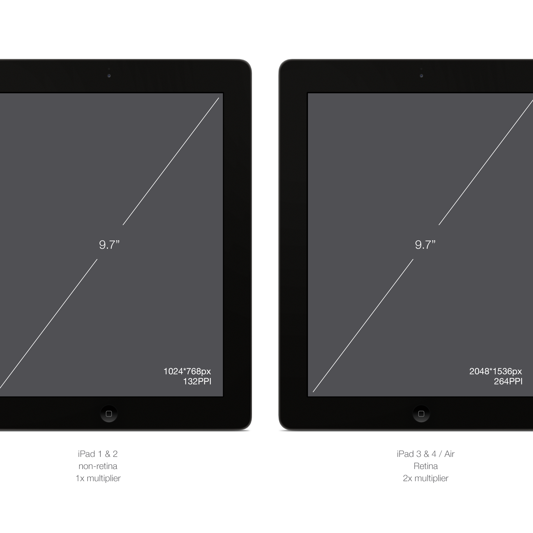
What is a retina display
Apple introduced the term "Retina" display for the release of the iPhone 4 smartphones. It is called Retina (translated as retina) because the device's PPI was so high that the human retina probably could not see the individual pixels on the screen.
This statement is true for the screen sizes of the device range in which it is used, but while screens are getting better and better, our eyes are now trained enough to perceive pixels - especially for the rounded user interface elements.
Technically, they display twice as many pixels in height and width in the same physical size.
The iPhone 3G / S was with a diagonal of 3.5 inches and a resolution of 480 * 320px and 163PPI.
The iPhone 4 / S was with a diagonal of 3.5 inches and a resolution of 960 * 640px and 326ppi.
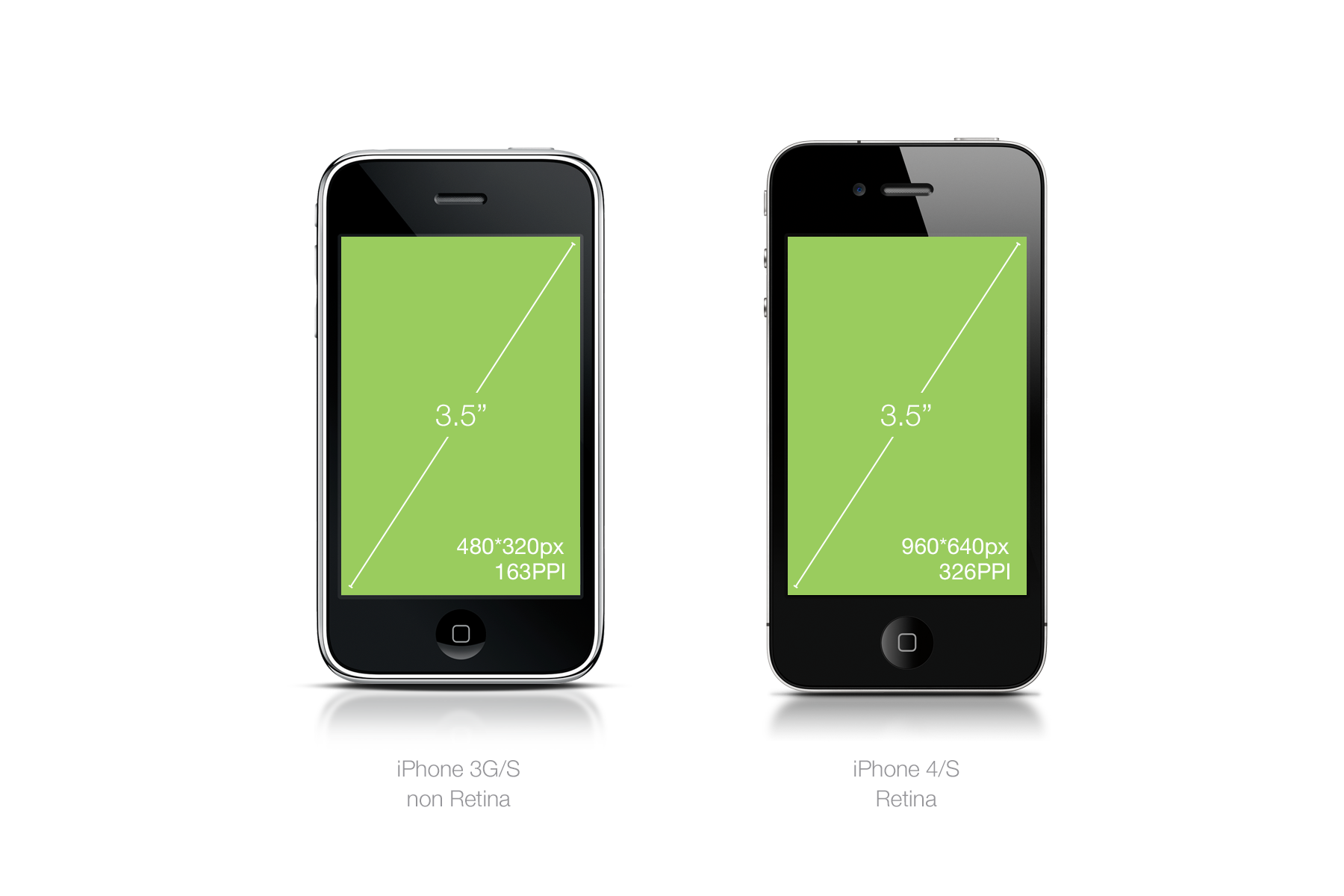
BOOM! Exactly twice. Simple multiplier. Therefore, the elements on the screen, instead of being smaller, look doubly visually sharper, because they have twice as many pixels and exactly the same physical dimensions. One normal pixel is 4 pixels retina.
Consider the example below for direct use in complex designs.
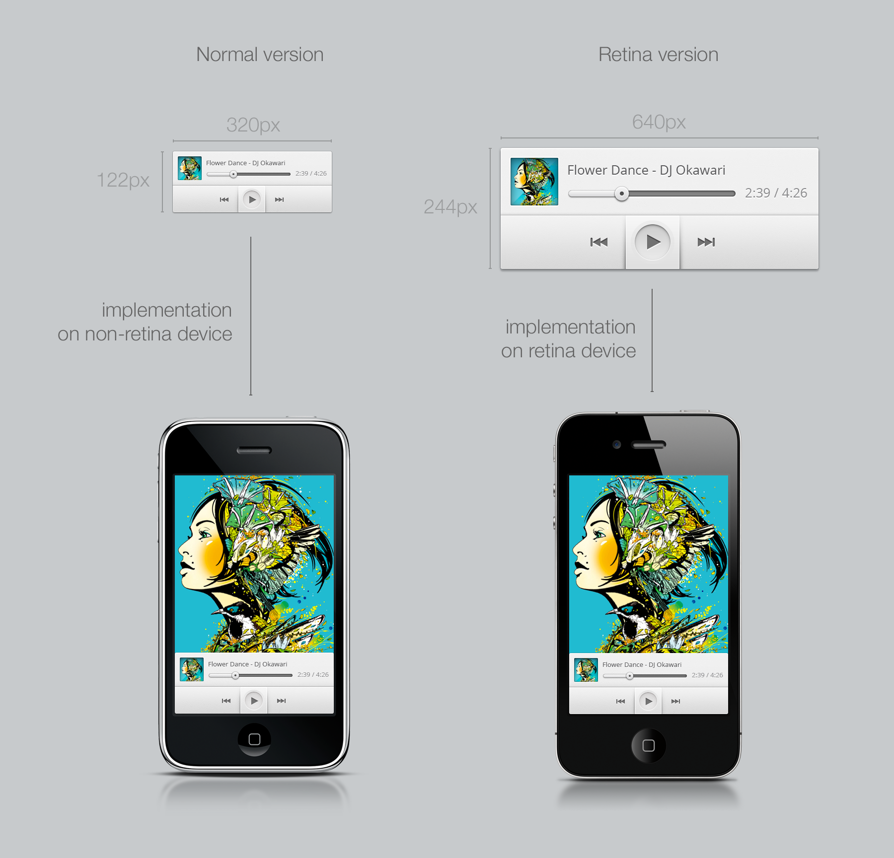
Image Note: It is difficult to imitate different image quality from two devices to a third device, that is, the one you are looking at right now. The image quality will look twice as good and sharper for the music player on the retina, even taking up the same physical space. If you want to check it yourself, I used one of my free programs, you can download the source code .
The term “Retina” is owned by Apple, so other companies will use “HI-DPI” or “Super power pixel maximum sp33d display” (I'm going to register the latest brand) or none of this at all. You will remain, reading the characteristics of the device, find out what is the DPI and screen size (how fun).
Remember: Apple products are a great way to experience DPI conversions and understand the differences between resolution, PPI and physical size ratio, because you only need to worry about 1 factor.
What is a multiplier
When it comes to converting your design to all possible PPIs, the multiplier will be your mathematical savior. If you know the multiplier, you no longer have to worry about the detailed characteristics of the device.
Let's take our example with the iPhone 3G and 4. You have two times more pixels in the same physical size. Therefore, your multiplier is 2. This means that in order to make your graphics resources compatible with 4G resolution, you just have to multiply the size of your graphics resources by 2 - that's all.
Suppose you create a 44 * 44px button, which is a iOS-recommended touch target (I will talk about this later). Let's call it the typical button name "JIM".
To make a good JIM on the iPhone 4, you need to create its doubled version. What we are doing below.

Note: on the left - 2px rounded corners 16px font size, on the right 4px rounded corners 32px font size .
Pretty simple. Now JIM has Jim.png version for normal PPI (IPhone 3) and Jim@2x.png version for 200% PPI (iPhone 4).
Now you ask: “But wait! I am sure that there are other factors besides just two. Yes, there is, and here it becomes a nightmare. Well, maybe not a nightmare, but I'm sure you would rather spend the day stroking your socks than coping with a lot of factors. Fortunately, this is not as scary as you think we will come back to this later.
Let's first talk about the units of measurement, because now you need a non-pixel unit to describe your multi-DPI designs. That's when the time comes DP and PT.
Remember: for each design you are working on you need to know the multiplier. Multipliers hold together this world of chaos screen sizes and PPI and make it understandable to humans.
What are DP, PT and SP?
DP or PT is a unit of measurement used to create descriptions for your layouts created for a variety of devices and DPI.
DP or DiP stands for Device independent Pixel (device-independent pixel) and PT as Point. PT use Apple; DP is used in Android, but essentially - they are the same. In short, they size independently of the multiplier of the device. This helps a lot when discussing those. assignments between such diverse subjects as a designer and engineer.
Let's take our previous button example, “JIM”.
Jim has a width of 44px for regular, non-retina screens, and a width of 88px for retina screens. Let's get to the technical details and add padding around Jim by 20px, because he loves free space. Then the indent will be 40px for retina. But in fact, it makes no sense to consider retina pixels when designing on a non-retina screen.
We will proceed as follows: we take the 100% aspect ratio of the usual non-retina screen as a basis.

In this case, the JIM will have a size of 44 * 44DP or PT and indents of 20DP or PT. You can give your tech. task in any PPI, JIM will still be 44 * 44dp or pt.
Android and IOS adapt this size to the screen and convert with the correct multiplier. That's why I think it's easier to always design with the default PPI for your screen.
SP is used separately from DP and PT, but it works the same. SP stands for Scale-independent pixels (scale independent pixel) and is used to determine font sizes. SP depends on the font settings of users of Android devices. For a designer, the definition of SP is the same as the definition of DP for everything else. Take as a basis what is readable at 1x scale (16SP, for example, is an excellent font size for reading).
Remember: when you make those. task, always use resolution / scale independent values. Is always. The larger the screen size / resolution, the more significant it is.
PPI Setup
Now that you know what PPI, retina and multiplier are, it's important to say what I was asked very little about, and this is confusing: “What happens if I change the configuration of PPI in my graphic editor?”
If you ask yourself this question, it means that you are a little familiar with graphic editors. Now it’s very important to understand what took me some time: For everything that is not for printing, the dimensions in pixels are used, regardless of the initial PPI configuration .
PPI settings in programs are the legacy of printing. If you are designing only for the Internet, PPI will not have any effect on the size of your bitmap. This is why we use multipliers, not specific PPI values. Your canvas and graphics will always be converted to pixels using software using the appropriate multiplier.
For example. You can try it yourself in a program that allows you to customize PPI, for example, Photoshop. I drew a 80 * 80px square and text with a size of 16pt in Photoshop with a 72ppi configuration. The second is the same with the 144PPI configuration.


As you can see, the text has become quite large, more precisely twice as large, while the square has remained the same. The reason for this is that the program (Photoshop in this case) scales (as it should) the pt values based on the PPI value, as a result of doubling the text rendering size on the doubled PPI settings. On the other hand, what was determined with the help of pixels — a blue square — remains exactly the same size. A pixel is a pixel and will remain a pixel regardless of the PPI settings. They differ from each other only in PPI of the screen that displays them.
It is important to remember that when designing for digital technology, PPI will only affect how you perceive your design in both your workflow and graphics in pt sizes, such as font. If you include source files with different PPI settings in your work, the program will resize any transferred image between different files with the PPI ratio of the receiving file. This will be a problem for you.
Decision? Use PPI (for 1x design preferably in the range of 72-120) and stick to it. I personally use 72 ppi, because this is the default setting in Photoshop, and most of my colleagues do the same.
Remember:
- PPI settings do not affect exports for the Internet.
- PPI settings will only affect graphics created from PPI-independent measurements, such as PT
- Pixel unit of measure for all digital.
- Keep in mind the multipliers and what you develop, not PPI.
- Use realistic PPI settings when designing for digital technology, which give you a sense of how it will look on target devices (for example, 72-120ppi for 1x Internet sites / desktop computers).
- Keep the same PPI settings for all your files.
- Additionally, you can read about this in the most interesting post on StackExchange .
PPI processing in iOS
It's time to dive into platform dependent design. Let's go through the devices with IOS at the beginning of 2014. Regarding screen size and DPI, with iOS there are 2 types of mobile devices and 2 types of screens for laptops / desktops. In the mobile category, of course, they have an iPhone and an iPad.
In the category of phones, you have the old 3GS (still supported by iOS6) and above. Only iPhone 3GS is not with retina. iPhone 5 and up use a higher screen with the same DPI as the iPhone 4 and 4s. See the cheat sheet below:

Note: 1) multiplier 1x, 2) multiplier 2x, 3) multiplier 2x.
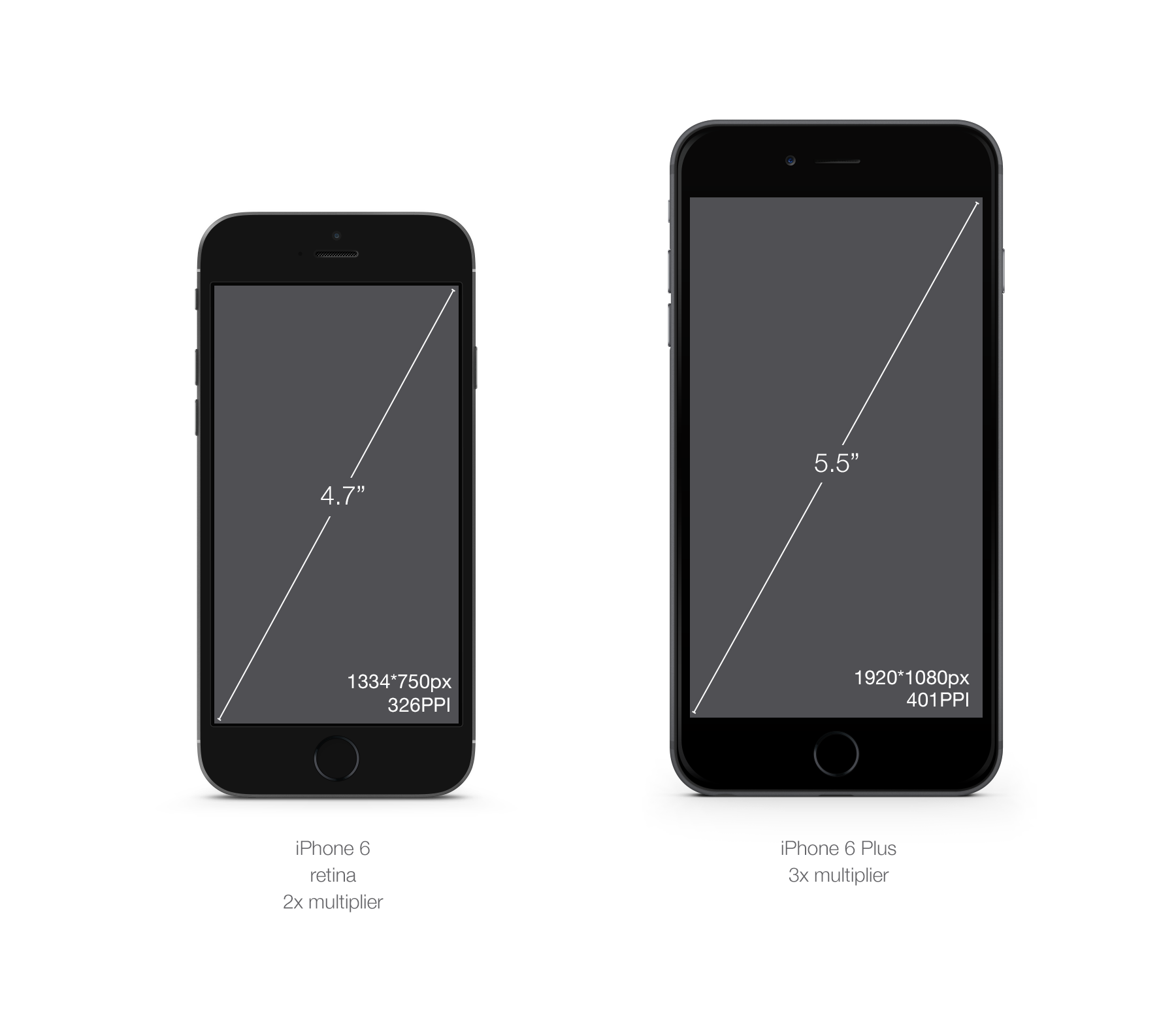
In September 2014, Apple introduced 2 new iPhone categories: iPhone 6 and iPhone 6 Plus. iPhone 6 is bigger than iPhone 5 (by 0.7 inches), but with the same PPI. On the other hand, the iPhone 6 represents a completely new multiplier for iOS, @ 3x because of its size, 5.5 inches.
There is something special you need to know about how the iPhone 6 Plus handles its display relative to all other iPhones.
It reduces the size of the images.
For example, when you design for iPhone 6, you design 1334 * 750px on canvas and the phone also renders 1334 * 750 physical pixels. In the case of iPhone 6 Plus, the phone resolution is less than image rendering, so you need to design for a resolution of 2208 * 1242px and the phone will reduce the size to a resolution of 1920 * 1080px. See the picture below:

Physical resolution is 13% lower than the rendered resolution. This creates a couple of glitches, such as semi-pixels, making very fine details blurry. Although the resolution is so great that it will be imperceptible only if you look very closely. So design on a canvas of 2208 * 1242px and be careful with very small design elements, such as super dividers. See below for a simulation of what is happening:

Thanks to Paintcode for a wonderful explanation of this, right after the main report. Watch their web page . This explanation comes from their cool schemes.
Then you have the category iPod Touch. Consider the design for them as well as for the iPhone. iPod 4th generation and below uses iOS6 and not retina. iPods of the fifth generation and above use retina screens and are compatible with iOS7. Accordingly, the fifth-generation iPod screen size is the same as the iPhone 5.
Finally you have an iPad. With the exception of the first generation iPad (obsolete), they all work on iOS7, and only the first generation iPad2 and iPad mini use a non-retina screen. If you're wondering what an iPad mini is in terms of design, this is a regular iPad (screen with the same PPI), but physically smaller. By this I mean that they took the same resolution and reduced it from 9.7 inches to 7.9 inches. With the same aspect ratio, therefore, increasing the pixel density. Your graphic resources will look a bit smaller.

As for the category of desktop / laptop, we will not consider all screen sizes offered by Apple. Today, Apple offers most of its screens with a 1x multiplier (Macbook, Macbook Air, old MacBook Pro, desktop screens.). Retina is only in 13 and 15 inch MacBook Pro. The 2x multiplier is the same as the iPad and iPhone. Even if designing for desktop PCs is different from mobile devices, you will create graphic resources in the same way to work on 2 different types of screens.
With only one multiplier, creating graphics resources for iOS and OSX is quite simple. I propose to start designing for the basic PPI (i.e. 100% / 1x) and then multiply by 2 to work your design on the @ 2x screen and generate @ 2x graphic resources. When you get comfortable with switching between 1x and 2x, you will be able to design directly at @ 2x, scaling your graphic resources for a lower resolution. This will be especially useful if you are developing on-screen retina (MacBook Pro).
Necessary graphics resources, example Chrome

, 1 . retina name.png. retina @ 2x, name@2x.png. iOS .
, iPad, ~ipad . @ 2x. Chrome. . , DPI.
IOS:
— @ 2x 1x .
— @ 2x retina .
— 100% 200% .
— 1 2 .
— 100%, .
— .png .
— . pt, .
PPI Android
Android , iOS. , Android. DPI, , , , , , . .
, IOS. DPI.
iOS, : . DPI : ldpi, mdpi, tvdpi, hdpi, xhdpi, xxhdpi xxxhdpi.
, , , .
, , , 1 IOS. Android — MDPI.
.

, , . .

DPI: MDPI, HDPI, XHDPI XXHDPI. LDPI — DPI , TVDPI — Nexus 7 2012 . . , : TVDPI (1.33x) Android, LG G, .
, Android DPI.


, XXXHDPI , . , XXXHDPI .
, Chrome
4 1- , MDPI XXHDPI. LDPI . , Chrome, , TVDPI, 5 1- . iOS, 100% 1x . , Android — , 1,33 1,5.
Chrome Android:

DPI, , Android. - , .
, , . :
— drawable-mdpi/asset.png
— drawable-hdpi/asset.png
— .. ...
As you can see, the graphic resource is based on a 32 * 32dp square. The problem with Android multipliers is that some of them are with decimal points. If you multiply the number by 1.33 or 1.5, most likely you will end up with a number with decimal places. In this case, you want to round the number in the right direction, as you think it makes sense. In the above case, 32 * 1.33 = 42.56, so we round it to 43px.
Be careful with pixel-sized elements such as strokes. You need to make sure that your stroke is either 1px wide, or 2px wide and not blurred, as described in the screen resolution section.
Remember the rules of Android:
- Android has 7 different DPI, you need to worry about 4: mdpi, hdpi, xhdpi, xxhdpi plus XXXHDPI, if you want to make a preparation for the future of your application.
- MDPI DPI 1x
- Android dp pt ,
- .
- .png .
- , .
PPI Mac Chrome OS
In terms of processing PPI, Mac (OSX) and Chrome OS behave the same. Both OSs support normal PPI (100%) and high resolution PPI / retina (200%). There is only a 2x multiplier as well as for Iphone and iPad.
Even if the majority of your users, both Mac and Chrome OS, will be with a small screen resolution (for now), I highly recommend preparing your applications for high resolution screens for the future. Preparing for the future for ChromeOS means creating high-resolution graphics resources for a web application or website, it will never be wasted time.
Currently there are a total of 3 laptops using this PPI, MacBook Pro 13 ", 15" and Chromebook Pixel. In addition, Chromebook Pixel with touch screen.

Necessary graphics resources, example Chrome
A great example of this similarity would be the Chrome toolbar button graphic resource. We use the same graphical resources on both platforms. Although the code is different, there is no visual difference. See below for an example of a Chrome menu button.

Remember:
- Chrome OS and OSX use the same multiplier, 2
- touchscreen only high resolution displays Chrome OS
Stretchable graphics resources
Regardless of whether your application is for desktops or mobile devices, drawing resources are almost always needed. A stretchable graphic resource is so arranged that the code can increase it to the desired size without rendering deterioration. They differ from repeatable graphic resources that work differently, even when sometimes they display the same result.
See the Chrome example below. The toolbar on iOS is generated using only one super thin graphic resource, which is repeated on the X axis in full screen.

At the moment, this does not suit us, let's see how different platforms cope with stretchable graphics resources.
Stretchable graphics resources on iOS
IOS allows the designer to do this easily, since stretching is defined in the code as opposed to cutting pieces of graphic resources or marking. All you need to do is to provide a base image, and if you do not create it, describe this graphic resource as stretchable horizontally, vertically, or in both directions. See the example below, which is on iOS Chrome the default button for content.

Extensible graphics resources on Android
Android, unlike iOS, has another way to create expanding graphics resources. He relies more on the designer. For this platform you will use the guides 9-patch. These guides consist of 4 lines surrounding the graphic resource itself. They should be provided in chunks / images as if they were part of the image itself, literally visually displaying its characteristics in it. They define two things: a scalable area and a fill area. After they are defined, the code can only stretch what you have defined and insert the content - where you have defined it.
See the example below the default button for the Android version of Chrome, shown earlier. For the sake of demonstration, I made it bigger.

, 9- 4 (# 000000) . 1px DPI; . , ( .) , 10dp . . .9 100% . , .

9- , .9 , @ 2x iOS. :

Please note that you must be careful with the size of your graphic resource. For the demonstration, I made it quite large. It is important that you optimize your graphic resource weight, reducing its size to a minimum, as shown below. I left the corners as they were, but reduced the area of stretching and content to a minimum.

Make sure that the marking of the 9-patch does not overlap your design and that the cutting of the graphic resource is correct. .9 should be as close as possible to the graphic resource, without overlapping it, try not to embed indents. The previous example has indented indentation due to shading.
9-patch does not replace the export of your graphic resource in all DPI. This must be done for each version of the graphic resource.
And finally, .9 may have several stretchable areas (top and left). Although I did not come across this in the work, but it is worth mentioning.
Remember: always ask the person implementing your design, what is the best decision to make, especially for desktop computers. The more images you have, the harder the application will be, and it will be harder for you to monitor and update your graphic resources. The 9 patch should be used only with good naming rules and good organization of your source files.
Touch control and touch targets
, , - DPI. , DPI.
, .
, , .
,
I will not give history lessons here, but if you were born before 2005, you know that computer technology was not created with the idea of touch control.
We use the mouse and keyboard, which are extremely accurate tools for navigating the user interface. The accuracy of the mouse cursor is 1pt. In theory, you could create a 1x1 pt button that would be clickable by any superman.
See picture below.
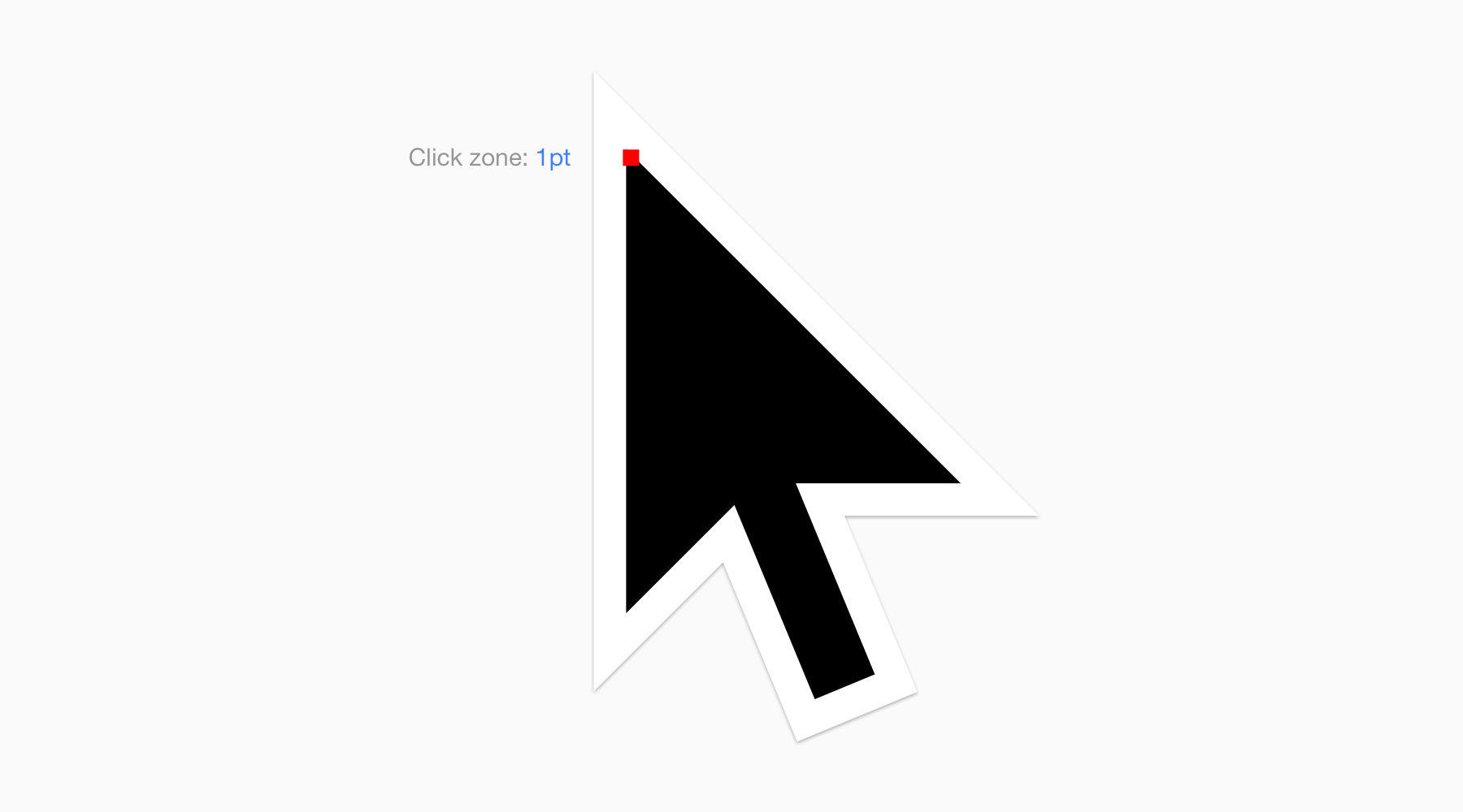
This is the 20x version of the Chrome OS cursor.
The red dot is the actual area that triggers the action on the user interface. Pretty accurate.
Guess where I'm going. What is not very accurate? Our fingers.
So, how do you design for touch control? Well, do more.
Finger size
Here is the average size of the two most commonly used fingers for interacting with the user interface, index finger and thumb. It represents both a touch zone and a zone blocked by a finger. The actual touch zone (i.e. the part of the finger that is in contact with the screen) will of course be smaller and slightly more accurate, unless of course you press the screen with your finger.
When designing for touch control, it is safer to overestimate the size required for sensory purposes than to underestimate it.

Note: on the left is the middle area of the index finger, on the right of the thumb.
How to apply this to my design work
As we have seen, inches or centimeters are not the best way to calculate in the pixel world. In fact, even a pixel is not a very good way to count. So how do you make sure your design is ready for touch control?
I will say the obvious, but you should always test your design on target devices / platforms.
But, in order not to lose too much time, there are some basic dimensions in pixels that are considered safe to use and recommended as basic for the operating system.
Recommended sensory targets for platforms
Again, be careful, these dimensions are for convenience and are not units of measure for anything in real life. They work because OEMs and manufacturers follow the guidelines for making compatible screens in terms of the size / dpi (dots per inch) ratio.

As you can see, each OS has its own set of recommendations, but they are all about 48pt. Windows includes indents in its specifications, so I added them here.
The difference of these sizes comes from various factors.
Apple controls its hardware, knows the quality of the touch screen and controls the exact aspect ratio of the screen. They can rely on smaller sensory targets. In addition, their equipment is, as a rule, physically smaller.
Android and Windows, on the other hand, have different OEMs, each of which creates its own hardware and the use of large touch targets makes them “safer”. Their user interfaces are also more stretched (especially windows) and their devices are usually physically larger.
Chrome example
This is how it is used in Chrome. Programmable sensory targets are displayed in blue.

As you can see, both toolbars use the recommended touch target height for each platform. Also, the area around the image is a square 44x44pt and 48x48pt for iOS and Android, respectively. Not only does this make the user interface consistent with the rest of the operating system in terms of size, but it is a great way for you to have the minimum size for everything you want the user to interact with.
Windows 8 And Chrome OS
Windows 8 and Chrome OS support both touch and contactless interfaces. If you are designing for a Windows 8 application, I would highly recommend following their manuals for sensory purposes .
The manual for Chrome OS has not yet been released, but the use of Pixel (with a touch screen) is not great. However, since all Chrome OS applications are web based, I would suggest designing for touch screens anyway. My recommendation would be to use the Android manual for sensory purposes .
Web, hybrid devices and the future
It will be clear to you what decision to make if you are developing for mobile. Make for touch screens. If you are developing for desktop computers, choose non-touch. It sounds simple, but it ignores a new growing trend — hybrid devices.
A hybrid device is a device that supposedly provides both touch control and non-touch control. Chromebook Pixel, Surface Pro and Lenovo Yoga are a good example.
What to do in this case? Well, there is no simple answer, but I will run ahead and give one: select the touch controls. This is where technology will develop.
If design for the web, or something like that, think about touch control.
Remember:
- For almost everything that you will do in the future, think about mobile and touch control.
- Use recommended sensory targets for each OS. This will help make your design better and help you achieve consistency with the OS.
- Sensory goals are indicative, it does not mean you should follow them literally. Ultimately, you control the experience.
Graphic software
Software will not make you a designer, but choosing the right software for your task can greatly improve your productivity and simplify your work. The “know-how” of software should not be your only skill, but learning and mastering the right tool will be a great contribution to translating your ideas.
When it comes to handling DPI change in interface design, all programs work differently. Some are better than others in specific tasks. Here are the most common:

Photoshop
Mother of interface design tools. Probably the most used tool today. For him, there are an infinite number of resources, tutorials, articles. Photoshop exists almost since the emergence of interface design.
As the name suggests, the first goal of the program was not in the design of the interface, but was in retouching photos or bitmaps. It has evolved over the course of a year and with the birth of the interface design, the designers changed its purpose. In part, it was because they were used to it, and because it was the only program that was able to make things as good as necessary.
Photoshop is still the master of bitmap editing and is still the most used program for user interface design. His ten year old legacy makes Photoshop an inaccessible learning program. Using "Photoshop" as a giant Swiss Army Knife you can do everything, but not always in the most efficient way.
Since it is initially based on a raster image, it is DPI dependent, opposite it is Illustrator and Sketch are described below.
Illustrator
Vector editor, sibling Photoshop. As its name indicates, it is aimed at illustrators, but it can also be used as an interface design tool.
The illustrator is suitable for print design, and therefore its interface, color management, scale, rulers and units of measure can push you away and it requires several settings so that it can be easily used only for interface design. Like Photoshop, this is an incredibly powerful tool, with a steep learning curve.
It differs from Photoshop in that it does not depend on DPI due to its base on vector shapes. Unlike raster images, graphics made using vector shapes are based on mathematical formulas and will be recalculated programmatically without loss of quality.
Understanding the difference between raster and vector images is the key to creating scalable visual design and graphic resources.
If you want to get started using Illustrator for web design / interface, I recommend reading "My work with vector" (eng.) From janoskoos .
Sketch 3.0
Sketch is a new product, compared to Photoshop and Illustrator. He is only 4 years old, this program has caused a big stir (in a good way) in the user interface design industry. The reason is that Sketch is designed from the very beginning for use by designers and user experience designers (UX). Without the legacy of Photoshop or Illustrator, Sketch positions itself as a perfectly adapted tool for user niche consisting of interface designers.
Sketch is suitable for quick creation of frames as well as more complex visual design. It is completely vector based, just like Illustrator, with a minimal and well thought out user interface. The combination of installation areas, the ease of use and flexibility of its graphics resource generation system make it the fastest tool for multi-DPI and multi-platform design. The recent release of version 3.0 makes it a very good alternative to Photoshop.
Sketch, on the other hand, is supported by a smaller team and is still relatively young. His team is extremely fast, but does not have the Adobe scale (Photoshop and Illustrator). Sketch offers (by design) the very minimum when it comes to editing bitmaps. Photoshop is better suited for this kind of work. Finally, due to his youth, resources in the form of source files, tutorials and the entire community are an order of magnitude smaller than those of Photoshop. As mentioned above, the community is very active and motivated.
Subjectively, I've been a Photoshop user since I started working with design 8 years ago, but I recently switched to Sketch 3.0 in most of my design process. This is not a quality assessment, Photoshop is still a damn good program, but it (Sketch) just satisfies my needs better.
If you want to learn more about my particular experience, I recommend that you read my article Month with Sketch 3.0 (English) or my “Sketch tutorial_01” (English).
Want to dive deeper and understand how vectors work in Sketch? Go to the @ pnowelldesign article “Harnessing vector awesomeness in Sketch” .
Remember: there is no perfect tool for work, besides that which you are comfortable to use. If you can afford to spend time and money, I recommend that you try them all to form your own opinion.
Documentation and resources
This guide is just an introduction, it's time to do and learn more. If you want to know more or clarify details on the topics that we discussed, here are some links (eng):
Platform documentation
Android UI guidelines
Google Material guidelines
iOS7 UI guidelines
iPhone 6 Screens Demystified
Windows UI guidelines
Google dev Principles of site design
Cheat-sheets and templates
Screen sizes, ratio and PPI
iOS7 designer cheat sheet
iOS7 design resource (requires Apple account)
App icons template, Android and iOS
Bjango blog (A design article gold mine)
iPhone GUI and iPad GUI (.psd) by @teehanlax
Tools
Density converter by @brdrck
Android asset generation by @brdrck
Android design tips by @destroywerk and @BPScott
9patch creation in Android by @romannurik
Android asset studio by @romannurik . Lots of great tools for Android specific asset creation.
Learn more and read
Device independent pixel formula for mobile devices
More information about 4K by Cnet.com
Smashing Mag
The Android Screen Fragmentation Myth
About me

I am Sebastian Gabriel aka Kounterb and I am a visual designer for googlechrome . I like to write things and create free utilities .
When I started, I wanted one clear guide explaining what DPI is and what problems would arise with a multi-platform design. This is what I'm trying to do here. When designing Chrome for almost every platform, I learned a lot about these issues, and I tried to provide them in the simplest form. As mentioned in the introduction, if you think that I misunderstand something, or lack a detailed description, or if you would like to know more about something, send me a message at sgabriel.contact@gmail.com.
Link to the original.
Source: https://habr.com/ru/post/237931/
All Articles