Visual effects for Skyforge: theory and practical advice
Effect artist is an alchemist. His task: in the absence of gold to extract gold. In any case, it will be a fake, but it depends on the experience of the artist how much it will be plausible. Effects artist - wagon. If the task does not fit into the standard artists' pipeline, then this task is for the special effects artist. You need to be able to as much as possible and not be afraid of non-standard solutions, but only if they give a benefit. In this article I will try to tell in detail what the artists are guided by the effects on our project. I'll tell you about some tricks. I will touch on the side of optimizing art and will talk about the relationship in the team.
Artistic terms and their effects on effects
In this section, I want to talk about the theoretical side of the issue. The effects lie at the intersection of several types of classical and modern art. Coupled with various techniques and branches, the theory of visual effects is complemented by new terms and principles. I will describe the most significant and applied by me every day. I will not talk much about the basis, if you want it can be found in textbooks. I propose to focus on how they affect the visual component.Mass of color
')
This is the total amount of color in the frame for a certain time. Increase the mass can be due to the size of the spot, increasing the density, brightness, display time, reducing the speed of movement. You can also compensate for one another. But each component makes its own contribution. The greater the mass, the more attention the viewer will pay to it. The more important part of the effect, the greater the mass should be, and vice versa. For me, this is the most important generalizing parameter.
Stylization
Creates a unique visual range. Preserves the integrity of the art. Makes it easier to understand the new due to what he saw. The main technique here is the inheritance of elements, dynamics, and in a competent approach it allows to achieve good reuse of art elements, saving development time.
Detailing
The style dictates the level of detail. Detailing is affected by the number of parts in a frame for a certain time. Details attract the viewer's attention, so they need to be added to important parts of the effect. Excessive amount of detail will look "porridge". If you go overboard with detailing for minor elements, the viewer will constantly experience discomfort, trying to consider something that does not carry useful information.
Dynamics
The change of all components of the effect in time. The more dynamics, the more detail. Dynamics can use rhythm to increase the detail. Dynamics is a very important component of the effect. With it, you can set the mood and nature of the effect. You can focus attention or, conversely, reduce. Do not think of dynamics as motion. The dynamics of large masses and silhouette are more important for the viewer than the dynamics inside the elements.
Rhythm
Most often it improves the harmony of the perception of the effect, but increases the detail. In games tied to sound, this can be part of the gameplay. For example, Patapon or Guitar Hero.
Contrast
Contrast is a strong change in something over a short period of time. Most often, the strongest contrast is used as an accent in the effect, meaning that the action has taken place. Contrast is an irritant, it attracts attention, but excessive enthusiasm will annoy and tire the viewer. If you want to achieve a contrast, it is not necessary to make a bright flash. You can quickly change any component of the mass of color. The number of contrasts in the frame directly affects the detail. Do not forget also that the contrast of dynamics is the absence of dynamics, and contrasts also make up the rhythm. If you score a frame with constant flashes, it will be very difficult for you to show something more important against this background.
Artistic and technical techniques
Game Mechanics - first!
So we are arranged: for us the game is first of all the rules, and then what it looks like. Hence the rule: mechanics - first. But the artistic part is also very important. It makes a unique component, improves the perception from the first look at the game. Makes promoshoty and trailers more competitive, allows players to brag to friends screenshots with their characters. But the more art in the effects is self-sufficient and beautiful, delicate and detailed, the more its basis as aesthetics begins to dominate, and therefore interfere with the gameplay. And we agreed that the mechanics are first. The most ideal solution would be to create art that complements game mechanics and does not interfere with understanding what is happening. But, as you know, there is nothing ideal in our world, and art will never fully make friends with the laws of the game. It is important to understand and be able to find a balance between them.
Priorities of elements in complex effects on the example of spells
The most important for the viewer should be the result of a spell on the target. Then the effect of linking the target and the person who used the spell. Further effect, showing that the author of the spell produced this spell. Then the effect of preparing the spell, then the effect of prolonged exposure, if required.
Learning gameplay
Ideally, your visual design should be intuitive at first glance, but in practice this is difficult to achieve. Sometimes you have to show not the most understandable art and hope that the player, after reading the abstract, associates it with the art and will not be mistaken in the future. The key word here is sometimes. This is a terrible approach, and drive into the neck of those who consider this normal! The most correct approach in the design of the effect is to search for the closest visual association.
Constructor
A constructor is a classification and reuse of elements of various effects. Not artistic, but very important reception. It can be attributed to the stylization, but it serves one purpose - to save development time. Among other things, it helps to preserve the integrity of the art. In effects, these can be textures, materials, geometric primitives, and even dynamics.
Color code
Part of the constructor. This is a well-known means of systematizing art elements. For the viewer, this is the most significant classifier. Feel free to use it. And best of all at the beginning of the project, develop a plate with shades for the main components of the gameplay. For example, for the Paladin class we use three colors. The main color is golden. Complementary - colder, reddish. For enhanced attacks - blue. All three shades can be used in the effect. This provides an acceptable, not boring gamut and differentiates the class, not overlapping in color with the rest.
Contrast is a relative thing.
If your visual line is full of constant explosions and shooting or other contrasts, then the best way to show something significant in the frame is to do a little more badabum, and add a pause before the effect, unloading the frame as much as possible. Against the background of the pause, your effect will be much more significant for the viewer.
Progress in dynamics. Gradients in color

Prolonged use of any object / object in the game or long preparation spells can tire the viewer. Try for such processes to use the progress of the dynamics and rhythm. It is not necessary to bypass the progress in color. At the design stage of the effect, always try to invent the initial and final states of the substance / entity that you show. This will tell you the change in color and shape. Associations such as heating, cooling and the like are often suitable for progress. Take an example from nature.
The rhythm of the music. Chords
Personally, it is easier for me to perceive, invent and evaluate the effect if the dynamics of the elements in it add up to some kind of chord. This allows you to remove the tinsel of elements starting at different times.
Simplicity - the guarantee of health frame and nerves of the viewer
Trouble novice artists on the effects of using all sorts of variations of textures, elements and colors, overloading the effect. I am not a supporter of minimalism, but you need to think about what besides your effect will be still in the frame and constantly keep in mind the priorities of the importance of your effect relative to the whole frame. Begin to make an effect with the basic elements that will unfold the idea, and add decor, just making sure that all the basic elements are ready, even if in draft form. This will save you from the case when adding the last basic elements that reveal the mechanics will overload the effect so much that you decide not to add them.
Prototyping
This is the best thing to remove all sorts of risks. The point is to quickly make a simple effect, explaining the game mechanics, or revealing a visual idea or testing the features of the project. For beginners, this stage is tiring with its not artistry, and they are trying to skip it or make it “unstuck”. Consider, the most cruel rakes are waiting for those who, in the process of their self-development, do not feel the benefits of the prototypes. =)
Real ref as a concept and basis for magic
If you want to portray teleportation, read how the light behaves when it hits a black hole. Want to show an interesting movement of magical energy, look at the spread of paint in water. Want to enrich the elements of ultra-fast movement, look at various ways, for example, a shot under water. Your examples can be many of the processes from real life, but rare enough for everyday life. Another indisputable advantage is that such examples clearly show progress, communication and affect on the environment, as well as enrich the base in the head. You can combine pieces of these examples, reaching new visual solutions, but each will have a rationale, which means credibility.
Examples:
Communication and affect on the environment. Shaking Shine
Do not forget to link your effect with the environment. This will add credibility to what is happening. If you create an explosion or a strong blow to the ground, then add flying dust and pebbles. If you create a luminous bright object, then add a light bulb that will shine on the surroundings, or a large particle with Virtual Offset or a hemisphere looking at the camera, with polygons on the edge smoothly going into transparency. If the shot in the frame is powerful enough, then shake the camera and add a circular wave (shockwave) with a distortion, or just a dusty or light wave. If you are drawing spilled water, then add a dark backing, it will give the feeling that the surface has become wet and absorbed water.
The destruction of something is perceived as negative, loss
This seems obvious, but most often the mistake is that people use this technique unwittingly. For example, one of the artists suggested an idea for a spell that absorbs damage. After absorption, additional armor disappears. His idea is to show a glowing shield and rend it smashing it into many pieces. On the one hand, this is what can happen with this armor in life. But in the heat of battle, the spectator will see another terrible “bang, bang!” Over his head, and he will clearly associate with the negative with respect to his avatar. Of course, the emphasis here should be on the fact that the shield sdjuzhil, and the damage did not pass, but the disappearance of the elements of the effect should be minor, since this information is not particularly interesting to the viewer.
Swiftness as aggression
It seems too obvious, but the error is the same as in the previous hint. In the heat of development, artists forget how sharp dynamics are perceived and shove it where the viewer should perceive the effect as a treatment or something else positive.
Patterned perception of form and silhouette
Check the shape of the individual elements and in which silhouette they fold.
Rounded - protection, positive.
Stretched - swiftness.
Angular - aggression.
Sample perception of dynamics
We must not forget that speed is a relative thing, as well as any component of the dynamics. If you want to show fast movement, then you must first move the element as slowly as possible or in the opposite direction.
The long buildup gives power and weight to the effects. Contrast speed - to enhance the impression of acceleration. Reverse swing - to increase the speed and distance of impact. Movement inside, most often, the viewer is associated with accumulation, negative, absorption. Outside - with positive, overwhelming power or energy. Up - with gain, positive, increased performance. Down - with weakening, lowering characteristics, negative.
Overdiving principle
Often in the search for the ideal value is required to twist any parameter many times. It takes a lot of time. The situation worsens if viewing the result is not interactive. In this case, it is worth changing the parameter at once much, obviously more than necessary. One such iteration will allow you to immediately determine the boundary of a valid one and fewer iterations will be required for parameter refinement.
Good feedback should be able to collect
Before creating the effect, do not hesitate to tell the idea to your colleagues or presenter. Twist the unfinished effect on the screen until you are at the computer. Perhaps someone will give you a good idea. Before passing the effect, tell the original idea and what elements or methods you wanted to convey to the viewer the game-mechanical component. Tell us what options you have refused or what you failed to achieve and for what reasons. This will save you from a lengthy discussion of various “bikes” or wasting time and make the feedback more concentrated.
Give people a look at their art after a while.
If a lot of iterations have passed, and all the terms have come out, but the artist has not been able to achieve the required quality, then you should accept the task as it is and return to it later when the artist completes the skill. He takes a different look at his old job and spends much less time and nerves to improve.
Scrolling UV Wrapping Types
Most graphics engines allow you to set the type of wrapping (calculation of texture coordinates when they are out of the 0-1 range) when drawing objects. The most commonly used type of tiling, that is, repetition of the texture. But there is also less popular, when for pixels that go beyond the boundaries of texture coordinates 0-1, the color on the texture border is taken.
This is very useful when you need to skip something from “nowhere to nowhere” in geometry. Vertical run of the glow is done in the same way.
Distortion as motion blur
Honest motion blur is not always available. It can be imitated by distortion if the normals of the distorton map are located in the direction of travel.
Motion blur as a summary
It's hard to add anything here. He lubricates the details and, thus, summarizes the frame. As a suggestion following from the previous one, you can save on details during a strong motion blur.
Noise UV as detail
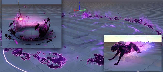
Noise UV is a technique for using the optional normal map. Texture coordinates are distorted depending on the vectors in this map. About Noise UV, you can write a book or at least a separate article. The coolest thing, the magic trick of ours and not only artists by effects. If you do not already have this option, urgently ask it for programmers. =)
An example of a visual, built on materials with Noise UV and a small texture 2 * 128 with a vertical gradient. Immediately make a reservation, I turned off the rest of the effect to demonstrate the Noise UV.
Virtual Offset instead of Soft Particles
Virtual Offset is the offset of the geometry or particles on the camera without changing its size. Used to avoid the intersection of a particle or geometry of an effect with the geometry on which it plays.
Soft Particles is the smooth movement of a particle or geometry into transparency when it crosses an opaque geometry. The first approach is much more economical, try to use it instead of Soft Particles.
Additive VS Alpha blending - pros and cons
Additive blending in old renderers with LDR (low dinamic range) picture allowed to do all kinds of volumetric and other glows. In the HDR-rendering, the brightness is not limited and you can make an ultra-bright element with an alpha blend. Differences in blends will appear if the element is drawn on a light background that is brighter than a volumetric effect. An additive blend of any background will make it even brighter, and the effect will disappear. Alpha-blending bright background will darken, which will add readability to the effect. The disadvantages of the alpha blend are the same. It requires sorting.
Savings in all
Fill Rate - the number of pixels drawn on the screen per second.- The larger the particle size relative to the screen, the larger the Fill Rate and thus the smaller the fps. It is necessary to ensure that particles and other translucent elements are not drawn close-up for a long time. Most often, this problem occurs when the effect starts to take up more than a quarter of a frame. This can be avoided in the following ways: not to draw long-lasting large elements, not to allow complex elements to be drawn large or simplified, i.e. for near Lods, a simplified Lod with a smaller overdraw was used, or the effect when approaching went into transparency.
- To reduce the Fill Rate, you do not need to draw unnecessary / invisible pixels to the viewer. If the effect on the third is never visible to the viewer, then it is worth correcting the effect or moving it so that the invisible part is completely absent in the effect. It is necessary to monitor the effective use of textural place. An invisible part of the texture that has full transparency in alpha or close to zero is still drawn and spends fps at idle.
- A significant amount of Fill Rate is eaten by huge decals. For example, we need to draw a circle outline, denoting the border of the AOE effect with a radius of 30 meters. If you draw such area with one decal, you will need a huge texture and a large number of pixels in the center of the area will have 0 transparency and the video card will idle. To save textural space and Fill Rate, you need to draw this circle with several decals. Each decal looks like a small part of a circle, for example, 1/16 part. From such decals you can make a circle. This rule applies to other elements.
- Sometimes you can exchange the Fill Rate for particles. For example, there is a desire to draw several sparks in one partikl. This is good, it saves particles, but if a similar effect is required to draw large, for example, in a quarter of the screen, then the number of particles becomes much less important than the Fill Rate. For close-ups, all transparent pixels on a particle will spend fps, and there are many such pixels. In this case, it is better to draw each sparkle as a separate particle.
Overdraw - the number of drawn pixels in one place. As an example: several large particles drawn one on top of another. The more of these particles in the frame, the lower the fps.
- It is necessary to try to manage as few particles as possible, which are drawn one on another. This can be achieved by simplifying the effects or replacing several particles with one, but with a different texture, or by changing the design of the effect.
- Use the dodging system.
Textural place. On our project, the amount of memory allocated for texture effects maximum of 15 megabytes. But no matter how much space there is, it is always not enough, so you need to save.
- You need to make sure that the mapping is effective. The unoccupied texture space was as small as possible.
- You need to use textures as low as possible. Often, the effects do not require high-quality textures, due to the fact that the effect is shown in motion or has its own dynamics, that is, the viewer does not have time to notice the Lourestness. This should be used, that is, the more dynamic the effect, the smaller the texture can be used and vice versa.
- You can increase the texture detail by tiling or drill-down maps. Also well increases the detail of Noise UV. But you need to understand that the map detail and noise UV require a heavier shader.
- Need to reuse textures. This saves time on drawing new ones and saves memory for textures.
The number of emitted items. The fewer the better.
- For the usual effect, on average we use 100-150 particles. Particles are much more economical than geometry. Roughly speaking, one square polygon is approximately equal to one particle, that is, it is better to have 30 particle sizes than 1 geometric object consisting of 60 triangles.
- The number of items emitted is less important than saving the fill rate. The number of particles begins to be important only if their total number in the frame approaches the maximum.
The number of polygons. The fewer the better. Most often it is worth thinking about optimization when:
- small effect;
- the effect is far;
- short-term effect;
- the effect is visible from only one angle;
- the effect is of little importance to the frame;
- always do lods!
Scripts - constantly running scripts lower fps.
- If it is possible to use skeletal animation or baked dynamics in effect instead of constantly working scripts, then this should be done.
Decals. The fill rate is important. It is necessary to avoid a situation when several decals are drawn one on another.
What else can you save?
On all! In the game, everything can be measured in the amount of memory occupied, the Fill Rate and CPU / GPU time spent on drawing. These are the resources that are worth fighting for. After all, the more we save on the unimportant, the more we can show the viewer important things!
And yet, what else can you save?
- On the number of attributes of vertices. The more gaps on the mappiga or hard edges (hard edges), the more data.
- On the number of bones.
- On the size of the texture and complexity of the shader.
- On the number of objects in the frame.
- On decals. If the decal is small, it is better to use a quad or a particle instead.
- Remaining particles in the world are heavier than non remaining ones.
- The fewer different materials in the frame, the better. You can combine similar in configuration and often used together textures in texture atlases.
- The less translucent materials in the frame, the better.
- The smaller the shadow sources, the better.
- The smaller the light sources, the better.
- Opaque or dither material is drawn faster than translucent.
The right culture and motivation of the artist on the effects of the team
This is an excerpt from the internal effects document. I hope it will be useful for your employees. At least it helps us a lot.If something is not clear, it is not known, have forgotten - ask!
- Excuses - "I did not know", "I was not told" will not be accepted. Ask yourself! Come yourself!
- Be active, develop yourself. Offer ideas, but do not forget to explore the possibilities of the engine and games.
Listen to the advice.
- You can ask for help from any member of the team.
- You can comment and make suggestions to the work of any member of the team.
- Listen to advice and especially to leading experts. In the event that their ideas do not work, the bumps will fall on their heads. Otherwise yours.
- If you disagree, say so! Discuss this! But stick to the rule: "criticize, suggest." You do not need to overpower yourself and do something bad, or do not silently do what is required.
Make decisions deliberately. Always know the answers to the questions:
- Did I take care of the prototype? Am I really sure that my art design is realizable in the game? Do I need additional support from other teams?
- Are there any ready-made effects that can be zaryuzat?
- Why am I making this element of art? How is it useful?
- Do I really spend more time on the production of important things for mechanics and less time on unimportant ones?
- How much time do I need to produce an asset?
- Can I be sure that my asset will be used elsewhere?
- Can someone do some of my work faster than me? Perhaps there is a more suitable person for the production of geometry, texture, animation?
- If I think about a problem for more than 20 minutes, then I’m doing something wrong.
Where to go next?
Our profession is so good that we are universal. We are also useful books and lessons from all areas of art. If you look deeper, you can see that the roots or the so-called base of all types of art are common - this is the human perception of the world, and this is an inexhaustible topic.In technical terms, it is possible and necessary to study popular graphic APIs (DirectX, OpenGL). Explore third-party engines and software solutions (Unity, UDK, PopcornFx). Read lectures from topical conferences (Siggraph, HPG, GDC, etc.). Understand and understand how modern graphics engines work for the title of Physical Based Render (PBR).
Conclusion
The industry is moving forward with constant acceleration. Just doing your job well is no longer enough. Knowledge will become obsolete very quickly and the quality of work, in comparison with other projects, will gradually decline. We need to constantly evolve. Information on effects for games is much less than you want, but I hope that my article has closed at least some of the gaps. Beginners advise to see my report for KRI 2009 (link below).Frequently met gaming terms in the SkyForge project
Caster (caster) - the one who makes the spell in the game.Target (target) - the one who is the purpose of the spell.
Single Damage Attack - Attack to one target. Most often not a cyclical effect.
AOE - square attack. Most often not a cyclical effect. The area can be set by a circle, a rectangle, a sector.
Projectile . For example, a flying fireball or acid puddle on the ground, causing damage. There are two types of projectile:
- Mechanical, for example, fireball, chasing the goal and damaging everyone in its path. Calculation of movement on the server.
- The client, for example, fireball, flying into the target, but not causing any effects until it reaches the target.
The effects for projectile should be cyclical, since the time they exist varies during the game.
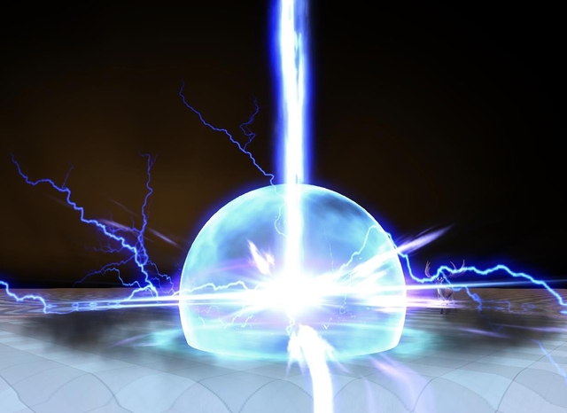
The precast effect is a cyclical effect around a caster or around parts of a caster. Indicates that the spell is being prepared.
The channel effect is a cyclical effect that will be stretched from caster to target in the game. The visual inside the effect should be directed along one axis.
The length of the channel-effect must be done the same as in the game with the usual use of the spell. If in the game the effect is most often cast on a target located at a distance of 15 meters, then the effect must also be made 15 meters.
useful links
Slow motion video (slow motion):http://www.sonicbomb.com/
http://www.artbeats.com/
https://www.youtube.com/user/theslowmoguys
https://www.youtube.com/user/FPSRussia
https://www.youtube.com/user/ratedrr
Vfx channel. Effects lessons for games for the Unreal Engine and CryEngine
Lectures from the Siggraph Conference
Pro PBR recommend 2006 introductory article by Nati Hoffman
William Kladis. Realtime VFX in Games - Reel 2013 (Injustice: Gods Among Us)
Cedric Humeau. VFX Reel 2012 (Ghost Recon Future Soldier)
Mark Eaton. VFX Reel 2013
Mark Eaton. VFX Reel 2012
He worked on Borderlands, Mass Effect 2, TRON: Evolution, Halo 4, Borderlands 2, Guardians of the Middle-earth, Batman: Arkham Origins and many other games.
Peter Clark (GRiD, DiRT Showdown)
Doug Holder (Uncharted 3, Last of Us) blog dougvfx.blogspot.ru
Mark Wood vfx reel 2014 (inFAMOUS: Second Son, FEAR 2: Project Origin, Condemned 2: Bloodshot, Gotham City Impostors, and Halo 4)
KEVIN HART FX REEL 2012-2013 (Halo 4, Destiny)
Klemen lozar
Fabio M. Silva. Ryse FX Reel
Books
Elemental Magic, Volume I: The Art of Special Effects AnimationElemental Magic, Volume II: The Technique of Special Effects Animation
By Joseph Gilland
Previous publications
2009 report on the CWI. If you download, you can read the comments to the slides.Source: https://habr.com/ru/post/237677/
All Articles