Overview of mail clients for Android, or how I chose the mailer
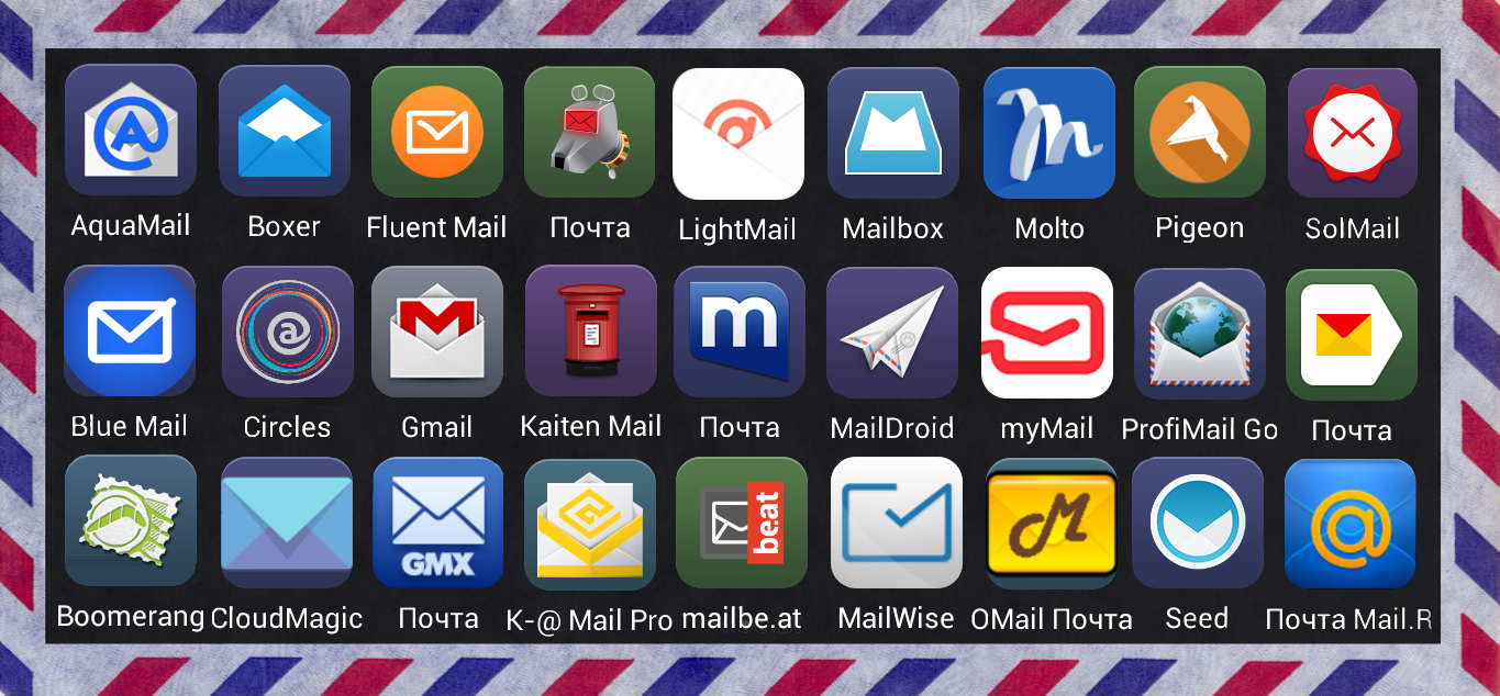
Good day, Habr ( and now GT ).
I needed an email client here, because I rarely used the standard one on the phone (because it was wildly inconvenient), and Yandex.Mail got out (it’s not
')
Under the cat you can find screenshots of the programs that I put and which I tried to use, as well as what I liked and did not like.
It will be useful to those who do not want how I go through a bunch of programs to put the desired one.
Who cares - I ask under the cat.
Foreword
I bought my first Android-phone in 2011, it was a cool and convenient SE XPERIA neo, by that time it had quite good characteristics. Then it still had a strong value on how much the application consumes RAM and how much it takes after installation, since on your 380MB of internal memory and 512MB of operational memory, you do not get too far. As far as I remember now, there was a standard mail client, which was ugly, slow and completely non-functional, but because I have mail on Yandex, there was almost no choice, and Yandex.Mail was the only option (due to its low weight and low RAM consumption). So I went with him until May 2014, when the phone literally began to crumble, and a replacement was clearly required. Under my parameters, only one phone was suitable - Xiaomi Mi2S. But here the freedom has already begun, because there are so many resources (and even the operating system MIUI is optimized for the device), that you do not know where to put it.
In a short time, I realized that I needed another email client, since I had a lot of subfolders in the mail and it was completely inconvenient to watch them in Yandex.Mail (the client was updated shortly after publishing the review and became much more convenient ), moreover, the client has long been stopped updating, and unnecessary functions such as Yandex.Disk Beta (at that time, the Disk has long ceased to be beta) were not removed, and the standard in MIUI, though not so bad, but for me it was not very convenient for me anyway. I opened Google and tried to find an overview of mail clients, but somehow it was very sad, he gave me information, or I did not learn how to google. In any case, I had to open the Play Store and enter the mail client there, and then the email client. Clients were selected by 3 parameters:
- Rating not less than 4 stars
- IMAP support
- Not a Chinese Underground Developer
On the occupied place in the RAM, weight, power consumption, etc., clients could not do it for the reason indicated above.
So let's go.
Customer description, screenshots, etc.
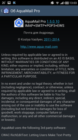
- Aquamail

Client in which you can customize anything and how you want. The program has existed for quite some time (since 2011), it is being cut by our developer. There are two versions - regular and Pro. They differ from each other only in that in the first case, when sending a letter, it is impossible to delete the entry “The letter was sent using AquaMail”.
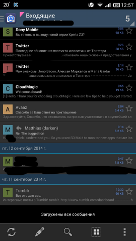
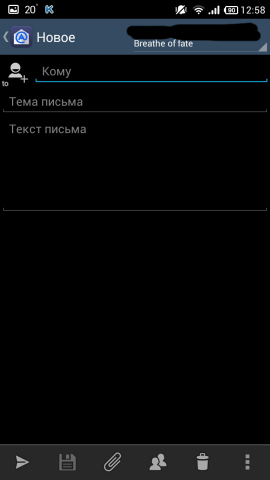
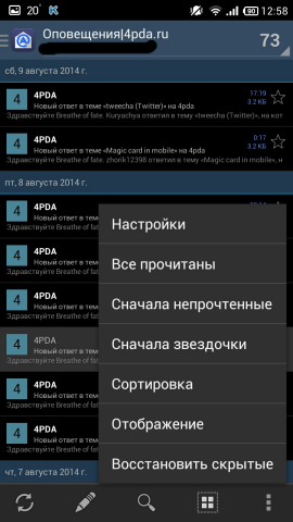
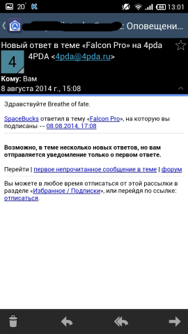
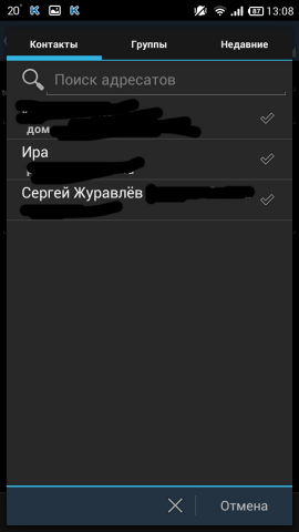
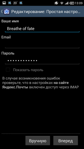
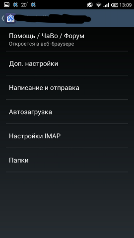
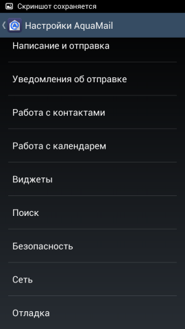
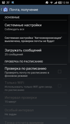
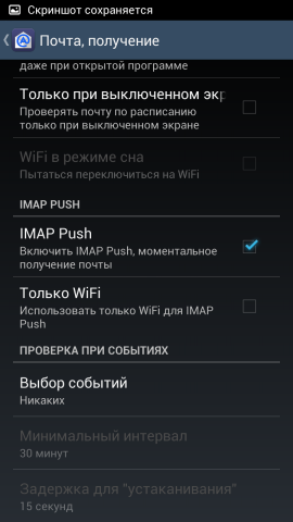
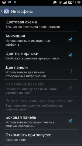
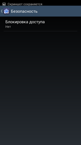
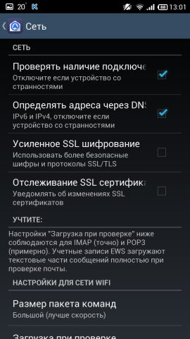
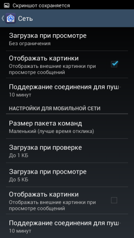
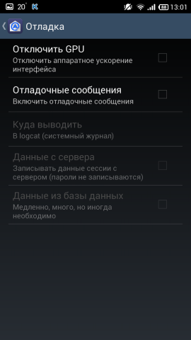
AquaMail Screenshots



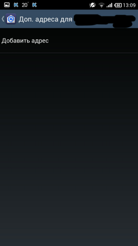
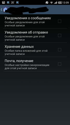
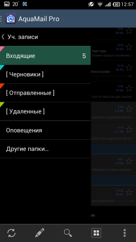

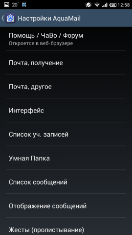



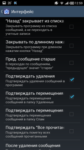
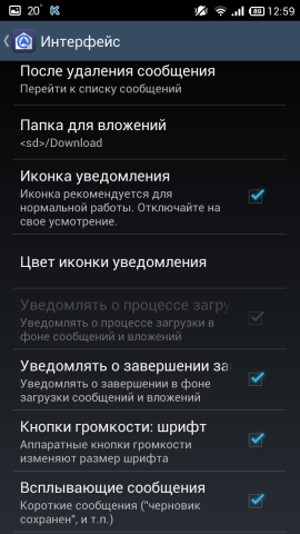

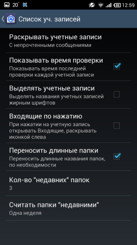
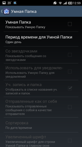

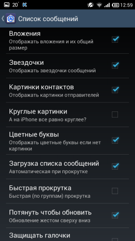


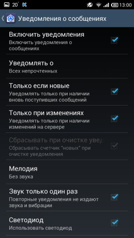

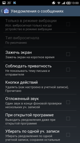
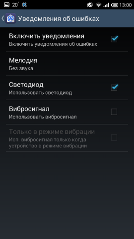


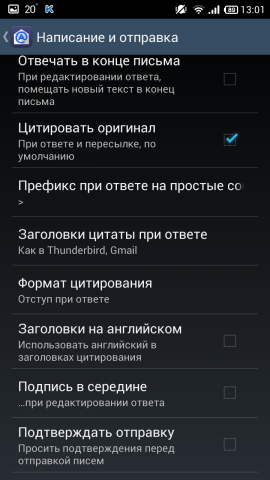
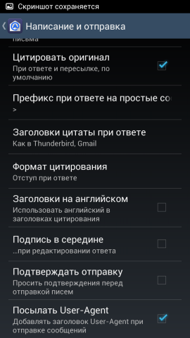
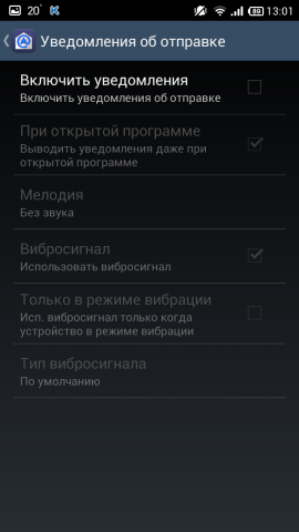


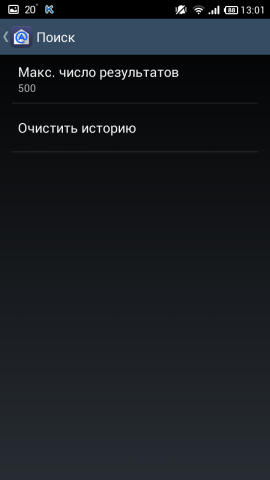



Pros :
- a huge number of settings
- nice letter box
- conveniently located buttons in the bottom panel
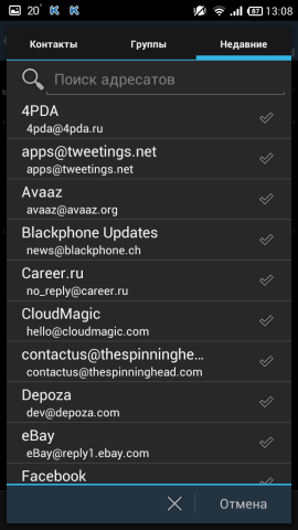
- the recipient can choose from their own from the server (recent) and from the phone
- request for downloading pictures if they are in the letter
Cons :
- inconvenient to watch subfolders
- minus free version (see above)
Awesome client with a huge amount of settings. He knows how everything. Maybe the interface is a bit "unfashionable", but everything else is top notch. Pretty simple window for writing a message, the recipients are taken from recent from the server, as well as from the phone. The developer did not create his own file manager, and when attaching attachments to a letter (as one of the clients will have below), a standard program selection dialog is used, with which something must be attached.
As for the subfolders, when they are viewed they are added to Recent, and it becomes easier to view them.
In all other respects, the client is excellent, I left it at home.
Links: Google Play Store , project website .
- Blue mail

Customer with a funny name in blue tones. The project is new, the customer record for the phone is dated to the end of December 2013 (on Facebook). Version of the application is one, distributed for free.
Blue Mail Screenshots




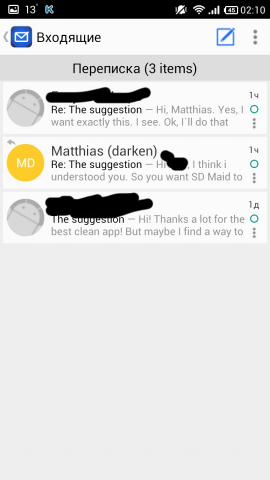

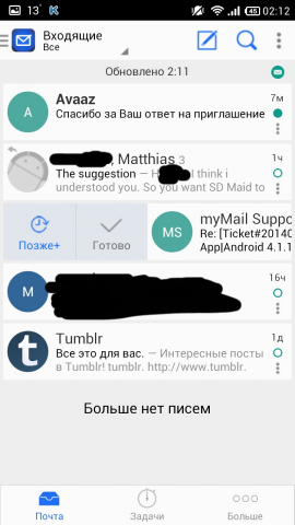


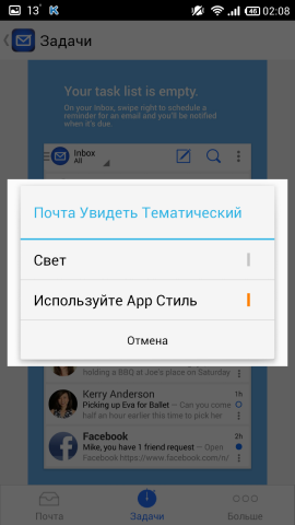

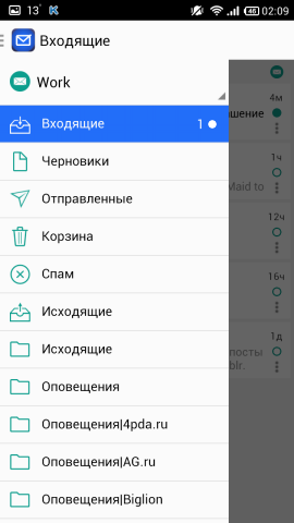

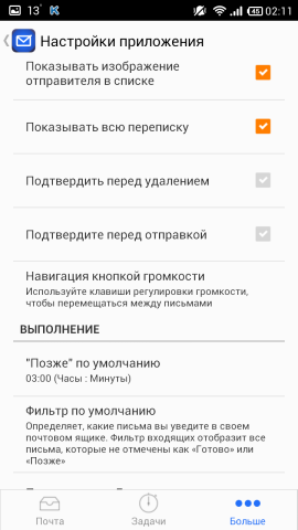

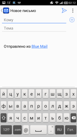
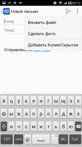


Pros :
- simple and cute
- availability of "Tasks"
- convenient to watch subfolders
Cons :
- few settings
- incorrect localization
This client also did not begin to create his own file manager when attaching attachments to a letter, but uses a standard program selection dialog with which to attach something.
Almost immediately after creating an account, it climbs to watch e-mail addresses in the phone book.
Attached folders look much more convenient. Also from the letter you can erase the inscription "Sent from Blue Mail". It has a writing window similar to AquaMail, only the addressee wants to be taken from the phone book, and not from the north. The letter can be controlled and gesture, on the screen shows. It also has a nice gray theme. This is what caught my eye after a couple of days of use.
A good client, but such trifles as the selection of the addressee from the server and the availability of “Tasks” that I do not need, forced me to look for more options further.
Links: Google Play Store , Facebook , website .
- Boomerang

Young client, but how much he exists could not be found. Open or closed code - could not be found. They promise some cool chips. Version one, distributed free of charge.
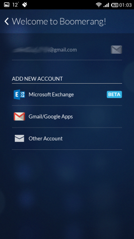
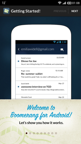
Boomerang Screenshots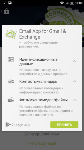



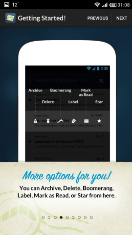
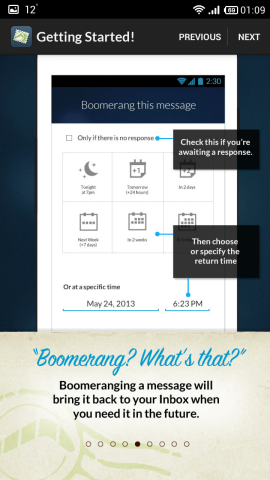


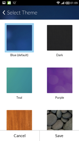


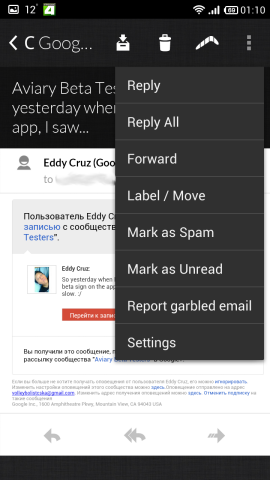



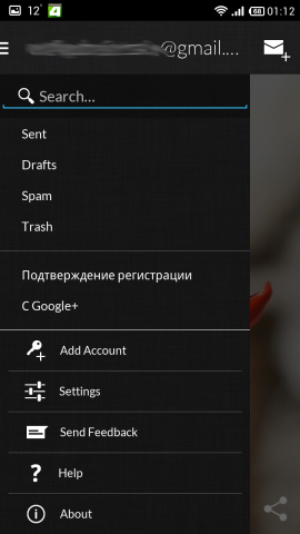
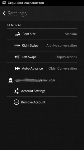
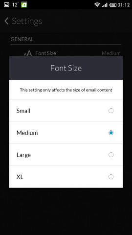

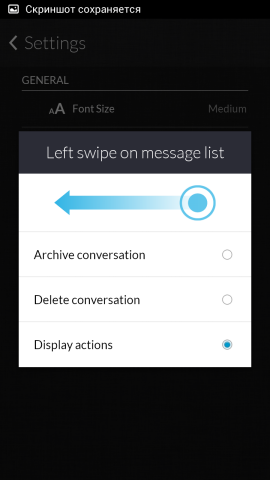






Pros :
- nice
- skins support
- convenient to watch your shortcuts
Cons :
- few settings
- no Russian localization
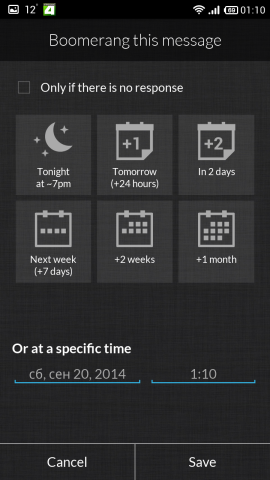
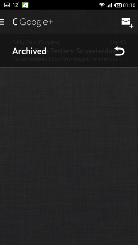
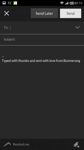
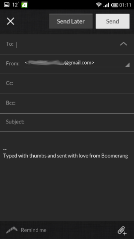
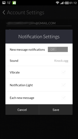
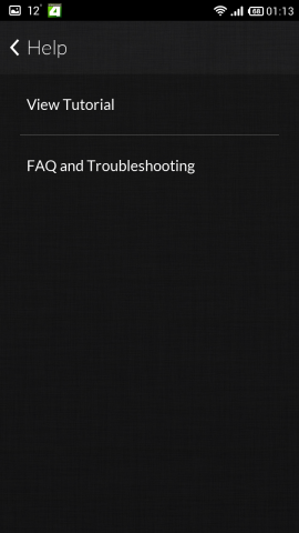
The first thing that catches your eye is the darkness of the application, everything is done stylishly and tastefully, even the animation in all the menus and settings is the same. The principle is like that of ProfiMail Go , only less colorful - everything is in black and gray. There are few settings, but there is everything you need. Almost immediately after creating an account, it climbs to watch e-mail addresses in the phone book.
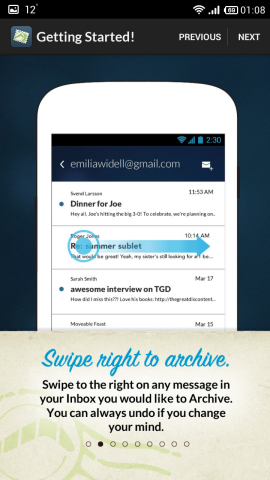
Your labels are also convenient to watch. A letter can be controlled by gestures: from left to right we send a letter to the archive, from right to left - a panel with actions, where there is a chip, because of which the client is so called - “boomeranging” the letter, that is, it can be sent to the queue to receive again through which some time. For example, I have often had such an incident that an important letter comes to me, I look, I think, they say, I will look later and forget. With this chip, this does not happen - we set, when you need to "boomerang" the letter back, and it arrives.
Conveniently organized chain of letters - cards, when clicked, which unfolds the letter, as in Fluent Mail . The cap of the letter is organized, though not colorful, but convenient - everything is immediately clear: who, when and to whom. Attachments loads just files (some client immediately opened the attached picture as a picture), next to which there is a “Download” button.
For now, the real disadvantage of the client is the lack of support for services other than Gmail and Exchange. The rest is very convenient to use. And someone with a "boomerangling" will have a very liking.
Links: Google Play Store , site .
- Boxer

A completely new client, appeared on September 11 (by recording in their blog). There is a Pro and a free version in which they offer to send a link to 5 friends and get a Pro together with your 5 friends. They promise to support the connection of many services with mail.
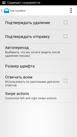
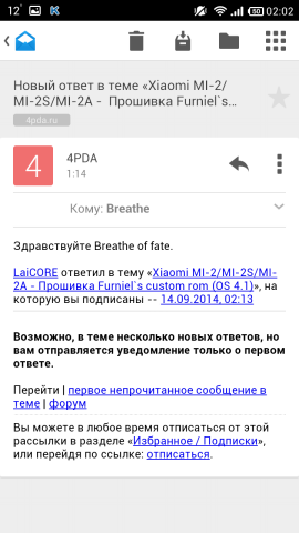
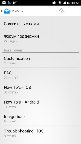
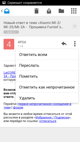
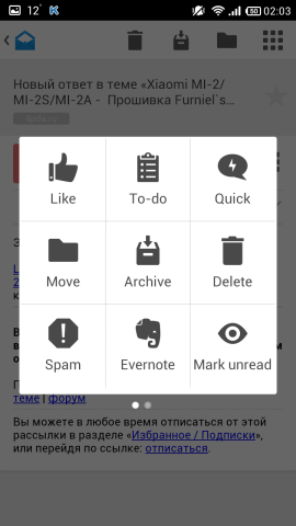
Boxer Screenshots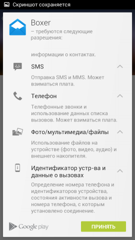
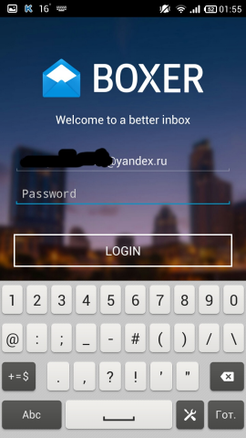

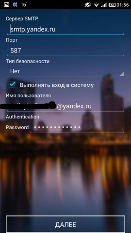
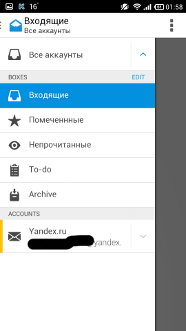
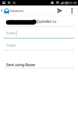
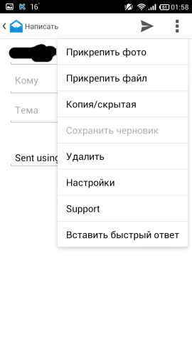
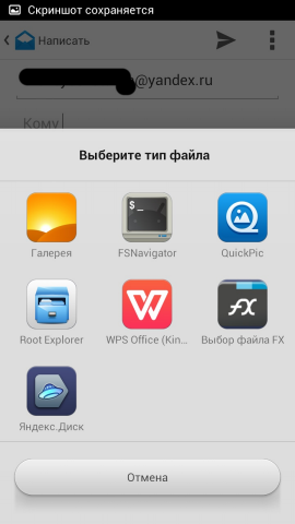


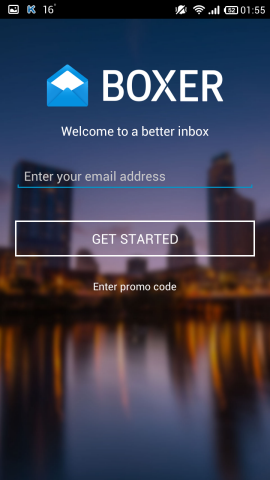


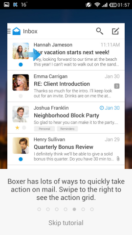
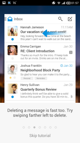
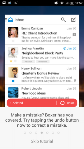



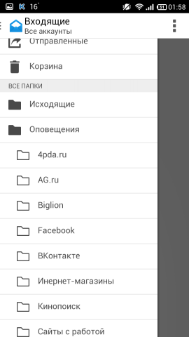


Pros :
- very convenient to watch subfolders
- choice of swipe action by letter
Cons :
- few settings
- incomplete localization
- glitches with sync
- no address selection
This client also uses the standard program selection dialog, through which something needs to be attached.
Almost immediately after creating an account, it climbs to watch e-mail addresses in the phone book.
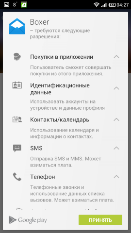
Attached folders look much more convenient, moreover, they are made in a tree form. Also from the letter you can erase the inscription "Sent from Boxer", and in the settings you can specify what to write there. There is no choice of addressee - only handles. The letter can be controlled and gesture (according to the words in Google Play). Unfortunately, the synchronization broke for some reason (judging by the reviews on Google Play, I’m not the only one), so I refused the client, since there are alternatives, and I don’t use the buns that they offer (heap support). He also created a couple of his folders in my mail for me, which I also didn’t seem very happy about.
It seems like a good client is being planned, I hope that I’ll finish it, but for the time being, in my opinion, it’s not worth using it because of the reasons sounded above.
Links: Google Play Store , site .
- Circles Mail

A young client, a blog entry about the release of the application is dated January 2014. As always, we are promised a "super-duper" email client, saying that this is "the most elegant mailer." We'll see. Version one, distributed free of charge.
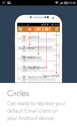
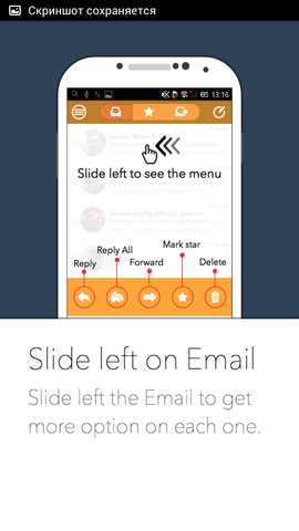
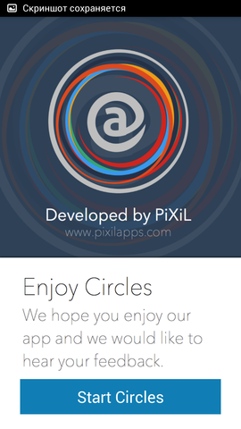
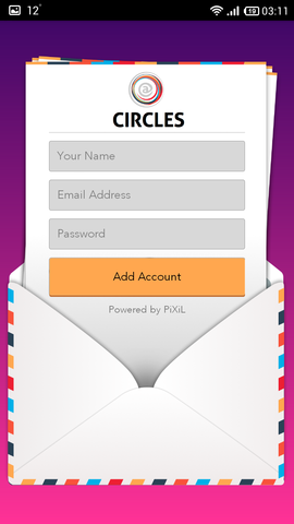
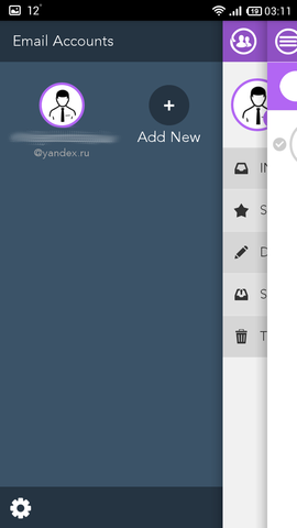
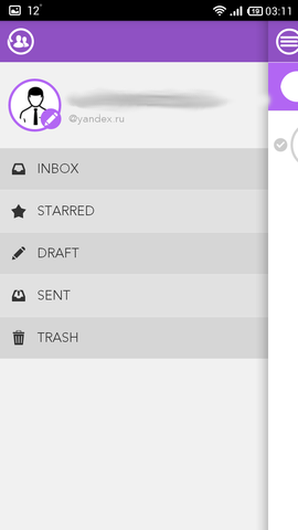
Cirles Mail Screenshots











Pros :
- beautiful conversations
- style
Cons :
- few settings (almost none)
- very inconvenient to watch subfolders
- uninformative curtain notification
- no Russian localization
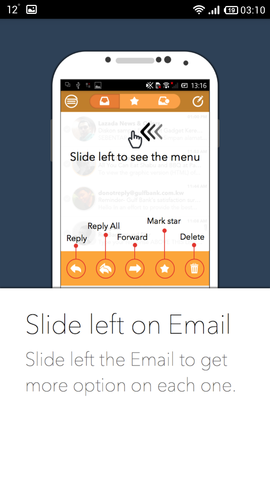
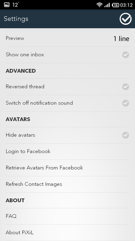
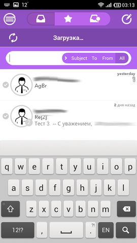
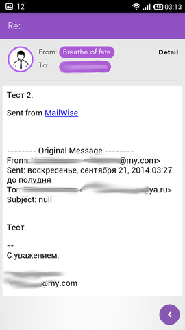
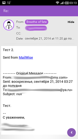
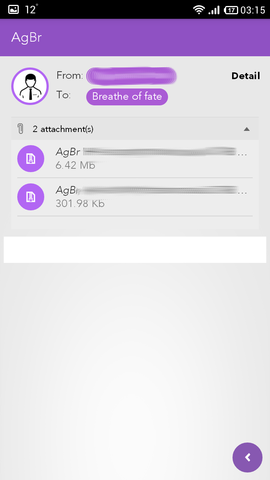
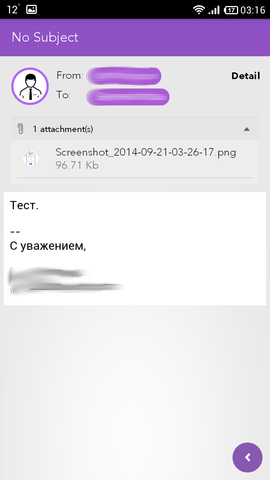
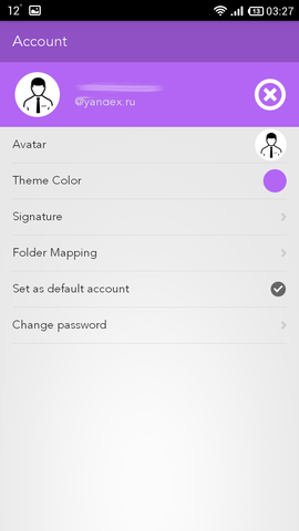
So, what we see: a panel with three screens on the left, a la navigation, like myMail and Mail Mail.ru. Only if in the case of the latter we have the ability to view subfolders, then in this client there is no such thing - you can mark one folder by clicking on STARRED , and only you will see it by clicking on the star on the screen with letters. Separately, you can also watch and unread letters. The cap of the letter is made simply and with taste (and also in the subject of the application): the names of the sender and the addressee in a purple ellipse, by clicking on Show next you can find out the date of receipt of the letter. Attachments are displayed approximately as in a spoiler - they clicked on a line, and a body with attachments comes out. For some reason, the avatars of the senders were not loaded for me (you can put yours in the settings), so only the silhouette is shown (see screenshots). On the letter screen at the bottom right, you can see the arrow in the purple circle, by pressing - to get the exit panel with actions that can be done with the letter. But the main feature of the application is chains. There is no such anywhere - the chain is formed from all with whom you corresponded. For example, you corresponded with X and Y, your name is Z, then the chain will be like this (depending on the frequency): X - Z - X - Y. That is, anyone with whom you corresponded is displayed. This can be both a plus and a minus. On the main window of letters there is the same filter, it has the same style as the action panel in the letter. The letter writing window is also concise and simple. The addressees are taken from the server and appear as you write their name in the field (well, at least that way). The letter attachment panel in the same manner as the action panel and letter filter. Almost no settings. But the author thought about the possibility of changing the color range - it is full of colors. The application has an extremely non-informative notification in the curtain - “You have a new message”, nothing, from anyone, not at all, nothing, just the fact of the new message. The application supports swipe by letter - a panel with actions appears.
If you are a fan of minimalism in terms of functionality (and settings), but want everything to be “pretty”, you can try. I refused this client only because of the ill-conceived reading of nested folders.
Links: Google Play Store , site .
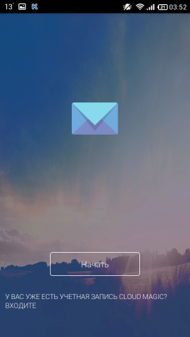
- CloudMagic

The client has been around for a long time, judging by blog entries from August 2010 (older than AquaMail ), has a nice interface (judging by the screens on Google Play and on the site), you can connect a bunch of different accounts, and also promise a custom interface (on the site, at least). Version one, distributed free of charge. Well, let's see what kind of cloud magic there is.
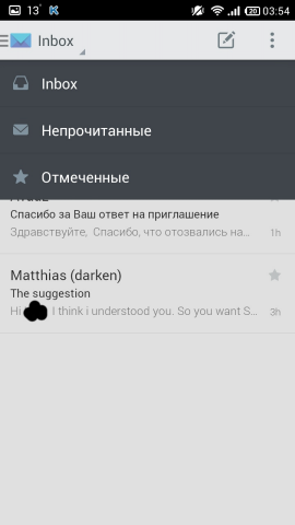
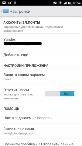
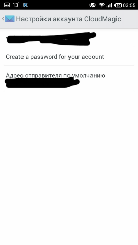
Screenshots of CloudMagic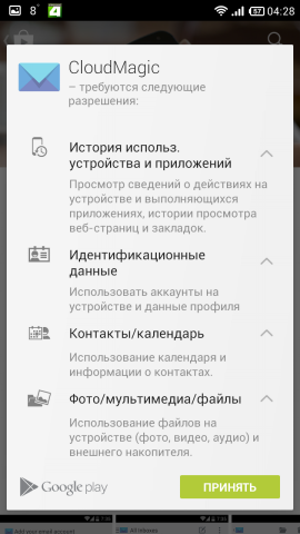






 <
< 


 <
< 

Pros :
- pretty
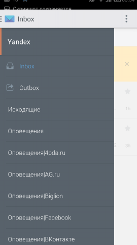
- convenient to watch subfolders
- the choice of actions on svaypu by letter (from right to left)
Cons :
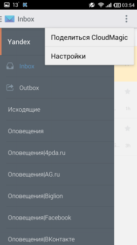
- no settings at all
- no address selection
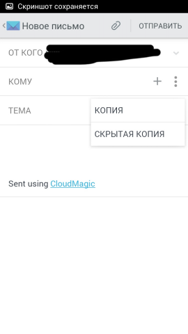
A simple and concise client that doesn’t really load the average user. In order to attach a file to a letter, a standard program selection dialog appears, with the help of which something needs to be attached - like with the clients above.
Subfolders are the same as Blue Mail . From the letter you can also erase "Sent from CloudMagic". There is no choice of address - only handles - very inconvenient. The letter can be controlled by a gesture, a red line appears with the functions “Delete”, “To archive” and “Mark as read”. It will be convenient for those who just want a client who will be a little prettier than the standard one and will work.
Since I need only one mail, and it is more convenient to look at the folders in the tree view, I finally refused it. Especially dokanala every time to drive in the address of the recipient.
Links: Google Play Store , site .
- Fluent mail

The client, apparently, is completely new, and even not very popular (at the request of the “mail client”) - scrolling down to about 230 places. They also promise support for everything in the world. I did not find anything about the open / closed code. Version one - distributed free of charge. We look.
Fluent Mail Screenshots










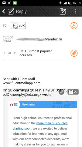
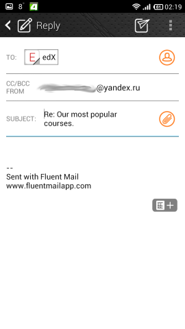


Pros :
- many settings
- skins support
- pretty
- convenient to watch subfolders
- action selection panel with a swipe
Cons :
- no Russian localization
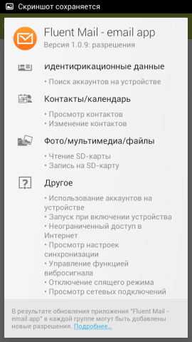
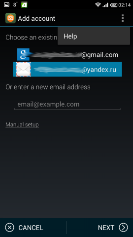
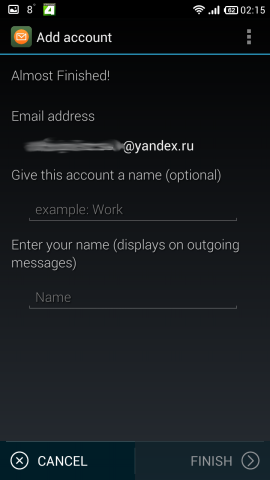
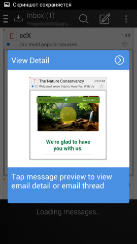
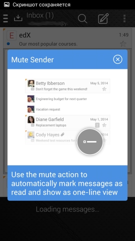
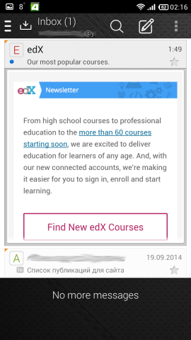
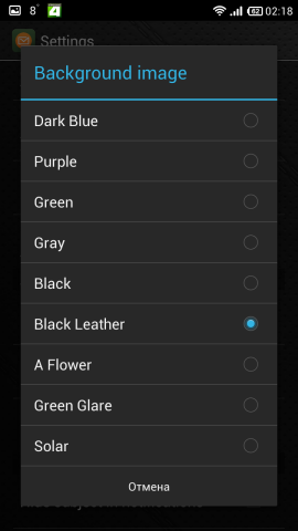
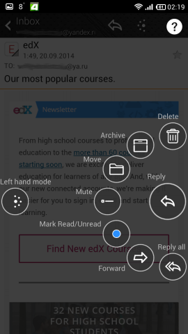
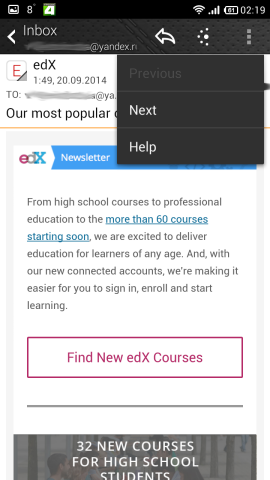
I liked the client from the very beginning - he immediately found two of my accounts: Yandex (apparently, from standard Mail) and Google. Localization yes, no - minus. Even less, you can only accept that unread letters immediately open in the form of a card, that is, it “unfolds”, as it were, and shows the body of the letter; but this is more of a chip. Even avatars of senders are displayed. Another thing is that there is a circular beautiful menu for selecting actions with a letter. Skins support also adds a desire to use the client. Another handy feature is the menu on the left, where you can change the order of folders, what to display, as well as tags, attachments, etc., that is, there is a type of shared folder for all connected accounts. In addition to this, the folders in the mail are displayed in tree form here, but, unfortunately, not in such a convenient form as, for example, in myMail . Address selection is carried out by handles, or from the phone book, where the client really wants to break into. There are also settings when you click on the account itself in the settings, but I already found this at the time of writing, when the screenshots were taken, reduced, etc. There are two options for writing a letter on the swipe: from left to right (let's call it “action circle”) and from right to left - there is an archive.
Work with letters is very unusual and conveniently organized, there are subfolders, a folder for all connected accounts, swipe actions, a lot of settings ... Client of a dream? I did not notice obvious minuses.
Links: Google Play Store , site .
- Gmail
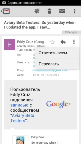
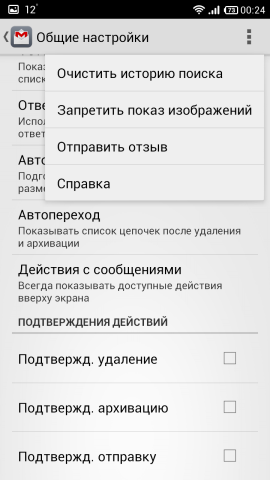
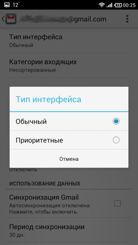
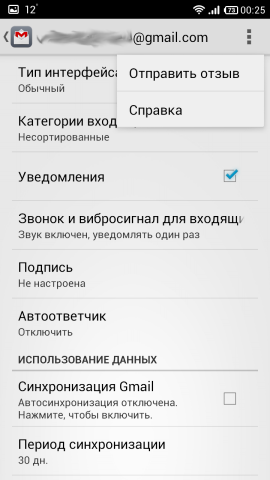
There is even nothing to comment on. The review would not be so complete without his participation. :)
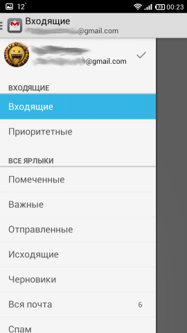
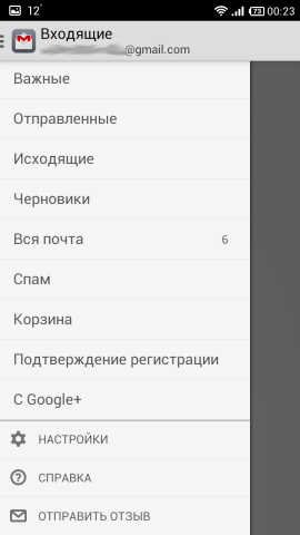
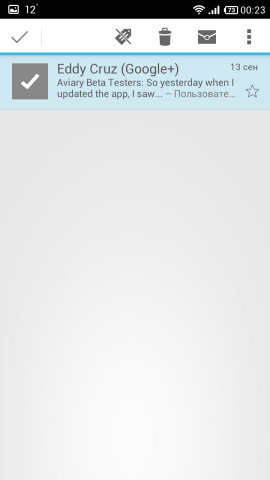
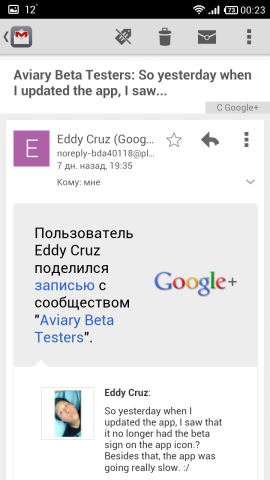
Gmail Screenshots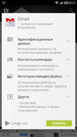








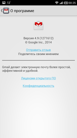

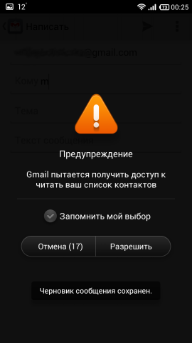

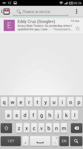
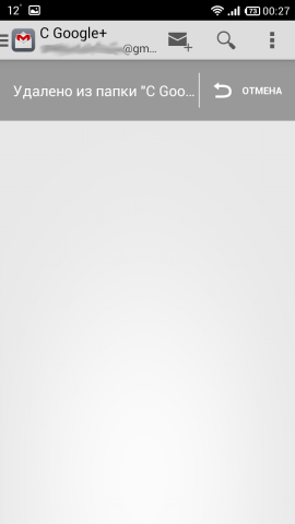


Pros :
- plain
Cons :
- few settings
- only google mail
In this client, compared to all other prosot is its advantage. The fact that he knows how to work with the labels of your mail should not be surprising - he is sharpened for it. Address selection is carried out with pens, as soon as you start to write something, the client climbs into the phone book. It supports svaypu actions, but for some reason only “Delete” when left to right and vice versa. But the usability with such functions, of course, is very high - everything can be done very quickly.
What can I say - sharpened exclusively under Google Mail with all the consequences. Compared to the rest of the client almost does not look. Real plus is convenience. IMHO.
Links: Google Play Store , site .
- GMX Mail

Apparently, this is a client of GMX.net service, the link from Google Play leads exactly there. When I took the version for Android, I did not see it, but I didn’t really look for it. Version one, distributed free of charge.
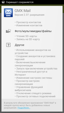
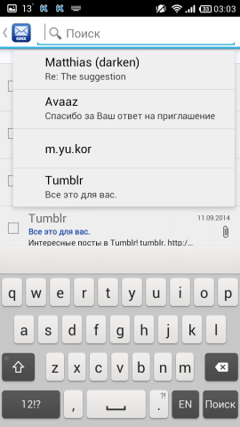
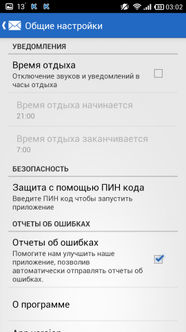
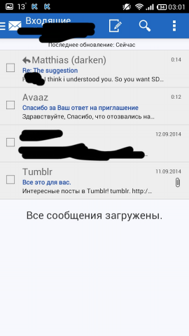
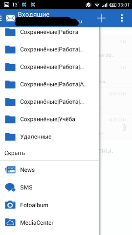
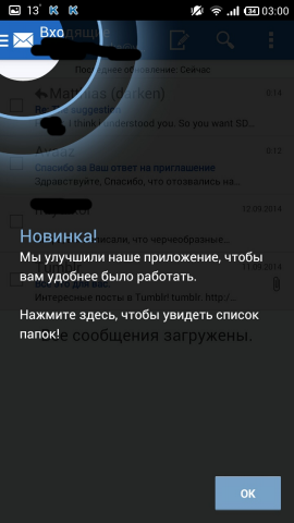
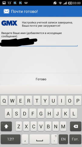
GMX Mail Screenshots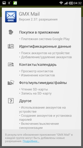




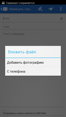
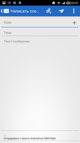

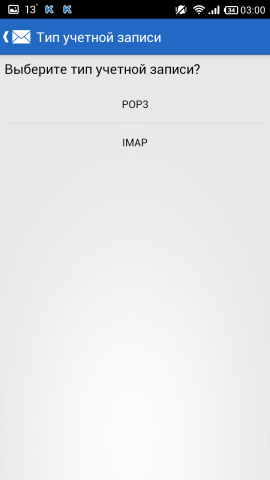


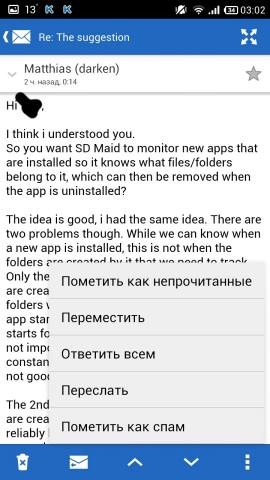






Pros :
- folder management
- the ability to expand the letter to full screen
- convenient to watch subfolders
Cons :
- few settings
- incorrect localization
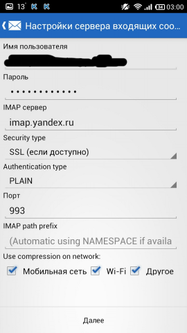
And here we have a complete repetition of my.com mail (or vice versa), but it is written about it above. The comments suggested that this is the product of United Internet AG , focused on the markets of England, France and Spain, and my.com mail - for England, Spain, France, Russia, Portugal and Romania, so these two customers are not very different. The only exception is the availability of services at the bottom of the panel on the left. Localization is the same: how is MGX Mail translated as Mail ? Well, another difference from my.com mail is a lighter blue tint and in the panel on the left a square indicating the number of new messages is not filled with blue, but is highlighted with a blue outline.
Not bad, but nothing outstanding client.
Links: Google Play Store , site .
- K-9 Mail

Customer with a story. Judging by the records on the site, perhaps the first client, because It was included in Android 1.0. It is important to mention that this is an open source project. Version one, distributed free of charge.
K-9 Mail Screenshots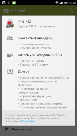


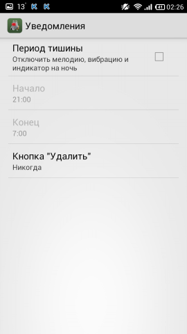
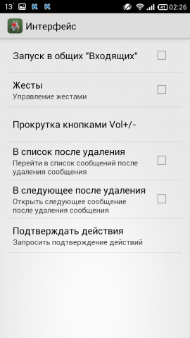


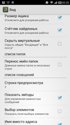
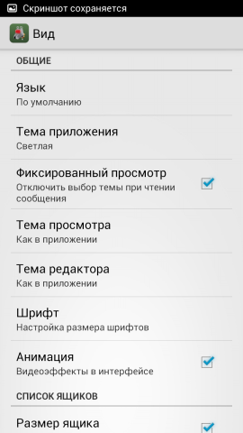
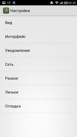
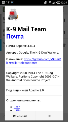
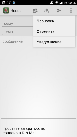
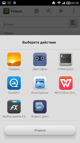

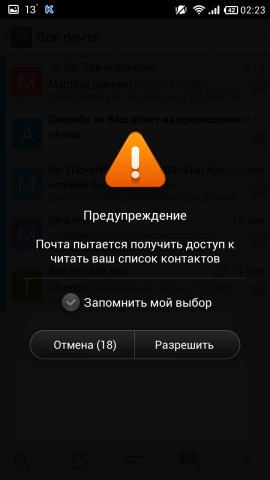


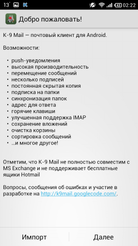

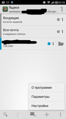
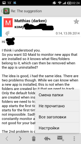
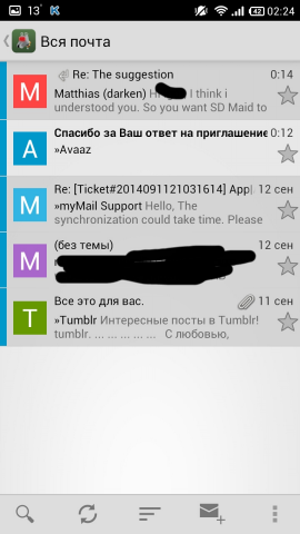
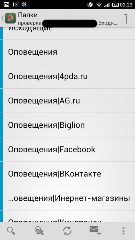

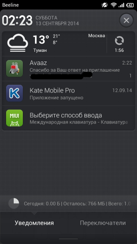


Pros :
- a lot of settings
- Russian localization
Cons :
- inconvenient to watch subfolders
In fact, Pigeon is lapped from this client, and it is written about it above. The only exception is the presence of a dark theme, with which the client already looks great. Only in this case it is still credible that this is an open source. Permits required at a minimum.
The client is good, but because There is no choice of addressee from the server, it is necessary to drive in either manually, or to take from the contacts in the phone and it is not very convenient to watch the subfolders, I did not fit.
Links: Google Play Store , website , page on the F-Droid .
- Kaiten Mail

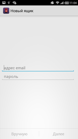
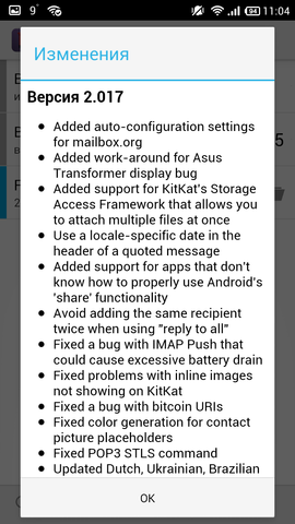
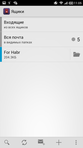
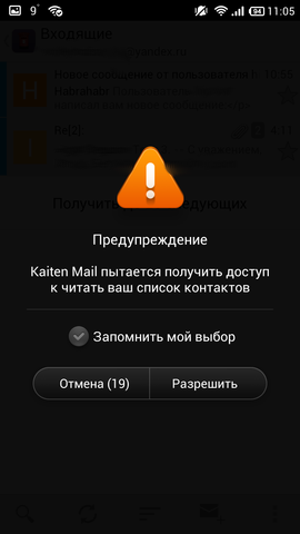
The client is far from being young; it has existed since May 2011 (from the first blog entry). Supports all protocols, including Exchange (but not ActiveSync). There are two versions: free (with ads) and Pro - without. There are not so many evaluations in the Market, maybe that's why the client is not so popular. According to some reviews on a well-known mobile resource with tsiferkoy wrote that it does not always work well with Rambler. On the Internet, I found the Pro-version, and tested it. We look:
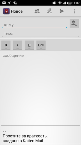
Kaiten Mail Screenshots
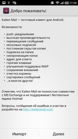


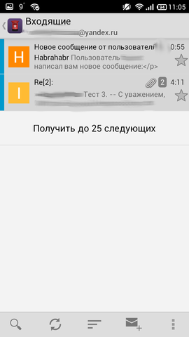
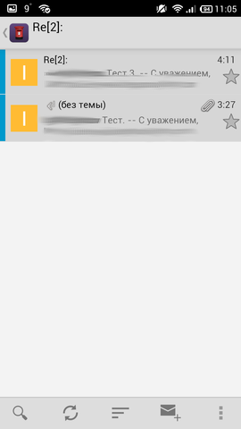


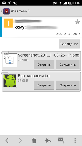
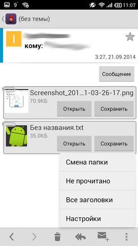



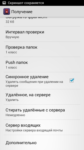
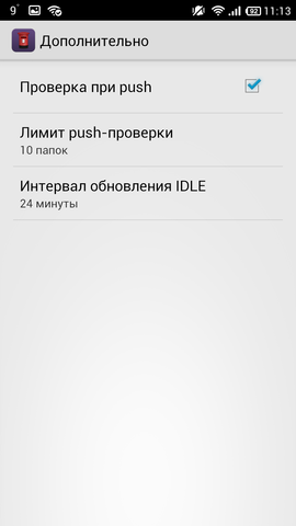


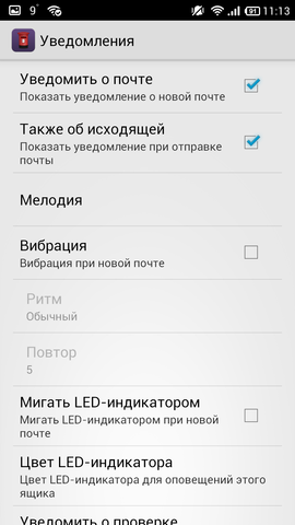


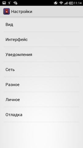


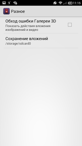
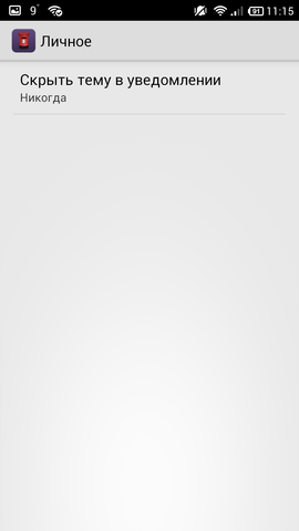
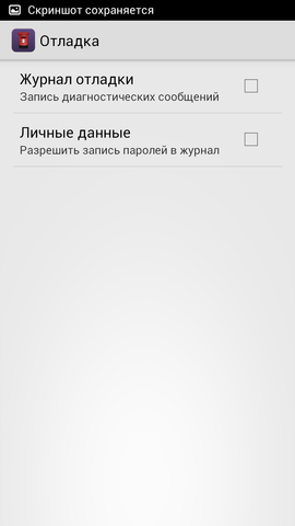
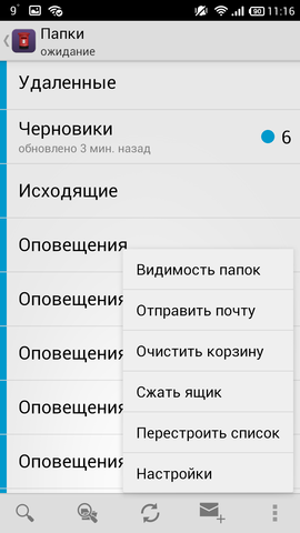




Pros :
- many settings
- Russian localization
Cons :
- no swipe support
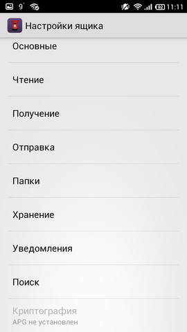
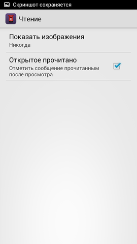
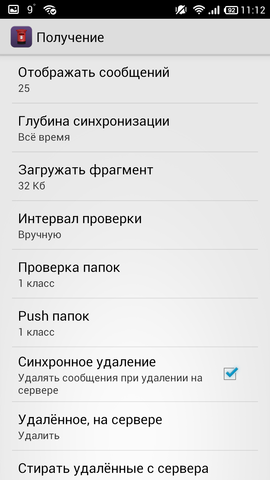
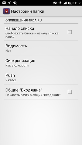
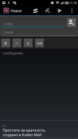
Messages from one sender are grouped, there are message chains. The recipients are taken from the contacts in the phone. In the body of the letter there are tags. There are many settings that the application that a separate box. Conveniently showing attachments. Subfolders can also be viewed, but not very convenient. For some reason, I didn’t remove the strip before the letter, showing its “novelty” even after reading. There are two more themes - dark and light. Everything would be fine, but there is no support for swipe when all other clients support it. Cannot work with folders.
A good client who has everything you need, but there is no some kind of pure chip. I have not experienced any negative emotions. The client does not have any unique chips either. They wrote that it may not work correctly with Rambler, but I do not have mail there, so I did not check. The client did not fall, did not bug - in short, a serious disadvantage - the lack of svaypov and inability to work with folders. Otherwise, all is well and good.
Links: Google Play Store , site .
- K - @ Mail

How many years did I find out to the client and could not. The blog of the project has a record, they say, a revolutionary client, but there is no date. By the appearance of the topic on a known resource, it can be assumed that it appeared in December 2013. Supports all protocols except Exchange. There are two versions: free (with ads) and Pro - without. For testing, I took the Pro version.
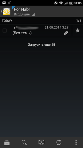
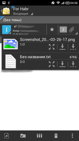
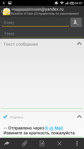
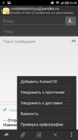
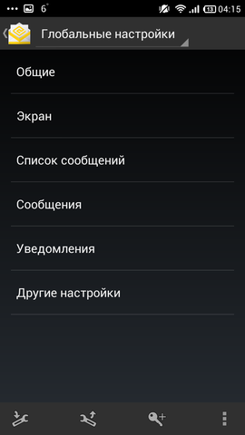
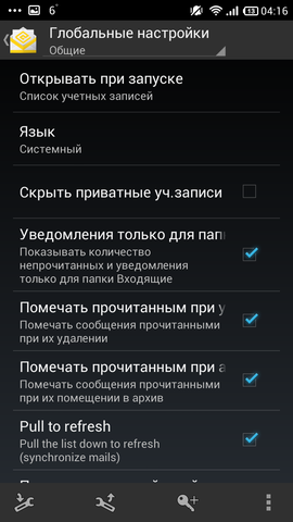
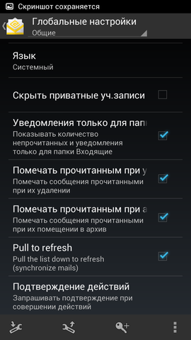
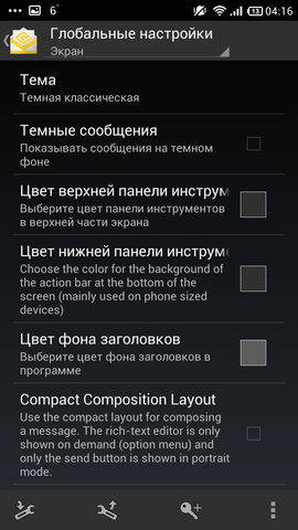
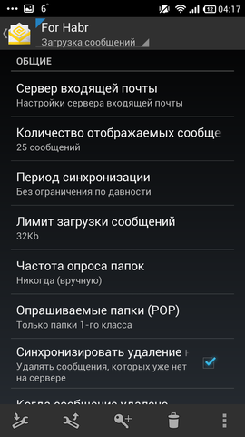
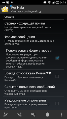
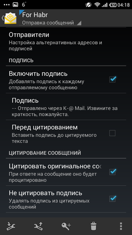
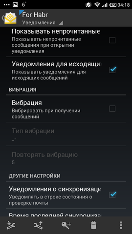
K - @ Mail Screenshots












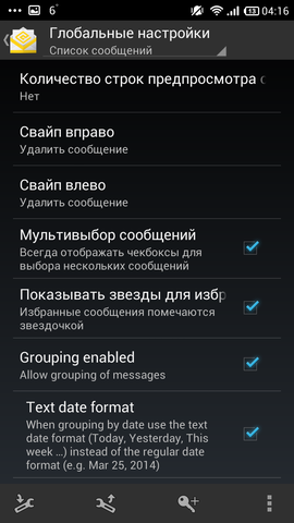
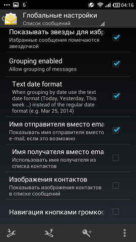


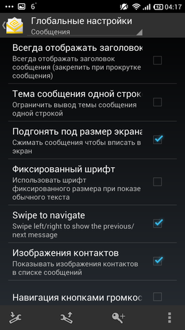
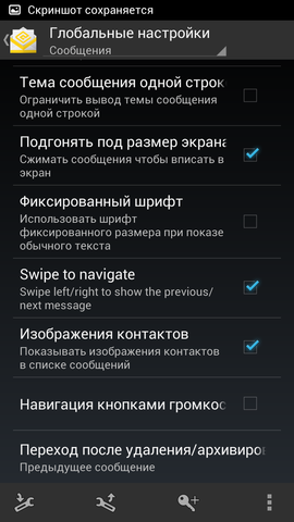






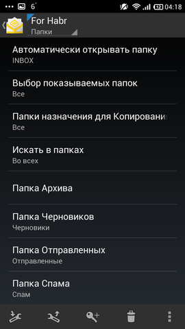
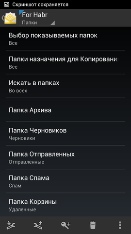


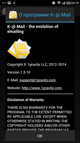


Pros :
- a bunch of settings
- pretty
- convenient and thoughtful interface
- many settings
- Russian localization
Cons :
- no conversations
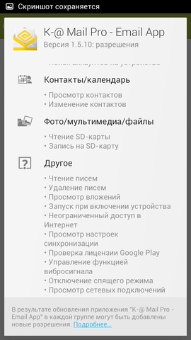
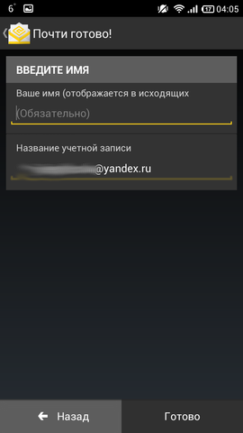
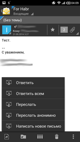
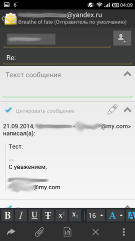
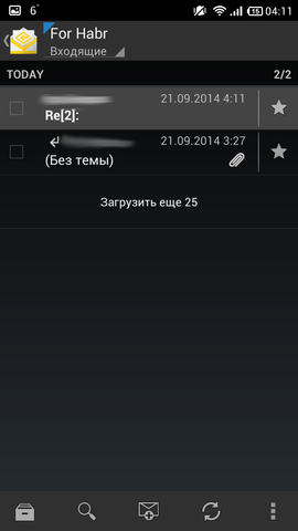
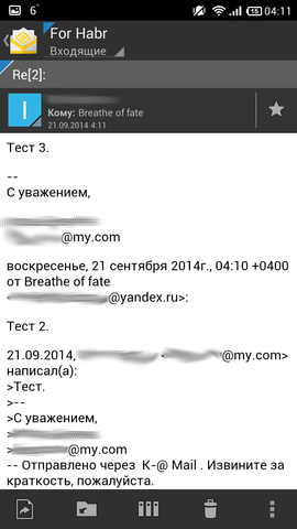
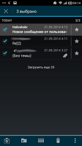
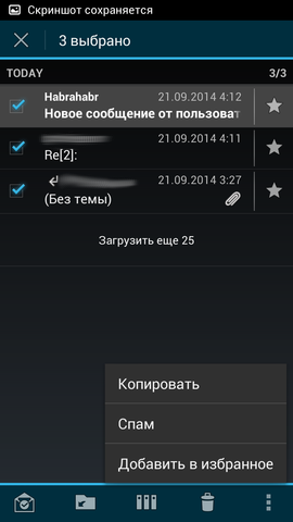
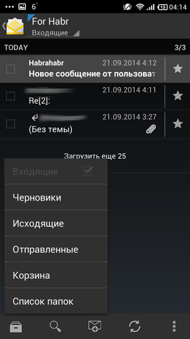
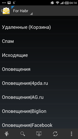
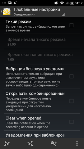
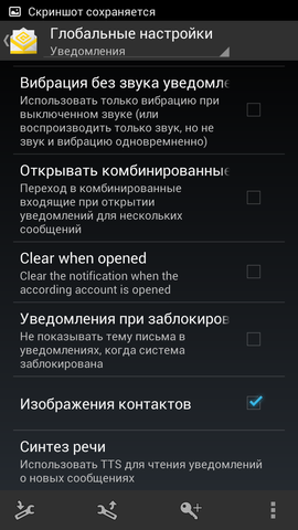
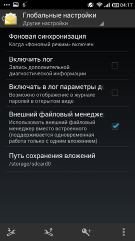
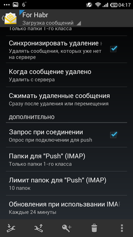
Immediately after launching, the client started to make me happy: I hooked up my Yandex account (apparently, from a standard email client). The client immediately after launching already offers a beautiful interface, everything is at hand, there is no need to deeply climb anywhere. If many boxes are connected, it will conveniently show how many important letters have come, etc. There are many settings - they are individual for each box and for the program as a whole. Able to work with folders. The recipients are taken from the contacts on the phone. There is support for svaypov, however, only from left to right - Delete. Customer trick - you can change the view window of the letter, that is, tap on the letter, a letter opens, and a “tongue” appears at the top, with which you can move the viewing window below, so you can quickly switch between two letters - very convenient; Something similar is implemented in ProfiMail Go . When you click on the bottom of the screen, the panel with tags comes out below, and, there are a lot more of them than, for example, Kaiten Mail . For those who like to immediately see all the folders, there is such a setting so that all your folders are displayed on the main window. Investments are very conveniently made; the client does not automatically load them, only by his master's wish. You can watch subfolders, even quickly, but they are not very conveniently displayed.
Very functional and very beautiful client. The most serious drawback - there is no support for the chain of letters. Everything else is just a great customer.
Links: Google Play Store , site , vote for new buns .
- Light mail

How many years did I find out to the client and could not: there is no blog, Twitter is empty, off. everything is in Chinese (probably I don’t know what language it is). By the appearance of a topic on a known resource, it can be assumed that it appeared in June of this - 2014 - year. Supports all protocols except Exchange. Version one, distributed free of charge.
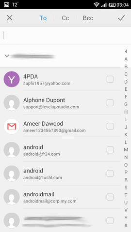
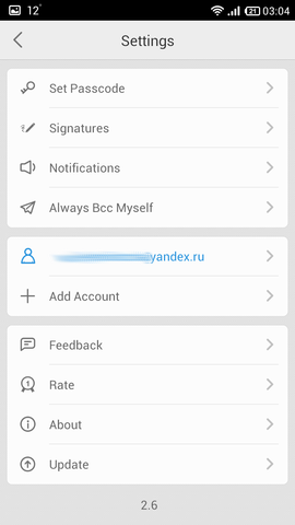
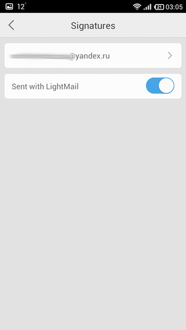
Light Mail Screenshots
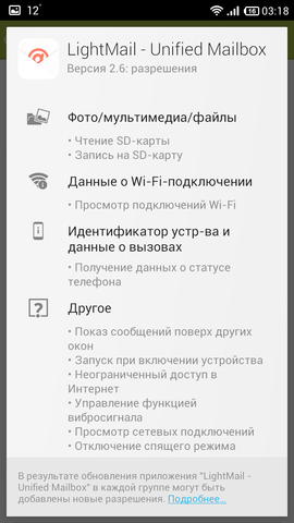
















Pros :
- Topics
- beauty
- convenient and thoughtful interface
Cons :
- no Russian localization
- no settings
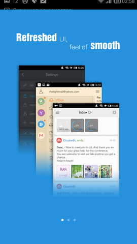
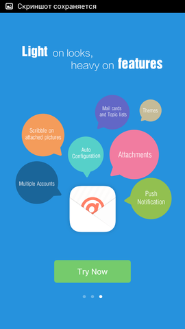
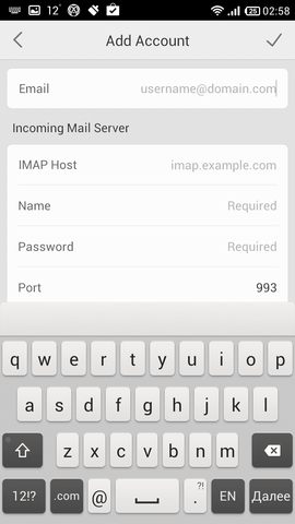
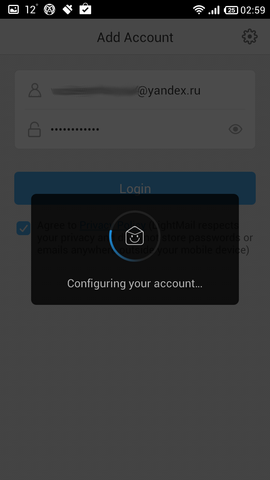
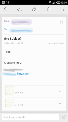
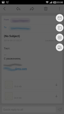
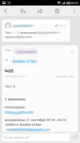
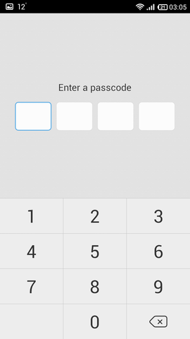
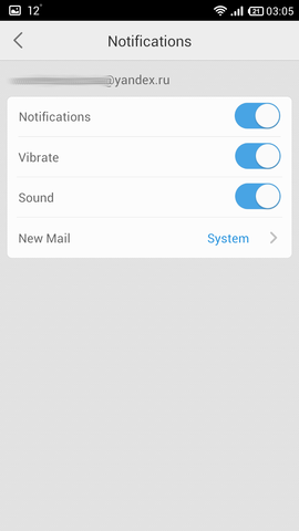
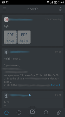
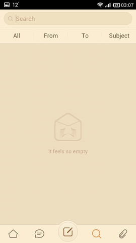
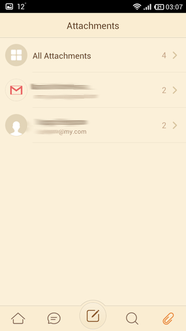
The side menu in three screens, like myMail , Mail Mail.ru and Circles Mail . Only if the latter has reduced functionality (as a sacrifice to imaginary convenience, IMHO), then here we can already see the subfolders, even in a tree view. The application has a few chips. 1st: topics. Yes, many customers have it, but this is just that. The default is white, but by clicking on the top right of the icon the sun can be changed to a warm lamp or night. Very comfortably. 2nd feature: a list of letters and conversations. The list of letters is not “cap”, but about half of the letter is shown immediately along with the header (unfortunately, it is impossible to change the size of such an attached body). But conversations imply a “nodding” interface with support for chains: that is, letters from a separate sender are grouped, and when viewing a letter, the previous message is shown almost in miniature — quite convenient. Udomleniya in the curtain is not rich in information: the account to which the message came and "2 new messages." 3rd: when writing a letter, the first line automatically becomes the subject of the letter - very convenient, I think. Also, in the window of writing there is a window of emoticons, but I already consider this superfluous and useless. Separately, on the main screen, you can click on the clip and all messages with attachments will appear - conveniently. The attachments in the message are also conveniently displayed - a miniature in the form of a small square on which the attachment format and its weight are written. When you click on it, the attachment is loading, while you can use the mail further (unlike Circles Mail competitor, where you can’t do anything while the attachment is loading, you can even exit the program). The recipients in the letter are taken from the server, the client also takes the addresses from the contacts on the phone. This is where the client pumped up, so these are the settings - there are almost none: setting up notifications, signatures and a password. The client also does not support a swipe by letter, but if you select it, it supports, however, only one - from right to left, "Delete."
Very comfortable and beautiful customer. Again, for those who like minimalism. If you need to set everything up forever, then you should try another client.
Links: Google Play Market , site , apparently, English-language site .
- mail.com mail

The client, apparently, was originally meant as an application for his (mail.com) mail, but you can use any one that supports IMAP. On the site there is no mention of the release date of the client, unfortunately. Version of the application is one, distributed for free.
PS: in the comments suggested that this is the product of United Internet AG , oriented to the markets of England, Spain, France, Russia, Portugal and Romania, like GMX , only the latter - to England, France and Spain, therefore these two customers are not very different.
Screenshots mail.com mail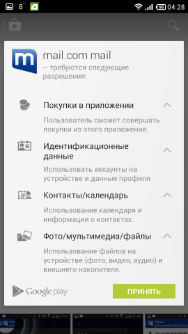

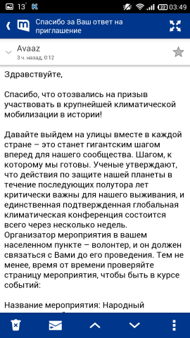


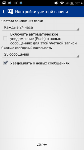

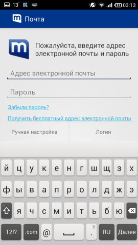
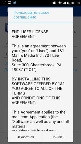
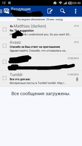


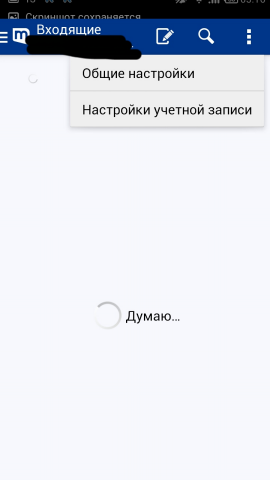
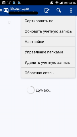


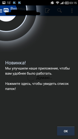
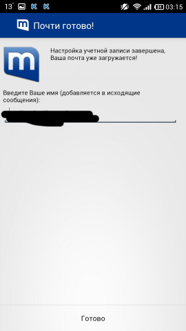


Pros :
- folder management
- the ability to expand the letter to full screen
- convenient to watch subfolders
Cons :
- few settings
- incorrect localization
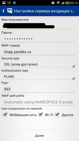
Here, almost the same as the clients above: a standard program selection dialog is used, with which something needs to be attached, you can attach a photo separately, after creating an account it climbs to watch e-mail addresses in the phone book, if you refuse, it will be ask every time.
It is convenient to look at the subfolders, tree (for some reason, a two-level). From the letter you can erase the inscription that was sent from such a mail, or add your own. When writing the addressee, he wants to take the address from the phone book, and not from the north (thanks at least for this). A letter can be deleted with a right-to-left swipe (ibid. There is also a suggestion to cancel the deletion).
An important plus is that you can arrange folders in the program as you wish, as well as delete them. By "incorrect localization" I mean the translation of mail.com mail as Mail .
It seems everything works, but somehow "freshly", no settings level, and the interface is even simpler. We continue the search.
Links: Google Play Store , site .
- mailbe.at

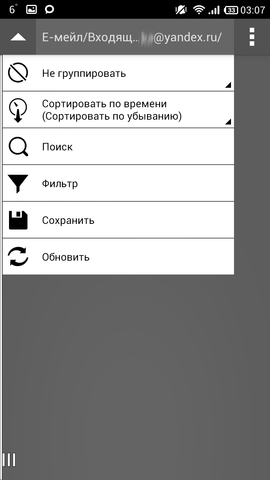
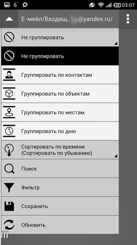
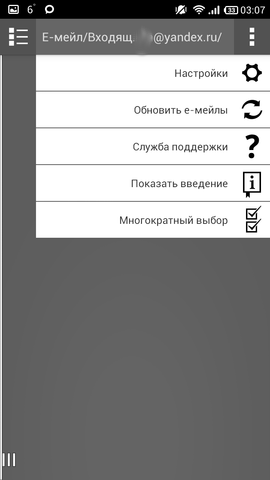
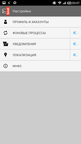
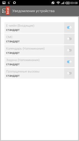
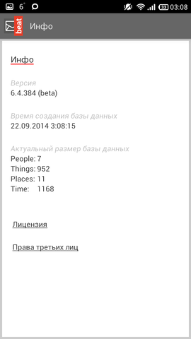
The client is new, has not yet come out of the beta development stage. The first post on their blog on Facebook is October 2013. Supported protocols are IMAP (POP3?) And Exhange. They promise the same beauty as Mailbox : lists, tasks, another calendar, etc. Time to check it out. Version one, distributed free of charge.
Screenshots mailbe.at
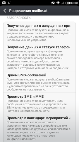


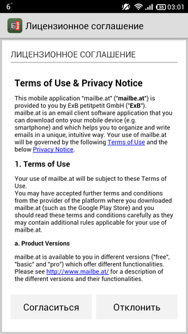


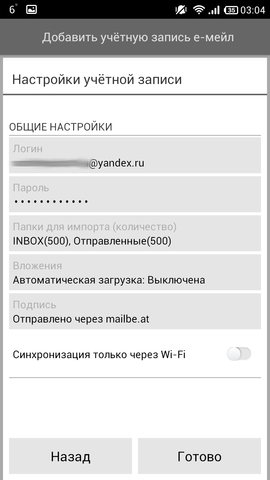
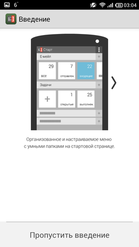
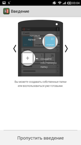

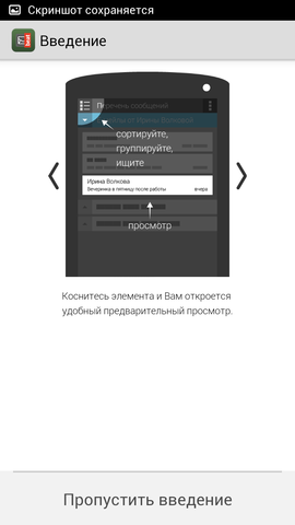
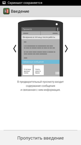


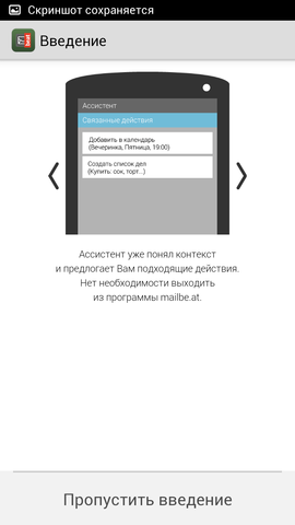
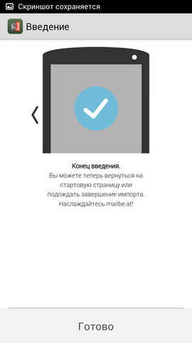
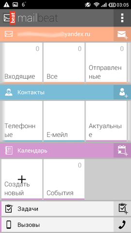
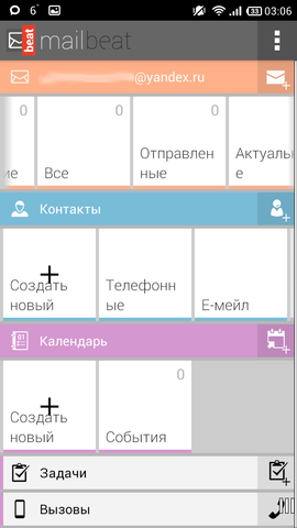


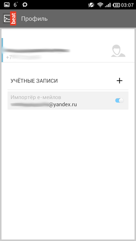
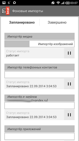
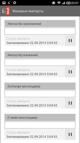
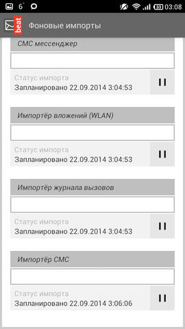

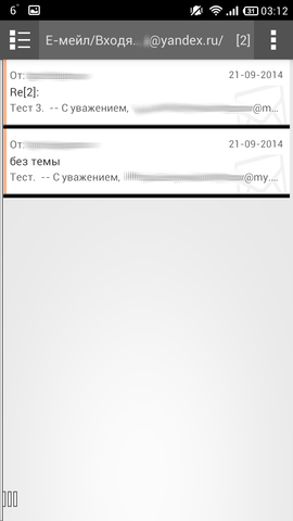

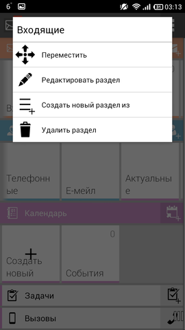


Pros :
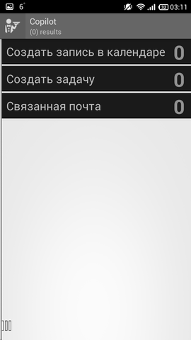
- lists, tasks, calendar, etc.
- convenient message header
Cons :
- no subfolders view
- no support for conversations
- few settings
- no swipe
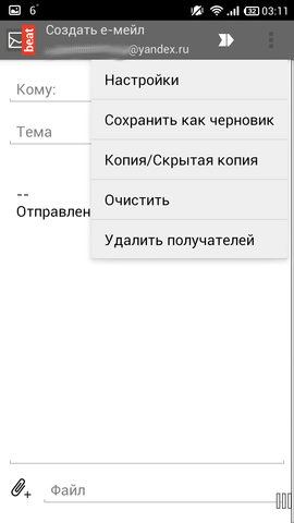
The recipient will have to drive handles, there is not even a pop-up window with recent contacts. Few settings, although it is possible to customize something for yourself. The hardware “Menu” button does not cause exactly any reactions in the client, and dragging your finger up on the big screens is not very convenient (what can I say, on the 4.3 diagonal there are already some difficulties). You can add your own, so-called “categories” - such as a shortcut on the main screen, by clicking on which you will be shown what you want to see. Read messages differ from unread only in regular font instead of bold, so look at the list - you can break your eyes, because Neither are those, only white. The message cap is made interesting, but there is no date of receipt of the letter, only time, otherwise the cap is made pleasant to view. No swipe. In short - beta.
The project is still too raw in my opinion. Compared to other customers, this slow-moving combine is just a hell for the user. Perhaps, in time they will finish. But this is the first customer to offer such a wide synchronization.
Links: Google Play Store , site .
- Mailbox

Recently appeared client from well-known file storage. They promise a fantastic usability. Now we check it out. Version of the application is one, distributed for free.
Mailbox Screenshots







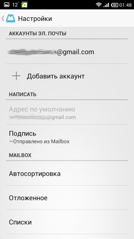
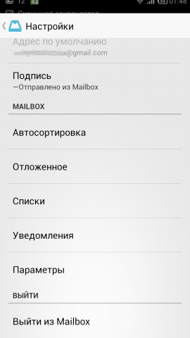

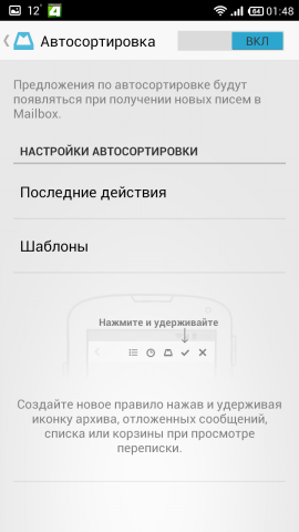
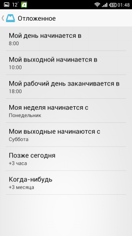




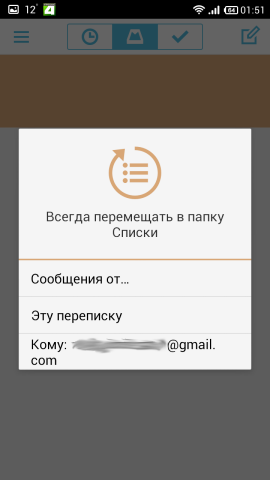
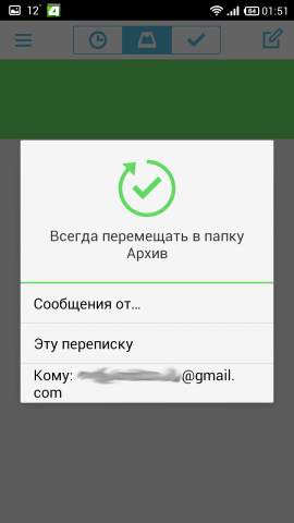


Pros :
- convenience(!)
Cons :
- few settings
- no labels
- only Gmail and iCloud
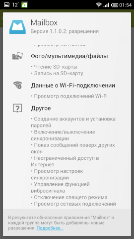
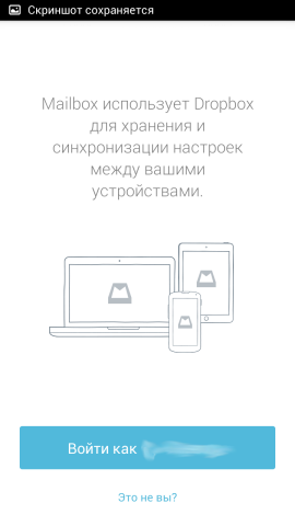
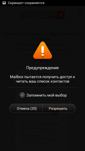
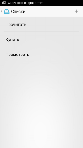
The most important note: mail goes through the Dropbox server .
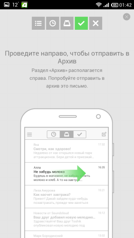
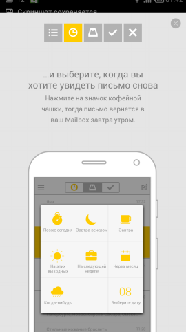
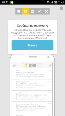
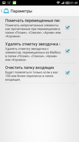
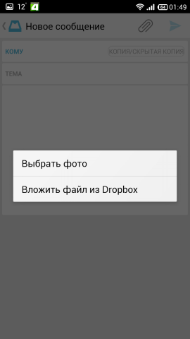
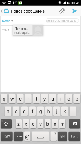
If the client is positioned as the most convenient client, then yes, this is partly true, depending on what you mean by convenience. The client can work with a group of letters (which are chains, which are separate): in the incoming mail list, by clicking just below the last letter (there is a socket type), you can send everything at once to the Archive, or postpone (Later) (analogous to “boomerangation” in Boomerang ). The same operations can be performed with individual letters. In addition there are lists, there everyone can find an application for themselves. There are few settings, you can customize it. Unfortunately, it’s impossible to watch your labels. You can expand the chain of letters, but collapse - no, the message immediately opens ( Fluent Mail brought this to mind). The attached picture is not displayed as an attachment, but immediately opens with a picture. The cap of the letter is displayed simply, but informatively - who, when, to whom and the topic. You can attach a file from both Dropbox and from your phone. When you enter the recipient, a pop-up window appears with the recipients (only I did not understand whether this is recent or the address is taken from contacts uploaded to Google). There are no skins, only one white theme.
Unfortunately, there is no support for other services, only Gmail and iCloud. Work with mail is limited only to the folders of the Mailbox itself, although it is made very convenient. The rest - yes, the client is beautiful.
Links: Google Play Store , site .
- Maildroid

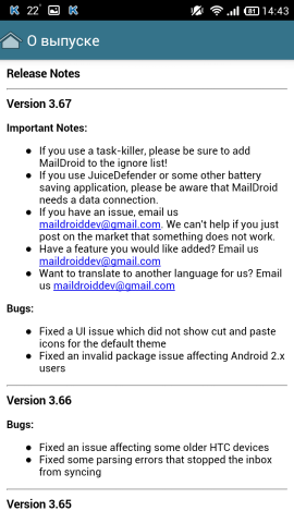
A client with a long history, which was still at 2.3 (judging by the screenshots on a well-known forum), but I couldn’t find a date, the developer’s site is a group on Google+. Two versions of the application - free and Pro. It's clear that they differ by the presence of advertising (maybe something else, but I took the version on the Internet already without ads).
MailDroid Screenshots
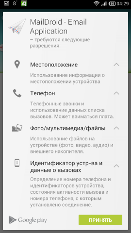
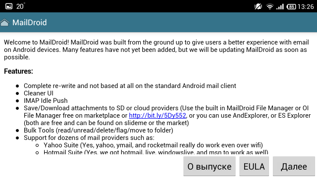


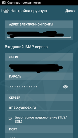

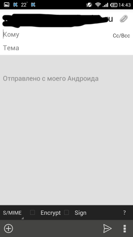


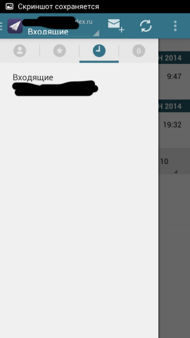
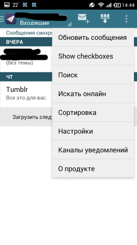
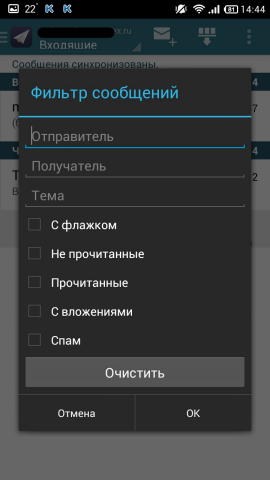


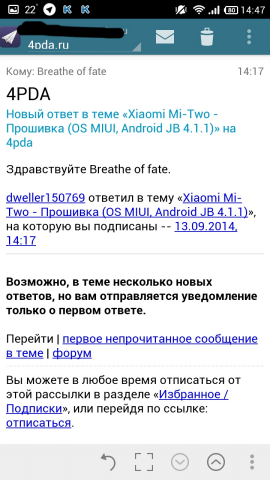
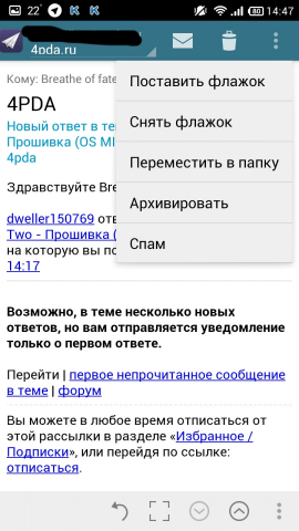

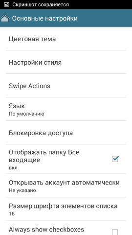

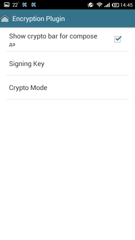


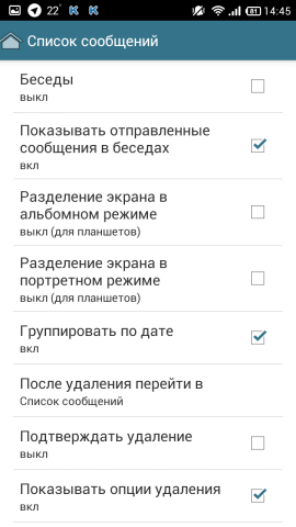

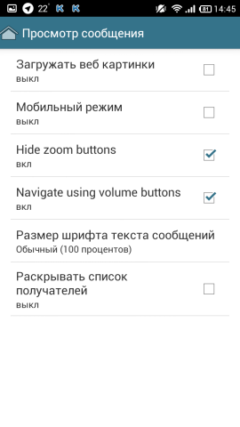
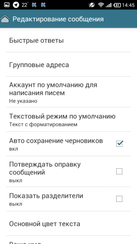
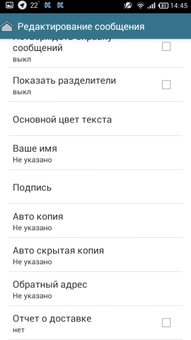


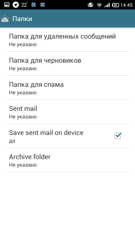

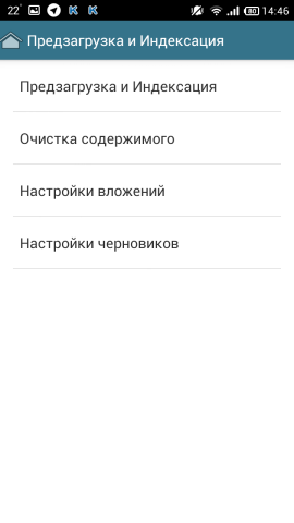




Pros :
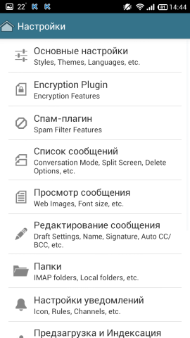
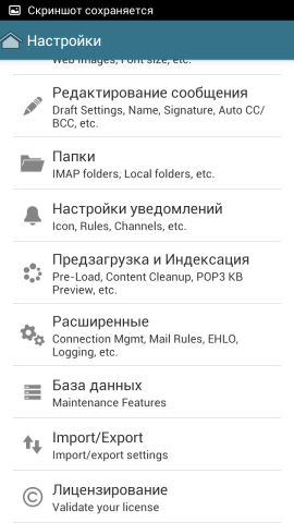
- many settings
- folder management
- the ability to expand the letter to full screen
- convenient to watch subfolders
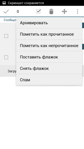
- convenient group operations with letters
Cons :
- incomplete localization
Here, almost the same as the clients above: a standard program selection dialog is used, with which something needs to be attached, but! there is also its own file manager.
Attached folders are not very convenient to watch, but done in an original way. From the letter you can erase the inscription that was sent from such a mail, or add your own. Managing a letter with a swipe from right to left, as well as group operations with letters with a swipe from left to right.
An important plus is that in the program you can arrange folders as you like, as well as delete, create your own, etc., as in mail.com mail . There are encryption settings and much more. There is also a convenient message filter. Incoming messages are broken (at least without settings) by the date of receipt of the letter - conveniently.
A good and very functional client. However, you don’t look at the nested folders quickly, and you don’t have the choice of addressee either (only from the contact list on the phone). The search continues.
Links: Google Play Store , site .
- Mailwise

Apparently, the client is completely new, less than six months. On screenshots in the Market offer various kinds of goodies. Version one, distributed free of charge.
MailWise Screenshots



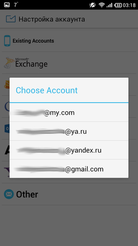

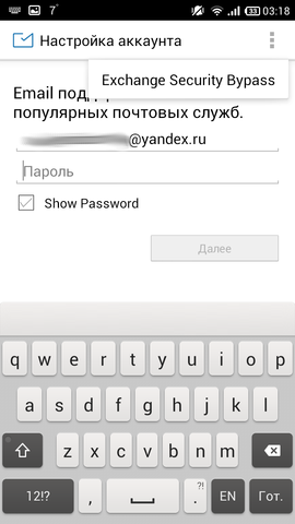
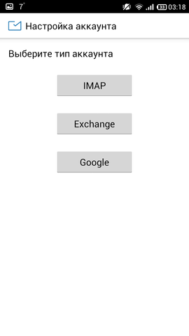
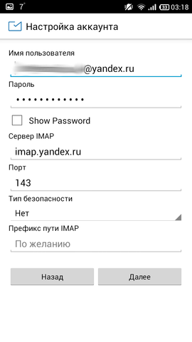






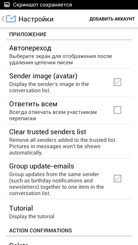
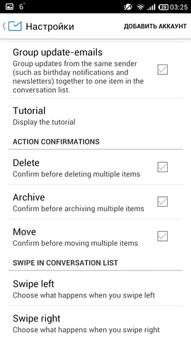


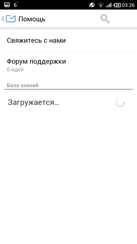

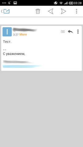



Pros :
- Russian localization
- convenience
- message chains
Cons :
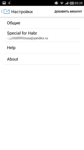
- not a lot of settings
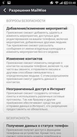
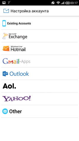
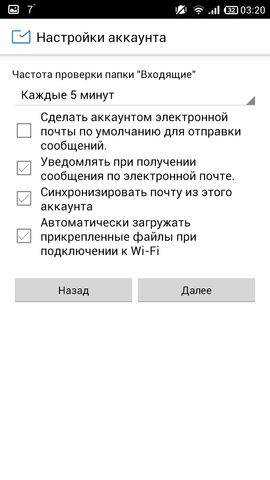
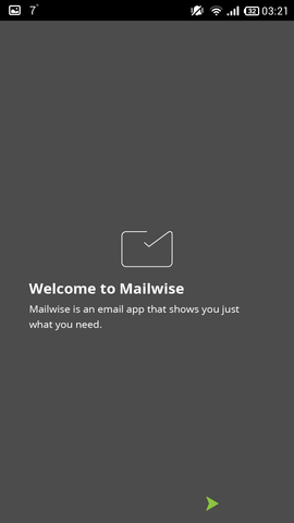
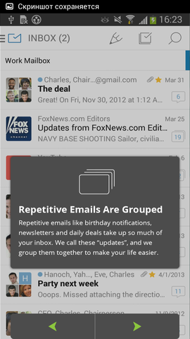
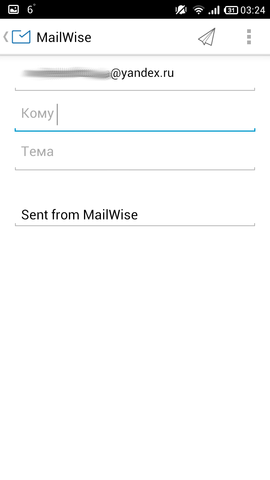
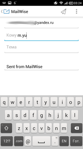
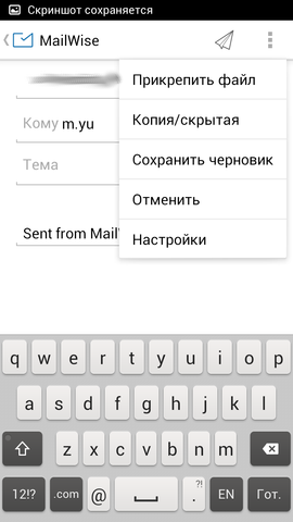
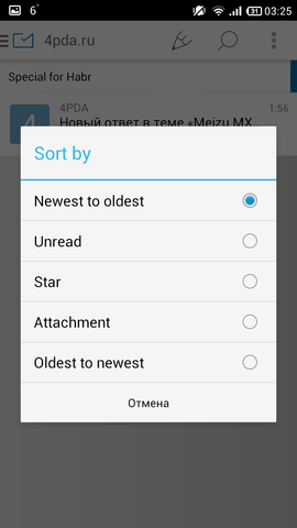
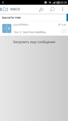
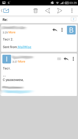
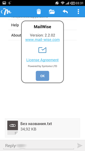
The client began to please from the very beginning, when I clicked on Existing accounts I gave me the entire list of my accounts - conveniently. Immediately when setting up I asked when to synchronize - a trifle, but it's nice. A very handy panel, leaving on the left, is where you can see your subfolders, though by clicking on the folder containing them, but it’s still convenient and beautiful. There is no dark theme, but everything looks very nice, it is not vigorous, the color scheme is well chosen. The message header is conveniently made, the Show and Hide button can be expanded, where everything will be shown in more detail. It supports message chains, the cards look very nice, when you click on them, the whole body of the letter opens from below, as was the case in Fluent Mail . Supports swipe on the message in both directions. Unfortunately, the addressee has to pick up handles.
Very comfortable and beautiful customer. The settings are not the sea, but you can customize for yourself. Unfortunately, my client began to crash at launch after initial setup and removal of screenshots (in the Market it was written that my device is incompatible).
Links: Google Play Store , site .
- Molto

A young client, he first entered the i-market in May 2013, then in January 2014 on Android (judging by the blog). In the market we are promised a beautiful client, now we'll see. Version of the application is one, distributed for free.
Molto Screenshots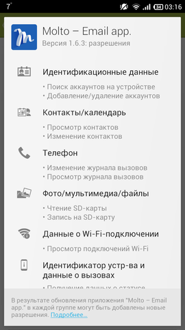

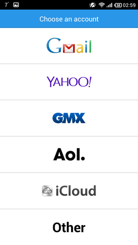


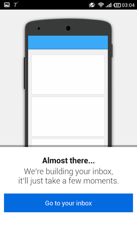

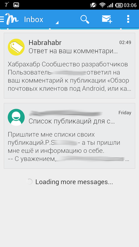


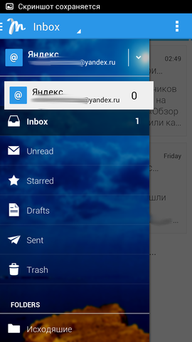








Pros :
- letter cards
Cons :
- no settings
- buggy
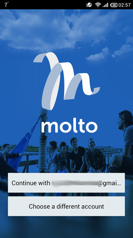
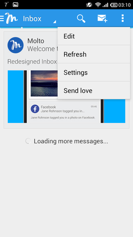
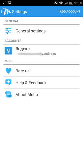
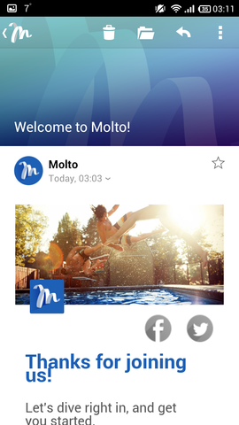
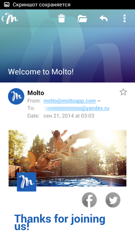
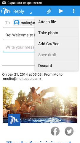
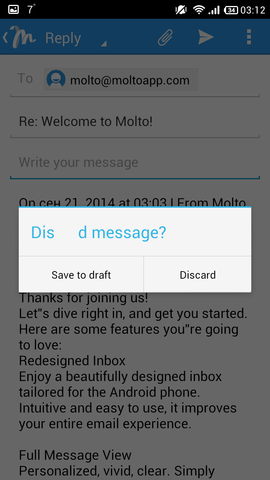
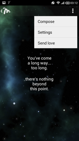
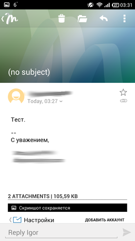
Well, let's start with the fact that he is trying to read my mailbox for the second day. Once he succeeded, but synchronization still works disgustingly. The panel on the left is made relatively standard, subfolders are convenient to watch, but they are not in a tree view. In addition, the background of the panel - some kind of picture, but if he does not like, you can not change it too. While writing, the client still updated the list of messages (I repeat - two days!). The message window is divided into two parts: the top one is a picture (perhaps there should be a sender's avatar), the bottom one is a letter. Attachments are shown conveniently, only the pictures open immediately, and in the settings do not turn this off. You can send a message only from the message view window. The recipient of the message will have to drive in handles. There is a svayp: from left to right - delete. If you twist messages for a long time (yes, you can load the following, if you tap the message in the body of the message from left to right), then you can fly out the window with the space image, which says that "we have been walking a long way here, and there is nothing here." The settings are simply extremely small and this is more garbage than configuration.
It seems that a good client would have been if the author was engaged in it. If dopilit, it may be an alternative to other customers, but for now the lack of at least stability forces one to look for other options.
Links: Google Play Store , site .
- myMail

A young client, the first entry in their blog is dated November 2013, perhaps the client was written a little later. The company itself also saws its chat and games. The links can learn more all by yourself. Version of the application is one, distributed for free.
MyMail screenshots









Pros :
- pretty
- fast
- convenient to watch subfolders
Cons :
- few settings
- does not support chains
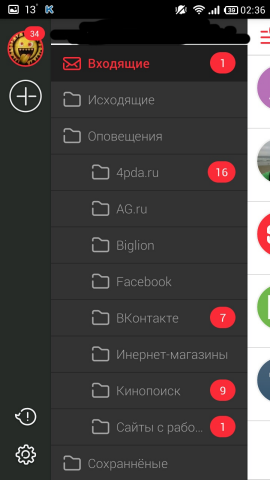
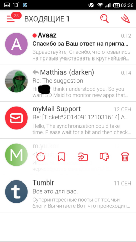
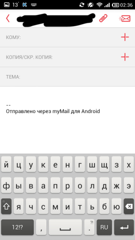
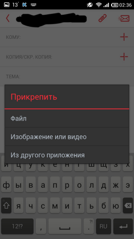
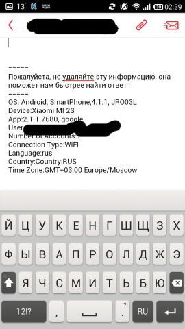
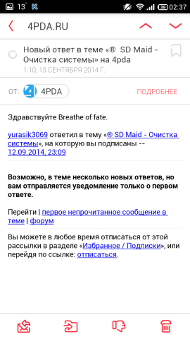
This is closer to what I was looking for. The client is very beautiful, the colors are well chosen: red, white, wet asphalt and black. Very convenient and smart: for example, letters can be flipped to svaypam right or left, or by buttons on the top. Yes, many clients are able to do it, but there are no delays here. When writing a letter, its header is rather conveniently highlighted - to whom, a copy and a topic (in gray), unfortunately, there is no frame in the field for entering the message itself, and there would be, for example, a black outline in the subject! There is a choice of addressee, moreover, the addresses are taken from the server, also, when entering manually, a window pops up from the contact selection, a la fast search. Each contact has its own avatar - either the one that the contact itself made, or (as is fashionable now) - the letters of the name. As for attaching files, you first ask what you want to attach, and then choose exactly what, just like one of the clients above. From the letter you can erase the inscription that was sent from such a mail, or add your own. You can manage the letter with right-to-left swipe, and the menu that appears appears without any hint of brakes - everything is very smooth and beautiful. From the letter itself, you can just as easily erase the phrase that the message was sent from such and such a client. The same chip with letters is in the list of letters (in any folder) - it looks beautiful. In the message, the sender and will be highlighted with an ellipsoid, red outline - looks great. Well, you can, of course, add to Favorites or or put the label "Unread". Attachments are shown in the form of small thumbnails - maybe not really necessary, but it looks great.
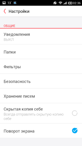
Very comfortable and beautiful customer. Yes, there are few settings, including you cannot manage folders, as a couple of clients can at the top, but here you can see that attention is paid to trifles. From this and the minus that the pictures he also loads, regardless of WiFi or 2G, that is, if AquaMail, for example, asks whether to load or not, this one loads. I would also make a darker set of messages, for example, gray, it would be more convenient to watch. In all other respects, this is almost a “client of my dreams,” I hope, in time, all this will finish. At least I wrote my wishes twice (different, of course) and they answered me the same way twice, they say, thank you, we will consider.
Links: Google Play Store , site .
- Omail

The client is based on K-9 Mail , but as written in the Market, with some improvements. There are few reviews, as well as ratings, it seems, just does not get into the search. Version of the application is one, distributed for free.
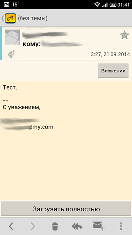
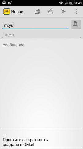
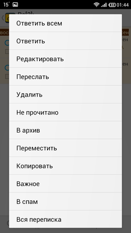
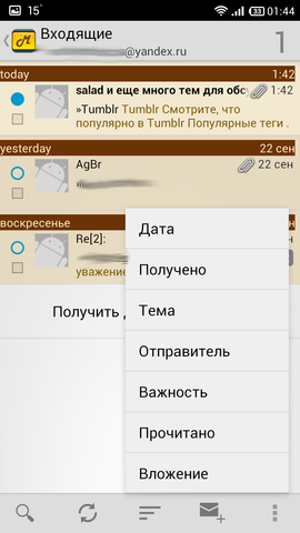
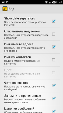
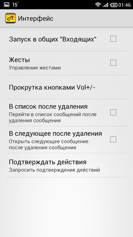
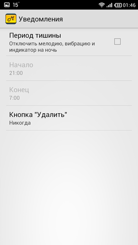
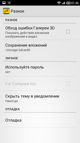
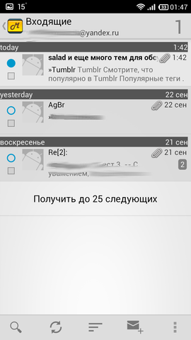
OMail Screenshots









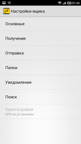


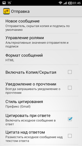
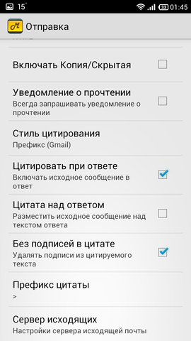


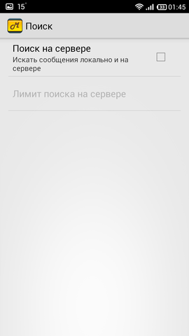






Pros :
- many settings
- Topics
- convenient to watch subfolders
Cons :
- no svaypov
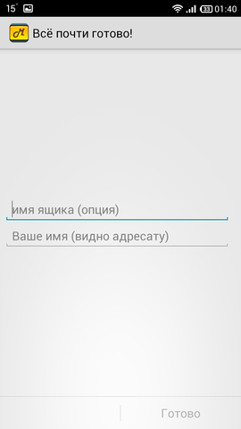
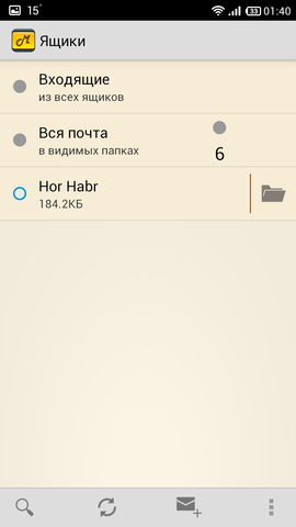
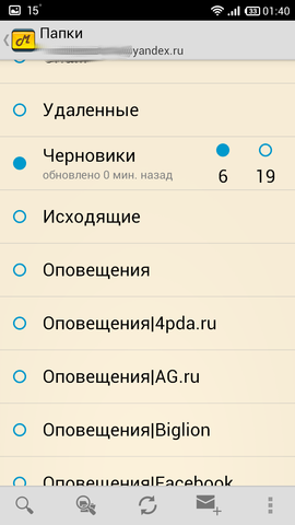
Differences from K-9 Mail only in the interface, in my opinion, it is more pleasant (especially the dark theme, there are only three). Permits required at a minimum. Swipe does not support. The addressee picks up only from the phone book of the device.
It seems that someone did not like something K-9 Mail and this someone decided to make his “preference with the young ladies”, trying to make the client more beautiful and generally user-friendly. The result was a very good modification.
Links: Google Play Store , site .
- Pigeon

Apparently, a young client, because information about it is not even on the site specified in Google Play. But there are two versions: free and Pro.
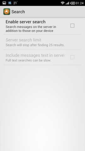
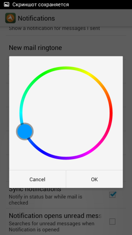
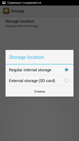
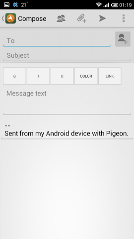
Pigeon Screenshots



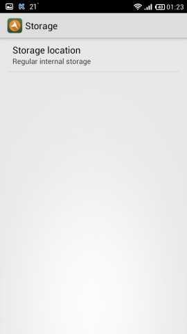
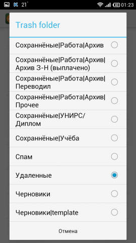
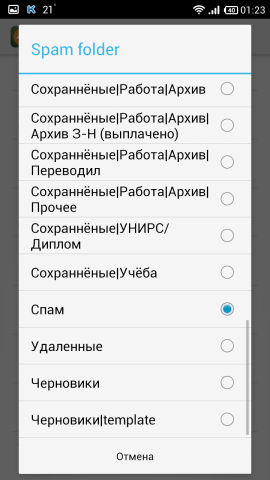

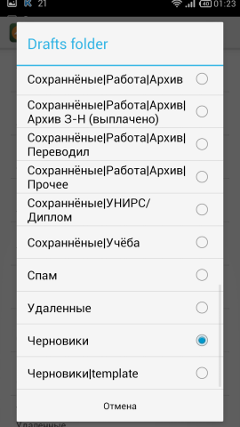
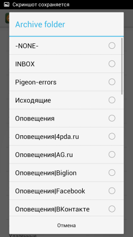
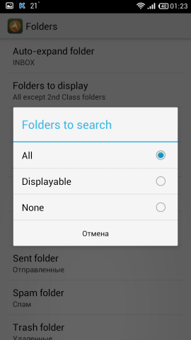

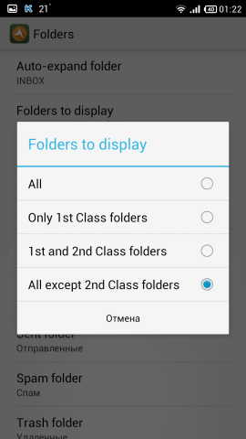
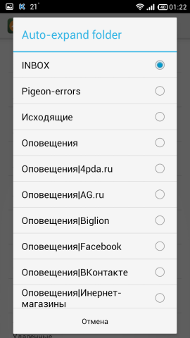




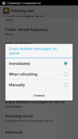


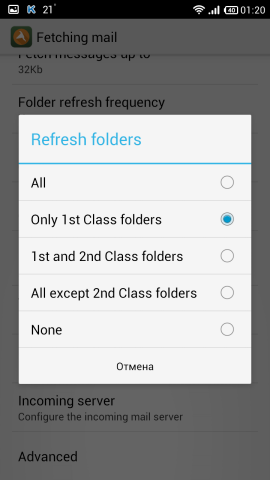

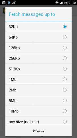


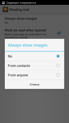
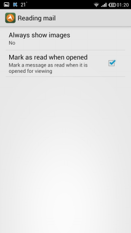
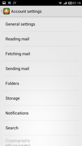
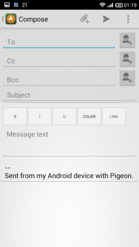
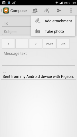





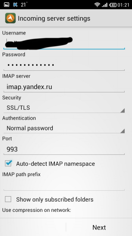
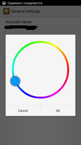
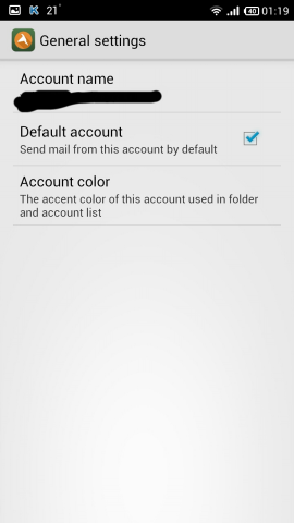

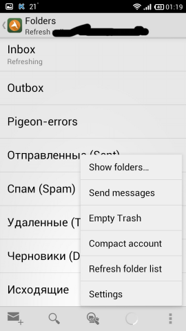
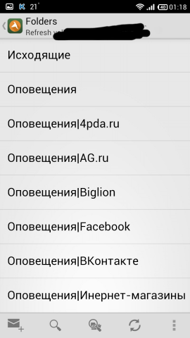
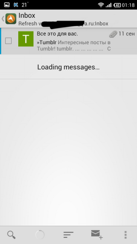
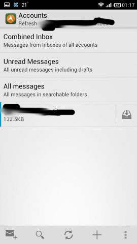


Pros :
- many settings
Cons :
- inconvenient to watch subfolders
- no Russian localization
- unsuccessful color range
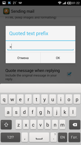
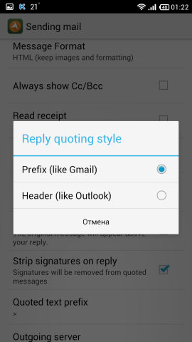
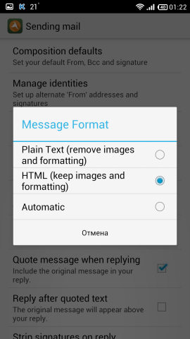
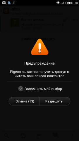
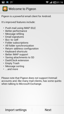
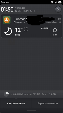
There is a huge amount of settings here, as in AquaMail and MailDroid , but the color scheme is unsuccessful. There are topics, but in the free version, apparently, they are not there - the item is inactive. Almost standard window with writing a message, only there are tags: bold, italics, underlined, etc. The choice of contacts is made from the contacts on the phone. When choosing an attachment, they first ask whether to take a photo or, after all, an attachment. You can save the letter as a draft directly from the menu. The signature that was sent with the help of something you can remove and write your own. There is a message filter, search, group actions, but there is no svayp action on the letter (every self-respecting client can do this) When downloading a letter with an attachment, it asks whether to download it is convenient if you do not want to download any garbage, such as coupons ( AquaMail can do it ).
And everything would be fine if the client were a little prettier, and that the subfolders could be viewed a little more visually. Maybe the author and dopilit.
Links: Google Play Store , site . Yes, yes, this is from the author of the twitter client Tweetings.
- ProfiMail Go

Long-lived client who was still on Symbain. Version one, distributed free of charge.
ProfiMail Go Screenshots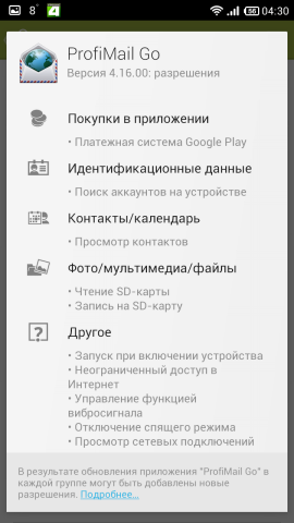







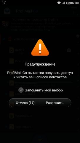
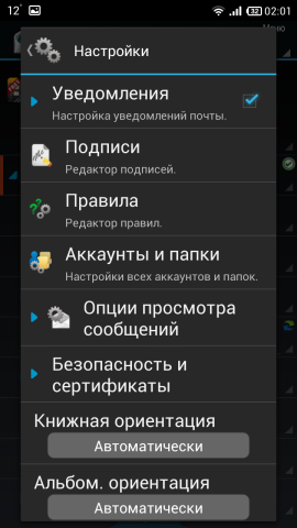
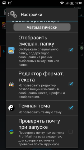
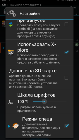


Pros :
- nice
- fast
- many settings
Cons :
- for some it may be too colorful
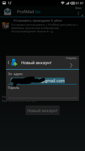
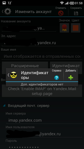
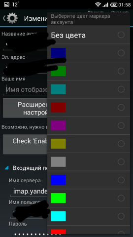
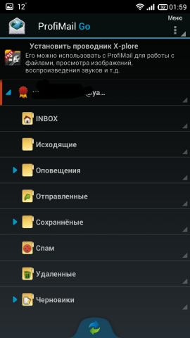
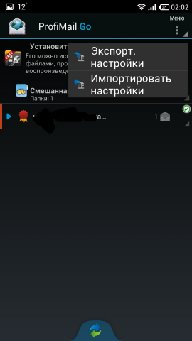
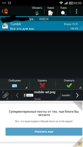
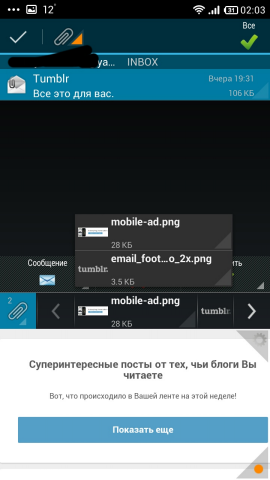
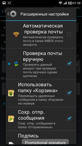
There are also many settings, as in AquaMail , MailDroid and Pigeon , you can configure everything. Subfolders appear when you click on an account folder, etc., you can synchronize individual folders by long tap. There is a preview of the message at the bottom of the screen, i.e. in the upper half of the screen is a list of letters, in the lower half is the letter itself. Attention is paid to trifles, as in myMail (even trivially when scrolling through the list in the settings, the gear turns in the corner of the dialog box, the scrolling stops, the gear does not spin either). There is no action on svaypu, but without them it is quite convenient. Unfortunately, the addressee will have to be driven in with pens - there is no choice, it also does not appear when entering. Attachments also show clearly as AquaMail , incl. and pictures coming from Twitter, Tumbler and others. It even has the function of reading messages out loud, but I have not tried it. You can manage folders, incl. and delete.
Great customer, put a look exactly worth it.
Links: Google Play Store , site .
- Seed

Young client, judging by the first posting on Twitter - September 2013. Surprisingly, the site has no mention of the client for Android, only under iOS. Version one, distributed free of charge.
Screenshots Seed


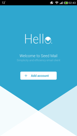


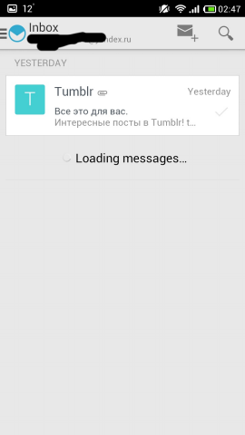
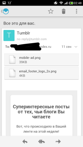


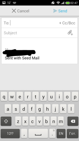



Pros :
- fast
Cons :
- no settings
- no Russian localization
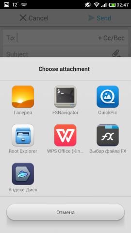
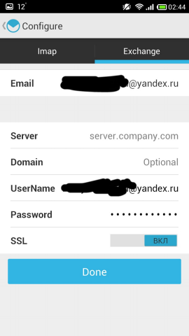
Very simple customer. Able to show subfolders in the left pane, but not in a tree view. Letters in the list are shown in the form of cards. The addressee can be driven only with pens. When you attach, they immediately ask us what to attach. However, when there are attachments in the letter, the client shows them as Aquamail , ProfiMail Go and MailDroid . Surprisingly, despite this simplicity, this client needs so many permissions.
The client is simple, concise, low-functional. But for those who need to quickly enter and see what is in the mail, it will do. Very similar to CloudMagic , only easier.
Links: Google Play Store , site .
- SolMail

Young client, judging by the first entry in Facebook - October 2013. Koreans sawing it. Version one, distributed free of charge.
SolMail Screenshots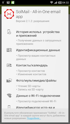


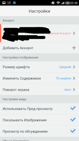
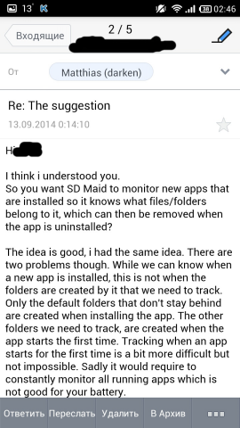


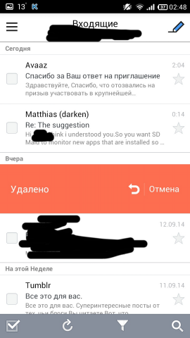
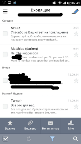


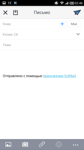




Pros :
- pretty
- fast
Cons :
- few settings
- recommended applications at the end of the folder list
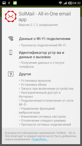
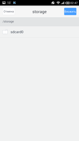
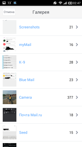
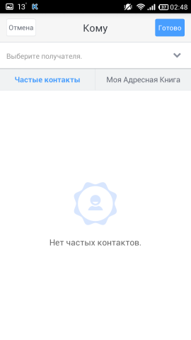
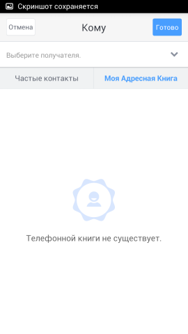
A good customer. The navigation bar on the left (like many clients above) contains a list of subfolders and accounts, although the folders are not displayed in a tree-like state, but below we see the so-called “Recommended Applications”. The client also does not know how to search for the addressee, you can write it with pens, or you can take it from the contacts in the phone, where the client is breaking at startup. The cap of the letter (from whom and to whom) is made like myMail , i.e. the addressee and the sender in an ellipsoid with a blue contour, - looks good. The bottom panel on the screen of writing a letter is made quite conveniently - whatever you want, attach it. By the way, the client is your file manager. There is a right-to-left swipe action - deleting a letter and canceling it (deleting). Also, the client does not know how to manage folders (delete, rename, etc.). The comments suggested that there are glitches when synchronizing over WiFi.
Good customer. There are few settings, but everything is there. Maybe like those who liked, for example, Seed .
Links: Google Play Store , site .
- Mail.ru Mail
We all know who Mail.ru is, there is nothing to write here. But you can see with your own eyes. Version one, distributed free of charge.
Mail.ru Mail Screenshots



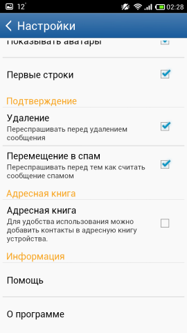

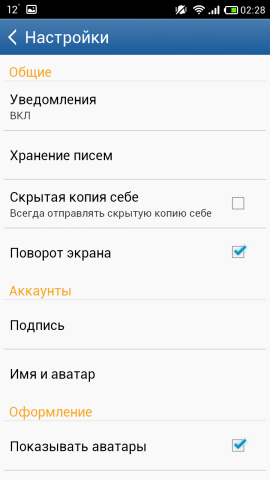


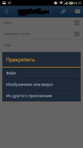


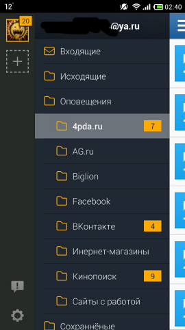




Pros :
- fast
- convenient to watch subfolders
Cons :
- not too good color
- few settings
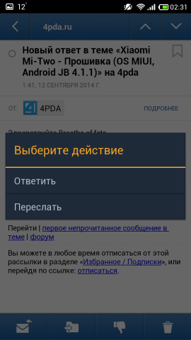
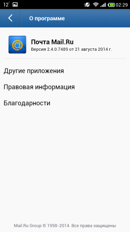
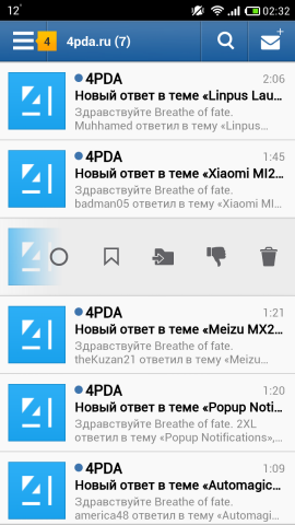
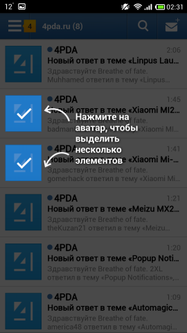
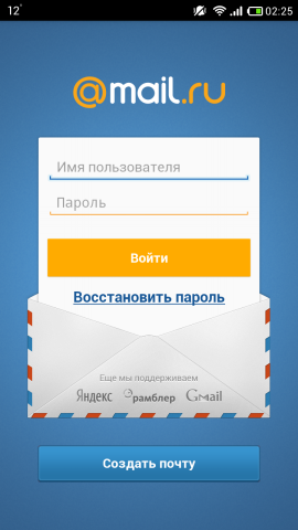
And here we see the complete clone myMail . Surprisingly, the company is one, but only if the first one is very carefully made, then the second one, as the famous character from the famous cartoon said, “It will do so!”: In the first case, the account icon is round, in the second one is square, in the header of the letters exactly the same situation. The panel at the top with the Ginderbread interface, against the modern and beautiful myMail , etc., etc. This is only my perception of the beautiful, perhaps, many find it really beautiful.
But attention to detail shows the interest of the developer in his product, as well as attitudes towards customers.
Links: Google Play Store , site .
- Yandex Mail
My first email client. Sharpened only for Yandex. Anyway, the presentation does not need. Version one, distributed free of charge.
Screenshots of Yandex.Mail
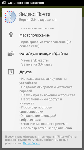


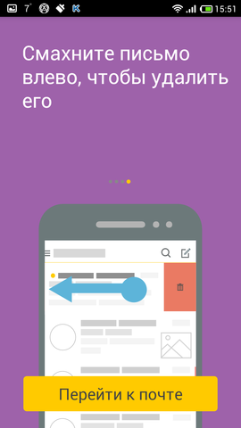

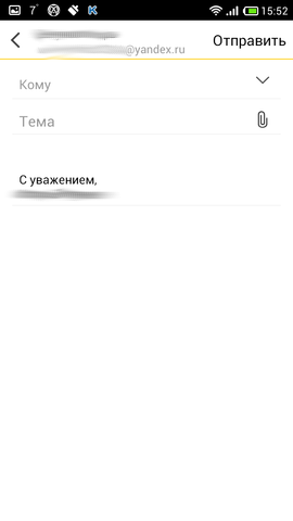
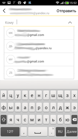




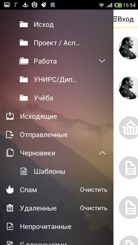
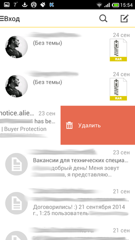

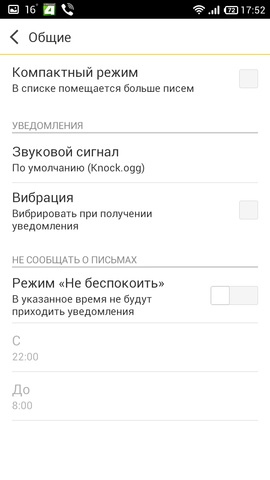







Pros :
- grouping posts by topic
- Beautiful design
- very (!) convenient to watch subfolders
Cons :
- few settings (almost none)
- podglyuchivaet
- no landscape mode
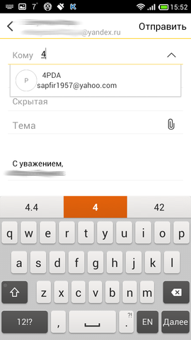
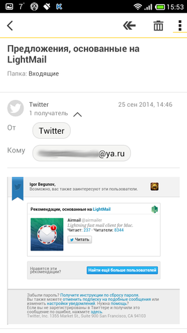
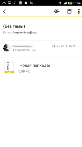
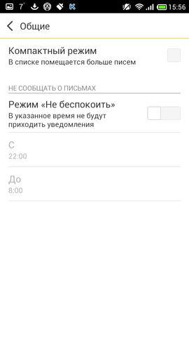
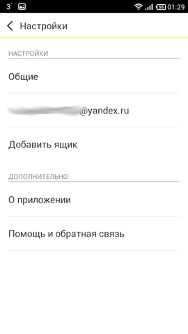
So, the old Yandex Mail has been updated in a year (and the penultimate version of the update did not fix anything), and, finally, the pleas of the users were heard. Now we have an interface approximately like in myMail , etc.: avatar-circles, the sender's name in an ellipse, and so on, only in the case of this client, there is one window - on top of the account photo, then its address and below all your folders. I was very pleased with the appearance of the folders, each subfolder can be minimized so as not to see the subfolders under it, and with each such “unfolding” of the folder, each subfolder falls into a more darkened area (see screenshots), that is, very big-eyed. Unfortunately, this panel has a background image, and if you don’t like it, all you have to do is accept it, or look for another client, there’s no way to change the background. There are very few settings, in principle, there is a notification setting. There is a Compact mode, which removes only avatars and a couple of lines of writing. The client is able to group messages by topic, not chains, as in Cirles Mail , but at least something. You can also change your signature.
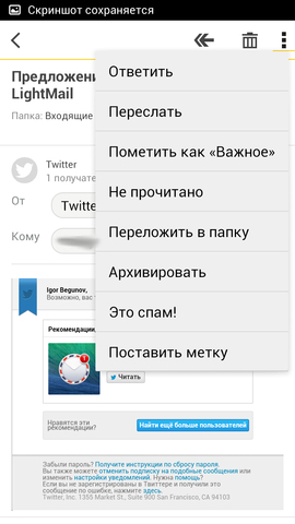
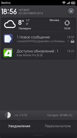
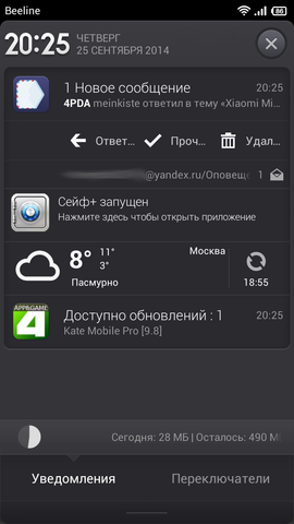
There is a setting which folders of your mail should be put on background synchronization, which is quite convenient, by the way, if you don’t take into account that there is no “Do not sync everything” button, because If you have a lot of folders, it is enough to manually disconnect all your folders manually. The letter writing window is very simple, nothing special. When you click on the field to enter the recipient, a drop-down menu appears, where there are recent addresses to which you sent something. However, if you start to drive with pens, then there will be recipients that you have in the mail in principle. When you click on a clip - attachment - offer to choose what, there is even Yandex.Disk. And yet - in the panel on the bottom left, Yandex offers its other programs - Maps, Browser and Disk. If there were lovers of a permanent notification in the status bar about open mail - it is no more. Client supports swipe: right - left - Delete, on the contrary - Mark as read.
And everything could be endured if it were possible to connect the boxes of other services, as long as it supports only Yandex. When you move a letter to another folder, a window flies out, where the folders are not in a tree-like state, it doesn’t look very nice (I don’t know the technical side of the question, but it would be better if this is done through the panel on the left). The client also does not know how to send letters from the list of letters, only from the view window of the letter. PS: I respect Yandex very much and actively use all of the services, I hope they can finish the client.
Compared to the old mail, this is certainly a breakthrough: it is clear that the client was sawed to work specifically with Yandex.Mail, but there are still not enough settings (perhaps for me personally) and the client still has room to grow before competing (for example, sharpened under Gmail Mailbox shows this, and Mail.Ru Mail attracts with work with other mail services). If the features I have described to you and the bugs do not seem so serious - put it, try it. Unfortunately, I (even with all my personal dislike for mail.ru) will stay on a more functional myMail .
Links: Google Play Store , site .
Results
If 3 years ago there wasn’t much choice in the clients, now there are a lot of them, some of them are covered in this short review. I do not pretend to the truth of my words, the taste and color of all the markers are different, but I hope this will help someone not to put tons of garbage, but at least to find out about what you can try. Personally, I left myMail and AquaMail as a spare client.
Approximate comparison in the plate under the spoiler (big picture):
Picture-table

- Legend: 1 - bad, 2 - moderate, 3 - excellent.
- The column of the table with the protocols contains the description of the protocols from the application page in the Google Play Store .
- Convenience was evaluated in general, IMHO.
- If the score was controversial, then Exchange was an added plus.
- mailbe.at 2, .. , 1.
Thank you all for taking the time to read this post.
Review update history
13.10.14, 21:40 MSK :
27.09.14, 17:50 MSK :
27.09.14, 00:00 MSK :
24.09.14, 22:20 MSK :
23.09.14, 00:00 MSK :
21.09.14, 1:00 MSK :
- Aqua Mail
- :)
27.09.14, 17:50 MSK :
27.09.14, 00:00 MSK :
- ;
24.09.14, 22:20 MSK :
- : LightMail, OMail Circles Mail ;
23.09.14, 00:00 MSK :
- SolMail myMail
- : Molto, MailWise, K — @ Mail, Kaiten Mail
- «» ,
21.09.14, 1:00 MSK :
- : Gmail, Mailbox, Boomerang, Fluent Mail
Source: https://habr.com/ru/post/237381/
All Articles