Through difficulties and mistakes to a flawless self-service checkout interface

Designing the interface of even a small system rarely goes without user interaction problems. These can be visual flaws that perfectionist designers often pay attention to. There are minor violations of the guidelines and disregard for the habits of users, leading to a hitch and a slight negativity when performing certain scenarios.
But the most interesting category is the interface errors leading to the fact that the planned script is not executed by the user on its own. In this case, user satisfaction also suffers strongly enough that in multi-user systems can lead to the rejection of the use of such a system.
')
To increase usability, it is these problems that need to be addressed in the first place, the substitution of goals and the desire of the designer to align the labels can lead to tragic consequences for the system. You can compare them with the desire of the doctor to cure dandruff to the patient, who was brought to him after a heart attack.
I am pleased to list such problems that we, at Crystal Service, have encountered while developing the self-service cashier’s user interface.
The self-checkout is a real challenge for the interface designer.
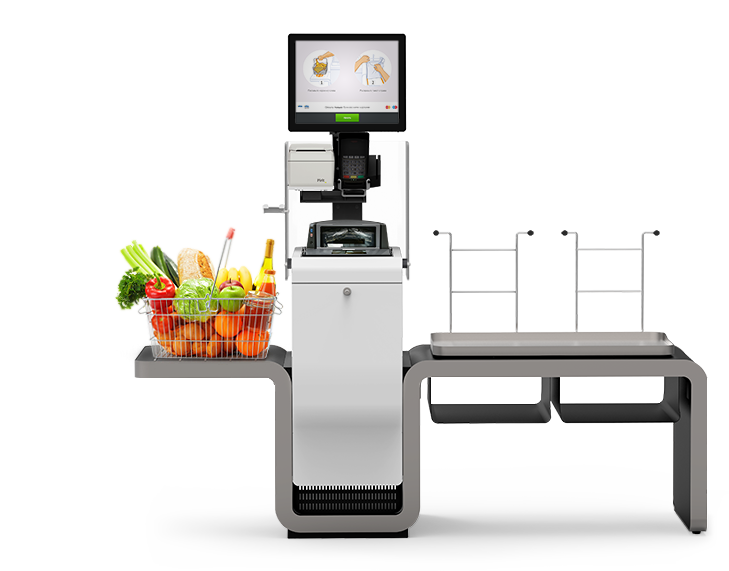
Firstly, because this is a system that has a specific task - to enable the buyer to make a purchase, but the purchase mechanic itself is very unusual - you need to scan the goods and put them on the weighing platform for verification (otherwise the goods will not be added to the check), and This must be conveyed to the buyer. Cashier should be as clear as possible for beginners and not annoy experienced buyers. A shift to one of the extremes will significantly reduce recurrence and the situation will turn out, which we have seen many times in some Moscow and Baltic stores: customers will queue for regular cash registers, and self-service cash registers will stand idle.
Secondly, because the scope for research is enormous. When designing websites or mobile applications, you can collect a sequence of clicks or clicks on the screen, but watching users in the field is an almost inaccessible luxury. Everything is simple here: you just need to find a store where self-checkout counters already stand and spend a few hours with a notebook and pen. The difficulty arising from this is that in Russia, until recently, they were rather wary of such innovations and, for example, we had no such stores in St. Petersburg until November 2013. Therefore, the objects of research in the past year were shops in Moscow, the UK and the Baltic countries.
Thirdly, the interfaces of self-checkout cash registers with which I happened to meet are far from ideal. As a rule, this is a noisy photo-realistic 3D video, a machine female voice for audio prompts, a huge number of elements on the screen, gradients in the style of the late 90s. Often the prompts do not differ for right- and left-oriented cash registers, as a result, the screen shows that the product must be placed on the right, but in reality it must be placed on the left.
It would seem that in such a situation, the mediocre by the standards of the specialists interface will surpass the existing interfaces several times. But as the real world shows, how much rake you do not get around - they still overtake you. But first things first.
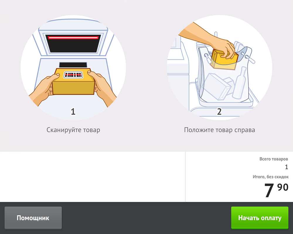
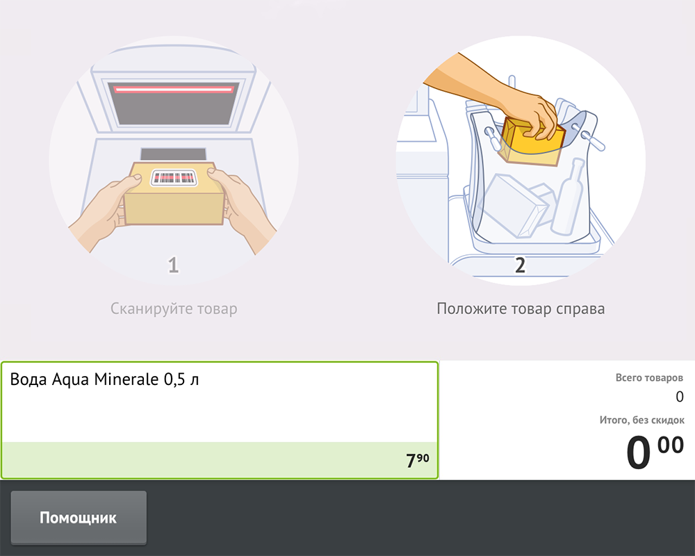
The scanning process in our interface: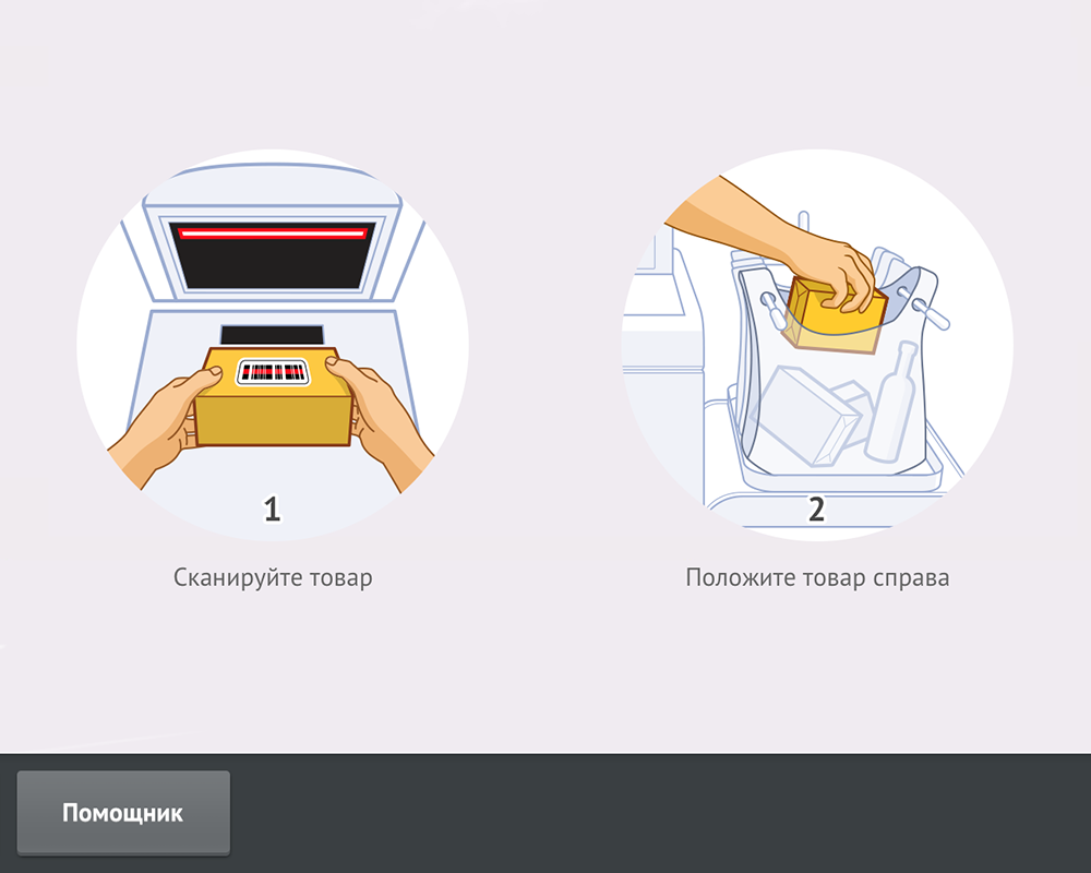

We started the development of self-checkout in mid-2013. Despite having been released a month before the start of the development of our iOS7 self-service cash register, we decided not to chase trends and not to make the cash register interface very flat. This is due to the fact that it must pass in time before a simple rectangle without light gradients and rounding will be perceived by most users as a button. Self-checkout is a system for a wide audience, so the good old (but still not very old) is better here.
In addition, we:
- Abandoned video
The hypnotic effect of the looped video makes beginners “sticky” even on a simple task, while experienced users constantly spinning the video on the screen are not needed at all. There are two options: either banner blindness will develop for an experienced buyer, then he will not care, or the irritation from such a hint will only grow. - Refused sound
An island of self-service in a supermarket, for example, in London is similar to the Oriental bazaar - ticket offices from different angles shout out the same phrases. As a result, the effect described in the experiments of the American psychologist Anne Trisman arises - giving the same information to different channels with a delay causes attention to jump between these channels. We also wanted that customers could easily make a purchase and they would not be distracted by anything. - Removed a virtual check
At other self-service cash registers, a third of the screen space is occupied by the list of goods added by the buyer.
At the same time, customers can follow a cashier at a regular checkout through a tiny crack - the customer’s display. Often this is a small monochrome screen with two lines on which the last product is shown, its price and total amount. And in general, this is usually enough for buyers. So why not leave the same idea for self-scanning, giving the main area to context-sensitive tips? - Dual scan
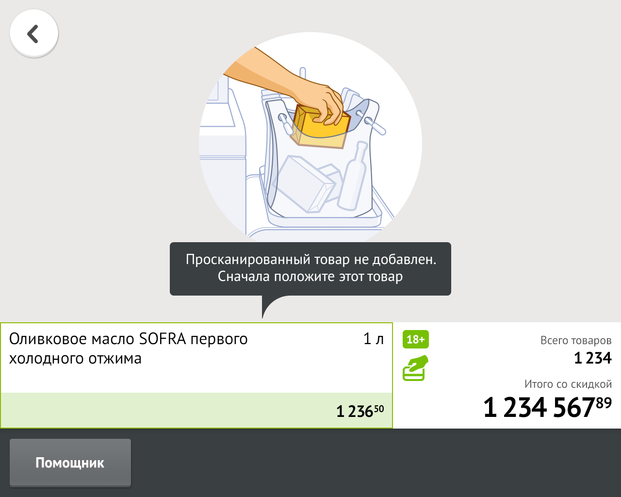
Due to the peculiarities of the weight control of goods at the self-checkout, it will be better if the buyer scans and puts the goods on the weighing platform one by one. What if the buyer, having scanned one product, tries to scan another one? In other cash registers, this situation has been resolved as follows: when trying to scan a second product, the scanner is simply silent. More than once I have seen how this lack of feedback made buyers turn the goods over the scanner for tens of seconds, waiting for the cherished peak.
What we did: in the case of rescanning, the scanner in our checkout issues a negative signal in the form of four short peaks. At the same time, the scan hint on the screen becomes translucent in order to draw attention to the “Put the goods into the package” prompt.
Which of these steps led us to the biggest problems after the launch? I am sure many of you are now thinking about abandoning the sound or check. No, the main problems are not there. And not at all in the absence of video. The most unfortunate of these solutions was the current double-scan solution.
What is his problem?
After 2-3 scans, it becomes clear to customers that the self-service checkout works, the next scans are much faster. But if in the case of large or medium-sized goods they internally agree to put the goods after each scan, then in the case of small (for example, yogurt or spices), many after scanning, for example, one sachet of pepper, try to scan another one. The negative sound in this case really makes buyers look up at the monitor. But they don’t get a clear answer to their question, they don’t understand what they did wrong and what they need to do to get back to scanning again.
In addition, it is in this case that the lack of a check plays a negative role - the opacity of the process pushes some buyers to ask the assistants to show their check and make sure that the second product was not added to the check. It is very important that the problem is not in the absence of a check - in the case when there are no errors, people are really interested in the maximum by the intermediate result, which is on the screen. The problem is precisely in handling this error.
I didn’t want to return to the solution with a complete lack of reaction from the scanner. It has enough disadvantages, and the fact that it annoys buyers a little less does not mean that it should be used immediately.
To solve the problem, we used a combination of our solution with a negative sound and a solution of competitors with a complete lack of response. If, after scanning the goods, the buyer tries to scan another product, then for 3 seconds the cashier does not issue any reaction. Thus, any goods randomly carried through the scanner will not be met with hysteria from the cash register. Moreover, if the buyer is persistently trying to scan the second product, then the ticket office will still produce a negative sound, but the screen will clearly show what to do in this case.
We caught another problem at the stage of usability testing.
For stores that have discount cards, after scanning all the goods, the cash desk offers the buyer to hold his card.
In the original version was done like this:
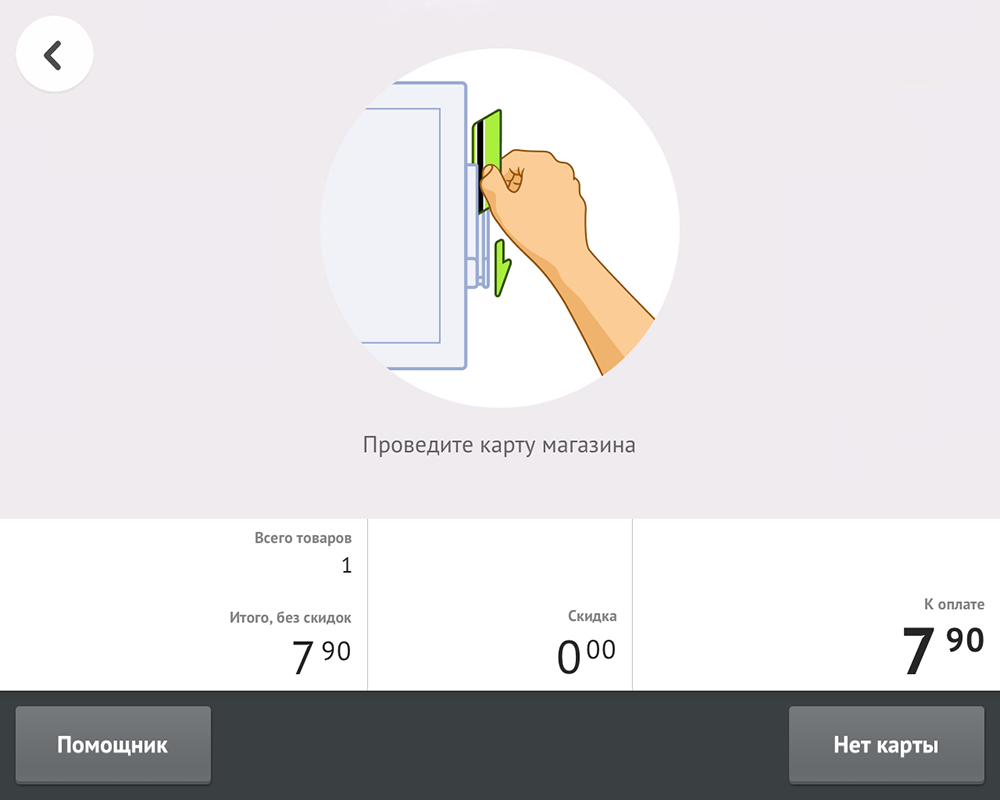
It seemed to us that it was schematically clear that the reader is depicted to the right of the monitor. But each new member tried again and again to carry out exactly the discount card through the bank terminal. Moreover, the eytracking study showed that people were keeping their eyes on the illustration for a couple of seconds, but still could not understand the meaning of the prompt.
Naturally, the tip had to be redone, at the same time showing the buyer exactly where to draw the card.

I will give a couple of examples of the problems we are working with.
Here is the package selection screen:
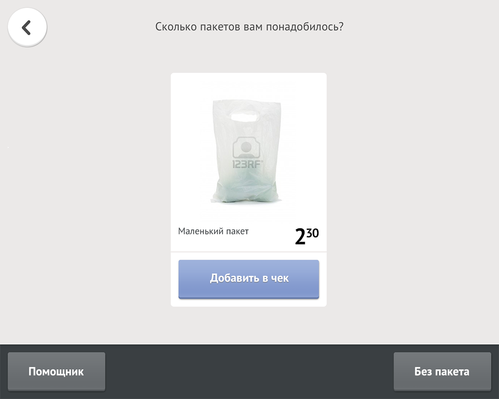
Here, the buyer either indicates how much he took the package, or says that he did not have the package. The packages are already hanging on the holder on the weighing platform, at the end of the purchase he will only need to remove the necessary quantity. There are no problems with honesty, the interface problem of this screen is that on the previous screen the “Continue” button is exactly in the same place as the “Without package” button. So for some users, clicking on the “Without Package” button is more of a reflex character. The percentage of such people is small, but this is a loss for the stores, so this screen is already on the redesign, whose task is to make the choice of packages less reflex and more meaningful.
We also have some doubts about the sounds. At the time of purchase, the buyer practically does not look at the screen, therefore, perhaps in some cases, audio prompts would be useful - they will reduce the time to solve problem situations. On the one hand, this will free up the direct script from sounds, and on the other, it will help the buyer in case of any difficulty. But there is a problem in that the cashier will speak only in case of problems - the surrounding buyers will hear that their neighbor has difficulties. Is this important? Most likely you need to try, it is unlikely that something here can be solved speculatively.
It is important to note that the design of the interface is a long way, which does not end with the launch of the product on the market; rather, it only begins with the launch. And the most important thing in this way is to be able to find, prioritize and correct errors. We keep abreast of our efforts and try to make the most convenient solutions for our users, each mistake we find is an opportunity to make our programs even better.
Source: https://habr.com/ru/post/236811/
All Articles