"If it has already managed" or "what should be a Pop-up"
Pop-up, pop-ups, is one of the most controversial elements of online advertising. To put it mildly, the user does not like it when the desired content is unexpectedly closed by an offer to subscribe to the newsletter or buy a bucket. But anyway, the foreign Internet is gradually returning to the active use of this method of presenting advertising information, and taking into account the trends, the Internet will soon become domestic.
Now there are two reasons for the creator of the site to use Pop-ups in their projects:
- It says so in the TK;
- No matter how users treat them, they work. Especially when it comes to subscription, registration and other things that do not require immediate purchase. According to econsultancy.com, a site that uses “superimposed blocks” is 4 times more effective in terms of conversion (but this does not mean that adding these blocks guarantees you a default profit).
')
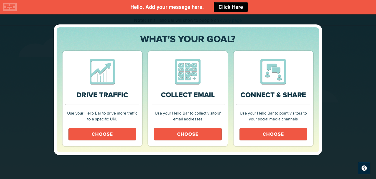
Today there are two main types of pop-ups: Page-Stop and Hello-Board. The first option is a window that temporarily limits the functionality of the site and requires the user to perform specific actions or close the window. Hello-Board is a less aggressive option that has a horizontal or vertical orientation, and closes a small part of the screen, somewhat reducing the functionality. Attention of the user is attracted due to the visual effect of movement.
Pros of page-stop
- Wide functionality and scope for creativity, the ability to use any tools and techniques;
- Guaranteed to attract the attention of the visitor, a strong effect;
- More opportunities to personalize content.
Cons Page-Stop
- Makes the site useless and causes the visitor to interact with something, against his will, which is fraught with the appearance of negative emotions.
A bit of Hello Bar
Humanized version of pop-ups. Received the name of the resource that provides free services to create and connect these elements on the site. Perhaps this is the best option in terms of negative user experience / efficiency ratio.
Cons Hello Bar
- It still takes up some of the space and impairs user interaction with the content;
- Less efficient and less functional than Page-Stop due to its size and location.
Some basic tips
1. Do not be familiar
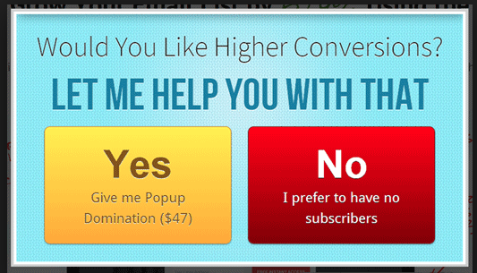
Do not be rude to your user, do not consider him an idiot, and especially do not try to guess the motivation of his behavior. The inscription "no, I prefer not to have subscribers" on your pop-up will turn into "I prefer not to have business with you" in the head of a visitor.
2. Do not overdo it
400%, of course, a tempting figure, but you are guaranteed not to get them right away. Do not try to compensate for the quality quantity. Look for the best options, test, experiment.
And, of course, you should not place windows on each page.
3. In the wrong place at the wrong time.
If your window pops up immediately after the site loads, you will most likely lose the user. If it closes the entire screen and it is difficult to close, you are guaranteed to lose a potential client.
Analyze the user's time on your page and set up the pop-up appearance so that it occurs shortly before the inevitable closing of the page. You can also record the movement of the cursor from the block with content to the blocks that can be caught in the path of the cursor to the close button of the tab.
4. Do not forget about personalization.
Another fashion trend in modern e-commerce is personalization. It is considered that the visitor is inclined to buy goods and services where they are sold to him, and not to the faceless username.
Your pop-ups must comply with this assumption, if possible. If we are talking about an online store, give the user time so that he can designate his range of interests and offer something that may be interesting to him.
5. Do not hide the cross
The more difficult it is to close a pop-up, the greater the chance that the visitor will have a negative anchor associated with your site, and, accordingly, the less chance that he will perform the desired action.
6. Do not disturb the user ... as far as possible.
People do not like surprises, especially when it comes to something that prevents to achieve the desired result. Abruptly stopping reading an interesting article or contemplating a thing that interests you because of the offer to subscribe to the weekly newsletter is not the best way to start productive cooperation.
An excellent example of the implementation of this rule.
The window does not jump out of the wild deer in the middle of the screen, but smoothly, almost unobtrusively appears at the bottom of the screen, causing the site functionality minimal losses.
7. Be specific
Pop-up is different from other methods in that you have very little time to interest the user. Use precise, specific language to help the visitor understand and evaluate your offer.
8. Be concise
This concerns not only text, but also design. Use simple shapes, clean, pleasant colors and familiar functional elements. Break the window into intuitive zones that allow you to quickly understand the structures of your proposal.
9. Weigh the risks and think carefully. Use pop-ups only when you have no other options.
Now there are two reasons for the creator of the site to use Pop-ups in their projects:
- It says so in the TK;
- No matter how users treat them, they work. Especially when it comes to subscription, registration and other things that do not require immediate purchase. According to econsultancy.com, a site that uses “superimposed blocks” is 4 times more effective in terms of conversion (but this does not mean that adding these blocks guarantees you a default profit).
')
Today there are two main types of pop-ups: Page-Stop and Hello-Board. The first option is a window that temporarily limits the functionality of the site and requires the user to perform specific actions or close the window. Hello-Board is a less aggressive option that has a horizontal or vertical orientation, and closes a small part of the screen, somewhat reducing the functionality. Attention of the user is attracted due to the visual effect of movement.
Pros of page-stop
- Wide functionality and scope for creativity, the ability to use any tools and techniques;
- Guaranteed to attract the attention of the visitor, a strong effect;
- More opportunities to personalize content.
Cons Page-Stop
- Makes the site useless and causes the visitor to interact with something, against his will, which is fraught with the appearance of negative emotions.
A bit of Hello Bar
Humanized version of pop-ups. Received the name of the resource that provides free services to create and connect these elements on the site. Perhaps this is the best option in terms of negative user experience / efficiency ratio.
Cons Hello Bar
- It still takes up some of the space and impairs user interaction with the content;
- Less efficient and less functional than Page-Stop due to its size and location.
Some basic tips
1. Do not be familiar
Do not be rude to your user, do not consider him an idiot, and especially do not try to guess the motivation of his behavior. The inscription "no, I prefer not to have subscribers" on your pop-up will turn into "I prefer not to have business with you" in the head of a visitor.
2. Do not overdo it
400%, of course, a tempting figure, but you are guaranteed not to get them right away. Do not try to compensate for the quality quantity. Look for the best options, test, experiment.
And, of course, you should not place windows on each page.
3. In the wrong place at the wrong time.
If your window pops up immediately after the site loads, you will most likely lose the user. If it closes the entire screen and it is difficult to close, you are guaranteed to lose a potential client.
Analyze the user's time on your page and set up the pop-up appearance so that it occurs shortly before the inevitable closing of the page. You can also record the movement of the cursor from the block with content to the blocks that can be caught in the path of the cursor to the close button of the tab.
4. Do not forget about personalization.
Another fashion trend in modern e-commerce is personalization. It is considered that the visitor is inclined to buy goods and services where they are sold to him, and not to the faceless username.
Your pop-ups must comply with this assumption, if possible. If we are talking about an online store, give the user time so that he can designate his range of interests and offer something that may be interesting to him.
5. Do not hide the cross
The more difficult it is to close a pop-up, the greater the chance that the visitor will have a negative anchor associated with your site, and, accordingly, the less chance that he will perform the desired action.
6. Do not disturb the user ... as far as possible.
People do not like surprises, especially when it comes to something that prevents to achieve the desired result. Abruptly stopping reading an interesting article or contemplating a thing that interests you because of the offer to subscribe to the weekly newsletter is not the best way to start productive cooperation.
An excellent example of the implementation of this rule.
The window does not jump out of the wild deer in the middle of the screen, but smoothly, almost unobtrusively appears at the bottom of the screen, causing the site functionality minimal losses.
7. Be specific
Pop-up is different from other methods in that you have very little time to interest the user. Use precise, specific language to help the visitor understand and evaluate your offer.
8. Be concise
This concerns not only text, but also design. Use simple shapes, clean, pleasant colors and familiar functional elements. Break the window into intuitive zones that allow you to quickly understand the structures of your proposal.
9. Weigh the risks and think carefully. Use pop-ups only when you have no other options.
Source: https://habr.com/ru/post/236733/
All Articles