Conversion optimization: where is the best place to place a call to action? [case]
 A call to action on the landing page is one of the stages of the sales funnel, often very important for increasing conversion into paying customers. When placing a call-to-action button on a landing page, many site owners follow the same stereotypes and patterns and are afraid to experiment. Moreover, when placing a call-to-action button on a large number of sites, they seemed to have forgotten to use elementary logic, the employees of these companies clearly do not try to track the movements of the site visitor and send it, and do not test different CTA options. In this article, Olya Gardner, written in the first person, examines numerous variations of the placement of the call-to-action button, the author analyzes which of them are most effective and which are erroneous, and makes several conclusions-recommendations for placing CTA on the landing page. Where should this damned call to action be located?
One day I was sitting in a coffee shop (well, okay, in a bar), and the last kiss was played by the Pearl Jam song. Being obsessed with metaphors, I began to change the words of the first stanza to marketing terms, using CTA (call to action) instead of the word “child”. Call it madness or inspiration - whatever you like, but in the end I created this post, which will talk about where to place the call to action on your landing page and why.
')
First, let's read together the beginning of the song so that I can get stuck in your head for a while, as do songs like “I think we're alone now” by Tiffany, which you hum for a few more days after you hear it.
Original version (in translation):
Oh where are you, my child?
The Lord took you ...
She went to heaven, left me,
Hope to meet you
When I leave this world and me.
My version:
Oh where are you, my CTA?
The site is hidden from me,
I'll look at the landing page, because it's not bad,
Oh help me find the CTA, my God!
I should seriously think about building a career in music marketing, right? Not? Well, okay.
In this post I will analyze the following ideas for placing a call to action on the landing page:
- At the top of the page (before the fold, the “broken” line of the page).
- At the very bottom of the page.
- Under the fold, but using the guide tips.
- CTA placement cases.
- Button layout among many other CTA.
A place on the landing page where you place a call to action can have a big impact on the conversion, which I will discuss later, citing specific cases as an example.
I already hear the screams "In the upper part, in the upper part, above the fold!" - Boredom
The Internet has evolved, user behavior has also changed - according to this, marketing must evolve. Now, not only what is usually called a fold — the “breakthrough” line of a page means more than before — but the manner of reading stories on your website has changed (if you know how to tell stories on a web page) .
History lesson : since the creation of MySpace, Facebook and other long sites, as well as the invention of the scroll wheel on the mouse, everyone is used to scrolling the page, it has become a habit.
In addition to this, to place a call to action right before the eyes of the site visitor before they even got into your product message, this is about the same thing as going straight to second base, bypassing the first one.
This is not to say that placing CTA at the top of the page, above the “fracture line” is a mistake, in most cases it is a good idea. However, do not be afraid to experiment with your selling history and use different ways to convey the value of the product to the user.
Consider the heat map below, according to which, if you place less content at the top of the site, users are more likely to scroll to the end of the page.

Simple design of the top of the page to the fold line encourages users to scroll down.
Now that I’ve set the stage for a call to action conversation, let's look at the promised five tactics. I hope they inspire you to test your next CTA.
1. Placing CTA at the top of the landing page
I can't help talking about placing a call to action at the top of the page, because this is still the most popular choice of location. As I mentioned above, this method of placement expects from the site visitor everything at once.
What I would like to suggest is what I call a 5-stage strike, and it works as follows:

1. A catchy and informative headline: one that makes you stop when you catch a glimpse of it in the newspaper machine on the street.
2. A subtitle to complement it: it is necessary so that you can make your headline short and effective, while providing additional information that would make your headline completely nonsense if you tried to fit all the data in it.
3. A brief indication of the main advantages: it describes the key advantages of your product or service.
4. Limited offers: it motivates users to click. Examples include the time limit or the number of products available on offer (Expedia, for example, says that only two places are left for the required flight). A special offer, for example, a discount, also prompts you to click on the call to action button.

5. A call to action that accurately describes what the user will end up with: it must be closely related to the title so that the goal of your page is even clearer and clearer.
Using these five steps, you can create a miniature user interaction above the fold, which can improve your conversion potential at the top of the page.
2. CTA below fold on selling page - AIDA
Let's remember the old school for a second. Do you remember the marketing concept called AIDA?
The abbreviation stands for Attention, Interest (Interest), Desire (Desire), Action (Action) and is based on the idea that the visitor goes through a certain sequence of simple steps towards the decision to take an action. The template below illustrates this process, and this is a good example of placing a CTA at the bottom of the page, when the user has already followed the development of your selling story from beginning to end.

Let's look at this pattern to illustrate how the AIDA principles work:
- ATTENTION (attention): you attract the attention of visitors with a relevant and catchy title.
- INTEREST (interest): with the help of the video you are interested visitors.
- DESIRE (desire): the desire is formed through the use of features and benefits that appeal to the needs of visitors.
- ACTION (action): and finally, a powerful call to action completes the story at a point where the visitor is already convinced that your decision is completely
- will satisfy his needs. In this case, the contrast and color work, as well as a clear definition of what he gets when he clicks the button.
If you can turn the text of your page into a story, then the AIDA technique can be a very effective way for you to create a landing page.
3. CTA under fold using guide hints.
Sometimes you can't do anything other than place a CTA under a fold, and the best example of this is a long contact collection form, where the call-to-action button is located at the bottom. To encourage visitors to scroll down the page, use the guides to influence their subconscious.
The correct place to place them is the heading of the form itself, pointing down to the form (filling in which is a conversion action). You need to direct the visitor's gaze down so that he knows: even more information is on the page below.
Here is a good example:

Another good example is the sidigital animated webpage , where they make us glance down the page lower and lower in a very interesting way.

The fluid slides through the tubes when you scroll the page. It seems to me that users really hang on this page for a long time.
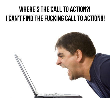
4. Placing too much CTA on the landing page
Good luck to those who are trying to understand exactly what actions are expected from the client.

This is a metaphorical example of too many calls to action on the notorious landing page. Trying to figure out what you should do on this page is the same as looking for a needle in a pile of other needles!
5. Case for CTA placement on the landing page
In this A / B testing, we experimented with Unbounce landing pages with traffic attracted through contextual advertising using the Pay Per Click (AdWords) model. Note that the calls to action are located under the fold at the bottom of the page. To soften this, we used the background navigation CTA at the top of the page, saying “choose your tariff below”, and also used the smooth scrolling effect to move down the page to the tariff plans. The smooth scrolling effect allows the visitor to see how much content is on the page while he scrolls it. Also immediately noting that the tariff plan will be located "below", the visitor understands that at the bottom of the page is important information that you need to read before leaving the site.

The hypothesis proposed by our marketing director, Gia, was that by moving the CTA above the price grid, we would see a sharp increase in the number of clicks on the active link. To test the hypothesis, CTA was placed at the top of the bottom half of the page (after smooth scrolling using the button located at the top of the page). Earlier, after scrolling down, there was a chance that the call to action was still invisible.
Results: In option B (page after optimization) conversion increased by 41% compared with the original version.
Summing up
I hope that you have learned from this post something useful about placing a call to action. To summarize, here are some tips on what to and should not do.
What to do:
- Conduct A / B testing to determine the best place to place a CTA.
- Use multiple calls to action on a long page to split it into several mini sections.
- Use guide hints (visual or text) if the CTA is located under the fold, in the bottom half of the page.
- Create a competent marketing story to guide the user to your call to action, wherever he is.
- With the help of well-designed design make CTA catchy (contrast, empty space around).
What not to do:
- Do not be afraid to place the CTA under the fold in the bottom half of the page.
- It is not necessary to place the CTA in the area already filled with various buttons.
- It is better not to use several calls to action, except when they serve the same purpose.
Source: https://habr.com/ru/post/236513/
All Articles