A selection of entertaining CSS recipes "Naked Fridays # 2"
Hi, Habr! This time we will talk about styling of input points without images and JS, features of vertical indents, CSS counters, immense possibilities in class naming, and also tell you how to improve the animation on weak devices.
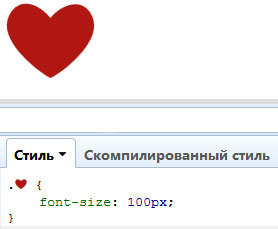
By tradition, let's start with the heading "dusty shelves." On Habré already written , and more than once , how to stylize input without JavaScript. But we will go a little further, and also give up the pictures:
')
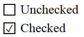
As you can see, the whole salt in the pseudo-elements and pseudo-selector: checked (IE9 +). In the code above, we hide the original input, instead we display a stylized pseudo-element, and when we click, we display the Unicode symbol in the content property.
Please note that the form for writing a Unicode character in CSS is different from that in HTML. Here, the slash indicates the number of the character, while the HTML code will look like this: & # 10003 ;.
Let's go even further and ANIMATE our checkbox:
or radiobutton:
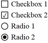
Inputs of this kind on the Internet are still not enough, so go for it!
A complete list of Unicode characters can be found here . Play with the code - here
Unbelievable, but it is a fact. The vertical indents in percent are recalculated based on the width, not the height of the parent element.
Let's create 2 blocks:
In theory, the child must fill the parent height. But what do we see?

Since percentages are calculated from the width of the parent, the height is not enough. This nuance must be borne in mind.
Few know that since the time of IE8, CSS alone can be used to count elements.
In the counter-reset property, we specify an arbitrary identifier (or several), as well as the initial value (default = 0).
In the property counter-increment after the reference to the identifier, you can also specify a number. It will determine the increment value of the counter (for example, " counter-increment: i 2 " will only output even numbers).
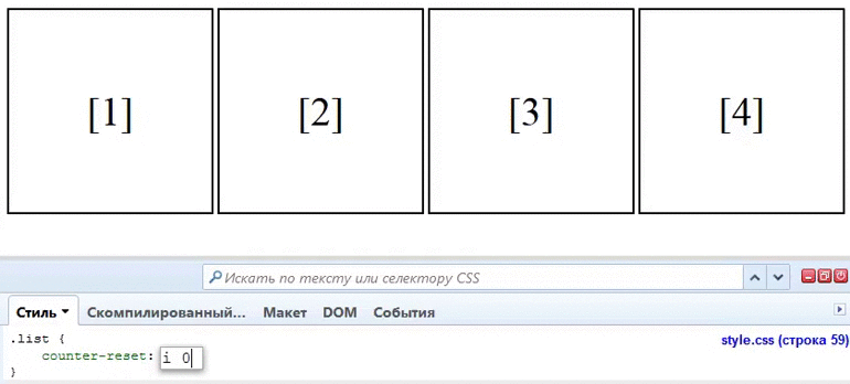
Do you think this can only be used for ordered lists? And no! The counter works with all elements.
Sometimes the animation of some elements slows down on weak machines and mobile devices. A fairly popular method to fix this is to enable hardware acceleration when displaying the desired item:
In statics, you will not notice any difference, however, the browser understands that the element should be treated as three-dimensional, which includes acceleration. As long as there is no normal support specifically for this intended will-change property, this method is fine.
Progress does not stand still, and now you can name the classes as you please:
Now boring classes like " arrow " can be replaced by " ➔ "! Down with the boring letters!
If you still have to support IE7 and write hateful hacks for it through the boring " * " symbol, there is great news for you! Now, hacks can be designated a cheerful smiley!
Isn't it such a record much more pleasant to the eye? There is some kind of symbolism in it. After the smiley, you can even put a space, and this will not affect the subsequent properties!
That's all for today. We hope this selection was successful. See you soon.
Styling checkbox and radiobutton
By tradition, let's start with the heading "dusty shelves." On Habré already written , and more than once , how to stylize input without JavaScript. But we will go a little further, and also give up the pictures:
<input type="checkbox" id="check" name="check" /> <label for="check">Checkbox</label> input[type=checkbox] {display: none;} input[type=checkbox] + label:before { content: ""; border: 1px solid #000; font-size: 11px; line-height: 10px; margin: 0 5px 0 0; height: 10px; width: 10px; text-align: center; vertical-align: middle; } input[type=checkbox]:checked + label:before { content: "\2713"; } ')
As you can see, the whole salt in the pseudo-elements and pseudo-selector: checked (IE9 +). In the code above, we hide the original input, instead we display a stylized pseudo-element, and when we click, we display the Unicode symbol in the content property.
Please note that the form for writing a Unicode character in CSS is different from that in HTML. Here, the slash indicates the number of the character, while the HTML code will look like this: & # 10003 ;.
Let's go even further and ANIMATE our checkbox:
input[type=checkbox] + label:before { content: "\2713"; color: transparent; transition: color ease .3s; } input[type=checkbox]:checked + label:before { color: #000; } or radiobutton:
input[type=radio] + label:before { content: "\26AB"; border: 1px solid #000; border-radius: 50%; font-size: 0; transition: font-size ease .3s; } input[type=radio]:checked + label:before { font-size: 10px; } Inputs of this kind on the Internet are still not enough, so go for it!
A complete list of Unicode characters can be found here . Play with the code - here
The vertical indents of the element, given in percent
Unbelievable, but it is a fact. The vertical indents in percent are recalculated based on the width, not the height of the parent element.
Let's create 2 blocks:
<div class="parent"> <div class="child"></div> </div> .parent { height: 400px; width: 200px; } .child { height: 50%; padding-top: 25%; padding-bottom: 25%; width: 100%; } In theory, the child must fill the parent height. But what do we see?
Since percentages are calculated from the width of the parent, the height is not enough. This nuance must be borne in mind.
Pure CSS counters
Few know that since the time of IE8, CSS alone can be used to count elements.
<ol class="list"> <li>a</li> <li>b</li> <li>c</li> </ol> .list { counter-reset: i; // } .list > li { counter-increment: i; // } .list li:after { content: "[" counter(i) "]"; // } In the counter-reset property, we specify an arbitrary identifier (or several), as well as the initial value (default = 0).
In the property counter-increment after the reference to the identifier, you can also specify a number. It will determine the increment value of the counter (for example, " counter-increment: i 2 " will only output even numbers).
Do you think this can only be used for ordered lists? And no! The counter works with all elements.
Enable hardware acceleration
Sometimes the animation of some elements slows down on weak machines and mobile devices. A fairly popular method to fix this is to enable hardware acceleration when displaying the desired item:
.block { transform: translatez(0); } In statics, you will not notice any difference, however, the browser understands that the element should be treated as three-dimensional, which includes acceleration. As long as there is no normal support specifically for this intended will-change property, this method is fine.
Unicode Classes
Progress does not stand still, and now you can name the classes as you please:
. { ... } . { ... } .☭ { ... } .★ { ... } . { ... } Now boring classes like " arrow " can be replaced by " ➔ "! Down with the boring letters!
And in fact
Of course, it was a joke. In serious projects, it is better to call classes in the old manner, because utf-8 may not be included everywhere.
Bonus for retrogrades
If you still have to support IE7 and write hateful hacks for it through the boring " * " symbol, there is great news for you! Now, hacks can be designated a cheerful smiley!
body { :) background: pink; } Isn't it such a record much more pleasant to the eye? There is some kind of symbolism in it. After the smiley, you can even put a space, and this will not affect the subsequent properties!
That's all for today. We hope this selection was successful. See you soon.
Source: https://habr.com/ru/post/235889/
All Articles