WebMoney updated interfaces
Either I am sloping, or the other day WebMoney very quietly completely redid its site and a number of applications (Keeper mini), leading everything to the now fashionable Flat design.
It is not a secret for anyone that electronic money once popular in Russia has slipped into impossible bureaucracy and paranoia to such an extent that it has become impossible to use them, even with a liter. Infinite sheets of texts that turn the arrows on each other, idiotic authorization systems, paranoia ... - who used that will understand. It seemed that the point of no return had already been passed, that all this hell could not figure out even the company itself, but no.
')
The new interface is personally interesting to me not from the point of view of design and icons, but from the convenience of using the service - it has grown by an order. The developers managed, without changing the procedures and algorithms, to simplify the lives of users.
I must say, I am not a fan of webmoney, although I have to use them for work. But on the work done in the VM you can learn.
I suggest to quickly run through the highlights of the new interface.
I have not saved the screenshots of the old version of the site, so the information is more likely for those "who are in the subject." The rest of the vrkatse can say that using the site was a real pain: you read the text without formatting on 2 pages, with incomprehensible terms and a bunch of links that lead to the same pages, and then return you to the original page and you start all over again and such You can walk in circles endlessly until you suddenly get lucky and you accidentally get to the necessary page, where it will be written in two lines, like, for example, withdraw money.
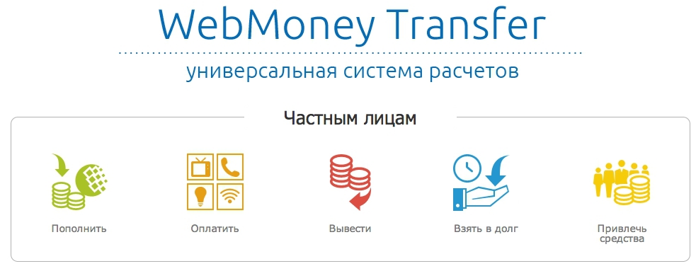
So, for example, a page with information about the replenishment of the wallet began to look like:

All in one tablet. And the ways and percentages. Yes, it is not imposed on Taft, but already progress. Maybe I am mistaken, but before this was not in the system.
Previously, VM had a hefty incomprehensible Vicky. Now they all combed. It seems that they have reworked almost every text, deleted all unnecessary pages, glued similar links, formatted text and so on. Now, how to get a certificate is written on one page: www.webmoney.ru/rus/help/start/poluchenie_attestata.shtml (by the way, the URLs have become more understandable too):

The number of software product versions was reduced to 3x. I remember how my friends could not throw away the old laptop, because the webmoney were tied to it, and it was very difficult to figure out how to untie them and reattach them, it was easier to keep a separate laptop.

Yes, even call now where it became clear .

And earlier I could find a page with limits only through a search engine.

Interfaces also changed a bit. Money can be sent quickly and easily:

The top menu, however, made again incomprehensible, but you can quickly click it and find the page you need:

As I said, the procedures have not changed. How were different "zones of the site" remained. It is not clear why I have to enter passwords 100 times and confirm it with sms:

Of course, this is not licked Yandex Money with Chyomin design and usability, but progress, no, progress on the face. The guys shoveled megabytes of texts, remade the entire data structure from scratch. It deserves respect.
Will the VM have more users from these changes? Well, at least, old users will be able to figure out how to recover their passwords and access and withdraw their money. For new users, I think, the system is still quite heavy.
What do you think, does VM have a future? Vaughn,stir change.
It is not a secret for anyone that electronic money once popular in Russia has slipped into impossible bureaucracy and paranoia to such an extent that it has become impossible to use them, even with a liter. Infinite sheets of texts that turn the arrows on each other, idiotic authorization systems, paranoia ... - who used that will understand. It seemed that the point of no return had already been passed, that all this hell could not figure out even the company itself, but no.
')
The new interface is personally interesting to me not from the point of view of design and icons, but from the convenience of using the service - it has grown by an order. The developers managed, without changing the procedures and algorithms, to simplify the lives of users.
I must say, I am not a fan of webmoney, although I have to use them for work. But on the work done in the VM you can learn.
I suggest to quickly run through the highlights of the new interface.
I have not saved the screenshots of the old version of the site, so the information is more likely for those "who are in the subject." The rest of the vrkatse can say that using the site was a real pain: you read the text without formatting on 2 pages, with incomprehensible terms and a bunch of links that lead to the same pages, and then return you to the original page and you start all over again and such You can walk in circles endlessly until you suddenly get lucky and you accidentally get to the necessary page, where it will be written in two lines, like, for example, withdraw money.
So, for example, a page with information about the replenishment of the wallet began to look like:
All in one tablet. And the ways and percentages. Yes, it is not imposed on Taft, but already progress. Maybe I am mistaken, but before this was not in the system.
Previously, VM had a hefty incomprehensible Vicky. Now they all combed. It seems that they have reworked almost every text, deleted all unnecessary pages, glued similar links, formatted text and so on. Now, how to get a certificate is written on one page: www.webmoney.ru/rus/help/start/poluchenie_attestata.shtml (by the way, the URLs have become more understandable too):
The number of software product versions was reduced to 3x. I remember how my friends could not throw away the old laptop, because the webmoney were tied to it, and it was very difficult to figure out how to untie them and reattach them, it was easier to keep a separate laptop.
Yes, even call now where it became clear .
And earlier I could find a page with limits only through a search engine.
Interfaces also changed a bit. Money can be sent quickly and easily:
The top menu, however, made again incomprehensible, but you can quickly click it and find the page you need:
As I said, the procedures have not changed. How were different "zones of the site" remained. It is not clear why I have to enter passwords 100 times and confirm it with sms:
Of course, this is not licked Yandex Money with Chyomin design and usability, but progress, no, progress on the face. The guys shoveled megabytes of texts, remade the entire data structure from scratch. It deserves respect.
Will the VM have more users from these changes? Well, at least, old users will be able to figure out how to recover their passwords and access and withdraw their money. For new users, I think, the system is still quite heavy.
What do you think, does VM have a future? Vaughn,
Source: https://habr.com/ru/post/235875/
All Articles