Study: how users actually work with touch screens
I have been researching how users have been interacting with touch screens for many years, and I can say that understanding of the topic in the professional community is just beginning to develop. Touch devices are still a fairly new phenomenon, patterns of interaction with similar devices are still being developed.
Over a year ago, I published a study on how people actually hold and touch their mobile phones. The next logical step is to understand the motivations of users and identify the connections between different actions, context and actions of people.
Together with colleagues from the company ZIPPGUN, I developed a mobile application that allows you to simulate various scenarios of mobile phone use. With this application, tests were conducted with the help of 31 participants (about two thirds of them used smartphones, and the rest worked with tablets).
')
All interactions were recorded on video - this was necessary in order to restore later how the person held the device, how he touched the screen, etc. The direction and “length” of the scrolling gestures, the point on the screen where the user pressed with a finger, and the accuracy of selecting various menu items were recorded. Recording was carried out with the help of special video glasses.

The number of participants in the experiment was not very large, but even with so many people, the study was very difficult. Only recording 31 sessions took almost 100 hours of video.
At the first stage of the research, it was decided to focus on identifying links between how people hold the phone and touch the screen and various contexts. When tests were conducted, everything looked rather ordinary - for example, many people held the phone with one hand. But when it came to real data analysis, the results were unexpected. As you can see in the picture below, there are practically no scenarios for using a “one-handed” smartphone:
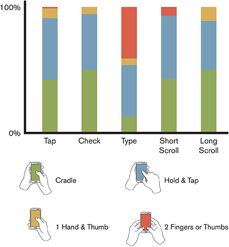
People can hold the phone with one hand and scroll through the pages with the thumb of the same hand, but as soon as it becomes necessary to perform more serious tasks, they immediately go on to hold the device with one hand, and use the second one to work with the menu - most of the tasks are solved exactly like this in a way. In a little less than 41% of cases, users typed on a virtual keyboard, using the thumbs of both hands - some test subjects always work with a smartphone this way. Tablet users were excluded from the results of this experiment, as these devices are used in other situations.
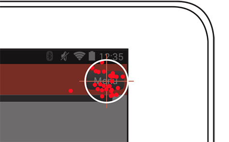
Various studies have shown that users can most accurately interact with elements located in the center of the screen of a mobile phone or tablet. It is the center that best attracts the attention of people, the edges and corners of the screen interest them much less. Neither environmental conditions nor previous experience with touch-screens do not affect this. People involuntarily seek to "tap" into the center of the screen. In the course of the current research, the collected data also substantiated this thesis for 7, 8, and 10-inch tablets.
This is how the visualization of people's attempts to get into the menu button located in the corner of the tablet screen (each point is a touch on the screen) looks like:
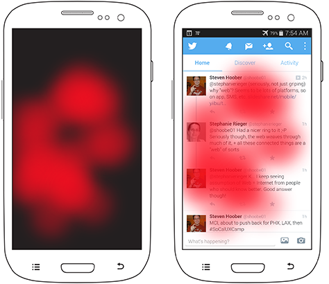
Heat maps confirm the claim that people prefer to interact with the central part of the screen of their device. The figure below shows such a map for the scenario in which users had to select an element on the page with full-screen scrolling capability:
In most cases, they scrolled content to a position in the center of the screen, and only then clicked on it. When a user has the ability to select a specific place on the screen to touch him, then almost always he will choose the central two thirds of the space. Users of smartphones and tablets got into the data sample for this experiment - the sympathy for the center of the screen does not depend on the type of device.
Even if in order to reach the center of the screen, the user will have to exert more effort (reach out with a finger or take the phone in the other hand), more often he will go for it - not because someone forces him, but because it is more convenient for him. This means that the content and main elements of the interface should always be located in the central part of the screen, and the secondary elements can be placed in the upper or lower part.
If you look at the data a little more closely, you can notice some tendency of users to touch the left central part of the screen. This phenomenon is not so significant, but it is definitely present. It seems to me that the reason for this lies in the fact that in European languages we read from left to right - therefore, the text is aligned along the left edge.
Developers of mobile applications, it is useful to know what specific gestures are used by users when working with their products. One of the most popular gestures (after “tapa”) is scrolling (“scrolling”). The figure below shows a heat map of how people usually perform a scroll gesture.
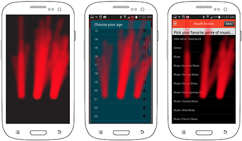
Three separate areas are marked on each of the three images. But why? It depends on the type of content on the screen. The picture on the left shows how people scroll short content (usually in a dialog box), the images in the center and on the right correspond to scrolling long content "full screen". The central image shows that the items in the list for choosing an answer do not contain much information, as a result of which a significant empty space appears on the screen - and still people prefer to touch the screen in the center, although there is nothing there. In the picture on the right, long list items occupy a significant part of the screen, and users prefer to scroll the screen to the right, where there is no content. Even users with a “working” left hand preferred not to touch the content.
After my presentation at one conference, during which I told my experiences, some colleagues shared their experience in creating applications in Hebrew and Arabic. There everything turned out to be absolutely the same, only in the other direction. In these languages, people read from right to left and, accordingly, scroll the page on the left side of the page in order not to touch the content.
In addition, users are not always free to use scrolling gestures where there are various elements on the page - they are afraid to accidentally activate a menu item and just want to see the content. If the page is full, so there is no free space on it, then the speakers of European languages scroll it by touching the screen on the right. The behavior may depend on the type of device - the tablet screen is larger, with the result that the content may take up less space on the page, leaving more space for touch.
It is impossible to create a high-quality interface for touch screens without understanding how users work with such devices. Here are the key findings that I made from my research:
References:
PS If you notice a typo, mistake or inaccuracy of the translation - write a personal message and I will correct everything promptly.
Over a year ago, I published a study on how people actually hold and touch their mobile phones. The next logical step is to understand the motivations of users and identify the connections between different actions, context and actions of people.
Research methodology
Together with colleagues from the company ZIPPGUN, I developed a mobile application that allows you to simulate various scenarios of mobile phone use. With this application, tests were conducted with the help of 31 participants (about two thirds of them used smartphones, and the rest worked with tablets).
')
All interactions were recorded on video - this was necessary in order to restore later how the person held the device, how he touched the screen, etc. The direction and “length” of the scrolling gestures, the point on the screen where the user pressed with a finger, and the accuracy of selecting various menu items were recorded. Recording was carried out with the help of special video glasses.
The number of participants in the experiment was not very large, but even with so many people, the study was very difficult. Only recording 31 sessions took almost 100 hours of video.
Switching
At the first stage of the research, it was decided to focus on identifying links between how people hold the phone and touch the screen and various contexts. When tests were conducted, everything looked rather ordinary - for example, many people held the phone with one hand. But when it came to real data analysis, the results were unexpected. As you can see in the picture below, there are practically no scenarios for using a “one-handed” smartphone:
People can hold the phone with one hand and scroll through the pages with the thumb of the same hand, but as soon as it becomes necessary to perform more serious tasks, they immediately go on to hold the device with one hand, and use the second one to work with the menu - most of the tasks are solved exactly like this in a way. In a little less than 41% of cases, users typed on a virtual keyboard, using the thumbs of both hands - some test subjects always work with a smartphone this way. Tablet users were excluded from the results of this experiment, as these devices are used in other situations.
Centering
Various studies have shown that users can most accurately interact with elements located in the center of the screen of a mobile phone or tablet. It is the center that best attracts the attention of people, the edges and corners of the screen interest them much less. Neither environmental conditions nor previous experience with touch-screens do not affect this. People involuntarily seek to "tap" into the center of the screen. In the course of the current research, the collected data also substantiated this thesis for 7, 8, and 10-inch tablets.
This is how the visualization of people's attempts to get into the menu button located in the corner of the tablet screen (each point is a touch on the screen) looks like:
Heat maps confirm the claim that people prefer to interact with the central part of the screen of their device. The figure below shows such a map for the scenario in which users had to select an element on the page with full-screen scrolling capability:
In most cases, they scrolled content to a position in the center of the screen, and only then clicked on it. When a user has the ability to select a specific place on the screen to touch him, then almost always he will choose the central two thirds of the space. Users of smartphones and tablets got into the data sample for this experiment - the sympathy for the center of the screen does not depend on the type of device.
Even if in order to reach the center of the screen, the user will have to exert more effort (reach out with a finger or take the phone in the other hand), more often he will go for it - not because someone forces him, but because it is more convenient for him. This means that the content and main elements of the interface should always be located in the central part of the screen, and the secondary elements can be placed in the upper or lower part.
If you look at the data a little more closely, you can notice some tendency of users to touch the left central part of the screen. This phenomenon is not so significant, but it is definitely present. It seems to me that the reason for this lies in the fact that in European languages we read from left to right - therefore, the text is aligned along the left edge.
Gestures
Developers of mobile applications, it is useful to know what specific gestures are used by users when working with their products. One of the most popular gestures (after “tapa”) is scrolling (“scrolling”). The figure below shows a heat map of how people usually perform a scroll gesture.
Three separate areas are marked on each of the three images. But why? It depends on the type of content on the screen. The picture on the left shows how people scroll short content (usually in a dialog box), the images in the center and on the right correspond to scrolling long content "full screen". The central image shows that the items in the list for choosing an answer do not contain much information, as a result of which a significant empty space appears on the screen - and still people prefer to touch the screen in the center, although there is nothing there. In the picture on the right, long list items occupy a significant part of the screen, and users prefer to scroll the screen to the right, where there is no content. Even users with a “working” left hand preferred not to touch the content.
After my presentation at one conference, during which I told my experiences, some colleagues shared their experience in creating applications in Hebrew and Arabic. There everything turned out to be absolutely the same, only in the other direction. In these languages, people read from right to left and, accordingly, scroll the page on the left side of the page in order not to touch the content.
In addition, users are not always free to use scrolling gestures where there are various elements on the page - they are afraid to accidentally activate a menu item and just want to see the content. If the page is full, so there is no free space on it, then the speakers of European languages scroll it by touching the screen on the right. The behavior may depend on the type of device - the tablet screen is larger, with the result that the content may take up less space on the page, leaving more space for touch.
Results
It is impossible to create a high-quality interface for touch screens without understanding how users work with such devices. Here are the key findings that I made from my research:
- Users often change the way they capture a smartphone. If the device is comfortable to hold with one hand, it does not mean that typing messages on it or scrolling the page in this position would be just as convenient. Developers need to create interfaces that will be equally comfortable to use, no matter what hand a person holds a smartphone. You should test the interface on different devices and in different contexts in order to cover all the positions of the hands of users.
- People subconsciously tend to touch the center of the screen of the smartphone and do so in any case, even if they have the opportunity not to do it. Key information and controls should be located on the central two-thirds of the screen, and minor elements can be placed in its upper and lower parts.
- Users tend to touch the screen to scroll the page where there is no content. Therefore, the availability of free space on the page can be very useful - people will use it for scrolling gestures and swipe gestures.
References:
- Hoober, Steven. “ Common Misconceptions About Touch. "- Russian translation on Habré
- Hoober, Steven. “ How Do Users Really Hold Mobile Devices? "
- Hoober, Steven, and Patti Shank. “Making mLearning Usable: How We Use Mobile Devices.”
- Hoober, Steven. “ Design for Fingers and Thumbs Instead of Touch. "
PS If you notice a typo, mistake or inaccuracy of the translation - write a personal message and I will correct everything promptly.
Source: https://habr.com/ru/post/235745/
All Articles