Optimization of business processes using survival curves
Let's imagine that we have a restaurant reservation service. Booking takes place in 2 stages:
We want to understand how well the call center works and how quickly applications are processed.
Good ways to analyze this are the survival curves.
')
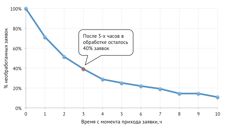
In our case, the survival curve is a graph showing the% of the raw requests after a certain time.
The graph above shows the simplest example of a survival curve. More clever options, we consider at the end of the article.
To build a survival curve, we need:
These data can be represented as follows:
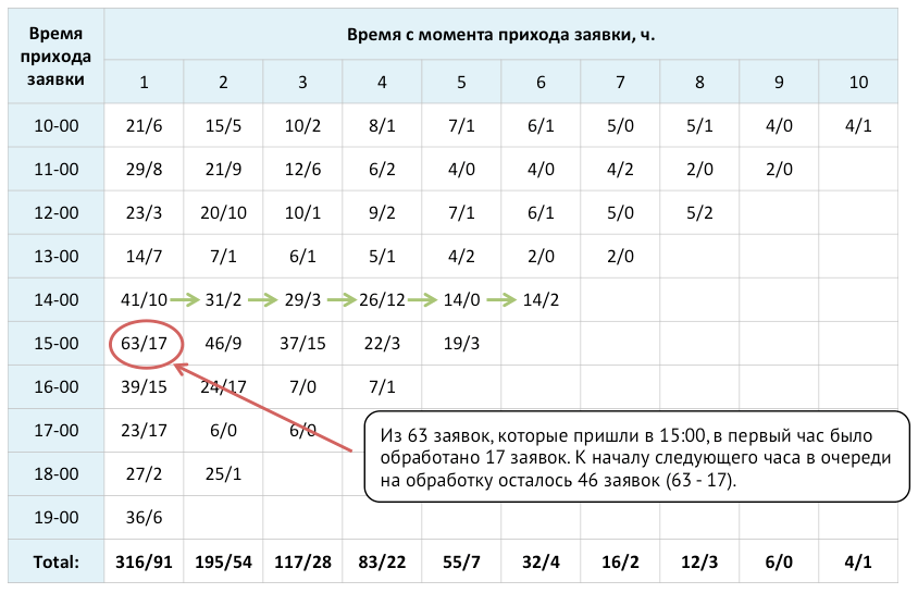
In each cell:
For example, out of 63 applications that came from 15:00 to 16:00, 17 applications were processed in the first hour, and 46 applications remained in the queue for processing by the beginning of the next hour.
The bottom line of the table summarizes the total number of remaining bids from each “one age” group, as well as the total number of processed bids from the corresponding group.
Let's present the data from the last row in the form of the following table (calculations are given below):
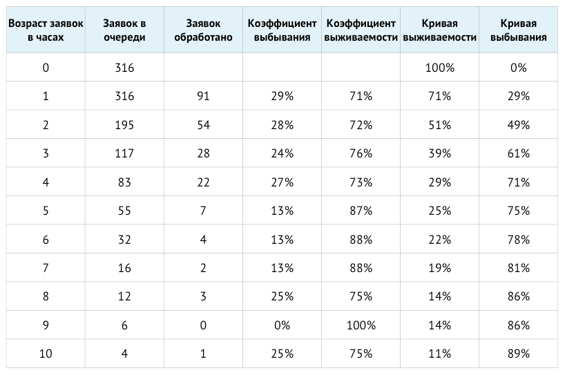
The corresponding values from the table are calculated as follows:
Dropout factor [i] = Requests processed [i] / Applications in the queue [i]
Survival rate [i] = 1 - Rejection rate [i]
Survival Curve [i] = Survival Rate [i] * Survival Curve [i-1]
Dropout Curve [i] = 1 - Survival Curve [i]
The survival curve plotted below starts with 100 percent of unprocessed applications at zero age:

For analysis, it is more convenient to use the dropout curve. The dropout curve is the proportion of applications processed at the relevant age. Do not confuse the dropout curve with the survival curve. In the first case, we look at the share of processed applications, in the second - the unprocessed ones.
Below built corresponding dropout curve:
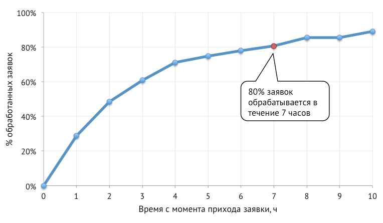
Further, for the analysis we will use drop curves.
Let's start with the last chart from the last item. It allows you to understand how quickly our call center processes applications. It can be seen that, on average, 80% of applications are processed within 7 hours.
If we construct such survival curves not for the entire call center, but for each employee individually, it will be possible to understand who is working more efficiently. Based on these data, you can reward the best employees and dismiss / train less effective ones.
Let's look at another example:

From the graph it is clear that booking requests are not processed during the first two hours. The reasons for the delay may be different:
Let's look at this schedule:
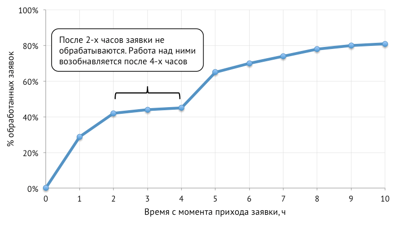
It can be seen that after 2 hours, applications are practically not processed, and work on them resumes only after 4 hours. The reasons may be as follows:
It is necessary to deal with each specific case separately. Drop curves help to find bottlenecks, but in order to benefit, additional efforts must be made:
- The user leaves a request for booking a table on the site.
- Our call center calls the user back to confirm or cancel the reservation.
We want to understand how well the call center works and how quickly applications are processed.
Good ways to analyze this are the survival curves.
')
What is the survival curve?
In our case, the survival curve is a graph showing the% of the raw requests after a certain time.
The graph above shows the simplest example of a survival curve. More clever options, we consider at the end of the article.
How to build survival curves?
To build a survival curve, we need:
- the number of applications received at the beginning of each hour;
- number of applications processed during each hour.
These data can be represented as follows:
In each cell:
- The first number shows the number of unprocessed reservation requests available at the beginning of the hour;
- the second number shows the number of requests processed by the call center during this hour.
For example, out of 63 applications that came from 15:00 to 16:00, 17 applications were processed in the first hour, and 46 applications remained in the queue for processing by the beginning of the next hour.
The bottom line of the table summarizes the total number of remaining bids from each “one age” group, as well as the total number of processed bids from the corresponding group.
Let's present the data from the last row in the form of the following table (calculations are given below):
The corresponding values from the table are calculated as follows:
Dropout factor [i] = Requests processed [i] / Applications in the queue [i]
Survival rate [i] = 1 - Rejection rate [i]
Survival Curve [i] = Survival Rate [i] * Survival Curve [i-1]
Dropout Curve [i] = 1 - Survival Curve [i]
The survival curve plotted below starts with 100 percent of unprocessed applications at zero age:
For analysis, it is more convenient to use the dropout curve. The dropout curve is the proportion of applications processed at the relevant age. Do not confuse the dropout curve with the survival curve. In the first case, we look at the share of processed applications, in the second - the unprocessed ones.
Below built corresponding dropout curve:
How to analyze?
Further, for the analysis we will use drop curves.
Let's start with the last chart from the last item. It allows you to understand how quickly our call center processes applications. It can be seen that, on average, 80% of applications are processed within 7 hours.
If we construct such survival curves not for the entire call center, but for each employee individually, it will be possible to understand who is working more efficiently. Based on these data, you can reward the best employees and dismiss / train less effective ones.
Let's look at another example:
From the graph it is clear that booking requests are not processed during the first two hours. The reasons for the delay may be different:
- We may not have enough people in the call center, and first processed old applications.
- Restaurants can confirm reservation with a delay, and our call center processes the application only after confirmation from the restaurant.
- Requests from the site database can be downloaded to dial-up every 2 hours.
- Perhaps the delay is due to the specifics of our service.
Let's look at this schedule:
It can be seen that after 2 hours, applications are practically not processed, and work on them resumes only after 4 hours. The reasons may be as follows:
- If the call center cannot reach the customer, then he postpones the call attempt for 4 hours.
- Some restaurants confirm the reservation later, and the call center may process the reservation of such restaurants with a delay.
- Perhaps the first attempt to dial is made in automatic mode, and if dialing did not take place, then after 4 hours the application is unloaded on a manual call.
What's next?
It is necessary to deal with each specific case separately. Drop curves help to find bottlenecks, but in order to benefit, additional efforts must be made:
- To reward or dismiss employees.
- Agree on a more rapid response of partners.
- Change the processing of applications.
Source: https://habr.com/ru/post/235529/
All Articles