Conversion increase: how to create a product card that you want to buy
 Welcome to the Witget.com blog. Continuing yesterday’s article on increasing conversions on the example of the Nike website.
The product information page is an important tool in working with customers, and the quality of user interaction on these pages directly affects sales. If the conversion rate of your site is terribly low, first of all it is worth checking out the item cards. And what if a potential client really wanted to buy your product, but could not find the right shade? Or he wanted not only to choose the color of the product, but to discern in the smallest details, what would his future purchase look like in this color? Perhaps the product of interest to the client is simply not available, and you calmly let the visitor leave without trying to get his contacts. In this article, Tommy Walker , written in the first person, you can see examples of pages with information about products, both successful and not so. Cases increase conversion by changing the various elements of the interface will help you not to make common mistakes. How to help a potential client find exactly what he wants most?
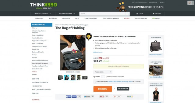
Different images of the same product give a deeper understanding.
The buyer can not touch the goods in the online store. The photos should show him exactly what excites most about the product, they should give the maximum amount of visual information to help make a purchasing decision. However, just choosing high quality photos is not enough, as well as adding a few additional images.
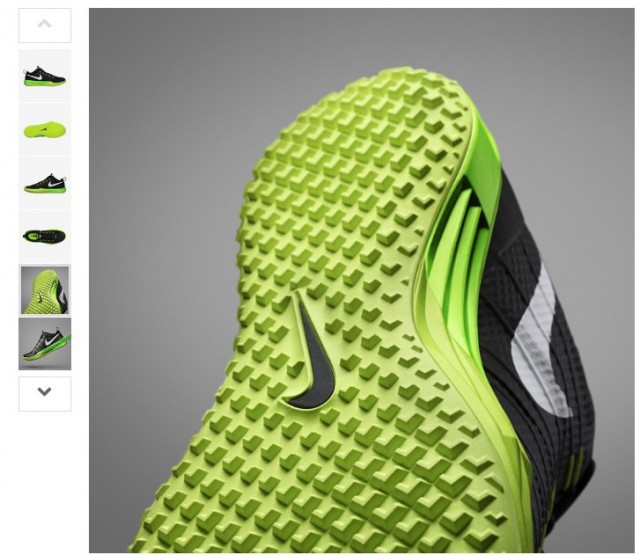
In the example above, Nike tried to show shoes from all angles on a gray background and with the right lighting, in order to better show what kind of grip gives the surface on the sole. For an experienced athlete, the sole of a shoe is of utmost importance when it comes to competitions.
')
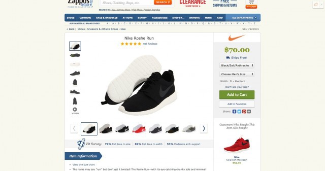
Compare a similar product on Zappos.com and see how small, but very important details can be lost on the general background.
You really should pay attention to this, because, according to a Forrester study, about 22% of online shoppers return goods because it does not match the image on the site.

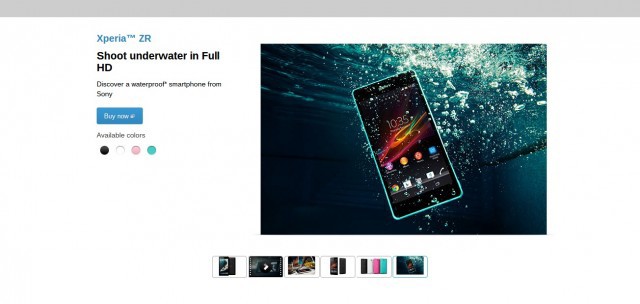
There are several reasons for posting photos of goods from different angles, for example, such images can give answers to some questions at a glance at them, although this might require a whole detailed description.
This page, for example, shows the following parameters:
- The smartphone is waterproof;
- Available in several colors;
- HD screen.
But seriously, in those situations when small items matter or where the part is located, the product photo from different angles will help to sell it.
For example, this statuette of Batman has so many photos to show all the details of the figure, as well as the various poses that Batman can take.

In the case of more functional products, sometimes detailed photos help the site visitor weigh how this product suits them, and this ultimately leads to a purchase.
What would have caused you a clearer association:
- a statement that your Macbook fits in a 16 "x 13.5" x 1.5 "soft case;
- or this picture of someone stuffing a Macbook into a bag.
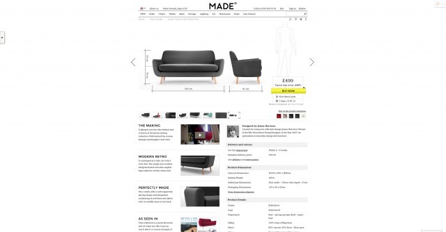
In the following example, on the website Made.com, a couple of lines of text are attached to the photo, from which you can understand how long the model is on the diagram - this will help you to better determine the size of the furniture.
Keep in mind that when we talk about a variety of photographs, it is assumed that each of them serves some kind of purpose, and not just forces the buyer to say: "Well, yes ... pretty!".
I personally fell into this trap by ordering a sofa that was too big for my office and too small for me.
Depending on the context, a variety of photos can also enhance the overall level of site design, which neither a well-designed structure, nor a text, nor a single photo can do separately.
DollsKill , for example, used a variety of images of their models to make it clear to the visitors for whom their site (and for whom, on the contrary, it was not intended).
Using additional photos of the product in its natural environment can help the buyer to visualize how the product will look in their space.
For example, Urban Outfitters places a wooden frame (a fairly prosaic product) in a room that symbolizes the perfect apartment for their customers.

In addition, it is worth adding that if there are several products on one photo, make it easy to find them all on the product page.
Usability researchers at Baymard institute found that the “disappointment of dissatisfied users” is due to the fact that they have to search for a long time on the site other products depicted in the photograph. As a rule, after that their opinion about the site deteriorates, and they declare that the creators of the site do not seem to use it themselves.
“I want exactly this. What should I do? ” One of the buyers lamented, laughing at his confusion and clicking on the picture of the coffee table depicted in one of the photos in IKEA.
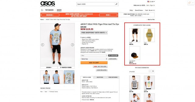
In fact, it is enough just to do something like the “add image” feature, as on the product page on the Asos website.
Find and view alternative product options should be easy
For me, there is nothing more terrible than an impersonal palette of colors, not even corresponding to the colors of the goods, like this:

It infuriates me when I cannot find the color or size of the product I am viewing.
Let's go back to the Nike.com page, where alternative versions of the same product are always displayed qualitatively.
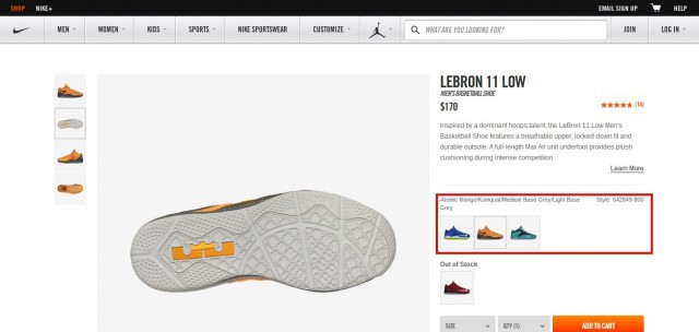
What I like about this page is how easy you can see what alternative product versions look like without choosing additional colors in any drop-down box ...
... how to do it, for example, on the IKEA website.
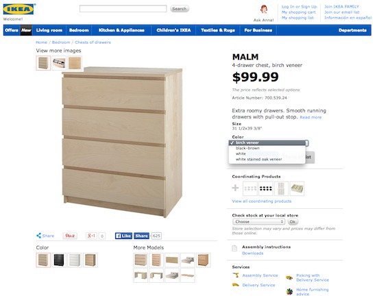
Looking at this site twice, you can see small images of the goods of alternative colors, but they are located in the lower left corner, where they are difficult to notice.
This, of course, is not so annoying as when, after choosing a color, you are not shown a photo of the product in this variant. An example is on CanvasHomeStore.com .

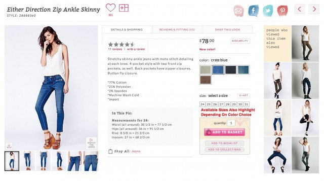
What else I like about the alternative versions of the product on the Nike website are the small microcopies above the photos of the sneakers - the names of the shades.
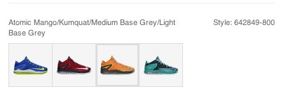
This element is not so important at first glance, but if shade is of paramount importance for the buyer, it will really help him to motivate him.
On the Zappos website, alternative color options merge with each other. If you glance at the page, all 5 pairs of sneakers of dark color look the same. Only a bright red pair stands out (but I would not buy it).

Probably, you are thinking now: “On my site you already have the opportunity to choose the color and size of the goods,” but looking at Ikea and Zappos sites, I understand that no one is insured against images of the goods hidden in the far corner in different colors.
Users can not click on what they do not see , so I think you should ask yourself the following question: “Is it easy to find alternative product options on your site?”
A study was conducted, according to the results of which, when sellers indicate more parameters of a single product (colors, sizes, model popularity, etc.), their sales go up. In the case of cars, sales increase by 5%.
According to Wish , collected from its shopping carts on various websites, this graph shows the growth in sales of those products, to which additional sizes and colors have been added.

And although I could not find an example in which conversion increased as a result of the fact that alternative products were made more visible, I can say with confidence that if I do not find a product in the size or color I need, I will not buy it.
Here are some other examples of sites that do a lot of work to make alternative product options really noticeable.
The north face

Free people
There are two things that I really like about the variations of colors in FreePeople. The first is that the photo of the product is completely updated - even the models that do not look alike at all often change.
This is important because, as researcher Harry Farmer discovered , “when a person is like us, it automatically seems to us that he can be trusted.”
The second thing I like is that when choosing a color, the dimensions are automatically highlighted or “extinguished” depending on their presence.
House of Fraser
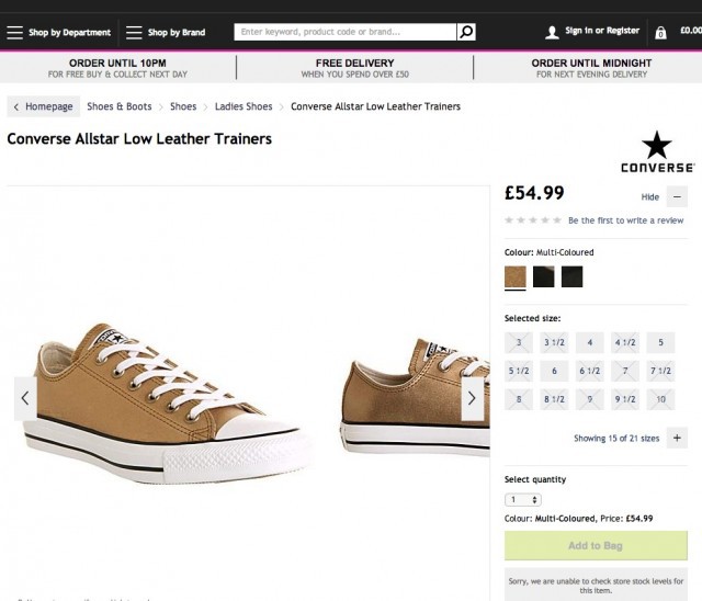
In House of Fraser, color options are also noticeable, except for this, I like how they use the real color of the material from the photo, rather than drawing a standard palette of shades.
Highlight bright products that are not in stock (this will help you earn more)
Clearly identify products that are not in stock, so as not to give the customer false expectations. And if you do everything right, then in the future your sales may grow significantly.
Nike really takes a lot of time to show which models are not available (displays them next to the panel of additional colors) ...
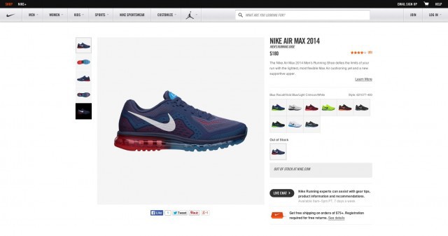
... however, this page lacks the notification function when this product reappears in stock.
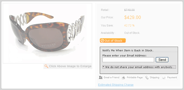
This Yahoo plugin allows you to automatically change the call to action "buy now" button "out of stock", giving the user the opportunity to leave an email address, which will receive a notification when the product appears in stock.
As my colleague Gagan Mehran told me, using this switch can be quite expensive, as it requires updating the program, which displays inventory, in real time.
However, the use of such a mechanism can help to get the profit that would otherwise be lost.
In this MarketingSherpa case, Jim Moore from BirkenstockCentral talks about how, thanks to an “out of stock” email campaign, they were able to recover 22.45% of sales that could have been lost due to customers switching to competitors.
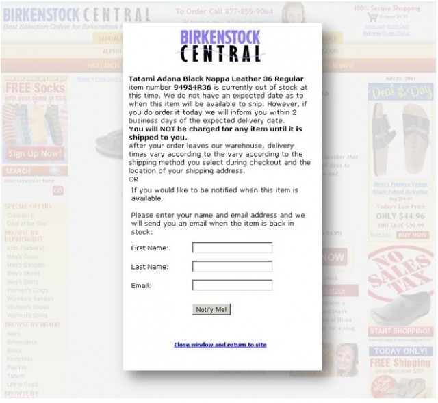
One of the most effective elements of their strategy was to motivate a site visitor to make a purchase on their website, even if the product was not currently available.
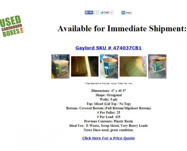
The e-mail "back in stock" allowed UsedCardboardboxes.com to earn more than $ 13,000 in sales, simply notifying those who viewed this product that it was back in stock.
Source: https://habr.com/ru/post/235357/
All Articles