Educational program on cartographic projections with pictures
Visualization of data of various kinds, having a certain geographical distribution, has recently become more and more widespread. Here, on Habré, articles with maps are found almost every week. Maps in the articles are very different, but they have one thing in common: as a rule, they use only two cartographic projections, though not the most successful of the existing ones. I would like to give some illustrative examples of projections that look more aesthetically pleasing and are better suited for different types of visualization. In this article, global projections and projections of most of the Earth will be considered, since visualization of something on the world map is perhaps the most common of such tasks.
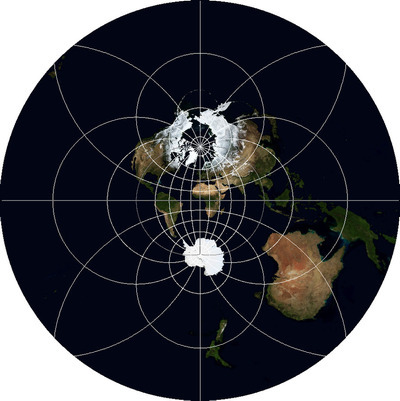
Since the article is focused on data visualization issues, I will not touch deeply on the theory of projections (datums, conformance, equiagonality, and the like), except for the general principles of their construction. Also, I will speak here about the “projections”, formally implying the “coordinate system”, the coordinate reference system, because for maps of such scales it does not make sense to separately consider the projection and datum. There is practically no mathematics here, except for simple geometry. Those who wish to become familiar with mathematical principles can do so under articles on Wolfram MathWorld . So for those who study programming in the field of geographic information systems or their experienced users, this article may not be very useful.
Before you start, I'll explain a couple of things. All examples will be given using the state borders data set from this site and the Blue Marble Next Generation data set from the NASA website . The latter includes synthesized cloudless images of the earth's surface for each of the twelve months of 2004, which will allow to introduce some variety in the illustrations.
')
I love open software very much, but it seemed inefficient to use GDAL in this case - some of the not very popular, but useful projections in its implementation at the moment are either not, or I didn’t look at the source code well, and therefore I prepared the illustrations in the commercial program GlobalMapper, which I have been using for many years, and which is famous for supporting an impressive list of coordinate systems.
I will give the names of the projections and some terms in English, because if someone wants to look for materials on this topic, there are fewer Russian-language sources in the network (the volume of Wikipedia articles in Russian is several times smaller). For most of the projections, I will try to give not only names, but also EPSG and / or WKID codes, as well as the name of the projection in the PROJ.4 library, widely used in an open software (for example, in the R package) to support coordinate systems.
Some projections may be familiar to someone in the picture with xkcd , but all of them will not be considered here.
To begin with, what are these most common projections, and what is wrong with them.
The first projection is the so-called “Geographical” , it is also Geographic projection, Latitude / Longitude, Plate carrée EPSG: 4326 WKID: 54001 PROJ.4: longlat . Strictly speaking, it is not even quite a projection, because it is obtained by interpreting the polar angular coordinates as linear rectangular, without any calculations. This projection is used because it is capable of displaying the entire surface of the Earth entirely and because it is the simplest mathematically, and the data very often spread not projected, that is, in geographic coordinates (degrees of latitude and longitude).

What is the result? It turns out a rectangle where the points of the poles are turned into lines (upper and lower bounds). The farther from the equator, the stronger any object on the map is flattened vertically and stretched horizontally. As I have already said, it is somehow suitable for displaying global data sets, but the polar territories (Canada, Norway, Sweden, northern Russia, Finland, Greenland, Antarctica, Iceland) are distorted. Projections that avoid this exist, and they will be discussed further. The only reason to use this projection is its extreme simplicity of software implementation — you just need to map the coordinate system from -180º to 180º for X and from -90º to 90º for Y on a plane, considering the angular units to be linear.
Another very popular projection is the Mercator projection, Mercator projection PROJ.4: merc . It is also used to visualize data covering the whole world, but its popularity is dictated not only by simplicity - its options are the de facto standard for global map services such as Google Maps, Bing Maps, Here. The cartographic libraries of OpenLayers, Leaflet, API of the above-mentioned services are deeply connected with it. In the Google and OpenStreetMap variant, it is called Web Mercator and has the EPSG / WKID code: 3857 , sometimes it is also referred to as EPSG: 900913 . The principle of its construction is not much more complicated than Geographic - it is a projection on a cylinder, whose axis coincides with the geographic axis of the Earth, the projection occurs by lines extending from the center of the planet, from which the stretching error of the polar regions horizontally is compensated by proportional stretching vertically. The only problem with this is that the map will turn out too large vertically if you try to map the north of Greenland. Therefore, usually 16 ° of the polar regions are rejected (in equal proportion or more - from the south).

In someone's opinion, it looks a little better than Geographical, but we have already mentioned one problem, and the second - the closer the object is to the poles, the more it seems, although its shape is not so distorted. Therefore, if the object of visualization is the density of markers per unit of territory or distance, this display method will be misleading. With proper choice of the method of visualization, of course, this can be compensated, but for some cases this is not a problem at all: for example, if the value of an indicator in the whole country is correlated with the color of this country on the map, the effect of stretching the areas does not affect. This projection retains only the shape of objects, because the outlines of continents and countries look quite recognizable. And, as I said, it is your first and easiest option when creating interactive web maps.
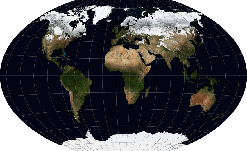
What to do with global data, if for some reason we needed a projection that better preserves such properties of objects as shape, area, distances and angles? The laws of geometry do not allow us to preserve all these properties at once, turning the round surface of the Earth onto a plane. However, aesthetics and perception are most important for visualizing data, and not the preservation of properties, as for navigation or measurement tasks. Therefore, it becomes possible to choose such a projection, the distortions in which would be evenly distributed over the properties. And there are quite a few such projections. There are three of the most famous, with similar properties: Winkel's Triple Projection Winkel Tripel WKID: 54042 PROJ.4: wintri , Robinson projection Robinson projection WKID: 54030 PROJ.4: robin , Kavraisky projection (Kavrayskiy projection). The first and last are visually minimal distortions, and for a non-specialist, not seeing the grating grid, it is generally very difficult to distinguish them, so I will give an illustration for Winkel Tripel, like the one that I personally like the most.

This is how the description of this projection looks in ESRI WKT format:
It is easy to see, although the distortion of the contours and a slight increase in the area of countries to the poles are also observed here, but this cannot even be compared with the stretching of the Geographical projection and the proportional increase of the Mercator projection.
Here it is worth making a small digression and pay attention to the fact that the view of this projection by default suffers from one drawback, which also applies to other global projections. The fact is that if the central meridian - the line connecting the north and south poles through the center of the map (longitude of origin) - takes the zero meridian, then the card will be cut along the 180th. But at the same time, a third of Chukotka will be on the left edge of the map, and two thirds - on the right. To make the map more beautiful, the cut must go somewhere around the 169th western meridian east of Ratmanov Island, for which the 11th must be taken as the central one. Here is an illustration of what happens:
Here is the modified description for this case in ESRI WKT:
In the format of determining the coordinate system for PROJ.4, the longitude of the projection center is specified by the parameter + lon_0 =.
The 11th meridian is a “magic” number: almost all world projections having a uniform scale along the equator can be cut along the Bering Strait, if we take it as the central one and not the zero one.
I note that thinking about the choice of projection, it is necessary to take into account all existing real requirements for visualization. For example, if the data relates to climate, then it may make sense to either map the lines of latitude, or use a projection where they are horizontal, and not bent to the edges of the map (that is, abandon the Triple Winkel in favor of, for example, Robinson). In this case, it will make it easier and more accurate to estimate the relative proximity of different places to the poles and the equator. Another significant plus of the Robinson projection is that it is supported by a variety of software, including open source, whereas for some others this cannot be said.
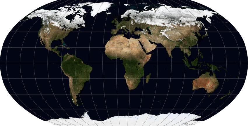
Sometimes, when you want to preserve as much as possible a property, for example - the ratio of the area of objects (countries) - the aesthetic side suffers. But since this may still be necessary for something, I will give one example of such a projection - the “ Mollweide projection ” , Mollweide projection WKID: 54009 PROJ.4: moll .

As can be seen, it rather closely resembles the Robinson projection, but with the difference that the poles are nevertheless tied into points, from which the shape of the polar regions looks strongly distorted. But the proportions of the area of countries, as required, remain much better.
The projection of Natural Earth PROJ.4: natearth is the youngest competitor of these projections - it is a hybrid of the projections of Kavraiski and Robinson, and its parameters were selected by a group of American, Swiss and Slovenian specialists in 2007, while the age of most cartographic projections is no less half a century.

To reproject data into it, there are a number of tools that were written specifically for this, but its support is still far from widespread.
Of course, the whole variety of projections does not end there. They invented a lot. Some just look weird (for example, the Bonnet projection depicts the Earth as a figure resembling a cut apple or a stylized heart), some are designed for special situations. For example, I bet that very many people saw in the pictures a map of the world, which looks like a mandarin peel, which was removed and flattened. This, for sure, was the “Hood's Homolosinusoidal Discontinuous Projection” Interrupted Goode Homolosine projection WKID: 54052 .

Her appearance is worthy of the name. Its purpose is to display the size of the objects (and to some extent, the shape) close to the natural proportions. Its main problem, besides its name and strange appearance, is that by selecting the central meridian it is impossible to ensure that not a single large piece of sushi is cut. Be sure to suffer something from the list: Greenland, Iceland, Chukotka, Alaska. Personally, in my opinion, it is easier to give separate images of countries than to use such a map if you do not want to stylize your work under the middle of the XX century.
There are projections which by their nature can not be attributed to the world, but I would like to consider them here, because they are able to show the globe, that is, as if a view of the planet from space. One of them is “Projection of the vertical near perspective” Vertical Near-Side Perspective projection WKID: 54049 . Its special feature is to show the earth's surface in such a perspective as it looks from a certain height. The height above the ellipsoid (an idealized figure modeling the Earth) is given for this projection in explicit form.
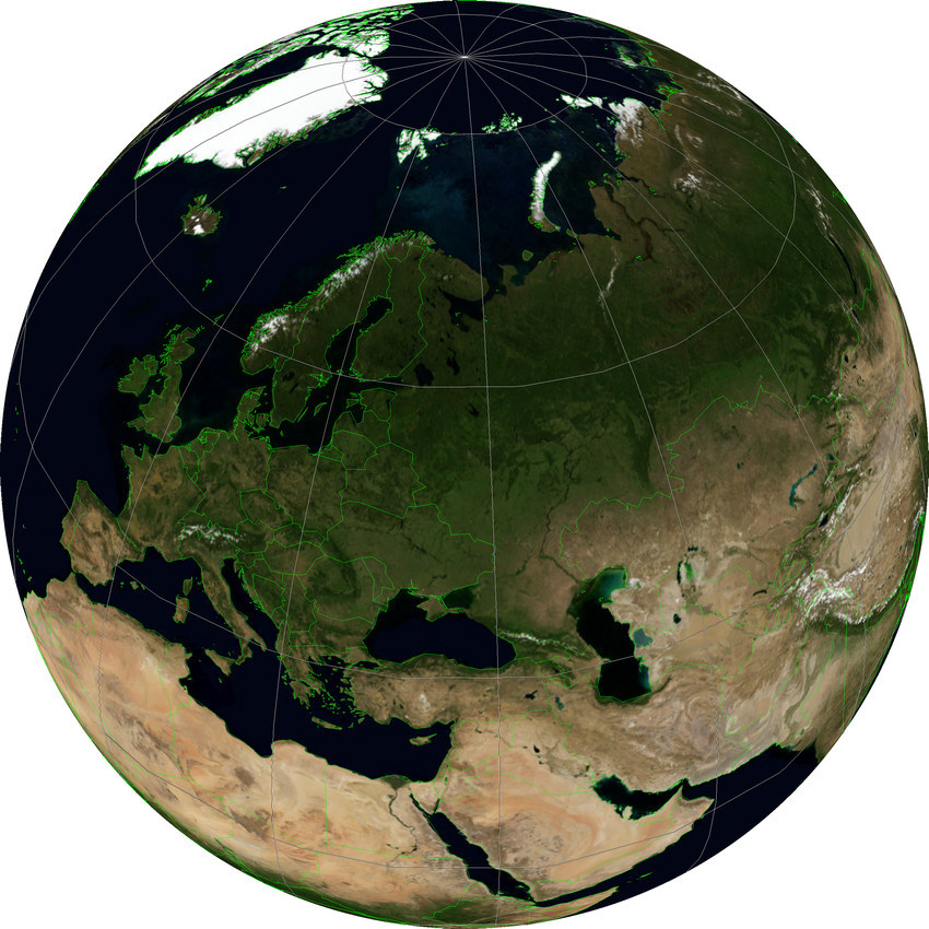
In the illustration, this projection has a latitude and longitude of the center, equal to the latitude and longitude of Moscow, and a height of 5,000,000 meters. The greater this distance, the stronger the image of the Earth becomes similar to its image in the projection, which we consider last.
The projection, which shows a view of the Earth in a parallel perspective, that is, as if from an infinite distance, is called “Orthographic Projection”. Orthographic projection WKID: 43041 PROJ.4: ortho . In a sense, it is familiar to anyone who has ever used Google Earth. I say that in a certain sense, because the “direction of sight” in this projection is always perpendicular to the surface of the Earth, whereas in Google Earth it can be tilted as you please.

For it, as for the previous projection, you can set the central latitude and longitude to orient the Earth in a desired way. For example, you can show the hemisphere with its center at some point in question - for example, illustrating traffic flows of a continental scale emanating from a single enterprise. Having made two maps with opposite coordinates, you can get a map of the whole world (although at the edges there will be very large distortions). Generating a sequence of maps with a smooth change in the center point will give frames for animating a rotating planet without any three-dimensional graphics.
If the article turns out to be interesting, I will try to write a continuation of the projections used to display individual countries or regions, oriented, like this article, to the basic properties of these projections for the task of data visualization, infographics, and the like.

Easy introduction
Since the article is focused on data visualization issues, I will not touch deeply on the theory of projections (datums, conformance, equiagonality, and the like), except for the general principles of their construction. Also, I will speak here about the “projections”, formally implying the “coordinate system”, the coordinate reference system, because for maps of such scales it does not make sense to separately consider the projection and datum. There is practically no mathematics here, except for simple geometry. Those who wish to become familiar with mathematical principles can do so under articles on Wolfram MathWorld . So for those who study programming in the field of geographic information systems or their experienced users, this article may not be very useful.
Before you start, I'll explain a couple of things. All examples will be given using the state borders data set from this site and the Blue Marble Next Generation data set from the NASA website . The latter includes synthesized cloudless images of the earth's surface for each of the twelve months of 2004, which will allow to introduce some variety in the illustrations.
')
I love open software very much, but it seemed inefficient to use GDAL in this case - some of the not very popular, but useful projections in its implementation at the moment are either not, or I didn’t look at the source code well, and therefore I prepared the illustrations in the commercial program GlobalMapper, which I have been using for many years, and which is famous for supporting an impressive list of coordinate systems.
I will give the names of the projections and some terms in English, because if someone wants to look for materials on this topic, there are fewer Russian-language sources in the network (the volume of Wikipedia articles in Russian is several times smaller). For most of the projections, I will try to give not only names, but also EPSG and / or WKID codes, as well as the name of the projection in the PROJ.4 library, widely used in an open software (for example, in the R package) to support coordinate systems.
Some projections may be familiar to someone in the picture with xkcd , but all of them will not be considered here.
Problem
To begin with, what are these most common projections, and what is wrong with them.
The first projection is the so-called “Geographical” , it is also Geographic projection, Latitude / Longitude, Plate carrée EPSG: 4326 WKID: 54001 PROJ.4: longlat . Strictly speaking, it is not even quite a projection, because it is obtained by interpreting the polar angular coordinates as linear rectangular, without any calculations. This projection is used because it is capable of displaying the entire surface of the Earth entirely and because it is the simplest mathematically, and the data very often spread not projected, that is, in geographic coordinates (degrees of latitude and longitude).

What is the result? It turns out a rectangle where the points of the poles are turned into lines (upper and lower bounds). The farther from the equator, the stronger any object on the map is flattened vertically and stretched horizontally. As I have already said, it is somehow suitable for displaying global data sets, but the polar territories (Canada, Norway, Sweden, northern Russia, Finland, Greenland, Antarctica, Iceland) are distorted. Projections that avoid this exist, and they will be discussed further. The only reason to use this projection is its extreme simplicity of software implementation — you just need to map the coordinate system from -180º to 180º for X and from -90º to 90º for Y on a plane, considering the angular units to be linear.
Another very popular projection is the Mercator projection, Mercator projection PROJ.4: merc . It is also used to visualize data covering the whole world, but its popularity is dictated not only by simplicity - its options are the de facto standard for global map services such as Google Maps, Bing Maps, Here. The cartographic libraries of OpenLayers, Leaflet, API of the above-mentioned services are deeply connected with it. In the Google and OpenStreetMap variant, it is called Web Mercator and has the EPSG / WKID code: 3857 , sometimes it is also referred to as EPSG: 900913 . The principle of its construction is not much more complicated than Geographic - it is a projection on a cylinder, whose axis coincides with the geographic axis of the Earth, the projection occurs by lines extending from the center of the planet, from which the stretching error of the polar regions horizontally is compensated by proportional stretching vertically. The only problem with this is that the map will turn out too large vertically if you try to map the north of Greenland. Therefore, usually 16 ° of the polar regions are rejected (in equal proportion or more - from the south).

In someone's opinion, it looks a little better than Geographical, but we have already mentioned one problem, and the second - the closer the object is to the poles, the more it seems, although its shape is not so distorted. Therefore, if the object of visualization is the density of markers per unit of territory or distance, this display method will be misleading. With proper choice of the method of visualization, of course, this can be compensated, but for some cases this is not a problem at all: for example, if the value of an indicator in the whole country is correlated with the color of this country on the map, the effect of stretching the areas does not affect. This projection retains only the shape of objects, because the outlines of continents and countries look quite recognizable. And, as I said, it is your first and easiest option when creating interactive web maps.
Solution options
What to do with global data, if for some reason we needed a projection that better preserves such properties of objects as shape, area, distances and angles? The laws of geometry do not allow us to preserve all these properties at once, turning the round surface of the Earth onto a plane. However, aesthetics and perception are most important for visualizing data, and not the preservation of properties, as for navigation or measurement tasks. Therefore, it becomes possible to choose such a projection, the distortions in which would be evenly distributed over the properties. And there are quite a few such projections. There are three of the most famous, with similar properties: Winkel's Triple Projection Winkel Tripel WKID: 54042 PROJ.4: wintri , Robinson projection Robinson projection WKID: 54030 PROJ.4: robin , Kavraisky projection (Kavrayskiy projection). The first and last are visually minimal distortions, and for a non-specialist, not seeing the grating grid, it is generally very difficult to distinguish them, so I will give an illustration for Winkel Tripel, like the one that I personally like the most.

This is how the description of this projection looks in ESRI WKT format:
PROJCS["Robinson",
GEOGCS["GCS_WGS_1984",
DATUM["D_WGS84",
SPHEROID["WGS84",6378137,298.257223563]
],
PRIMEM["Greenwich",0],
UNIT["Degree",0.017453292519943295]
],
PROJECTION["Robinson"],
PARAMETER["central_meridian",0],
PARAMETER["false_easting",0],
PARAMETER["false_northing",0],
UNIT["Meter",1]
]
It is easy to see, although the distortion of the contours and a slight increase in the area of countries to the poles are also observed here, but this cannot even be compared with the stretching of the Geographical projection and the proportional increase of the Mercator projection.
Here it is worth making a small digression and pay attention to the fact that the view of this projection by default suffers from one drawback, which also applies to other global projections. The fact is that if the central meridian - the line connecting the north and south poles through the center of the map (longitude of origin) - takes the zero meridian, then the card will be cut along the 180th. But at the same time, a third of Chukotka will be on the left edge of the map, and two thirds - on the right. To make the map more beautiful, the cut must go somewhere around the 169th western meridian east of Ratmanov Island, for which the 11th must be taken as the central one. Here is an illustration of what happens:

Here is the modified description for this case in ESRI WKT:
PROJCS["Robinson",
GEOGCS["GCS_WGS_1984",
DATUM["D_WGS84",
SPHEROID["WGS84",6378137,298.257223563]
],
PRIMEM["Greenwich",0],
UNIT["Degree",0.017453292519943295]
],
PROJECTION["Robinson"],
PARAMETER["central_meridian",11],
PARAMETER["false_easting",0],
PARAMETER["false_northing",0],
UNIT["Meter",1]
]
In the format of determining the coordinate system for PROJ.4, the longitude of the projection center is specified by the parameter + lon_0 =.
The 11th meridian is a “magic” number: almost all world projections having a uniform scale along the equator can be cut along the Bering Strait, if we take it as the central one and not the zero one.
I note that thinking about the choice of projection, it is necessary to take into account all existing real requirements for visualization. For example, if the data relates to climate, then it may make sense to either map the lines of latitude, or use a projection where they are horizontal, and not bent to the edges of the map (that is, abandon the Triple Winkel in favor of, for example, Robinson). In this case, it will make it easier and more accurate to estimate the relative proximity of different places to the poles and the equator. Another significant plus of the Robinson projection is that it is supported by a variety of software, including open source, whereas for some others this cannot be said.

Sometimes, when you want to preserve as much as possible a property, for example - the ratio of the area of objects (countries) - the aesthetic side suffers. But since this may still be necessary for something, I will give one example of such a projection - the “ Mollweide projection ” , Mollweide projection WKID: 54009 PROJ.4: moll .

As can be seen, it rather closely resembles the Robinson projection, but with the difference that the poles are nevertheless tied into points, from which the shape of the polar regions looks strongly distorted. But the proportions of the area of countries, as required, remain much better.
The projection of Natural Earth PROJ.4: natearth is the youngest competitor of these projections - it is a hybrid of the projections of Kavraiski and Robinson, and its parameters were selected by a group of American, Swiss and Slovenian specialists in 2007, while the age of most cartographic projections is no less half a century.

To reproject data into it, there are a number of tools that were written specifically for this, but its support is still far from widespread.
Some exotic and special occasions
Of course, the whole variety of projections does not end there. They invented a lot. Some just look weird (for example, the Bonnet projection depicts the Earth as a figure resembling a cut apple or a stylized heart), some are designed for special situations. For example, I bet that very many people saw in the pictures a map of the world, which looks like a mandarin peel, which was removed and flattened. This, for sure, was the “Hood's Homolosinusoidal Discontinuous Projection” Interrupted Goode Homolosine projection WKID: 54052 .

Her appearance is worthy of the name. Its purpose is to display the size of the objects (and to some extent, the shape) close to the natural proportions. Its main problem, besides its name and strange appearance, is that by selecting the central meridian it is impossible to ensure that not a single large piece of sushi is cut. Be sure to suffer something from the list: Greenland, Iceland, Chukotka, Alaska. Personally, in my opinion, it is easier to give separate images of countries than to use such a map if you do not want to stylize your work under the middle of the XX century.
There are projections which by their nature can not be attributed to the world, but I would like to consider them here, because they are able to show the globe, that is, as if a view of the planet from space. One of them is “Projection of the vertical near perspective” Vertical Near-Side Perspective projection WKID: 54049 . Its special feature is to show the earth's surface in such a perspective as it looks from a certain height. The height above the ellipsoid (an idealized figure modeling the Earth) is given for this projection in explicit form.

In the illustration, this projection has a latitude and longitude of the center, equal to the latitude and longitude of Moscow, and a height of 5,000,000 meters. The greater this distance, the stronger the image of the Earth becomes similar to its image in the projection, which we consider last.
The projection, which shows a view of the Earth in a parallel perspective, that is, as if from an infinite distance, is called “Orthographic Projection”. Orthographic projection WKID: 43041 PROJ.4: ortho . In a sense, it is familiar to anyone who has ever used Google Earth. I say that in a certain sense, because the “direction of sight” in this projection is always perpendicular to the surface of the Earth, whereas in Google Earth it can be tilted as you please.

For it, as for the previous projection, you can set the central latitude and longitude to orient the Earth in a desired way. For example, you can show the hemisphere with its center at some point in question - for example, illustrating traffic flows of a continental scale emanating from a single enterprise. Having made two maps with opposite coordinates, you can get a map of the whole world (although at the edges there will be very large distortions). Generating a sequence of maps with a smooth change in the center point will give frames for animating a rotating planet without any three-dimensional graphics.
If the article turns out to be interesting, I will try to write a continuation of the projections used to display individual countries or regions, oriented, like this article, to the basic properties of these projections for the task of data visualization, infographics, and the like.
Source: https://habr.com/ru/post/235283/
All Articles