How to increase website conversion (on the example of Nike)
 The product card or product information page is a very important tool on the website of any online store; this is where the visitor makes the final purchase decision. For some reason, very many in the e-commerce segment do not pay enough attention to these pages. But it is on this page that the first impression about the product in the field of online trading is formed. How to create a product page that will be effective and increase the conversion of the site? It is impossible to give a monosyllabic answer to this question, but it may be useful to consider successful examples of effective product pages that were picked up by Tommy Walker. How does Nike provide information about its products? And how should you not do this? Below is a detailed analysis of the excellent pages of Nike.com products and unsuccessful pages of other companies.
When creating a product information page, it is very easy to lose sight of the fact that your goal is to convince a customer to purchase a particular product. Instead, at 99% of online shopping sites, the page design seems to say: “Sir, here’s the product, I really hope you buy it.”

I mean, like, everything on this page is correct: discounts, large photos of the product, reviews, recommended products ... But is there anything on this page that encourages you to buy? Hardly.
')
If your task is to have the person on the other side of the screen say, “I really need it, I’ll put it in the basket right now!”, Then you need to take into account all the little things that encourage users to make a purchase decision.
While you need to remember a lot of aspects to look convincing, in this article we will consider, first of all, the visual component of an effective product information page.
Let the first impression be unforgettable.
First, I want you to know: research has shown that the brain processes an image in just 0.013 seconds (13 milliseconds), and visual information is processed 60,000 times faster than text.

a source
What about the fact that we understand the meaning of the word in 0.003 seconds (when the brain needs it), and our first impression of the site is formed in 0.05 seconds (50 milliseconds)?
To imagine how incredibly short this time is - in 50 milliseconds the bee flaps its wings 10 times.
Now, run over your product page with your eyes and honestly tell yourself, is it really so motivating?
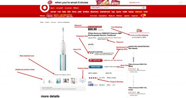
Even such an unremarkable product, like an electric toothbrush, looks more attractive if the page on which it is sold even tries to be convincing.
Considering that visual elements play an important role in shaping user experience and influence the buying process on the site, I would like to see how one of my favorite online stores uses visual (and some other) elements. And also analyze a number of studies to help you be more convincing on your product information pages.
Parsing Nike.com product pages
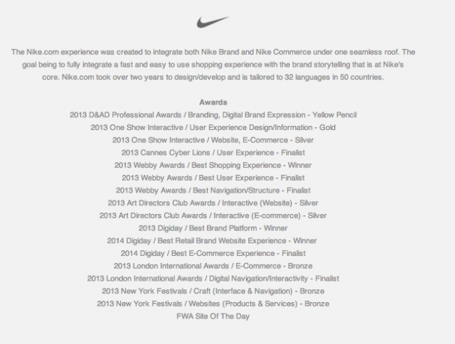
Nike.com is recognized as one of the best in terms of user interaction, and has won numerous awards, including the Cannes Jury, Webby, Digiday & London International.
To understand the scale of the competition, it should be noted that Nike surpassed Fab, Target, WarbyParker, Gucci, Sephora and many other sites that have user interaction also at a very good level. Therefore, the Nike.com product information pages are something really worth considering.
The site has a very clear and understandable structure, which creates a positive first impression and draws attention to the product.

What I really appreciate in this site is the top navigation bar, with which you can glance through all the main sections of the site, and each of its elements is located in the right place. Navigation is always at your service when you need it - and it does not sore eyes, when not needed.
This allows you to focus on the product — as required by the product information page.
And most of all on this page, I like that, thanks to the use of the desired color, first your gaze lingers on the call to action, and then on the feedback (thanks to the fact that the same color was used there). This is a clear demonstration of the Fitts law in action.
As your view slides through the key elements of the page, additional information is presented to your attention, such as:
- Detailed description of the product under the form with reviews;
- “Choose shoes” below the “add to cart” button;
- ... in this section there is also the possibility to choose the size, the number of pairs and even the function "save for later";
- The same model in other colors between the description of the goods and the call to action;
- As well as additional photos of the product next to the main image.
In other words, this page helps you focus on what you need, and the above sections provide you with additional information that you need to make a purchase decision as soon as possible (for other ways to motivate site visitors to make a purchase, read in the first and second parts of the article " How to convince website visitors to buy a product using competitors? ”). This product is revealed from the new side, while your eyes are browsing the page. And all this for 10 bees bee wings.
In case you are one of those 20% of people who scroll the page to the very end to find additional information or anything else, then the creators of the site have taken care to satisfy your curiosity.

The further the better, is not it? But try to compare this page with the one in which the creators are trying to place at the beginning of the page as much information as possible.

And what is your first impression?
Why you should upload only very high quality product photos
In case you are arguing with the boss or the client about this, let me assure you: large, high-resolution images do not just look attractive. They allow you to view all the smallest details and seemingly feel the product physically.
The same applies to the ability to zoom in on the photo. I saw a bunch of sites that had a scaling function, but it was completely useless.
But look at how Nike does it - they don't just bring the picture closer, but rather, they use it to prove everything they said in the product description section.

It's just not to notice, but try to familiarize yourself with the research of Forrester & UPS, in the third paragraph of which it is indicated that people do not buy goods online because they have not seen it live.
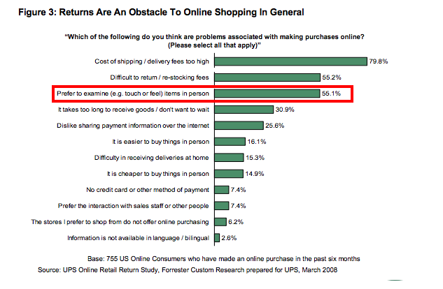
According to this work , tactile interaction (as well as simply the illusion of tactile sensation) can significantly increase the desire to purchase goods and create a sense of possession of this product, so detailed photos and the ability to increase the scale turn into powerful sales tools that motivate the user to make a purchase.
In my experience, many online stores use pictures only as an aesthetic element, arguing about how big photos can affect the “see and feel” setting.
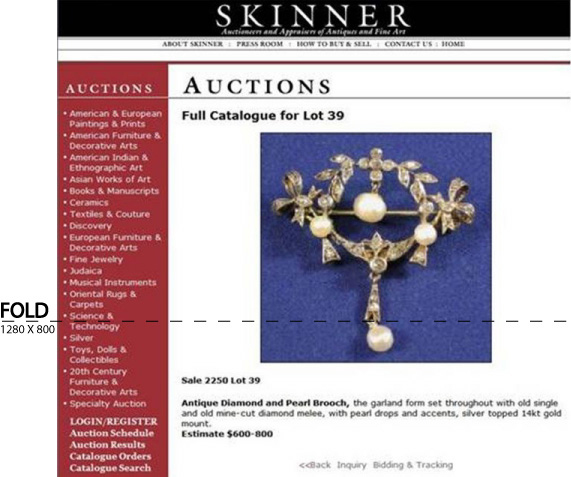
Our colleague Justin Rondo from WhichTestWon in one of the articles argued that there are several cases in which increasing the size of the image contributes to an increase in conversion. In the case of SkinnerAuction, they increased the number of people who participated in the auction (who raised the bid for a particular product) by 63%!
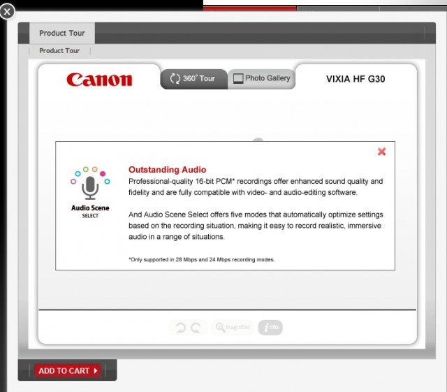
As a rule, these images are used to show the goods as if under a microscope, but Nike experts decided to go further and use clickable elements - just like Canon shows its products in full - the object can be rotated 360 degrees.
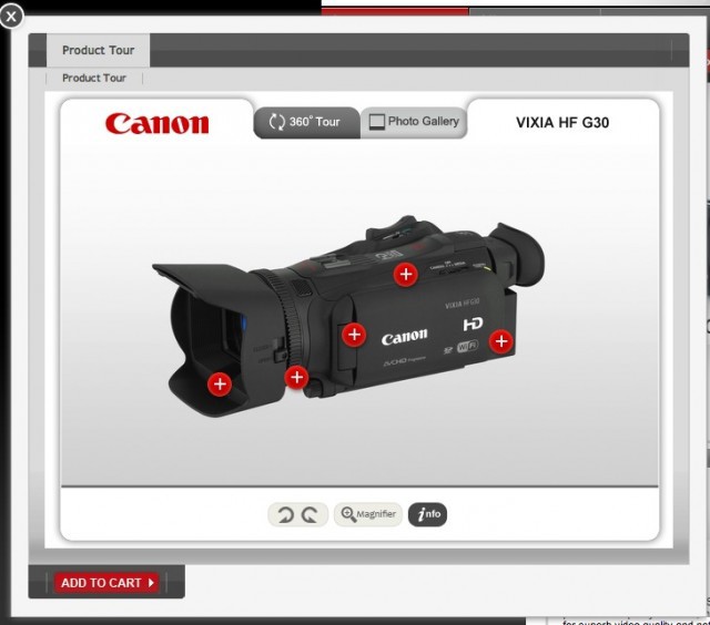
In this example, when you click on each element indicated by a small “target”, a window opens in which detailed information about each function is given and you are invited to familiarize yourself with this element in more detail.
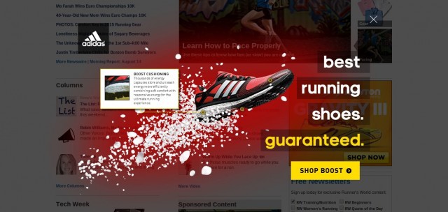
I was pleasantly surprised when I learned that Adidas did something like this in a pop-up window on Runnersworld.com. I wonder why they do not use them on their pages with the goods?
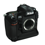
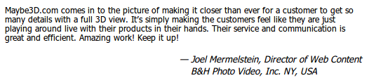
Some companies, such as B & HPhoto , have leaped even further: they provide complete 3D models and allow shoppers to inspect the product from all angles. The supplier of the software Maybe3D claims that thanks to this the conversion increased by 10-20%.
Click on the link under the picture with Nikon to see for yourself and draw your own conclusions.
A source
There are many studies on how images affect your conversion rate, and you should definitely consider them if you are going to increase the credibility of your product information page. For example, how to motivate site visitors to make a purchase using basic knowledge of the features of human thinking can be found in the first and second parts of the article " 10 Ways to Increase Conversion Using Psychological Techniques ."
Of course, the proposed tactics are only a small part of what will help make your product information page motivating you to immediately make a purchase. In the continuation of this article, read tomorrow about why you should use a lot of different product images, as well as simplify the search for alternative versions of the product on the site.
Follow our blog posts!
Source: https://habr.com/ru/post/235185/
All Articles