UI in the Enterprise application, or how we made a convenient system for creating maps
We usually talk about how we make external products or their individual features - 2GIS itself, its graphics and typography or Floors . At the same time, the topic of domestic products has never been raised. We correct this annoying mistake by the example of “Fiji” - a product for drawing an interactive map.
10 years ago, when 2GIS was still small, a map for it was created in its own DGPP system. It was a simple and understandable tool, as they say, " appropriate to the time of release ."
Every year there are more functions in it. It was necessary to create more objects and do it very quickly. After 10 years of "improvements" DGPP was this:
')

The bottom line:
- old technology;
- artifacts, the sacred meaning of which was lost in the centuries;
- a pile of controls in which it is difficult to navigate;
- Problems with the introduction of new features.
There is no limit to perfection, but it was no longer possible to "improve" and "refine" the product. It was necessary to create a new system.
At first we thought about ideology. It was necessary to understand what is good and what is evil, what principles will determine this or that decision?
Industrial drawing of the map is not an easy process and has its own subtleties:
Customers understood the complexity of the task, and no one spoke about creating an “intuitive interface”. However, within the framework of each concrete stage, the interface should have become transparent and, as far as possible, prompt the user the way he should go.
Creating a map is an expensive process. It consists of hundreds of thousands of cartographer actions. If any operation becomes just a couple more clicks, in the end, for the company, this change may cost a lot of money.
Therefore, the first principle was "do no harm." It would be a shame to make a beautiful product and understand that it takes more time to perform an elementary action than in the product predecessor.
In addition to the geometry of objects on the map, the product contains a large amount of related data.
For construction, for example, there is an appointment, address (street + house number), building material, number of entrances and floors, height, name, and a dozen other two attributes that need to be displayed.
This brings us to the second principle. Attributes and any data accompanying the drawing of the map should be visible, well distinguishable and not lost.
Surely, some of you have experienced the loss of data entered on different pages of the site. You write the exact address, name and surname, go to the second screen, press save ... lag ... the data is rubbed, rabies, we start from the beginning.
In our case, the lost data is not just a chagrin, but also a waste of company funds. The system should take over the work of users. Using the default data, all sorts of automation and pre-calculations - something that will help us.
DGPP is outdated, but it had a lot of good. Following processes, responsiveness, protection against random errors and much more. Users formed habits, some of which speed up work. For us, this has become the third principle: if there is something positive, convenient and useful in the old interface, then this should be preserved. This will increase user loyalty and reduce their pain when switching to a new product.
New features are regularly added to external products that are tied to content. For internal products, this means constantly adding requirements and the need to support new data. This fact also needs to be considered when developing the system.
Historically, enterprise developers are more focused on creating new functionality than on masking interfaces. And when the question comes to implementation, the priority is often given to a quality-made logic, rather than a visual component. Therefore, a nice looking, but simple design is more likely to get into production.
These principles allowed us to come to a common opinion on controversial issues and to determine the most appropriate ideas.
On the rules agreed, it's time to start developing. More precisely, with decomposition.
First of all - investigated the process of drawing the map. Fortunately for us, technologists have described their business processes in detail and with love. If it was impossible to sort out something, then the answer went to the predecessor system or directly to the users.
They wrote out the processes and singled out general actions in them. For example, in terms of actions, drawing the house and the road is the same. Drew object => filled attributes => saved. Based on this grouping, we have identified functional blocks with the same goal.
After the task is decomposed, everything becomes simple. We set priorities and work on features separately.
Yes, the creation of a crossroads - this is a separate feature. Or rather, the visualization of the process of creating and editing crossroads.
A little dive into the subject area. We have a crossroads - a point at the intersection of road links.

Crossroads carry information about forbidden maneuvers. For example, you cannot turn from one street to another, or there is a barrier when entering the courtyard.
First of all, we turned to the existing solution.
To enter the attribute information came off the window:
The user filled out the data and clicked "OK". The positive point: the data in the window was pre-filled.
For example, in the “level” field, the values of the level of the links attached to the intersection were entered. The list of forbidden maneuvers was pulled up on the same principle. Most often, you could just click "save". In addition, for the prohibition of each maneuver required one click, and for greater clarity, the maneuver was highlighted.
However, it was striking that the link ID as the identification mark of the maneuver was not very informative. The column “type of transport” (meaning the type of transport for which the ban is valid) also did not inspire confidence.
There are two reasons. Firstly, several types of transport are not visible in the table. Secondly, to ban movement on a specific type of transport required three clicks for each maneuver. The choice of a ban schedule also took more than three clicks.
After talking with customers and users, the hypothesis of non-informative ID was confirmed. Users look more at the highlight of the maneuver on the map than on the ID. But ticking ban is considered convenient. We also found that the schedule for maneuvers is made quite rarely and is not a key case.
After this, a number of ideas were born:
With these thoughts in mind, we moved on.
And then we had a question: did anyone try to solve a similar problem? And what came of it? We started looking.
After examining more than 30 products, we identified 2 patterns that seemed to us applicable:
But we wanted to go a little further and combine these two approaches. Thus, we wanted to preserve the habit and give a more visual and technological tool.
The next step is to bring our ideas to the customer.
The easiest and fastest way is direct communication.
At the meetings we drew sketches of ideas, described how they should work and immediately received feedback. It was important not only to understand whether our ideas like us or not, but to find out what exactly does not suit us and what practical cases stand behind it.
We tried to pull out a maximum of applied information from a customer in order to get a unified view of solving a problem.
After several dialogues, the concept was as follows:
After all agreed, we made the first version of the process visualization:
Controls for editing maneuvers through a map, in fact, are raster icons that are superimposed on the intersection and its associated links.
The distance between the icons is fixed and does not depend on the scale.
At the same time, it is possible to change the scale of the map.
After the decision was shown to the customer, a few more nuances surfaced:
And we went to think further. The new version was this:


The new visualization took into account the difficult cases of constructing intersections. As well as situations when there are many objects of the same type on the map. In addition, we have illustrated the options for working with a crossroads on different scales.
As a result, we got a solution that allows:
Now that users are happy, it's time for the developers. It is necessary to make a reservation immediately that the developers participated in the creation of solutions at all stages.
Each concept was discussed with the developers in terms of its feasibility. The solution proposed as a result was user-friendly and technologically advanced, and the functionality for editing intersections was critical for the first release of the product.
But its implementation required time and would draw off the strength of the team. It was necessary to find a balance between functionality and convenience, so we decided to detail the task.
Editing maneuvers through the sidebar could be done quickly. At the same time, it looked better than a similar solution in the old system. The ability to edit maneuvers from the map looks comfortable, but users do not wait for it and, therefore, will not be upset if it is not in the first version.
In the harsh world of enterpise, graphical interfaces more often answer the question “what?” Than the questions “how?” And “why?”. Everywhere you can find systems that solve a functional problem, without giving due attention to the simplicity and convenience of its solution. But it is the convenience and following the problematic and user habits that allows you to create truly useful products.
Therefore, do not be afraid to invest time in the interface and search for convenient solutions. Create cool products that will really save users time, company money, and developer nerves. Your work will not be in vain.
Prehistory
10 years ago, when 2GIS was still small, a map for it was created in its own DGPP system. It was a simple and understandable tool, as they say, " appropriate to the time of release ."
Every year there are more functions in it. It was necessary to create more objects and do it very quickly. After 10 years of "improvements" DGPP was this:
')
The bottom line:
- old technology;
- artifacts, the sacred meaning of which was lost in the centuries;
- a pile of controls in which it is difficult to navigate;
- Problems with the introduction of new features.
There is no limit to perfection, but it was no longer possible to "improve" and "refine" the product. It was necessary to create a new system.
Training
System of views
At first we thought about ideology. It was necessary to understand what is good and what is evil, what principles will determine this or that decision?
Industrial drawing of the map is not an easy process and has its own subtleties:
- The map is created in several stages.
At first otrisyvovyetsya on satellite pictures, and then verified on the ground. For example, you can draw a building from a picture, but specify the number of floors only after alignment on the ground. - Compliance with the sequence when creating classes of objects.
Rivers, districts, houses, streets, etc. should be drawn in a certain sequence. For example, roads can cross homes, but cannot cross rivers. - Atypical device of the city.
For example, from the presence in the city of complex hydrography, from the peculiarities of road interchanges or specific constructions of buildings.
Customers understood the complexity of the task, and no one spoke about creating an “intuitive interface”. However, within the framework of each concrete stage, the interface should have become transparent and, as far as possible, prompt the user the way he should go.
Noli nocere
Creating a map is an expensive process. It consists of hundreds of thousands of cartographer actions. If any operation becomes just a couple more clicks, in the end, for the company, this change may cost a lot of money.
Therefore, the first principle was "do no harm." It would be a shame to make a beautiful product and understand that it takes more time to perform an elementary action than in the product predecessor.
Content comes first
In addition to the geometry of objects on the map, the product contains a large amount of related data.
For construction, for example, there is an appointment, address (street + house number), building material, number of entrances and floors, height, name, and a dozen other two attributes that need to be displayed.
This brings us to the second principle. Attributes and any data accompanying the drawing of the map should be visible, well distinguishable and not lost.
Time saving
Surely, some of you have experienced the loss of data entered on different pages of the site. You write the exact address, name and surname, go to the second screen, press save ... lag ... the data is rubbed, rabies, we start from the beginning.
In our case, the lost data is not just a chagrin, but also a waste of company funds. The system should take over the work of users. Using the default data, all sorts of automation and pre-calculations - something that will help us.
Inheritance
DGPP is outdated, but it had a lot of good. Following processes, responsiveness, protection against random errors and much more. Users formed habits, some of which speed up work. For us, this has become the third principle: if there is something positive, convenient and useful in the old interface, then this should be preserved. This will increase user loyalty and reduce their pain when switching to a new product.
Extensibility
New features are regularly added to external products that are tied to content. For internal products, this means constantly adding requirements and the need to support new data. This fact also needs to be considered when developing the system.
Simplicity
Historically, enterprise developers are more focused on creating new functionality than on masking interfaces. And when the question comes to implementation, the priority is often given to a quality-made logic, rather than a visual component. Therefore, a nice looking, but simple design is more likely to get into production.
These principles allowed us to come to a common opinion on controversial issues and to determine the most appropriate ideas.
Block decomposition
On the rules agreed, it's time to start developing. More precisely, with decomposition.
First of all - investigated the process of drawing the map. Fortunately for us, technologists have described their business processes in detail and with love. If it was impossible to sort out something, then the answer went to the predecessor system or directly to the users.
They wrote out the processes and singled out general actions in them. For example, in terms of actions, drawing the house and the road is the same. Drew object => filled attributes => saved. Based on this grouping, we have identified functional blocks with the same goal.
After the task is decomposed, everything becomes simple. We set priorities and work on features separately.
Crossroads
Yes, the creation of a crossroads - this is a separate feature. Or rather, the visualization of the process of creating and editing crossroads.
A little dive into the subject area. We have a crossroads - a point at the intersection of road links.
Crossroads carry information about forbidden maneuvers. For example, you cannot turn from one street to another, or there is a barrier when entering the courtyard.
Research task (gathering requirements)
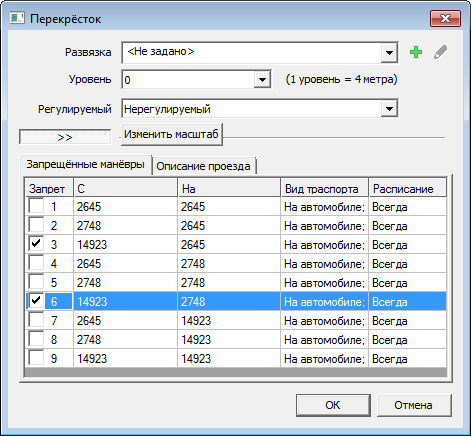
First of all, we turned to the existing solution.
To enter the attribute information came off the window:
The user filled out the data and clicked "OK". The positive point: the data in the window was pre-filled.
For example, in the “level” field, the values of the level of the links attached to the intersection were entered. The list of forbidden maneuvers was pulled up on the same principle. Most often, you could just click "save". In addition, for the prohibition of each maneuver required one click, and for greater clarity, the maneuver was highlighted.
However, it was striking that the link ID as the identification mark of the maneuver was not very informative. The column “type of transport” (meaning the type of transport for which the ban is valid) also did not inspire confidence.
There are two reasons. Firstly, several types of transport are not visible in the table. Secondly, to ban movement on a specific type of transport required three clicks for each maneuver. The choice of a ban schedule also took more than three clicks.
After talking with customers and users, the hypothesis of non-informative ID was confirmed. Users look more at the highlight of the maneuver on the map than on the ID. But ticking ban is considered convenient. We also found that the schedule for maneuvers is made quite rarely and is not a key case.
After this, a number of ideas were born:
- The method of arranging the maneuvers must be preserved, since users are used to it. However, it is worth making it more visual.
- It is impossible to make an arrangement of prohibitions on automatic maneuvers, since There is no indication that this can be done 100% for sure. Therefore, it makes sense to make all the default maneuvers permitted, since This is the most frequent case.
- The link and attributes should be shown simultaneously. So that the attributes do not overlap the map.
- Link IDs as a maneuver identification mark does not work. You need something to replace it. For example, the name of the street.
- Give the ability to edit an object where you create it. If you draw the intersection on the map, it is logical to be able to place all the necessary restrictions in the same place. There was an idea to edit forbidden maneuvers through the map.
- The placement of the ban on a particular type of transport is not very frequent, and the customer does not raise the issue of reducing the number of actions. However, if you use icons, you can make this element more compact and intuitive. This will add points to the decision as a whole and increase loyalty.
- Schedule of prohibitions - the case is not only rare, but also requiring a great variety of actions. Accordingly, trying to make it faster is not only difficult, but not advisable.
With these thoughts in mind, we moved on.
Analog research
And then we had a question: did anyone try to solve a similar problem? And what came of it? We started looking.
After examining more than 30 products, we identified 2 patterns that seemed to us applicable:
- Display of forbidden maneuvers in the form of a list (JOSM). It seemed more visual than the table view, and replacing the ID with the street name was consistent with our idea.
- Visualization of restrictions on the map.
But we wanted to go a little further and combine these two approaches. Thus, we wanted to preserve the habit and give a more visual and technological tool.
First ideas
The next step is to bring our ideas to the customer.
The easiest and fastest way is direct communication.
At the meetings we drew sketches of ideas, described how they should work and immediately received feedback. It was important not only to understand whether our ideas like us or not, but to find out what exactly does not suit us and what practical cases stand behind it.
We tried to pull out a maximum of applied information from a customer in order to get a unified view of solving a problem.
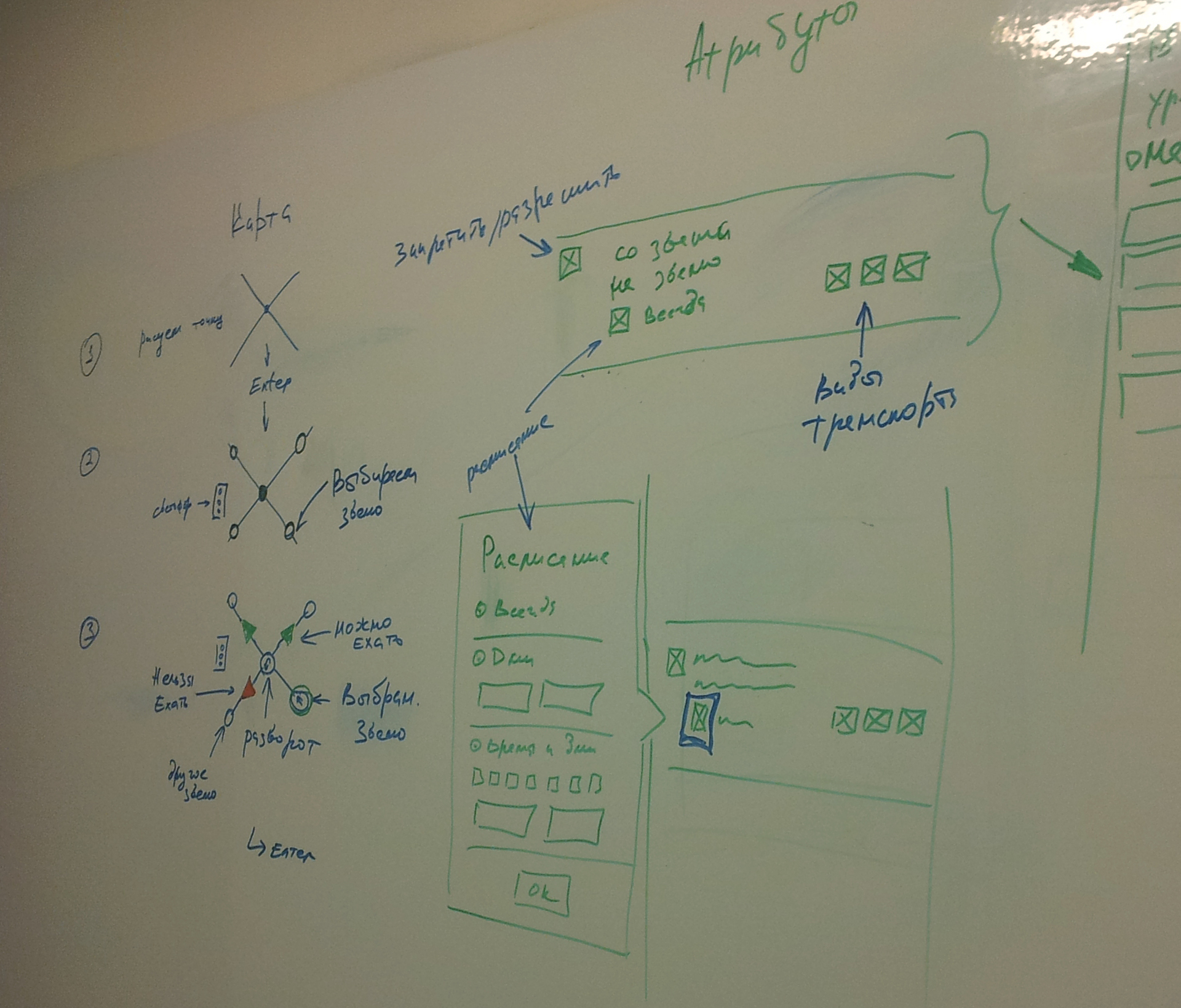
After several dialogues, the concept was as follows:
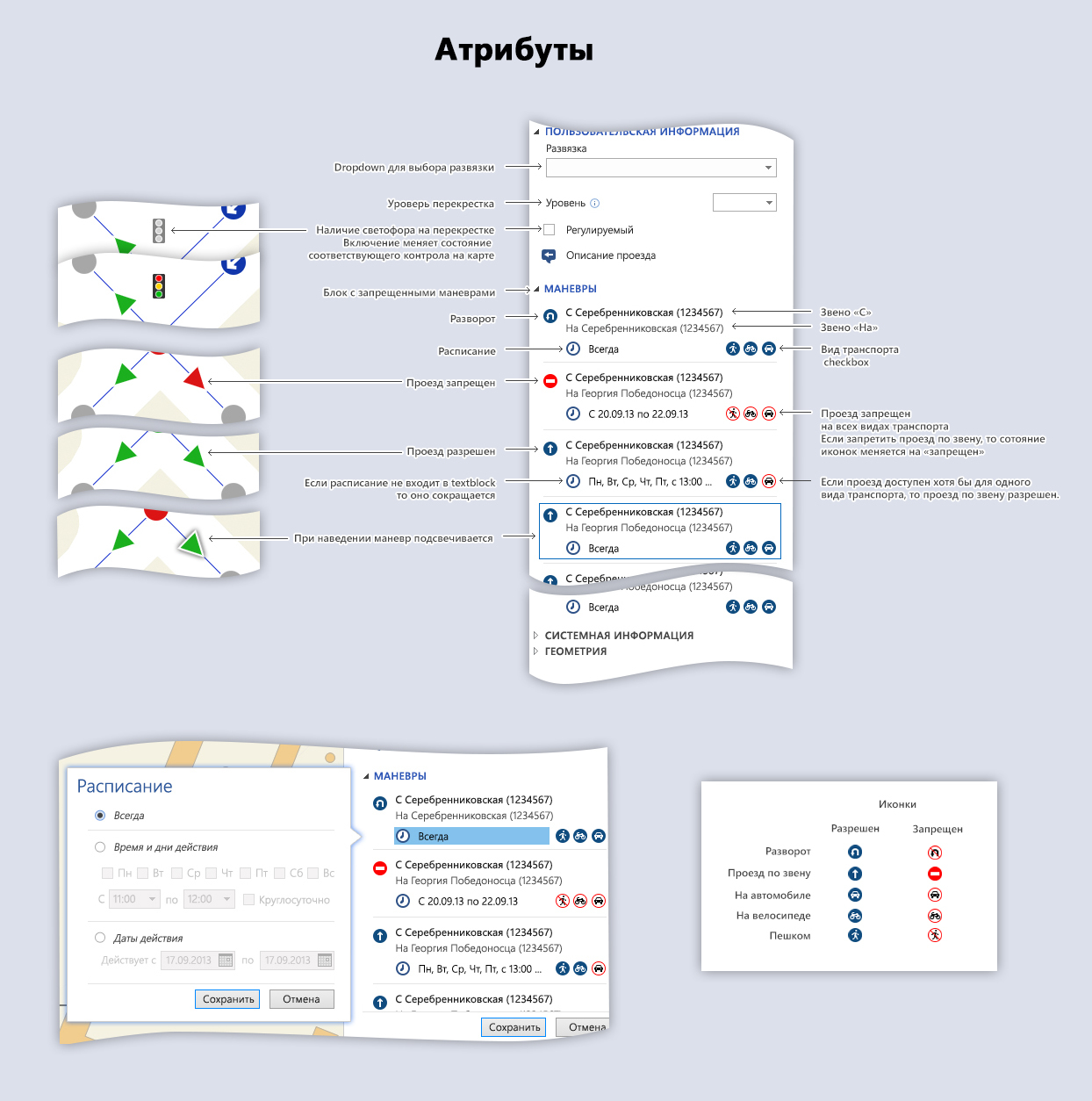
- The attribute information of the intersection is shown in the dock panel on the right.
- Save prefill data.
- We leave two ways of editing the maneuvers (from the map and through the doc-attribute panel).
- Editing in attributes is done as a list of elements in two lines.
- Editing through the map is done with icons drawn over the vector map. The ability to scale the map is preserved.
Process study
After all agreed, we made the first version of the process visualization:
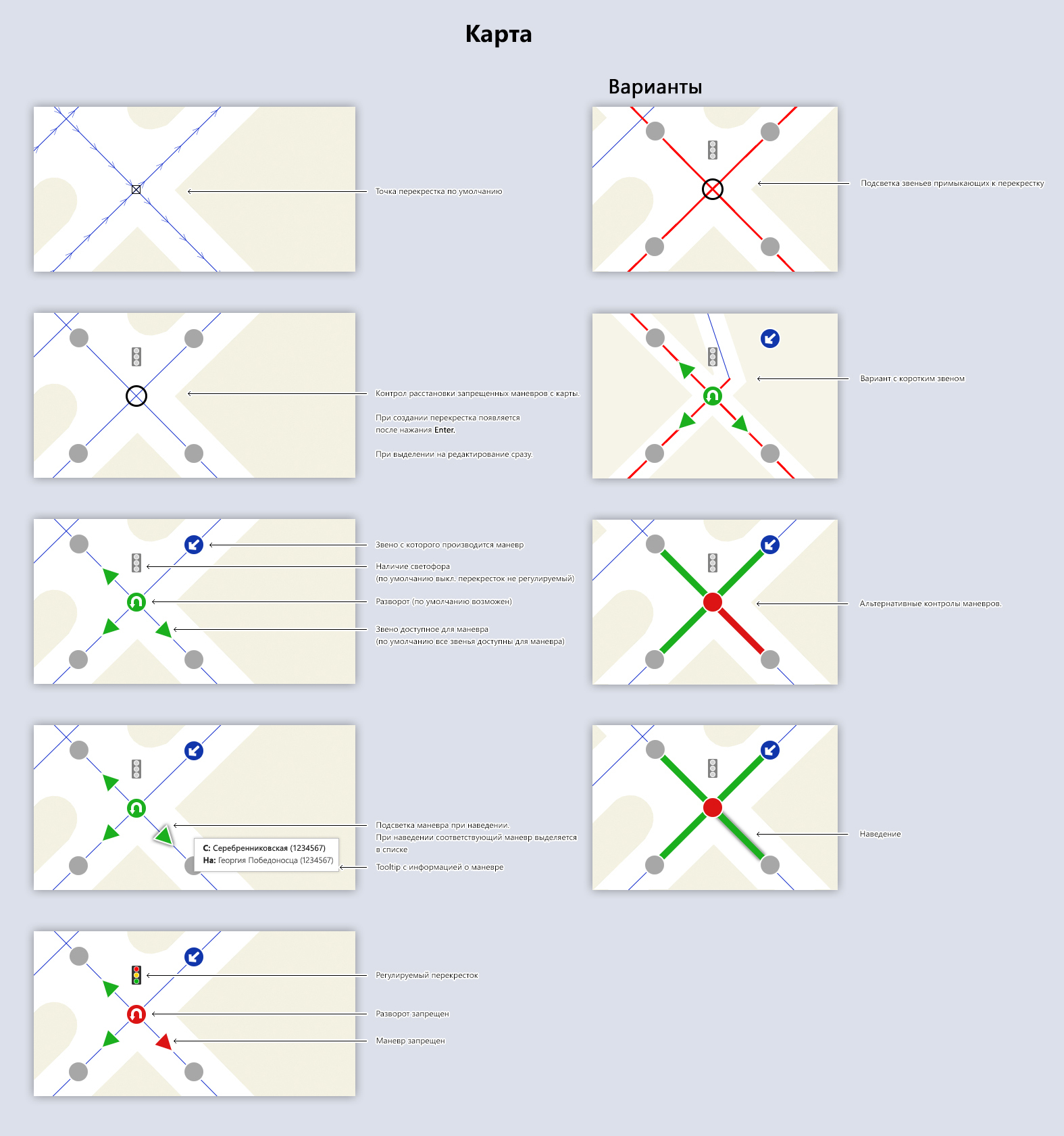
Controls for editing maneuvers through a map, in fact, are raster icons that are superimposed on the intersection and its associated links.
The distance between the icons is fixed and does not depend on the scale.
At the same time, it is possible to change the scale of the map.
After the decision was shown to the customer, a few more nuances surfaced:
- Due to the fact that elements were used in two lines, the list of maneuvers was too cumbersome. And since the number of elements in it can be large, scrolling it is not always convenient.
- A link will not always have a street name. Even within the city, many roads have no name. For example, all sorts of intra-quarter passages, park alleys, etc.
- It was not clear how the controls would behave in the map at a difficult intersection. The obvious now was that if the links intersect at an acute angle, the icons overlap each other.
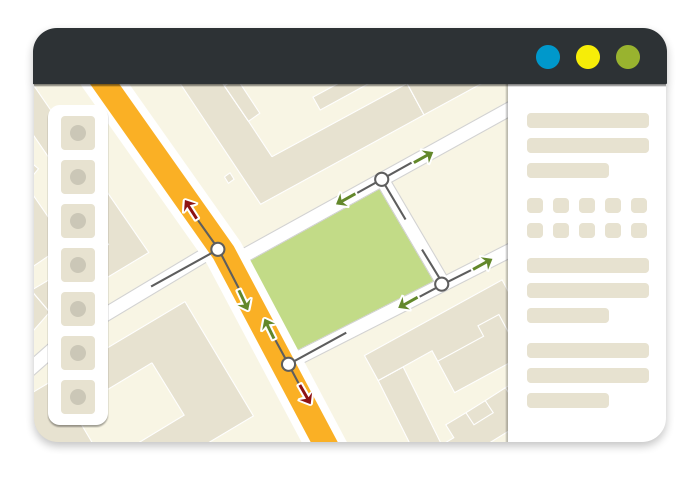
And we went to think further. The new version was this:
The new visualization took into account the difficult cases of constructing intersections. As well as situations when there are many objects of the same type on the map. In addition, we have illustrated the options for working with a crossroads on different scales.
As a result, we got a solution that allows:
- Quickly create intersections , as the fields are automatically filled for the most frequent case. In other words, we do not ask the user to enter data when this can be avoided.
- Create forbidden maneuvers in a more visual way. Placement of prohibitions through the list, since the icons with the image of road signs look clearer than checkboxes. In turn, the creation of maneuvers through the map facilitates the task when working with complex interchanges.
- Easy to adapt. Despite the fact that the appearance and position of the panel have changed, we have preserved its structure and sequence of input data. In addition, we left the opportunity to place bans through the list. This allowed users to quickly get used to the new interface and saved time on learning.
- Increase the amount of data collected. The block structure of the attribute panel allows you to expand it without serious consequences if you need to collect new data on intersections.
- Place bans for a particular mode of transport in one click.
Design => Development => ???
Now that users are happy, it's time for the developers. It is necessary to make a reservation immediately that the developers participated in the creation of solutions at all stages.
Each concept was discussed with the developers in terms of its feasibility. The solution proposed as a result was user-friendly and technologically advanced, and the functionality for editing intersections was critical for the first release of the product.
But its implementation required time and would draw off the strength of the team. It was necessary to find a balance between functionality and convenience, so we decided to detail the task.
Editing maneuvers through the sidebar could be done quickly. At the same time, it looked better than a similar solution in the old system. The ability to edit maneuvers from the map looks comfortable, but users do not wait for it and, therefore, will not be upset if it is not in the first version.
And finally
In the harsh world of enterpise, graphical interfaces more often answer the question “what?” Than the questions “how?” And “why?”. Everywhere you can find systems that solve a functional problem, without giving due attention to the simplicity and convenience of its solution. But it is the convenience and following the problematic and user habits that allows you to create truly useful products.
Therefore, do not be afraid to invest time in the interface and search for convenient solutions. Create cool products that will really save users time, company money, and developer nerves. Your work will not be in vain.
Source: https://habr.com/ru/post/234947/
All Articles