Flask Mega-Tutorial, Part 12: Reconstruction
This is the twelfth article in the series, where I describe my experience of writing a Python web application using the Flask mic framework.
The purpose of this guide is to develop a fairly functional microblog application, which I decided to call
')
If you played with our microblog, then you notice that it does not look the best way. So far, we have used the basic patterns, without any styling. This was useful because we didn’t want to be distracted from writing code to make beautiful HTML.
We worked hard, coding logic up to the present moment, so now we will take a break and see how we can make our application a little prettier for our users.
This article will be slightly different from previous ones, because writing attractive HTML / CSS is an extensive topic that goes beyond our series. There will be no detailed HTML or CSS, we will simply discuss the basic principles and ideas on how to approach this task.
The difficulty of writing code is nothing compared to how web designers create beautiful templates that look good in a number of browsers, each with quirks, bugs and their own opinions. And nowadays, the situation is aggravated by the fact that sites, in addition to browsers, should look good also in resource-limited browsers of phones and tablets.
Unfortunately, the study of HTML, CSS and JavaScript and the fight against the unique features of each browser is a task of uncertain size. We really have no time (or interest) to do this. We just want to make our application better without extra effort.
So, how can we accomplish this task in such conditions?
Our good friends from Twitter have released an open source web framework called Bootstrap, which can be our winning ticket.
Bootstrap is a collection of CSS and Javascript utilities, for most types of web pages. If you want to see the benefits that we will get by developing with this framework, here are a few examples.
Here are a few things Bootstrap is good at:
Before we can add Bootstrap to our application, we need to install the CSS, Javascript and images included in the framework where our web server can find them.
In Flask applications, static files are stored in the
For example, if we put a file named
We will install Bootstrap like this:
Now we will load the framework specifying the following instructions in the
The
Please note that one of the required files is jQuery, which is used by some Bootstrap plugins.
The
Given the changes in our
Changes you need to make:
We will not discuss how to make these changes, because they are pretty simple. Those interested can see the diff on GitHub with the changes.
Help Bootstrap will help you in an attempt to analyze the new patterns of our application.
Today we made a promise not to write a single line of code, and kept our promise. All the improvements we made in the template files.
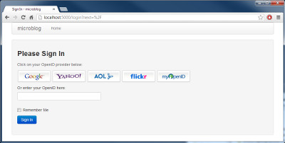
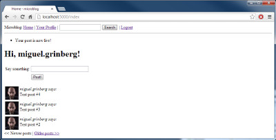
To give an idea of the scale of the transformation, here are a few screenshots.


The updated application can be downloaded below:
Download microblog-0.12.zip.
In the next section, we will see how to improve the formatting of dates and times in our application.
Miguel
The purpose of this guide is to develop a fairly functional microblog application, which I decided to call
microblog in the absence of originality.Table of contents
Part 1: Hello, World!
Part 2: Templates
Part 3: Forms
Part 4: Database
Part 5: User Login
Part 6: Profile Page and Avatars
Part 7: Unit Testing
Part 8: Subscribers, Contacts and Friends
Part 9: Pagination
Part 10: Full Text Search
Part 11: Email Support
Part 12: Reconstruction (this article)
Part 13: Date and Time
Part 14: I18n and L10n
Part 15: Ajax
Part 16: Debugging, Testing, and Profiling
Part 17: Deploying to Linux (and even to Raspberry Pi!)
Part 18: Deploying to Heroku Cloud
')
Brief repetition
If you played with our microblog, then you notice that it does not look the best way. So far, we have used the basic patterns, without any styling. This was useful because we didn’t want to be distracted from writing code to make beautiful HTML.
We worked hard, coding logic up to the present moment, so now we will take a break and see how we can make our application a little prettier for our users.
This article will be slightly different from previous ones, because writing attractive HTML / CSS is an extensive topic that goes beyond our series. There will be no detailed HTML or CSS, we will simply discuss the basic principles and ideas on how to approach this task.
How do we do it?
The difficulty of writing code is nothing compared to how web designers create beautiful templates that look good in a number of browsers, each with quirks, bugs and their own opinions. And nowadays, the situation is aggravated by the fact that sites, in addition to browsers, should look good also in resource-limited browsers of phones and tablets.
Unfortunately, the study of HTML, CSS and JavaScript and the fight against the unique features of each browser is a task of uncertain size. We really have no time (or interest) to do this. We just want to make our application better without extra effort.
So, how can we accomplish this task in such conditions?
Introduction to Bootstrap
Our good friends from Twitter have released an open source web framework called Bootstrap, which can be our winning ticket.
Bootstrap is a collection of CSS and Javascript utilities, for most types of web pages. If you want to see the benefits that we will get by developing with this framework, here are a few examples.
Here are a few things Bootstrap is good at:
- Same display in different browsers
- Practicing screen sizes of tablets, phones and desktop browsers
- Custom layouts
- Fully styled navigation bar
- Fully stylized forms
- And much more ...
We fasten Bootstrap to our application
Before we can add Bootstrap to our application, we need to install the CSS, Javascript and images included in the framework where our web server can find them.
In Flask applications, static files are stored in the
app/static directory. The web server knows what to look for files in this directory, when the URL has the /static prefix.For example, if we put a file named
image.png in the /app/static directory, then in the HTML template we can display an image using this tag: <img src="" /> We will install Bootstrap like this:
/app /static /css bootstrap.min.css bootstrap-responsive.min.css /img glyphicons-halflings.png glyphicons-halflings-white.png /js bootstrap.min.js Now we will load the framework specifying the following instructions in the
HEAD section of our basic template: <!DOCTYPE html> <html lang="en"> <head> ... <link href="/static/css/bootstrap.min.css" rel="stylesheet" media="screen"> <link href="/static/css/bootstrap-responsive.css" rel="stylesheet"> <script src="http://code.jquery.com/jquery-latest.js"></script> <script src="/static/js/bootstrap.min.js"></script> <meta name="viewport" content="width=device-width, initial-scale=1.0"> ... </head> ... </html> The
link and script load the CSS and Javascript files provided by the framework.Please note that one of the required files is jQuery, which is used by some Bootstrap plugins.
The
meta includes the "Rubber" mode, which allows you to scale the page for computers, tablets and phones.Given the changes in our
base.html we are ready to start implementing Bootstrap, which will require a slight change in our templates.Changes you need to make:
- Put all the contents of the page in one column with "rubber" features.
- Adapt all forms to use Bootstrap styles.
- Replace our navigation bar with the Navbar
- Convert our previous and next links to
Pagerbuttons - Use Bootstrap notification styles for flashing messages.
- Use stylized images to represent OpenID providers in the form of a login.
We will not discuss how to make these changes, because they are pretty simple. Those interested can see the diff on GitHub with the changes.
Help Bootstrap will help you in an attempt to analyze the new patterns of our application.
Conclusion
Today we made a promise not to write a single line of code, and kept our promise. All the improvements we made in the template files.
To give an idea of the scale of the transformation, here are a few screenshots.
The updated application can be downloaded below:
Download microblog-0.12.zip.
In the next section, we will see how to improve the formatting of dates and times in our application.
Miguel
Source: https://habr.com/ru/post/234785/
All Articles