A little about handwritten fonts

“You have such glorious writing utensils, and how many pencils you have, how many feathers, what a thick, glorious paper ... And what a glorious office you have!
F.M. Dostoevsky, "Idiot"
First used handwritten fonts. They were used by skilled calligraphers, by virtue of the laboriousness of producing manuscripts, each turned into a work of art.
With the invention of typography, the art of calligraphy is gone. It was no longer necessary to display every handwritten zagogulin, it was necessary to place the standard pre-prepared letters in a certain sequence. This was done by professional printers. Readers received a ready-made standardized product, while they themselves continued to write letters or compose manuscripts by hand, due to the fact that there were no printers suitable for individual work.
')
The situation has moved off the ground with the invention of typewriters. Oh happiness: a mechanized letter has become available to everyone! Instead of beautiful handwriting, office workers began to demand the ability to type on a typewriter - however, the manuscript could be submitted to a typewriter bureau, where experienced typists turned any business paper written in the most clumsy handwriting into a readable document. With the spread of typewriters, the individuality of the handwriting, however, the smallest variety in the lettering characters is a thing of the past: if it was possible to replace one typesetting box with another when typing, then it was impossible to change the font on a typewriter - technically unjustified.
A new round of technical progress in the field of typewriting technology - the invention of computers - has returned to the personality of handwriting its former greatness. Fonts remained standard, but now they were chosen according to their own taste and discretion.
Desired mechanization with preservation of individual features? Certainly so. But let's compare all of us familiar computer fonts with handwritten ones: partly for educational purposes, partly - for the purpose of indulging in nostalgia about the great and unforgettable art of calligraphy.
“Mommy washed the frame” - everyone remembers this, let's take something just as uncomplicated and age-related.
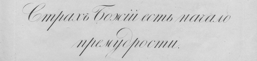
This is from the 1837 recipe. Pushkin did not have time to study for them, but it is unlikely that the specimens of his time represented something fundamentally different. School recipes — a little more flowery or a little less — and there are school recipes: it is difficult to get the right squiggle with my own hand, but in the end their monotony is boring.
What kind of science is this, in fact, in which the main thing is to observe the correct slope?

As the protagonist of the well-known novel by V. Kaverin “Two Captains” was instructed by the unloved stepfather: the rods should be perpendicular.
It is also necessary to observe uniform indentation of words from each other.

Plus the harmonious thickness of the lines achieved by the slope of the pen and the force of pressure on the paper.
And of course, the overall, pleasant looking smooth outlines.
To comply with the rules, it was necessary to correctly hold a pen in the fingers - the main production tool of the calligrapher
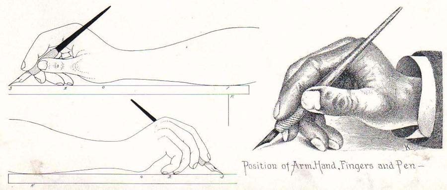
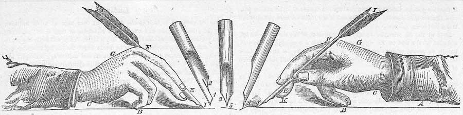
... and maintain correct posture.

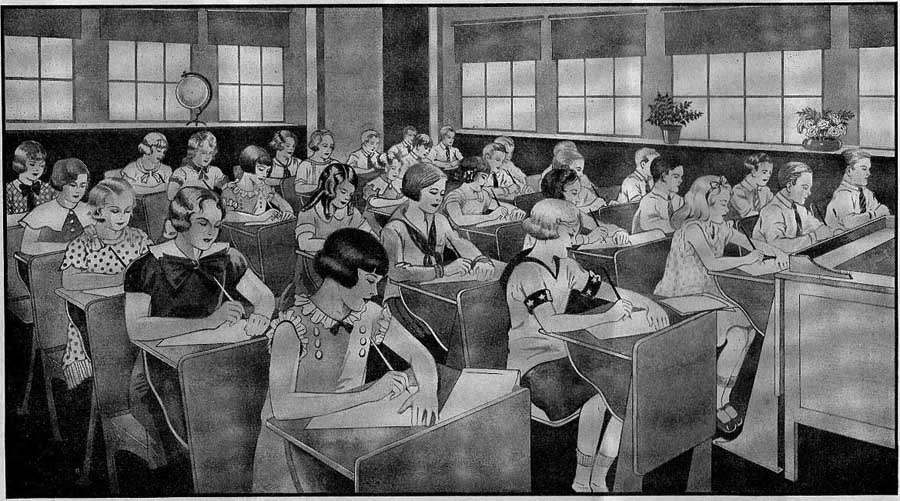
Years of hard work were needed to learn penmanship — like learning any other craft: in schools, business colleges, in calligraphy courses that were very common at the beginning of the last century.
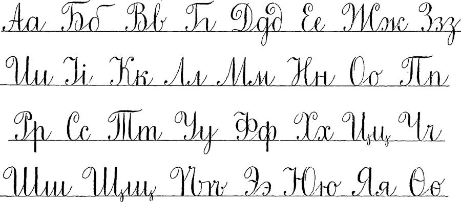
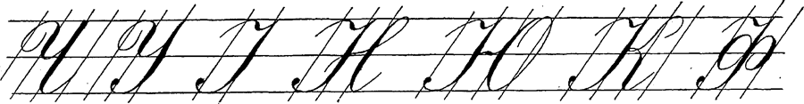
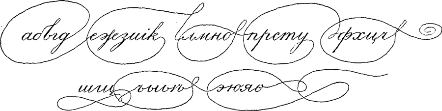
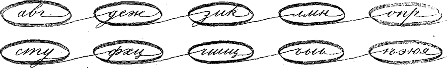
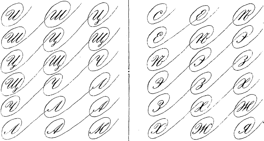
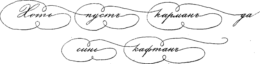
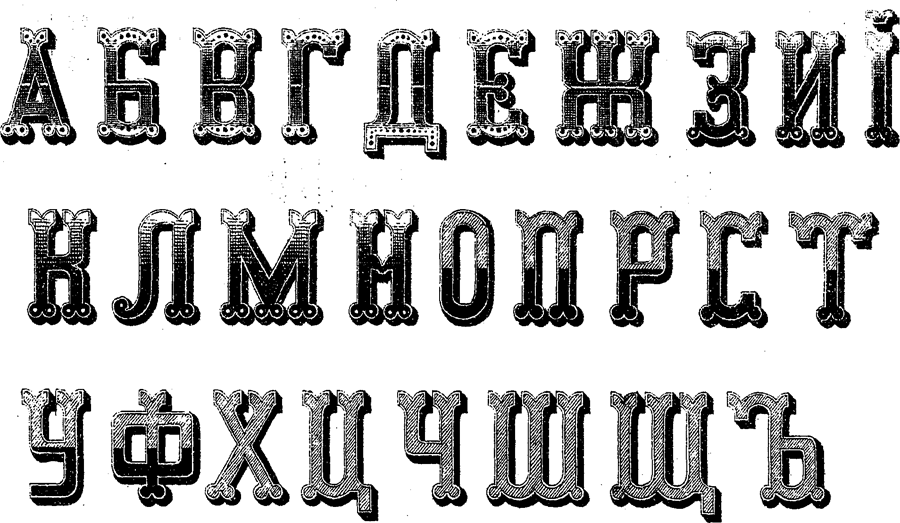
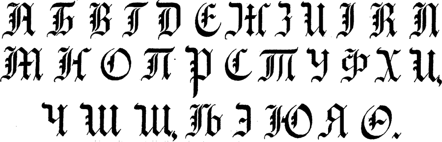
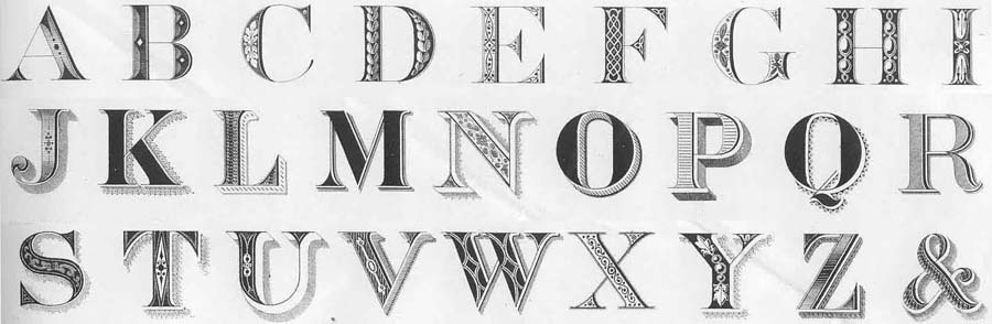
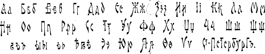
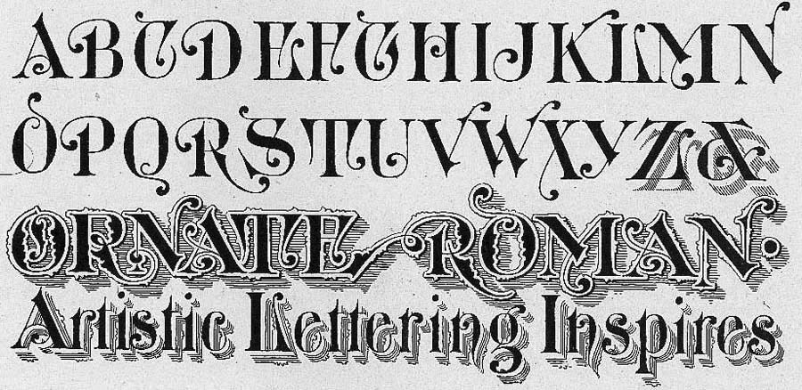
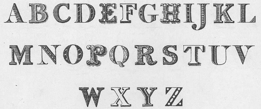
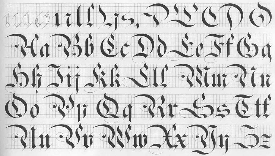
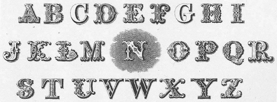
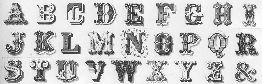
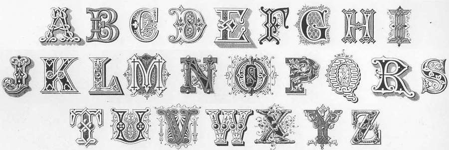
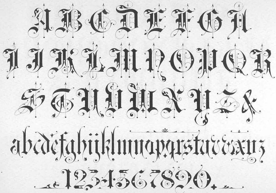
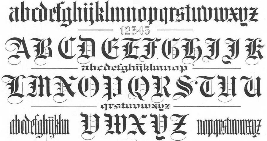
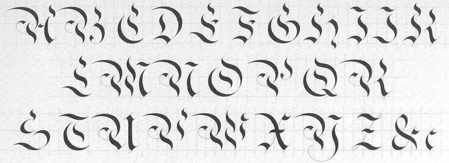
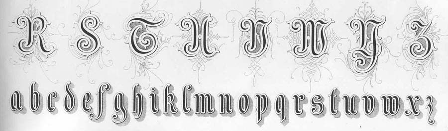
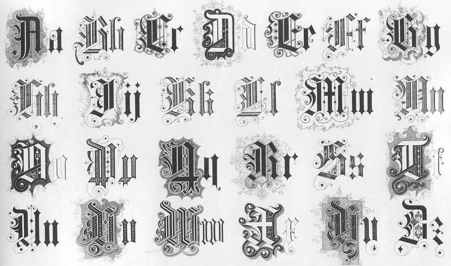
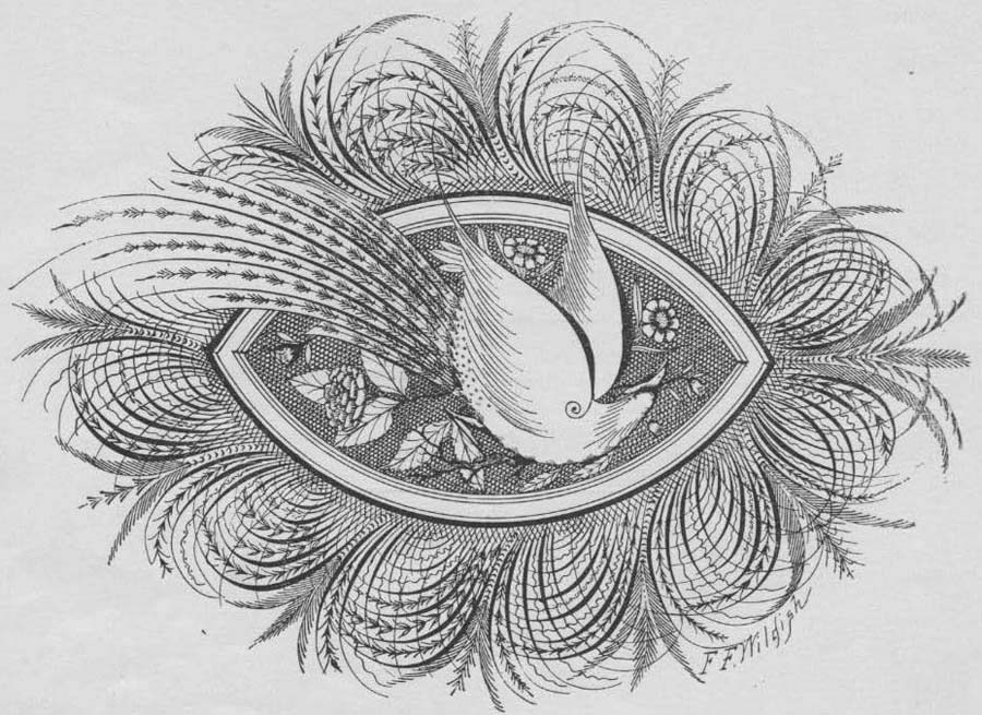
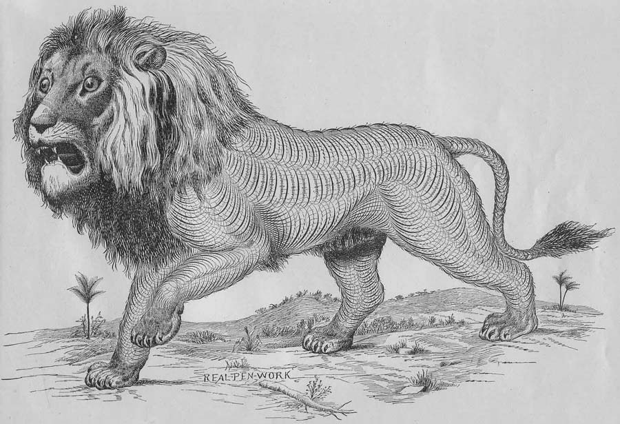
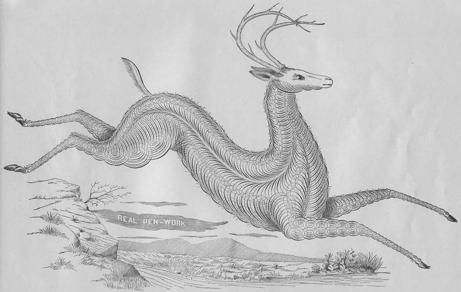
But if a man possessed this art - oh! he turned into a guru for whom any professional graces are available. First of all, handwriting - in computer language, fonts. Here, thanks to the individuality of the master, there was no limit to perfection. Look at these little patterns of letters, from relatively simple to the most intricate, and appreciate their ageless beauty.


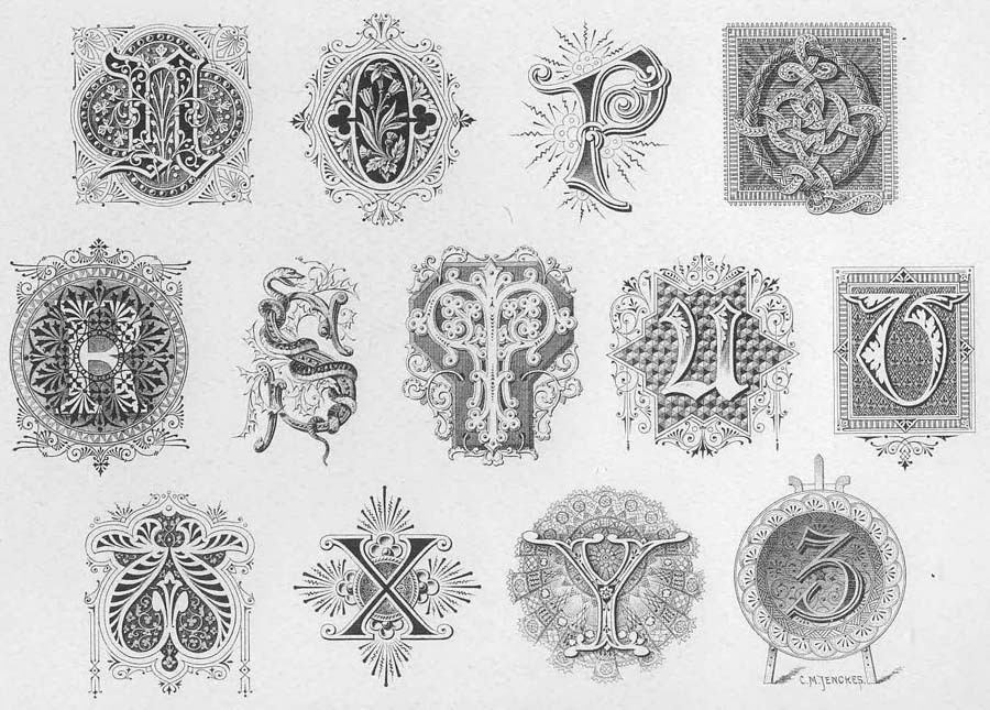
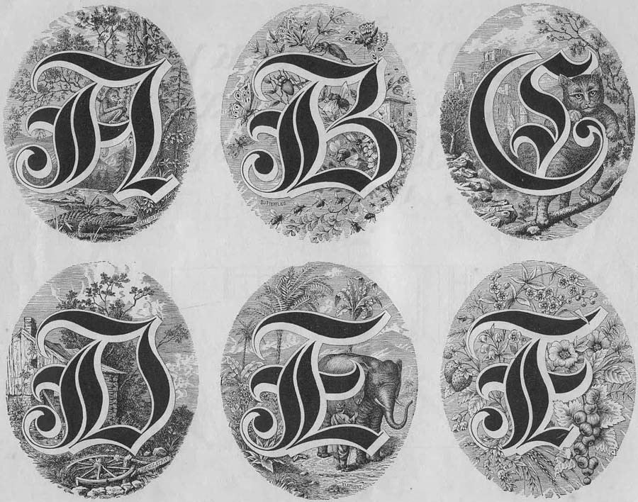
From such handwriting to painting - one step. Why would a man who possessed such intricate patterns not manifest himself in the adjacent field? And exhib.
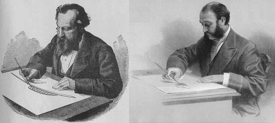
They painted calligraphers in a style similar to them: a calligraphic pattern, often with application purposes or just for fun.
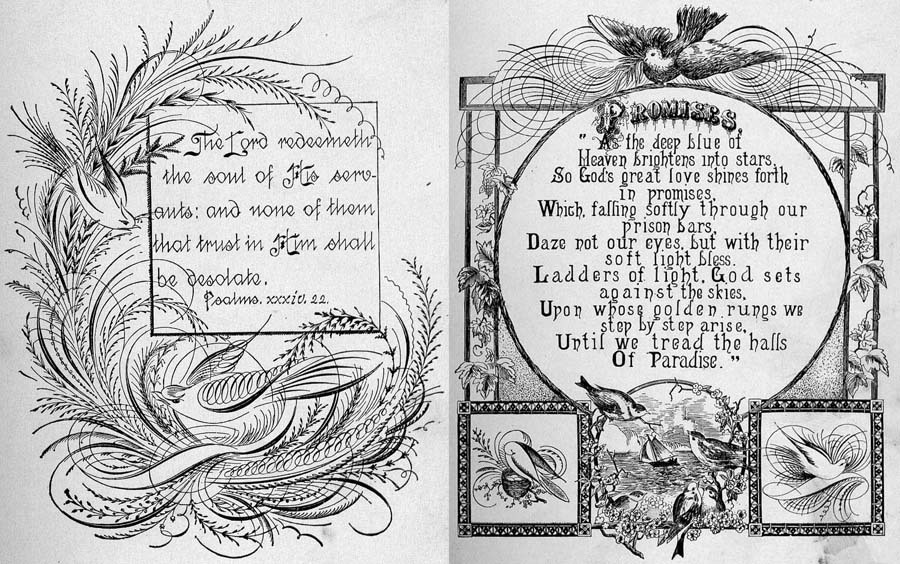
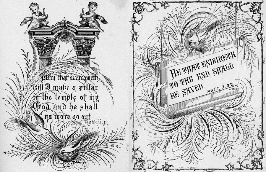
Naturally, it wasn’t the girls who drew the picture, but the aged people, wise by the experience gained - as befits the masters of their craft.
This, in fact, could have been completed, but I would like to cite a small excerpt from the novel Idiot, from which the epigraph is borrowed to this post.
“- Wow! - the general cried, looking at the sample of calligraphy, presented by the prince: - but this is a recipe! Yes, and record something rare! Look, Ganya, what a talent!
On a thick vellum leaf, the prince wrote a phrase in medieval Russian:
“The humble hegumen Pafnuti put his hand”.
“This is it,” the prince explained with extreme pleasure and animation, “this is the own signature of Abbot Paphnutia from a fourteenth-century photograph. They were excellently signed, all these our old abbots and metropolitans, and with what sometimes taste, with what diligence! Do not you even have Pogodinsky edition, General? Then I wrote it here in a different font: it is a round, large French font of the last century, other letters were even written differently, the font of the areal, the font of public scribes, borrowed from their swatches (I had one) - you should agree that it is not without merits Take a look at these round d, a. I translated the French character into Russian letters, which is very difficult, but it turned out well. Here is a beautiful and original font, this phrase: “zeal overcomes everything”. This is the font of Russian clerks or, if you like, military clerks. This is how official paper is written to an important person, also a round font, a nice, black font, written in black, but with remarkable taste. The calligrapher would not allow these strokes, or, better to say, these attempts to open, these unfinished half-tails, you notice, but in general, look, it makes up the character, and rightly so the military clerk's soul peeped out: I wanted to, and the talent asks, but the military collar is tight on a hook, discipline and in handwriting came out, lovely! This recently, I was struck by one such specimen, by chance I found it, and where else? in Switzerland! Well, here, this is a simple, ordinary and pure English font: further grace cannot go on, everything is lovely, beads, pearls; it's over; but here's a variation, and again French, I borrowed it from a French commuter traveling: the same English font, but black; the line is a bit blacker and thicker than in English; an is a proportion of light and disturbed; and note too: the oval is changed, a bit rounder and in addition a stroke is allowed, and a stroke is the most dangerous thing! The ink requires an extraordinary taste; but if only it was a success, if only a proportion is found, then such a font is not comparable with anything, so even that you can fall in love with it.
- Wow! yes, what subtleties you enter, - the general laughed, - yes you, father, are not just a calligrapher, you are an artist, eh? ”.
Now you understand how princely Myshkin owned the intricate art? Is it possible so deep individualization when using computer fonts?
Source: https://habr.com/ru/post/234109/
All Articles