Redesign concept vk.com

Not so long ago, Vkontakte announced the launch of a competition for redesign . At least it will be interesting, I thought. And took part. All this resulted in a kind of rough concept, which I want to share - I hope my thoughts, ideas and reasoning will be useful for the habrasoobshchestvo. Caution traffic!
The main rule of redesign
Perhaps I'll start with a little story. I had to engage in the redesign of a single social network (unfortunately, this social network, mobrika.ru, is currently disabled, and the redesign has nothing to do with it). The entire interface has been radically changed, as well as a complete rebranding. Despite the fact that everything objectively became more convenient and attractive, and all the functionality was preserved, the approximate statistics were as follows: 10% of users reacted positively to the changes, 50% of users did not express their opinion, 40% of users were extremely negative. Why? People don't like change. Subsequently, I found confirmation of this and in many other projects. Therefore, in the context of vk.com, the following main rule of future redesign was formulated:
')
A radical change in the interface of such a large-scale project with such a diverse audience is categorically contraindicated.
Branding and guidelines
The vk.com interface has always been distinguished by its simplicity, minimalism and high speed, highlighting the social network from competitors. But it is obvious that the development went without relying on any guidelines. In visual terms, mobile applications and the web version are completely different products.
Development of guidelines, brandbook and bringing all the products of the company to a common denominator, should be priorities.
The visual unity of all products will increase the credibility of the brand, allow the company to move to a new level of development and take a leading position in the global market.
Within the framework of the provided layouts, it is already possible to see some progress in the formation of a new visual language.
The color scheme was slightly changed, controls were standardized, unity in the content design appeared, fonts were updated. A well-proven stack is used - font-family: “Helvetica Neue”, Helvetica, Arial, sans-serif; Despite the support of plug-in fonts with all modern browsers, there is still a decrease in performance and problems with rendering - standard fonts are still worth using for such large-scale projects.
Global interface changes
Enlarged fonts
All fonts are enlarged by default. Content is highlighted in larger size (entries in the news feed, correspondence in dialogs, etc.)
Updated menu
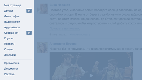
Items are cleared of the unnecessary pronoun "My ...". The menu is fixed when scrolling the page, so the need for the Back button disappears. The item "My Settings" is moved to the top menu.
Additional column
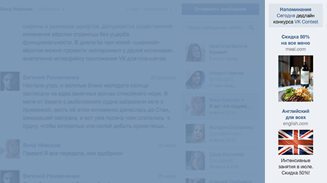
All reminders and advertisements are moved to the right column. This will increase the CTR of ads, which in turn will increase the company's profits.
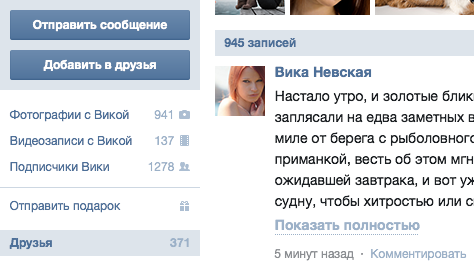
User Profile
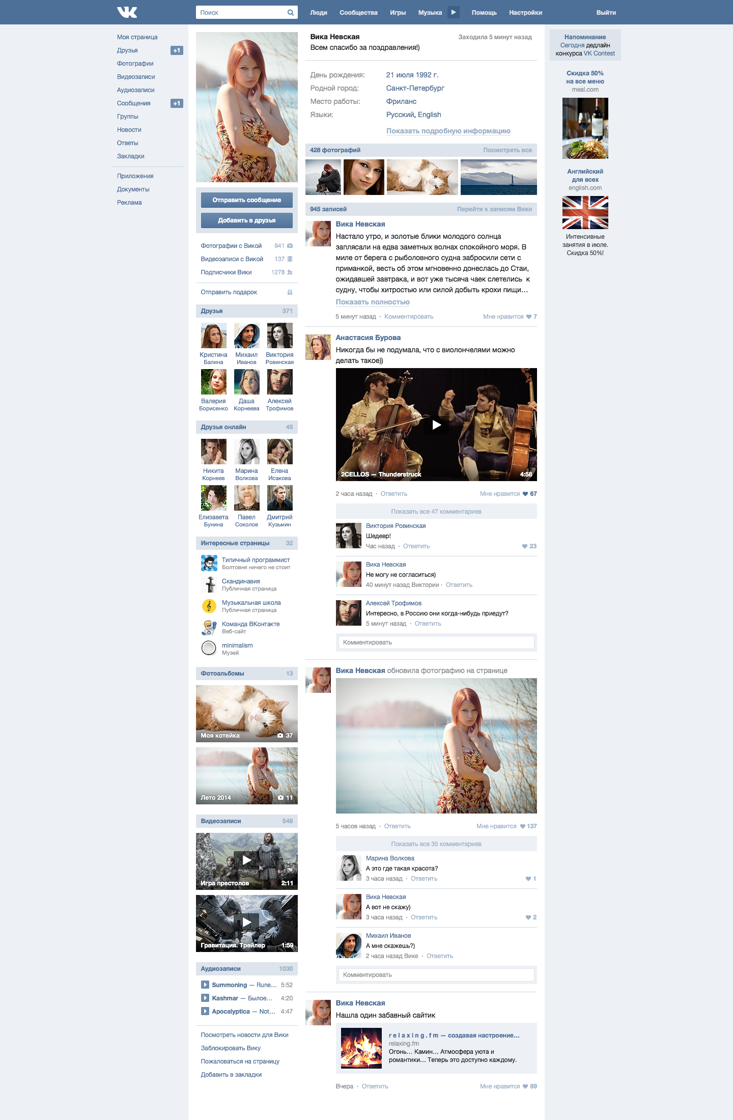
User profile has not changed. Small cosmetic improvements made the new design more compact, and at the same time added a bit of “air”.

The headers were combined with counters, freeing the design from unnecessary visual noise. The link to the news that the user reads has been moved to the group of links at the bottom of the column.
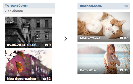
Thumbnails of photo albums have become a little wider, while more compact and less overloaded from a visual point of view.
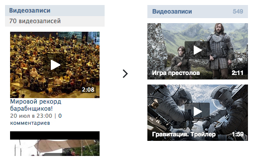
The same thing happened with the videos. Date added and the number of comments eliminated as unnecessary.
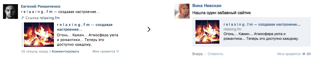
Attached links are now smaller, yet they contain more information.
News feed
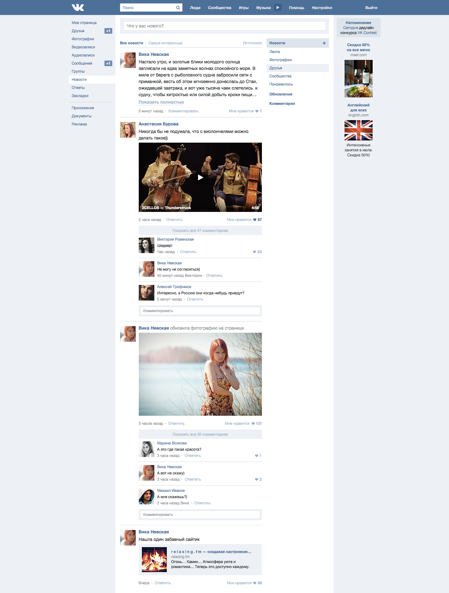
The news line has been changed according to the recommendations - a form for creating a new record and a right column with navigation through sections have been added.
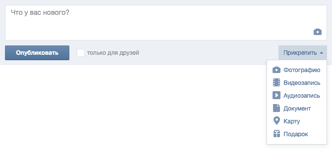
At focus, the form unfolds. In the future, in addition to directly uploading photos to the form, I would like to attach any files by dragging and dropping them, just like any popular web-based mail interface.

When you click on the “+” symbol, it turns 45 °, turning into a cross. At this time, leave infusions sections of the tape.
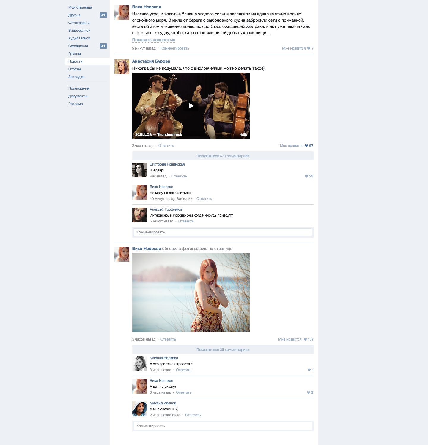
When scrolling the page, after the filtering column is hidden from view, the entries take up the entire width - just like viewing the user's wall of the current version of vk.com.
Messages
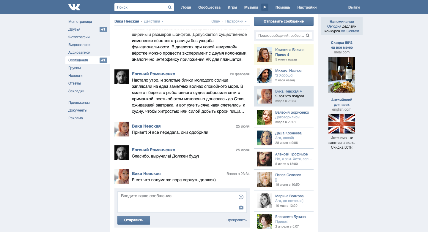
The message interface has undergone the most significant changes. In the current version of vk.com there is a small confusion with the titles - in the menu section is called “My Messages”, in the titles, in the “title” tag there are used “Dialogues”. I propose to focus on the heading "Messages". In the English version there is no such confusion.
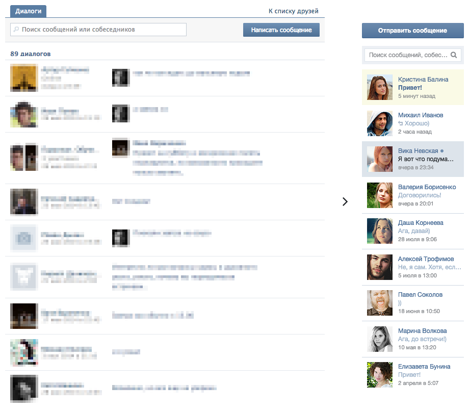
The dialog navigation page has become a compact right column. Search searches not only among existing messages, but also among all friends. In the column on the right, after all conversations, friends are displayed. Thus, together with the search for the need to link "To the list of friends" disappears. Unread messages are highlighted in sand color, selected correspondence in light blue.
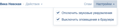
The settings for notifications and notifications are checked out and moved to the corresponding drop-down list.

The expanded action menu has become more attractive.
Afterword
One of the main advantages of redesigning an existing resource is the ability to use statistics based on real data. In the process of work, I had a lot of questions: what is the average length of a message, a post; what is the average length of the headers; how often do users use this or that functionality, etc. Without reliance on such statistics can not guarantee a successful redesign.
I wanted to mention a few more points. The introduction of the right column was partly necessary in order to sustain the optimal number of characters per line in the content area (55-85 characters). But also the right column will bring a very useful side effect - an increase in CTR, and therefore the company's profits.
Another pleasant fact is that the redesign involves the use of all the pictures in the current size - that is, the number of billions of images will not need to be regenerated. This is probably all, thank you for your attention.
Links
Announcement of the competition
Results of the competition
Source: https://habr.com/ru/post/234083/
All Articles