7 basic usability principles for online stores (translation)
What impact do web pages of online store products have on conversion rates? Well, it's like to say. But the fact is that the product page is your last chance to encourage a user to make a purchase.
It is here that the user expects to find all the necessary information for making a purchase. And this is a big problem for the UX designer (“usability designer”), since he needs to convey so much information to the user in such a limited space. Perhaps that is why most of the pages describing the product, in the end, look random and sloppy. Therefore, it is very important to present all the information in the most convenient, understandable and convincing way.
')
This is where usability techniques come in handy.
Who besides the users themselves can tell you more about the convenience of the interface?
Testing with your target users can help you identify the reasons for the low conversion of the site and even suggest some solutions.
Although such a tool is still not absolute. Each industry has its own specifics, for example, what worked for an online jewelry store will not necessarily work for a bookstore. However, through benchmarking research and usability testing for online stores, we are able to identify some basic rules that can serve as a guide.
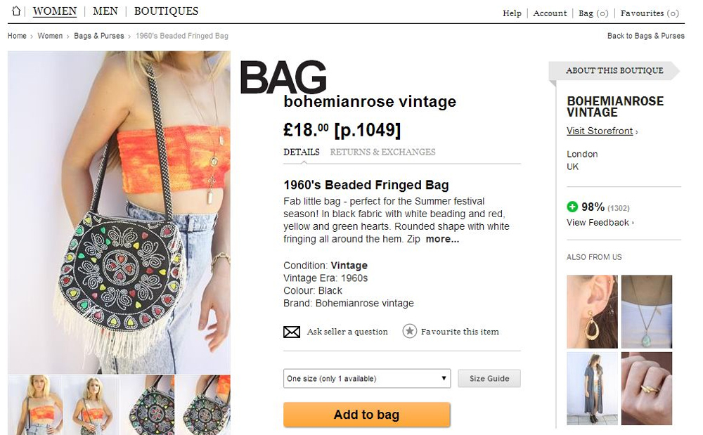
Expressive product visualization

It's no secret that today the entire Internet is becoming visual, and all the latest updates from technology giants like Google, Facebook and Twitter emphasize the importance of photo and video content. The same applies to websites of online stores, which should provide the user with the most expressive high-resolution photos, 360-degree reviews or product videos. And this does not mean that having only one good photo will encourage users to make purchases. Everything must be done to ensure the feeling of a real purchase and minimize the user's fear of making the wrong purchase.
Thus, if you want to run your online store, it definitely makes sense to invest in high-quality photos and editing. However, do not overdo it with Photoshop, make the final results as close as possible to reality.
Fast download

High-quality images are great, but fast loading is more important. Usability aims to save user time by making the purchase process as simple and quick as possible. According to Kiss Metrics , 47% of consumers expect the page to load in less than 2 seconds, and 40% of people leave the website if it loads more than 3 seconds.
However, images are not the only reason for slow loading of your online store. This also contributes to a large number of DNS records, HTTP requests, the rejection of the use of PHP accelerators, GZIP compression, etc. Therefore, make sure that the user’s waiting time is minimized; otherwise, 1 second delay in page response may result in a 7% reduction in conversion, which is impermissible.
Detailed Product Descriptions
Imagine that your product page is a sales consultant in a real store. Only the visitor is completely alone on your website and must find out everything about the product itself. Thus, make sure that on the product page there is as much useful information as a real consultant could give. It is quite difficult to organize all the information about the product, delivery and transportation so that it is readable and does not burden the user with too much text. Therefore, you should use tabs and layering to break up the content into easily digestible portions.
But the most important information, such as product name, images, brief description, price and availability, method of delivery and transportation, method of payment, should be always at hand.
Spatial navigation
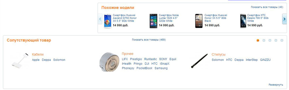
If you have a large range of products and many different filters that can hide the product from the user, you need to think about interesting ways to display products that can also help the user choose the most appropriate option. There are several common ways to do this:
- Recommended products;
- Related products;
- The people who looked at this product also looked;
- People who bought this product also purchased, etc.
This kind of content will allow the user to see, find and buy the product for which they came.
Clear and targeted CTA
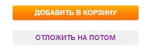
It must be said that a well-designed call-to-action (CTA) can change the rules of the game on any website, and especially in the online store. But what is considered a good CTA? Of course, there is no single right formula, however, it must be said that a working CTA must be:
- Concise but focused on action (Buy Now, Add to Cart);
- Visually prominent and easy to find;
- Acceptable (using the same language as your customers).
CTA is a great way to guide a user through the buying process without interrupting shopping. But the importance of a good CTA is even higher on the product details page. Therefore, it is best to conduct a couple of A / B tests with different formulations, colors, and CTA forms to see which one will work best for your site. According to a Kiss Metrics study , creating a more visible call to action increases conversion by 591%.
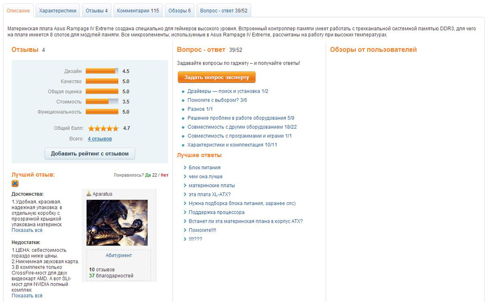
Signs of trust

One of the main tasks of the online store is to gain the trust of the client and give him confidence when making a purchase. The presence of an online store directly includes payment by the buyer, therefore, for smoother user interaction, it is necessary to prove that he can trust you. Do not worry about the piling up of design with signs of trust in different colors and shapes, this is not the time to play aesthetic. Signs of trust are needed to give the user a slight push to continue making a purchase.
Stock information
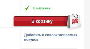
One of the most irritating factors for the consumer is the ability to find information about the availability of goods only on the purchase page. Or even worse, to find that the product is not available after adding it to the basket. This is a sure way to lose customers. The best way to inform the consumer about the availability of goods, add information directly to the page with a description or not show at all. In addition, the availability of goods in stock must be constantly updated to save the patience and time of the user.
Putting it all together
Setting up an online store site is difficult, but even more difficult to keep it workable and expanding. This requires constant analysis of the effectiveness of the site and, most importantly, optimization. Very part of the webmasters do not want to make any significant changes on the site, which may be the only deterrent cause. Therefore, my advice is to never stop improving the site and keep up with modern technologies. And finally, put yourself in the user's place, and everything will become clearer.
Source: http://www.webdesignviews.com/
Source: https://habr.com/ru/post/233917/
All Articles