Sly Lamb Company Experience: Adapting an iOS App Design for Windows Phone
This article was created by our friends, partners from Sly Lamb, and describes their real experience in adapting and developing mobile applications for Windows Phone.Good day! My name is Alexey Perezhogin, I am the head of the studio Sly Lamb , in which we are engaged in the profile development of applications for Microsoft platforms since the release of Windows Phone to the Russian market.
This post is devoted to our most frequent type of projects lately - the adaptation of iOS applications for Windows Phone on the example of the application “Julia Vysotskaya Recipes” .
Introduction to the application
The recipes of Julia Vysotsky are the first application for Windows Phone in Russian, in which for most of the 1500 recipes there is a video instruction. In the application, you can quickly find the right dish by tags or with an exact indication of the ingredients / type of cooking; create a shopping list for selected products and share it with your family / friends; Make lists of your favorite dishes and share them on social networks.
')
Initial data
Our task was to develop a WP application, retaining the basic functionality of the iOS version, taking into account the adaptation of the design. This is what the screens for iOS apps looked like when we started work.


Screenshots of iOS applications before starting work
Summer-like, but not at all like a Microsoft-style design - it means there is something to be done!
Sometimes, for such projects, it is necessary to think through a navigation scheme from scratch, for example, because often the main cases include scenarios that are unusual for Windows Phone users, and sometimes design errors for the original platform are detected. In our case, similar processing was done, but not in its worst form.
Custom scripts and navigation
So, the first thing we do with an iOS application is sorting out existing user behavior scripts across screens. The main application scenarios are the selection of dishes from the recommended blocks and the search for dishes by parameters. Additional scenarios - the ability to make a list of products by dishes, create collections of "favorite" dishes, other features - service (settings / reviews, etc.) and social (share recipe).
An iOS application initially did not have a single visual map (a visual map is an application diagram with all the screens and transitions between them), so we ourselves prepared it on the basis of screenshots. The main navigation blocks are clearly visible on the map below, it is from them, and not from the screens, that we push off further.

Visual map for iOS applications
Visual map and main screen for Windows Phone <
After the stage of drawing up the navigation scheme of an existing application, we proceed to drawing up a visual map for a WP application, immediately selecting atypical interface elements from iOS and replacing them with those familiar to Windows Phone users. First everything is drawn simply and schematically and by hand - each screen with basic elements on a separate sheet. Obviously, this allows you at the very beginning to arrange the pages without spending significant time and make changes without being distracted by the form.
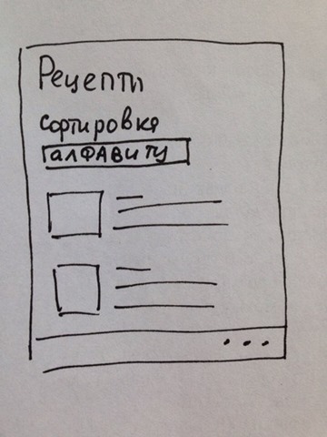
The first "mockups" - by hand
Among non-typical screens, the very first is the main screen. For it, instead of the classic iOS menu with the navigation bar at the bottom, we decided to use the panorama by placing the main tabs on it along with photos of the dishes. After that, the Home began to look like the cover of a glossy magazine or a showcase - and that was what we were aiming for. This is important, because the essence of the main screen is not only to give priority information (this is not even discussed), but to “lure” the user deeper into the application; we achieve this, including through bright pictures that cling.
It is also worth saying that from the very first versions we use real images and names of dishes - oddly enough, but this is neglected as often as they say about it, and this still helps a lot with design.
Colors
While working on a visual map, there was a question about the elaboration of the color scheme of the application. Based on the colors selected with the customer, we proposed various options for the main page. At this stage, it is important not to use the background photos, since we will have pages without backgrounds (for example, "settings"), and the application should always look good. In the example below, you can see an option that was rejected for obvious reasons (of course, there were white letters and other combinations / variations of the background and page layout).
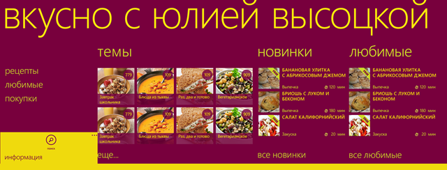
Unsuccessful version of the main
As a result, the colors turned out to be pleasant, while, due to the lack of gradients and other noise on the navigation elements, the application looks truly digital.
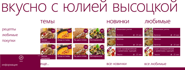
Main screen without substrate
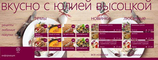
The main screen with a test substrate
Other screens
After the main scenarios are worked out and reworked in places, UI elements-substitutes for the main scenarios were selected, key colors were selected, we proceeded to direct drawing the remaining screens, according to Modern user interface guidelines from Microsoft.
It is important that after changing the Main one, it became necessary to add intermediate screens, first of all those that would duplicate the sections of the panorama and at the same time contain lists of their elements in full. There are several reasons for creating new screens instead of placing all the elements of the section at once in the panorama. One of them is that for some screens additional content modifiers are possible, such as, for example, sorting (if not in this version, then when expanding the functionality such a need may arise and this should be foreseen); such elements would make noisy screens and distract the user on Main. Another reason - you should not make deep lists with vertical scrolling, when there is also horizontal scrolling - this will have a bad effect on UX and performance with a large number of items.
This is the working version of one of the non-core screens with a modular grid superimposed on top - for a more convenient current and subsequent layout.
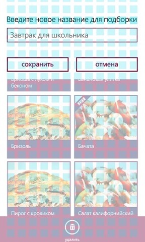
Modular grid working screen
Something like this looked like a general scheme before approval by the customer.
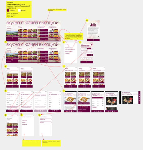
Visual application map
Other features of the platform and the final stages
After drawing up such a detailed visual map with all screens, we make additional requirements regarding interaction with the platform - for example, tiles in three sizes (small / standard / wide) with support for tiles not only of the application, but also of a specific recipe. This will allow the user to access the selected recipe in one touch from the desktop.
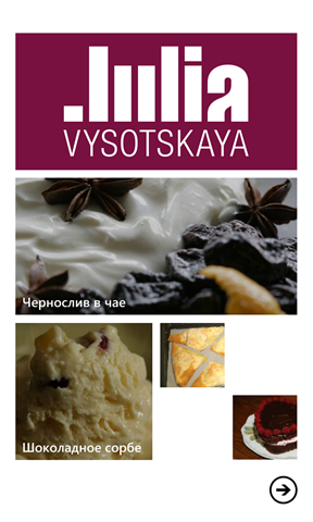
Live Tiles Apps
After this, there is a stage of cutting screens into pages and the mandatory “fitting” of these screens to real phones with different resolutions and subsequent adjustments. Often these are very minor adjustments, but sometimes some elements have to be redone.
And only after we have worked all possible user cases and solved the interaction problems with the unusual design in the style of iOS, adapted the color scheme and created a common visual map, thought out the role in the application of the platform’s distinctive features, only after all this we proceed to the direct development of the application . But that's another story.
It is also interesting to know your experience, colleagues, have you already adapted your applications for Windows Phone? What is the difference between the stages of design adaptation in your company?
Source: https://habr.com/ru/post/233711/
All Articles