Designing an online store: personal account, shopping cart, delivery, payment, mailing and more
Another article of a large review of the functionality of online stores. Today I will talk about my personal account, favorites, integration with social networks, shopping cart, delivery, payment, newsletters and notifications. In total, together with this part of the article, I reviewed about 50 modules of modern online stores.
“Serious design of a serious store. Part 1. Research "
“Serious design of a serious store. Part 2. Modules online store "
“Serious design of a serious store. Part 3. Card product and not only "
“Serious design of a serious store. Part 4. Substitutes, complements, comparison and other tools to increase conversion "
For any online store, it is important that users register on the site and leave a lot of information about themselves. This allows you to increase the average bill and greatly increases the chances of an online store to turn a one-time customer into a permanent one.
')
Registration itself should be very simple so as not to become a barrier to the user, and the online store should encourage users to register. Some large online stores prohibit purchases by unregistered users - this is a rather controversial way to get registered, but it shows the importance of registering on the site. The motivation to register can be very different: a special discount for registered users, access to any shares only for registered, special conditions registered, etc.
Fig. 1. Personal account.
Often, sites use a hidden registration method, ask the user for an email or phone for non-registration purposes, for example, at checkout, and then send him a username and password from his account. At the same time, a cookie is created on the user's computer with the help of which the site will remember this user for several months, preferably not less than six months. This is generally the correct technique: the purchase is available without registration, but the user will still be registered as a result.
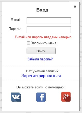
The registration / login form itself is usually located on the right side of the site header. When clicked, a pop-up window opens with a form. Sometimes, to save space, they make only one “Login” link, when clicked, a pop-up window opens, divided into two parts: on the left is a registration form, and on the right is a login and password entry form for registered users.
Fig. 2. Registration.
It is important to make it possible to register using social networks. This reduces the barrier for lazy users and increases the number of registrations. Not all social networks give the user's email, so for some you will need to additionally ask him immediately after authorization. In your account should be able to link several popular social networks to the profile, for RuNet it is: VK, Facebook, Google, Yandex and Twitter.
In addition, for any online store will be useful any additional information about the user. It is necessary to make an optional tab with advanced data about the user, to convey to him the idea that this information will make the store more personalized and unobtrusively ask him to fill it at registration. Filling is not everything, but it will be one of many steps to collect and analyze detailed information about each user.
Fig. 3. Personal account (registration).

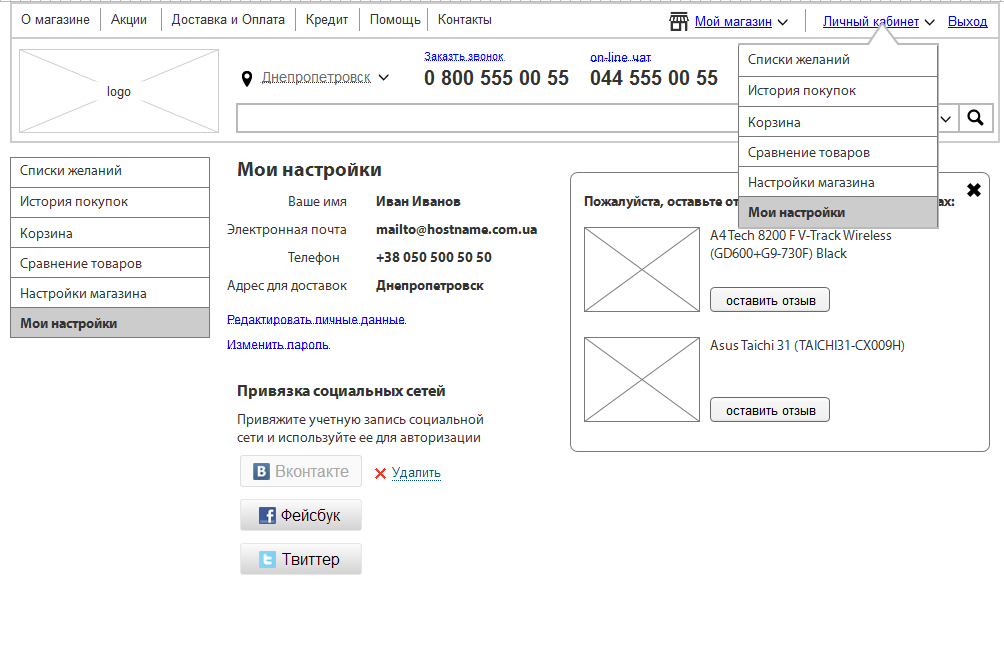
The first page in your personal account is usually the user’s main settings page (name, email, phone, shipping address, connection with social networks, etc.) and the store (interesting categories, personalization settings, etc.), it may appear in it important informational messages. One of such messages is a block with a request to leave feedback about the purchased goods or to fill out extended user information. In general, this is exactly the place where you should ask the user to make actions profitable for the store. As an option, a more modern and profitable store - make the first tab activity, which selects everything the user has to do with: updating prices for interesting products, new items in interesting categories, replies to his comments, etc. This page is highly likely to make it go deeper to perform various actions on the site. If the user has made an order, then on the main page of the user’s cabinet it is worthwhile to show a temporary block with information on the order being carried out and its movement; after delivery, the block should be gone.
The next important function in your account is the purchase history. The store must store data for all purchases made by the user. In the interface, this is usually a separate tab in which a list of all orders is presented in chronological order, starting with the most recent. Each order must have a number and date by which the store employees will be able to identify it. In addition, the quantity of goods in the order, price and status (Completed, Waiting, On the way, etc.). In each order, you can go and see. Quite often, people repeat orders, so it’s worthwhile to offer the user the “Repeat order” function.
After the story comes the tab "My wishes", in which there is one or more wish lists.
Also important is the tab with the management of subscriptions: for mailings, for individual products, for comments and other elements of sites.
Often, the personal account includes a basket, as a separate tab. This is also a part of the user's personal space: he can put the goods in the basket and leave the site, all the products must be saved and they will be available upon authorization.
You can also look towards the socialization of the online store and make the function of personal messages, or even go ahead and make the elements of a social network. This will stimulate social activity, which, in turn, with the right marketing positioning and the direction of users in the right direction, can increase sales and will definitely benefit from brand loyalty. In particular, you can make a function to ask a question in the “I have” block: the user bought something and put the mark “I have”, the new buyer of this product entered the corresponding block in the card and wrote a question to the user who has the product. Simple social function, which is tied to sales and properly positioned. Of course, we don’t need to make a copy of the usual social network, everything just for the purpose of selling.
For regular customers will need a tab with information about loyalty programs. You can call it “Personal discounts” and show the level of the user and his discounts, accumulated bonuses, possible levels and what needs to be done for the next level. You can also add a block with "personal discounts" for the user, in which to show the goods with discounts only for him. It should be small discounts that are automatically calculated by the site for a specific user and depend on the volume of his purchases. Such a move will increase loyalty and make additional sales.
The principle of operation of this function is the same as that of "I want a gift." This is a kind of “box” where users can store products of interest to them that they are not yet ready to buy. In this case, only the positioning of the function changes: in the case of “I want a gift”, this is a list of gifts, and in the case of a chosen one, the total. These and other lists that the user wants to create for themselves are stored in the user's personal account.
In the interface, in the preview of the goods, there should be a link "To Favorites". It is duplicated on the product page. When you click on a link, the inscription dynamically changes to “Already in Favorites”, which is a link to the corresponding section. In the header, next to the basket, you can show an inconspicuous reminder "XX products in favorites", to constantly remind the user about pending purchases.
In your account should be a separate tab with lists of favorites, with the ability to manage and share in social networks of individual lists.
Fig. 4. Wish list.

Another important aspect of the online store, which affects sales. Over the past 10 years, the vast majority of Internet users have begun to use social networks, so it is important for any online store to integrate with them as much as possible in order to get an additional influx of visitors and, as a result, customers.
The largest social networks increasingly adhere to the concept of “Internet on the Internet”. In other words, they are trying to give users everything they need so that they do not leave the social networking site and they gradually succeed. We can and should use this feature. All major networks have an API that allows you to create applications. With this tool, you can create a store application that will work in a social network as a small representation of the main online store. So far there are not very many such examples, but such app stores quite successfully sell goods.
It is also important to integrate the main site with social networks. First you need to make authorization through social networks, which will save users from registering, and the store will give the necessary information about the buyer, at least - the main ones. After that, the number of registrations will increase significantly.
Fig. 5. Integration with social networks.

It is necessary to get official fan pages of the brand in social networks. There you can manually or automatically upload new arrivals, promotions, news and other important information. So subscribers will be constantly informed, and the store will receive a constant influx of visitors from social networks. In addition, it is important to put blocks on the pages of an online store with the ability to subscribe to the fan page and show the number of already signed people in order to inspire confidence among new customers. Usually, these blocks are placed in the footer or the right column.
For the product page, articles, and news, you need to make Like and Share blocks, which will allow users to share information with their friends and again will give an additional influx of visitors. These buttons are usually placed under the main information on the page and have a standard look.
The layout of the pages should be optimized for the Share function so that Facebook and VK pull the correct logo (photo), name and description.
For new visitors, after viewing 10 any pages of the online store, you can make a pop-up window with an offer to subscribe to the official fan pages, this will increase the number of subscribers. By the way, the number of subscribers and their activity is taken into account by search engines, so this is an important point.
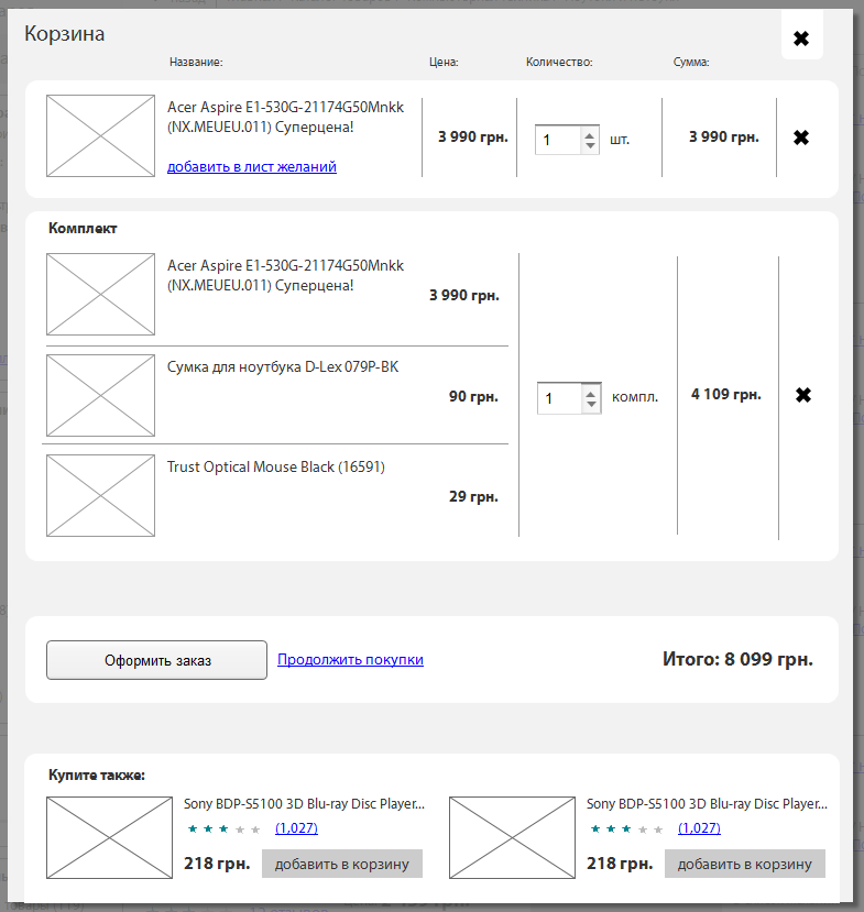
Another important part of any online store, without which it can not work. The buyer encounters a basket in the middle of his journey: he has already chosen a product, but has not yet made a purchase. This step on the way to the purchase is extremely important, more than 30% of users put the goods in the basket, but never make a purchase for various reasons. Here our task is to help complete the purchase.
Usually the basket looks like a small block on the right side of the header, in which a small pictogram is indicated, the quantity of goods in the basket and the total amount. The whole block is clickable and when pressed the user enters the basket. Less often, the cart can be made elsewhere, for example, the bar at the bottom of the screen, which remains in place when scrolling.
Fig. 6. Basket.
Until now, there are disputes about how to do it correctly: to allow access to the basket only after registering on the store’s website or making it possible to buy without registration. I think the truth, as always in the middle. For small and medium-sized stores, for which trust is not so high, it is better not to make an extra barrier for buyers, it is worth making an opportunity to purchase without registering, but still somehow motivate to register, for example, with additional discounts for registered users. It is better for large online stores to collect the user base and work with it all the time, so in this case you should make it to register in any case. They trust a lot, they are known, so this will not be a problem for users. The main thing that registration was not difficult: clicked to buy, entered username and password and registered. Without mandatory confirmations, huge forms, etc. All this information can be taken from the user later.
Before a person sees the basket from the inside, he needs to add at least one item. This should happen without reloading the page. It is necessary to replace after clicking the "Buy" button on "In the basket", and then open a pop-up window with a list of goods in the basket and the total amount. Under the list you need to offer two buttons: "Checkout" or "Continue shopping." In this case, the button "Checkout" should visually dominate and stand out. Under the buttons will be offered complementary products.
In the case of clicking on the "Checkout" user enters the basket page. It should not be advertising, banners, catalog or other unnecessary elements. The buyer has already decided to complete the purchase, you can not distract him from the transfer of money. Many in this step want to try again to sell complementary goods, but it is better to do this after confirming the order through a letter or call the store manager than to distract and risk nothing at all.
The checkout page should contain several blocks:
1. To whom
a.The name of the recipient
b.Phone (field to enter numbers and select the type of phone)
2. Delivery
a.City (drop-down list)
b.Shipping method (drop-down list)
c. Issue point (drop-down list) or delivery address)
3.Payment
a.Payment Method (drop-down list)
b.Shipping method (drop-down list)
c. Issue point (drop-down list) or delivery address)
4. Order comment (optional text field)
5. “Confirm” button
6. Galka "I agree with the terms of use
Fig. 7. ordering 1_1.

Fig. 7.1 ordering 1_2.

Fig. 8. ordering 2_1.
Fig. 8.1 ordering 2_2.

Fig. 8.2 ordering 2_3.

Fig. 8.3 ordering 2_4.

There must be a minimum of fields to fill in; it is not worthwhile to produce them Above, I described important fields, they will be quite enough. You can also make a tick "For gift" and arrange the goods accordingly.
All fields are dependent on each other. For example, if a person chooses “under the door” in the delivery method, then the field for entering the address is loaded; if he chooses the method of payment with a card, then a questionnaire for payment with a plastic card is loaded.
By the way, the sequence of the information is not random. Payment is the last, because it will depend on the delivery, which may have a different cost depending on the city of the recipient and method of delivery.
To the right of the form, you can make an order card, in which, visually, in the form of a formula, the calculation and the total amount are shown. This card must be editable so that the user can change the composition of the purchase or the amount. Also, there you can offer to enter a discount certificate, if any, are used in the loyalty program of the online store.
There is an alternative implementation of the basket - step by step. In this case, the steps are indicated above the entered data and it is visually shown at what step the user is now and how much is left. In the last step, you need to show the user a complete questionnaire with all the data entered and allow editing, in case of an error or if he changes his mind. The content and principle itself do not change.
After the first purchase, the site must remember the user data and the next purchase will not force them to re-enter them.
One of the most important criteria for choosing an online store for buyers is delivery. It should be convenient and fast, and ideally also free. Usually in online stores there is a certain threshold amount of the order, over which the delivery is free. This amount is always calculated and depends on the margin of goods sold. In especially large stores, delivery may always be free, but they do this to increase loyalty, which small shops may not have money for.
In the interface of the online store you need to give information about the delivery in at least three places: in the auxiliary menu make a separate item with similar information, make an information block in the product card and at the stage of placing the order make it possible to choose different delivery options. When selecting each of the options, additional information should be loaded to fill in, and the cost of the order automatically calculated without reloading the data.
Fig. 9 Shipping.

The main types of delivery:
1.Address delivery
2. Self-pickup
3. Mail
Most buyers still enjoy post payment, upon receipt of the goods, so the most profitable delivery option for an online store is self-pickup (with the condition that there is a warehouse). A rather large percentage of users may refuse to pay for their orders after delivery, in which case the store will pay first for the delivery and then for the return of the goods, which will mean a net loss. Therefore, the store is guaranteed to receive money either in the option with a prepayment, or when it is self-delivery, while not risking to remain at a loss.
Commercial delivery services often have an API with which you can connect additional tools to the site: calculating the cost of delivery depending on distance and weight, the current database of the nearest branches, etc.
In the store interface, we can first show the delivery and payment option we need, or even offer additional discounts to stimulate store-friendly actions (for example, if targeted delivery costs 3% of the order amount, we can offer the customer a 3% discount when choosing pickup).
Separately, you can make options for expedited delivery, for this you need to give information in the product card about this possibility and its cost, as well as offer options to choose from when placing an order.
You can also make additional options for the special storage of certain types of goods, buyers can also willingly pay for this in certain product categories.
Today, most customers prefer to pay upon receipt of the goods. It is profitable for the store to receive money in the form of prepayment. There is a difficult choice: 1. To allow to pay upon receipt, which will lead to a forced increase in the working capital of the store and the risk of not paying for a certain percentage of orders. 2. Sell only prepaid (not necessarily full) and thereby lose a significant portion of customers who do not trust the store and are not willing to pay before they see the goods.
Payment methods may also depend on the selected type of delivery, so the interface of the site you need to lay the logic of interaction of these blocks.
Payment can be realized in two ways: through the payment acceptance system (intermediary) or directly connected. The payment acceptance system allows you to pay for goods in dozens of different ways, but it takes a commission of 3-5% of the purchase amount. Binding directly more labor-intensive, but with large volumes it pays off. Both methods typically use the services API, so first you need to select these services, and then examine the connection requirements and lay them in the ToR.
There are not so many basic payment methods that many people actually use. This makes payment acceptance systems for most not highly demanded, unless there is any specificity in the developed store. I recommend linking the payment directly, in particular with plastic cards (Visa, MasterCart) and electronic money (WebMoney, Yandex.Money). The remaining methods of payment are made in manual or semi-automatic mode.
Fig. 10 Payment.

The main types of payment:
1. Cash to courier (3-4% commission + taxes)
2. Cash in the office (no commission + taxes)
3. Replenishment of a plastic card (0.5% -1.5% commission + taxes)
4. Payment by plastic card (3% + taxes)
5. Invoice (0.5% -1.5% commission + taxes)
6. Electronic money (1-3% + taxes)
7. Cash on delivery
8. Loan (installment plan)
Payment is better to choose based on the convenience for the user and the percentage of the commission on the withdrawal of money. The above are all the most common payment methods in runet. From country to country, they fluctuate, but the list itself does not really change. Ideally use them all. The interest on the withdrawal is almost everywhere up to 3 percent, you can design an algorithm for automatic calculation of the most profitable payment option on the site and clearly show different options to the client.
It is better to divide delivery and payment into steps: first, the delivery method is selected, then additional fields are loaded, then the payment method is selected, then additional fields or directly payment are loaded (if it is carried out on-line in automatic mode).
A tool that in many Western online stores is one of the main sales. In runet with his help, however, also very successfully sold.
Contacts for mailings should be collected from everywhere, at the first opportunity: when a person registers, when he makes an order, when he asks a question, on the website to offer a form for a subscription, etc. Whether email or phone. In the first letter or sms you should suggest the user to set up a subscription.
Mailing customization is usually in your personal account, in this section there are different types of mailings: for product catalogs, for products, for reviews, for availability, for price changes, etc. As well as the general settings: receive information about discounts, new promotions, or unsubscribe from all mailings in general (the function should not apply to order status notifications).
The entire audience needs to be segmented and collect information about it. The task of the online store is to make a smart newsletter, which the user is likely to like. The store should do the mailing taking into account the interests of the user, his purchase history, viewed products and other information that he was able to collect.
Mailings can be either automatic (for example, notification of order status) or manual (for example, special mailing for the holiday).
Automatic mailings can inform users about new products in the product categories to which he has shown interest, about the appearance of goods in stock, about changes in the price of goods, etc. At the same time, you need to think about the possibilities of flexible mailing settings so that users can unsubscribe or narrow down the subject in case of anything. Some may not be interested in certain categories of goods, so it makes no sense to bomb them with any information. You can alternate email newsletters and sms-mailings, so the probability of reaching the user is higher. Through sms you can inform about general discounts, for example, that is, small informational messages. In your personal account, you can provide the possibility of choosing a priority information channel so that the user can set it up himself, although it is more profitable for us to send email, provided that it reaches its destination.
Manual mailings should be carefully designed and planned by marketers who can figure out how to sell the maximum. These may be general promotions that apply to the entire store, or there may be personal discounts, for example, select a group of users under certain conditions, for example, who added items to favorites for the last month and send them all a “personal” discount. For this purpose, the store needs a mailing conditions designer, which can greatly increase sales from the mailing list.
For mailing, you should consider various rules: for example, knowing that a mobile phone is updated on average once every 2-3 years, you can make an automatic mailing to all mobile phone buyers after this time with a suggestion to update them, and include the top sales, news from favorite brand of the buyer and a lot of other useful information. There can be quite a few such rules; they should be thought through with the help of marketers.
The site should determine which of the emails do not work and automatically remove them from the database.
In any online store there are stages of interaction with the customer when he should be notified about something. This is quite important for sales and logistics, and to unload managers, many things need to be automated.
. . , - , , , , , . .
: , , . , - .
, , .. , , , , .
, email. , , . .
email email , .
, . Off-Line , , , , , , , , , , SEO , Social CRM, , 1 , , , () . , !
PS , ? , : , - - .
PPS — SECL Group: Facebook , VK , Twitter .
: http://seclgroup.ru/article_proyektirovaniye_serjoznogo_magazin_lichnyy_kabinet_korzina_dostavka_oplata.html
Author:
The president
SECL Group
Past articles of the series can be found here:
“Serious design of a serious store. Part 1. Research "
“Serious design of a serious store. Part 2. Modules online store "
“Serious design of a serious store. Part 3. Card product and not only "
“Serious design of a serious store. Part 4. Substitutes, complements, comparison and other tools to increase conversion "
Registration / personal account
For any online store, it is important that users register on the site and leave a lot of information about themselves. This allows you to increase the average bill and greatly increases the chances of an online store to turn a one-time customer into a permanent one.
')
Registration itself should be very simple so as not to become a barrier to the user, and the online store should encourage users to register. Some large online stores prohibit purchases by unregistered users - this is a rather controversial way to get registered, but it shows the importance of registering on the site. The motivation to register can be very different: a special discount for registered users, access to any shares only for registered, special conditions registered, etc.
Fig. 1. Personal account.
Often, sites use a hidden registration method, ask the user for an email or phone for non-registration purposes, for example, at checkout, and then send him a username and password from his account. At the same time, a cookie is created on the user's computer with the help of which the site will remember this user for several months, preferably not less than six months. This is generally the correct technique: the purchase is available without registration, but the user will still be registered as a result.
The registration / login form itself is usually located on the right side of the site header. When clicked, a pop-up window opens with a form. Sometimes, to save space, they make only one “Login” link, when clicked, a pop-up window opens, divided into two parts: on the left is a registration form, and on the right is a login and password entry form for registered users.
Fig. 2. Registration.
It is important to make it possible to register using social networks. This reduces the barrier for lazy users and increases the number of registrations. Not all social networks give the user's email, so for some you will need to additionally ask him immediately after authorization. In your account should be able to link several popular social networks to the profile, for RuNet it is: VK, Facebook, Google, Yandex and Twitter.
In addition, for any online store will be useful any additional information about the user. It is necessary to make an optional tab with advanced data about the user, to convey to him the idea that this information will make the store more personalized and unobtrusively ask him to fill it at registration. Filling is not everything, but it will be one of many steps to collect and analyze detailed information about each user.
Fig. 3. Personal account (registration).
The first page in your personal account is usually the user’s main settings page (name, email, phone, shipping address, connection with social networks, etc.) and the store (interesting categories, personalization settings, etc.), it may appear in it important informational messages. One of such messages is a block with a request to leave feedback about the purchased goods or to fill out extended user information. In general, this is exactly the place where you should ask the user to make actions profitable for the store. As an option, a more modern and profitable store - make the first tab activity, which selects everything the user has to do with: updating prices for interesting products, new items in interesting categories, replies to his comments, etc. This page is highly likely to make it go deeper to perform various actions on the site. If the user has made an order, then on the main page of the user’s cabinet it is worthwhile to show a temporary block with information on the order being carried out and its movement; after delivery, the block should be gone.
The next important function in your account is the purchase history. The store must store data for all purchases made by the user. In the interface, this is usually a separate tab in which a list of all orders is presented in chronological order, starting with the most recent. Each order must have a number and date by which the store employees will be able to identify it. In addition, the quantity of goods in the order, price and status (Completed, Waiting, On the way, etc.). In each order, you can go and see. Quite often, people repeat orders, so it’s worthwhile to offer the user the “Repeat order” function.
After the story comes the tab "My wishes", in which there is one or more wish lists.
Also important is the tab with the management of subscriptions: for mailings, for individual products, for comments and other elements of sites.
Often, the personal account includes a basket, as a separate tab. This is also a part of the user's personal space: he can put the goods in the basket and leave the site, all the products must be saved and they will be available upon authorization.
You can also look towards the socialization of the online store and make the function of personal messages, or even go ahead and make the elements of a social network. This will stimulate social activity, which, in turn, with the right marketing positioning and the direction of users in the right direction, can increase sales and will definitely benefit from brand loyalty. In particular, you can make a function to ask a question in the “I have” block: the user bought something and put the mark “I have”, the new buyer of this product entered the corresponding block in the card and wrote a question to the user who has the product. Simple social function, which is tied to sales and properly positioned. Of course, we don’t need to make a copy of the usual social network, everything just for the purpose of selling.
For regular customers will need a tab with information about loyalty programs. You can call it “Personal discounts” and show the level of the user and his discounts, accumulated bonuses, possible levels and what needs to be done for the next level. You can also add a block with "personal discounts" for the user, in which to show the goods with discounts only for him. It should be small discounts that are automatically calculated by the site for a specific user and depend on the volume of his purchases. Such a move will increase loyalty and make additional sales.
Favorites (wishes)
The principle of operation of this function is the same as that of "I want a gift." This is a kind of “box” where users can store products of interest to them that they are not yet ready to buy. In this case, only the positioning of the function changes: in the case of “I want a gift”, this is a list of gifts, and in the case of a chosen one, the total. These and other lists that the user wants to create for themselves are stored in the user's personal account.
In the interface, in the preview of the goods, there should be a link "To Favorites". It is duplicated on the product page. When you click on a link, the inscription dynamically changes to “Already in Favorites”, which is a link to the corresponding section. In the header, next to the basket, you can show an inconspicuous reminder "XX products in favorites", to constantly remind the user about pending purchases.
In your account should be a separate tab with lists of favorites, with the ability to manage and share in social networks of individual lists.
Fig. 4. Wish list.
Integration with social networks
Another important aspect of the online store, which affects sales. Over the past 10 years, the vast majority of Internet users have begun to use social networks, so it is important for any online store to integrate with them as much as possible in order to get an additional influx of visitors and, as a result, customers.
The largest social networks increasingly adhere to the concept of “Internet on the Internet”. In other words, they are trying to give users everything they need so that they do not leave the social networking site and they gradually succeed. We can and should use this feature. All major networks have an API that allows you to create applications. With this tool, you can create a store application that will work in a social network as a small representation of the main online store. So far there are not very many such examples, but such app stores quite successfully sell goods.
It is also important to integrate the main site with social networks. First you need to make authorization through social networks, which will save users from registering, and the store will give the necessary information about the buyer, at least - the main ones. After that, the number of registrations will increase significantly.
Fig. 5. Integration with social networks.
It is necessary to get official fan pages of the brand in social networks. There you can manually or automatically upload new arrivals, promotions, news and other important information. So subscribers will be constantly informed, and the store will receive a constant influx of visitors from social networks. In addition, it is important to put blocks on the pages of an online store with the ability to subscribe to the fan page and show the number of already signed people in order to inspire confidence among new customers. Usually, these blocks are placed in the footer or the right column.
For the product page, articles, and news, you need to make Like and Share blocks, which will allow users to share information with their friends and again will give an additional influx of visitors. These buttons are usually placed under the main information on the page and have a standard look.
The layout of the pages should be optimized for the Share function so that Facebook and VK pull the correct logo (photo), name and description.
For new visitors, after viewing 10 any pages of the online store, you can make a pop-up window with an offer to subscribe to the official fan pages, this will increase the number of subscribers. By the way, the number of subscribers and their activity is taken into account by search engines, so this is an important point.
Basket and checkout
Another important part of any online store, without which it can not work. The buyer encounters a basket in the middle of his journey: he has already chosen a product, but has not yet made a purchase. This step on the way to the purchase is extremely important, more than 30% of users put the goods in the basket, but never make a purchase for various reasons. Here our task is to help complete the purchase.
Usually the basket looks like a small block on the right side of the header, in which a small pictogram is indicated, the quantity of goods in the basket and the total amount. The whole block is clickable and when pressed the user enters the basket. Less often, the cart can be made elsewhere, for example, the bar at the bottom of the screen, which remains in place when scrolling.
Fig. 6. Basket.
Until now, there are disputes about how to do it correctly: to allow access to the basket only after registering on the store’s website or making it possible to buy without registration. I think the truth, as always in the middle. For small and medium-sized stores, for which trust is not so high, it is better not to make an extra barrier for buyers, it is worth making an opportunity to purchase without registering, but still somehow motivate to register, for example, with additional discounts for registered users. It is better for large online stores to collect the user base and work with it all the time, so in this case you should make it to register in any case. They trust a lot, they are known, so this will not be a problem for users. The main thing that registration was not difficult: clicked to buy, entered username and password and registered. Without mandatory confirmations, huge forms, etc. All this information can be taken from the user later.
Before a person sees the basket from the inside, he needs to add at least one item. This should happen without reloading the page. It is necessary to replace after clicking the "Buy" button on "In the basket", and then open a pop-up window with a list of goods in the basket and the total amount. Under the list you need to offer two buttons: "Checkout" or "Continue shopping." In this case, the button "Checkout" should visually dominate and stand out. Under the buttons will be offered complementary products.
In the case of clicking on the "Checkout" user enters the basket page. It should not be advertising, banners, catalog or other unnecessary elements. The buyer has already decided to complete the purchase, you can not distract him from the transfer of money. Many in this step want to try again to sell complementary goods, but it is better to do this after confirming the order through a letter or call the store manager than to distract and risk nothing at all.
The checkout page should contain several blocks:
1. To whom
a.The name of the recipient
b.Phone (field to enter numbers and select the type of phone)
2. Delivery
a.City (drop-down list)
b.Shipping method (drop-down list)
c. Issue point (drop-down list) or delivery address)
3.Payment
a.Payment Method (drop-down list)
b.Shipping method (drop-down list)
c. Issue point (drop-down list) or delivery address)
4. Order comment (optional text field)
5. “Confirm” button
6. Galka "I agree with the terms of use
Fig. 7. ordering 1_1.
Fig. 7.1 ordering 1_2.
Fig. 8. ordering 2_1.
Fig. 8.1 ordering 2_2.
Fig. 8.2 ordering 2_3.
Fig. 8.3 ordering 2_4.
There must be a minimum of fields to fill in; it is not worthwhile to produce them Above, I described important fields, they will be quite enough. You can also make a tick "For gift" and arrange the goods accordingly.
All fields are dependent on each other. For example, if a person chooses “under the door” in the delivery method, then the field for entering the address is loaded; if he chooses the method of payment with a card, then a questionnaire for payment with a plastic card is loaded.
By the way, the sequence of the information is not random. Payment is the last, because it will depend on the delivery, which may have a different cost depending on the city of the recipient and method of delivery.
To the right of the form, you can make an order card, in which, visually, in the form of a formula, the calculation and the total amount are shown. This card must be editable so that the user can change the composition of the purchase or the amount. Also, there you can offer to enter a discount certificate, if any, are used in the loyalty program of the online store.
There is an alternative implementation of the basket - step by step. In this case, the steps are indicated above the entered data and it is visually shown at what step the user is now and how much is left. In the last step, you need to show the user a complete questionnaire with all the data entered and allow editing, in case of an error or if he changes his mind. The content and principle itself do not change.
After the first purchase, the site must remember the user data and the next purchase will not force them to re-enter them.
Delivery
One of the most important criteria for choosing an online store for buyers is delivery. It should be convenient and fast, and ideally also free. Usually in online stores there is a certain threshold amount of the order, over which the delivery is free. This amount is always calculated and depends on the margin of goods sold. In especially large stores, delivery may always be free, but they do this to increase loyalty, which small shops may not have money for.
In the interface of the online store you need to give information about the delivery in at least three places: in the auxiliary menu make a separate item with similar information, make an information block in the product card and at the stage of placing the order make it possible to choose different delivery options. When selecting each of the options, additional information should be loaded to fill in, and the cost of the order automatically calculated without reloading the data.
Fig. 9 Shipping.
The main types of delivery:
1.Address delivery
2. Self-pickup
3. Mail
Most buyers still enjoy post payment, upon receipt of the goods, so the most profitable delivery option for an online store is self-pickup (with the condition that there is a warehouse). A rather large percentage of users may refuse to pay for their orders after delivery, in which case the store will pay first for the delivery and then for the return of the goods, which will mean a net loss. Therefore, the store is guaranteed to receive money either in the option with a prepayment, or when it is self-delivery, while not risking to remain at a loss.
Commercial delivery services often have an API with which you can connect additional tools to the site: calculating the cost of delivery depending on distance and weight, the current database of the nearest branches, etc.
In the store interface, we can first show the delivery and payment option we need, or even offer additional discounts to stimulate store-friendly actions (for example, if targeted delivery costs 3% of the order amount, we can offer the customer a 3% discount when choosing pickup).
Separately, you can make options for expedited delivery, for this you need to give information in the product card about this possibility and its cost, as well as offer options to choose from when placing an order.
You can also make additional options for the special storage of certain types of goods, buyers can also willingly pay for this in certain product categories.
Payment
Today, most customers prefer to pay upon receipt of the goods. It is profitable for the store to receive money in the form of prepayment. There is a difficult choice: 1. To allow to pay upon receipt, which will lead to a forced increase in the working capital of the store and the risk of not paying for a certain percentage of orders. 2. Sell only prepaid (not necessarily full) and thereby lose a significant portion of customers who do not trust the store and are not willing to pay before they see the goods.
Payment methods may also depend on the selected type of delivery, so the interface of the site you need to lay the logic of interaction of these blocks.
Payment can be realized in two ways: through the payment acceptance system (intermediary) or directly connected. The payment acceptance system allows you to pay for goods in dozens of different ways, but it takes a commission of 3-5% of the purchase amount. Binding directly more labor-intensive, but with large volumes it pays off. Both methods typically use the services API, so first you need to select these services, and then examine the connection requirements and lay them in the ToR.
There are not so many basic payment methods that many people actually use. This makes payment acceptance systems for most not highly demanded, unless there is any specificity in the developed store. I recommend linking the payment directly, in particular with plastic cards (Visa, MasterCart) and electronic money (WebMoney, Yandex.Money). The remaining methods of payment are made in manual or semi-automatic mode.
Fig. 10 Payment.
The main types of payment:
1. Cash to courier (3-4% commission + taxes)
2. Cash in the office (no commission + taxes)
3. Replenishment of a plastic card (0.5% -1.5% commission + taxes)
4. Payment by plastic card (3% + taxes)
5. Invoice (0.5% -1.5% commission + taxes)
6. Electronic money (1-3% + taxes)
7. Cash on delivery
8. Loan (installment plan)
Payment is better to choose based on the convenience for the user and the percentage of the commission on the withdrawal of money. The above are all the most common payment methods in runet. From country to country, they fluctuate, but the list itself does not really change. Ideally use them all. The interest on the withdrawal is almost everywhere up to 3 percent, you can design an algorithm for automatic calculation of the most profitable payment option on the site and clearly show different options to the client.
It is better to divide delivery and payment into steps: first, the delivery method is selected, then additional fields are loaded, then the payment method is selected, then additional fields or directly payment are loaded (if it is carried out on-line in automatic mode).
Newsletter
A tool that in many Western online stores is one of the main sales. In runet with his help, however, also very successfully sold.
Contacts for mailings should be collected from everywhere, at the first opportunity: when a person registers, when he makes an order, when he asks a question, on the website to offer a form for a subscription, etc. Whether email or phone. In the first letter or sms you should suggest the user to set up a subscription.
Mailing customization is usually in your personal account, in this section there are different types of mailings: for product catalogs, for products, for reviews, for availability, for price changes, etc. As well as the general settings: receive information about discounts, new promotions, or unsubscribe from all mailings in general (the function should not apply to order status notifications).
The entire audience needs to be segmented and collect information about it. The task of the online store is to make a smart newsletter, which the user is likely to like. The store should do the mailing taking into account the interests of the user, his purchase history, viewed products and other information that he was able to collect.
Mailings can be either automatic (for example, notification of order status) or manual (for example, special mailing for the holiday).
Automatic mailings can inform users about new products in the product categories to which he has shown interest, about the appearance of goods in stock, about changes in the price of goods, etc. At the same time, you need to think about the possibilities of flexible mailing settings so that users can unsubscribe or narrow down the subject in case of anything. Some may not be interested in certain categories of goods, so it makes no sense to bomb them with any information. You can alternate email newsletters and sms-mailings, so the probability of reaching the user is higher. Through sms you can inform about general discounts, for example, that is, small informational messages. In your personal account, you can provide the possibility of choosing a priority information channel so that the user can set it up himself, although it is more profitable for us to send email, provided that it reaches its destination.
Manual mailings should be carefully designed and planned by marketers who can figure out how to sell the maximum. These may be general promotions that apply to the entire store, or there may be personal discounts, for example, select a group of users under certain conditions, for example, who added items to favorites for the last month and send them all a “personal” discount. For this purpose, the store needs a mailing conditions designer, which can greatly increase sales from the mailing list.
For mailing, you should consider various rules: for example, knowing that a mobile phone is updated on average once every 2-3 years, you can make an automatic mailing to all mobile phone buyers after this time with a suggestion to update them, and include the top sales, news from favorite brand of the buyer and a lot of other useful information. There can be quite a few such rules; they should be thought through with the help of marketers.
The site should determine which of the emails do not work and automatically remove them from the database.
Notifications
In any online store there are stages of interaction with the customer when he should be notified about something. This is quite important for sales and logistics, and to unload managers, many things need to be automated.
. . , - , , , , , . .
: , , . , - .
, , .. , , , , .
, email. , , . .
email email , .
, . Off-Line , , , , , , , , , , SEO , Social CRM, , 1 , , , () . , !
PS , ? , : , - - .
PPS — SECL Group: Facebook , VK , Twitter .
: http://seclgroup.ru/article_proyektirovaniye_serjoznogo_magazin_lichnyy_kabinet_korzina_dostavka_oplata.html
Author:
The president
SECL Group
Source: https://habr.com/ru/post/233447/
All Articles