Improving site conversion: 5 ways to avoid creating bad microcopy. Part 2

Today we are publishing the second part of the Bill Byrd material on what exactly you shouldn’t do when writing microtexts to keep usability positive. The first part can be read here . In this article we will talk about three more things that can spoil a good microcopy.
NB: Microcopy - small phrases or even individual words that add personality to your site, increase customer loyalty and encourage them to perform a targeted action.
3. A microcopy should help the user, not interfere
Often, the quality of user interaction leaves much to be desired, and this is a really big problem. If it's design, you need to work with it. As a rule, the best samples of the user interface include a minimum of text - everything is clear on an intuitive level. Be careful if during the development of user experience you want to add a couple of extra sentences in order to more easily explain to the user exactly what action to take.
Since 1880, tests have been carried out for readability and the optimal length of texts for better understanding. With the advent of the Internet, accents have shifted to the optimal line length. Most sources claim that the ideal line is from 45 to 75 characters.
')
It seems to me that the optimal length of the string is a rather controversial concept, especially considering the adaptive design for mobile phones. In addition, counting the number of characters is quite a tedious task.
I am a supporter of the readability tables of Rudolf Flush (picture below), in which sentences consisting of 8 or fewer words belong to the category very readable, from 11 words - easy to read, 14 - quite easily, 17 - is standard, 21 - read with a little difficulty, 25 - with great difficulty, from 29 and more - with great difficulty. Also, depending on the length of sentences, a certain level of education is conditionally required for a correct understanding of the text, in the case of 8 words, these are 4 classes of school, and in the case of 29 or more, college.
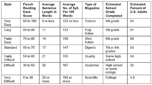
Rudolf Flash readability chart
Perhaps this is a rather outdated standard, but it is still the best measure. On the Internet, it is better to use phrases that are easily perceived by users, because we want to attract as many customers as possible.
If you cannot explain to the user what he needs to do using 8 or fewer words, then you should reconsider the design of the site.
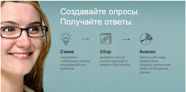
The most vivid example of short, but capacious phrases from SurveyMonkey :
Once the user is caught in the marketing channel and brought to the site, use microcopies to quickly explain to him how to use your product. Ideally, the text placed on one of the main elements of the user interface (for example, the form to be filled out) will be read by the visitor, but he will not even have time to realize it. The client will accept the information automatically and immediately take the desired target action.
4. Every user contact is an opportunity to strengthen the brand.
There are several definitions of the term “branding moment”. When it comes to microcopy in the user interface, this concept implies the branded content of some point of contact with the user on the site.
For example, Foursquare has quite a lot of branding elements in their badge system. I received one of the branded icons quite recently, it is promoting a new Swarm application. Foursquare is nowhere without a bit of humor, and sometimes it gets a little annoying.
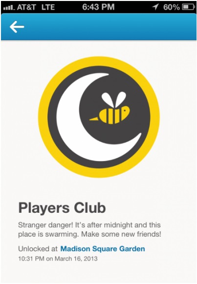
A good example of a branding moment in Foursquare.
Get carried away is easy. Think carefully before using too funny or eccentric text (even if it is a feature of your brand) in situations where the user is expecting something simple and clear from you.
When creating content, you must take into account the characteristics of your brand, but this should not prevent the user from performing the target action.
Avoid unnecessarily branded content in the following site elements:
• navigation;
• names of forms to fill out;
• explanatory text;
• text in the selection field (drop-down lists, radio-buttons);
• buttons.
Do not forget to remind users about your brand:
• in messages upon confirmation of registration;
• in awards (badges, points);
• on error 404;
• in case of problems with the server;
• in case of error during the exchange of messages.
The difference between the two lists provided is very simple. In the first of these, the user only tries to perform an action, and the second represents the results of these actions.
In one of the cases of the first list with a reminder of your brand, you can accidentally confuse the user, as a result of which he will not take action. Clarity and clarity are vital.
In the case of the results, you have the opportunity to use the microcopy to draw the user's attention to his victories (in Foursquare - “You're in shock!”) Or mitigate disappointment (in TheLadders - “Sorry, but we found a better job for this page”). In these cases, you do not need anything from the user.

TheLadders - Page not found.
This does not mean that you should completely exclude branded content from the first list. But if you are going to use it, before that we recommend testing. In the case of branding moments, the performance technique is of paramount importance. If you are not sure about it, do not risk.
If you refuse to use branding elements to make your website simple and user-friendly, you provide a positive experience of interacting with a website visitor, which, in turn, will greatly enhance your brand. So every moment of user interaction is an opportunity to make a brand stronger. Without even using the brand symbolism.
5. If content is king, then the context is rightfully the queen.
The expression "Content is a King" is gaining popularity. “Natural advertising” (native ad) or the integration of relevant content into the process of user interaction to attract customers has already given rise to agencies specializing in content marketing, as well as several popular startups.
However, without regard to the context, the content is useless (and if you are an expert on Game of Thrones, then you probably know that real power is always concentrated in the hands of the queens!).
When you come up with a name for the form to fill out or write a post in a blog, you need to either integrate into the already known context in which users are located, or create it yourself.
The context in which the user will perceive the text will depend on its subjective interpretation. Anything can be the basis of the context: the letter he just read, the event that happened to him as a child, etc.
When the user cannot perceive the information in the correct context, he becomes confused, which leads to the rejection of the target action.
Simply changing the microcopy on the first page can affect whether the user visits the next ten.
To better understand the user context, check how it fits your understanding: sit at least once in one development stage and imagine yourself in the user's place. Examine the context in which your service is perceived by the user, step by step through each step from following the link to the target action (“contextual flow”).
For example, if your service operates on a subscription model, the user's path might look something like this:
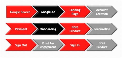
During these at least 10 steps, the user context can be formed and confirmed or modified.
Sit down, take a deep breath and clear your mind of all the information about your service that has accumulated there. Then open Google or another homepage, which usually begins the user's path to your service.
Does the functionality of your service match what your advertising on Google promises? Is your feature described in the same language throughout the user's journey to purchase it? Is the general context lost due to the originality of the inscriptions on the interface elements? These are issues that you should think about when you present yourself in the user's place.
Whatever happens, do not forget about the microcopy
A microcopy very often becomes a victim of personal bias, an excess of internal terminology, poor branding, unsuccessful “contextual flows”, time differences, and other factors. Any one of them can reduce to zero even the effect of well-thought usability and content in general.
What you need to know about errors in microcopy: they are so easy to make, but so difficult to identify after they have already been made.
Try to make the microcopy work like this video:
The language of the video is English. But from what second did you realize what the company was doing? So it should be with your text on the landing page. Simple, easy to understand and intuitive text will increase the conversion at times.
You have a great opportunity to think about the possibility of mistakes in advance and avoid them, instead of acting after the fact. During testing, you often think: "Hey, maybe you should change the name of the third field of this form?". But after you dig into other more noticeable user interface errors and forget about the microcopy. Unfortunately, the problems in this area will be repeated again and again until you realize that you should pay attention to this short phrase - update it and conduct a separate test.
The next time you work on the user interaction process, I hope you will use some of the tricks from this article. With their help, you can avoid common mistakes and create a truly high-quality microcopy for your users.
Source: http://www.smashingmagazine.com/2013/06/17/five-ways-prevent-bad-microcopy/
Source: https://habr.com/ru/post/231949/
All Articles