Web design, inkscape and all-all-all, part 1
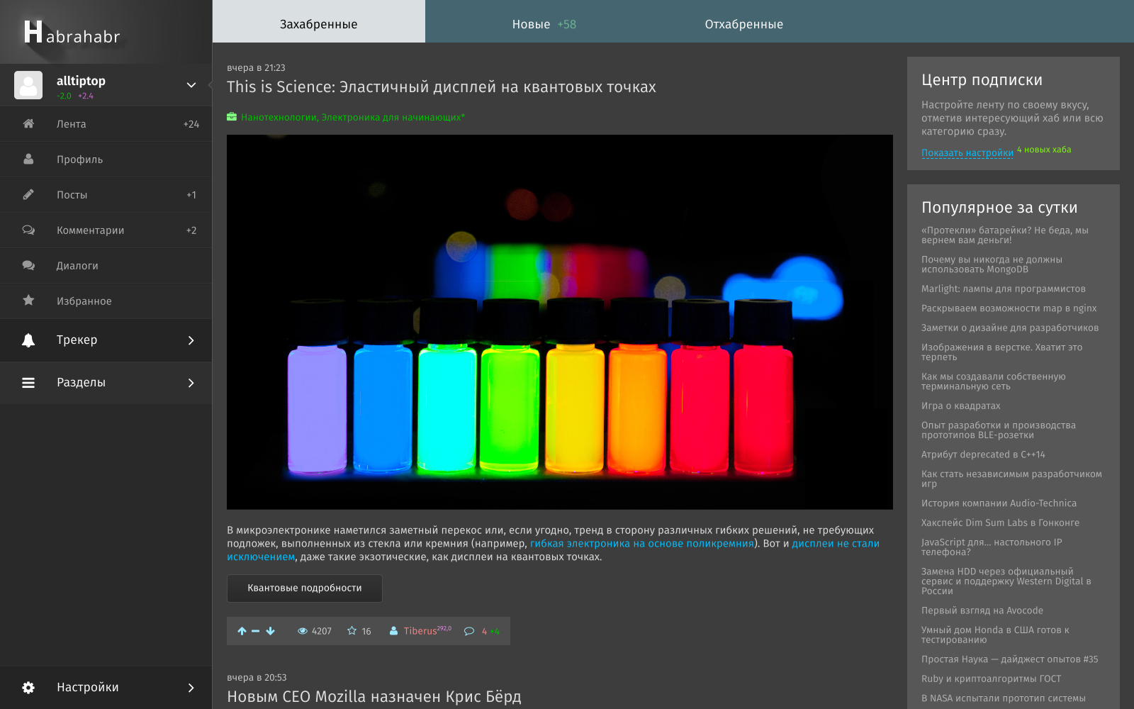
There are special programs for design like Sketch , but they are only on poppies (and I don’t have them) and they only do design, although judging by the reviews they do it well (unix way after all). And there are photoshops, gimps and other Korela that are misused, one of these cases is this topic. Picture to attract attention (I do not pretend to design, and I don’t consider it better than what is now, just a picture):
First you need to prepare a document and the editor itself for quick work, we will specifically edit: hot keys, document settings, grids and some trifles.
Settings, strange as it may seem, open in the menu under Edit / Options . General view of the parameters (I apologize for the hot blue color of the hot keys, gtk does not digest the color settings of the shoe very much), I suppose the readers themselves will find the described settings, especially since the overwhelming part is available on the great and powerful:
')

File / Document Properties . By default, when opening, an empty document is already created, so we will work with it:
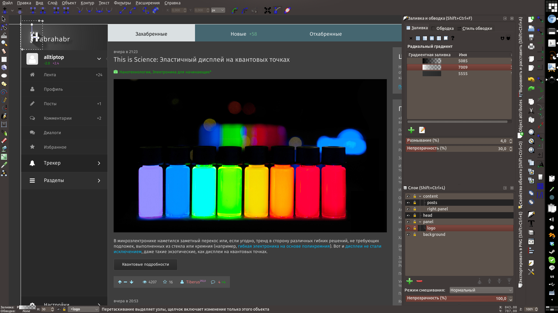
Here everyone can create a familiar layout for himself, although window management is not at all familiar, working with layers is ordinary, but due to some features you can sometimes get by with the same level of layers:


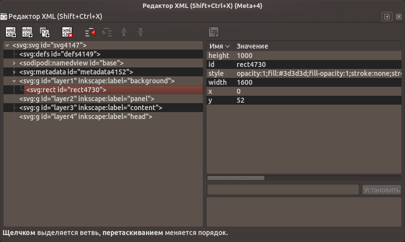
Toolbars are not customizable for them; you can only get used to it or change the position to the other side of the screen, although this is by default the most convenient one for me. The layers window does not display anything except layers, for managing objects and their properties directly there is an xml editor, it is embedded in the panel, but it is painfully wide, it is better to open it with a separate window if necessary:
It is important to do everything carefully in advance in layers, it will be more difficult, since the objects in the layers are not shown, and you have to either transfer them to the xml editor or touch them to the right place. In inkscape, layers are created to create a document, not a layout - for this there are other things.
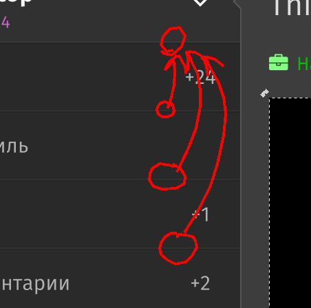
Clones are also one of the most remarkable things in inkscape: one object is created and only its clones are copied, which is very important in any duplicate elements. Creating clones: for starters, create the desired element / text / something difficult and combine them into a group - Edit / Clones / Create a clone . Clones can be transformed, moved and rotated, but no more - for the rest, you have to disconnect the clone. In this case, you only have to change the original. An example with banal borders (useful in all kinds of online stores with a bunch of identical blocks):
I will not teach you design, conversion, interfaces and other fonts, I think it will be so obvious - no witchcraft will be needed.Himself who taught
This section is worthy of a separate post and I will not write it, just sort out the habr icon:

Before the heap, the editor has a lot of functionality related to the alignment of objects, a lot of options for snapping, filters, working with the contour, and so on. At the exit from the heap of text, square blocks, icons and one logo we have a ready layout.
What is missing in inkscape: adequate management of objects is similar to the “layers” in the gimp / photoshop - the xml editor is too overloaded and at the same time useless without knowing the specific svg pointers; pages - only one page is available when creating a document, the rest are done either in one document with just a big shift, or in different files - but then clones are impossible and collaborative edits become more difficult (although separate css for svg can be connected, which is correct with the layout, but will slow down the work during design).
In the second part, the functionality for the layout will be considered.
References:
Icon font Font Awesome from fontello.com
Fira sans font
Open Sans Font
Inkscape
Result.svg , optimized for browsers.
Training
First you need to prepare a document and the editor itself for quick work, we will specifically edit: hot keys, document settings, grids and some trifles.
- Install pixels in grids by default everywhere, get rid of centimeters, inches and other real-world number systems;
- Adjust hotkeys according to habit, or not touch and get used to the native;
- Clones - re-link duplicated clones;
- Automatic save set often;
- Other settings at the discretion (the size of the cache for rendering, increase the number of threads, respectively, the processor, etc.)
Settings, strange as it may seem, open in the menu under Edit / Options . General view of the parameters (I apologize for the hot blue color of the hot keys, gtk does not digest the color settings of the shoe very much), I suppose the readers themselves will find the described settings, especially since the overwhelming part is available on the great and powerful:
')
Creating a document and a grid:
File / Document Properties . By default, when opening, an empty document is already created, so we will work with it:
- Set the image size (it is more convenient for me to work with a 1600x1200px document on a fullHD monitor);
- Set the background color if necessary (if the site is supposed to be dark or gray, then it will be more comfortable to work with a dark background (this will not be the background of the site, just the background of the canvas)), change the color of the guide as desired;
- Remove the canvas border (it bothers me), instead show the guides on the Edit / Show guides around the page ;
- Metadata and license - at will and need;
- Grids are one of the finest parts of inkscape, these are grids. Lots of meshes.
And so, we will need:- The grid with an interval of 1px - to make it invisible, but to enable sticking - will visually interfere;
- Grid with an interval of 20px and repetition every 5 times - here preferences may differ, only a special case; by experience it is better to make it black or white with low transparency
- A grid with an interval of 5 and a repetition every 2 times is again a special case of my convenience; by experience it is better to make it opposite in color to the previous one - it will be visible on elements with the corresponding previous color and vice versa
- The grid with an interval of 300px in x and 500px in y will be columns, if there is a desire to indent between them, it’s enough to create the same one with a shift, you can make a color selection;

Panels, layers, etc.
Here everyone can create a familiar layout for himself, although window management is not at all familiar, working with layers is ordinary, but due to some features you can sometimes get by with the same level of layers:
Toolbars are not customizable for them; you can only get used to it or change the position to the other side of the screen, although this is by default the most convenient one for me. The layers window does not display anything except layers, for managing objects and their properties directly there is an xml editor, it is embedded in the panel, but it is painfully wide, it is better to open it with a separate window if necessary:
It is important to do everything carefully in advance in layers, it will be more difficult, since the objects in the layers are not shown, and you have to either transfer them to the xml editor or touch them to the right place. In inkscape, layers are created to create a document, not a layout - for this there are other things.
Clones
Clones are also one of the most remarkable things in inkscape: one object is created and only its clones are copied, which is very important in any duplicate elements. Creating clones: for starters, create the desired element / text / something difficult and combine them into a group - Edit / Clones / Create a clone . Clones can be transformed, moved and rotated, but no more - for the rest, you have to disconnect the clone. In this case, you only have to change the original. An example with banal borders (useful in all kinds of online stores with a bunch of identical blocks):
Design
I will not teach you design, conversion, interfaces and other fonts, I think it will be so obvious - no witchcraft will be needed.
Graphics
This section is worthy of a separate post and I will not write it, just sort out the habr icon:
- Create an outline of the letter H;
- Extensions / create from contour / Motion ;
- Object - ungroup (x2);
- Select everything except the letter H;
- Summarize the contours of the shadow;
- Create a gradient from black to transparent black, draw it along the outline of the shadow (linear or radial in flavor);
- Shade: Filters / Blur / Out of Sharp ;
- Reduce the transparency of the shadow;
- Draw reflections (gradients, a little blur and a bit of work with the contour);
Before the heap, the editor has a lot of functionality related to the alignment of objects, a lot of options for snapping, filters, working with the contour, and so on. At the exit from the heap of text, square blocks, icons and one logo we have a ready layout.
What is missing in inkscape: adequate management of objects is similar to the “layers” in the gimp / photoshop - the xml editor is too overloaded and at the same time useless without knowing the specific svg pointers; pages - only one page is available when creating a document, the rest are done either in one document with just a big shift, or in different files - but then clones are impossible and collaborative edits become more difficult (although separate css for svg can be connected, which is correct with the layout, but will slow down the work during design).
In the second part, the functionality for the layout will be considered.
References:
Icon font Font Awesome from fontello.com
Fira sans font
Open Sans Font
Inkscape
Result.svg , optimized for browsers.
Source: https://habr.com/ru/post/231417/
All Articles