Images in the layout. Enough tolerating this
I hope this post will serve as an educational program for all web designers, layout designers, and project managers. If you are a good coder, raster images definitely annoy you. You hate raster, and everything that has visible pixels. If this is not the case, welcome under cat.
It all started a long time ago, when layout designers used tables with tables. Such a layout did not take a lot of time, it was correctly displayed in all browsers, and no one even thought of using some kind of DIVs. But as time went on, the Internet developed and evolved, and the possibilities of the tables dried up, and the layout makers became extremely uncomfortable in the tabular “cell”. Then it came to them that tables should be used only for tabular data ! And layers began to rule the Internet.
The era of WEB 2.0 has arrived, oval glass buttons with shadows, a reflecting logo with highlights, and other “charms”. It so happened that, having got rid of one infection, they picked up another: raster images.
')
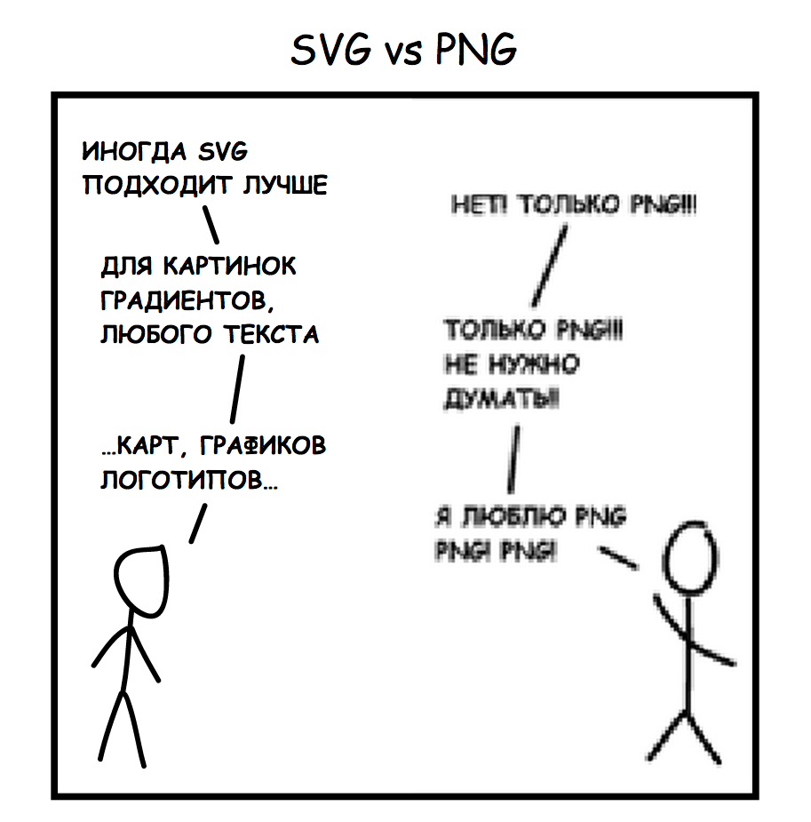
The main idea of this post is that the Internet is a vector , and bitmap images should be used ONLY for photos. At its core, any site is an interface, and all interfaces must be vector-based. A year ago, starting to use highDPI display on the desktop, I seemed to see. A bad layout was instantly detected when you first visited the site; you didn’t even have to open the inspector.
Of course, the era of desktops with highDPI displays has not yet come, but this is a matter of time. I believe that this will happen as quickly and quickly as it happened with smartphones. But still, given the results of research for 2013, 91% of the population of the planet has a mobile phone, and half of them use it as the BASIC tool for surfing the Internet!
Considering that most smartphones now have highDPI displays, it becomes silly to use raster graphics in the layout, which not only causes the user's eyes to immediately leave their sockets, but also has quite a noticeable weight, which is no less critical for users of mobile devices. This is why it is not appropriate to use @ 2x bitmaps that you are thinking about right now.
Milling without using raster images, you get a lot of significant advantages:
- Low weight, which means fast loading speed.
- Excellent display on highDPI displays.
- Flexibility and scalability of everything and everyone
Personally, I go berserk when I see another layout in which 30+ vector simple icons, and for some reason they are rasterized. What for?
Designers, remember! Photos - raster, everything else is a vector.
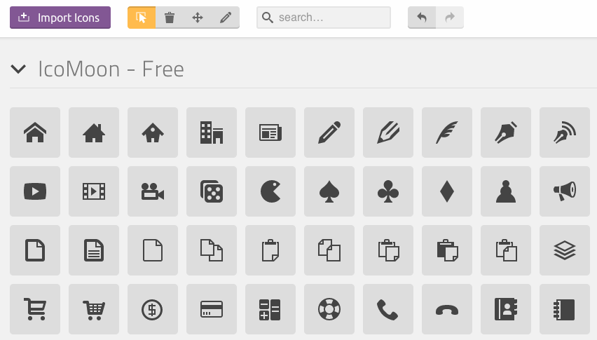
Thanks to the excellent IcoMoon tool, you can easily convert all this into a WebFont kit, and use it comfortably in the layout.
Better yet, use in designs FontAwesome , which is actively supported by the community, and evolving. You can easily install this font into the system, and use it in a graphic editor, in your layouts, by copying icons from http://fontawesome.io/cheatsheet .

The same with gradients. Every second designer considers it his duty to throw a gradient to the shape, and click on “Rasterize Layer Style”. And then you stick around with your pipette on the fucking gradient, trying to pick up colors. I began to treat this with particular trepidation, starting to use CSSHat from Source.
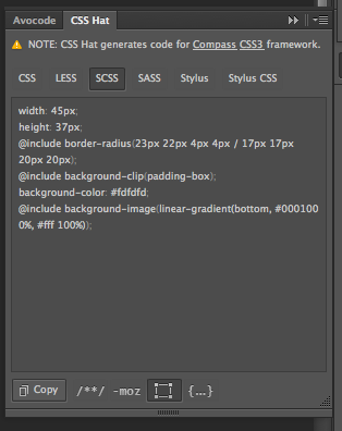
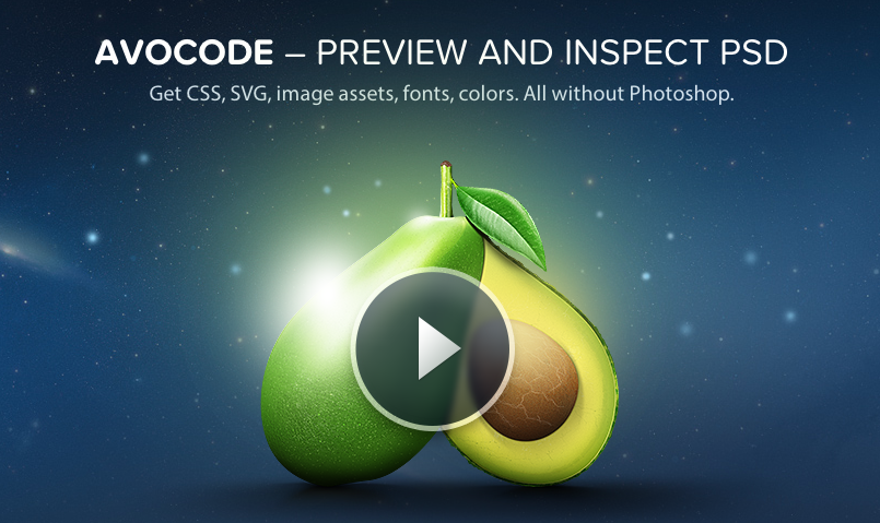
By the way, these guys are developing a “photoshop killer” for web designers, called “Avocode” . The project is now at the private-beta stage, and is still very limited in capabilities. Review: http://habrahabr.ru/post/231381/
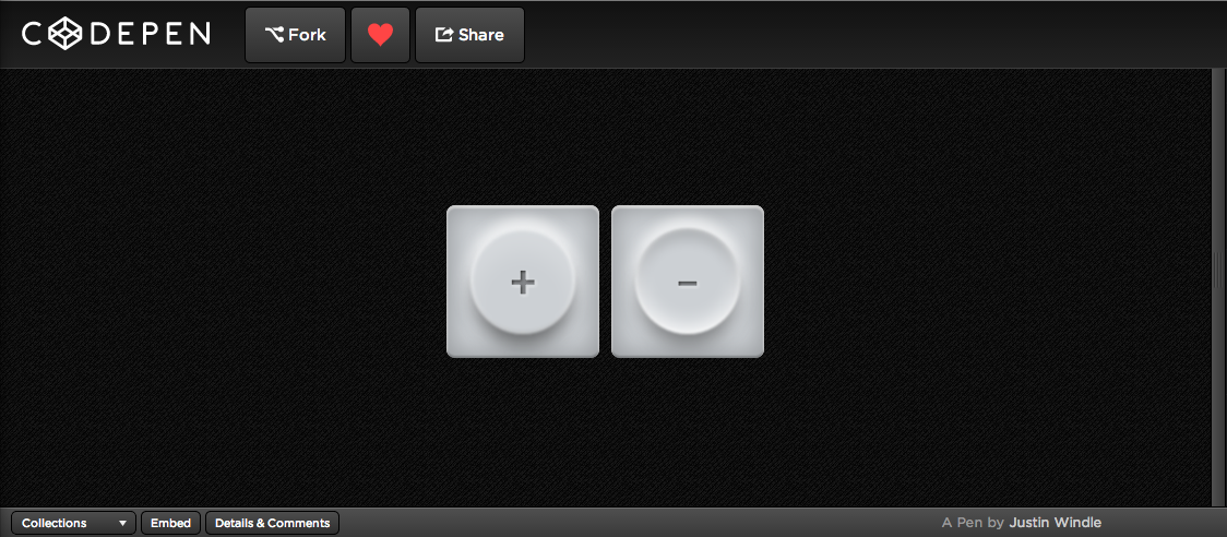
Finally I want to say that the possibilities of CSS / SVG are almost endless, especially since they are in a hurry to help WebGL and Canvas. This can be seen by digging into http://codepen.io .

Thank you for reading to the end, and remember: the Internet - vector!
UPD:
A couple of links from pepelsbey
1. Detailed report on SVG: Let me introduce: SVG
2. Many good SVG articles with examples on the “ About CSS ” blog
And from SVGen
A Compendium of SVG Information
UPD2:
Gash Avocode Review
UPD3:
k3nny continued the topic in his post SVG, Iconfonts vs PNG
Source: https://habr.com/ru/post/231295/
All Articles