Using the principles of psychology to increase the conversion of sites. Part 5: Face Effect
Part 1
Part 2
Part 3
Part 4
All people subconsciously observe others. Every time when we come across someone's portrait, we consider it and draw a conclusion about the emotions that this person is experiencing. Almost always it happens completely unconsciously.
Human faces can increase the number of transitions in two ways:
')
1. Attracting attention
Portraits almost always attract attention better than any other design element. This makes them a great way to draw users' attention to key elements of the site. An excellent solution will be the person looking at the item that you want to highlight, the user will definitely follow the gaze and stumble on what is needed.
2. Stimulate emotions
We are all “experts” in reading human emotions. If the person on the site looks really happy or sad, we can probably feel the same feelings. But be careful, excessive expression of emotions creates the effect of fake and unreliability.
The use of portraits in the design of the site includes several mechanisms of influence:
- Social proof
This effect is based on the opinion that the people around us can be much better informed than we are. It is this mechanism that makes us look around, in the case when we do not know what to do.
Social proof lies at the heart of the effectiveness of reviews, as a conversion tool and other methods that demonstrate that "others use this product, so you should use it."
- "Expert opinion"
A special case of the use of social evidence. The basis of this approach is the conviction that there is a group of people who specializes in this particular issue (on this product, in this area) and is ready to share with us information about this, the best and proven product.
A photograph of a representative person, next to his quote that “we checked ... and made sure that ... the best” looks quite impressive for many and can be a significant factor in making decisions, while not forgetting that extremes in use This tool can also lead to negative results.
- Mirror neurons
Example number 1: Highrise (+ 102.5%)
We already talked about Highrise in the first part of this article. Having received a 37.5% increase in CTR by simplifying their design, they did not stop there.
In the next test, in a complex with a simplified form, a photograph of a girl who looks quite happy was used.
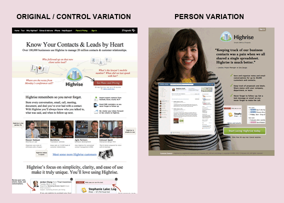
This change helped increase the number of conversions by 102.5% compared to the base case. Subsequent tests that tested various portraits showed similar results with a deviation of 5%.
Example number 2: Medalia Art (95.4% growth)
The online art shop Medalia Art has posted some of the profiles of its artists on the main page. New visitors were able to immediately go to the individual artist's page, view the paintings and purchase them.
In the original version, one of the artist’s works was used to represent the portfolio in the list. In the course of the test, a photograph of the artist himself was chosen as the cover for the portfolio.

The result was a rapid CTR increase of 95.4%.
When it comes to art, people rarely buy the product itself, they buy the history of the product. Using photos of the authors on the site allowed Medalia Art to begin telling this story to its visitors.
Example No. 3: Harrington Movers (45.45% increase)
At the beginning of the article we have already said that the portrait used should be credible.
Initially, Harrington Movers used a photo of a smiling couple with boxes. In general, the photograph was not related specifically to this carrier, but could illustrate the activities of any enterprise that operates in this area.
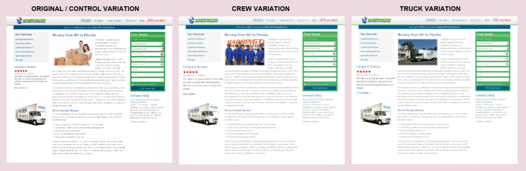
In search of a solution that will increase conversion rates, it was decided to test two design options:
1. Option with a photo of the company's employees;
2. Moving company truck.
Both options significantly improved conversions (45.45% and 45.05%, respectively). This proves the fact that not all photos are equally effective for increasing the impact of the site.
A few words about why the photo of the truck turned out to be more effective than the original version:
1. Photograph of a truck with a company logo on the body significantly increases the level of confidence in the site, proving that the company at least exists;
2. Users who plan to transport their belongings can clearly associate themselves with this truck: “Oh, there may be my things there.”
Conclusion:
The examples above are just isolated cases that are supported by assumptions based on theories and principles. But the problem is that the result from the use of various techniques may be completely unexpected.
Firstly, not at all these methods act the same way, and if you have a specific audience, it is worth considering this when designing your website. Secondly, when you make changes in order to use the effect of some principle or law, you can accidentally break some other law, the negative impact of which will exceed the positive impact of the changes.
Planning to introduce such methods in your design, it is worth conducting a comprehensive analysis and a full assessment of each of the proposed options. In addition, today there are ample opportunities for A / B analysis and other ways to evaluate the effectiveness of a page, and you simply have to use them widely if you want to achieve real results.
Part 2
Part 3
Part 4
All people subconsciously observe others. Every time when we come across someone's portrait, we consider it and draw a conclusion about the emotions that this person is experiencing. Almost always it happens completely unconsciously.
Human faces can increase the number of transitions in two ways:
')
1. Attracting attention
Portraits almost always attract attention better than any other design element. This makes them a great way to draw users' attention to key elements of the site. An excellent solution will be the person looking at the item that you want to highlight, the user will definitely follow the gaze and stumble on what is needed.
2. Stimulate emotions
We are all “experts” in reading human emotions. If the person on the site looks really happy or sad, we can probably feel the same feelings. But be careful, excessive expression of emotions creates the effect of fake and unreliability.
A little information
The use of portraits in the design of the site includes several mechanisms of influence:
- Social proof
This effect is based on the opinion that the people around us can be much better informed than we are. It is this mechanism that makes us look around, in the case when we do not know what to do.
Social proof lies at the heart of the effectiveness of reviews, as a conversion tool and other methods that demonstrate that "others use this product, so you should use it."
- "Expert opinion"
A special case of the use of social evidence. The basis of this approach is the conviction that there is a group of people who specializes in this particular issue (on this product, in this area) and is ready to share with us information about this, the best and proven product.
A photograph of a representative person, next to his quote that “we checked ... and made sure that ... the best” looks quite impressive for many and can be a significant factor in making decisions, while not forgetting that extremes in use This tool can also lead to negative results.
- Mirror neurons
Example number 1: Highrise (+ 102.5%)
We already talked about Highrise in the first part of this article. Having received a 37.5% increase in CTR by simplifying their design, they did not stop there.
In the next test, in a complex with a simplified form, a photograph of a girl who looks quite happy was used.
This change helped increase the number of conversions by 102.5% compared to the base case. Subsequent tests that tested various portraits showed similar results with a deviation of 5%.
Example number 2: Medalia Art (95.4% growth)
The online art shop Medalia Art has posted some of the profiles of its artists on the main page. New visitors were able to immediately go to the individual artist's page, view the paintings and purchase them.
In the original version, one of the artist’s works was used to represent the portfolio in the list. In the course of the test, a photograph of the artist himself was chosen as the cover for the portfolio.
The result was a rapid CTR increase of 95.4%.
When it comes to art, people rarely buy the product itself, they buy the history of the product. Using photos of the authors on the site allowed Medalia Art to begin telling this story to its visitors.
Example No. 3: Harrington Movers (45.45% increase)
At the beginning of the article we have already said that the portrait used should be credible.
Initially, Harrington Movers used a photo of a smiling couple with boxes. In general, the photograph was not related specifically to this carrier, but could illustrate the activities of any enterprise that operates in this area.
In search of a solution that will increase conversion rates, it was decided to test two design options:
1. Option with a photo of the company's employees;
2. Moving company truck.
Both options significantly improved conversions (45.45% and 45.05%, respectively). This proves the fact that not all photos are equally effective for increasing the impact of the site.
A few words about why the photo of the truck turned out to be more effective than the original version:
1. Photograph of a truck with a company logo on the body significantly increases the level of confidence in the site, proving that the company at least exists;
2. Users who plan to transport their belongings can clearly associate themselves with this truck: “Oh, there may be my things there.”
Conclusion:
The examples above are just isolated cases that are supported by assumptions based on theories and principles. But the problem is that the result from the use of various techniques may be completely unexpected.
Firstly, not at all these methods act the same way, and if you have a specific audience, it is worth considering this when designing your website. Secondly, when you make changes in order to use the effect of some principle or law, you can accidentally break some other law, the negative impact of which will exceed the positive impact of the changes.
Planning to introduce such methods in your design, it is worth conducting a comprehensive analysis and a full assessment of each of the proposed options. In addition, today there are ample opportunities for A / B analysis and other ways to evaluate the effectiveness of a page, and you simply have to use them widely if you want to achieve real results.
Source: https://habr.com/ru/post/231229/
All Articles