Using the principles of psychology to increase the conversion of sites. Part 2: Gestalt psychology, the law of past experience
Part 1 .
Part 3
Part 4
Part 5
Also known as the concept of "mental models", the law of past experience believes that our previous experience contributes to our interpretation of what is happening.
This law is a bit more complicated than it seems at first glance. Past experience is a personal concept, therefore, what affects one person may not affect another.
')
It is rather difficult to say that the influence of a change is due precisely to this law, but the author believes that it is. In addition, it is generally accepted that this law is of secondary importance and is easily overlapped by other sub-patterns.
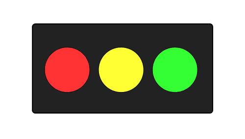
Nevertheless, this principle works, and a vivid example of his work is that we assign certain values and informational content to certain colors (the picture above is most likely perceived as a traffic light lying on its side), as well as the ability to extrapolate the previously obtained information.
Case No. 1: Fab.com (49% growth)
Fab.com realized that even a small increase in the number of purchases would significantly affect profit margins.

They changed the way products were presented and created the “Add to Cart” button design, but they understood that they could still improve their results.
Options (the authors presented screenshots of pages with various products):
1. Added manufacturers tags ("by Blu Dot x Fab" and "by Qualy")
2. Changed call to action (“Add to Cart” and “+ Basket”)
Option 2 led to an increase of 15%. Modest, but still significant result.
Option 1 really surprised. Simply adding a description and a button labeled "Add to Cart" increased the increase by 49%!
What could cause such a big increase?
In fact, everything is very simple. The shopping cart icon was misleading. For a long time using various online stores, such an image began to be associated with the state of the basket, and not with the add to cart button.
Example # 2: TycoonU (130% increase)
TycoonU had a big problem: 80% of potential customers interrupted the checkout process. Therefore, they decided to completely revise their ordering interface.

In the second version, several key elements were used:
• Split into columns
• Security icons (increase confidence)
• Chat window (answers to emerging questions)
• Telephone number (increases confidence and allows you to get answers to some questions)
As in most tests, this result cannot be attributed to one psychological principle: it is a mixture of dozens of factors, but two basic principles are of the greatest importance. First, the overall design and individual elements (such as images, credit card icons, and security services symbols) correspond to the customer’s past experience, unlike the previous form, which looked empty and did not look like the usual forms of payment. Secondly, the McAfee symbol, BBB confirmation, and other confirmations help to increase user confidence.
Example No. 3: AMD (3600% increase)
/ * Note from translator :
Perhaps this example is rather controversial for several reasons:
- at the moment on the AMD website, the “share” buttons remain only in the blog, while their arrangement has been changed (the buttons are located at the top and bottom of the articles);
- “Sharing” buttons have a recognizable design, which, according to the same law of previous experience, will dominate such an element as location.
Most likely, this result was due to the fact that in the new design the buttons became more noticeable, although the author also takes this moment into account. * /
AMD do not use their site to sell products. Instead, they use it as a platform for product promotion and customer support.
They had a set of social sharing buttons, but marketers began to wonder if they could increase the number of citations on social networks by moving or changing buttons.
As an experienced Internet user, you subconsciously expect to find exchange buttons in certain places. For example, it is more likely that buttons located on the sidebar will be used than those located in the basement of the site.
To highlight the optimal position of the buttons on the site, they conducted several tests (the buttons were located on the left, bottom and right, the size and design of the buttons were also varied).

The winning version demonstrates a 36-fold improvement in the benchmark.
How could such a minor change cause such an effect?
First, the new icons and placement correspond to user expectations, since many sites use similar placement. Secondly, the floating icons on the left side became more noticeable, many people did not even scroll far enough to see the icons hidden in the bottom of the site.
In addition, this arrangement coincides with the “F” shape of the average user's eye movement . (If you are in a country that reads from right to left, the right side is probably the best option for placement.)
Case # 4: Veeam Software (161% increase)
Veeam Software planned to increase conversion rates, but they did not want to rush from element to element, trying to guess what would help to succeed. Instead, they decided to find out the opinions of their customers through a survey.
During the study, the question was also asked: “What other information would you like to see on this page?”
Analyzing the results, Veeam Software noticed that many users requested more information about pricing and pricing. And despite the fact that the page already had a link to pricing information in the “Request a quote” section.
Understanding the importance of using customer language, Veeam Software decided to conduct a very simple test: they changed the words “Request a quote” to “Request pricing”.

Changing these two words increased the CTR of the page by 161%!
Part 3
Part 4
Part 5
Also known as the concept of "mental models", the law of past experience believes that our previous experience contributes to our interpretation of what is happening.
This law is a bit more complicated than it seems at first glance. Past experience is a personal concept, therefore, what affects one person may not affect another.
')
A little information
It is rather difficult to say that the influence of a change is due precisely to this law, but the author believes that it is. In addition, it is generally accepted that this law is of secondary importance and is easily overlapped by other sub-patterns.
Nevertheless, this principle works, and a vivid example of his work is that we assign certain values and informational content to certain colors (the picture above is most likely perceived as a traffic light lying on its side), as well as the ability to extrapolate the previously obtained information.
Case No. 1: Fab.com (49% growth)
Fab.com realized that even a small increase in the number of purchases would significantly affect profit margins.
They changed the way products were presented and created the “Add to Cart” button design, but they understood that they could still improve their results.
Options (the authors presented screenshots of pages with various products):
1. Added manufacturers tags ("by Blu Dot x Fab" and "by Qualy")
2. Changed call to action (“Add to Cart” and “+ Basket”)
Option 2 led to an increase of 15%. Modest, but still significant result.
Option 1 really surprised. Simply adding a description and a button labeled "Add to Cart" increased the increase by 49%!
What could cause such a big increase?
In fact, everything is very simple. The shopping cart icon was misleading. For a long time using various online stores, such an image began to be associated with the state of the basket, and not with the add to cart button.
Example # 2: TycoonU (130% increase)
TycoonU had a big problem: 80% of potential customers interrupted the checkout process. Therefore, they decided to completely revise their ordering interface.
In the second version, several key elements were used:
• Split into columns
• Security icons (increase confidence)
• Chat window (answers to emerging questions)
• Telephone number (increases confidence and allows you to get answers to some questions)
As in most tests, this result cannot be attributed to one psychological principle: it is a mixture of dozens of factors, but two basic principles are of the greatest importance. First, the overall design and individual elements (such as images, credit card icons, and security services symbols) correspond to the customer’s past experience, unlike the previous form, which looked empty and did not look like the usual forms of payment. Secondly, the McAfee symbol, BBB confirmation, and other confirmations help to increase user confidence.
Example No. 3: AMD (3600% increase)
/ * Note from translator :
Perhaps this example is rather controversial for several reasons:
- at the moment on the AMD website, the “share” buttons remain only in the blog, while their arrangement has been changed (the buttons are located at the top and bottom of the articles);
- “Sharing” buttons have a recognizable design, which, according to the same law of previous experience, will dominate such an element as location.
Most likely, this result was due to the fact that in the new design the buttons became more noticeable, although the author also takes this moment into account. * /
AMD do not use their site to sell products. Instead, they use it as a platform for product promotion and customer support.
They had a set of social sharing buttons, but marketers began to wonder if they could increase the number of citations on social networks by moving or changing buttons.
As an experienced Internet user, you subconsciously expect to find exchange buttons in certain places. For example, it is more likely that buttons located on the sidebar will be used than those located in the basement of the site.
To highlight the optimal position of the buttons on the site, they conducted several tests (the buttons were located on the left, bottom and right, the size and design of the buttons were also varied).
The winning version demonstrates a 36-fold improvement in the benchmark.
How could such a minor change cause such an effect?
First, the new icons and placement correspond to user expectations, since many sites use similar placement. Secondly, the floating icons on the left side became more noticeable, many people did not even scroll far enough to see the icons hidden in the bottom of the site.
In addition, this arrangement coincides with the “F” shape of the average user's eye movement . (If you are in a country that reads from right to left, the right side is probably the best option for placement.)
Case # 4: Veeam Software (161% increase)
Veeam Software planned to increase conversion rates, but they did not want to rush from element to element, trying to guess what would help to succeed. Instead, they decided to find out the opinions of their customers through a survey.
During the study, the question was also asked: “What other information would you like to see on this page?”
Analyzing the results, Veeam Software noticed that many users requested more information about pricing and pricing. And despite the fact that the page already had a link to pricing information in the “Request a quote” section.
Understanding the importance of using customer language, Veeam Software decided to conduct a very simple test: they changed the words “Request a quote” to “Request pricing”.
Changing these two words increased the CTR of the page by 161%!
Source: https://habr.com/ru/post/230127/
All Articles