How to create a legend
Many years ago I participated in brevets: bike marathons, where one by one and leisurely (but with a time limit) you need to travel from 200 to 1200 kilometers. A meditative exercise, when there is time to enjoy nature, to sing all the songs, to look at the legend and the route map ... Which are depressing: often this is a regular Excel table with irregular design, and the map is optional. The St. Petersburg club "Baltic Star" is more advanced than many: the participants of its brevets always received a card - true, dark gray, with a dark gray route and KP on black callouts. Not very comfortable. And since I was fascinated by OpenStreetMap, I felt that I was able to improve the design of legends. And he started the second attempt (the first, six years ago, ashamed to remember).
In 2010, Maptox invented the CartoCSS format and released the beautiful TileMill editor: in fact, the CartoCSS → Mapnik XML converter, the interface to the mapnik plus the backlit style editor. This fundamentally changed the preparation of cartostyle: now you do not need to write XML with your hands or study even more intricate “simplifying” analogues: the main merit of MapBox was not even the CartoCSS format, but detailed documentation for each of its keys and a convenient multiplatform installer. Now, really, everyone can create a cartille, from scratch to an impressive map.
')
There are textbooks on the GIS Lab and on Habré , but they will only help to deal with the buttons. There are no difficulties in coloring the lines from the database, but it is important to know exactly what to display on the map, and ideally understand the specifics of the source data. In OpenStreetMap this is not easy: for example, go and draw built-up areas. OSM - map for editors, and not for users, the data model in it is absolutely terrible in places. The task of generalization is still not normally solved by anyone, so on a small scale, you still have to draw every bend of a small river and every way of a railway sorting station. So yes, the main thing is to know exactly which objects to draw (less is better, a universal principle), and to plunge into the wiki and into examples in order to understand how to isolate them from the data messaging.
The goal is clear: to make a style for printing on a black and white printer, on a scale of 9-11 (2-5 km per centimeter). Important are the main roads, their coverage is useless, and the maximum settlements. And horizontally. With the latter it is interesting: to what solution do the style markers come after rummaging half an hour on the Internet? Of course, take the SRTM, process the gdal_contour and flop on the map as it is. It's easy, there are dozens of instructions, and the output is something like this:
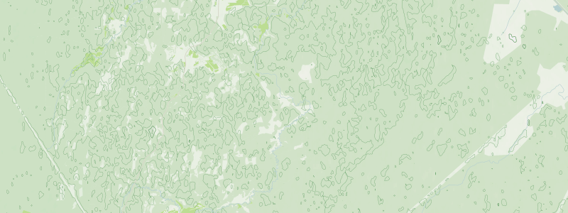
To use such contours is impossible. There are so many of them that they turn into a uniform non-informative background. In addition, cropped at 60 latitude. When I asked how to be, on the GIS-Lab forum they suggested: why SRTM on such a small scale, when you can take a less accurate relief, but covering the entire globe? As a result, I found a magnificent GMTED2010 , connected several of its squares and further smoothed it into the SAGA GIS. Isolines need to be prepared in gdal_contour, because it correctly guides the lines in the resulting vector file, allowing you to draw the burgshirts: small serifs that show the direction of the slope. I added them “because I can”, but later I realized that without bergstriches, the isolines do not make sense: how to distinguish a ravine from an embankment, if only horizontals in multiples of 100 m are signed?
The need to overlay the route line led to the removal of all signatures away from the roads. Printing on a small scale requires the signature of even villages where only large cities are usually marked. And the density of dots per inch on the printer allowed to reduce font sizes by 1-2 points relative to other web maps. This entry in shtosme pays attention to the details that make the resulting “ Veloroad ” cartostile the best for its task. Here I bring the most important remark to the future authors of the maps: never, hear, never draw a metro station at the points = station . Dozens of newbies every week drag underground platforms under the station lobbies, because on the osm.org map, these underground stations are marked at a convenient scale of 12+, and the subway entrances themselves are only 18+. Some details of my style have already begun to penetrate into others, and I hope this aspect will also spread.
Lyrical digression: drawing as a renderer is a scourge of the OpenStreetMap project. Most of the participants, including 99% of newbies, perceive the map editor as a graphic editor, and fill in the area: the city is covered with landuse = residential instead of invisible place = * because it becomes pleasantly gray, garbage cans indicate amenity = recycling , because the correct waste_disposal is not displayed on osm.org. It comes to the point of absurdity: the parks are designated by the contour of highway = trunk , for it is green. One Hindu mastered the “vector editor” perfectly, adding volume to the map (this is a two-dimensional picture):
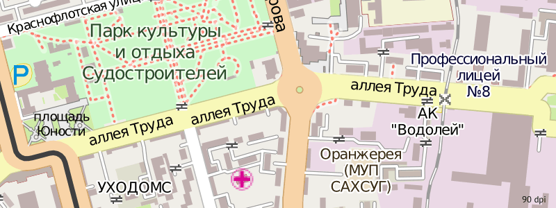
Style "Veloroad" can be compared with others on the demo site . After it, viewing alternatives (including Yandex maps) is difficult: blood and tears flow from the eyes, the boundless emptiness discourages. There are only two styles comparable or superior to this: these are “MapSurfer” with a divine arrangement of signatures and “Chepetsk.net” with an abundance of data. All of them, as well as pictures, tracks, public transport, etc., are included in the list of openstreetmap.ru layers.
What is the point in cartostile, which cannot be shown to all your friends? Do not brag, it helps to move towards the goal. Besides, since I had such an awesome style, I need to give people the opportunity to use it in any form. So, having studied the offers, I took a ten-dollar server at DigitalOcean ($ 10 for 30 gigabytes SSD! Explodes the brain) and deployed a tile server on it. Instructions for the deployment of mass:
As you might guess, there are a lot of references, because none of them is exhaustive. Technologies change faster than they are described: the osm.org style has long since moved to CartoCSS, renderd has received an alternative in the form of Tirex, many packages have long been in system repositories. No matter how common your OS (i.e. Ubuntu) is, you still have to shuffle when setting up the server (starting with mod_tile), and the quality of setting up the server will depend on your ability to find and process information.
I downloaded a small region, only 17 gigabytes, but I updated it every minute with diffs of the entire planet. This gave a gain of 650 megabytes per day. Every ten days the disk space was running out, we had to re-create the database on the local machine and upload it to the server: it did not have enough resources to run osm2pgsql. On the fourth pouring, patience ran out and I sat down for programming. The result was posted on the githab : a script for pruning a planetary diff to the ground and the database osm2pgsql. It is not ideal, but the daily gain fell four times. Once a month, you can start reloading. The ideal option, as one Frenchman noted in the mailing list, would be to teach osm2pgsql to read augmented diffs and not to store intermediate data in the database (they occupy about 60% of the volume).
Despite the fact that the base was entirely Northwestern, Central and Far Eastern districts, every second asked to add his city, unexpectedly far from the borders of trimming. The mapper and the Self-Perfection admin, who shared the burden of paying for the server, helped me with requests, thanks to which I increased the base by another 10 gigabytes. Now, the map lacks only the Southern and North Caucasus districts, but there is also little demand from there. And the Crimea, too, yet.

I don’t remember who in our little chatter hinted at the retin tiles. At that moment I suddenly realized: on my laptop because of the excess number of pixels, I look at all sites on a scale of 133%. The text looks good, but the maps are solid soap (google maps is a pleasant exception). I have already become skilled in setting up the map - why not try to make tiles in 2: 1 format for HiDPI mode? One ma-a-scarlet problem: the only demonstration of such tiles in my memory worked on Tirex, and I have an older renderd. In general, my first commit to a C ++ project followed. I sometimes go to Veloroad Retina just like that, without need: on clear lines and high-quality fonts the eye rests, and it seems that raster maps have a future.
Print
We return to the problem. The data is loaded into the database, the map is configured, the style is written, you need to get a map of the specified rectangle in vector and raster formats of 300 dpi for printing on page A5. Simple operation, where is the tool? Oh, for rendering pictures of the mapnik script, as many as half a dozen - from simple generate_image, where the coordinates of the corners of the area need to be written in the source, to nik2img, which can do different projections and formats. But no one accepts millimeters, and having tried to request a snapshot of a map with a given zoom at a given point for verification, I didn’t get what I’m seeing on osm.org. The resolution is also a problem: there is the scale_factor parameter, but if you change it, only the lines become thicker, closing everything around. What the hell, how do they use it ?!
And again, do it yourself. I sat down at the python and in a week made a cool Nik4 script . Pretty simple, except for the sheets izrisovanymi schemas and razvroshennyh source code mapnik. The main thing is reliability and ten kilobytes of illustrated documentation. If you know what you want to get, the decision is elementary. From the simplest
up to precise settings for paper format, margins, layers and dpi. No surprises, no mysterious parameter. I sketched an interactive bbox selection and made maps from the command line for about a month. In addition, especially for cyclists who prefer closed and very expensive programs for free, he prepared impressions of the map in his style on several scales and converted them for OziExplorer. The largest, on the 11th scale, had a size of 21 × 22 thousand pixels: Nik4 is able to bypass the mapnik restrictions, pasting the final map from the fragments. True, img2ozf this monster did not chew, only z10 (16k × 16k).
The main task was to get a vector map in SVG format. Strangely enough, the dpi value affects the file: the letters in the captions are placed on the pixel grid, so at low dpi the kerning suffers. Another problem with captions is that cairo does not know how (according to the authors of the mapnik, I didn’t check) to combine elements into groups, so each word consists of individual letters, plus their highlight (halo). The signature placement algorithm at mapnik is stupid, like a log, so after exporting it would be good to move signatures from the roads and the route, but this is 2 times the number of letters of the curves, which are very annoying to select. Back to Python: the mapnik-group-text script assembles caption letters and halo them into groups.
In early June, for the poster contest at the conference “State of the Map EU”, a huge SVG with the surroundings of Karlsruhe in the veloroad style was unloaded. Editing files larger than 100 megabytes in Inkscape is hard, so I didn’t move the signatures, just added a plate with text. The poster took the fifth place in the voting, but was the first to disappear from the exhibition: no wonder, it was the most practical there. I managed the second: I stole a bright “Pop Art”, which now hangs on my wall.
The command line is fine, but normal users need a GUI. I’m not doing this whole system for myself, but for cyclists: they have to receive legends and maps with a minimum of effort so that it is not much more difficult than before, with Excel and OziExplorer screenshots. The above-mentioned images already allow you to take screenshots, but you can still simplify, according to the popular algorithm, "click on the button - you will get the result." I used to use php (web) or perl (cgi) for simple sites, but since I started writing Python scripts, I went to study cgi-programming on it.
The service “ Get Veloroad ” is the most epic, in my opinion, cartographic application on the Russian Internet this year. For those who need a snapshot of the map, at least. In essence, this is a web interface to Nik4: the same parameters for size, margins and format, plus several parametric fields: a GPX layer and a linear scale. Unlike tiles, additional styles do not require space for the cache, so I added several styles to choose from: the same veloroad, but without forced Russification, and the standard style osm.org. In other words, now you do not need to take screenshots or glue tiles : just select the desired area, picture size, png format, and press the button. Participants in the "national cards" who are waiting for weekly handouts for printed cards, should then think about what they are wasting their time on.
But no, it is still inaccurate. Another feature of mapnik is hindering: if you tell him that you want a 360 dpi picture, the size of the resulting SVG will be quadrupled, as if there was no dpi, and for some reason, the cairo library writes dimensions in pixels with the suffix "Pt", increasing the picture 1.25 times. Of course, if you export this SVG to PDF, the page size will surprise you. So the file needs to be scaled. I was already preparing to recalculate the numbers in each attribute of each tag, as found by the width / height mismatch and the viewBox attribute. I read the specification, and here it is: you don’t need to process all the XML, it’s enough to recount these six numbers. Back to the notebook and geometric constructions!

Suppose it turned out, but there is another task: when you export a picture with fields to a centimeter, vector objects are not cut off along the border, but stick out well, so it’s not enough to expand the viewBox, you need to close the fields with a white frame. Ideally, it would be good to cut objects yourself, but this is a difficult and not burning task (and cropping does not cancel the frame, because thick strokes will stick out). Another couple of days of coordinates calculation, and the svg-resize script is ready and implemented in Get Veloroad: now, downloading the map for A5 with 7 mm fields in SVG, after exporting the file to PDF, you will receive exactly this: white fields and the exact page size. Of course, this does not apply to direct PDF download from the site.
Automatic resizing in passing solved another problem: a set of graphic elements for designing brevets (markers for start, finish and gearbox, name, logo and arrows) when importing onto a sheet no longer need to be scaled, just ungrouped, dragged to the right places and correct the text. Making the route map has become faster and more enjoyable, and the whole process is built on open source programs.
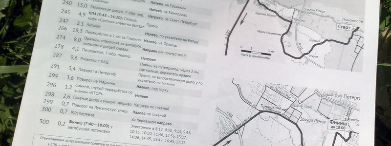
"50 Kukuyev ►" . Before me, the legends were printed from Excel, were too lengthy, and therefore - the A4 sheet is not attached to the steering wheel - a random fly could close a paragraph. Each new author of the route drew a table from scratch, sometimes even calculating the time of opening and closing of the control on the calculator.
Building a legend takes a lot of time. Even without leaving the track, but simply opening Google panoramas in one window, OSRM site for calculating distances in another, you can spend half a day searching for unique signs of turning, formulating unambiguous phrases, formatting the table. This can be facilitated by formalizing the process, so that traveling around the panoramas takes not 40, but 80% of the time. Therefore, I made a legend template in LibreOffice, using the open source PT Sans. Of course, it’s not good to force people to install left-handed programs, but it’s better to rely on open formats than to upload files in a proprietary xls, depending on the Microsoft font, which is forbidden to be distributed by a license.
Then everything is simple, an animated picture about simplifying tables helps the brain. I removed the grid, but selected even lines with light gray, so that it was easier to track on the road: light turn, dark turn. Removed the extra columns, entering the necessary information (KP number, for example) directly into the text. I made a mandatory description of the turn itself, but some people strive to leave only mileage and direction: bikers will not pass the pointer now. The text is printed in tenth size, kilometers - even larger. Only key words are highlighted: “left”, “right”, “KP”. All legends are collected in the archive, where you can copy pieces of routes, and see how to correctly designate a particular situation (T-shaped intersections, road numbers in Finland, springs, etc.).

On the second sheet of the table, time marks for each turn are automatically calculated: when volunteers need to be at a point to catch the first elks, and when the point needs to be closed according to the ACP regulations. There are standards for passing brevets: from 13.5 hours to 200 km to 90 to 1200. It is easy to calculate time to 600 km by dividing the distance by 15 km / h. The speed of the "elk", the fastest cyclists, is considered 32-334 km / h in the first stage, and then downward. Of course, on long brevets we must not forget about the date. The calculated values are copied to the description of the KP and the finish. Having finished, the legend needs to be exported to PDF.
PDF
Now we have PDF legends and one or more PDFs with maps, all in A5 format, as cyclists will use them. Printers usually load A4 sheets, so you need not only to merge several files into one, but also to glue together the pages in pairs, turning them if necessary. Windows users, who, judging by the file formats, are all marathon runners, have to dodge here: although you can shuffle the pages in PDF Split and Merge , glue them together is a much more difficult task. At first I made a two-column pattern, and I split the picture with a map, but this approach was only suitable for short brevets, the legend to which fit on one sheet of A5. How to be?
For Linux, all repositories have the magic programs pdftk and pdfjam, which solve any PDF preparation tasks that come to mind. For a month I used them, but you can’t order normal people to install a virtual machine only to prepare a pair of documents. And pdfjam, by the way, pulls up dependencies by half a gigabyte. Without creating a web interface can not do. At first I decided to cut the corner: I put four forms of the PDF fill and a line for pdftk page shuffling on the page (“A1 B A2 C” is the first page of document A, document B, second page ... well, of course). The cgi-script button called pdftk and pdfjam, and returned the finished PDF. Often a curve, because avoiding errors in the pdftk line is difficult the first time. And the instruction for authors was replenished with three paragraphs of the format description, plus a link to PDFsam and its description, as a fallback for the busiest. Not a deal.
Formally, the problem is solved: it is enough for the authors to install two programs and one font, and we go through the whole process from beginning to end. There would be a fairy tale end, unsubscribe in a personal and goodbye, already wrote the text of the letter ... but no, I can not. Inaccurately. Convincing myself that at least Flask learn, created a new directory and launched vim. I looked at the framework documentation for a whole week (very good, by the way), pulled off a couple of lines from a tutorial on a Habré , lazily wrote templates and copy-paste pieces from cgi-crypt. At a certain point: “ba, yes, it is almost ready” - and in two evenings I quickly finished it, tested it, uploaded it to the server, finished it again and perevylozhil . It turned out awesome: you only need to be able to press a button, but to distinguish between left and right; instead of the line for pdftk - a visual editor, all documents are validated, and you can use pictures as pages. Of course, it didn’t do without ImageMagick: it creates thumbnails of pages, and raster maps are converted into PDF. Using identify is determined by the need to turn the pages, so there are no orientation changes in the interface, only flipping. The system, however, is locked to the password, because the disk is not rubber, and the resources of other processes are more important.

Nobody needs printed maps now, they reminded me in the OpenStreetMap chat. Tourists take with them navigators, experienced tourists buy an atlas with maps “for the general staff”, and ordinary people have enough web maps on their smartphones. St. Petersburg's weekly Friday night bike riders publish route maps rather as a tribute to tradition: the substrates they use are unreadable, but no one complains: it’s enough to follow the lead and hundreds of red lights, you won’t get lost. When was the last time I opened the atlases in the passenger seat pocket of my car? I do not remember.
But there is an occupation for which the ability to quickly print maps is vital. In the literal sense: this is humanitarian aid and rescue work. In Africa, in Indonesia, in Haiti, in Pakistan, thousands of doctors, rescue workers, just volunteers draw and update OpenStreetMap, so that they can be printed and used in their work. In third world countries you cannot rely on batteries and the Internet channel. To collect cartographic data, they use “bypass sheets”: small fragments of a map on a very large scale, on top of which they draw missing objects. To be honest, in the same primitive way data is collected in Russia, in Germany, and in the UK. At the same time, there is still no convenient way to print bypass sheets for future use. In the process of working on the preparation of printed maps, I studied a lot of relevant technologies, and this will help me in the future to optimize the process of printing bypass sheets, already without multi-gigabyte servers and complex components. Soon all these people will be enough to press the button.
Map
The main feature of OpenStreetMap: unlimited possibilities and a black hole instead of ready-made solutions. To put a route on a map, you need to make not only a route, but also a map. Without exception, all existing OSM-based styles are either not suitable for displaying the route, or are glaringly disgusting, and it is better to impose a thick sheet of cardboard on them. Therefore, I do the usual actions: I install mapnik, postgis, osm2pgsql, osmosis, download a 25-gigabyte planet, cut out an area, load into the database. There is data, now you need to issue them.Style
In 2010, Maptox invented the CartoCSS format and released the beautiful TileMill editor: in fact, the CartoCSS → Mapnik XML converter, the interface to the mapnik plus the backlit style editor. This fundamentally changed the preparation of cartostyle: now you do not need to write XML with your hands or study even more intricate “simplifying” analogues: the main merit of MapBox was not even the CartoCSS format, but detailed documentation for each of its keys and a convenient multiplatform installer. Now, really, everyone can create a cartille, from scratch to an impressive map.
')
There are textbooks on the GIS Lab and on Habré , but they will only help to deal with the buttons. There are no difficulties in coloring the lines from the database, but it is important to know exactly what to display on the map, and ideally understand the specifics of the source data. In OpenStreetMap this is not easy: for example, go and draw built-up areas. OSM - map for editors, and not for users, the data model in it is absolutely terrible in places. The task of generalization is still not normally solved by anyone, so on a small scale, you still have to draw every bend of a small river and every way of a railway sorting station. So yes, the main thing is to know exactly which objects to draw (less is better, a universal principle), and to plunge into the wiki and into examples in order to understand how to isolate them from the data messaging.
The goal is clear: to make a style for printing on a black and white printer, on a scale of 9-11 (2-5 km per centimeter). Important are the main roads, their coverage is useless, and the maximum settlements. And horizontally. With the latter it is interesting: to what solution do the style markers come after rummaging half an hour on the Internet? Of course, take the SRTM, process the gdal_contour and flop on the map as it is. It's easy, there are dozens of instructions, and the output is something like this:
To use such contours is impossible. There are so many of them that they turn into a uniform non-informative background. In addition, cropped at 60 latitude. When I asked how to be, on the GIS-Lab forum they suggested: why SRTM on such a small scale, when you can take a less accurate relief, but covering the entire globe? As a result, I found a magnificent GMTED2010 , connected several of its squares and further smoothed it into the SAGA GIS. Isolines need to be prepared in gdal_contour, because it correctly guides the lines in the resulting vector file, allowing you to draw the burgshirts: small serifs that show the direction of the slope. I added them “because I can”, but later I realized that without bergstriches, the isolines do not make sense: how to distinguish a ravine from an embankment, if only horizontals in multiples of 100 m are signed?
The need to overlay the route line led to the removal of all signatures away from the roads. Printing on a small scale requires the signature of even villages where only large cities are usually marked. And the density of dots per inch on the printer allowed to reduce font sizes by 1-2 points relative to other web maps. This entry in shtosme pays attention to the details that make the resulting “ Veloroad ” cartostile the best for its task. Here I bring the most important remark to the future authors of the maps: never, hear, never draw a metro station at the points = station . Dozens of newbies every week drag underground platforms under the station lobbies, because on the osm.org map, these underground stations are marked at a convenient scale of 12+, and the subway entrances themselves are only 18+. Some details of my style have already begun to penetrate into others, and I hope this aspect will also spread.
Lyrical digression: drawing as a renderer is a scourge of the OpenStreetMap project. Most of the participants, including 99% of newbies, perceive the map editor as a graphic editor, and fill in the area: the city is covered with landuse = residential instead of invisible place = * because it becomes pleasantly gray, garbage cans indicate amenity = recycling , because the correct waste_disposal is not displayed on osm.org. It comes to the point of absurdity: the parks are designated by the contour of highway = trunk , for it is green. One Hindu mastered the “vector editor” perfectly, adding volume to the map (this is a two-dimensional picture):
Style "Veloroad" can be compared with others on the demo site . After it, viewing alternatives (including Yandex maps) is difficult: blood and tears flow from the eyes, the boundless emptiness discourages. There are only two styles comparable or superior to this: these are “MapSurfer” with a divine arrangement of signatures and “Chepetsk.net” with an abundance of data. All of them, as well as pictures, tracks, public transport, etc., are included in the list of openstreetmap.ru layers.
Tiles
What is the point in cartostile, which cannot be shown to all your friends? Do not brag, it helps to move towards the goal. Besides, since I had such an awesome style, I need to give people the opportunity to use it in any form. So, having studied the offers, I took a ten-dollar server at DigitalOcean ($ 10 for 30 gigabytes SSD! Explodes the brain) and deployed a tile server on it. Instructions for the deployment of mass:
- From switch2osm.org for Ubuntu 12.02
- From there and also for ubuntu, but a little different
- Article on GIS Lab for CentOS 6
- A set of commands for Fedora 20 (without mod_tile yet, but with the new style of osm.org)
- The secret page on switch2osm for Ubuntu 14.04 (for now, too, without mod_tile)
As you might guess, there are a lot of references, because none of them is exhaustive. Technologies change faster than they are described: the osm.org style has long since moved to CartoCSS, renderd has received an alternative in the form of Tirex, many packages have long been in system repositories. No matter how common your OS (i.e. Ubuntu) is, you still have to shuffle when setting up the server (starting with mod_tile), and the quality of setting up the server will depend on your ability to find and process information.
I downloaded a small region, only 17 gigabytes, but I updated it every minute with diffs of the entire planet. This gave a gain of 650 megabytes per day. Every ten days the disk space was running out, we had to re-create the database on the local machine and upload it to the server: it did not have enough resources to run osm2pgsql. On the fourth pouring, patience ran out and I sat down for programming. The result was posted on the githab : a script for pruning a planetary diff to the ground and the database osm2pgsql. It is not ideal, but the daily gain fell four times. Once a month, you can start reloading. The ideal option, as one Frenchman noted in the mailing list, would be to teach osm2pgsql to read augmented diffs and not to store intermediate data in the database (they occupy about 60% of the volume).
Despite the fact that the base was entirely Northwestern, Central and Far Eastern districts, every second asked to add his city, unexpectedly far from the borders of trimming. The mapper and the Self-Perfection admin, who shared the burden of paying for the server, helped me with requests, thanks to which I increased the base by another 10 gigabytes. Now, the map lacks only the Southern and North Caucasus districts, but there is also little demand from there. And the Crimea, too, yet.
I don’t remember who in our little chatter hinted at the retin tiles. At that moment I suddenly realized: on my laptop because of the excess number of pixels, I look at all sites on a scale of 133%. The text looks good, but the maps are solid soap (google maps is a pleasant exception). I have already become skilled in setting up the map - why not try to make tiles in 2: 1 format for HiDPI mode? One ma-a-scarlet problem: the only demonstration of such tiles in my memory worked on Tirex, and I have an older renderd. In general, my first commit to a C ++ project followed. I sometimes go to Veloroad Retina just like that, without need: on clear lines and high-quality fonts the eye rests, and it seems that raster maps have a future.
We return to the problem. The data is loaded into the database, the map is configured, the style is written, you need to get a map of the specified rectangle in vector and raster formats of 300 dpi for printing on page A5. Simple operation, where is the tool? Oh, for rendering pictures of the mapnik script, as many as half a dozen - from simple generate_image, where the coordinates of the corners of the area need to be written in the source, to nik2img, which can do different projections and formats. But no one accepts millimeters, and having tried to request a snapshot of a map with a given zoom at a given point for verification, I didn’t get what I’m seeing on osm.org. The resolution is also a problem: there is the scale_factor parameter, but if you change it, only the lines become thicker, closing everything around. What the hell, how do they use it ?!
And again, do it yourself. I sat down at the python and in a week made a cool Nik4 script . Pretty simple, except for the sheets izrisovanymi schemas and razvroshennyh source code mapnik. The main thing is reliability and ten kilobytes of illustrated documentation. If you know what you want to get, the decision is elementary. From the simplest
nik4.py --url www.openstreetmap.org/#map=16/55.9865/37.2160 osm.xml screenshot.pngup to precise settings for paper format, margins, layers and dpi. No surprises, no mysterious parameter. I sketched an interactive bbox selection and made maps from the command line for about a month. In addition, especially for cyclists who prefer closed and very expensive programs for free, he prepared impressions of the map in his style on several scales and converted them for OziExplorer. The largest, on the 11th scale, had a size of 21 × 22 thousand pixels: Nik4 is able to bypass the mapnik restrictions, pasting the final map from the fragments. True, img2ozf this monster did not chew, only z10 (16k × 16k).
The main task was to get a vector map in SVG format. Strangely enough, the dpi value affects the file: the letters in the captions are placed on the pixel grid, so at low dpi the kerning suffers. Another problem with captions is that cairo does not know how (according to the authors of the mapnik, I didn’t check) to combine elements into groups, so each word consists of individual letters, plus their highlight (halo). The signature placement algorithm at mapnik is stupid, like a log, so after exporting it would be good to move signatures from the roads and the route, but this is 2 times the number of letters of the curves, which are very annoying to select. Back to Python: the mapnik-group-text script assembles caption letters and halo them into groups.
In early June, for the poster contest at the conference “State of the Map EU”, a huge SVG with the surroundings of Karlsruhe in the veloroad style was unloaded. Editing files larger than 100 megabytes in Inkscape is hard, so I didn’t move the signatures, just added a plate with text. The poster took the fifth place in the voting, but was the first to disappear from the exhibition: no wonder, it was the most practical there. I managed the second: I stole a bright “Pop Art”, which now hangs on my wall.
Button
The command line is fine, but normal users need a GUI. I’m not doing this whole system for myself, but for cyclists: they have to receive legends and maps with a minimum of effort so that it is not much more difficult than before, with Excel and OziExplorer screenshots. The above-mentioned images already allow you to take screenshots, but you can still simplify, according to the popular algorithm, "click on the button - you will get the result." I used to use php (web) or perl (cgi) for simple sites, but since I started writing Python scripts, I went to study cgi-programming on it.
The service “ Get Veloroad ” is the most epic, in my opinion, cartographic application on the Russian Internet this year. For those who need a snapshot of the map, at least. In essence, this is a web interface to Nik4: the same parameters for size, margins and format, plus several parametric fields: a GPX layer and a linear scale. Unlike tiles, additional styles do not require space for the cache, so I added several styles to choose from: the same veloroad, but without forced Russification, and the standard style osm.org. In other words, now you do not need to take screenshots or glue tiles : just select the desired area, picture size, png format, and press the button. Participants in the "national cards" who are waiting for weekly handouts for printed cards, should then think about what they are wasting their time on.
But no, it is still inaccurate. Another feature of mapnik is hindering: if you tell him that you want a 360 dpi picture, the size of the resulting SVG will be quadrupled, as if there was no dpi, and for some reason, the cairo library writes dimensions in pixels with the suffix "Pt", increasing the picture 1.25 times. Of course, if you export this SVG to PDF, the page size will surprise you. So the file needs to be scaled. I was already preparing to recalculate the numbers in each attribute of each tag, as found by the width / height mismatch and the viewBox attribute. I read the specification, and here it is: you don’t need to process all the XML, it’s enough to recount these six numbers. Back to the notebook and geometric constructions!
Suppose it turned out, but there is another task: when you export a picture with fields to a centimeter, vector objects are not cut off along the border, but stick out well, so it’s not enough to expand the viewBox, you need to close the fields with a white frame. Ideally, it would be good to cut objects yourself, but this is a difficult and not burning task (and cropping does not cancel the frame, because thick strokes will stick out). Another couple of days of coordinates calculation, and the svg-resize script is ready and implemented in Get Veloroad: now, downloading the map for A5 with 7 mm fields in SVG, after exporting the file to PDF, you will receive exactly this: white fields and the exact page size. Of course, this does not apply to direct PDF download from the site.
Automatic resizing in passing solved another problem: a set of graphic elements for designing brevets (markers for start, finish and gearbox, name, logo and arrows) when importing onto a sheet no longer need to be scaled, just ungrouped, dragged to the right places and correct the text. Making the route map has become faster and more enjoyable, and the whole process is built on open source programs.
Legend
The map is not important to the translators: having only her in your arms, it’s easy to get lost at some confusing intersection. The most important thing is a clear legend, a verbal description of the route with a clear direction of movement at each turn and distances between points. Step-by-step automatic descriptions will not work: after 10 hours of pedaling, I would like not to guess which of the right turns were meant, but to follow the signTemplate
Building a legend takes a lot of time. Even without leaving the track, but simply opening Google panoramas in one window, OSRM site for calculating distances in another, you can spend half a day searching for unique signs of turning, formulating unambiguous phrases, formatting the table. This can be facilitated by formalizing the process, so that traveling around the panoramas takes not 40, but 80% of the time. Therefore, I made a legend template in LibreOffice, using the open source PT Sans. Of course, it’s not good to force people to install left-handed programs, but it’s better to rely on open formats than to upload files in a proprietary xls, depending on the Microsoft font, which is forbidden to be distributed by a license.
Then everything is simple, an animated picture about simplifying tables helps the brain. I removed the grid, but selected even lines with light gray, so that it was easier to track on the road: light turn, dark turn. Removed the extra columns, entering the necessary information (KP number, for example) directly into the text. I made a mandatory description of the turn itself, but some people strive to leave only mileage and direction: bikers will not pass the pointer now. The text is printed in tenth size, kilometers - even larger. Only key words are highlighted: “left”, “right”, “KP”. All legends are collected in the archive, where you can copy pieces of routes, and see how to correctly designate a particular situation (T-shaped intersections, road numbers in Finland, springs, etc.).
On the second sheet of the table, time marks for each turn are automatically calculated: when volunteers need to be at a point to catch the first elks, and when the point needs to be closed according to the ACP regulations. There are standards for passing brevets: from 13.5 hours to 200 km to 90 to 1200. It is easy to calculate time to 600 km by dividing the distance by 15 km / h. The speed of the "elk", the fastest cyclists, is considered 32-334 km / h in the first stage, and then downward. Of course, on long brevets we must not forget about the date. The calculated values are copied to the description of the KP and the finish. Having finished, the legend needs to be exported to PDF.
Now we have PDF legends and one or more PDFs with maps, all in A5 format, as cyclists will use them. Printers usually load A4 sheets, so you need not only to merge several files into one, but also to glue together the pages in pairs, turning them if necessary. Windows users, who, judging by the file formats, are all marathon runners, have to dodge here: although you can shuffle the pages in PDF Split and Merge , glue them together is a much more difficult task. At first I made a two-column pattern, and I split the picture with a map, but this approach was only suitable for short brevets, the legend to which fit on one sheet of A5. How to be?
For Linux, all repositories have the magic programs pdftk and pdfjam, which solve any PDF preparation tasks that come to mind. For a month I used them, but you can’t order normal people to install a virtual machine only to prepare a pair of documents. And pdfjam, by the way, pulls up dependencies by half a gigabyte. Without creating a web interface can not do. At first I decided to cut the corner: I put four forms of the PDF fill and a line for pdftk page shuffling on the page (“A1 B A2 C” is the first page of document A, document B, second page ... well, of course). The cgi-script button called pdftk and pdfjam, and returned the finished PDF. Often a curve, because avoiding errors in the pdftk line is difficult the first time. And the instruction for authors was replenished with three paragraphs of the format description, plus a link to PDFsam and its description, as a fallback for the busiest. Not a deal.
Formally, the problem is solved: it is enough for the authors to install two programs and one font, and we go through the whole process from beginning to end. There would be a fairy tale end, unsubscribe in a personal and goodbye, already wrote the text of the letter ... but no, I can not. Inaccurately. Convincing myself that at least Flask learn, created a new directory and launched vim. I looked at the framework documentation for a whole week (very good, by the way), pulled off a couple of lines from a tutorial on a Habré , lazily wrote templates and copy-paste pieces from cgi-crypt. At a certain point: “ba, yes, it is almost ready” - and in two evenings I quickly finished it, tested it, uploaded it to the server, finished it again and perevylozhil . It turned out awesome: you only need to be able to press a button, but to distinguish between left and right; instead of the line for pdftk - a visual editor, all documents are validated, and you can use pictures as pages. Of course, it didn’t do without ImageMagick: it creates thumbnails of pages, and raster maps are converted into PDF. Using identify is determined by the need to turn the pages, so there are no orientation changes in the interface, only flipping. The system, however, is locked to the password, because the disk is not rubber, and the resources of other processes are more important.
So what?
The archive of maps and legends, short and detailed instructions and all links are collected on the page for authors , the link to which I sent to those six authors with whom I interacted this year. Until the end of the year, there are only five brevev, the legends to which I will make myself, in order to build up the base. In one of them, I hope and participate. I consider the project completed, although its success will be understood only next year: will the authors use my services, or will they return to Excel and OziExplorer?Nobody needs printed maps now, they reminded me in the OpenStreetMap chat. Tourists take with them navigators, experienced tourists buy an atlas with maps “for the general staff”, and ordinary people have enough web maps on their smartphones. St. Petersburg's weekly Friday night bike riders publish route maps rather as a tribute to tradition: the substrates they use are unreadable, but no one complains: it’s enough to follow the lead and hundreds of red lights, you won’t get lost. When was the last time I opened the atlases in the passenger seat pocket of my car? I do not remember.
But there is an occupation for which the ability to quickly print maps is vital. In the literal sense: this is humanitarian aid and rescue work. In Africa, in Indonesia, in Haiti, in Pakistan, thousands of doctors, rescue workers, just volunteers draw and update OpenStreetMap, so that they can be printed and used in their work. In third world countries you cannot rely on batteries and the Internet channel. To collect cartographic data, they use “bypass sheets”: small fragments of a map on a very large scale, on top of which they draw missing objects. To be honest, in the same primitive way data is collected in Russia, in Germany, and in the UK. At the same time, there is still no convenient way to print bypass sheets for future use. In the process of working on the preparation of printed maps, I studied a lot of relevant technologies, and this will help me in the future to optimize the process of printing bypass sheets, already without multi-gigabyte servers and complex components. Soon all these people will be enough to press the button.
Source: https://habr.com/ru/post/229911/
All Articles