A / B testing and its results that shocked experts: intuition sometimes fails
 When choosing one or another interface, website design, contact collection tools and increasing conversion, site owners often make the same mistake: they do not test different options. When creating a website, we often trust the opinion of so-called experts, or read useful articles, where it is stated in one voice, for example, that using photos of happy people in a landing page increases conversion. Should we unconditionally listen to the opinions of experts? And on all persuasions to test different options to respond, what exactly such an interface has advised to create a conditional Ivan Ivanovich? Since website development and web design in particular have turned into professional occupations, certain stereotypes have emerged in each of these areas, followed by the majority of website creators. Why is it worth checking, even in your opinion, or in the opinion of your familiar expert, the effective design of your interface or some of its details with the help of a / b testing? Because in the field of usability there are practically no solutions that are equally good for all sites. Do not believe? Under the cut - cases of how checking even the most obvious ones at the first glance obviously reveals that they did not work at all for conversion.
This article, written on the basis of Justin Rondo's material, is intended to dispel some myths about which interface elements increase the conversion, as well as to prove the need for a / b-testing of absolutely any tools that the visitor’s view falls on. The article is written about the first person.
What I like about split testing is its ability to shock even the most experienced testers. Sometimes even the most deeply studied hypotheses are wrong.
')
This is the main reason why companies should test absolutely everything: from the text of the quotation to the page design, instead of relying on intuition and personal preferences. In this post I will share some cases in which either there is a huge difference in opinions among the participants of the WhichTestWon community, or the results of these tests absolutely shocked not only the team of our editorial staff, but also the judges of TestingAwards.
Social approval is not all
Will you be able to guess which of the two versions of the form with one input field will generate more subscribers to the web design blog?

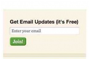
71% of the WhichTestWon community members decided that the first version (the one on the left) works more effectively because there is evidence of social approval on it. When I offer the same test to a live audience at various conferences, as a rule, 90-95% of respondents choose the option supported by the indication of the number of subscribers.
However, they are all wrong. The right option (the one that without counting the number of subscribers) filled 122% more users than the version with the social approval element. In a world where everyone was fed up with a huge number of Facebook or Twitter accounts, 14,000 subscribers do not look convincing enough to motivate potential customers to take action.
Usually, we see how companies add an element of social recognition without first testing it, because “social media experts” vigorously tell them that this increases conversion. Fortunately, in our example, the guys did not neglect testing, otherwise, they would lose more than half of the subscribers.
Don't get me wrong, social approval is very valuable. For some, it helps combat visitor mistrust and increase brand credibility. However, the difficulty lies in choosing where exactly it is best to post statistics illustrating social approval, and what information is worth sharing. What is more profitable: to tell about the number of subscribers, the number of likes on Facebook, about rewards - or about everything at once? The answer is simple: test it. Never act blindly, you do not know what this may lead to.
Icons are now in trend, but they may worsen conversion
Icons returned to web design with triumph. In general, they are quite useful, especially if they are used as markers in stylized lists of product categories. The Build.com team decided to find out if the icons would be effective navigation tools ... and the results surprised them a lot.
Here are two options for the top of the page that they tested (with and without icons):
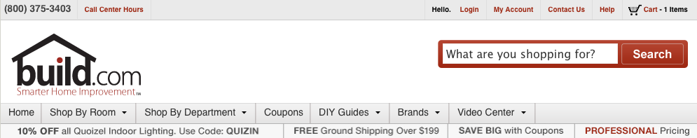
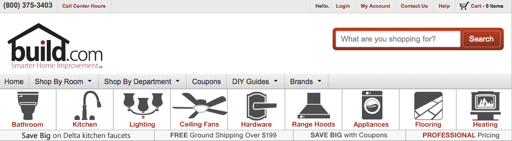
In this case, the function of the icons was the reflection of different categories of goods on the pages of the site. Representatives of the company believed that easy navigation through the most visited sections would help increase sales. However, they were mistaken: the option without icons contributed to an increase in sales by 21%.
Why? It seems to us that even though the icons made the navigation system more attractive, they visually overloaded the interface and confused the user.
Testing security certificates on contact collection forms
The sticking point of any lead generation page is the subscription form itself. It is very important to determine the optimal number of fields, choose the right design, add privacy icons to increase user confidence.
Such methods are fairly well known, all marketers understand this ... and that is why 74% of the members of the WhichTestWon team incorrectly determined the winner in this A / B testing.

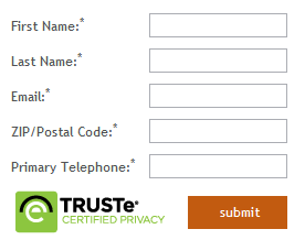
The form without the TRUSTe logo was filled by 12.6% more users. Yes, the “subscribe” button was reduced to accommodate the TRUSTe logo, but it seems to us that the very reason for the lower conversion was the very presence of the logo.
User confidence plays a key role in increasing conversion rates; but the trick is to place items that increase confidence in the right place at the right time.
In this particular case, the TRUSTe logo was published in the wrong place at the wrong time, and the privacy label did not work to increase confidence. Visitors are used to seeing this element in the basket, and not when filling out the form. It is likely that many of them, on a subconscious level, began to suspect that money will be written off from them now.
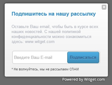
Instead of a logo with assurances of the security of the service, you could use a small text link leading to a privacy policy page.
An example of this form of subscription created on the Witget service:
But this can only be learned through testing.
If it’s hard for you to figure out how to motivate potential customers to leave contacts, we recommend reading the article "10 useful tips: using what sauce to collect contacts of website visitors."
Remember, context is the key to everything!
If the conversion rate falls, you need to add a photo of a happy person?
Conversion rate optimization specialists and designers love to use photos of happy people. A person is the first thing that catches the eye when you enter the site. Numerous studies that track the trajectory of a user's gaze prove this.
However, such photos of human faces can be very distracting. Thus, we recommend that before adding a photo to your page, test this solution to make sure that the photo does not compete with the title and call to action.
Here is an example:
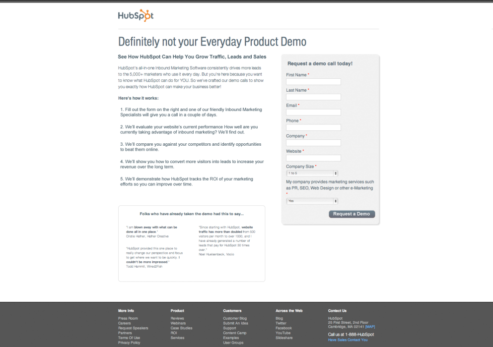
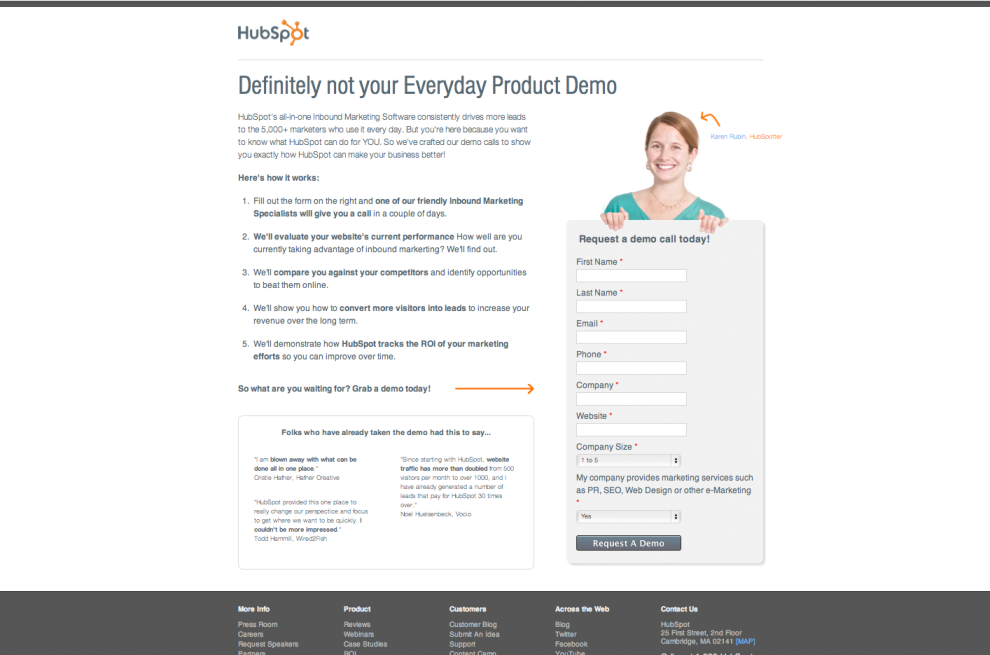
A form without a picture was filled in by 24% more users. It should be said that the testing was not perfectly fair - in the second picture the text was slightly changed, but no more. Honestly, it's better this testing than none. However, it should be said that this is not the first, and not the last testing, from which it became clear that if you remove people from a page, the conversion will increase.
By the way: it’s good that the company’s representatives used a photo of a real employee, and not another “stock” photo. Stock and staged photos are much less effective than those depicting real clients, employees, etc.
Perhaps the most surprising is that during this split-testing company HubSpot was going to make it mandatory practice to place a photo of a person on each of their landing pages. Perhaps at some level it makes sense - they found that the effectiveness of some pages increases if you place a photo there. However, this rule is not true for all pages. Fortunately, testing sowed doubt, and the company changed its page design requirements.
So, before creating a landing page or developing design requirements, be sure to test ... you have no idea how many conversions you can miss!
Preview video with focus on product or person?
Here is another case, clearly demonstrating whether to use human faces. Before you are two versions of the video page, in the first half of the video preview, there are people, and on the second, only the product.

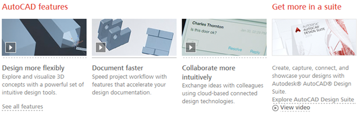
The version of the Autodesk page in which a person was depicted on the video cover received 50% fewer video views. Nothing but the picture preview for the video has changed. I am not against the photos of people on the sites, I only urge to pre-test all of their decisions!
Of course, the testing team was shocked by the results. In the end, they conducted a user survey to figure it out. The answers showed that potential Autodesk customers are interested in seeing exactly how the product works, instead of listening to how other people are talking about this product.
It all boils down to one thing: you need to know your audience, and remember that solutions tested by others are not for everyone.
Summing up
Leaders in the field of testing were stumped by such unexpected results, and so will be more than once. The trick is to understand what to do after the test results have diverged from your hypotheses and assumptions. Your next steps may include reevaluating a specific list of things, such as hypotheses, technology, traffic sources, devices, and so on.
In any case - even if testing failed, or even the very understanding of what your site visitors want was wrong - you learned something valuable that you can use in the future.
Remember, testing is a long process, and we can get closer to the ideal only after passing through a series of successes and failures.
Keep testing! To succeed, you need to check so many options, so it is not surprising that we often suffer losses where we least expected it.
Source: https://vwo.com/blog/ab-testing-results-that-surprised-experts/
By the way, if you are looking for testers for your site and do not know where and how to find them, then we told about this in one of our blog’s previous articles “ 6 available usability testing tools for web sites ”. Follow our blog posts!
Source: https://habr.com/ru/post/229507/
All Articles