How to educate the user and not drive him crazy. Experience Yandex Browser
In Yandex Browser, as in any other multi-functional program, there are opportunities that far from everybody knows. And not only the users themselves lose from this, but also the product as a whole - as a result, its potential is not revealed to the entire audience. You can polish the design for as long as you wish, fill in reference materials and write articles on Habr, but the majority of users will still not be aware of all the possibilities. We needed a new, smarter and more accurate tool to accurately train the user. In this article we will share our experience in creating this, and perhaps it will be useful to you when developing your products.

As we have already noted above, it is possible and even necessary to talk about product features in detailed reference materials. But the situation is now such that Help is addressed less and less. This is about the same as the user manual. Tell me honestly, did you read the user manual for your new smartphone before using it?
')
In addition to Help, there is such a thing as a start page (we call it the “welcome page”) with a description of several of the most striking features. But there are many possibilities, and the user’s patience is not very. Therefore, it was necessary to come up with something else. We will not tell you that as a result we invented tooltips. After all, they have been used in various programs for a long time. Recall, at least, the world-famous Paperclip from one very popular office suite, which had both strengths and some annoying moments. We took this idea as a basis in order to build our system of clever prompts on the basis of it. And then the fun began.
What could be simpler than showing a person a hint about the availability of a particular function, you would think. In fact, everything is not so simple. To understand this, let us return to the welcome page, which we have already mentioned above. Why this start page can not be used to teach a person all the intricacies of the browser? There are at least three reasons for this:
These thoughts apply to any method of learning and, on the basis of them, the developers offered to show the hints contextually and only when the need for them is maximal. But this is only the surface of the iceberg, because for each function there is its own optimal moment that still needs to be determined. But let's not get ahead of ourselves, we will look at specific examples below.
Imagine that we have a lot of functions, and the user quickly faces them, which leads to the constant appearance of advice. You can imagine it, but the development team decided to try it for themselves. If you show a dozen unexpectedly pop-up messages within ten minutes, you are unlikely to be satisfied, despite their usefulness. Feeling it all on ourselves, we realized the need to ration the frequency of prompts. After that, we conducted several more experiments on almost volunteers from the Yandex.Browser team, which made it possible to find the following gentle mode of prompts:
A separate point is how the user can act after the notification appears. Our tips are contextual, which means that they always appear exactly when the user is learning the content or performing some actions. To show the browser blocking prompt at such a moment (for example, to demand to click on the cross or the button “I have read and understood everything”) is guaranteed to cause inconvenience to the person. In the course of all the same field trials, it also became clear that the pop-up hint should not take focus on itself, otherwise the text entered at this time could be forever history. A man, to put it mildly, will be displeased. Therefore, our messages can be ignored and continue to work - they just disappear.
And something else. The last wish for the tips was the ability to turn them off. Therefore, now in the settings of the browser, you can turn them off immediately and that's it. Or click on the cross in each specific message, which will turn it off for the next three months.
We finished with the theory, and now we can look at the practice of applying these recommendations. We picked up a few examples that might be of interest to you.
Habr's readers are well aware of the possibility to search immediately via the omnibox, but many other users often arrive in the old manner: first they drive in the address of the search engine, and only then they search in it. Different browsers solve this problem in different ways. At one time, Chromium offered to place a search engine on a new tab and immediately transfer requests to the omnibox. Also now you can find the mention of the Origin chip experiment, which is to remove the address of the page from the omnibox in general.
In the Yandex Browser, the omnibox was originally designed in the style of the Yandex search box, so that, at the association level, it would suggest further steps for the user. Now, in parallel with this, hints are used that clearly tell about this possibility. Since the essence of the omnibox is widely known in narrow circles, we did not immediately tell each user of the Browser about it, but preferred to use prompts only if a certain condition was met.
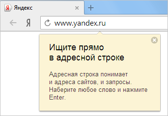
If the ratio of search requests from omnibox and from the Yandex home page drops to at least 1 to 4 in favor of the site, then the user sees a hint. The ratio was derived solely by trial and error. At the same time, it is imperative that the total achievement of search queries exceeds 100. On smaller numbers, the risk of getting to a user who knows everything perfectly well, but is currently actively searching through the site for some reason, is high.
If you now look at the results, the preliminary data are as follows: among those who saw the hint, the number of searches through the omnibox increased by 7%. This figure is quite modest, and we have a suggestion that these users more than consciously go to the main page of Yandex and search from there.
Yandex.Browser can offer to translate the page into Russian. Previously, we used a pop-up panel for this, which was annoying by the fact that it was shifting content on the page. Therefore, recently we moved the translator directly into the omnibox, which many of our users perceived very positively. By the way, in the project, Chromium went the same way and in 34 versions acted in a similar way.
After the transfer of the translator, we noticed that his CTR decreased by about 20%. This is quite logical, because now users can safely ignore it. If the old translator was himself rather intrusive, and did not need prompts, then for the new training it would not hurt.
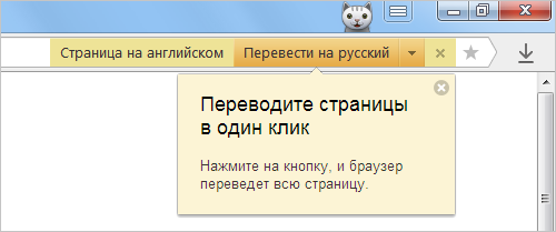
In this case, we show a hint if a translator appeared in the omnibox, but the user has never used it. As a result, we, on the one hand, do not impose a function on those who definitely have no need for it. On the other hand, we do not cause irritation to users already familiar with the translator. Here are the results:
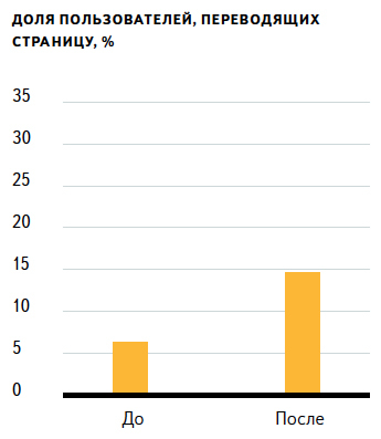
Judging by the fact that the share of those who agree to translate the page has more than doubled, the hint has reached its goal, and a sufficiently large number of users have become acquainted with the function.
By the way, while studying the hints, we accidentally noticed that transferring the translator to the omnibox somehow had a positive effect on the use of the latter. The number of searches in the omnibox increased by 3.4% as a result. Either this is an error or an example of an interesting interrelation of seemingly unrelated functions. What are your versions?
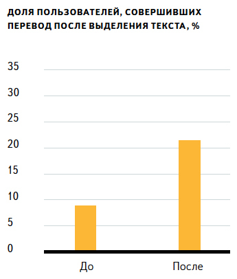
While many people are already familiar with the paginated translator from the Chrome browser, there is no translation of individual words and phrases. It may not be obvious to a beginner that the browser is capable of this, which means that much already depends on the hints. But how to determine that the tip is needed? Almost every page on the web contains words in a foreign language, so the tooltip cannot focus on this factor. Fix the use of online translators? But who said that the translated words were found on the page, and not in the subtitles of the beloved honestly purchased series.
The decision came completely unexpectedly. Already known to readers Habr kukutz expressed a hypothesis that the selection and copying of words in a foreign language in some cases may be a sign of the desire to translate it in a third-party service. It is clear that there will always be those who copy words for other tasks, but the developers have hooked on this idea, added a filter that cuts off those who have already used the translator, and created a hint.

And the result was very pleasant. The proportion of users who have ever used a translator of words and phrases has jumped.
The browser is able to warn the user about visiting a site that is suspected of fraud. Previously, a pop-up panel was used for this. Unfortunately, a large number of not entirely correct advertising on the Internet has done its job, and many users have developed immunity to such warnings and simply do not pay attention to them. To fix this, we tried to add a tooltip to the panel. It turned out like this:
And the attention was really attracted, as users began to read the details more often.

But the most interesting was the fact that the share of ignored warnings has increased, and few could have expected this. There are various hypotheses on this score. For example, there is even an opinion that users were afraid of the warning, because they did not understand its essence, and after getting acquainted with the details, they began to act bolder.
Such a high percentage of potential victims could not be ignored. Therefore, here we used the experience of blocking sites that distribute malicious content, and immediately began to block the pages of fraudsters. In this case, it is perfectly acceptable to interrupt the consumption of content by the user, since it is no longer a matter of teaching new opportunities, but of stopping a crime. Do you agree with us?
The “Up” button is our conventional name for the function of returning to the top of the page by clicking on the tab. The simplest thing here would be to show a hint when you are at the bottom of the page, but in most cases we do not go back up. So, in order to make our message as useful as possible, you need to more accurately identify the desire. Therefore, the Browser tracks the scrolling down (at least two screens), and then up (at least one screen) and only then offers to return to the top of the page in a simpler way.
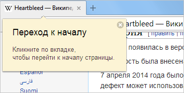
If the user has used the hint, he will be immediately informed about the possibility of returning to the previous place through the second click.
There are more tips in Yandex Browser than we described in this article. But even these examples show that even such a simple thing as hints, requires a special approach and can sometimes lead to very interesting results. We realized that for some functions, hints are useful and necessary, while for others they do not bring much results. We learned how to select points for displaying hints so as not to cause irritation to the user. And they also understood that in matters of security, it is necessary to act more decisively and prevent problems due to changes in the product, not prompts.
But how did people perceive these clues? According to our statistics, most people see no more than one clue a week. At the same time, only 12% of people prefer to close them with a cross, which is not so much. In support of the browser almost did not come with complaints of tips. Based on this, we concluded that the model of user training we have chosen does not create additional inconveniences and fits perfectly into the product.
As we have already noted above, it is possible and even necessary to talk about product features in detailed reference materials. But the situation is now such that Help is addressed less and less. This is about the same as the user manual. Tell me honestly, did you read the user manual for your new smartphone before using it?
')
In addition to Help, there is such a thing as a start page (we call it the “welcome page”) with a description of several of the most striking features. But there are many possibilities, and the user’s patience is not very. Therefore, it was necessary to come up with something else. We will not tell you that as a result we invented tooltips. After all, they have been used in various programs for a long time. Recall, at least, the world-famous Paperclip from one very popular office suite, which had both strengths and some annoying moments. We took this idea as a basis in order to build our system of clever prompts on the basis of it. And then the fun began.
Smart tips are what?
What could be simpler than showing a person a hint about the availability of a particular function, you would think. In fact, everything is not so simple. To understand this, let us return to the welcome page, which we have already mentioned above. Why this start page can not be used to teach a person all the intricacies of the browser? There are at least three reasons for this:
- A multi-page start-up briefing is more likely to cause a desire to remove the Browser or to recall a kind word from the developer and his relatives than to try all these features. You can, of course, give a button to close this training, but then the situation will be about the same as with licensing agreements. We all read them, aren't we?
- The theory in isolation from the practice of application will be forgotten quickly enough. It is like with foreign languages: if you even read a textbook, then without communicating in the language being studied, it will be very difficult to speak it.
- There is no sense in teaching the user something that he may never use. And it is not about modern higher education.
These thoughts apply to any method of learning and, on the basis of them, the developers offered to show the hints contextually and only when the need for them is maximal. But this is only the surface of the iceberg, because for each function there is its own optimal moment that still needs to be determined. But let's not get ahead of ourselves, we will look at specific examples below.
Imagine that we have a lot of functions, and the user quickly faces them, which leads to the constant appearance of advice. You can imagine it, but the development team decided to try it for themselves. If you show a dozen unexpectedly pop-up messages within ten minutes, you are unlikely to be satisfied, despite their usefulness. Feeling it all on ourselves, we realized the need to ration the frequency of prompts. After that, we conducted several more experiments on almost volunteers from the Yandex.Browser team, which made it possible to find the following gentle mode of prompts:
- Show the same hint no more than once a day.
- During the day, show no more than two tips of a different type.
- If the user saw the same hint three times, but did not respond, then we do not show it for 1-3 months.
A separate point is how the user can act after the notification appears. Our tips are contextual, which means that they always appear exactly when the user is learning the content or performing some actions. To show the browser blocking prompt at such a moment (for example, to demand to click on the cross or the button “I have read and understood everything”) is guaranteed to cause inconvenience to the person. In the course of all the same field trials, it also became clear that the pop-up hint should not take focus on itself, otherwise the text entered at this time could be forever history. A man, to put it mildly, will be displeased. Therefore, our messages can be ignored and continue to work - they just disappear.
And something else. The last wish for the tips was the ability to turn them off. Therefore, now in the settings of the browser, you can turn them off immediately and that's it. Or click on the cross in each specific message, which will turn it off for the next three months.
We finished with the theory, and now we can look at the practice of applying these recommendations. We picked up a few examples that might be of interest to you.
Omnibox
Habr's readers are well aware of the possibility to search immediately via the omnibox, but many other users often arrive in the old manner: first they drive in the address of the search engine, and only then they search in it. Different browsers solve this problem in different ways. At one time, Chromium offered to place a search engine on a new tab and immediately transfer requests to the omnibox. Also now you can find the mention of the Origin chip experiment, which is to remove the address of the page from the omnibox in general.
In the Yandex Browser, the omnibox was originally designed in the style of the Yandex search box, so that, at the association level, it would suggest further steps for the user. Now, in parallel with this, hints are used that clearly tell about this possibility. Since the essence of the omnibox is widely known in narrow circles, we did not immediately tell each user of the Browser about it, but preferred to use prompts only if a certain condition was met.
If the ratio of search requests from omnibox and from the Yandex home page drops to at least 1 to 4 in favor of the site, then the user sees a hint. The ratio was derived solely by trial and error. At the same time, it is imperative that the total achievement of search queries exceeds 100. On smaller numbers, the risk of getting to a user who knows everything perfectly well, but is currently actively searching through the site for some reason, is high.
If you now look at the results, the preliminary data are as follows: among those who saw the hint, the number of searches through the omnibox increased by 7%. This figure is quite modest, and we have a suggestion that these users more than consciously go to the main page of Yandex and search from there.
Page translator
Yandex.Browser can offer to translate the page into Russian. Previously, we used a pop-up panel for this, which was annoying by the fact that it was shifting content on the page. Therefore, recently we moved the translator directly into the omnibox, which many of our users perceived very positively. By the way, in the project, Chromium went the same way and in 34 versions acted in a similar way.
After the transfer of the translator, we noticed that his CTR decreased by about 20%. This is quite logical, because now users can safely ignore it. If the old translator was himself rather intrusive, and did not need prompts, then for the new training it would not hurt.
In this case, we show a hint if a translator appeared in the omnibox, but the user has never used it. As a result, we, on the one hand, do not impose a function on those who definitely have no need for it. On the other hand, we do not cause irritation to users already familiar with the translator. Here are the results:
Judging by the fact that the share of those who agree to translate the page has more than doubled, the hint has reached its goal, and a sufficiently large number of users have become acquainted with the function.
By the way, while studying the hints, we accidentally noticed that transferring the translator to the omnibox somehow had a positive effect on the use of the latter. The number of searches in the omnibox increased by 3.4% as a result. Either this is an error or an example of an interesting interrelation of seemingly unrelated functions. What are your versions?
Translator of words and phrases
While many people are already familiar with the paginated translator from the Chrome browser, there is no translation of individual words and phrases. It may not be obvious to a beginner that the browser is capable of this, which means that much already depends on the hints. But how to determine that the tip is needed? Almost every page on the web contains words in a foreign language, so the tooltip cannot focus on this factor. Fix the use of online translators? But who said that the translated words were found on the page, and not in the subtitles of the beloved honestly purchased series.
The decision came completely unexpectedly. Already known to readers Habr kukutz expressed a hypothesis that the selection and copying of words in a foreign language in some cases may be a sign of the desire to translate it in a third-party service. It is clear that there will always be those who copy words for other tasks, but the developers have hooked on this idea, added a filter that cuts off those who have already used the translator, and created a hint.
And the result was very pleasant. The proportion of users who have ever used a translator of words and phrases has jumped.
Scam Protection
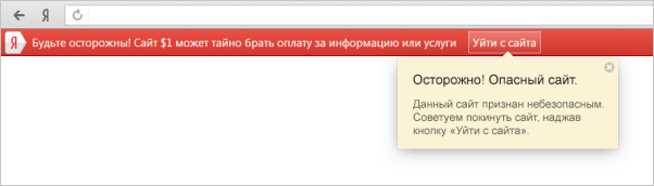
The browser is able to warn the user about visiting a site that is suspected of fraud. Previously, a pop-up panel was used for this. Unfortunately, a large number of not entirely correct advertising on the Internet has done its job, and many users have developed immunity to such warnings and simply do not pay attention to them. To fix this, we tried to add a tooltip to the panel. It turned out like this:
And the attention was really attracted, as users began to read the details more often.
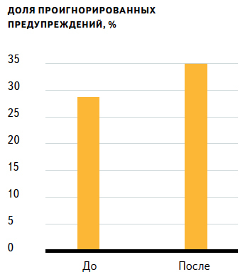
But the most interesting was the fact that the share of ignored warnings has increased, and few could have expected this. There are various hypotheses on this score. For example, there is even an opinion that users were afraid of the warning, because they did not understand its essence, and after getting acquainted with the details, they began to act bolder.
Such a high percentage of potential victims could not be ignored. Therefore, here we used the experience of blocking sites that distribute malicious content, and immediately began to block the pages of fraudsters. In this case, it is perfectly acceptable to interrupt the consumption of content by the user, since it is no longer a matter of teaching new opportunities, but of stopping a crime. Do you agree with us?
Up Button
The “Up” button is our conventional name for the function of returning to the top of the page by clicking on the tab. The simplest thing here would be to show a hint when you are at the bottom of the page, but in most cases we do not go back up. So, in order to make our message as useful as possible, you need to more accurately identify the desire. Therefore, the Browser tracks the scrolling down (at least two screens), and then up (at least one screen) and only then offers to return to the top of the page in a simpler way.
If the user has used the hint, he will be immediately informed about the possibility of returning to the previous place through the second click.
Instead of conclusion
There are more tips in Yandex Browser than we described in this article. But even these examples show that even such a simple thing as hints, requires a special approach and can sometimes lead to very interesting results. We realized that for some functions, hints are useful and necessary, while for others they do not bring much results. We learned how to select points for displaying hints so as not to cause irritation to the user. And they also understood that in matters of security, it is necessary to act more decisively and prevent problems due to changes in the product, not prompts.
But how did people perceive these clues? According to our statistics, most people see no more than one clue a week. At the same time, only 12% of people prefer to close them with a cross, which is not so much. In support of the browser almost did not come with complaints of tips. Based on this, we concluded that the model of user training we have chosen does not create additional inconveniences and fits perfectly into the product.
Source: https://habr.com/ru/post/229411/
All Articles