Designing an online store: substitutes, complements, comparisons and other tools to increase conversion
A new article on the design of online stores, this time described the mechanics of a number of blocks that increase conversion. In this part we will tell you about substitutes, complements, comparisons and other tools to increase conversion. Last time we covered a few dozen functional blocks of stores: “Designing an online store: research” , “Designing an online store: modules of an online store” and “Designing an online store: product card and not only” this article is a logical continuation.
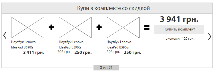
Fig. 1. I have it
')
Another social mechanism: "I have it." The function is very simple, allows you to tell new customers that I have already bought and tried it. It is realized either with the help of the social networks garter or after login on the site. The tool can be used for two purposes: first, to show other users that the thing is in demand and is used, it will bring a person closer to the purchase. Secondly, you can disguise the Share function under this tool, then a person clicks on the “I have it” button and a pop-up window opens with a suggestion to tell friends in his social network that he has it and the message will link to the store and product card.
This feature has great potential. Earlier, I already wrote that gradually online stores will become overgrown with social functions, so this function can serve as a tool for creating connections between users. Imagine a situation: you choose a new mobile phone, go to the catalog, choose your favorite brands and the amount you are counting on, open one of the suitable product cards and see that this product has already been bought by 100 people. Not all will be enough official information from the brand and the store, consumers every year lose confidence in advertising, but to communicate with a living person who has already bought this product is always interesting. It is here that the social connection of previously unfamiliar people can be established on the basis of the general interest - the purchase of something. And then these social connections can be developed into a whole shopping club: to unite people according to their interests, according to their geo-attributes, do joint events, etc. All this will allow consumers to engage in the life of the brand and can greatly increase purchases. A store can become not just a place of one-time purchases every six months, but a place for daily communication and with the time of daily purchases, because each of us buys something almost every day, it remains only to be motivated to do it in one place.
I move on the list and this time I will talk about one more social function - I want as a gift. A similar function is, for example, at OZON.ru. It can act as a social one and for this mark “I want” should be public, or it can act as a personal, a certain analogue of the one chosen. Publicity is beneficial for the store, so you need to try to motivate the user to this option.
Often, the buyer, walking through an online store, can meet those things that he would like, but is not ready to buy or is not ready to buy at all, but wants to be presented with it. The store has a choice: 1. Offer him to add it to the special “I want a gift” list, which at a minimum will serve as a reminder to the buyer, and as a maximum help the store to sell this product; 2. To disregard this desire and, most likely, the buyer will forget about it in time. The first option is more profitable for us, let's talk about it.
The button "I want a gift" should be on the product page, preferably in a prominent place. Alternatively, it can be one of the tabs along with the reviews. When you click on it, a person is offered a form in which: he is invited to log in, call the list (by default, “I want as a gift”, but the user may want to share gift lists, say, for each of the holidays), display name, privacy settings for the list, the priority of this desire from 1 to 5, a comment to the desire, the button "Save". After clicking on "save" the buyer appears a list with a unique URL-address, which the site should offer to share with friends on social networks or send by email. With each subsequent addition of goods to this list, you can also offer to fumble or the entire list, or the product itself.
Before a big holiday, which traditionally presents gifts in our culture (birthday, new year, March 8, February 23, professional holidays, etc.), all users should send a newsletter, in which they should offer to make such wish lists and tell about them to your friends through social networks, email, etc. This will allow you to get an influx of visitors and seasonal purchases.
In addition, knowledge of the desires of users are extremely valuable for marketers! We can use them for personal discounts and mini-shares, especially for the holidays.
Fig. 2. I want a gift

Fig. 3. I want a gift

By the way, here again there is an opportunity to make advanced social functions and thereby increase sales. You can give users the opportunity to specify the place of work and profession and be able to make mailings for professional holidays or in some way link employees of companies among themselves, discuss gifts together, etc. Or give the opportunity to indicate your relatives, friends, colleagues and invite them to the store site, and before the holidays the store can directly say: “Give your friend (aunt, uncle, mom, dad, grandmother, grandfather, etc.) your gift on the new year "and, knowing the information about this person, deliver him a gift at the expense of his friend. But I again think about the future and deviated a little to one side.
You can also make the function “I want to donate” and put a reminder for it in the future.
Both lists, “I want a gift” and “I want to donate,” should be displayed in your personal account and have tools to manage these lists.
Fig. 4. Goods substitutes
Almost any product has substitutes, analogues. These may be close models of the same manufacturer, or may be models of a competing brand. It is important to offer the buyer several options at the selection stage.
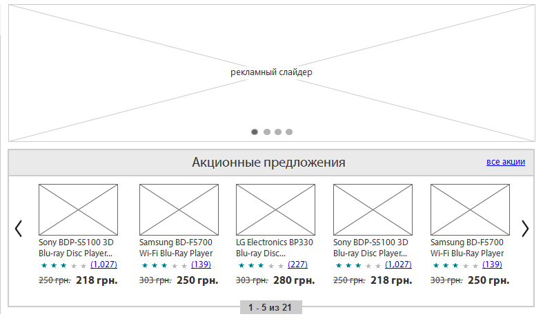
Usually this function is presented in the product card as a separate unit, under the basic information. In the block, the most common product previews, as in the catalog. All you need to do is think of a functional that can automatically detect similar products. First of all, the comparison should go on the goods of one category. You can compare the characteristics, price and other parameters. All the closest goods are shown in the appropriate block, there should be 5-7 of them. You can make the possibility of scrolling the block to the right, if there are more similar goods than places in the block.
In addition, it would be good to collect statistics on which brands the user prefers, his average check, his social status and income. It can be obtained from the history of purchases, from the activity on the site, from Social CRM and other places. You can enable a person to fill out extended information about themselves and their preferences. Having such information, we can greatly increase the likelihood of a purchase or even an average check, showing the user analogues of the product of his favorite brand, but a little more expensive than what he is watching now.
Fig. 5. Complementary items
There is a very good way to increase the average check - to offer a person complementary goods to the main. If a person bought a computer, he can sell licensed software and services to set it up. Batch sale of several goods and services.
This is a very effective way, so the block should be in a prominent place. You can even make several blocks for this purpose, for example, “buy in a set” and “related products”. The unit to buy in a set offers complementary goods at a discount, and the “related products” unit can be used in case we didn’t guess what the buyers need in the first case or he is ready to buy several related products at once.
In this case, the more important “buy in a set” block, it acts as a stock and buyers willingly agree to such offers, so it should be placed on the item card under the basic information, and the block with accessories, additional services and other complements can be under the characteristics, detailed descriptions, reviews and other information. There is a fine line here: we cannot divert the user's attention from the basic information, because if he does not buy the main product, he will not buy the complementary ones. But on the other hand, it is important for us that the user "stints in the store to the fullest."
The “buy in bundle” block should visually inform the user that it is cheaper than separately, which he can save. He needs to give the appropriate title, in the nutria block, the goods can be shown as a formula: one product + second product = amount with a discount and show how much interest the user saves. However, we do not know exactly what the user wants most of all to see as the second product of the kit, because there are many options. Therefore, it is important to make this block with the function of paging different options so that the user selects the right one. So, as this promotional offer, its options should be limited. Do not make more than 5-7 variants of such kits. By the way, we can thus sell goods that are stale in stock. Although this must be careful.
Complementary products can be quite a lot, it will be impossible to show them all on the product page. In addition, we do not even know what type of complementary goods the user can buy. Therefore it is worth making a choice of categories in this block. Links or tabs. So that the user himself could choose the type of complementary product, look at a particular group. In addition to tabs, it is important to give a link to the page with all the complementary goods, a small auto-generated catalog. In many online stores in the product card make a special tab "Accessories", along with the tabs "Features", "Reviews", "Shipping and payment", etc.
There is also a more brazen way to increase the average bill: when you add a product to the cart, a pop-up window opens, the rest of the site is darkened and in this window a person is offered to put one additional service or item in the basket, as well as the Yes or No button. But such methods can be annoying. However, on Amazon.com there is one and no one asks the users. Or less aggressive option: a window opens with a list of products and under them an offer to buy complementary products.
In general, any buyer is easier to part with the money gradually, in steps. Therefore, offer your customers to buy everything gradually: first, one product, then supplement, then a service for it, because a gift to a loved one, then everyday purchases, then all purchases, and always just from you. If with the help of these blocks a person did not make an additional purchase, we will be able to sell him in a hundred more different ways, the main thing is for him to take the first step, at least one bought something. As the statistics show, to attract a new buyer is several times more expensive than to keep the old one.
Fig. 6. Missing goods
Not all products are always in stock. Something may end up in the warehouse, and the purchasing manager did not order the goods on time (by the way, I will tell about it in the articles on the internal structure of online stores), the goods were removed from production, the goods are reserved, etc.
The user needs to show the real balances of goods. If the goods are not in stock, he should clearly see this and, ideally, also see the reason for the absence. In each case, the site will lead in different ways.
In the product catalog you need to show only those products that appear in stock. Discontinued products should not be shown. In the product preview, you need to show with color that there is no product, and also replace the “Buy” button with “Report availability”.
The first case: the goods ended in stock, but the store plans to buy it in the future. It is necessary to replace the “Buy” button with “Report availability”, and on the place where the availability is indicated indicate: “The goods are not in stock. The expected receipt date is xx.xx.xxxx ”, and the date should only be shown if it is really known, for example, when the purchasing manager placed an order with a supplier from the internal system, you can automatically start showing the expected date.
The second case: the goods are out of production. Do not rush to remove product cards that are out of production. They can not be shown in the general directory, but the site should be left to search engines, because not everyone can know that the goods are no longer produced. In the product card, you need to remove the "Buy" button, subscribe to the product, add to favorites, etc. And instead of all these functions, show the message: “The product is discontinued” and under it is a large block with analogues of this product that are in stock.
The third case: the product is reserved. Often people place an order, the store reserves goods in stock and waits for payment. This payment does not always come. Therefore, in such cases in the presence you can specify the quantity of the reserved goods, as well as information when it will be removed from the reserve. The "Buy" button also changes to "Report Availability".
Fig. 7. Comparison of goods
Another feature that is enjoyed by many online store customers. Virtually any product has analogues that are difficult to distinguish in terms of characteristics without detailed analysis. To assist customers in deciding to make a particular purchase, a comparison mechanism was invented.
In the interface, the buyer should be able to add any product to the comparison. This function should be both in the preview of the product, right in the catalog, and in the product card itself. Usually the function is a checkbox and a “By comparison” link, when you click on a checkbox or link, the item is dynamically added to the comparison list, and the label is replaced with “By comparison” and if two or more products are compared, the label turns into a link, clicking on which, the user gets to the comparison page.
In the catalog, from the goods added to the comparison in the right column above you can form a dynamic block with a list of selected products. The list is a red cross “close” on the left and the name-link to the product to the right of the cross, and below the list is a link or a button calling for the action “Compare”. It is needed so that when scrolling up the page or when going to the next page through pagination, the user can see how many products he has already chosen in comparison.
The comparison page is usually organized in the form of a table, where the goods themselves are vertically, and their characteristics horizontally. Some products may have a lot of parameters, so it’s worth making the switch “All specifications” and “Only differences”. In the interface, all horizontal lines should be highlighted in alternating unobtrusive colors in order to facilitate visual perception of information by users. The product photo is small, the buyer will first of all compare the product characteristics in the table. Near the photo there is a red cross, which allows you to remove from the comparison table those products that are worse than others. Under the table it is worth making the block "Similar products" and "Most bought" so that the user can add other products to the comparison when scrolling down. At the top of each column you need to make a big buy button, because it is on this page that many buyers make the final decision.
Fig. 8. Patterns of behavior
I have many times focused on the interests of users and purchase history. In psychology, people are often divided into groups on certain grounds, each of the groups has patterns of behavior. We cannot carry out full psychological research, but there is plenty of information for indirect conclusions and predictions from any online store.
Imagine a situation: a person creates a family and a child is born to him. His life has changed and after that consumer behavior changes. Very soon, he will need first a cot, a little later a stroller, and even later - a children's bicycle. This is a pattern of consumer behavior caused by a particular event. If the store could know about this event, he could offer the buyer the necessary goods even before he began to think about them. But while online stores are far from social networks and this joyful event in a person’s life is recognized by his friends on VK or Facebook, but not the store. However, such changes can still be monitored and automated predictions made and assumptions about possible further behavior changes based on primary signals.
First you need to make a mechanism that allows you to set patterns of behavior and predict its change over time. Patterns can be many. They can be both simple and complex. For example: if a person bought games of a certain genre, he would certainly want to buy a novelty of the same genre; if a person buys chocolate, he will certainly buy other sweets; if a person has bought a mobile phone, he will probably want to change it to a new one in 2-3 years, etc. After we set the templates, we need to teach the website to track them and keep statistics in order to be able to analyze and improve conditions in the templates. Users can sometimes be asked for control questions for complete confidence; when his activity allows him to offer something, you can ask him a direct question. For example, if the store suggested that a person loves all sweet (his activity corresponds to a certain pattern of behavior), you can ask him through the pop-up question: “Do you like sweet?” And answer “Yes” or “No”. Over the years, a huge number of patterns of behavior and analytics will accumulate, the store will be understood by the consumer even without words.
Such statistics would be useful activity of people with similar interests or behavior. For a start, you can show a simple block "People with similar interests are buying."
Fig. 9. Loyalty program
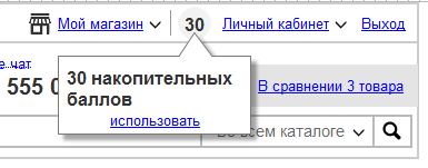
Fig. 10. Loyalty program
To stimulate sales is very important to think carefully about loyalty programs. This is a marketing task, and when designing a store, it is important for us to take this into account in the functionality and interface. I will try to consider the main variants of loyalty programs.
The first and one of the most interesting options are virtual points that you can accumulate when shopping and change to discounts. This makes one-time buyers - permanent. In the interface, you need to show it in at least two places: on the product page next to the price or below it, and also in your personal account. When buying a user, you need to be informed that he has been awarded a certain amount of points and he can exchange them for a discount on the next purchase. This is done using the information block in the item card, when making a purchase, when it is summed up and through a notification to the post office. In your personal account, the balance of points should be visible on the main page of your personal account with basic information, as well as in a special tab, where you can see the history of accrual, expenditure and rules of use. If this technique is the basis of the loyalty program, then the bonus account balance can be shown in a header on each page. Also, virtual points can be used in ezines to stimulate additional sales.
In addition to points, many stores use promotional codes. These special codes are set in the administrative part of the site and can be automatically sent to a particular group of users. The ability to enter codes is best done at the checkout stage, in the shopping cart. Do not forget that after entering and sending the code, the site should return the answer to the user: either a positive and after the old price is crossed out and a new price is written next to it, or a negative one, in which case the reason for the negative answer and solutions should be indicated.
Some stores in their loyalty programs go even further and make free gifts to their regular customers. Here it is a delicate matter, from the point of view of marketing, you can make a mistake: on the one hand, it is better to give presents to regular customers who make good profits. On the other hand, you will not give a particularly expensive gift to everyone, but a cheap one can offend. Therefore, this process can also be automated and give either useful stuff (for example, when buying a mobile phone, you can give a case for it or a discount on this type of product), or calculate a gift depending on the amount of the order - the larger the check, the bigger the gift. In addition, it would be good to make the possibility of manual assignment of gifts in some kind of monetary framework, which depends on the history and amount of purchases of a particular person, so that the sales manager has the opportunity to encourage individual customers or smooth out the negative.
A special place in the loyalty program is occupied by promotions and discounts. It is important to make not only the possibility of holding shares, but also attach them to the history of a person’s purchases. So that we could conduct them automatically or semi-automatically, as well as do personalized promotions. In particular, automatically analyze the history of purchases and make promotions on related products. To prevent people from being taught to free, you can also consider certain restrictions on shares.
From the point of view of interfaces, it is necessary to limit stocks in time or even set timers with a countdown to the exact second of the end of the action.
More often in stores are used cumulative discounts and special distinctive badges "regular customer". Cumulative discounts can be displayed as a graph in your personal account, where you can see the reference point (minimum), the end point (maximum) and the current position of the client, as well as brief conditions. Separately, you can enter the category "wholesale customer" and show for this category special prices throughout the store. Any discount must be clearly shown in the interface (the crossed out price next to the new one, a special mark in the product card as a percent sign, etc.).
Fig. 11. Loyalty program
Since we still have e-commerce, advertising will be much, very different. And the advertising system needs serious. Just making a "bannerokrutilku" will not be enough, any serious online store needs a smart and modern advertising system.
Small and medium online stores will use this system only for their own internal needs, and large stores with large attendance may also attract external advertisers, for example, big brands who want to increase the proportion of their sales in the store compared to competitors. Therefore, the advertising system must be designed for a specific task, here the approach should not be a template. I will try to describe below a rather sophisticated advertising system, which is not needed by every store, but only by large stores.
To begin with, our advertising system must be equipped with precise targeting tools. First of all, it is geo-targeting, social targeting and behavioral targeting.
Geo-targeting should allow to show different advertisements to visitors from different countries and regions of the country. There will be difficulties with this, if you do it programmatically, then only through a technology that is based on determining the user's geolocation by IP, which is impossible to do, there will be a significant percentage of errors. Due to these technical difficulties, many stores immediately offer the user to specify their city and then not only advertising, but also the entire site adapts to the user's city: the availability of goods in stock, telephones, information, etc. You can use it in conjunction: first, we automatically determine the city of the user, and then we ask to clarify it, whether we have correctly defined. This is an essential tool for large stores that have offline offices in the regions. So we can, for example, stimulate sales of stale goods in a warehouse in a particular city.
Social targeting will be more difficult. On good, the store should offer to fill in the user with an extended questionnaire indicating the age, social status, interests and other information. But users will be reluctant to take this step, so you need to make this feature optional. , OpenID, Social CRM .
, . , , .. , .
. , , . .
- , , . : HTML-. , . : , , , . HTML, , . , , , .
- , .
, , , . , .. , , , .
. . , . , . .
. , «», , : , , .
, , . . .
, , . , , , «». , . , , , . .
. , , .
Fig. 12.
, , . , : , . , - , , , . – .
, . , . . , «» . , , .
: , 5-7 , , « , . , .
That's all for today. , , (), , , , , , . !
:
1. . 2014 - «Digitov» : ( , !), - - . !
2. . -. Those interested can leave a request and get the first copies of the book. email: info@secl.com.ua - « » .
3. . — SECL Group: Facebook , VK , Twitter .
: http://seclgroup.ru/article_substituty_komplementy_sravneniye_drugiye_instrumenty_uvelicheniya_konversii.html
Author:
The president
« SECL Group » / « Internet Sales Technologies »
I have it
Fig. 1. I have it
')
Another social mechanism: "I have it." The function is very simple, allows you to tell new customers that I have already bought and tried it. It is realized either with the help of the social networks garter or after login on the site. The tool can be used for two purposes: first, to show other users that the thing is in demand and is used, it will bring a person closer to the purchase. Secondly, you can disguise the Share function under this tool, then a person clicks on the “I have it” button and a pop-up window opens with a suggestion to tell friends in his social network that he has it and the message will link to the store and product card.
This feature has great potential. Earlier, I already wrote that gradually online stores will become overgrown with social functions, so this function can serve as a tool for creating connections between users. Imagine a situation: you choose a new mobile phone, go to the catalog, choose your favorite brands and the amount you are counting on, open one of the suitable product cards and see that this product has already been bought by 100 people. Not all will be enough official information from the brand and the store, consumers every year lose confidence in advertising, but to communicate with a living person who has already bought this product is always interesting. It is here that the social connection of previously unfamiliar people can be established on the basis of the general interest - the purchase of something. And then these social connections can be developed into a whole shopping club: to unite people according to their interests, according to their geo-attributes, do joint events, etc. All this will allow consumers to engage in the life of the brand and can greatly increase purchases. A store can become not just a place of one-time purchases every six months, but a place for daily communication and with the time of daily purchases, because each of us buys something almost every day, it remains only to be motivated to do it in one place.
I want a gift
I move on the list and this time I will talk about one more social function - I want as a gift. A similar function is, for example, at OZON.ru. It can act as a social one and for this mark “I want” should be public, or it can act as a personal, a certain analogue of the one chosen. Publicity is beneficial for the store, so you need to try to motivate the user to this option.
Often, the buyer, walking through an online store, can meet those things that he would like, but is not ready to buy or is not ready to buy at all, but wants to be presented with it. The store has a choice: 1. Offer him to add it to the special “I want a gift” list, which at a minimum will serve as a reminder to the buyer, and as a maximum help the store to sell this product; 2. To disregard this desire and, most likely, the buyer will forget about it in time. The first option is more profitable for us, let's talk about it.
The button "I want a gift" should be on the product page, preferably in a prominent place. Alternatively, it can be one of the tabs along with the reviews. When you click on it, a person is offered a form in which: he is invited to log in, call the list (by default, “I want as a gift”, but the user may want to share gift lists, say, for each of the holidays), display name, privacy settings for the list, the priority of this desire from 1 to 5, a comment to the desire, the button "Save". After clicking on "save" the buyer appears a list with a unique URL-address, which the site should offer to share with friends on social networks or send by email. With each subsequent addition of goods to this list, you can also offer to fumble or the entire list, or the product itself.
Before a big holiday, which traditionally presents gifts in our culture (birthday, new year, March 8, February 23, professional holidays, etc.), all users should send a newsletter, in which they should offer to make such wish lists and tell about them to your friends through social networks, email, etc. This will allow you to get an influx of visitors and seasonal purchases.
In addition, knowledge of the desires of users are extremely valuable for marketers! We can use them for personal discounts and mini-shares, especially for the holidays.
Fig. 2. I want a gift
Fig. 3. I want a gift
By the way, here again there is an opportunity to make advanced social functions and thereby increase sales. You can give users the opportunity to specify the place of work and profession and be able to make mailings for professional holidays or in some way link employees of companies among themselves, discuss gifts together, etc. Or give the opportunity to indicate your relatives, friends, colleagues and invite them to the store site, and before the holidays the store can directly say: “Give your friend (aunt, uncle, mom, dad, grandmother, grandfather, etc.) your gift on the new year "and, knowing the information about this person, deliver him a gift at the expense of his friend. But I again think about the future and deviated a little to one side.
You can also make the function “I want to donate” and put a reminder for it in the future.
Both lists, “I want a gift” and “I want to donate,” should be displayed in your personal account and have tools to manage these lists.
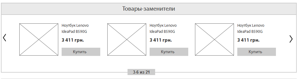
Goods substitutes (substitutes)
Fig. 4. Goods substitutes
Almost any product has substitutes, analogues. These may be close models of the same manufacturer, or may be models of a competing brand. It is important to offer the buyer several options at the selection stage.
Usually this function is presented in the product card as a separate unit, under the basic information. In the block, the most common product previews, as in the catalog. All you need to do is think of a functional that can automatically detect similar products. First of all, the comparison should go on the goods of one category. You can compare the characteristics, price and other parameters. All the closest goods are shown in the appropriate block, there should be 5-7 of them. You can make the possibility of scrolling the block to the right, if there are more similar goods than places in the block.
In addition, it would be good to collect statistics on which brands the user prefers, his average check, his social status and income. It can be obtained from the history of purchases, from the activity on the site, from Social CRM and other places. You can enable a person to fill out extended information about themselves and their preferences. Having such information, we can greatly increase the likelihood of a purchase or even an average check, showing the user analogues of the product of his favorite brand, but a little more expensive than what he is watching now.
Complementary products (complements)
Fig. 5. Complementary items
There is a very good way to increase the average check - to offer a person complementary goods to the main. If a person bought a computer, he can sell licensed software and services to set it up. Batch sale of several goods and services.
This is a very effective way, so the block should be in a prominent place. You can even make several blocks for this purpose, for example, “buy in a set” and “related products”. The unit to buy in a set offers complementary goods at a discount, and the “related products” unit can be used in case we didn’t guess what the buyers need in the first case or he is ready to buy several related products at once.
In this case, the more important “buy in a set” block, it acts as a stock and buyers willingly agree to such offers, so it should be placed on the item card under the basic information, and the block with accessories, additional services and other complements can be under the characteristics, detailed descriptions, reviews and other information. There is a fine line here: we cannot divert the user's attention from the basic information, because if he does not buy the main product, he will not buy the complementary ones. But on the other hand, it is important for us that the user "stints in the store to the fullest."
The “buy in bundle” block should visually inform the user that it is cheaper than separately, which he can save. He needs to give the appropriate title, in the nutria block, the goods can be shown as a formula: one product + second product = amount with a discount and show how much interest the user saves. However, we do not know exactly what the user wants most of all to see as the second product of the kit, because there are many options. Therefore, it is important to make this block with the function of paging different options so that the user selects the right one. So, as this promotional offer, its options should be limited. Do not make more than 5-7 variants of such kits. By the way, we can thus sell goods that are stale in stock. Although this must be careful.
Complementary products can be quite a lot, it will be impossible to show them all on the product page. In addition, we do not even know what type of complementary goods the user can buy. Therefore it is worth making a choice of categories in this block. Links or tabs. So that the user himself could choose the type of complementary product, look at a particular group. In addition to tabs, it is important to give a link to the page with all the complementary goods, a small auto-generated catalog. In many online stores in the product card make a special tab "Accessories", along with the tabs "Features", "Reviews", "Shipping and payment", etc.
There is also a more brazen way to increase the average bill: when you add a product to the cart, a pop-up window opens, the rest of the site is darkened and in this window a person is offered to put one additional service or item in the basket, as well as the Yes or No button. But such methods can be annoying. However, on Amazon.com there is one and no one asks the users. Or less aggressive option: a window opens with a list of products and under them an offer to buy complementary products.
In general, any buyer is easier to part with the money gradually, in steps. Therefore, offer your customers to buy everything gradually: first, one product, then supplement, then a service for it, because a gift to a loved one, then everyday purchases, then all purchases, and always just from you. If with the help of these blocks a person did not make an additional purchase, we will be able to sell him in a hundred more different ways, the main thing is for him to take the first step, at least one bought something. As the statistics show, to attract a new buyer is several times more expensive than to keep the old one.
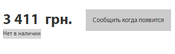
Missing goods
Fig. 6. Missing goods
Not all products are always in stock. Something may end up in the warehouse, and the purchasing manager did not order the goods on time (by the way, I will tell about it in the articles on the internal structure of online stores), the goods were removed from production, the goods are reserved, etc.
The user needs to show the real balances of goods. If the goods are not in stock, he should clearly see this and, ideally, also see the reason for the absence. In each case, the site will lead in different ways.
In the product catalog you need to show only those products that appear in stock. Discontinued products should not be shown. In the product preview, you need to show with color that there is no product, and also replace the “Buy” button with “Report availability”.
The first case: the goods ended in stock, but the store plans to buy it in the future. It is necessary to replace the “Buy” button with “Report availability”, and on the place where the availability is indicated indicate: “The goods are not in stock. The expected receipt date is xx.xx.xxxx ”, and the date should only be shown if it is really known, for example, when the purchasing manager placed an order with a supplier from the internal system, you can automatically start showing the expected date.
The second case: the goods are out of production. Do not rush to remove product cards that are out of production. They can not be shown in the general directory, but the site should be left to search engines, because not everyone can know that the goods are no longer produced. In the product card, you need to remove the "Buy" button, subscribe to the product, add to favorites, etc. And instead of all these functions, show the message: “The product is discontinued” and under it is a large block with analogues of this product that are in stock.
The third case: the product is reserved. Often people place an order, the store reserves goods in stock and waits for payment. This payment does not always come. Therefore, in such cases in the presence you can specify the quantity of the reserved goods, as well as information when it will be removed from the reserve. The "Buy" button also changes to "Report Availability".
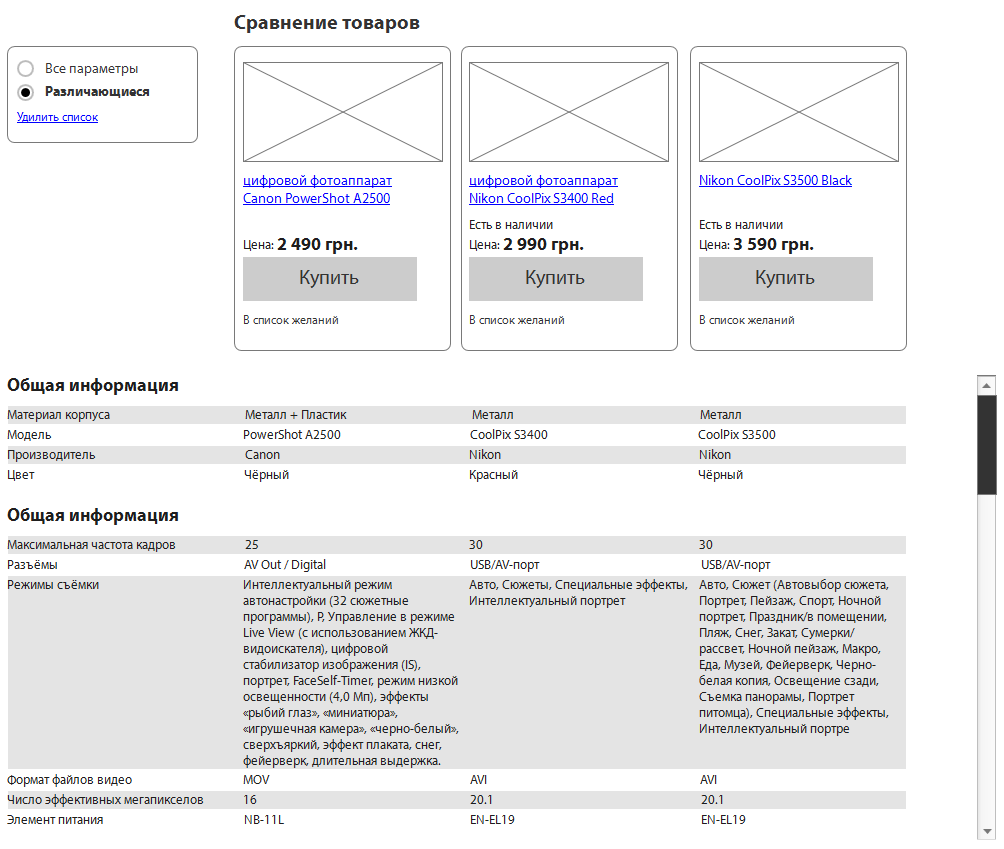
Compare Products
Fig. 7. Comparison of goods
Another feature that is enjoyed by many online store customers. Virtually any product has analogues that are difficult to distinguish in terms of characteristics without detailed analysis. To assist customers in deciding to make a particular purchase, a comparison mechanism was invented.
In the interface, the buyer should be able to add any product to the comparison. This function should be both in the preview of the product, right in the catalog, and in the product card itself. Usually the function is a checkbox and a “By comparison” link, when you click on a checkbox or link, the item is dynamically added to the comparison list, and the label is replaced with “By comparison” and if two or more products are compared, the label turns into a link, clicking on which, the user gets to the comparison page.
In the catalog, from the goods added to the comparison in the right column above you can form a dynamic block with a list of selected products. The list is a red cross “close” on the left and the name-link to the product to the right of the cross, and below the list is a link or a button calling for the action “Compare”. It is needed so that when scrolling up the page or when going to the next page through pagination, the user can see how many products he has already chosen in comparison.
The comparison page is usually organized in the form of a table, where the goods themselves are vertically, and their characteristics horizontally. Some products may have a lot of parameters, so it’s worth making the switch “All specifications” and “Only differences”. In the interface, all horizontal lines should be highlighted in alternating unobtrusive colors in order to facilitate visual perception of information by users. The product photo is small, the buyer will first of all compare the product characteristics in the table. Near the photo there is a red cross, which allows you to remove from the comparison table those products that are worse than others. Under the table it is worth making the block "Similar products" and "Most bought" so that the user can add other products to the comparison when scrolling down. At the top of each column you need to make a big buy button, because it is on this page that many buyers make the final decision.
Patterns of behavior and buying people with similar interests
Fig. 8. Patterns of behavior
I have many times focused on the interests of users and purchase history. In psychology, people are often divided into groups on certain grounds, each of the groups has patterns of behavior. We cannot carry out full psychological research, but there is plenty of information for indirect conclusions and predictions from any online store.
Imagine a situation: a person creates a family and a child is born to him. His life has changed and after that consumer behavior changes. Very soon, he will need first a cot, a little later a stroller, and even later - a children's bicycle. This is a pattern of consumer behavior caused by a particular event. If the store could know about this event, he could offer the buyer the necessary goods even before he began to think about them. But while online stores are far from social networks and this joyful event in a person’s life is recognized by his friends on VK or Facebook, but not the store. However, such changes can still be monitored and automated predictions made and assumptions about possible further behavior changes based on primary signals.
First you need to make a mechanism that allows you to set patterns of behavior and predict its change over time. Patterns can be many. They can be both simple and complex. For example: if a person bought games of a certain genre, he would certainly want to buy a novelty of the same genre; if a person buys chocolate, he will certainly buy other sweets; if a person has bought a mobile phone, he will probably want to change it to a new one in 2-3 years, etc. After we set the templates, we need to teach the website to track them and keep statistics in order to be able to analyze and improve conditions in the templates. Users can sometimes be asked for control questions for complete confidence; when his activity allows him to offer something, you can ask him a direct question. For example, if the store suggested that a person loves all sweet (his activity corresponds to a certain pattern of behavior), you can ask him through the pop-up question: “Do you like sweet?” And answer “Yes” or “No”. Over the years, a huge number of patterns of behavior and analytics will accumulate, the store will be understood by the consumer even without words.
Such statistics would be useful activity of people with similar interests or behavior. For a start, you can show a simple block "People with similar interests are buying."
Loyalty program
Fig. 9. Loyalty program
Fig. 10. Loyalty program
To stimulate sales is very important to think carefully about loyalty programs. This is a marketing task, and when designing a store, it is important for us to take this into account in the functionality and interface. I will try to consider the main variants of loyalty programs.
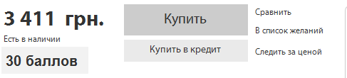
The first and one of the most interesting options are virtual points that you can accumulate when shopping and change to discounts. This makes one-time buyers - permanent. In the interface, you need to show it in at least two places: on the product page next to the price or below it, and also in your personal account. When buying a user, you need to be informed that he has been awarded a certain amount of points and he can exchange them for a discount on the next purchase. This is done using the information block in the item card, when making a purchase, when it is summed up and through a notification to the post office. In your personal account, the balance of points should be visible on the main page of your personal account with basic information, as well as in a special tab, where you can see the history of accrual, expenditure and rules of use. If this technique is the basis of the loyalty program, then the bonus account balance can be shown in a header on each page. Also, virtual points can be used in ezines to stimulate additional sales.
In addition to points, many stores use promotional codes. These special codes are set in the administrative part of the site and can be automatically sent to a particular group of users. The ability to enter codes is best done at the checkout stage, in the shopping cart. Do not forget that after entering and sending the code, the site should return the answer to the user: either a positive and after the old price is crossed out and a new price is written next to it, or a negative one, in which case the reason for the negative answer and solutions should be indicated.
Some stores in their loyalty programs go even further and make free gifts to their regular customers. Here it is a delicate matter, from the point of view of marketing, you can make a mistake: on the one hand, it is better to give presents to regular customers who make good profits. On the other hand, you will not give a particularly expensive gift to everyone, but a cheap one can offend. Therefore, this process can also be automated and give either useful stuff (for example, when buying a mobile phone, you can give a case for it or a discount on this type of product), or calculate a gift depending on the amount of the order - the larger the check, the bigger the gift. In addition, it would be good to make the possibility of manual assignment of gifts in some kind of monetary framework, which depends on the history and amount of purchases of a particular person, so that the sales manager has the opportunity to encourage individual customers or smooth out the negative.
A special place in the loyalty program is occupied by promotions and discounts. It is important to make not only the possibility of holding shares, but also attach them to the history of a person’s purchases. So that we could conduct them automatically or semi-automatically, as well as do personalized promotions. In particular, automatically analyze the history of purchases and make promotions on related products. To prevent people from being taught to free, you can also consider certain restrictions on shares.
From the point of view of interfaces, it is necessary to limit stocks in time or even set timers with a countdown to the exact second of the end of the action.
More often in stores are used cumulative discounts and special distinctive badges "regular customer". Cumulative discounts can be displayed as a graph in your personal account, where you can see the reference point (minimum), the end point (maximum) and the current position of the client, as well as brief conditions. Separately, you can enter the category "wholesale customer" and show for this category special prices throughout the store. Any discount must be clearly shown in the interface (the crossed out price next to the new one, a special mark in the product card as a percent sign, etc.).
Advertising system
Fig. 11. Loyalty program
Since we still have e-commerce, advertising will be much, very different. And the advertising system needs serious. Just making a "bannerokrutilku" will not be enough, any serious online store needs a smart and modern advertising system.
Small and medium online stores will use this system only for their own internal needs, and large stores with large attendance may also attract external advertisers, for example, big brands who want to increase the proportion of their sales in the store compared to competitors. Therefore, the advertising system must be designed for a specific task, here the approach should not be a template. I will try to describe below a rather sophisticated advertising system, which is not needed by every store, but only by large stores.
To begin with, our advertising system must be equipped with precise targeting tools. First of all, it is geo-targeting, social targeting and behavioral targeting.
Geo-targeting should allow to show different advertisements to visitors from different countries and regions of the country. There will be difficulties with this, if you do it programmatically, then only through a technology that is based on determining the user's geolocation by IP, which is impossible to do, there will be a significant percentage of errors. Due to these technical difficulties, many stores immediately offer the user to specify their city and then not only advertising, but also the entire site adapts to the user's city: the availability of goods in stock, telephones, information, etc. You can use it in conjunction: first, we automatically determine the city of the user, and then we ask to clarify it, whether we have correctly defined. This is an essential tool for large stores that have offline offices in the regions. So we can, for example, stimulate sales of stale goods in a warehouse in a particular city.
Social targeting will be more difficult. On good, the store should offer to fill in the user with an extended questionnaire indicating the age, social status, interests and other information. But users will be reluctant to take this step, so you need to make this feature optional. , OpenID, Social CRM .
, . , , .. , .
. , , . .
- , , . : HTML-. , . : , , , . HTML, , . , , , .
- , .
, , , . , .. , , , .
. . , . , . .
. , «», , : , , .
, , . . .
, , . , , , «». , . , , , . .
. , , .
Fig. 12.
, , . , : , . , - , , , . – .
, . , . . , «» . , , .
: , 5-7 , , « , . , .
That's all for today. , , (), , , , , , . !
:
1. . 2014 - «Digitov» : ( , !), - - . !
2. . -. Those interested can leave a request and get the first copies of the book. email: info@secl.com.ua - « » .
3. . — SECL Group: Facebook , VK , Twitter .
: http://seclgroup.ru/article_substituty_komplementy_sravneniye_drugiye_instrumenty_uvelicheniya_konversii.html
Author:
The president
« SECL Group » / « Internet Sales Technologies »
Source: https://habr.com/ru/post/229137/
All Articles