As we in PassportVision interface did
Interface design is a very complicated craft. Alas, it is not very clear how to learn this craft. Of course, today there are a huge number of different good books about different good approaches to this very design. However, the practice suggests that even if you read them all thoughtfully, it will not mean that you will be able to create the perfect UI in any situation. And the thing is that such an activity is rather a kind of art, rather than following a set of rules. But how to master this art if good books do not give the necessary skills? It seems to us that experience is still the key factor in this matter. But to learn only from one’s own experience is a long-term occupation, it would be better to look at other people (and this is not only related to interfaces).
Let's talk a little about how to learn from someone else's experience. We have many familiar teams that develop really cool apps. And when they show us their interfaces, they begin to tell what and how they did. And we always ask why they did it, why they came to precisely this decision. And it seems to us that this is the most correct question. Yes, there are brilliant people who, without any materiel in their sleep, will see the perfect interface without all sorts of hard thoughts about how to do well and how to do badly. But there are few such people, and you will not learn much from such experience. Image thinking really develops when you are told about the motivation of each of your decisions (even the smallest). Like, we first did this and that, but the users were uncomfortable because of this, so we redid everything like this, and now everyone lives happily.
In this post, we would like to tell the story of one mold that we made when developing our product PassportVision (which was already told on Habré). This is one and only small mold, but we have been doing it for a whole year. How well we did it is to judge you, but the users are very pleased (isn't this the criterion of a good interface?). We repeatedly reworked different things, hotly arguing about various trifles, but in the end it turned out that it is convenient to use. However, we think that in a year we will take a look at this post, take a look at our already old UI by that time and say: “O Lord! Did we really give it to users? Oh, shameful, how shameful. ” But everything is correct - the interface must constantly evolve, evolve, become better. And today we will talk about what is available today and how did we come to this.
')
There is the following situation: the client comes to some wonderful place, and they ask him for passport data. The client sends his passport to the operator, who, in turn, places the document in the scanner and presses a special button to start PassportVision. And after a few seconds, our program has recognized client data at the output. And it would be possible to immediately send this data to a Word document, database, web form, another specialized program (underline the necessary), but first it would be nice to show the recognition results to the operator for verification. Do not think that PassportVision recognizes everything so badly that it is constantly necessary to correct errors behind it. But, alas, we have to put up with the fact that modern computer technology is not able to provide one hundred percent recognizability of absolutely any text. And taking into account all the love with which in our country are suitable for the design of individual design of a passport for each person (a unique combination of the font, its outlines and colors, the location of the fields and the angle of inclination - let your passport not look like the others!), Errors will appear . Perhaps they will be only on every n-th passport, perhaps they will be very small, but they will still be. Therefore, it is not very desirable to skip the verification phase.
Strict statement of the technical assignment: make it so that verification happens as simply and quickly as possible. To direct "vzhuh!" - And the correctness of the results was verified.
We remember well our very first version of the interface: on the left - the passport picture, on the right - the values of the recognized fields. Like, look at the results and compare with the original.

And everything seems to be fine, but only the verification takes a lot of time (sometimes this time is comparable to the manual entry of passport data), and many errors still remain.
The process of working on the interface was very simple: we used our program every day and the inconvenient things were found by ourselves. The most annoying circumstance was the following: it was necessary to spend too much time after reading the value of the next field to translate the view of the passport and find on it the corresponding zone. The solution is simple: let's tell the user where the zone with which he is currently working is in the picture (that is, the field with the cursor, we also separately highlight it separately). You can, for example, circle the right place:

However, jumping from place to place, the rectangle created a not very pleasant visual noise, it annoyed many. Therefore, we decided to draw all the rectangles, and select the desired color:

The link “field-zone” works in both directions: when clicking on a field, a zone is highlighted, and when clicking on a zone, the field is activated (highlighting + cursor setting + focus). When you hover the mouse over a certain area, a pop-up hint appears with the recognized data.
With these colored rectangles it became, of course, somewhat better, but not really. All the same, it took a lot of time to drive the gaze left-right to verify the recognized data with the original image. Disorder, let's reduce this distance. We started to display a tooltip next to the current field, which displayed the corresponding zone:

Perhaps the solution will seem a bit strange, but experience has shown that it is really convenient. A bit of hassle added fields that are placed vertically (for example, a series and passport number). Of course, for the convenience of reading they had to turn:

Thus, the movement of the eye turned out minimal. At any given time, you are in the context of a single field: here is the recognized data, and here is the picture of the original. No need to be distracted to look somewhere else. This greatly accelerated the verification process.
Let's simplify the search tasks. Not always and not everyone can check the entire field entirely. Especially if it is some large field (for example, the place of issue of three lines). Soon we will talk about navigation and suspicious characters and find out that in the course of working with the program, problem areas are often highlighted. The problem arises to find the selected text fragment in the picture. It seems to be a simple task, but if you enclose the selected area in a frame on a pop-up hint, then everything becomes even simpler:

Some may say that improvements at this level are not needed, which, they say, will not affect anything. But we have a different approach: if we can somehow save a few tens of milliseconds to the user, then it would be better to do so. (In this place, it is necessary to bring calculations with a smart face, such as if 100 operators will process 100 clients a day each with our program, then 10 milliseconds saved on one passport in 100 days will save the industry almost three man-hours. But we will not do that.) In any case, the feature does not seem to interfere, but it looks cool. =)
An additional problem arises after it comes to the realization that in some documents some fields may be duplicated. For example, in the passport of a citizen of the Russian Federation, the number and series are stamped both on the top page and on the bottom page. And worst of all, each entry can be recognized in its own way (for example, due to the fact that the top page of the passport is devoid of any external protection and is more susceptible to mechanical damage; we are very sad about this). By default, we show the user the option in which they themselves are more confident, but you need to provide a choice. Therefore, with aslight hand movement with a couple of lines of code, we turn our TextBox into a ComboBox, which can be opened with the help of a hot key, and then use the up / down keys to select the desired option. In order to simplify the selection, while traveling in the drop-down list in the tooltip area, we show exactly the zone that corresponds to the selected option:

On the main image of the passport, alternatives are also highlighted in a special way:

We approach some fields in a special way. For example, a floor is always represented by a ComboBox with two options, regardless of the recognition results (they only affect the initial value).
And everything was good, until we began to support the machine-readable zone. Visually check it several, ahem, problematic. If the series and number is still easy to check, then the average person from the street is unlikely to cope with the last name. The fact is that 33 letters of the great and powerful are displayed in 26 letters of the English alphabet and 7 digits (for example, 'H' -> '3', 'S' -> '7'). It’s dangerous to show this on a tooltip - you can scare an unprepared person. Therefore, we treat some zones in a special way: even if we took a surname from a machine-readable zone (and more often we are somehow more confident in it), then we show the main zone with a surname in the tooltip to make the check easier. In this case, there are problems with the restoration of the original contours of characters (the image is something else we have slipped!), But we try to solve them as much as we can.

We prompted all kinds of clues, but so far have not saved a person from the need to carefully read the entire text. Disorder! Fortunately for our users, we learned to classify some characters as “suspicious”. In the interface, we paint these symbols in red:

Initially, we are based on the confidence of each character (the degree of confidence in the correctness of recognition), which Tesseract informs us with care. With the help of magical heuristics, we in each case determine the threshold confidence, below which all characters are considered suspicious. Then we run several additional algorithms (more heuristics for god heuristics!), Which help us improve the criteria for suspicion. For example, if the points were badly printed on the date “01/01/2014” and Tesseract is not particularly sure of them, we still will not consider them suspicious, because we know something that the recognition algorithm does not know.
Our efforts were not in vain: almost all the errors we have painted in red. Yes, we are capturing the right symbols, but it’s better to be safe than to overlook any shortcomings. In the overwhelming majority of cases, it is enough to go over suspicious characters and, if necessary, make edits. To speed up the process, we added the ability to move to the next and previous suspicious character from the keyboard. At the same time, the corresponding potential error is immediately highlighted in the text and highlighted on the tooltip. Due to the selection, the user can immediately begin to enter the correct version of the data, if the recognition results turned out to be erroneous.
But trouble does not come alone. We noticed that suspicious characters most often go in groups. This is due to the fact that the image of a passport in some place there is some trouble, which spoils not one particular character, but immediately a certain area. Therefore, if several suspicious characters go in a row, then we combine them into a suspicious group. However, it happens that inside a word that, logically, everything should be one suspicious group, there is a letter in which we are confident against all odds. Such a letter will remain black, but the word will most likely have to be completely rewritten. Therefore, we introduced the concept of suspicious words - these are words in which there are too many suspicious characters. By analogy, we introduced the concept of a suspicious field: if there are too many suspicious characters in the field (for example, bad people smeared the entire passport), then, most likely, the entire field will have to be rewritten, and the miracle in the form of several correctly recognized characters will not help us here.
How now to organize the navigation of errors in terms of "previous" and "next"? We thought for a long time and settled on the following solution: we built a tree of suspicious symbols, groups, words and fields, after which we went through it with a search for depth. Using the practice as a criterion of truth, they realized that it was really convenient.

Of course, there are additional buns. There is a navigation mode in which the transition by error and the transition through the fields are combined. That is, we will visit each field in any case, even if there are no “suspicious characters” in it (it still does not hurt to look at it so that our conscience is clear). There are hot keys to go to each specific field.
Observations on users gave us interesting information for thought. It turns out that most people perceive our form not as a set of input fields that are not particularly related, but as a single document. And since this is one document, then the Undo / Redo stack should be common to all fields. In other words, if the user corrected something, moved to the next field, and then realized that he had made some corrections somehow, then by pressing Ctrl + Z he expects that the changes will be rolled back exactly in the previous field. Not that this was obvious from the very beginning, but the convenience of users is paramount: we made a single Undo / Redo stack for all fields.
When editing it was necessary to take into account one more thing, which relates more to the software implementation than to the usability solution. Each character has special metadata (his confidence and outline on the original image), which need to be dragged when editing. Moreover, with Undo / Redo operations, all metadata should be correctly restored. There are more interesting cases. For example, the surname was recognized incorrectly (“Ivonov”), and the user in the clipboard just missed the correct spelling of the surname (“Ivanov”). What should happen after pressing Ctrl + V with metadata? The correct answer is: for the beginning and end of the word, the data should be saved completely (and confidence, and the outline of the letter), and turning the letter “o” into “a” should be understood by the program as correcting the error, which means that the outline of the letter should remain in the metadata of the new letter “ but".
I would like to say that the particular pain was delivered not by the correction of letters, but by the separation and connection of words, because gaps do not have metadata (we finish building them on the fly along the contours of adjacent letters). The internal data structure changes significantly with such operations, which had to be carefully taken into account when implementing the same Undo / Redo.
Not all changes need to be processed in the same way. For example, if a user corrected a letter case (for example, “Ivanov” was replaced by “Ivanov”), then from the point of view of metadata, nothing should change: all confidence and contours of letters remain in place. But in the Undo / Redo-stack such an operation still needs to be entered. In addition, we support the ability to automatically adjust the register. Some of our clients have standards on how passport information should be presented: someone needs all capital letters, and someone only needs to capitalize the first letters (special fun begins at the place of issue when we try to understand what words still need to write with a capital letter, and which - no). If you tick the appropriate box, then PassportVision will take all the problems with the register on yourself. For example, if you put a space in the middle of the “city of Moscow”, then as a result you should receive “the city of Moscow”. Such capitalizations should not be confused by the logic of the Undo / Redo-stack and the tracking of metadata: everything should work clearly and as much as possible for the user.
We have already talked about many little things and nuances, but no matter how elaborate the interface is, there are always people who don’t like it. We still have a lot of moments, because of which there are heated debates. For example, some believe that the image of the passport should be on the right, some - on the left, some do not need it at all. The “Subdivision code” field in the recognition results is called “Number” due to the fact that many of our corporate clients have “Number” written in their software in the appropriate place, but other clients want exactly “Subdivision Code”. Some people like our field order, and some want the field order to be like in a passport: first the information about the issue, and only then the full name, etc. And some information about the issue is not needed at all, they want to remove it. Someone didn’t like our navigation system and tooltips. Do you need to select the first suspicious place at the very beginning of working with the form (to save one keystroke) or just put the cursor at the beginning of the first field. Disputes are ongoing and additional features. For example, we have the function of checking the expired passport. Some do not need it at all, and some want to block the processing of results in the event of an overdue passport. Some want a feature with automatic transliteration of results. The list can be continued for a long time.
And if all these comments came only from some outside observers, then they could not be ignored. But when a client comes in and says: “I will give you money only if everything goes both way and that way”, it becomes more difficult to ignore comments. Therefore, now we are actively working on the settings of the application, so that, having pierced a few checkboxes, we could build for each one the interface that would suit it to the maximum. But that's another story.
I repeat: we do not pretend that we now have the perfect interface for our task. But this is the interface that some people work with daily, and they like it. We plan to continue to actively develop it, improve it and make it more and more convenient and enjoyable to use. And in this post, we only tried to show how our thought was going when we made certain decisions, to which we paid attention, how we worked through various trifles. We sincerely hope that you could learn some useful things from our history.
Let's talk a little about how to learn from someone else's experience. We have many familiar teams that develop really cool apps. And when they show us their interfaces, they begin to tell what and how they did. And we always ask why they did it, why they came to precisely this decision. And it seems to us that this is the most correct question. Yes, there are brilliant people who, without any materiel in their sleep, will see the perfect interface without all sorts of hard thoughts about how to do well and how to do badly. But there are few such people, and you will not learn much from such experience. Image thinking really develops when you are told about the motivation of each of your decisions (even the smallest). Like, we first did this and that, but the users were uncomfortable because of this, so we redid everything like this, and now everyone lives happily.
In this post, we would like to tell the story of one mold that we made when developing our product PassportVision (which was already told on Habré). This is one and only small mold, but we have been doing it for a whole year. How well we did it is to judge you, but the users are very pleased (isn't this the criterion of a good interface?). We repeatedly reworked different things, hotly arguing about various trifles, but in the end it turned out that it is convenient to use. However, we think that in a year we will take a look at this post, take a look at our already old UI by that time and say: “O Lord! Did we really give it to users? Oh, shameful, how shameful. ” But everything is correct - the interface must constantly evolve, evolve, become better. And today we will talk about what is available today and how did we come to this.
')
Formulation of the problem
There is the following situation: the client comes to some wonderful place, and they ask him for passport data. The client sends his passport to the operator, who, in turn, places the document in the scanner and presses a special button to start PassportVision. And after a few seconds, our program has recognized client data at the output. And it would be possible to immediately send this data to a Word document, database, web form, another specialized program (underline the necessary), but first it would be nice to show the recognition results to the operator for verification. Do not think that PassportVision recognizes everything so badly that it is constantly necessary to correct errors behind it. But, alas, we have to put up with the fact that modern computer technology is not able to provide one hundred percent recognizability of absolutely any text. And taking into account all the love with which in our country are suitable for the design of individual design of a passport for each person (a unique combination of the font, its outlines and colors, the location of the fields and the angle of inclination - let your passport not look like the others!), Errors will appear . Perhaps they will be only on every n-th passport, perhaps they will be very small, but they will still be. Therefore, it is not very desirable to skip the verification phase.
Strict statement of the technical assignment: make it so that verification happens as simply and quickly as possible. To direct "vzhuh!" - And the correctness of the results was verified.
First approach
We remember well our very first version of the interface: on the left - the passport picture, on the right - the values of the recognized fields. Like, look at the results and compare with the original.
And everything seems to be fine, but only the verification takes a lot of time (sometimes this time is comparable to the manual entry of passport data), and many errors still remain.
Work with zones
Painting on zones
The process of working on the interface was very simple: we used our program every day and the inconvenient things were found by ourselves. The most annoying circumstance was the following: it was necessary to spend too much time after reading the value of the next field to translate the view of the passport and find on it the corresponding zone. The solution is simple: let's tell the user where the zone with which he is currently working is in the picture (that is, the field with the cursor, we also separately highlight it separately). You can, for example, circle the right place:
However, jumping from place to place, the rectangle created a not very pleasant visual noise, it annoyed many. Therefore, we decided to draw all the rectangles, and select the desired color:
The link “field-zone” works in both directions: when clicking on a field, a zone is highlighted, and when clicking on a zone, the field is activated (highlighting + cursor setting + focus). When you hover the mouse over a certain area, a pop-up hint appears with the recognized data.
Tooltips
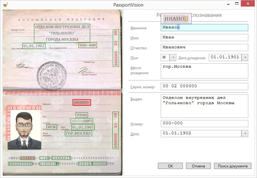
With these colored rectangles it became, of course, somewhat better, but not really. All the same, it took a lot of time to drive the gaze left-right to verify the recognized data with the original image. Disorder, let's reduce this distance. We started to display a tooltip next to the current field, which displayed the corresponding zone:
Perhaps the solution will seem a bit strange, but experience has shown that it is really convenient. A bit of hassle added fields that are placed vertically (for example, a series and passport number). Of course, for the convenience of reading they had to turn:
Thus, the movement of the eye turned out minimal. At any given time, you are in the context of a single field: here is the recognized data, and here is the picture of the original. No need to be distracted to look somewhere else. This greatly accelerated the verification process.
Highlight individual characters
Let's simplify the search tasks. Not always and not everyone can check the entire field entirely. Especially if it is some large field (for example, the place of issue of three lines). Soon we will talk about navigation and suspicious characters and find out that in the course of working with the program, problem areas are often highlighted. The problem arises to find the selected text fragment in the picture. It seems to be a simple task, but if you enclose the selected area in a frame on a pop-up hint, then everything becomes even simpler:
Some may say that improvements at this level are not needed, which, they say, will not affect anything. But we have a different approach: if we can somehow save a few tens of milliseconds to the user, then it would be better to do so. (In this place, it is necessary to bring calculations with a smart face, such as if 100 operators will process 100 clients a day each with our program, then 10 milliseconds saved on one passport in 100 days will save the industry almost three man-hours. But we will not do that.) In any case, the feature does not seem to interfere, but it looks cool. =)
Multiple zones for one field
An additional problem arises after it comes to the realization that in some documents some fields may be duplicated. For example, in the passport of a citizen of the Russian Federation, the number and series are stamped both on the top page and on the bottom page. And worst of all, each entry can be recognized in its own way (for example, due to the fact that the top page of the passport is devoid of any external protection and is more susceptible to mechanical damage; we are very sad about this). By default, we show the user the option in which they themselves are more confident, but you need to provide a choice. Therefore, with a
On the main image of the passport, alternatives are also highlighted in a special way:
We approach some fields in a special way. For example, a floor is always represented by a ComboBox with two options, regardless of the recognition results (they only affect the initial value).
Machine Readable Zone
And everything was good, until we began to support the machine-readable zone. Visually check it several, ahem, problematic. If the series and number is still easy to check, then the average person from the street is unlikely to cope with the last name. The fact is that 33 letters of the great and powerful are displayed in 26 letters of the English alphabet and 7 digits (for example, 'H' -> '3', 'S' -> '7'). It’s dangerous to show this on a tooltip - you can scare an unprepared person. Therefore, we treat some zones in a special way: even if we took a surname from a machine-readable zone (and more often we are somehow more confident in it), then we show the main zone with a surname in the tooltip to make the check easier. In this case, there are problems with the restoration of the original contours of characters (the image is something else we have slipped!), But we try to solve them as much as we can.
Error navigation
Suspicious characters
We prompted all kinds of clues, but so far have not saved a person from the need to carefully read the entire text. Disorder! Fortunately for our users, we learned to classify some characters as “suspicious”. In the interface, we paint these symbols in red:
Initially, we are based on the confidence of each character (the degree of confidence in the correctness of recognition), which Tesseract informs us with care. With the help of magical heuristics, we in each case determine the threshold confidence, below which all characters are considered suspicious. Then we run several additional algorithms (more heuristics for god heuristics!), Which help us improve the criteria for suspicion. For example, if the points were badly printed on the date “01/01/2014” and Tesseract is not particularly sure of them, we still will not consider them suspicious, because we know something that the recognition algorithm does not know.
Basics of navigation
Our efforts were not in vain: almost all the errors we have painted in red. Yes, we are capturing the right symbols, but it’s better to be safe than to overlook any shortcomings. In the overwhelming majority of cases, it is enough to go over suspicious characters and, if necessary, make edits. To speed up the process, we added the ability to move to the next and previous suspicious character from the keyboard. At the same time, the corresponding potential error is immediately highlighted in the text and highlighted on the tooltip. Due to the selection, the user can immediately begin to enter the correct version of the data, if the recognition results turned out to be erroneous.
We improve navigation
But trouble does not come alone. We noticed that suspicious characters most often go in groups. This is due to the fact that the image of a passport in some place there is some trouble, which spoils not one particular character, but immediately a certain area. Therefore, if several suspicious characters go in a row, then we combine them into a suspicious group. However, it happens that inside a word that, logically, everything should be one suspicious group, there is a letter in which we are confident against all odds. Such a letter will remain black, but the word will most likely have to be completely rewritten. Therefore, we introduced the concept of suspicious words - these are words in which there are too many suspicious characters. By analogy, we introduced the concept of a suspicious field: if there are too many suspicious characters in the field (for example, bad people smeared the entire passport), then, most likely, the entire field will have to be rewritten, and the miracle in the form of several correctly recognized characters will not help us here.
How now to organize the navigation of errors in terms of "previous" and "next"? We thought for a long time and settled on the following solution: we built a tree of suspicious symbols, groups, words and fields, after which we went through it with a search for depth. Using the practice as a criterion of truth, they realized that it was really convenient.
Of course, there are additional buns. There is a navigation mode in which the transition by error and the transition through the fields are combined. That is, we will visit each field in any case, even if there are no “suspicious characters” in it (it still does not hurt to look at it so that our conscience is clear). There are hot keys to go to each specific field.
Editing
Undo / Redo
Observations on users gave us interesting information for thought. It turns out that most people perceive our form not as a set of input fields that are not particularly related, but as a single document. And since this is one document, then the Undo / Redo stack should be common to all fields. In other words, if the user corrected something, moved to the next field, and then realized that he had made some corrections somehow, then by pressing Ctrl + Z he expects that the changes will be rolled back exactly in the previous field. Not that this was obvious from the very beginning, but the convenience of users is paramount: we made a single Undo / Redo stack for all fields.
Watching the characters
When editing it was necessary to take into account one more thing, which relates more to the software implementation than to the usability solution. Each character has special metadata (his confidence and outline on the original image), which need to be dragged when editing. Moreover, with Undo / Redo operations, all metadata should be correctly restored. There are more interesting cases. For example, the surname was recognized incorrectly (“Ivonov”), and the user in the clipboard just missed the correct spelling of the surname (“Ivanov”). What should happen after pressing Ctrl + V with metadata? The correct answer is: for the beginning and end of the word, the data should be saved completely (and confidence, and the outline of the letter), and turning the letter “o” into “a” should be understood by the program as correcting the error, which means that the outline of the letter should remain in the metadata of the new letter “ but".
I would like to say that the particular pain was delivered not by the correction of letters, but by the separation and connection of words, because gaps do not have metadata (we finish building them on the fly along the contours of adjacent letters). The internal data structure changes significantly with such operations, which had to be carefully taken into account when implementing the same Undo / Redo.
Register adjustment
Not all changes need to be processed in the same way. For example, if a user corrected a letter case (for example, “Ivanov” was replaced by “Ivanov”), then from the point of view of metadata, nothing should change: all confidence and contours of letters remain in place. But in the Undo / Redo-stack such an operation still needs to be entered. In addition, we support the ability to automatically adjust the register. Some of our clients have standards on how passport information should be presented: someone needs all capital letters, and someone only needs to capitalize the first letters (special fun begins at the place of issue when we try to understand what words still need to write with a capital letter, and which - no). If you tick the appropriate box, then PassportVision will take all the problems with the register on yourself. For example, if you put a space in the middle of the “city of Moscow”, then as a result you should receive “the city of Moscow”. Such capitalizations should not be confused by the logic of the Undo / Redo-stack and the tracking of metadata: everything should work clearly and as much as possible for the user.
Customization
We have already talked about many little things and nuances, but no matter how elaborate the interface is, there are always people who don’t like it. We still have a lot of moments, because of which there are heated debates. For example, some believe that the image of the passport should be on the right, some - on the left, some do not need it at all. The “Subdivision code” field in the recognition results is called “Number” due to the fact that many of our corporate clients have “Number” written in their software in the appropriate place, but other clients want exactly “Subdivision Code”. Some people like our field order, and some want the field order to be like in a passport: first the information about the issue, and only then the full name, etc. And some information about the issue is not needed at all, they want to remove it. Someone didn’t like our navigation system and tooltips. Do you need to select the first suspicious place at the very beginning of working with the form (to save one keystroke) or just put the cursor at the beginning of the first field. Disputes are ongoing and additional features. For example, we have the function of checking the expired passport. Some do not need it at all, and some want to block the processing of results in the event of an overdue passport. Some want a feature with automatic transliteration of results. The list can be continued for a long time.
And if all these comments came only from some outside observers, then they could not be ignored. But when a client comes in and says: “I will give you money only if everything goes both way and that way”, it becomes more difficult to ignore comments. Therefore, now we are actively working on the settings of the application, so that, having pierced a few checkboxes, we could build for each one the interface that would suit it to the maximum. But that's another story.
Instead of conclusion
I repeat: we do not pretend that we now have the perfect interface for our task. But this is the interface that some people work with daily, and they like it. We plan to continue to actively develop it, improve it and make it more and more convenient and enjoyable to use. And in this post, we only tried to show how our thought was going when we made certain decisions, to which we paid attention, how we worked through various trifles. We sincerely hope that you could learn some useful things from our history.
Source: https://habr.com/ru/post/229047/
All Articles