7 things in optimizing landing pages that often do wrong
 Disclaimer: we, the Witget project , are developing our own service to increase conversion tools. We try to find and summarize the experience of older and more successful comrades on the topic of Internet marketing and usability. We present you a list of the 7 most common mistakes in creating landing pages, prepared on the basis of materials from the SiteTuners blog. The article is supplemented with examples and tips from our team.
Landings are often unfairly ignored. Statistics show that an average of 83 times more money is spent on traffic optimization than on landing page optimization. However, traffic is half the battle, the main thing is to convert website visitors into buyers. Landing pages can largely shape your profits, so you should not ignore the optimization of these pages.
But even if you do not ignore the optimization of landing pages, then you, most likely, look at them through the eyes of a marketer. Only very small companies have the opportunity to communicate directly with clients, so in most cases the whole optimization strategy is based on your assumptions about the goals and desires of visitors. The marketer may present his page as a benchmark for a high conversion landing page, but in reality it will be an intricate maze for visitors. Below are seven simple tips on how you can optimize your pages:
1. Unclear Call to Action (Call to Action)
')
First thoughts of the user: What should I do here?
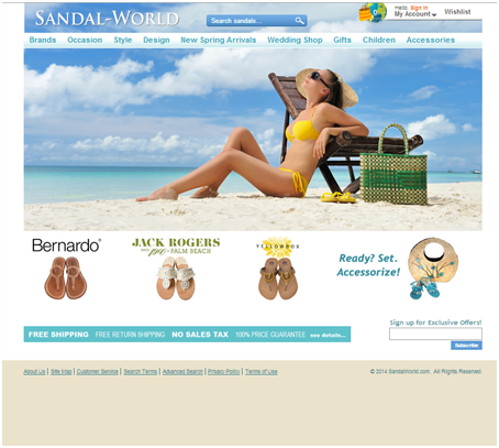
On Sandal World's home page, none of the key images lead the user to clear and precise actions.
Users may get lost on the page for two reasons:
a) no call to action;
b) too many items vying for attention and knocking off the main line.
Problem: Whoever says about the creation of landing pages, but the main problem of all landing pages is the lack of a large, noticeable and only “Buy” button. If you do not have it, then all games with titles, colors, and element sizes are a waste of time. Someone might say that this is commonplace, but try visiting 5-6 landing pages and you will understand how common this is.
Solution: the call to action must be the most distinguished part of the page and placed on the first screen. Remove graphic elements that do not support the main line, such as huge banners or social network buttons.
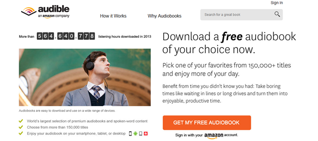
Audible example. Clear message, pressure with numbers and large button.
If you want to add a call to action, but you do not have the opportunity to make a revision to the programmer on the application form, you can use the tools available on the market, the installation of which does not require programming.
For example, a bunch of buttons and a pop-up window from the service Witget.com . When you click on the button on the site, the application form opens.
2. Too much choice.
User experience: and where to click here?
An example of a failed landing page. PunkBabyClothes.net shows several products on the home page, but this entire graphic does not provide information on what needs to be done next.
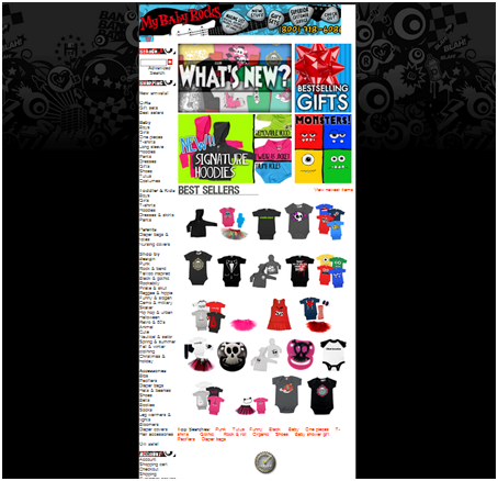
Problem: Busting with graphic elements, buttons and links will definitely confuse the visitor. The desire to show on the main everything and everyone, fearing that the client will not find the necessary information is the main mistake of the owners of online stores. You can not frighten the visitor of the site an abundance of the range. In one well-known experiment with jams, one part of the visitors to the online store offered to try 3 jams and then measure the number of purchases after tasting. Another group of subjects was given a try from more than 10 different jams and also measured the conversion into a purchase. Where do you think the number of purchases was higher? Purchases were many times more in the first group, where the choice was limited to a small number of products.
Solution: Do not try to make your product more noticeable by placing it on the main page or displaying on it a huge list of your product range. The main page’s mission is not to advertise, but to provide the visitor with a beautiful, clear and clear map of your site, where each option is easily accessible, and access to products in plain sight. Home is also needed to create trust of your company (about the company, reviews, contacts, promotions, benefits) and for easy navigation.
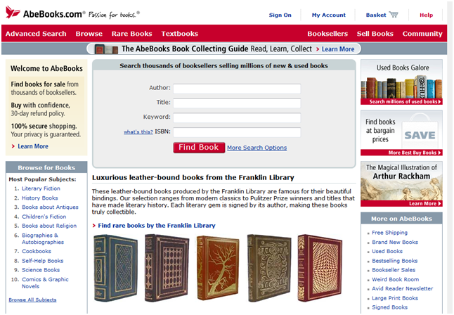
An example of a successful landing AbeBooks.com . Successful navigation on the main - search, the names of all sections, popular, special offers.
3. Too many requests
User experience: when will it all end?
Often, marketers sin by prematurely gathering information - users may find this annoying obsession.
An example of a failed landing page: on the Sapato website there is an oversupply of forms to fill in, calls to action, graphic elements.
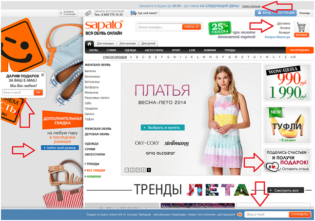
Problem: The owners of the resource are trying in every possible way to get the visitor's contact, luring him into the news section, the shares section, distracting from the purchase.
Solution: We recommend using 1 call for leaving contact, 1 call for sharing, 1 for taking advantage of the action. Do not forbid a person to perform a target action if he is not registered. Understand that payment is more important than customer information.
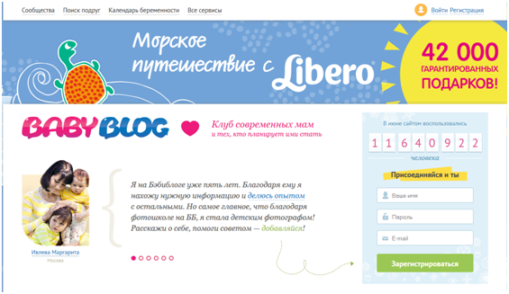
An example of a successful landing. The site Babyblog.ru is very concise - 1 central banner, 1 call to action with the form, and not intrusive.
4. Bust with text
User Experience: Interestingly, do they really think that I will read all this?
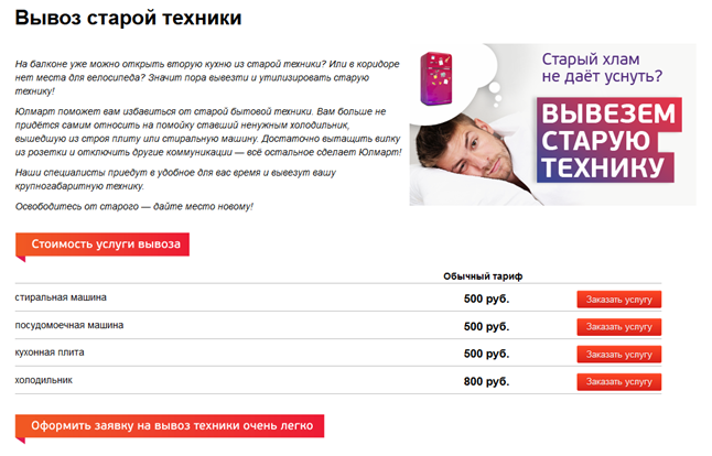
An example of a failed landing page. Landing Ulmart , where 4 paragraphs of text that do not carry practical information for the client. “Old stuff doesn’t allow to fall asleep” - hardly old equipment is what prevents to sleep. The client’s pain did not reflect the banner, since the main problem is that there is no place to put a new technique or furniture.
“The cost of the export service” - disorients the visitor with color, shape and location, and as a result, makes you want to click on this title as a button.
Problem: When searching for an interesting and profitable offer, site visitors do not read, but scan a page — run over it with their eyes in search of key information and call to action, which will help them make a choice. Therefore, large amounts of text and elements distracting from the key message on your page will immediately force a person to close the tab.
Solution : Landing should consist of 1 screen and contain key information: what is offered, why it is profitable, terms, links to pages or the “Pay” button, a bright and memorable image (for visuals).
An example of a successful landing . Laconic Landing from Ulmart, which on one page reports all the necessary information and provides links to those products that the visitor must buy.
5. Promises
User experience: Did you give me what you promised?
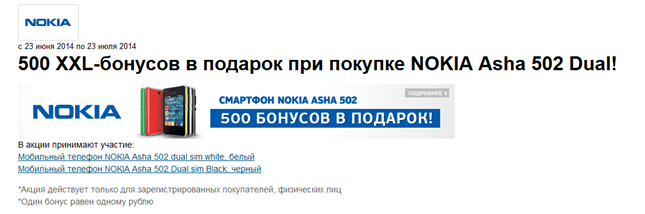
Visitors come to the site from advertising, where they read your offer and became interested in them. Landing must necessarily report the same thing as an advertisement in the expanded version, otherwise the level of trust in you will fall and the probability of a purchase will decrease to 0.
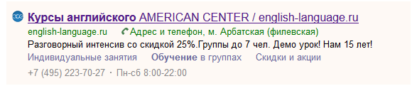
An example of an advertisement of the American Center , where they offer a 25% discount on intensive.
When you go to the site, we get to the landing page with all the shares of the center. 25% discount is missing. Please note that this material was prepared on July 3, 2014, and on the main offer posted until June 30.

Solution: Advertisements in your traffic source should lead the visitor exactly where it was promised. Ideally, you should be guided by the principle 1 advertising offer - 1 landing page.
6. Visual stimuli
User experience: where to look?
Problem: Half of our brain is responsible for processing visual information. That is why we can not ignore the movement. Using dynamic elements that distract the visitor from your call to action will have a detrimental effect on your business.
An example of a failed landing page. Of course, in the world of fashion sales make photos and collections. However, as is the case with Jimmy Choo on the landing page, there are 5 image blocks and 2 sliders. When you hit the landing, there is a defocusing, loss of concentration and the desire to escape from chaos.

Solution: Avoid rotating banners and sliders - they not only take up a lot of space, but can also serve as a strong distraction. Immediate initialization pop-up windows on the start page also need to be tested for distraction - check if the number of registrations is less than the number of failures, then it is time for changes.
Here are some more irritants for an example:
• chat window that pops up as soon as the user loads the page.
• Huge portraits of people who fill 90% of the screen.
Pop-up window at the start on shoes.com
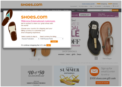
If you want to conduct a survey or persuade a visitor to the target action by a pop-up window, then it is advisable to show it not when a visitor enters, but when leaving.
Care window pops up on Meridian Travel & Tourism website:

7. Lack of trust
User impression: And why should I be sure that you will not fool?
Example of unsuccessful work with reviews Payless.com . Reviews are presented only in the form of stars. At the same time, all lots have exactly the same number of asterisks - 4.5, which suggests: the asterisks are simply entered by default. There are no reviews for specific models, there is no possibility to put this very asterisk either.

Problem: It is difficult for the client to make a choice in favor of the company without having sufficient arguments. Reviews with ratings - this is a significant reason to trust the brand. However, most companies either neglect the reviews, or place them in a special section on the site, and not on the decision page.
Solution: Place trust symbols directly on the landing page and at the top of the page, stick to professional design, and also make sure that the following elements are visible on the page:
• Estimate and max.
• Number of ratings
• Feedback texts with customer profiles
• Block for posting your own review
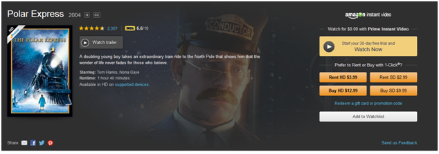
An example of a successful landing from Amazon :
If you follow these simple rules, the conversion of the landing page will increase without significant injections.
Editor - Anna Chaschina .
Thank you for your attention and for your positive feedback. Subscribe to our blog on Habré , read useful articles in the blog on our website , watch the video on our YouTube channel to follow the updates from the company Witget.com .
Source: https://habr.com/ru/post/228979/
All Articles