RZD application redesign: concept
How is the application inconvenient in its current form and how can it be improved?

One day, a Redmadrobot employee went to visit a grandmother living in a distant city, and installed the Russian Railways app to buy a train ticket. Seeing that the application gives him reluctantly, he decided to analyze what was the matter. Designer Leonid Borisov redrawn the app and explained the logic of the changes.
“The application has been tested at OAO Scientific Research Institute of Railway Transport and approved as a full-fledged channel for the sale of electronic tickets for trains,” said in the annotation to the application in the AppStore. The application is published by UFS LLC, which has the status of an official agent of Russian Railways.
Immediately to the point
')
To assess the effectiveness of the application, we will try to execute the main user scenario: book a train ticket.

Let's start with the start screen of the application. By the way, Apple strongly recommends that developers allow them to use the application right away, without the start screens. In the current version, the main functionality of the application remains behind the promo screen, which creates an additional obstacle for the user to find a ticket. It also immediately puzzles the switch of language, which obviously migrated to the mobile application from the web environment.
Don't forget about native navigation patterns.
Tab bar is still the main navigation pattern in iOS. The panel with shortcuts, located at the bottom of the screen, provides switching between subtasks, windows and modes and forms the overall structure of the application. Tab bar is recommended to leave available on all screens of the application. By the way, using other navigation patterns, such as a sidebar, reduces user involvement by half *. It is worth noting that the fashionable passion for the side menu gradually passes. With the release of iOS 8 and the emergence of iPhones with large screens, fewer and fewer developers want to experiment with the side menu.

Leonid Borisov, designer Redmadrobot
* According to a study conducted by zeebox.
Step 1. Mashruta selection

Each entry of information into an application is a labor that takes the user's precious time. It is critical to make this process as convenient and fast as possible. When choosing a route, a complete list of stations and a search can be useful. It is also important to remember recent search queries, since a person often makes regular trips. And another thing: if you implement geolocation positioning, then this from scratch will save a person 10 seconds of life. Another easy way to save user time is to show your search history right away on the main screen.
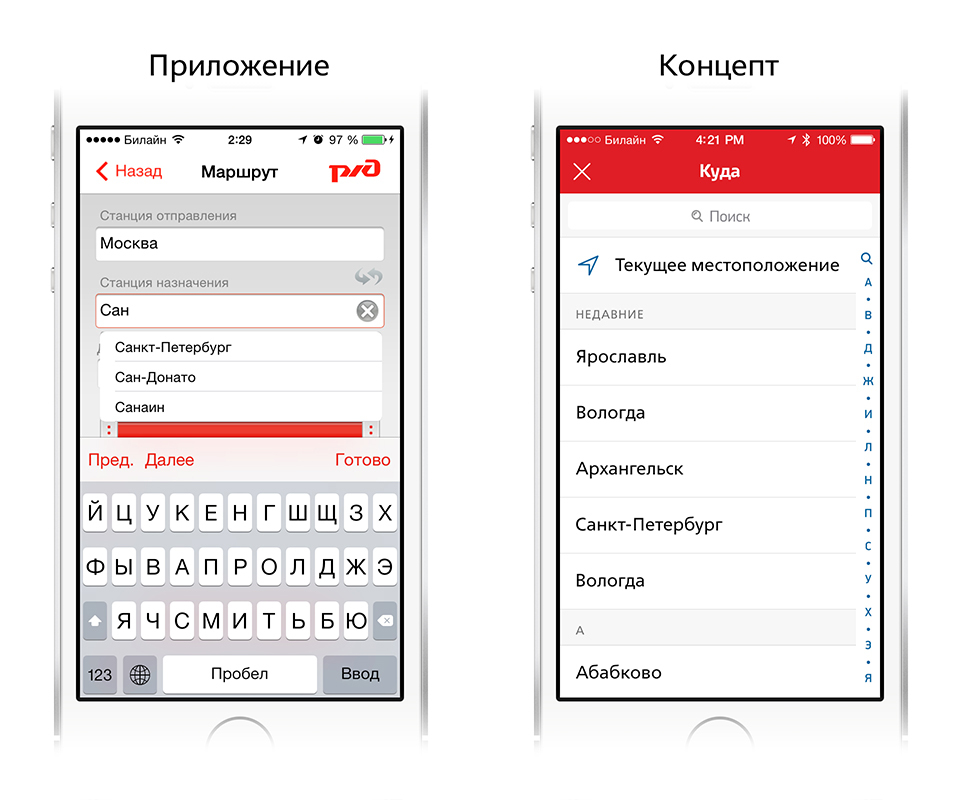
Each screen should have one task, the solution to which all interface elements are subordinate. This allows a person to quickly and easily navigate the application. Therefore, the mechanics of the input form, transferred from the web environment, are physically uncomfortable when used on the phone. It is necessary to try not to miss, and not to confuse the button among the many controls. Given that a person usually uses a smartphone on the go, this is not an easy task. The choice of station should be put on a separate screen. Nothing should distract the user from his task.
Go ahead. It is much more convenient and clearer to choose a date for a trip in the calendar. Another opportunity to try to save user time is to automatically indicate the departure by today.

The average time spent on choosing the right date in the drum will always be longer than in the calendar. If you have to turn the drum to the desired date, you can select it in the calendar with one touch.
By the way, to start the search you do not need to force a person to indicate the number of passengers. If a person is not traveling as a large company, then using this filter will not affect the relevance of the search. No need to require the user information, without which the application can do.
As a result: the search form became the start screen, geolocation and query history appeared, unnecessary filters were removed. Now you can start searching for a ticket in two or three touches.
Step 2. Choosing a train
The route is selected, it's time to go to search for a ticket. Now in the search results are not thought out sorting. When choosing a train, it is important to know the duration of the trip. Sorting tickets by train number is superfluous. The train number is not a property by which the user chooses a ticket. Rather, this information is needed in the context of a train search upon arrival at the station.
Ticket search is simplified by sorting by the following properties:
- trip duration
- departure time
- ticket price.

It is not obvious that in order to go to the purchase of a ticket, you need to click on one of the small price labels. Do it on the go and not miss it will not be easy. By the way, the minimum size of the area of depression is 44 points. Here this area is clearly smaller. At first, I tried to select a train by clicking on a cell in the list and wondered why a pop-up notification with the route of the train was shown to me.
Leonid Borisov, designer Redmadrobot
If there are no tickets ...
The current application sends the user to the previous screen if there are no tickets for the specified date. A good application should help the user to solve his problem. For example, it is much more useful to immediately offer the user tickets for the nearest dates.
Step 3. Choosing a place
In the current application, the type of ticket is selected on the train list screen. To make the process more understandable, the choice of train and the choice of ticket type should be divided into two steps. By selecting the type of ticket, the user indicates the car and seats in it.

The user selects a seat in the car and proceeds to ticket issuance.

Step 4. Passenger data entry
Seats are selected, now you must specify the data of the passengers. The time spent on their entry can be significantly reduced if one envisages the possibility of storing passengers in the application. Now the application stores the entered data, but the functionality is implemented completely unobvious.

Special mention deserves the button "go to payment", which is attached to the tab bar and is closed by the keyboard while the user fills out the questionnaire. You have to close the keyboard first, although the screen is full of free space.
Caution with branding
Branding the user space of the interface, in particular components such as the navigation bar, is not functionally justified. It is possible to place the logo on the application icon and on the download screen. Inside the application, it is enough to use branded colors and fonts. In the current version of the application, branding is clearly redundant.
Leonid Borisov, designer Redmadrobot
Step 5. Buying a ticket
One of the most important screens of the scenario: confirmation of the purchase of a ticket and the transition to payment. All interface elements should be subordinate to the main task of the user: to buy a ticket. In the current application, the “refuse” and “buy” buttons are too close to the tab bar, it is easy to miss and press the wrong direction. There are no accents on the screen - what is more important: buy a ticket or refuse to buy. It turns out that these actions are equivalent.

When you click the "buy" button, an alert appears confirming acceptance of the terms of the purchase. So, it would be nice to have the opportunity to get acquainted with them.

In the current version of the application, the ticket is paid via the web view. I want to simplify the payment script and make it native. Users trust less forms of payment through the web view.
"Zero" screens should not be empty
Attention to detail is a good indicator of quality product. For example, "zero" screens.
In the current version of the application, the zero screen says nothing to the user. Much more effective is a blank screen with a button calling for action. The sorting of tickets in the “my tickets” section has not been thought out either. The user can show upcoming trips and, of course, the history of trips should be available.

Leonid Borisov, designer Redmadrobot
What is the result
We still managed to buy tickets through this application, but the buying process was accompanied by errors and took an inadmissibly long time. In the AppStore, the app has two stars out of five. What did the developers of the current version not consider? The application must preserve the time and nerves of passengers, that is, help the company to provide a high level of service, thereby increasing customer loyalty.
To achieve specified goals, the application must be:
- Clever. That is, do not ask the user for information that the application is able to obtain independently.
- Comfortable. That is, to provide the ability to create and import passenger cards; remember his routes.
- Technological. That is, use the capabilities of the mobile platform: Push-notifications, Passbook and calendar integration.
And also necessarily:
- Have a simple registration mechanism.
- Be safe.
And it is desirable:
- Warn about approaching the end point :)
All this is possible with a careful analysis of the problem points and the search for optimal solutions.
Source: https://habr.com/ru/post/228915/
All Articles