"The effect of empty space" or the luxury of nothing
Recently, among the enormous amount of material on design and its concepts, two interesting studies caught sight of the effects of the same effect in retail and electronic commerce.
The first study was conducted in 2005. Its author, Dimitri Mortelmans, studied the relationship between storefront design and customer perception. In particular, the author points out that elite boutiques and shops manage to create a feeling of luxury in their expositions, thanks to the skillful use of empty space in the design of shop windows and exhibition halls.
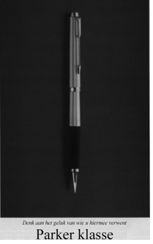
As a vivid example, the author cites an advertising concept from Parker (a black and white image is taken from the description of the study, but it can be argued that Parker retained this concept to this day, that is, for 10 years).
')
Example 1
Example 2
The second study was conducted in 2013. During the experiment, statistical data were collected on how the use of empty space in the design of an online store affects the assessment of the value of the goods by the visitor.
experimental part
A volunteer team was invited to conduct the study. Some subjectivity regarding the results is caused by two facts:
- small control group (108 people);
- the group was assembled from representatives of the same social environment (students studying psychology).
And if the first fact levels the article published in 2007, the second problem is not described by the authors.
During the experiment, a group of volunteers was divided into two control groups (A and B), each of which was demonstrated by several models of chairs in the online store. 20 groups of images were prepared, each of which included the same model, made in different colors. Images had a size of 300x300.
Each of the 20 groups of images had three options for implementation, which differed in the distance between the images (40, 80 and 120 px). As a result, 60 groups of pictures were shown to each participant in the control group.
Group A was shown two images of chairs, the total area of empty space was 754,875 px2.

Group B has already evaluated three chairs, while the white background occupied 664, 875 px2.

Volunteers had to estimate the cost of each model in the range from 100 to 900 dollars.
Results:

During the experiment, data were obtained, based on which it can be argued that there is an optimal combination of the total area of empty space in the design and the distance between its elements. In this case, the images of furniture.
Option B with a smaller free space exceeds option A by an average of $ 15. This suggests that excessive emptiness of design creates the feeling that the store is empty and leads to a decrease in the level of subjective assessment of each individual product.
At the same time, the same models were rated higher due to the increase in the space between the images. The effect of an increase of 80 pixels to 120, significantly higher than the effect of 40 - 80.
It may seem that it made sense to conduct a study of at least one design variant, where the total area of free space would be less than in variant B, but this is not so. On the basis of the data obtained, it is logical to assume that a decrease in the total area of free space will lead to a decrease in indents between objects and a decrease in the level of assessment of the models presented. The same logic eliminates the need to experiment with large distances between objects, which will lead to an increase in the total free space and a decrease in the number of objects that can be placed on the screen.
Gender Refinements

Despite some fluctuations in the "female" results, it is obvious that option B with a distance of 120 pixels between objects is optimal. At the same time, if you do not specialize in specific products for women, it is likely that two of the three buyers will be men (the graph shows data on the frequency of online purchases made by representatives of different sexes):

Conclusion:
To create a favorable environment for the product image, it is necessary to choose the optimal ratio between the total area of free space and the distance between objects. Simplified, this ratio can be described as images of medium size, surrounded by indents of 100-120 pixels (about a third of the image size).
At the same time, the excess space, which significantly exceeds the total area of the images, creates the effect of emptiness, and excessive crowding creates the sensation of a flea market. Both of these factors lead to a decrease in the subjective level of evaluation of the goods presented.
Do not let your horror vacui take your money!
Source: https://habr.com/ru/post/228609/
All Articles