Serious design of a serious store. Part 3. Card product and not only
We continue to review the functionality of a modern online store and the very technology of designing a high-quality product with high conversion. In this part, we will tell you about the product card and everything connected with it. Last time we wrote quite popular articles: “Serious design of a serious store. Part 1. Research " and " Serious design of a serious store. Part 2. Modules online store , this article is a logical continuation.
Fig. 1. Item Card
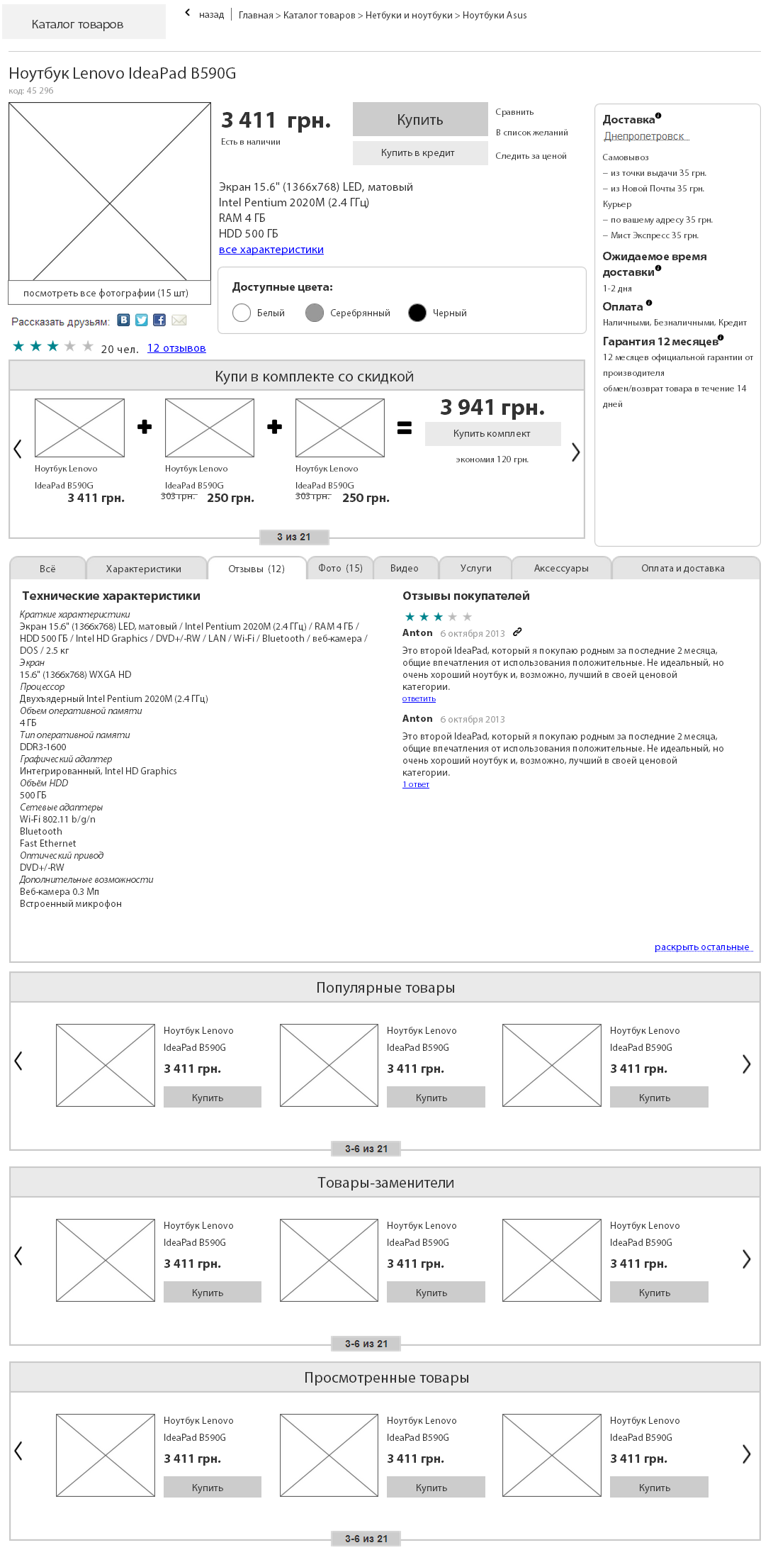
Another one of the most important parts of the store. It is on this page that users most often make purchasing decisions. The page is usually very loaded with different information and blocks that are designed to force the user to make a purchase or increase the average bill. Do not forget that the more information on the page, the less attention the user can focus on a separate element, and the longer it is, the less likely it is that the user will scroll to the end. Traditionally, the most important information needs to be placed on the first screen.
')
At the very top of the page should be a regular header, which is on all pages with contacts and search. Sometimes, a sub-category menu appears there to make it easier for the user to navigate, but this is only if we do not have this menu on the left.
Under the menu, centered on the big bold product name + article, which makes it clear to the user that everything below is information that relates to this product.
There is a large photo on the left and several small ones under it, when clicked, a pop-up window opens with a photo gallery function or, if the page is spacious, a large photo can change. Also, sometimes they implement the function of a magnifying glass and when you hover a large picture on a certain location, it increases side by side, as it is implemented in particular on Amazon.com. Under the photo can be a video review and 3D review.
To the right of the picture in the column is the price and its various options, including the discounted price, information on availability, product rating, number of reviews as a link, add to favorites, follow the product, the share and like buttons for social networks, the function to add to the comparison, a brief description of the product, the choice of additional parameters (color, size, etc.) and a large “Buy” button, sometimes “Buy on credit” and “Buy in one click” are next to it. Also there may be other important information for the purchase.
Just to the right of this block can be brief information about payment, delivery, warranty and the ability to view it in more detail.
Below is a large block "Buy in the set" or "Add accessories", which are designed to increase the average purchase check. There you can also make a block with the services to the product, for example, configuration and installation.
Below is a large block with detailed information about the product, usually in the form of tabs, since there may be a lot of information and it is of different types. The default tab “All” is included, which carries the combined information about the product, the most valuable. On this tab, the most valuable information will be the characteristics of the product, its description, the most useful reviews about it, a small block on delivery times and what exactly needs to be done to make a purchase, information about the possibility of returning the goods, here you can put the function “Buy in one click”, because the user no longer sees the “Buy” button, but it is in this place that they may want to do this.
We will have tabs: everything, photos, specifications, accessories, services, reviews, delivery, payment. In the "Reviews" tab, you can immediately register the number of these reviews, so that the user does not go in vain there if there are none.
Under the tabs with information about the product is the time to show the block "Users who viewed this product, also watched" or "Analogs". This unit, in case the user has studied the information about the product, but for some reason did not like it, it means that we may be interested in this product. Few will look at this block below, so already unimportant information is placed further.
Even lower is the "question-answer" block, where you can discuss the product with the sales manager.
Below you can make several blocks to increase the average bill and sell related products, goods substitutes, previously viewed products and other blocks. Amazon.com and ROZETKA are doing this successfully with their huge product pages.
Below may be tags for this item card, in case a person did not like anything.
Below you can make a block with seo-text, but this is optional. Only for products with very high competition.
With all this, the product page will strongly depend on the product itself. All products are different, so the set of information will be different in each case, but the main blocks and their purpose, most often, remain unchanged.
Very important functionality for making a purchase decision. Any online store has flaws in front of an offline store: the goods cannot be touched, twisted, sniffed, etc. Our feelings for perception are severely limited on the Internet. That is why you need to replace this disadvantage with other advantages of the store. Such advantages can be tools for product demonstration.
First of all, any online store needs high-quality photos and for each product there should be a lot of them, on average, 10 pieces. With clicks you need to make it possible to view a photo in high resolution. Ideally, to show the product from all sides and in different uses. The user should want to buy, looking at the photos. All photographic materials should be of high quality and resolution, do not skimp on a professional photographer. In the absence of the goods you need to draw a beautiful gray cap, which will inform the user that there are no photos yet.
Fig. 2. Demonstration of goods photo

It is necessary to provide for the protection of photographs with a watermark, which will automatically be superimposed on all images. This is necessary to protect content from theft.
For most product groups, you need to make a video review or several, in which the product will be shown from all sides and tell you how to use it, the result of use. The video must also be of high quality. Perhaps several videos for one product. Comments on the video should not be done, let users write their opinions only in reviews.
Fig. 3. Demonstration of goods video

In the past few years, the function of 3D models of goods has become increasingly popular. To do this, you need to properly photograph the product from different angles and with the help of a special technology to collect it into a 3D model, which the user can turn the mouse on his own. This function is not primary, it should be used only by the largest stores and for the most popular goods.
Fig. 4. Demonstration of goods 3-D

Some products have different modifications. The simplest modification is in color. To demonstrate these features, you can make an interactive product model and the ability to choose a complete set. A potential buyer can choose different parameters and the model will change before his eyes. It is very convenient, for example, for clothes. You can make a full-fledged designer, but it will be effective for the sale of specific products with a variety of options.
Each product should add a text review. In addition to the benefits for SEO, it is also a great help to the buyer, which allows him to get closer to buying and will not give reason to leave to wander around the Internet in search of additional information about the product.
Fig. 5. Demonstration of goods characteristics

Make all the above content is not easy and not cheap. I described an ideal product demonstration, but it will be more effective for large stores, where, say, video for a particular product can increase its sales by 5%, but for this store, this 5% will mean 100 purchases, 10,000 dollars of turnover and $ 1000 net profit. For a small store there will be enough photos.
A product demonstration is usually tabbed in the product card, along with other information. If there is no any kind of demonstration in the product, then there is no need to display an empty tab.
Fig. 6. Track price and availability

Probably, each of the people has a desire to buy something, something that a person does not yet possess. This is inevitable, embedded in human nature, constantly want something new, and as soon as it appears, again I want something new, but something else. For all countries of the former Soviet Union, the price is often a deterrent, there simply is not enough money to make a purchase here and now. In addition, many product categories are characterized by a rapid change in the model range due to its rapid obsolescence and a change to new, more technological counterparts, which leads to a drop in prices for some products several months after their release. And the store can do promotions, stimulate sales. Buyers know all this and accordingly build their behavior. These features of human behavior must be exploited for commercial purposes. The store needs mechanisms that will allow to monitor the goods. One of such mechanisms is the function “monitor the price”.
In the product card, ideally close to the price, you can make the function “follow the price”. As an option in the tooltip when hovering over the price or using a small icon near the price in the form of a triangle. The function can be in the form of a simple link, when clicked, the price subscription form is loaded. In a simple version, this can be a field for entering email and a button “Follow”. In a more sophisticated version, you can suggest the user to choose the tracking method: email, telephone, social network, etc. The most profitable for the store is email (you can do newsletters and promotions) and a telephone (you can also do a newsletter, but there are fewer opportunities). A lot of information comes to email, and users often create junk emails for such purposes, which they can rarely read information. The version with a phone has a number of restrictions, if we talk about SMS, but on the other hand the number of advertising SMS is still significantly less than advertising letters, and you can always call and talk by voice on the phone, the chances of reaching the buyer are higher.
After the subscription, on the place where there was an offer to subscribe, the function should be replaced by the ability to unsubscribe and in the future, each time visiting this page, the user should be able to see it. This will give him an understanding that he has already been signed and the opportunity to cancel the subscription when its relevance is lost. It is necessary to provide for checking email or phone in the database, in case you want to subscribe to an unregistered user who has previously subscribed.
All products that the user chooses to track, should be displayed in your account, you can in a separate tab with the functions of distribution management. Over time, the relevance of something to track may disappear from the user, then he may want to unsubscribe. If you do not make this opportunity and at least periodically do not tell him that you can unsubscribe from price tracking, there is a risk that the user will stop responding to any mailings of any information from the store or, even worse, put the recipient on the blacklist. There is a fine line and you can lose a client.
In addition to the price, you can still give the opportunity to monitor availability. The "buy" button is replaced by the "Report about availability" button. Especially true for clothing: the model itself may like it, and only one option will suit in color, which may not be in stock now. You can implement through the dropdown list. The drop-down list may contain other information that can be tracked. In any case, if there are several types of information with the possibility of tracking, in the interface you should not do this function in different places, group everything in one place in the form of a drop-down list and give the user a choice via checkboxes.
When changing the information selected by the user, he should receive a notification with information. The user at the time of mailing may forget that he subscribed to something, so he needs to give full information: say what he once signed, say what kind of store, say what kind of product, say what exactly has changed, give the link on the product and make a call to action to help buy.
Automate these mailings, in manual mode with a large catalog it will be unrealistic. Let the store sell for you.
Fig. 7. One-click purchase

The modern pace of life is accelerating, and users are becoming more and more lazy. Therefore, such a function appeared: “Buy in one click”. However, it is not in all stores, but nonetheless. The meaning of the function is as follows: in the product cards, a little less in importance than the “Buy” button, there is another “Quick purchase” button and next to it is a phone entry field. The user enters his phone and ... in a minute the manager of the online store is already calling him, who will advise and answer all questions over the phone, place an order.
The function is rather controversial: first, we already have a buy button, and second, there will be a buy on credit button, which I will discuss below. If we also put the third button with the word and the meaning of “buy”, it will distract the attention of the buyer and may confuse him. In addition, it is more profitable for us to receive both email and telephone from the user, and we don’t receive email when you purchase in one click. On the other hand, there are lazy or inexperienced users, and it is this button that can be a decisive factor when making a purchase.
I advise not to use this feature in all cases. Only for stores with a large proportion of target age 35+. In addition, you need to carefully insert it into the interface of the site so that it is as auxiliary information for the user and does not compete with the main “Buy” button.
By the way, this function can be replaced by an analogue - “Order a call”.
Fig. 8. Buy on credit (by installments)

Today it is an integral part of the trade. In off-line sales, purchases on credit reach 50%, on the Internet they buy loans many times less, but for the most part because the stores themselves do not provide such a function. Thus, this feature can increase the conversion in the online store by 60-80% in the long term. People used to live in debt, it is promoted at every turn. The more expensive the purchase, the more difficult it is for the buyer to find the money for it immediately. Therefore, for online stores with goods worth more than $ 250, it is worth thinking about the function of buying on credit. This will significantly increase the turnover. There are two schemes of work: 1. Conclude a partnership agreement with a bank (credit institution) and when buying on credit, the buyer enters into an agreement with the bank at the time of delivery of the goods, and the bank transfers the entire amount of the purchase to the store immediately 2. Conclude an agreement with the buyer directly, then this already get installment. I recommend the first option, for the store it is safer and does not require the involvement of working capital.
In the site interface, next to the "Buy" button, the "Buy on Credit" button will appear. It is worth making a little less and a different color so that the user can visually distinguish them. The store as a whole is more profitable for the user to buy the product immediately, without a loan, so he will spend less money and the chances of selling him other goods increase.
The button itself works in much the same way as the usual “Buy”, only when placing an order, there will be a “On Credit” payment option, a choice of a loan option and a passport information form so that the manager can check the buyer and decide whether a loan is available to him.
Some banks have begun to offer special technical solutions for this, which allow them to significantly automate and simplify the loan processing process. Thus, the user will be able to check the availability of the loan directly on the site, automatically.
When placing an order, in the block with errors it is possible to cheat a little and not show the final amount, in which the overpayment will be visible. Just the number of months and the monthly payment. But this is not very honest with respect to customers, so it is better to show the final amount of the loan. Yes, many will be afraid of the overpayment, but the image of the store will remain at its best, which is more important than the short-term profit in the long run, so I recommend to show it all.
Fig. 9. Reviews

In recent years, online shopping has increasingly become overgrown with various functions for social interaction. This trend will increase rapidly in the near future. Soon, social network elements will appear in the stores: you can send messages to each other, add them as friends, make purchases together and many other features. Who is developing projects at the junction of e-commerce and social networks today, tomorrow will earn millions and billions. But for now this near bright future has not yet come, let's talk about trivial social functions - about feedback.
For many buyers, product reviews from other people are extremely important. This is a psychological feature of any person: positive feedback increases confidence in the product, while negative feedback reduces it. It is not very important for us with the help of which product the buyer will satisfy his need, the main thing is that he makes a purchase, so I’ll immediately say that you should not be afraid of negative reviews. Moreover, a modern customer is incredulous and if there are only positive reviews on the store's website, this will most likely cause suspicion among consumers. One thing is for sure - reviews are a mandatory feature on the site.
Today, reviews are mostly textual. This is a simple feature for site developers and familiar to users. Some online stores experiment with video and audio reviews. You can try to do them, it can also be beneficial, they are harder to fake, but at the same time it is less useful for SEO and the user will not be able to "read diagonally" and understand the meaning, he will have to watch / listen to the full review.
In the interface, reviews are usually located in the product card itself, often a small block with some of the most useful reviews and a link to view all reviews. If there are no reviews yet, the site should offer to leave a review to anyone who has come. If there are already reviews, then the block should look something like this: block title, “write review” button, name of the person who left the review, review date, anchor link to this review, product rating in points, review rating in the form “Review was useful? Yes / No ”), the button to respond to a review, or if there are already answers, the number of responses, below the list of 3-5 reviews is the link“ All reviews ”, next to which is a number in brackets with the total number of reviews. You can tag reviews from people who bought the product, there will be more confidence in such reviews. You can also add a “complaint to the review”, let users help moderate the content in the online store. Greatly large reviews should be automatically cut off after 300 characters and give the user a "read full" link.
In the reviews tab itself, you can display the most useful records in the opinion of users, so that the new buyer does not spend his time reading all the reviews, but read only the most useful. Or you can do a sorting by rating (the default should be filtering by publication date).
The feedback itself can be left only by registered users. Firstly, it will motivate users to register, and secondly, other users will get more confidence that the feedback was left by a live person and, thirdly, it is protection against spam bots that automatically send spam on all forms on the site. At the same time, authorization should not become an obstacle for the user, immediately in the form of a review, you can offer the user to log in via social networks or enter your username and password. You need to implement this by dynamically loading the data in this block: clicked on the “Login” link, the line with the login and password loaded at the same place, entered your data and clicked the button, the line was immediately replaced with the user name and all this without reloading the page.
Separately, it is worth mentioning the possibility of authorization and leaving feedback through social networks. So that the name of the author of the review was a link to the profile on the social network. So other users will be sure of the reality of the people who left a review.
Some users will be important function "Follow the reviews." It is also important to inform users when their feedback has been answered. It is necessary to inform only with the consent of the user, therefore it is worthwhile to provide the checkbox “Inform about answers” when writing a review. Often the function of reviews used to discuss the details of the product, this section can sometimes turn into a mini-forum. In this regard, some online stores began to share reviews by type: "Product Review" and "Comment".
The comment field itself can be as simple as: name, email and comment; and more advanced: + score, pros, cons, checkbox "I used."
For marketing purposes, you need to attract sales managers to answer users. Something like an analogue of consultations in the trading floors of offline stores. Especially large online stores can try to attract the official representatives of large brands to answer questions from users.
Ideally, make a pre-moderation of reviews, otherwise there is a risk of generating spam, obscene expressions and other unpleasant moments.
Reviews - this is one of the indicators of the popularity of the store. All popular stores always contain a lot of reviews. Therefore, we must try to encourage customers to leave feedback. Both about the goods and about the store itself. The easiest and correct option is to ask everyone who bought this product to leave a review. The function is implemented quite simply: every 2 weeks after the purchase, a letter is automatically sent to each customer, asking him to leave a review about the product or store he bought, and about the product on the store’s website, and a review of the store as a whole on third-party sites: social networks or marketplaces .
The full list of reviews can be hidden in the tab on the product page and dynamically loaded when clicked. This will be useful for SEO, because reviews are unique content with keywords, and search engines are very fond of unique content.
Fig. 10. Product ratings

Another tool of social interaction is the evaluation of goods. Some simple visual mechanism that helps customers indirectly understand a good product or not. On the websites of online stores, the function is presented in the form of stars, there are usually five of them and they are in the product card not far from the block with reviews, since this is also a kind of product review, only a little in a different form.
The function can work both separately from the reviews themselves, and in a single bundle. If separately, the user can simply click on the stars and select from 1 to 5 points, but it will be more profitable for the store if the person not only clicks on the stars, but also writes the text. Every year users become more and more lazy, so they should be helped to take the necessary steps. Some stores began to bind the assessment of the goods to reviews, the user can rate only by accompanying her with the text of the review.
Estimates can and should be realized not only by asterisks. This mechanism is already becoming obsolete and it is being replaced by more trustworthy mechanics for buyers. A newer way to evaluate products is through likes. Ideally, they can be made with the help of social networks, in particular for the Russian Internet, VK, Facebook and Twitter. You can add less popular social networks at will, such as Google+, from which Google’s search engine tracks activity and expect that it may soon begin to have a noticeable effect on search results.
On some sites they make not only likes, but also anlayks for expressing a negative attitude towards the product. I would avoid negative emotions and their expression on websites, so I do not recommend doing such things.
Fig. 11. Modifications of goods

Marketers have long invented to sell different products with different packages of services or a set of functions. This will significantly expand the market. Many products have modifications: from simple modifications in color (clothing) to a whole set of possible parameters (technique). It’s not very correct to make a separate item card for each parameter set. It is better to make one product card and in it the ability to select the desired modifications that may affect the price and availability.
. , . . How to be? . , , , , , . - , , , , .
, . « » , «» .
, « », . . , , 50 , , . , , : , .
, . , , , , , , . , , , , . , .
«». , , .
. , (), (), , , , , . eCommerce.
:
1. . 2014 - «Digitov» : ( , !), - - . !
2. . -. Those interested can leave a request and get the first copies of the book. email: info@secl.com.ua - « » .
3. . — SECL Group: Facebook , VK , Twitter .
: http://seclgroup.ru/article_serjoznoye_proyektirovaniye_serjoznogo_magazina_kartochka_tovara.html
Author:
The president
« SECL Group » / « Internet Sales Technologies »
Card Product
Fig. 1. Item Card
Another one of the most important parts of the store. It is on this page that users most often make purchasing decisions. The page is usually very loaded with different information and blocks that are designed to force the user to make a purchase or increase the average bill. Do not forget that the more information on the page, the less attention the user can focus on a separate element, and the longer it is, the less likely it is that the user will scroll to the end. Traditionally, the most important information needs to be placed on the first screen.
')
At the very top of the page should be a regular header, which is on all pages with contacts and search. Sometimes, a sub-category menu appears there to make it easier for the user to navigate, but this is only if we do not have this menu on the left.
Under the menu, centered on the big bold product name + article, which makes it clear to the user that everything below is information that relates to this product.
There is a large photo on the left and several small ones under it, when clicked, a pop-up window opens with a photo gallery function or, if the page is spacious, a large photo can change. Also, sometimes they implement the function of a magnifying glass and when you hover a large picture on a certain location, it increases side by side, as it is implemented in particular on Amazon.com. Under the photo can be a video review and 3D review.
To the right of the picture in the column is the price and its various options, including the discounted price, information on availability, product rating, number of reviews as a link, add to favorites, follow the product, the share and like buttons for social networks, the function to add to the comparison, a brief description of the product, the choice of additional parameters (color, size, etc.) and a large “Buy” button, sometimes “Buy on credit” and “Buy in one click” are next to it. Also there may be other important information for the purchase.
Just to the right of this block can be brief information about payment, delivery, warranty and the ability to view it in more detail.
Below is a large block "Buy in the set" or "Add accessories", which are designed to increase the average purchase check. There you can also make a block with the services to the product, for example, configuration and installation.
Below is a large block with detailed information about the product, usually in the form of tabs, since there may be a lot of information and it is of different types. The default tab “All” is included, which carries the combined information about the product, the most valuable. On this tab, the most valuable information will be the characteristics of the product, its description, the most useful reviews about it, a small block on delivery times and what exactly needs to be done to make a purchase, information about the possibility of returning the goods, here you can put the function “Buy in one click”, because the user no longer sees the “Buy” button, but it is in this place that they may want to do this.
We will have tabs: everything, photos, specifications, accessories, services, reviews, delivery, payment. In the "Reviews" tab, you can immediately register the number of these reviews, so that the user does not go in vain there if there are none.
Under the tabs with information about the product is the time to show the block "Users who viewed this product, also watched" or "Analogs". This unit, in case the user has studied the information about the product, but for some reason did not like it, it means that we may be interested in this product. Few will look at this block below, so already unimportant information is placed further.
Even lower is the "question-answer" block, where you can discuss the product with the sales manager.
Below you can make several blocks to increase the average bill and sell related products, goods substitutes, previously viewed products and other blocks. Amazon.com and ROZETKA are doing this successfully with their huge product pages.
Below may be tags for this item card, in case a person did not like anything.
Below you can make a block with seo-text, but this is optional. Only for products with very high competition.
With all this, the product page will strongly depend on the product itself. All products are different, so the set of information will be different in each case, but the main blocks and their purpose, most often, remain unchanged.
Product demonstration
Very important functionality for making a purchase decision. Any online store has flaws in front of an offline store: the goods cannot be touched, twisted, sniffed, etc. Our feelings for perception are severely limited on the Internet. That is why you need to replace this disadvantage with other advantages of the store. Such advantages can be tools for product demonstration.
First of all, any online store needs high-quality photos and for each product there should be a lot of them, on average, 10 pieces. With clicks you need to make it possible to view a photo in high resolution. Ideally, to show the product from all sides and in different uses. The user should want to buy, looking at the photos. All photographic materials should be of high quality and resolution, do not skimp on a professional photographer. In the absence of the goods you need to draw a beautiful gray cap, which will inform the user that there are no photos yet.
Fig. 2. Demonstration of goods photo
It is necessary to provide for the protection of photographs with a watermark, which will automatically be superimposed on all images. This is necessary to protect content from theft.
For most product groups, you need to make a video review or several, in which the product will be shown from all sides and tell you how to use it, the result of use. The video must also be of high quality. Perhaps several videos for one product. Comments on the video should not be done, let users write their opinions only in reviews.
Fig. 3. Demonstration of goods video
In the past few years, the function of 3D models of goods has become increasingly popular. To do this, you need to properly photograph the product from different angles and with the help of a special technology to collect it into a 3D model, which the user can turn the mouse on his own. This function is not primary, it should be used only by the largest stores and for the most popular goods.
Fig. 4. Demonstration of goods 3-D
Some products have different modifications. The simplest modification is in color. To demonstrate these features, you can make an interactive product model and the ability to choose a complete set. A potential buyer can choose different parameters and the model will change before his eyes. It is very convenient, for example, for clothes. You can make a full-fledged designer, but it will be effective for the sale of specific products with a variety of options.
Each product should add a text review. In addition to the benefits for SEO, it is also a great help to the buyer, which allows him to get closer to buying and will not give reason to leave to wander around the Internet in search of additional information about the product.
Fig. 5. Demonstration of goods characteristics
Make all the above content is not easy and not cheap. I described an ideal product demonstration, but it will be more effective for large stores, where, say, video for a particular product can increase its sales by 5%, but for this store, this 5% will mean 100 purchases, 10,000 dollars of turnover and $ 1000 net profit. For a small store there will be enough photos.
A product demonstration is usually tabbed in the product card, along with other information. If there is no any kind of demonstration in the product, then there is no need to display an empty tab.
Monitor price and availability
Fig. 6. Track price and availability
Probably, each of the people has a desire to buy something, something that a person does not yet possess. This is inevitable, embedded in human nature, constantly want something new, and as soon as it appears, again I want something new, but something else. For all countries of the former Soviet Union, the price is often a deterrent, there simply is not enough money to make a purchase here and now. In addition, many product categories are characterized by a rapid change in the model range due to its rapid obsolescence and a change to new, more technological counterparts, which leads to a drop in prices for some products several months after their release. And the store can do promotions, stimulate sales. Buyers know all this and accordingly build their behavior. These features of human behavior must be exploited for commercial purposes. The store needs mechanisms that will allow to monitor the goods. One of such mechanisms is the function “monitor the price”.
In the product card, ideally close to the price, you can make the function “follow the price”. As an option in the tooltip when hovering over the price or using a small icon near the price in the form of a triangle. The function can be in the form of a simple link, when clicked, the price subscription form is loaded. In a simple version, this can be a field for entering email and a button “Follow”. In a more sophisticated version, you can suggest the user to choose the tracking method: email, telephone, social network, etc. The most profitable for the store is email (you can do newsletters and promotions) and a telephone (you can also do a newsletter, but there are fewer opportunities). A lot of information comes to email, and users often create junk emails for such purposes, which they can rarely read information. The version with a phone has a number of restrictions, if we talk about SMS, but on the other hand the number of advertising SMS is still significantly less than advertising letters, and you can always call and talk by voice on the phone, the chances of reaching the buyer are higher.
After the subscription, on the place where there was an offer to subscribe, the function should be replaced by the ability to unsubscribe and in the future, each time visiting this page, the user should be able to see it. This will give him an understanding that he has already been signed and the opportunity to cancel the subscription when its relevance is lost. It is necessary to provide for checking email or phone in the database, in case you want to subscribe to an unregistered user who has previously subscribed.
All products that the user chooses to track, should be displayed in your account, you can in a separate tab with the functions of distribution management. Over time, the relevance of something to track may disappear from the user, then he may want to unsubscribe. If you do not make this opportunity and at least periodically do not tell him that you can unsubscribe from price tracking, there is a risk that the user will stop responding to any mailings of any information from the store or, even worse, put the recipient on the blacklist. There is a fine line and you can lose a client.
In addition to the price, you can still give the opportunity to monitor availability. The "buy" button is replaced by the "Report about availability" button. Especially true for clothing: the model itself may like it, and only one option will suit in color, which may not be in stock now. You can implement through the dropdown list. The drop-down list may contain other information that can be tracked. In any case, if there are several types of information with the possibility of tracking, in the interface you should not do this function in different places, group everything in one place in the form of a drop-down list and give the user a choice via checkboxes.
When changing the information selected by the user, he should receive a notification with information. The user at the time of mailing may forget that he subscribed to something, so he needs to give full information: say what he once signed, say what kind of store, say what kind of product, say what exactly has changed, give the link on the product and make a call to action to help buy.
Automate these mailings, in manual mode with a large catalog it will be unrealistic. Let the store sell for you.
One click purchase
Fig. 7. One-click purchase
The modern pace of life is accelerating, and users are becoming more and more lazy. Therefore, such a function appeared: “Buy in one click”. However, it is not in all stores, but nonetheless. The meaning of the function is as follows: in the product cards, a little less in importance than the “Buy” button, there is another “Quick purchase” button and next to it is a phone entry field. The user enters his phone and ... in a minute the manager of the online store is already calling him, who will advise and answer all questions over the phone, place an order.
The function is rather controversial: first, we already have a buy button, and second, there will be a buy on credit button, which I will discuss below. If we also put the third button with the word and the meaning of “buy”, it will distract the attention of the buyer and may confuse him. In addition, it is more profitable for us to receive both email and telephone from the user, and we don’t receive email when you purchase in one click. On the other hand, there are lazy or inexperienced users, and it is this button that can be a decisive factor when making a purchase.
I advise not to use this feature in all cases. Only for stores with a large proportion of target age 35+. In addition, you need to carefully insert it into the interface of the site so that it is as auxiliary information for the user and does not compete with the main “Buy” button.
By the way, this function can be replaced by an analogue - “Order a call”.
Buy on credit (installments)
Fig. 8. Buy on credit (by installments)
Today it is an integral part of the trade. In off-line sales, purchases on credit reach 50%, on the Internet they buy loans many times less, but for the most part because the stores themselves do not provide such a function. Thus, this feature can increase the conversion in the online store by 60-80% in the long term. People used to live in debt, it is promoted at every turn. The more expensive the purchase, the more difficult it is for the buyer to find the money for it immediately. Therefore, for online stores with goods worth more than $ 250, it is worth thinking about the function of buying on credit. This will significantly increase the turnover. There are two schemes of work: 1. Conclude a partnership agreement with a bank (credit institution) and when buying on credit, the buyer enters into an agreement with the bank at the time of delivery of the goods, and the bank transfers the entire amount of the purchase to the store immediately 2. Conclude an agreement with the buyer directly, then this already get installment. I recommend the first option, for the store it is safer and does not require the involvement of working capital.
In the site interface, next to the "Buy" button, the "Buy on Credit" button will appear. It is worth making a little less and a different color so that the user can visually distinguish them. The store as a whole is more profitable for the user to buy the product immediately, without a loan, so he will spend less money and the chances of selling him other goods increase.
The button itself works in much the same way as the usual “Buy”, only when placing an order, there will be a “On Credit” payment option, a choice of a loan option and a passport information form so that the manager can check the buyer and decide whether a loan is available to him.
Some banks have begun to offer special technical solutions for this, which allow them to significantly automate and simplify the loan processing process. Thus, the user will be able to check the availability of the loan directly on the site, automatically.
When placing an order, in the block with errors it is possible to cheat a little and not show the final amount, in which the overpayment will be visible. Just the number of months and the monthly payment. But this is not very honest with respect to customers, so it is better to show the final amount of the loan. Yes, many will be afraid of the overpayment, but the image of the store will remain at its best, which is more important than the short-term profit in the long run, so I recommend to show it all.
Reviews
Fig. 9. Reviews
In recent years, online shopping has increasingly become overgrown with various functions for social interaction. This trend will increase rapidly in the near future. Soon, social network elements will appear in the stores: you can send messages to each other, add them as friends, make purchases together and many other features. Who is developing projects at the junction of e-commerce and social networks today, tomorrow will earn millions and billions. But for now this near bright future has not yet come, let's talk about trivial social functions - about feedback.
For many buyers, product reviews from other people are extremely important. This is a psychological feature of any person: positive feedback increases confidence in the product, while negative feedback reduces it. It is not very important for us with the help of which product the buyer will satisfy his need, the main thing is that he makes a purchase, so I’ll immediately say that you should not be afraid of negative reviews. Moreover, a modern customer is incredulous and if there are only positive reviews on the store's website, this will most likely cause suspicion among consumers. One thing is for sure - reviews are a mandatory feature on the site.
Today, reviews are mostly textual. This is a simple feature for site developers and familiar to users. Some online stores experiment with video and audio reviews. You can try to do them, it can also be beneficial, they are harder to fake, but at the same time it is less useful for SEO and the user will not be able to "read diagonally" and understand the meaning, he will have to watch / listen to the full review.
In the interface, reviews are usually located in the product card itself, often a small block with some of the most useful reviews and a link to view all reviews. If there are no reviews yet, the site should offer to leave a review to anyone who has come. If there are already reviews, then the block should look something like this: block title, “write review” button, name of the person who left the review, review date, anchor link to this review, product rating in points, review rating in the form “Review was useful? Yes / No ”), the button to respond to a review, or if there are already answers, the number of responses, below the list of 3-5 reviews is the link“ All reviews ”, next to which is a number in brackets with the total number of reviews. You can tag reviews from people who bought the product, there will be more confidence in such reviews. You can also add a “complaint to the review”, let users help moderate the content in the online store. Greatly large reviews should be automatically cut off after 300 characters and give the user a "read full" link.
In the reviews tab itself, you can display the most useful records in the opinion of users, so that the new buyer does not spend his time reading all the reviews, but read only the most useful. Or you can do a sorting by rating (the default should be filtering by publication date).
The feedback itself can be left only by registered users. Firstly, it will motivate users to register, and secondly, other users will get more confidence that the feedback was left by a live person and, thirdly, it is protection against spam bots that automatically send spam on all forms on the site. At the same time, authorization should not become an obstacle for the user, immediately in the form of a review, you can offer the user to log in via social networks or enter your username and password. You need to implement this by dynamically loading the data in this block: clicked on the “Login” link, the line with the login and password loaded at the same place, entered your data and clicked the button, the line was immediately replaced with the user name and all this without reloading the page.
Separately, it is worth mentioning the possibility of authorization and leaving feedback through social networks. So that the name of the author of the review was a link to the profile on the social network. So other users will be sure of the reality of the people who left a review.
Some users will be important function "Follow the reviews." It is also important to inform users when their feedback has been answered. It is necessary to inform only with the consent of the user, therefore it is worthwhile to provide the checkbox “Inform about answers” when writing a review. Often the function of reviews used to discuss the details of the product, this section can sometimes turn into a mini-forum. In this regard, some online stores began to share reviews by type: "Product Review" and "Comment".
The comment field itself can be as simple as: name, email and comment; and more advanced: + score, pros, cons, checkbox "I used."
For marketing purposes, you need to attract sales managers to answer users. Something like an analogue of consultations in the trading floors of offline stores. Especially large online stores can try to attract the official representatives of large brands to answer questions from users.
Ideally, make a pre-moderation of reviews, otherwise there is a risk of generating spam, obscene expressions and other unpleasant moments.
Reviews - this is one of the indicators of the popularity of the store. All popular stores always contain a lot of reviews. Therefore, we must try to encourage customers to leave feedback. Both about the goods and about the store itself. The easiest and correct option is to ask everyone who bought this product to leave a review. The function is implemented quite simply: every 2 weeks after the purchase, a letter is automatically sent to each customer, asking him to leave a review about the product or store he bought, and about the product on the store’s website, and a review of the store as a whole on third-party sites: social networks or marketplaces .
The full list of reviews can be hidden in the tab on the product page and dynamically loaded when clicked. This will be useful for SEO, because reviews are unique content with keywords, and search engines are very fond of unique content.
Product Ratings
Fig. 10. Product ratings
Another tool of social interaction is the evaluation of goods. Some simple visual mechanism that helps customers indirectly understand a good product or not. On the websites of online stores, the function is presented in the form of stars, there are usually five of them and they are in the product card not far from the block with reviews, since this is also a kind of product review, only a little in a different form.
The function can work both separately from the reviews themselves, and in a single bundle. If separately, the user can simply click on the stars and select from 1 to 5 points, but it will be more profitable for the store if the person not only clicks on the stars, but also writes the text. Every year users become more and more lazy, so they should be helped to take the necessary steps. Some stores began to bind the assessment of the goods to reviews, the user can rate only by accompanying her with the text of the review.
Estimates can and should be realized not only by asterisks. This mechanism is already becoming obsolete and it is being replaced by more trustworthy mechanics for buyers. A newer way to evaluate products is through likes. Ideally, they can be made with the help of social networks, in particular for the Russian Internet, VK, Facebook and Twitter. You can add less popular social networks at will, such as Google+, from which Google’s search engine tracks activity and expect that it may soon begin to have a noticeable effect on search results.
On some sites they make not only likes, but also anlayks for expressing a negative attitude towards the product. I would avoid negative emotions and their expression on websites, so I do not recommend doing such things.
Product Modifications
Fig. 11. Modifications of goods
Marketers have long invented to sell different products with different packages of services or a set of functions. This will significantly expand the market. Many products have modifications: from simple modifications in color (clothing) to a whole set of possible parameters (technique). It’s not very correct to make a separate item card for each parameter set. It is better to make one product card and in it the ability to select the desired modifications that may affect the price and availability.
. , . . How to be? . , , , , , . - , , , , .
, . « » , «» .
, « », . . , , 50 , , . , , : , .
, . , , , , , , . , , , , . , .
«». , , .
. , (), (), , , , , . eCommerce.
:
1. . 2014 - «Digitov» : ( , !), - - . !
2. . -. Those interested can leave a request and get the first copies of the book. email: info@secl.com.ua - « » .
3. . — SECL Group: Facebook , VK , Twitter .
: http://seclgroup.ru/article_serjoznoye_proyektirovaniye_serjoznogo_magazina_kartochka_tovara.html
Author:
The president
« SECL Group » / « Internet Sales Technologies »
Source: https://habr.com/ru/post/228383/
All Articles