Modernization of the MegaFon portal
Hello, my name is Yuri Mikhailov. In MegaFon, I hold the position of Director of the Online Competence Center. Today I would like to talk about how we remade the portal www.megafon.ru and created the MegaFon Personal Account mobile app.
Why did we do this? Some time ago it became obvious that our users no longer have enough standard site content. They needed new functions for managing services and services. In addition, the previous site design is outdated and was not very convenient for viewing on mobile devices. To meet the wishes of users, we decided to carry out a deep modernization of the portal.
')
This large-scale work began in 2013. Dozens of large projects were launched, because it required a lot of research: to evaluate the strengths and weaknesses of our sites, to study in detail the best world experience. It was necessary to define goals and objectives, to design new interfaces. From the very beginning, we set a goal: to move from the “site is a subscriber's guide” approach to the philosophy of an important service and sales channel.
Below is a story about what tasks we set for ourselves and what we have already done.
Changes noticeable to site visitors
• Adaptability . All online resources of the cellular operator should be perfectly adapted for any mobile devices, tablets, etc. The share of the mobile audience of our site at the end of 2012 was 20%, and in less than a year and a half it doubled!
• Usability . It requires a simple interaction with the visitor service. This applies to navigation, search, page structure, basic interaction scenarios for solving typical tasks, text quality. It is important convenience of the location of the buttons; important is the information that users see on the first screen without scrolling. It is important to take into account the specifics of interaction on different devices with different operating systems and screen resolution. This is a huge amount of work, in fact the creation of a new site - only gradually. Our internal criterion: the MegaFon website should be equally comfortable to use for 8-year-old children and 70-year-old seniors.
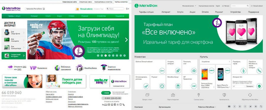
• Design update . As many have noticed, at the end of 2013, the MegaFon’s logo and style was updated, becoming more modern. Naturally, this should have been reflected on the sites. But we decided not to limit ourselves to changing the logo, but to make a really serious redesign of the site, solving, first of all, the usability task.
• Efficient self-care . The site of a mobile operator is not only a reference book on tariffs and services, but also a “personal account”, where an authorized subscriber can manage services, change the tariff, optimize their expenses. It was necessary to create a new Personal Account and a convenient mobile application for MegaFon customers.
"Internal tasks" - invisible to visitors, but important for us
When planning site changes, we set ourselves other tasks that are important for the company, but invisible to our customers. This is primarily:
• Measurable . Of course, a set of Web analytics systems was installed before. But what can give us values like “average viewing depth” or “time on the site”? How to interpret them? The average time has increased by 20%: is it good or bad, have we become more interesting or just navigation is inconvenient?
We want to manage the development of the site, based on real key performance indicators (KPIs), from actions reflecting the solution of the user's tasks. It is also important for evaluating and managing advertising campaigns. We began to measure with key performance indicators not only direct sales, but also the work of search, self-service, navigation, etc.
Example :
On the page with the description of the service the USSD connection command is indicated. Everything is good, but how can we assess the real effect of an advertising campaign to promote the service? It is also possible by the number of transitions to the page, but it is more efficient to make the “How to connect” button, which opens a window where all the ways to activate the service are described: via the Personal Account, using the USSD command, and so on. Clicking on this button is easy to count and count.
• Manufacturability , time-to-market, cost of ownership. The most important parameter at the modern level of Internet penetration, especially given the very intense competition in the cellular market. The speed of making changes to online resources should be very high. The task was: to move to time-to-market from years and months to weeks, or even days. Here we are talking not about changing the text on the page, but about the launch of new products, new functionality.
In addition to time-to-market, the costs of support and development are also important. We tried to redesign the sites so that the costs were less. Rather, the efficiency of the use of the same resources (funds and teams) increased by an order of magnitude.
Example :
If the tariff is wrapped in the structure of the site as a static page, then the work on changing it is editing 83 pages. Indeed, in each region of the Russian Federation the details of the tariff conditions may differ slightly. If you use this content somewhere else on the site (for example, in an online store), then the number of pages to edit will increase many times, and the complexity of maintaining connectivity and relevance exponentially. This is a job for dozens of people, but this is a monkey job. If it is reasonable to design such functionality and go to a single database, then edits are made once and automatically appear in any place on the site where this content is required. And there are hundreds of such mini-projects.
• Optimization of site support business processes . By optimizing the processes on the sites, the number of employees for their support was reduced significantly. And this is with the increased volume of products and active development. Thanks to this step, we managed to significantly strengthen the development team and focus on new projects. The support and development of MegaFon sites, including regional coordinators, is carried out by 30 people.
Updated website www.megafon.ru
In 2013, we decided not to build a new site, but to do “deep facelift” on the existing technological platform. The main changes are listed below.
Tiled design
It was not because we are hot fans of Metro style. Tiles are a very reasonable compromise between user friendliness and manufacturability. We work in a very high-tech industry, for several years the business is changing significantly. Tiles are convenient self-sufficient quanta from which it is easy to combine the user interface without redesigning the site.

Despite the fact that the structure of the main menu has changed little, the initial page has been radically updated. This was the result of a detailed study of attendance statistics, the main tasks of our users, several rounds of prototyping and usability testing.
Block division by user segment
Sites of mobile operators have historically developed as an Internet version of the subscriber's guide. The most important criterion was "that the site was all without errors." This approach led to the creation of an extremely complex and confusing hierarchical structure. But such a structure of the site did not correspond to the real requests of visitors. In the new design, we have focused on the most popular user actions. The main page is divided into two large blocks: for new customers and for existing ones. Further actions in the interface are also optimized for the most massive actions. And judging by the qualitative and quantitative research, the usability of the site has increased significantly.
Adaptive layout. Mobile first
The updated design and layout make it easier to work with the site on different devices. We design key interface details for four different resolutions:
- large monitor
- small monitor (or horizontal tablet),
- vertical tablet,
- a smartphone.


Such an approach to design involves a slightly higher cost compared to the traditional approach. But, first, the amount of these costs is extremely small in the total TCO (Total Cost of Ownership - total cost of ownership) of our sites, and secondly, the result is many times greater than the investment. For example, in April 2014, the share of www.megafon.ru visitors from tablets and smartphones exceeded 37%! We expect that in the first half of next year, the share of mobile users will exceed 50%. This is the most important trend that cannot be ignored. And it concerns the entire Internet, not just the sites of mobile operators.
Another important principle is Mobile first. At first, we make a convenient mobile version of the page, and then we draw a “full” one for a large screen with a lot of space for controls and content.

In design, it is critically important that all the main information about the service and action buttons get to the first screen.
Copywriting
Being engaged in design, it is impossible to forget about such prose, as texts. We pay close attention to this. All new texts get to the site only through a team of copywriters. They have the task to recycle all sections, in accordance with the priorities. Key requirements for copywriting:
• Do not make me think. Ideal text - which is not there at all;) Nobody likes to read sheets of text, solving their utilitarian tasks on the Internet.
• Orientation to the widest audience. The description of services and services should be as simple and clear as possible.
Copywriters receive a draft text, for example, from the product manager. That is, from a person who is deeply immersed in specifics, he has been working for the company for several years, for him the difference between the “package”, “service” and “option” is obvious and huge. And the copywriter has the task to include the “internal blonde”: forget all about cellular communication, and treat any difficulties in perception as incomprehensibility. And rewrite. Edits can be made many times, but the goal to be solved - ideally clear for the client text - justifies the costs.
Online store
Despite the fact that the online store in its essence and functionality is significantly different from the "main" site, we are moving away from the concept of "individual resources". The volume work carried out in 2013-2014 (which included usability studies, redesign of a number of interfaces, redesign, etc.) made it possible to make a significant step towards bringing the online store closer to the main site. A modern look, a simplified interface, embedding “selling” content in other sections of the MegaFon website make the online store more accessible.
There were also fundamentally new functions, for example, online reservation of goods in any of 2000 stores across the country, or online registration of switching to MegaFon of subscribers of other operators with the preservation of the number (MNP).
In the second part of the article, I will talk about the changes in the Personal Account, as well as the MegaFon Personal Account mobile app.
Source: https://habr.com/ru/post/227871/
All Articles