From prototype to prototype, from prototype to prototype, from prototype to ... trash
I wanted to develop a small application - Qtty. The application must be able to take a picture and apply a set of filters to it, and then publish this very picture as the main photo in the VKontakte profile.
The author will try to do everything through prototypes, as they did in 223 WWDC 2014 sessions .
Initially, the description looked like this:
I decided that I want to do something quickly, so I removed most of the functionality and made such an application, which is described in the first paragraph:
We make any sketches of screens, offer a variety of ideas and in any way put them on paper.
I started with the login screen. Without authorization, the application does not make sense to process the photo, so the option of showing the screen to take a picture as a start is excluded. On the authorization screen there should have been some element like a button, after clicking on which the user would be able to log in to the VC and we could carry out requests on his behalf.
What sketches I had:
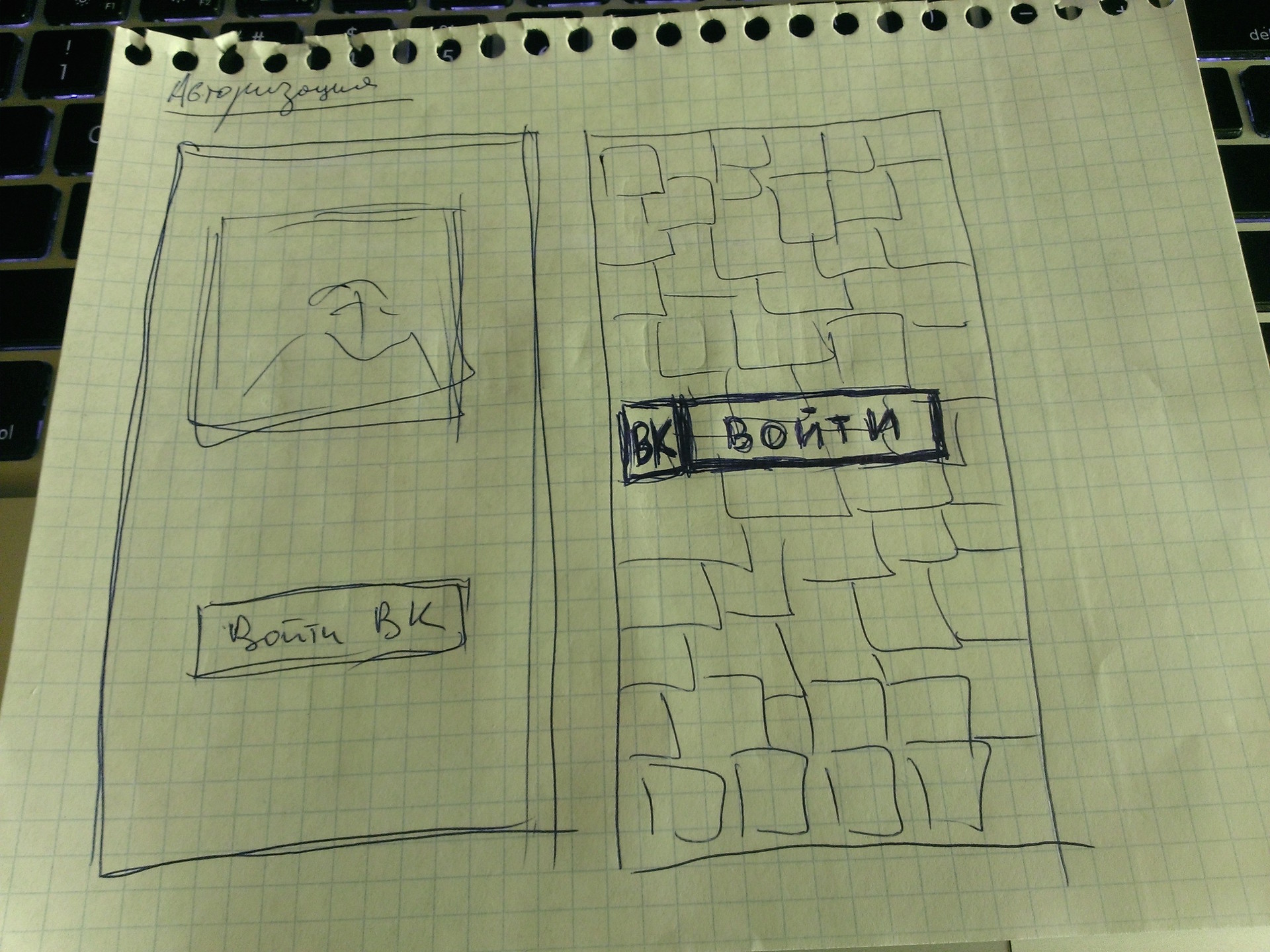
I will explain each of them.
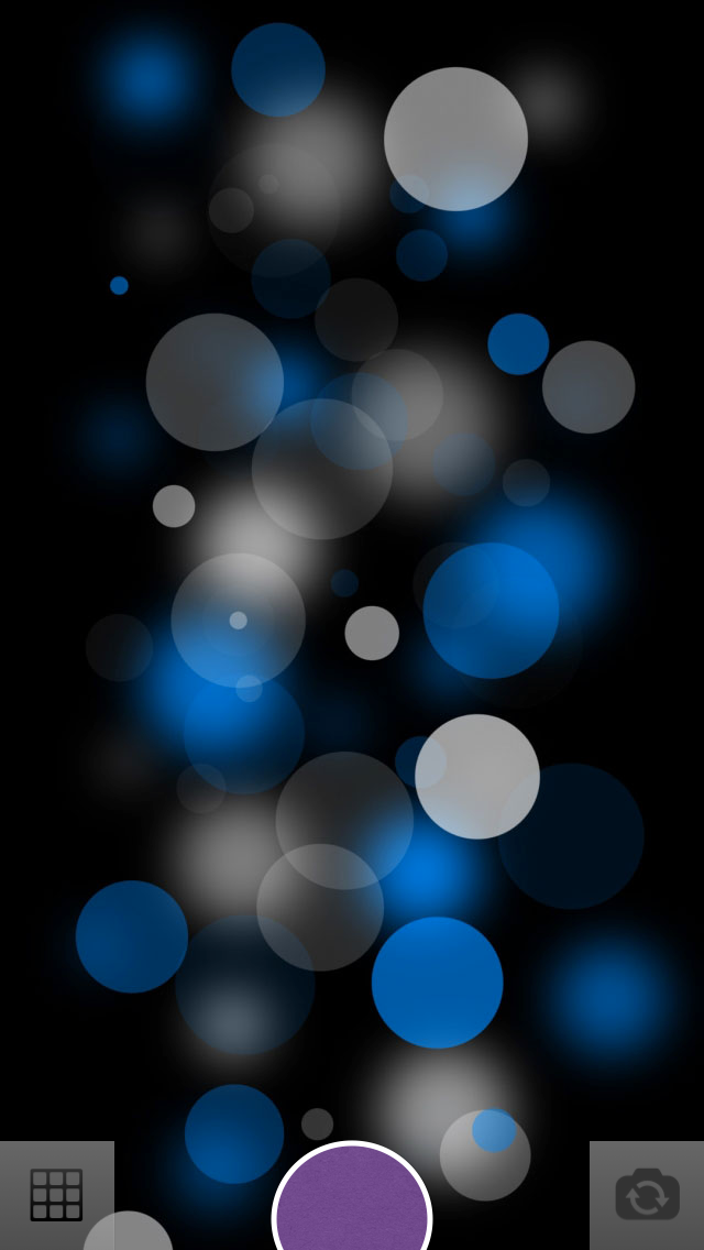
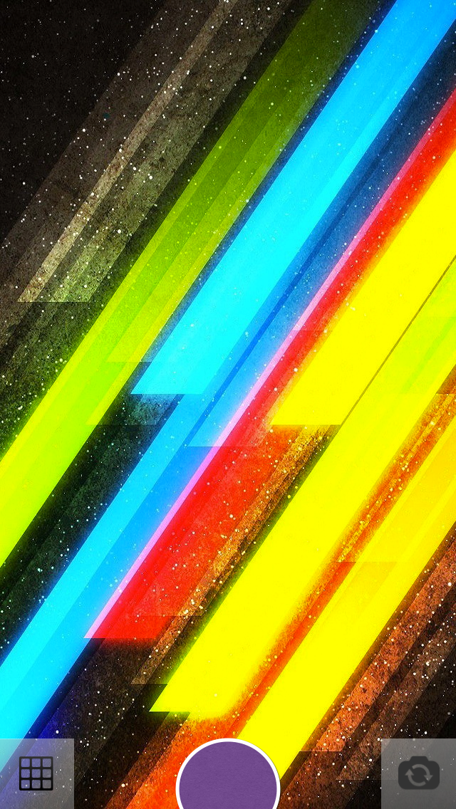
1. The idea was that in front of the user there will be a certain set of photos on which there will be inscriptions (Share impressions with friends, Always be in touch, Share joyful moments, etc.). Below is the authorization button.
Cons of this option:
We need something to flip through.
Excess work on the selection of pictures of the desired colors, which will be combined with the background color + selection of the font and its color for application to images.
Looks like some kind of user manual.
I just did not like it.
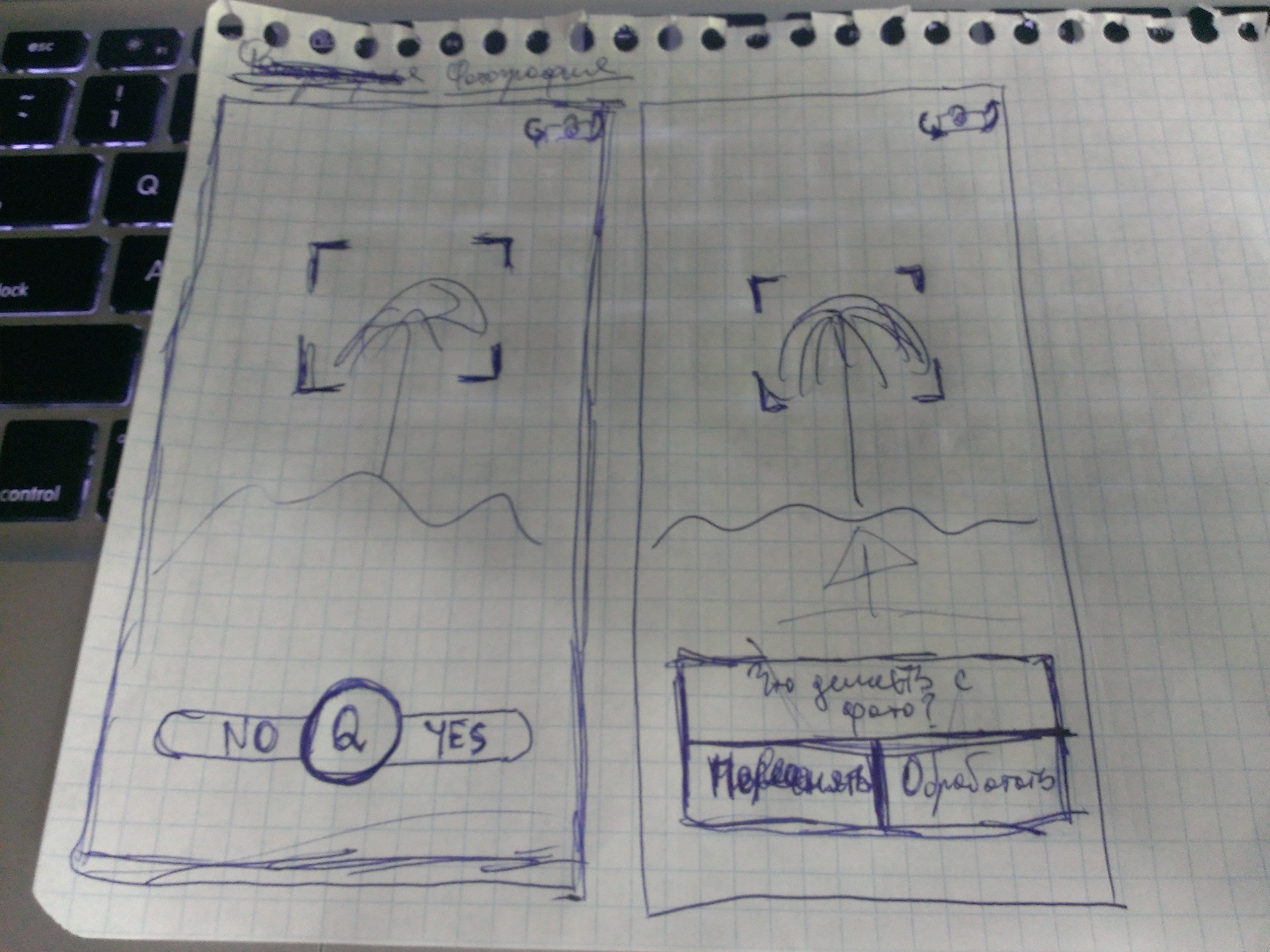
2. If in the first version it was not visible which image you are flipping through the account and how many of the total, then this defect has been corrected. However, the disadvantages remain the same.
3. Picture and button. It would seem simple, but a lot of questions arise: the color of the background, the color of the picture, their combinations. Option disappeared.
4. Here, the background is a picture with a lot of user photos, there can be some additional layer in the picture so that many faces do not hurt the eyes and the user does not cause anxiety and nervousness. The button remains.
This option I liked the most.
After all our ideas were transferred from the head to the paper, I began to make sketches of these very screens in real sizes with real elements. Everything was done in Keynote.
I will show not all the options, but only 2 that I could do. In the course of implementing the first two options, with flipping, I came to the conclusion that it was too cumbersome for such a small application.
The very first preview of the authorization screen:

I asked my colleagues at work which of the two options they like best. All answered first. The second was not much liked because of some dude and look. They could not understand the essence of the application, why this particular guy, who he is, etc.
The second option was dropped.
After some time, there were more such options:


There was no paper at hand, so the VC display screen in UIWebView for authorization was thrown right into Keynote. Options that turned out:


I stopped at the first option. With the “Close” / “Cancel” button, the top panel did not look the way we would like. I tried to add a button with different shadows / transparency and the “X” symbol, but it was also knocked out (although it starts to like the idea with stickers or sticker elements).


I want to remind once again that the main task at the prototyping stage is to visually recreate the application without programming, try out many types and variants of screens, look at the user’s reaction and hear their response (in the early stages of prototyping, we’ll get rid of some problems usually occurred somewhere in the middle of developing an application or at the end).
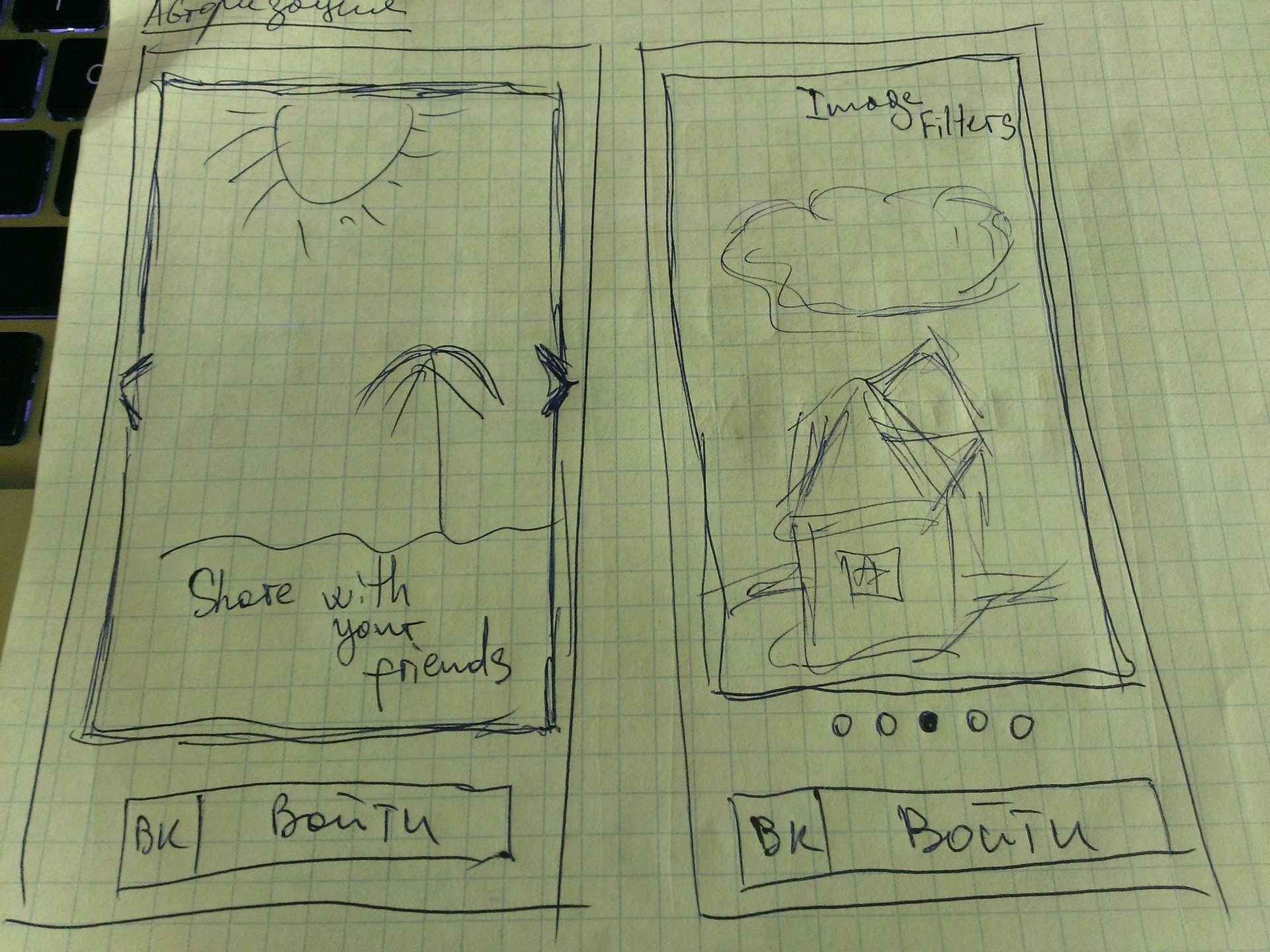
The next screen will be the photo screen, where the user can take a picture (using the front or rear camera) and go to the screen for applying filters / effects.
With the photo screen was much more interesting. I looked through and worked with Instagram, I didn’t like some moments and I decided to eliminate them, but at the same time I learned something from myself.
What happened (from the initial options to the last):

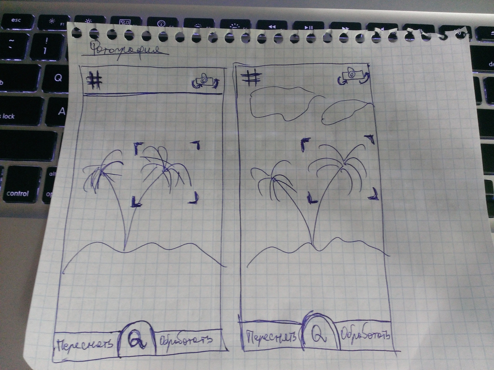
This screen did not want to clutter with something other than the most basic elements, so in general we can say that all the options are some variations of one. Initially, at the bottom of the screen there is only one button (one element) by clicking on which the user snapshot will be fixed. After fixing the snapshot of the button (in my view), two additional buttons “Reset” and “Edit” should “move out” to opposite sides. As you can see on one of the sketches, at the initial stage the buttons were only with the words “YES” and “NO”, but the second option (the first picture, the second screen) gave me the idea that YES / NO is not at all informative, but at the same time It is unnecessary to display the question “What do you want to do with a snapshot?”, because it is clear from the context what actions can be and what are needed.
Why did I decide to lower the button with the letter “Q” to the bottom of the screen in such a way that it began to drop down a bit? The answer is simple - the desire to increase free space. For this very reason, in the 3 pictures (1 screen) the top panel has been removed.
From Instagram I took over only the grid, it seemed to me necessary if I want to take a couple of shots so that the object is in the center of the photo.
This is what I received after 40-50 minutes (see below). Some moments have been changed, some will be changed, there are ideas. Thanks to the prototype, it was possible to notice that simply putting the sign of the grid and the camera on the image will not work - you need to put something under them. The panel is the first solution, but because of it the integrity and impression of the photo is lost, it interferes.
Video of the prototyping process can be found at this link.

While transferring items from portrait mode to Landscap mode, I thought about removing the status bar.
Compare:

Compare:


Compare:

Maybe try to do so?

And in the portrait mode, move the elements down:

After 20-30 minutes I decided to stop at this option (the more options there are now, the wider the choice will be then):


Purple button interferes. A snapshot will be captured by pressing, after clicking, no further action will appear in front of the user - immediately displaying filters, sprinkles, etc. From this screen, the user can one click to go to shooting.
Started sketching photo processing screen. The first versions were as follows:
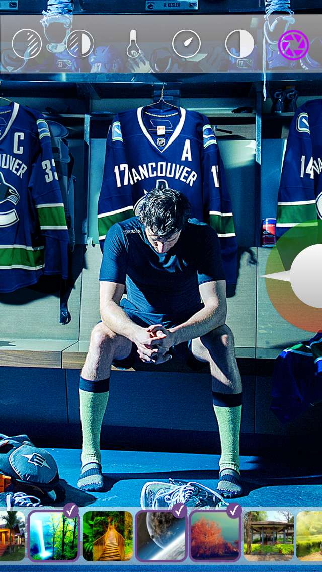

I liked the option, but I’m stuck in the implementation, which I don’t want.
Simplified to this:

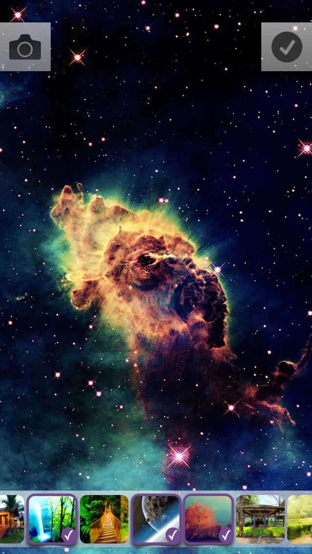

In this embodiment, I decided to beat the theme with stickers / stickers. As you can see, in the first version of this theme - flat elements.
I got such photo editing screens in Landscap mode (we’ll choose later, but there are already some favorites. Video from this link.):

Something completely different (each image must be a source image with a superimposed filter):
After clicking this screen opens:
True, this option has several questions:
1. How to leave this screen?
2. Two elements that confirm the action of some kind (button - applies the filter, and a tick - the transition to the settings)
3. With a small number of filters, it looks good and a large enough part of the image is visible, but what will this harmonica look like with 10-15 filters?
Still, it looks nice, so finally we will not discard this option.
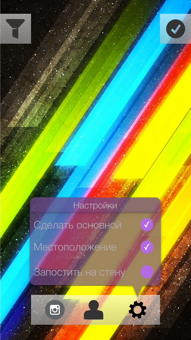
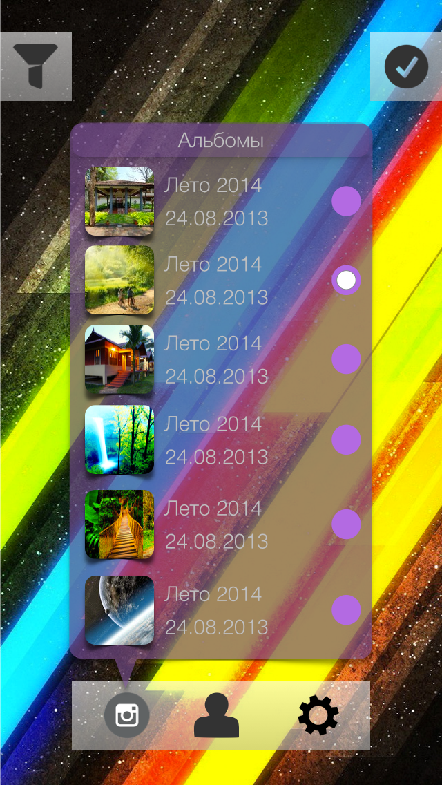
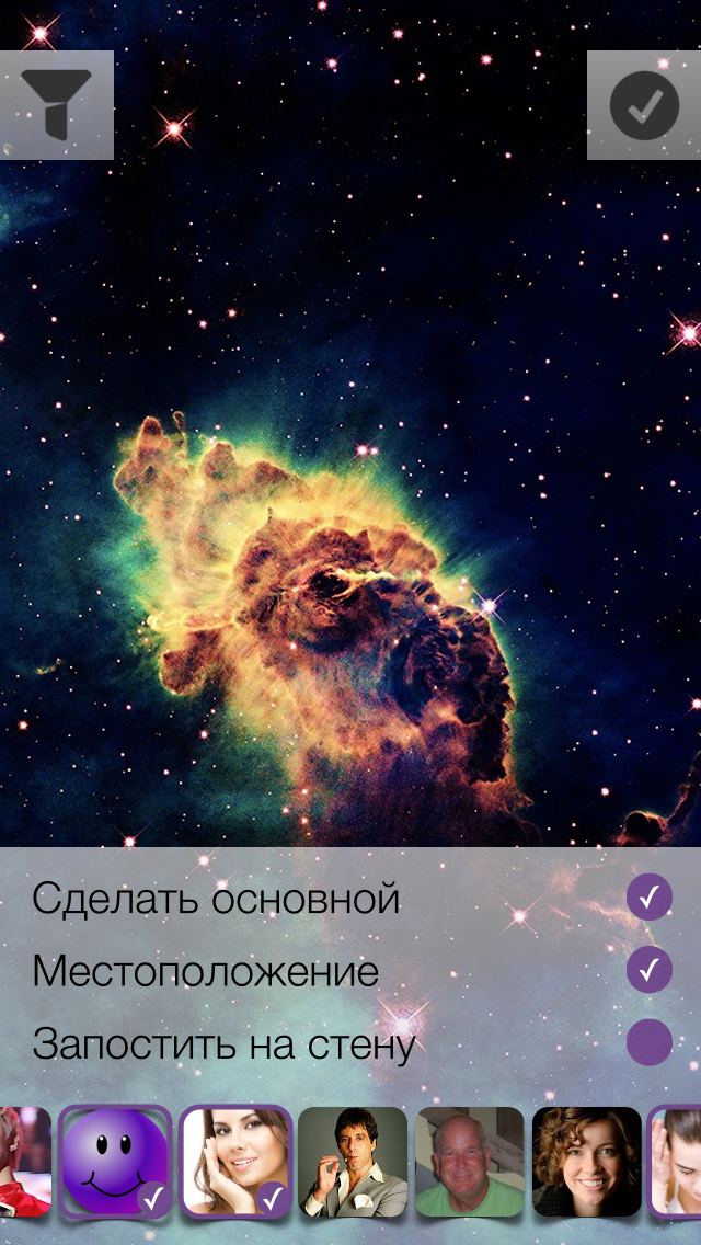
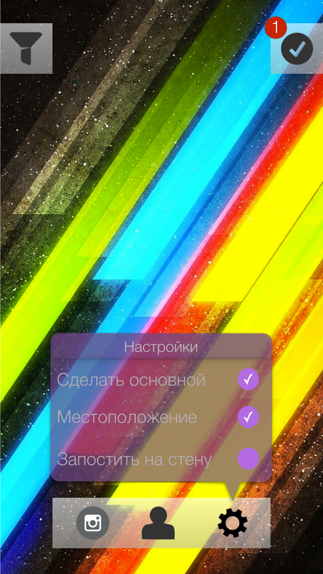
Next we have the loading options screen. What the user can specify:
1) Set photo as primary
2) Attach current location
3) Select an album in which the photo will be uploaded.
4) Add friend tag on photo
5) Post a photo on the wall
Keynote Sketches:

A video of the creation process can be found at this link.
Should I show the user how to upload a photo? If the answer is yes, then you need to place a certain loading indicator on the current screen, or create a new screen with a list of photos to be loaded. The list is needed in order to solve the problem of uploading photos when there is no Internet. How much does the user need such a list explicitly? The main task is to hide all unnecessary and make the work of the application as organic and natural as possible.
After a few minutes of estimations, I came to this option of displaying the number of photos in the queue:

We will upload images in the background. If for some reason it was not possible to upload a photo, then we will try again later, but we will not remove the photo from the list.
The last screen with the options I do not really like, I decided to poshamanit more. Compare:

Such interfaces are obtained in landscape mode:

The variant with the callout block did not even begin to be considered. The position of the vertical in the landscape mode was not enough + I wanted to preserve some common positions of the elements between the landscape variant and the portrait one.
Authorization screen:

Comments: None .
Modal authorization window in VK (corrected version):

Comments:
Shooting window (portrait mode):
Comments: None .
Shooting window (Landscap mode):

Comments: None .
Filters (portrait mode):

Comments: None .
Filters (landcap mode):
Comments: None .
Download settings (portrait mode):
Comments:
Boot Settings (Landscap mode):

Comments: the same as the screen in portrait mode .
The video can be viewed at this link.
On this screen, I decided to conduct several experiments:
1. Use the blur effect as a “glass” layer between the background image and the name of the application.
2. The authorization button is not inserted with a shadow image, but programmatically create it.
To begin with, the use of pure blue will not give the desired effect.
We must cheat - add another layer. So do. The additional layer will be gray and to achieve the desired effect (as on the layout) it is necessary to experiment with the transparency of the layer itself (alpha).
The application logo was inserted with a simple picture.
It was much more interesting to deal with the shadow, the fact is that it is impossible to use cornerRadius and custom shadowPath on one view. After googling and reading the documentation, we decide to put the shadow on a separate layer. To achieve the desired sticker effect, it is necessary to define the borders of the shadow under the button, for this we use GGPath and recall the geometry.
If you look closely at the shadow under the button, then you can estimate that it consists of a “almost” rectangle with one rounded side (bottom). With the construction of direct no problems should arise - CGPathAddLineToPoint () and CGPathMoveToPoint () . As for the rounded side, we have little choice - either we subtle and the rounded side is replaced by two straight lines, or we deal with the CGPathAddArc () method and the like.
I have to say that using the first method will not achieve the desired effect.
What questions need to be answered?
1. How to determine the angle "resting" on the chord knowing the chord length and radius ?
2. What are radians and what does a circle from 0 to 2Pi look like ?
With the first special difficulties should arise. There is a formula for calculating the chord length, it has variables of radius and angle, it is necessary to express the angle and substitute the necessary values.
In the second question, during implementation, I was confronted with what I did not expect to see.
Here is what a circle looks like with angles in radians:
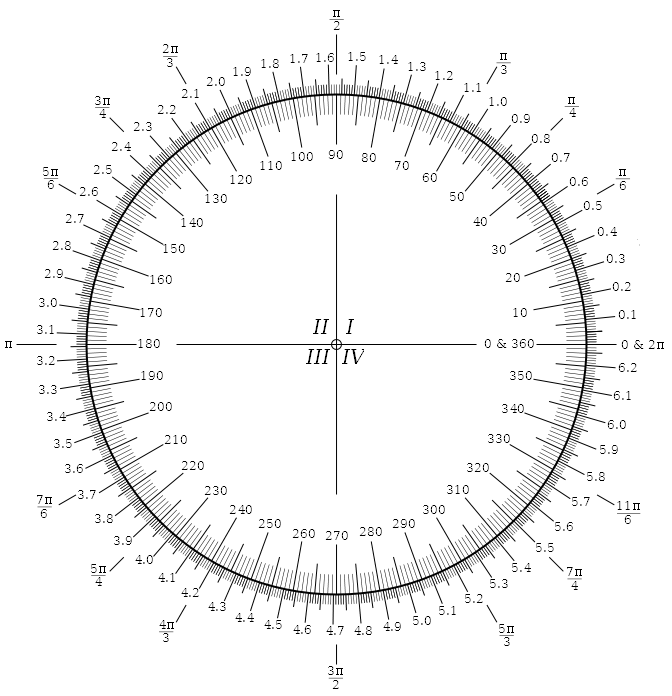
The countdown is counterclockwise, in the implementation of Apple, the countdown is clockwise ! Where 270 we have, 90 - with them.
I did not expect this, maybe something is missing?
The shadow rendering code looks like this (Shl: there is no backlight for Swift):
You can compare (on the left the layout, on the right the implementation):


The first thing to do is to integrate the Vkontakte iOS SDK into the project. Vkontakte iOS SDK is written in Objective-C, there is such a tutorial on how to integrate Objective-C into the Swift project.
Connect the SDK no problems.
Starting the authorization process starts with calling this method:

After successful authorization, we get an access token that will be stored in the SDK data store. The user will transfer the photos to the screen.
To begin with, I will show the final results:
The net is removed and made so invisible on purpose.
This is the layout of the buttons too, but I dropped it, because when I clicked on the screen border (button - screen), I often took a photo next to the button and did not switch between cameras or activate the grid:

The article is supplemented only after the screen has been programmed, so unfortunately I can miss some moments.
I took the UIImagePickerController as a basis, which is suitable for solving the task quite well. Hid all its elements, removed all unnecessary, installed its cameraOverlayView.
A slight surprise for me was the appearance of this visual element of zoom:

I did not need him here, and he was very spoiling the view, besides overlapping the button - I had to remove it. Implemented the first method that came to mind:
Then I decided to look for SO for some more interesting solutions and found - setting userInteraction to false.
Consider now the most interesting line, in my opinion the most interesting begins with it:
Two questions:
1. Since when UIImagePickerController appears, I have to start the animation of the appearance of buttons, then somehow I need to receive an event / notification about it, which means we have to overwrite the UIImagePickerController method viewDidAppear itself.
2. It is necessary to notify UIImagePickerController in some way that you need to take a photo or switch to the front camera
Found two solutions:
1. Move the UIImagePickerController into the global scope
2. Create a subclass of UIImagePickerController and implement it in such a way that it sends notifications about events that occurred “in it” and could process the commands itself (take a photo, change the camera, etc.) - NSNotificationCenter
The first option, I almost started to try and watch, but at some point I simply felt sick from this decision and I found it ugly. In the end, everything was implemented using notifications. It turned out quite simple and flexible at the same time.
This is what NAGImagePickerController looks like at this stage:
Now we quietly subscribe to our cameraOverlayView to receive notifications that viewDidAppear: in UIImagePickerController:
Aha Now you can create controls and display them with animation:
In the same method, we will subscribe to receive notifications about the change in the orientation of the device:
Why do we do it here and now? The fact is that if the device is in an arbitrary orientation when the application starts up - no initial orientation notification will initially arrive, which means you need to add a flag to the change processing method that determines whether this is the first element mapping or not. Only at the first appearance of the animation is played. I would have to add unnecessary ify and enter a variable flag, I did not like the result and I came to what I showed above.
In the method that handles device orientation changes, we 1) position the buttons in the desired corners of the screen 2) animate the rotation of the button in the direction of rotation of the device.
For some time I was picking with line drawing, I couldn’t understand why lines are not displayed when layer.alpha = 0.0. Pereklinilo, set the backgroundColor in clearColor () and everything fell into place.
Line drawing is in the drawRect: method and looks like this:
After the implementation of the screen, in the Swift blog , information appeared about access modifiers.
The actual source code of the application can be found on GitHub, at the end of the article, see the link to the repository.
After the user has taken a snapshot, the following method will be called:
We send a notice to the tracking objects (layers) that the photo has been taken and it is necessary to change the control elements to new ones (go to another screen).
The method that "handles" the notification is as follows:
Next, I plan to do the following: create a layer that will contain the final photo, on this layer there will be another UIView, which will be responsible for displaying and changing control elements.
In NAGPhotoOverlayView there will be (so far) two properties:
1. UIImageView
2. UIImage
and declared as follows:
Initialization is as follows:
We sign the current layer to receive notifications around the rotation of the device in order to correctly rotate the image. I want to remind you that by default, a photo that is made via UIImagePickerController will always be displayed in portrait mode, and this is fraught with image compression when displayed. The method of processing turns the device looks like this:
main image rotation code:
What are we doing? Let's check first in what orientation the photo was taken. If the photo is in Landscape mode, then turns should be allowed only for the position of the .LandscapeLeft and LandscapeRight device, if the photo in portrait mode is only .Portrait and .PortraitUpsideDown.
Since you cannot directly change the imageOrientation property of a UIImage instance, you have to create a new object.
The next step is to create a layer containing the controls, animate the appearance of the elements, and select and apply filters to the image.
Just tired ... decided not to delete the article, but still publish it.
Sources can be found at this link on GitHub .
Do not do what you do not see the point.
Thank you for your attention, dear habrazhiteli.
The author will try to do everything through prototypes, as they did in 223 WWDC 2014 sessions .
Project Description
Initially, the description looked like this:
The application will only work with VC (for now) and allow the user to take photos and immediately upload them to the desired album in the VC, if possible applying some filters.
')
The main functionality:1. Display photo album list2. Display photos of the selected album3. Ability to delete a photo4. Ability to delete album5. Ability to create an album and specify access rights to it.
6. Make a photo, apply filters, specify the album in which to upload the photo (or make the main profile picture), attach a location, add a description to the photo.
I decided that I want to do something quickly, so I removed most of the functionality and made such an application, which is described in the first paragraph:
The application will work only with the VC (for now) and allow the user to take photos and immediately upload them to the VC, possibly applying some filters.
Prototypes Time.
We make any sketches of screens, offer a variety of ideas and in any way put them on paper.
I started with the login screen. Without authorization, the application does not make sense to process the photo, so the option of showing the screen to take a picture as a start is excluded. On the authorization screen there should have been some element like a button, after clicking on which the user would be able to log in to the VC and we could carry out requests on his behalf.
What sketches I had:
I will explain each of them.
1. The idea was that in front of the user there will be a certain set of photos on which there will be inscriptions (Share impressions with friends, Always be in touch, Share joyful moments, etc.). Below is the authorization button.
Cons of this option:
We need something to flip through.
Excess work on the selection of pictures of the desired colors, which will be combined with the background color + selection of the font and its color for application to images.
Looks like some kind of user manual.
I just did not like it.
2. If in the first version it was not visible which image you are flipping through the account and how many of the total, then this defect has been corrected. However, the disadvantages remain the same.
3. Picture and button. It would seem simple, but a lot of questions arise: the color of the background, the color of the picture, their combinations. Option disappeared.
4. Here, the background is a picture with a lot of user photos, there can be some additional layer in the picture so that many faces do not hurt the eyes and the user does not cause anxiety and nervousness. The button remains.
This option I liked the most.
After all our ideas were transferred from the head to the paper, I began to make sketches of these very screens in real sizes with real elements. Everything was done in Keynote.
I will show not all the options, but only 2 that I could do. In the course of implementing the first two options, with flipping, I came to the conclusion that it was too cumbersome for such a small application.
The very first preview of the authorization screen:
I asked my colleagues at work which of the two options they like best. All answered first. The second was not much liked because of some dude and look. They could not understand the essence of the application, why this particular guy, who he is, etc.
The second option was dropped.
After some time, there were more such options:
There was no paper at hand, so the VC display screen in UIWebView for authorization was thrown right into Keynote. Options that turned out:
I stopped at the first option. With the “Close” / “Cancel” button, the top panel did not look the way we would like. I tried to add a button with different shadows / transparency and the “X” symbol, but it was also knocked out (although it starts to like the idea with stickers or sticker elements).
I want to remind once again that the main task at the prototyping stage is to visually recreate the application without programming, try out many types and variants of screens, look at the user’s reaction and hear their response (in the early stages of prototyping, we’ll get rid of some problems usually occurred somewhere in the middle of developing an application or at the end).
The next screen will be the photo screen, where the user can take a picture (using the front or rear camera) and go to the screen for applying filters / effects.
With the photo screen was much more interesting. I looked through and worked with Instagram, I didn’t like some moments and I decided to eliminate them, but at the same time I learned something from myself.
What happened (from the initial options to the last):
This screen did not want to clutter with something other than the most basic elements, so in general we can say that all the options are some variations of one. Initially, at the bottom of the screen there is only one button (one element) by clicking on which the user snapshot will be fixed. After fixing the snapshot of the button (in my view), two additional buttons “Reset” and “Edit” should “move out” to opposite sides. As you can see on one of the sketches, at the initial stage the buttons were only with the words “YES” and “NO”, but the second option (the first picture, the second screen) gave me the idea that YES / NO is not at all informative, but at the same time It is unnecessary to display the question “What do you want to do with a snapshot?”, because it is clear from the context what actions can be and what are needed.
Why did I decide to lower the button with the letter “Q” to the bottom of the screen in such a way that it began to drop down a bit? The answer is simple - the desire to increase free space. For this very reason, in the 3 pictures (1 screen) the top panel has been removed.
From Instagram I took over only the grid, it seemed to me necessary if I want to take a couple of shots so that the object is in the center of the photo.
This is what I received after 40-50 minutes (see below). Some moments have been changed, some will be changed, there are ideas. Thanks to the prototype, it was possible to notice that simply putting the sign of the grid and the camera on the image will not work - you need to put something under them. The panel is the first solution, but because of it the integrity and impression of the photo is lost, it interferes.
Video of the prototyping process can be found at this link.
While transferring items from portrait mode to Landscap mode, I thought about removing the status bar.
Compare:
Compare:
Compare:
Maybe try to do so?
And in the portrait mode, move the elements down:
After 20-30 minutes I decided to stop at this option (the more options there are now, the wider the choice will be then):
Purple button interferes. A snapshot will be captured by pressing, after clicking, no further action will appear in front of the user - immediately displaying filters, sprinkles, etc. From this screen, the user can one click to go to shooting.
Started sketching photo processing screen. The first versions were as follows:
I liked the option, but I’m stuck in the implementation, which I don’t want.
Simplified to this:
In this embodiment, I decided to beat the theme with stickers / stickers. As you can see, in the first version of this theme - flat elements.
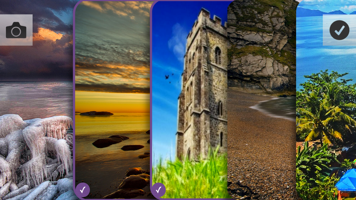
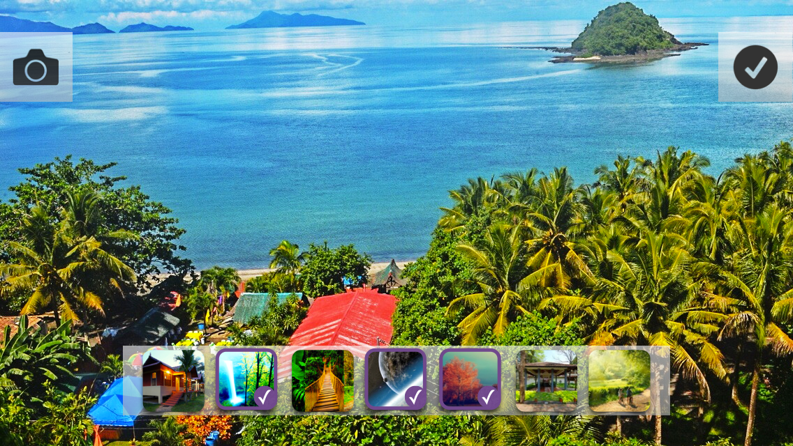
I got such photo editing screens in Landscap mode (we’ll choose later, but there are already some favorites. Video from this link.):
Something completely different (each image must be a source image with a superimposed filter):
After clicking this screen opens:
True, this option has several questions:
1. How to leave this screen?
2. Two elements that confirm the action of some kind (button - applies the filter, and a tick - the transition to the settings)
3. With a small number of filters, it looks good and a large enough part of the image is visible, but what will this harmonica look like with 10-15 filters?
Still, it looks nice, so finally we will not discard this option.
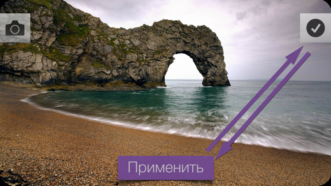
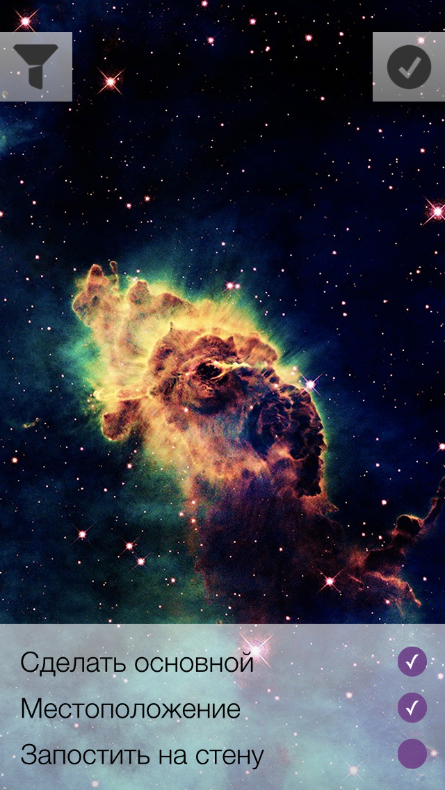
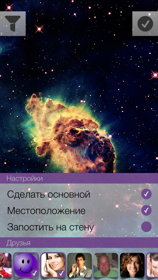
Next we have the loading options screen. What the user can specify:
1) Set photo as primary
2) Attach current location
3) Select an album in which the photo will be uploaded.
4) Add friend tag on photo
5) Post a photo on the wall
Keynote Sketches:
A video of the creation process can be found at this link.
Should I show the user how to upload a photo? If the answer is yes, then you need to place a certain loading indicator on the current screen, or create a new screen with a list of photos to be loaded. The list is needed in order to solve the problem of uploading photos when there is no Internet. How much does the user need such a list explicitly? The main task is to hide all unnecessary and make the work of the application as organic and natural as possible.
After a few minutes of estimations, I came to this option of displaying the number of photos in the queue:
We will upload images in the background. If for some reason it was not possible to upload a photo, then we will try again later, but we will not remove the photo from the list.
The last screen with the options I do not really like, I decided to poshamanit more. Compare:
Such interfaces are obtained in landscape mode:
The variant with the callout block did not even begin to be considered. The position of the vertical in the landscape mode was not enough + I wanted to preserve some common positions of the elements between the landscape variant and the portrait one.
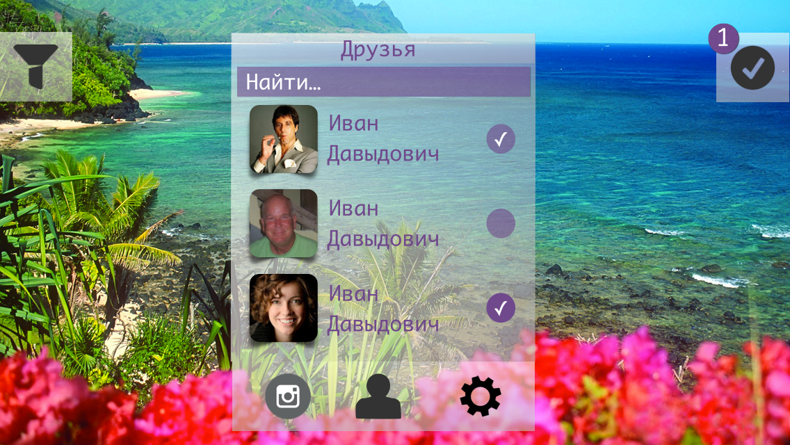
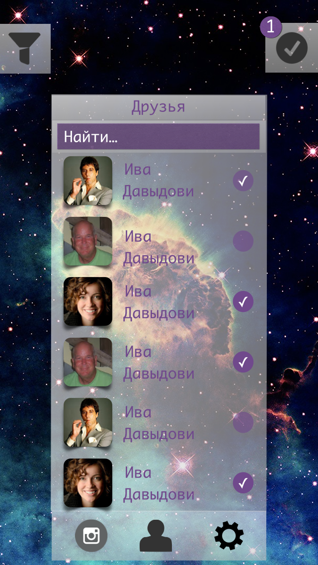
Prototypes: reviews. Two.
Authorization screen:
Comments: None .
Modal authorization window in VK (corrected version):
Comments:
The inscription "Authorization" on the past screen looked like a button and the subjects had questions about this.
Shooting window (portrait mode):
Comments: None .
Shooting window (Landscap mode):
Comments: None .
Filters (portrait mode):
Comments: None .
Filters (landcap mode):
Comments: None .
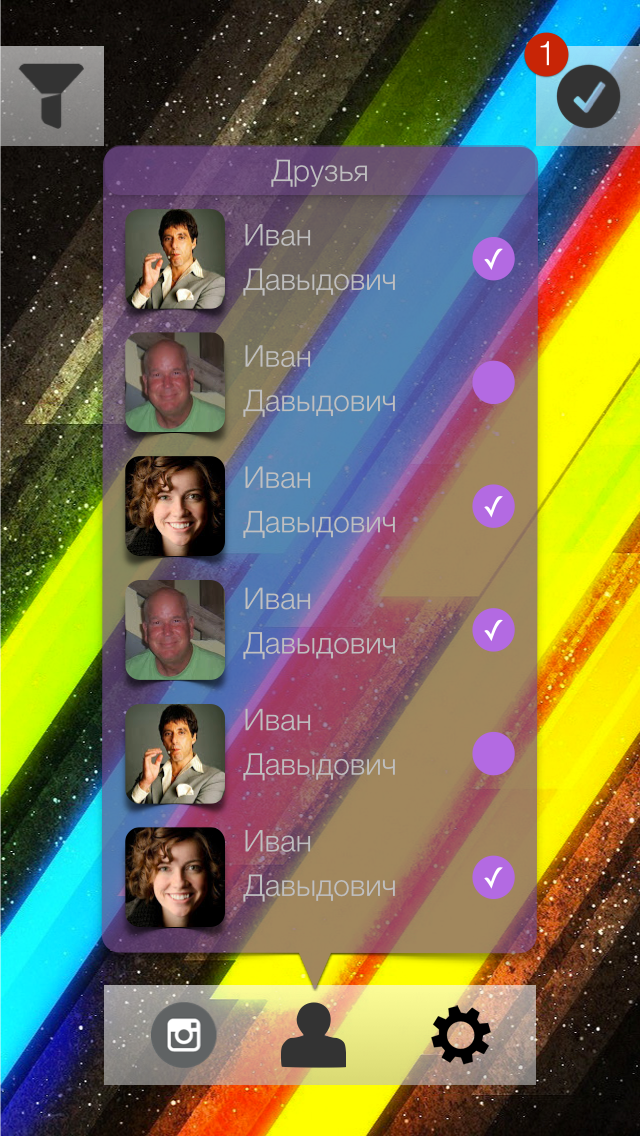
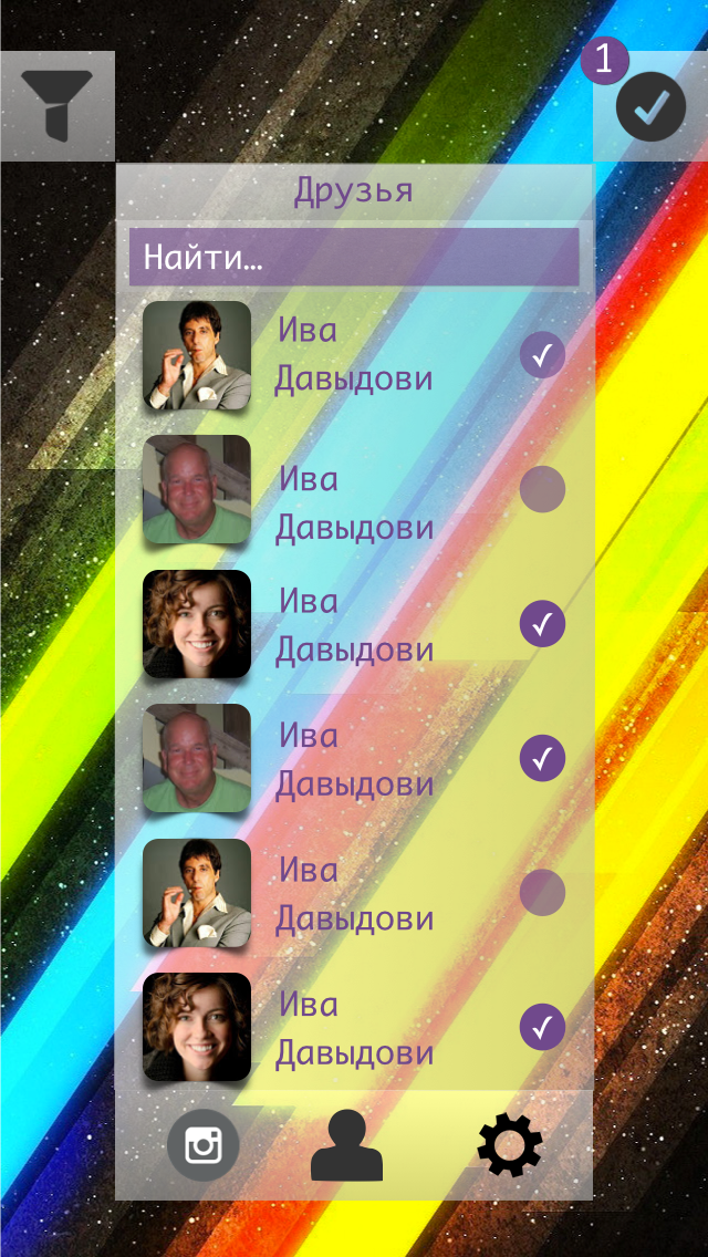
Download settings (portrait mode):
Comments:
Font sucks. Why do I need the heading "Friends" if I see now that these are my friends? (author: this is how the second version of the screen appeared)
Boot Settings (Landscap mode):
Comments: the same as the screen in portrait mode .
Prototypes: animation. Three.
The video can be viewed at this link.
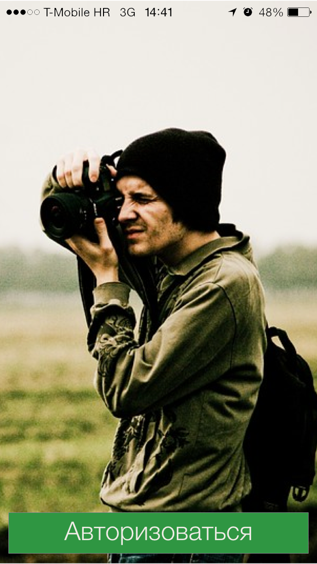
We program the main screen.
On this screen, I decided to conduct several experiments:
1. Use the blur effect as a “glass” layer between the background image and the name of the application.
2. The authorization button is not inserted with a shadow image, but programmatically create it.
To begin with, the use of pure blue will not give the desired effect.
We must cheat - add another layer. So do. The additional layer will be gray and to achieve the desired effect (as on the layout) it is necessary to experiment with the transparency of the layer itself (alpha).
The application logo was inserted with a simple picture.
It was much more interesting to deal with the shadow, the fact is that it is impossible to use cornerRadius and custom shadowPath on one view. After googling and reading the documentation, we decide to put the shadow on a separate layer. To achieve the desired sticker effect, it is necessary to define the borders of the shadow under the button, for this we use GGPath and recall the geometry.
If you look closely at the shadow under the button, then you can estimate that it consists of a “almost” rectangle with one rounded side (bottom). With the construction of direct no problems should arise - CGPathAddLineToPoint () and CGPathMoveToPoint () . As for the rounded side, we have little choice - either we subtle and the rounded side is replaced by two straight lines, or we deal with the CGPathAddArc () method and the like.
I have to say that using the first method will not achieve the desired effect.
What questions need to be answered?
1. How to determine the angle "resting" on the chord knowing the chord length and radius ?
2. What are radians and what does a circle from 0 to 2Pi look like ?
With the first special difficulties should arise. There is a formula for calculating the chord length, it has variables of radius and angle, it is necessary to express the angle and substitute the necessary values.
In the second question, during implementation, I was confronted with what I did not expect to see.
Here is what a circle looks like with angles in radians:
The countdown is counterclockwise, in the implementation of Apple, the countdown is clockwise ! Where 270 we have, 90 - with them.
I did not expect this, maybe something is missing?
The shadow rendering code looks like this (Shl: there is no backlight for Swift):
// let shadow = UIView(frame: CGRectMake(0, 0, CGRectGetWidth(frame), CGRectGetHeight(frame))) shadow.layer.shadowOpacity = 0.65 shadow.layer.shadowRadius = 4 shadow.layer.shadowColor = UIColor.blackColor().CGColor shadow.layer.shadowOffset = CGSize(width: 0, height: 0) // let diameter = (CGRectGetWidth(frame) / CGRectGetHeight(frame)) * CGRectGetWidth(frame) let radius = diameter / 2 let xCenter = CGRectGetWidth(frame) / 2 let yCenter = CGRectGetHeight(frame) + radius let angle = 2 * asin(CGRectGetWidth(frame) / (2 * radius)) let endAngle = M_PI + (M_PI - angle) / 2 let startAngle = endAngle + angle let shadowPath = CGPathCreateMutable() CGPathMoveToPoint(shadowPath, nil, 0, CGRectGetHeight(frame) / 2) CGPathAddLineToPoint(shadowPath, nil, frame.size.width, CGPathGetCurrentPoint(shadowPath).y) CGPathAddLineToPoint(shadowPath, nil, CGPathGetCurrentPoint(shadowPath).x, frame.size.height) CGPathAddArc(shadowPath, nil, xCenter, yCenter, radius, startAngle, endAngle, true) CGPathAddLineToPoint(shadowPath, nil, 0, frame.size.height) CGPathCloseSubpath(shadowPath) shadow.layer.shadowPath = shadowPath You can compare (on the left the layout, on the right the implementation):
We program the authorization screen in VK.
The first thing to do is to integrate the Vkontakte iOS SDK into the project. Vkontakte iOS SDK is written in Objective-C, there is such a tutorial on how to integrate Objective-C into the Swift project.
Connect the SDK no problems.
Starting the authorization process starts with calling this method:
VKConnector.sharedInstance().startWithAppID("87687678678", permissons: ["photo", "wall", "friends"], webView: self.webView, delegate: self) After successful authorization, we get an access token that will be stored in the SDK data store. The user will transfer the photos to the screen.
We program the photo implementation screen
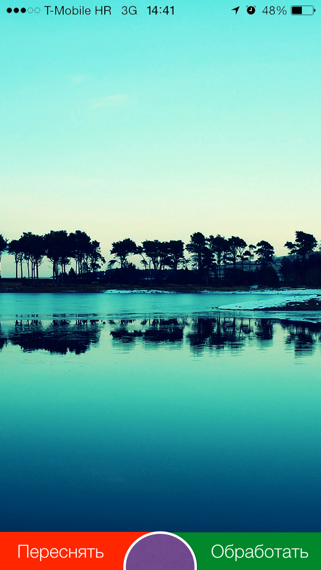
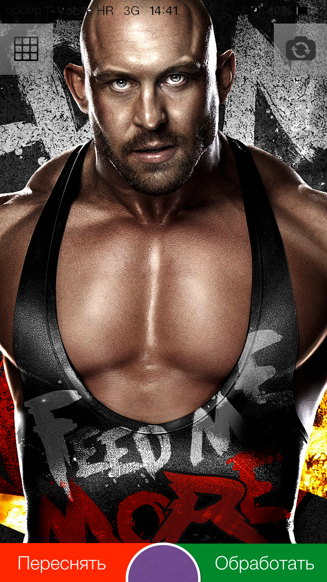
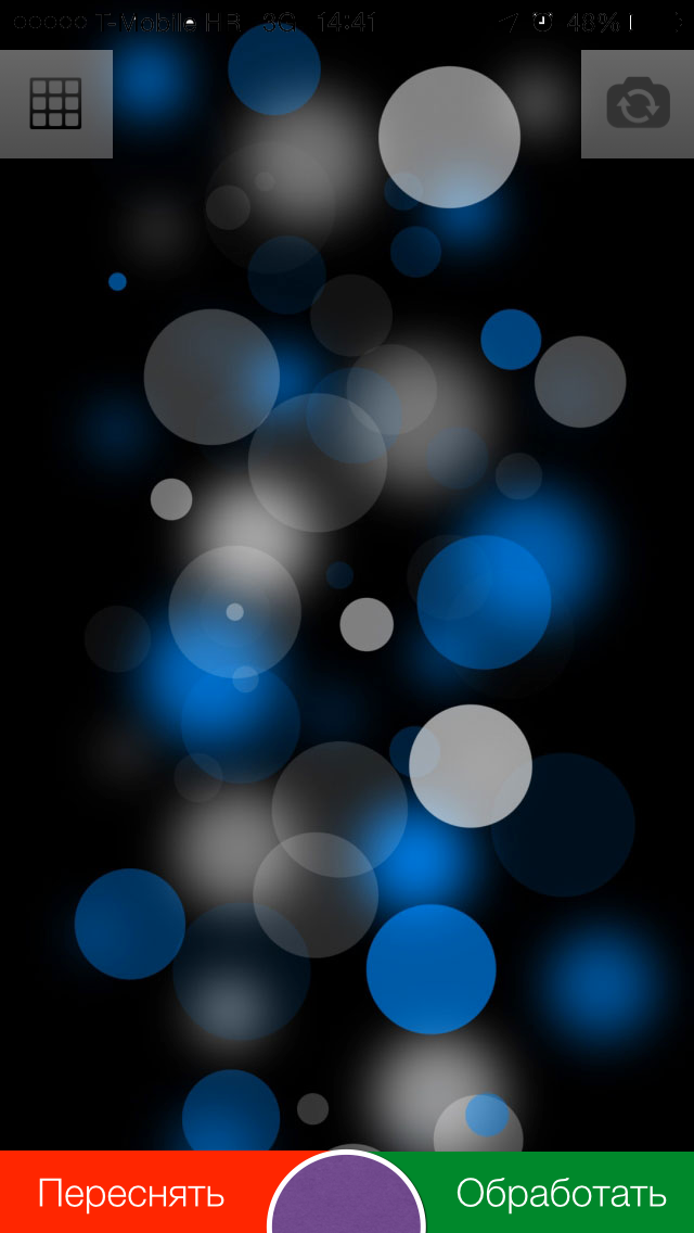
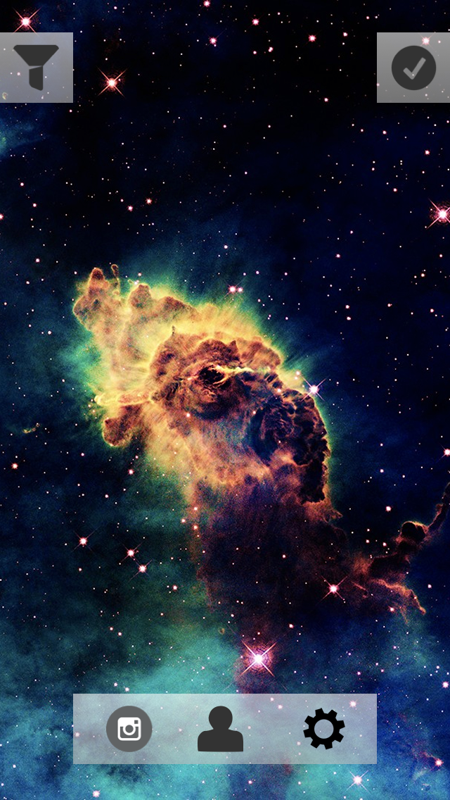
To begin with, I will show the final results:
The net is removed and made so invisible on purpose.
This is the layout of the buttons too, but I dropped it, because when I clicked on the screen border (button - screen), I often took a photo next to the button and did not switch between cameras or activate the grid:
The article is supplemented only after the screen has been programmed, so unfortunately I can miss some moments.
I took the UIImagePickerController as a basis, which is suitable for solving the task quite well. Hid all its elements, removed all unnecessary, installed its cameraOverlayView.
let cameraView = NAGImagePickerController() cameraView.delegate = cameraView cameraView.sourceType = UIImagePickerControllerSourceType.Camera cameraView.showsCameraControls = false cameraView.allowsEditing = false cameraView.cameraOverlayView = NAGFirstPhotoOverlayView(frame: UIScreen.mainScreen().bounds) A slight surprise for me was the appearance of this visual element of zoom:
I did not need him here, and he was very spoiling the view, besides overlapping the button - I had to remove it. Implemented the first method that came to mind:
let pinchGR = UIPinchGestureRecognizer(target: self, action: nil) addGestureRecognizer(pinchGR) Then I decided to look for SO for some more interesting solutions and found - setting userInteraction to false.
Consider now the most interesting line, in my opinion the most interesting begins with it:
cameraView.delegate = cameraView Two questions:
1. Since when UIImagePickerController appears, I have to start the animation of the appearance of buttons, then somehow I need to receive an event / notification about it, which means we have to overwrite the UIImagePickerController method viewDidAppear itself.
2. It is necessary to notify UIImagePickerController in some way that you need to take a photo or switch to the front camera
Found two solutions:
1. Move the UIImagePickerController into the global scope
2. Create a subclass of UIImagePickerController and implement it in such a way that it sends notifications about events that occurred “in it” and could process the commands itself (take a photo, change the camera, etc.) - NSNotificationCenter
The first option, I almost started to try and watch, but at some point I simply felt sick from this decision and I found it ugly. In the end, everything was implemented using notifications. It turned out quite simple and flexible at the same time.
This is what NAGImagePickerController looks like at this stage:
// // NAGImagePickerController.swift // Qtty // // Created by AndrewShmig on 21/07/14. // Copyright (c) 2014 Non Atomic Games Inc. All rights reserved. // import UIKit let kNAGImagePickerControllerViewDidLoadNotification = "NAGImagePickerControllerViewDidLoadNotification" let kNAGImagePickerControllerViewWillAppearNotification = "NAGImagePickerControllerViewWillAppearNotification" let kNAGImagePickerControllerViewDidAppearNotification = "NAGImagePickerControllerViewDidAppearNotification" let kNAGImagePickerControllerViewDidDisappearNotification = "NAGImagePickerControllerViewDidDisappearNotification" let kNAGImagePickerControllerViewWillDisappearNotification = "NAGImagePickerControllerViewWillDisappearNotification" let kNAGImagePickerControllerFlipCameraNotification = "NAGImagePickerControllerFlipCameraNotification" let kNAGImagePickerControllerCaptureImageNotification = "NAGImagePickerControllerCaptureImageNotification" class NAGImagePickerController: UIImagePickerController, UIImagePickerControllerDelegate, UINavigationControllerDelegate { override func viewDidLoad() { super.viewDidLoad() NSNotificationCenter.defaultCenter().postNotificationName(kNAGImagePickerControllerViewDidLoadNotification, object: self) } override func viewWillAppear(animated: Bool) { super.viewWillAppear(animated) NSNotificationCenter.defaultCenter().postNotificationName(kNAGImagePickerControllerViewWillAppearNotification, object: self) } override func viewDidAppear(animated: Bool) { super.viewDidAppear(animated) NSNotificationCenter.defaultCenter().postNotificationName(kNAGImagePickerControllerViewDidAppearNotification, object: self) NSNotificationCenter.defaultCenter().addObserver(self, selector: "flipCameras", name: kNAGImagePickerControllerFlipCameraNotification, object: nil) NSNotificationCenter.defaultCenter().addObserver(self, selector: "captureImage", name: kNAGImagePickerControllerCaptureImageNotification, object: nil) } override func viewWillDisappear(animated: Bool) { super.viewWillDisappear(animated) NSNotificationCenter.defaultCenter().postNotificationName(kNAGImagePickerControllerViewWillDisappearNotification, object: self) } override func viewDidDisappear(animated: Bool) { super.viewDidDisappear(animated) NSNotificationCenter.defaultCenter().postNotificationName(kNAGImagePickerControllerViewDidDisappearNotification, object: self) } // func flipCameras() { cameraDevice = (cameraDevice == .Rear ? .Front : .Rear) } // func captureImage() { takePicture() } // , func imagePickerController(picker: UIImagePickerController!, didFinishPickingMediaWithInfo info: [NSObject : AnyObject]!) { println(info) } deinit { NSNotificationCenter.defaultCenter().removeObserver(self) } } Now we quietly subscribe to our cameraOverlayView to receive notifications that viewDidAppear: in UIImagePickerController:
NSNotificationCenter.defaultCenter().addObserver(self, selector: "imagePickerControllerViewDidAppear:", name: kNAGImagePickerControllerViewDidAppearNotification, object: nil) Aha Now you can create controls and display them with animation:
createControlElements() // - UIView.animateWithDuration(1.0, animations: { self.layout(UIDevice.currentDevice().orientation) }) In the same method, we will subscribe to receive notifications about the change in the orientation of the device:
UIDevice.currentDevice().beginGeneratingDeviceOrientationNotifications() NSNotificationCenter.defaultCenter().addObserver(self, selector: "deviceDidChangeOrientation:", name: UIDeviceOrientationDidChangeNotification, object: nil) Why do we do it here and now? The fact is that if the device is in an arbitrary orientation when the application starts up - no initial orientation notification will initially arrive, which means you need to add a flag to the change processing method that determines whether this is the first element mapping or not. Only at the first appearance of the animation is played. I would have to add unnecessary ify and enter a variable flag, I did not like the result and I came to what I showed above.
In the method that handles device orientation changes, we 1) position the buttons in the desired corners of the screen 2) animate the rotation of the button in the direction of rotation of the device.
func layout(orientation: UIDeviceOrientation) { println(__FUNCTION__) switch orientation { case .Portrait: leftButton.frame = position(leftButton, atCorner: .UpperLeftCorner) rightButton.frame = position(rightButton, atCorner: .UpperRightCorner) case .PortraitUpsideDown: leftButton.frame = position(leftButton, atCorner: .LowerRightCorner) rightButton.frame = position(rightButton, atCorner: .LowerLeftCorner) case .LandscapeRight: leftButton.frame = position(leftButton, atCorner: .LowerLeftCorner) rightButton.frame = position(rightButton, atCorner: .UpperLeftCorner) default: // leftButton.frame = position(leftButton, atCorner: .UpperRightCorner) rightButton.frame = position(rightButton, atCorner: .LowerRightCorner) } var angle: CGFloat switch (prevDeviceOrientation, orientation) { case (.Portrait, .LandscapeLeft), (.LandscapeRight, .Portrait), (.PortraitUpsideDown, .LandscapeRight), (.LandscapeLeft, .PortraitUpsideDown): angle = CGFloat(M_PI) / 2.0 case (.Portrait, .LandscapeRight), (.LandscapeLeft, .Portrait), (.LandscapeRight, .PortraitUpsideDown), (.PortraitUpsideDown, .LandscapeLeft): angle = -CGFloat(M_PI) / 2.0 case (.Portrait, .PortraitUpsideDown), (.PortraitUpsideDown, .Portrait), (.LandscapeLeft, .LandscapeRight), (.LandscapeRight, .LandscapeLeft): angle = CGFloat(M_PI) default: angle = 0.0 } let rotate = CGAffineTransformMakeRotation(angle) UIView.animateWithDuration(0.3, animations: { self.leftButton.transform = CGAffineTransformConcat(self.leftButton.transform, rotate) self.rightButton.transform = CGAffineTransformConcat(self.rightButton.transform, rotate) }) } For some time I was picking with line drawing, I couldn’t understand why lines are not displayed when layer.alpha = 0.0. Pereklinilo, set the backgroundColor in clearColor () and everything fell into place.
Line drawing is in the drawRect: method and looks like this:
let screenHeight = CGRectGetHeight(UIScreen.mainScreen().bounds) let screenWidth = CGRectGetWidth(UIScreen.mainScreen().bounds) let context = UIGraphicsGetCurrentContext() CGContextSetLineWidth(context, 1.0) CGContextSetShadow(context, CGSizeZero, 1.0) CGContextSetStrokeColorWithColor(context, UIColor(red: 0.803, green: 0.788, blue: 0.788, alpha: 0.5).CGColor) // ( ) let horizontalLines = screenHeight / kVisualBlocks let countHLines = screenHeight / horizontalLines for i in 1..<countHLines { CGContextMoveToPoint(context, 0, i * horizontalLines) CGContextAddLineToPoint(context, screenWidth, i * horizontalLines) } // ( ) let verticalLines = screenWidth / kVisualBlocks let countVLines = screenWidth / verticalLines for i in 1..<countVLines { CGContextMoveToPoint(context, i * verticalLines, 0) CGContextAddLineToPoint(context, i * verticalLines, screenHeight) } CGContextStrokePath(context) After the implementation of the screen, in the Swift blog , information appeared about access modifiers.
The actual source code of the application can be found on GitHub, at the end of the article, see the link to the repository.
We program the screen of imposing of filters
After the user has taken a snapshot, the following method will be called:
func imagePickerController(picker: UIImagePickerController!, didFinishPickingMediaWithInfo info: [NSObject : AnyObject]!) { NSNotificationCenter.defaultCenter().postNotificationName(kNAGImagePickerControllerUserDidCaptureImageNotification, object: self, userInfo: info) } We send a notice to the tracking objects (layers) that the photo has been taken and it is necessary to change the control elements to new ones (go to another screen).
The method that "handles" the notification is as follows:
// , // func hideControlElements(notification: NSNotification) { // , // // deviceDidChangeOrientation NSNotificationCenter.defaultCenter().removeObserver(self) // UIImagePickerController (notification.object as NAGImagePickerController).view.userInteractionEnabled = false // if !superview.viewWithTag(kGridViewTag).hidden { invertGridVisibility() } // UIView.animateWithDuration(1.0, animations: { self.layout(self.prevDeviceOrientation, animation: .BeforeAnimation) }, completion: { _ in let imagePickerController = notification.object as NAGImagePickerController imagePickerController.cameraOverlayView = NAGPhotoOverlayView(imageInfo: notification.userInfo, frame: self.frame) }) } Next, I plan to do the following: create a layer that will contain the final photo, on this layer there will be another UIView, which will be responsible for displaying and changing control elements.
In NAGPhotoOverlayView there will be (so far) two properties:
1. UIImageView
2. UIImage
and declared as follows:
var photoView: UIImageView! var originalPhoto: UIImage! Initialization is as follows:
init(imageInfo: [NSObject : AnyObject]!, frame: CGRect) { super.init(frame: frame) originalPhoto = imageInfo[UIImagePickerControllerOriginalImage] as UIImage photoView = createPhotoLayer(image: originalPhoto) addSubview(photoView) NSNotificationCenter.defaultCenter().addObserver(self, selector: "deviceDidChangeOrientation:", name: UIDeviceOrientationDidChangeNotification, object: nil) } We sign the current layer to receive notifications around the rotation of the device in order to correctly rotate the image. I want to remind you that by default, a photo that is made via UIImagePickerController will always be displayed in portrait mode, and this is fraught with image compression when displayed. The method of processing turns the device looks like this:
func deviceDidChangeOrientation(notification: NSNotification) { rotateImage(toOrientation: UIDevice.currentDevice().orientation) } main image rotation code:
private func rotateImage(toOrientation orientation: UIDeviceOrientation) { let orientation = UIDevice.currentDevice().orientation let photoOrientation = originalPhoto.imageOrientation let isLandscapedPhoto = photoOrientation == .Down || photoOrientation == .Up if isLandscapedPhoto && (orientation == .LandscapeLeft || orientation == .LandscapeRight) { photoView.image = UIImage(CGImage: originalPhoto.CGImage, scale: originalPhoto.scale, orientation: orientation == .LandscapeRight ? .Right : .Left) } else if !isLandscapedPhoto && (orientation == .Portrait || orientation == .PortraitUpsideDown){ photoView.image = UIImage(CGImage: originalPhoto.CGImage, scale: originalPhoto.scale, orientation: orientation == .Portrait ? .Right : .Left) } } What are we doing? Let's check first in what orientation the photo was taken. If the photo is in Landscape mode, then turns should be allowed only for the position of the .LandscapeLeft and LandscapeRight device, if the photo in portrait mode is only .Portrait and .PortraitUpsideDown.
Since you cannot directly change the imageOrientation property of a UIImage instance, you have to create a new object.
The next step is to create a layer containing the controls, animate the appearance of the elements, and select and apply filters to the image.
the end
Just tired ... decided not to delete the article, but still publish it.
Sources can be found at this link on GitHub .
Conclusion
Do not do what you do not see the point.
Thank you for your attention, dear habrazhiteli.
Source: https://habr.com/ru/post/227751/
All Articles