What should be a good map - guidelines on Yandex.Maps
Yandex.Maps are used every day by millions of people. And each of them is different in its own way - someone is looking at traffic jams, someone is looking for organizations, someone is building routes, and almost everyone uses the map for orientation. What should the map look like in order to solve all these various tasks? Which cards are good and which are bad? What should be drawn and what should not? There are a lot of approaches. For example, some old maps of Moscow:
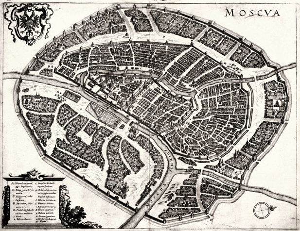
On this map of the 17th century, each house is neatly drawn in an isometric view, and important objects are described in the legend. It is unlikely that it was used by residents for orientation, rather, it was painted by travelers for their albums.
Today, object icons and signatures have appeared on Yandex.Maps, as well as, for example, the pedestrian streets have been updated. Under the cut, we will talk about what research and data we used for this important release.
This is a 1935 card. On it streets are signed and important city objects are marked, but houses are not drawn. But on this map you can already navigate.
')

As in the past there were different approaches to mapping, and today all cartographic services have different views on how the map should look. Starting from what information in principle should be placed on the map and how to represent it, and ending with the choice of colors for streets and houses. How to understand all this and make a map on which it would be really convenient to navigate? For ourselves, we formulated the answer to this question as follows: a good map is one that users can quickly and correctly relate to unfamiliar terrain.
To get a deeper understanding of the problem, we conducted several studies. At first we went on a trip to the cities of Russia, Ukraine and Turkey. We asked people to draw a hand-drawn map of their city in a couple of minutes - as they imagine it. On the map it was necessary to mark the places where they live, work, and often. From such drawings one can clearly see how people perceive the city: they are often marked with landmarks that are really important and well remembered. Considering such a card, you can quickly understand how the residents of the city represent its device, and draw conclusions that will help improve the readability of the card. Here is an example of one of these drawings:

This research helped us to formulate the main directions of development of the service, but there were still a lot of questions. Then we used another method: we invited people to our office and asked them to explain the way to an object to an imaginary friend using different maps. At the same time, they themselves were watching what our users say and what they pay attention to. This experience was also useful, but it was not enough. I really wanted to get some kind of tool that would help to compare several different cards and give an answer, which one is more readable.
For the next study, we used a panorama and a fragment of the map to which it relates. The task of the user is to navigate the terrain and indicate the shooting point on the map. We give the same places to different people, but different maps. Thus, measuring the time and correctness of the assignment, we understand which of the maps is easier to perceive and allows you to quickly correlate the map with the terrain.
We continue to conduct similar tests and test our many hypotheses about how a really good map should look. Some hypotheses have already been tested, and today we have taken the first steps to improve the readability of our map. Object icons and signatures to them appeared on Yandex.Maps, as well as, for example, the pedestrian street view was updated. And these are not random organizations and places, but those that will best help you navigate:
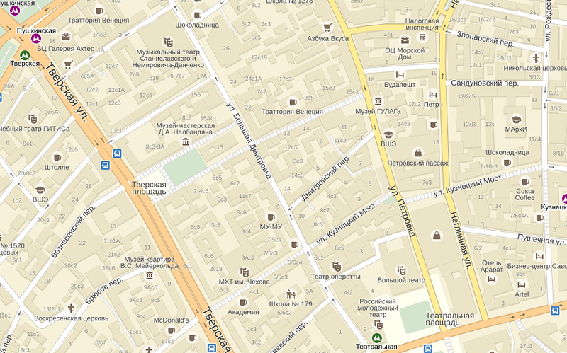
Now museums, theaters, shopping centers and other landmarks are visible at one glance at the map. And, if someone explains to you the words “after the church to the right,” you can immediately understand where this place of the district is on the map.
"Behind the church to the right, on Lev Tolstoy Street."

“On the way, you will pass a large building of the House of Music, followed by the left in front of the bridge.”

We take the information for signatures from the Yandex database, then simplify the names of the objects — for example, rename GOU SOSH to simply “School”, and “City Clinical Hospital No.… of the Central Administrative District” - to “Hospital No. ...”. This is necessary so that the names of the objects are informative and easy to read on the map. All organizations are automatically ranked by visibility. In particular, it allows you to properly sign large shopping centers with many organizations. For example, “Mega Teply Stan”, and not Burger King:

Adding labels to objects on maps requires processing a large amount of information. Since this is the first stage of work, there may be inaccuracies on the maps. We continue to work on this, and your help may be useful to us - you can report all found errors through the feedback form . Research has given us tremendous work material, and we will continue to improve the readability of Yandex.Map.
Updated maps are available in Russia, Ukraine, Belarus and Kazakhstan, both in the web version and in the Maps mobile applications , as well as in the API .
On this map of the 17th century, each house is neatly drawn in an isometric view, and important objects are described in the legend. It is unlikely that it was used by residents for orientation, rather, it was painted by travelers for their albums.
Today, object icons and signatures have appeared on Yandex.Maps, as well as, for example, the pedestrian streets have been updated. Under the cut, we will talk about what research and data we used for this important release.
This is a 1935 card. On it streets are signed and important city objects are marked, but houses are not drawn. But on this map you can already navigate.
')
As in the past there were different approaches to mapping, and today all cartographic services have different views on how the map should look. Starting from what information in principle should be placed on the map and how to represent it, and ending with the choice of colors for streets and houses. How to understand all this and make a map on which it would be really convenient to navigate? For ourselves, we formulated the answer to this question as follows: a good map is one that users can quickly and correctly relate to unfamiliar terrain.
To get a deeper understanding of the problem, we conducted several studies. At first we went on a trip to the cities of Russia, Ukraine and Turkey. We asked people to draw a hand-drawn map of their city in a couple of minutes - as they imagine it. On the map it was necessary to mark the places where they live, work, and often. From such drawings one can clearly see how people perceive the city: they are often marked with landmarks that are really important and well remembered. Considering such a card, you can quickly understand how the residents of the city represent its device, and draw conclusions that will help improve the readability of the card. Here is an example of one of these drawings:
This research helped us to formulate the main directions of development of the service, but there were still a lot of questions. Then we used another method: we invited people to our office and asked them to explain the way to an object to an imaginary friend using different maps. At the same time, they themselves were watching what our users say and what they pay attention to. This experience was also useful, but it was not enough. I really wanted to get some kind of tool that would help to compare several different cards and give an answer, which one is more readable.
For the next study, we used a panorama and a fragment of the map to which it relates. The task of the user is to navigate the terrain and indicate the shooting point on the map. We give the same places to different people, but different maps. Thus, measuring the time and correctness of the assignment, we understand which of the maps is easier to perceive and allows you to quickly correlate the map with the terrain.
We continue to conduct similar tests and test our many hypotheses about how a really good map should look. Some hypotheses have already been tested, and today we have taken the first steps to improve the readability of our map. Object icons and signatures to them appeared on Yandex.Maps, as well as, for example, the pedestrian street view was updated. And these are not random organizations and places, but those that will best help you navigate:
Now museums, theaters, shopping centers and other landmarks are visible at one glance at the map. And, if someone explains to you the words “after the church to the right,” you can immediately understand where this place of the district is on the map.
"Behind the church to the right, on Lev Tolstoy Street."
“On the way, you will pass a large building of the House of Music, followed by the left in front of the bridge.”
We take the information for signatures from the Yandex database, then simplify the names of the objects — for example, rename GOU SOSH to simply “School”, and “City Clinical Hospital No.… of the Central Administrative District” - to “Hospital No. ...”. This is necessary so that the names of the objects are informative and easy to read on the map. All organizations are automatically ranked by visibility. In particular, it allows you to properly sign large shopping centers with many organizations. For example, “Mega Teply Stan”, and not Burger King:
Adding labels to objects on maps requires processing a large amount of information. Since this is the first stage of work, there may be inaccuracies on the maps. We continue to work on this, and your help may be useful to us - you can report all found errors through the feedback form . Research has given us tremendous work material, and we will continue to improve the readability of Yandex.Map.
Updated maps are available in Russia, Ukraine, Belarus and Kazakhstan, both in the web version and in the Maps mobile applications , as well as in the API .
Source: https://habr.com/ru/post/226853/
All Articles