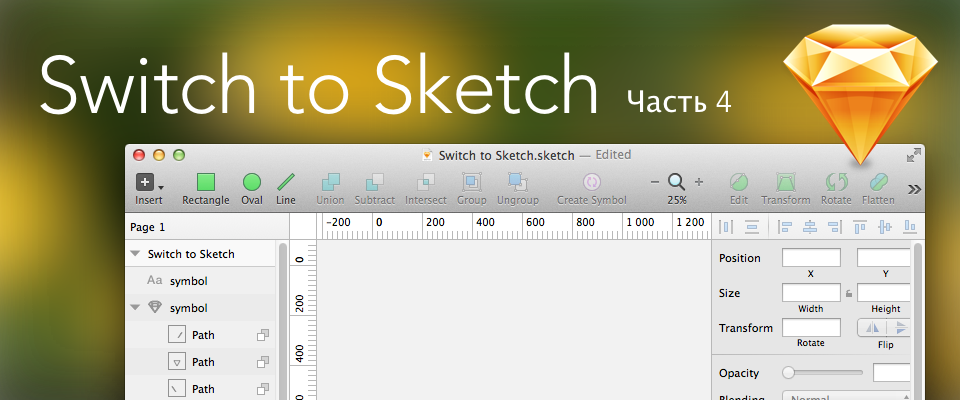
Switch to Sketch. Part 4
The original version of the old French proverb says: Le bon Dieu est dans le détail (“God in the details”). Actually, details that are inconspicuous at first glance distinguish Sketch from numerous competitors. Let's take a closer look at this treasure trove of amazing little things.
The creators of Sketch Dutchman Peter Omvlee, Portuguese Emmanuel Sa and Briton Christopher Downer, claim that as designers themselves, they did Sketch exclusively for designers. All the flaws that exist in Photoshop, they decided to eradicate and allow creative people to enjoy the work process, without experiencing any even the most minor inconveniences. Therefore, during the creation of Sketch, every action was scrupulously researched in other design packages and its new version was created. The basic principles of such modifications are simplicity, speed of execution and predictability of the result.
')
"Advanced details" meet you at the stage of creating a new document.
What will you see in almost any graphic editor by running File> New?
Most likely, the same as in Photoshop is a dialog box in which you need to specify the size of the future document, select a color model and set other parameters:
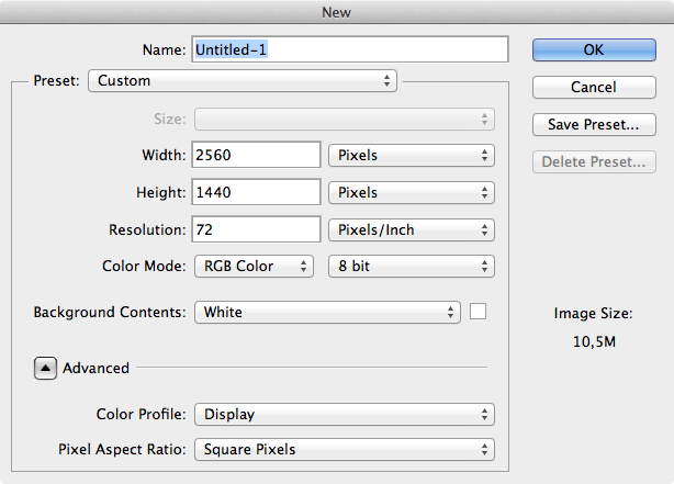
Developers from Bohemian Coding wondered: “Why do we need inches and centimeters, DPI and CMYK, if we want to draw interfaces and sites in pixels and in the RGB color scheme?”. And simply removed such a dialog box.
By pressing Cmd-N, you will receive a new document window instantly.
“What size will be the created document?” - you ask. And no.
The fact is that in Sketch a dimensionless canvas. And, accordingly, an infinite level of scaling. The background color of the canvas is white by default.
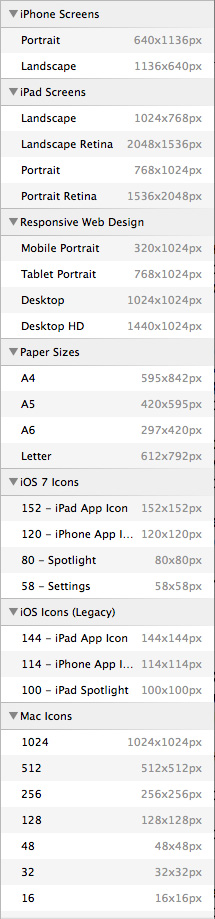
But what if there is a need to somehow limit the size of your document. For example, to make it for iPad Retina Landscape format?
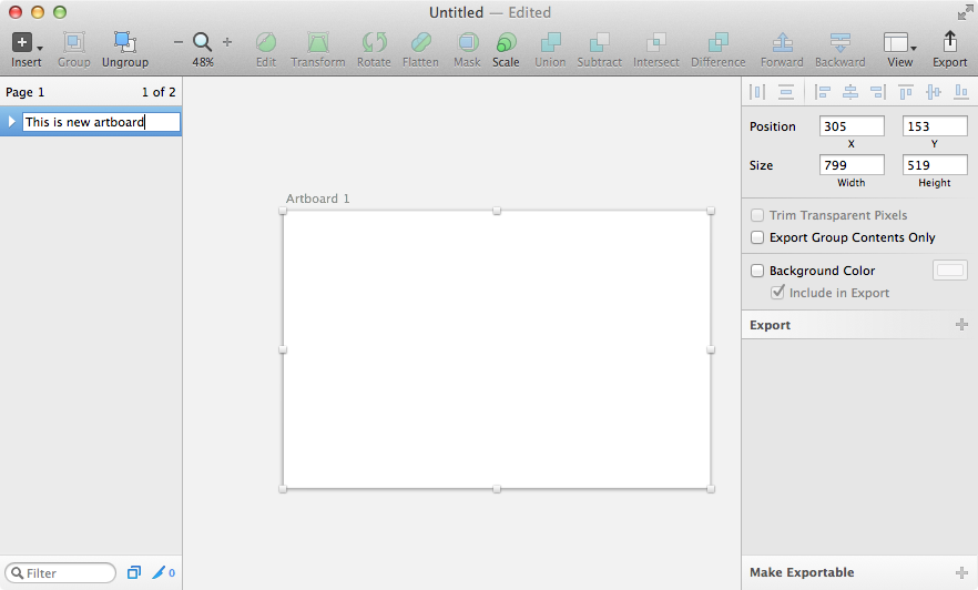
For this, the ability to create pages and artboards was introduced. Press the A key (or execute the command Insert> Artboard) and select one of the appropriate options in the list that appears in the inspector panel:
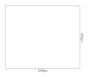
Or start creating your own size by clicking and dragging a rectangular area with the mouse cursor. At the same time, the width and height of the desired artboard will be dynamically displayed during creation:
After this artboard will be created. His name will appear in the list of layers, the properties of the artboard will appear in the inspector panel. The space outside will turn gray, and inside it remains white (the background color can then be changed in the inspector). Above the artboard, its name is displayed, which can be changed by double-clicking on the name in the layers panel:
You can also change the size of the artboard by pulling on any of the corner or middle controls. Artboards can be dragged to any place on the canvas, duplicated, deleted, aligned relative to each other. In general, to produce most of the operations typical of a regular rectangle, except, of course, rotation, bevel and other distortions. In fact, artboards are the same vector objects that have their own specific properties and are at the same time a group and a mask for objects placed inside other objects. What is part of the artboard, but goes beyond its borders, is simply not shown.
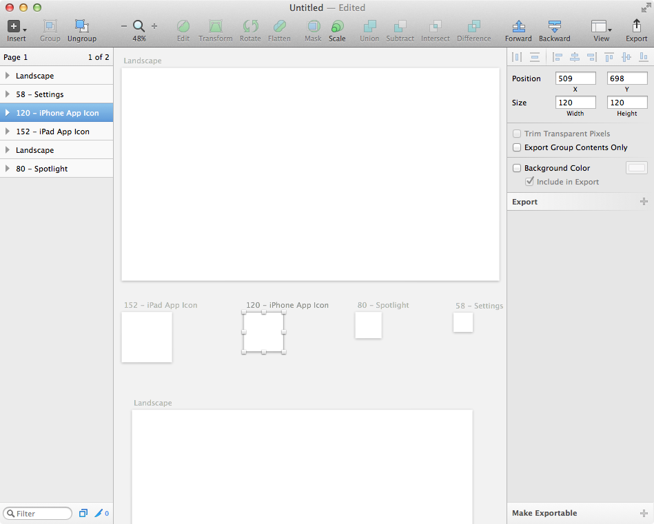
The number of artboards created is unlimited, so within the same document you can create, for example, the basics for iPhone, iPad screens, as well as for all main sizes of icons:
In addition to choosing the background color and specifying the ability to include an artboard background in the exported file, you can use two more options for export. Trim Transparent Pixels will be especially useful: if your artboard exceeds the size of the placed object, then when this option is enabled, the height and width of the image will be adjusted to the size of the object, and all extra pixels will be cut off.
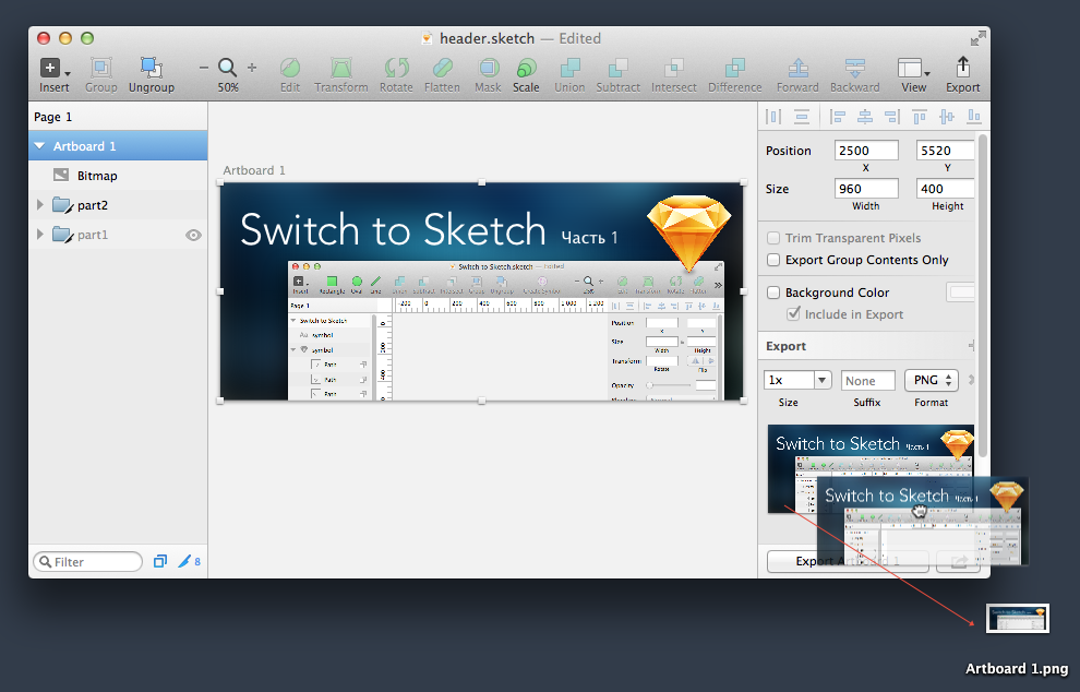
In addition, by clicking on the plus sign in the Export section on the inspector's panel, you will see various options for export (we will talk about this later) and a small thumbnail with the contents of the artboard. Just press and pull this miniature to any place (Desktop, Finder, Mail.app, Coda, etc.). A PNG file containing everything inside the artboard will be created at that location. Very simple and amazingly comfortable:
This allows you to do without calling additional windows like Save for Web ...
Artboards are still very convenient for creating a hierarchy of screens for a mobile application. You can place these in such a way as to keep track of all levels of nesting:
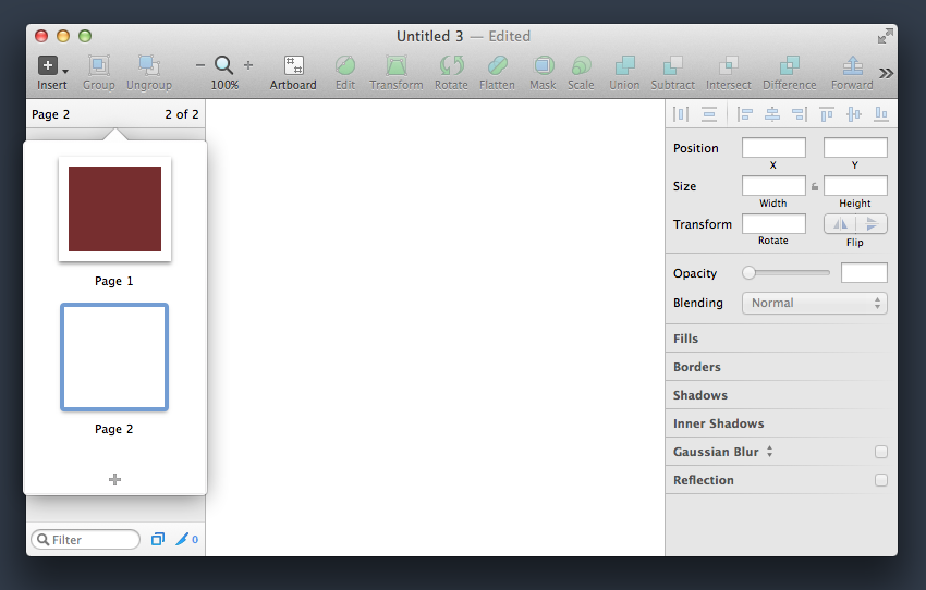
In addition, you can create any number of pages. Each page may have an arbitrary number of artboard. In the layers palette, click on the uppermost strip where it says Page 1, and you will see a pop-up list of the created pages (initially there is one). By clicking on the plus sign, you will create a new blank page, which you can rename at your discretion:
It is very convenient to have several pages within the same document, within which the necessary artboards are organized, containing groups of layers. Photoshop can not boast of such a developed system of organization of multi-page documents.
Alas, but for now there is no possibility to create master pages that contain the same repeating elements. But the developers promised to implement this feature in the next versions of the program.
However, when creating a new document, you can use the built-in templates and create your own templates based on your documents.
Click File> New From Template and select one of the five predefined options or from the templates you created using File> Save As Template.
So far, the built-in templates allow you to create interfaces and icons for Mac OS and iOS, but developers are planning to include similar kits for Android, Windows Phone, Windows, Linux, Tizen, and other operating systems. However, these templates can already be found on the network. For example, you can download a free set of interface elements of the latest OS X 10.10 Yosemite system .
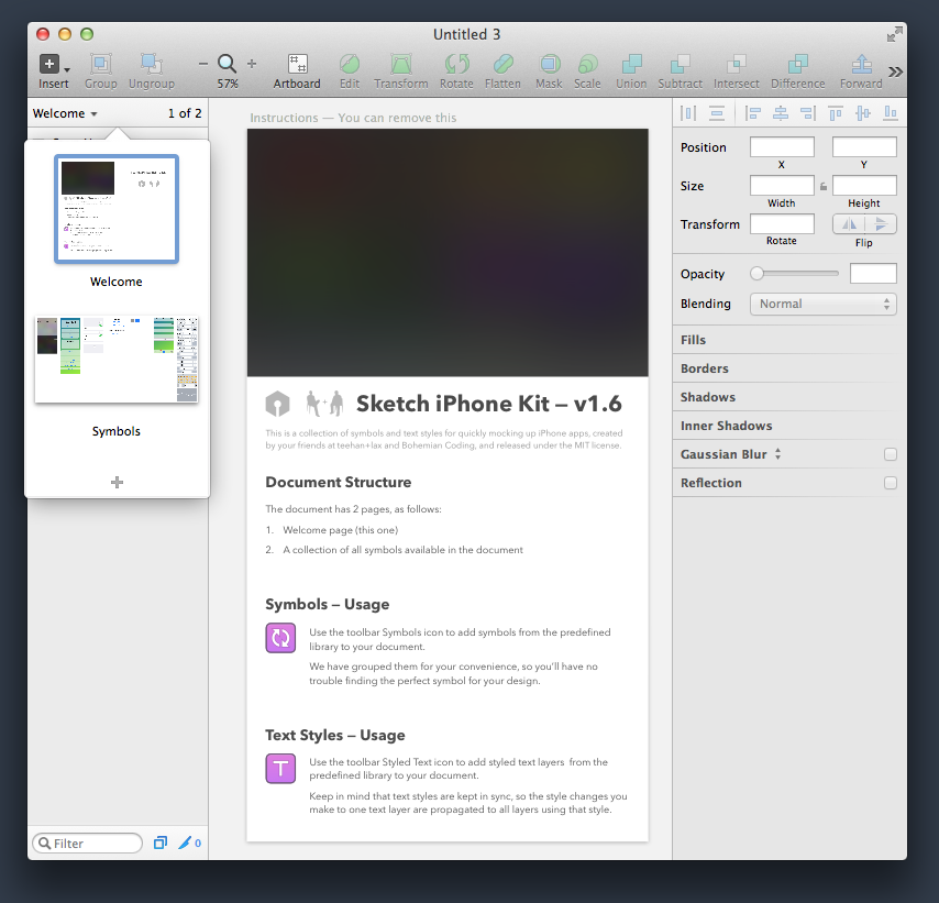
If you selected a pre-installed iOS UI Design template, you get a great set of characters from Teehan + Lax .
Click on the page selection and instead of Welcome, go to the Symbols page:
Here you will find all the necessary elements for creating applications for iOS8. Just drag the necessary objects to your artboards or create symbols from the library:
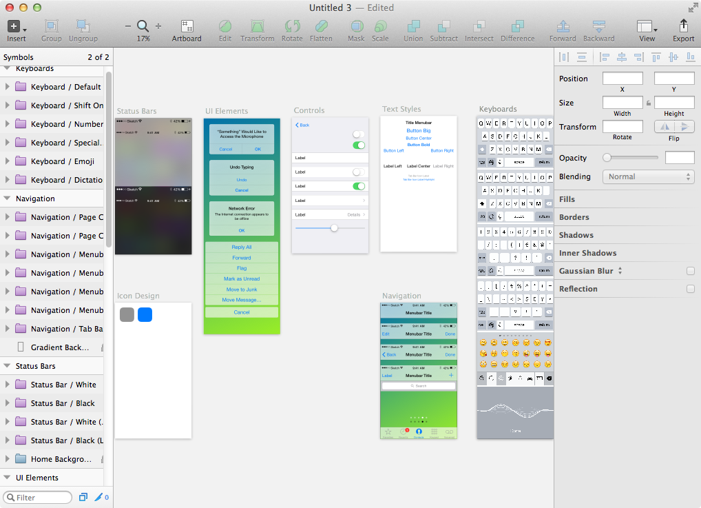
To deal with this is not difficult, especially since Teehan + Lax wrote a detailed guide, available on the first Welcome page.
So, with the creation of the document we figured out, what's next?
We partially got acquainted with export, and we will discuss important details later.
With the import of things as follows. Sketch understands all major raster graphic formats: JPEG, TIFF, PNG, and for the last two alpha channel is taken into account. PSD files can be imported, but the layers and channels will be ignored, the image will be placed as a single layer. The same applies to the AI format. In addition, there is support for three vector formats: SVG, EPS and PDF. The best conversion is implemented only for SVG (some loss of specific properties are possible, but most often Sketch imports everything correctly). In the case of EPS and PDF, the result is likely to be far from the best, so it is preferable to first transfer these files to SVG using Adobe Illustrator, as I wrote at the beginning of the review.
Layouts are written in .sketch format. Their size is relatively small, and only an abundance of bitmap images placed in Sketch has a significant effect on this value. Since, as I mentioned earlier, all images are treated as smart objects (you can reduce the image to any size and then restore it to its original size without loss of quality), so be careful not to use high-resolution images if you end up with small in size image.
For example, a file with an empty artboard for iPhone (640x1136 pixels) will occupy only 5 kilobytes against the same .psd file, the size of which will be several times larger - 68 kilobytes. The same trend is maintained when creating more complex layouts. For example, one composition in the .sketch format turned out to be 785 Kb, while the similar .psd took up as much as 3.2 megabytes. Needless to say, Sketch layouts are much more attractive both in terms of space saving and in terms of opening and writing speeds.
Being a Cocoa application, Sketch fully supports such great Mac OS features as Full Screen, Auto Save and Versions.
The latter is especially important because you can roll back to the previous design version at any time. If you have redesigned the layout, and want to return to one of the past recorded versions, click File> Revert To> Browse All Versions and select your favorite version ( you can read about working with Versions here ):
Photoshop can not yet boast such functionality, so users are forced to resort to not very convenient and not always clear methods like History Snapshots or Layer Comps. Personally, I could not get used to them, so Versions for me was a very useful method of working with changes in layouts.
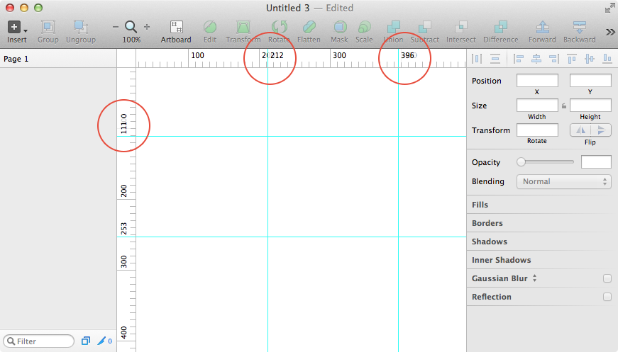
Pressing Ctrl-R, you turn on the rulers. You cannot draw and pull ruler guides, like in Photoshop, in Sketch, but you can create these guides by double-clicking on the ruler. You can move them by grabbing and pulling a piece of the guide on the ruler. This will always display the numerical value in pixels. The priority is given to these numbers, so the nominal marking values will hide translucently if the ruler gets close to the area of these values. Very convenient, because you will always know exactly where your guides are installed:
But, as practice shows, to create these rulers is completely optional. After all, Sketch has some absolutely amazing ways to control the placement of objects.
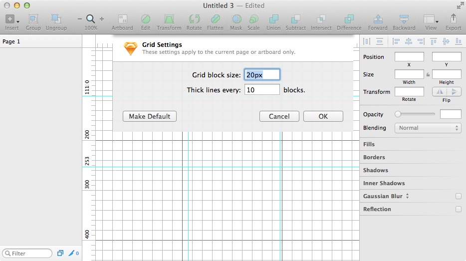
For example, you can turn on the simple grid display mode by clicking the View icon on the toolbar and selecting Show Grid or by pressing Ctrl-G:

You can also select the Grid Settings and customize the grid for you:
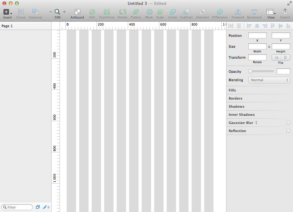
But there is a better way. Sketch has a feature for creating complex markup grids. Call View> Show Layout (Ctrl-L) and by default, the 12 columns that become standard for the layout width of 960 pixels will be displayed:
Of course, you can also customize the layout for yourself. For example, change the width of the layout, the number of columns, and add horizontal lines:
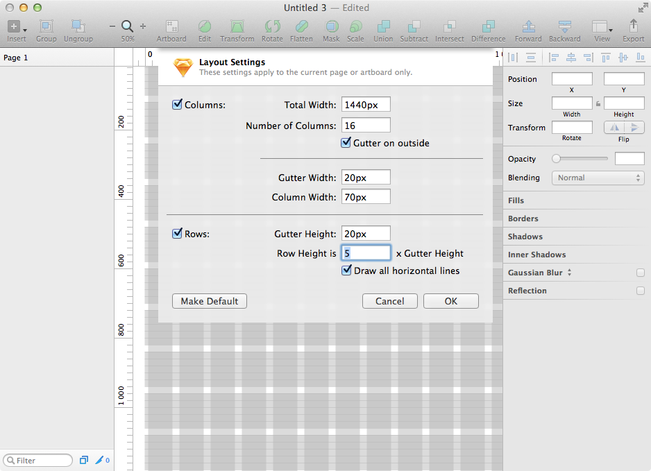
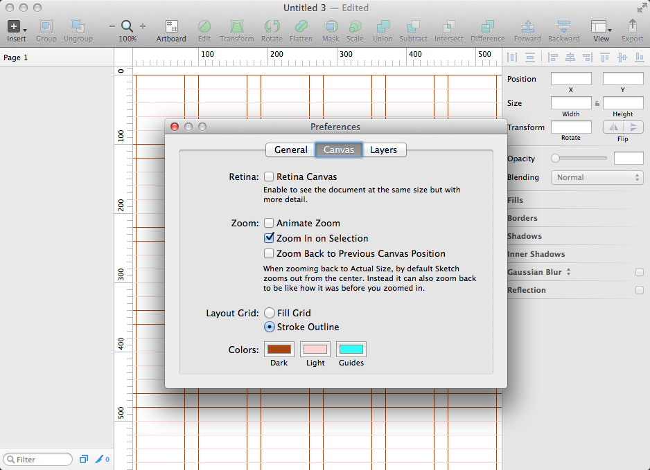
In this case, if you do not really like the semi-transparent filled rectangles as the basis for the grid, you can change them to rulers of any color. Go to the settings (Sketch> Preferences or Cmd-,) and in the Canvas tab, change the Fill Grid to Stroke Outline, and adjust the preferred colors:
Of course, all objects created and moved will stick to these guidelines. No more third-party plug-ins and templates with translucent layers are needed. Beauty!
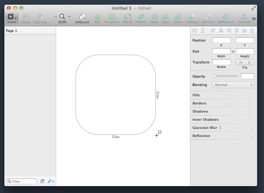
There are nuances and when creating objects. By selecting a drawing tool, for example, a rounded rectangle, you will see the linear dimensions of the object being created, dynamically displayed to the right and below:
When the Shift key is held down, the dimensions will be equivalent, and when the Alt key is held down, an object is created with twice the height and width values.
If you want to change the size of the created object, it is not necessary to refer to the inspector's panel (although it is very convenient to adjust these values there, since the ability to operate not by the eye, but with exact numbers is incredibly disciplined). While holding down the Cmd key, you can press the arrows on the keyboard and see how the size dynamically changes in the inspector in increments of one pixel. When you press the Shift key, these changes will be in 10-pixel increments. Awesome handy feature.
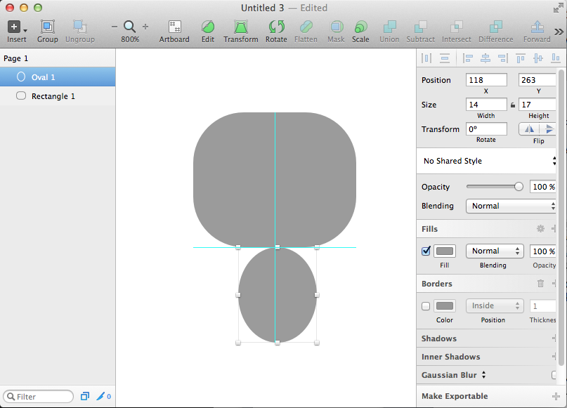
When you move objects, they stick not only to the grids and guides, but also to the smart guides that appear when the dragged object touches the borders or central axes of other objects:
But even this is not all!
Designers from Bohemian Coding have come up with a very powerful and effective way to track distances.
Select one object and, pressing the Alt key, move the mouse to any other object (it will be highlighted with a blue stroke), and you will see the distances to the borders of that object:
You can, without releasing the Alt key, move the mouse to any other object, and distances will be displayed to it.
But that is not all! Without releasing Alt and moving the mouse over an unselected object, to which it is important for you to see the distances, press the arrows on the keyboard and move the selected object, watching how the displayed values dynamically change. The Shift key also includes a 10 pixel pitch.
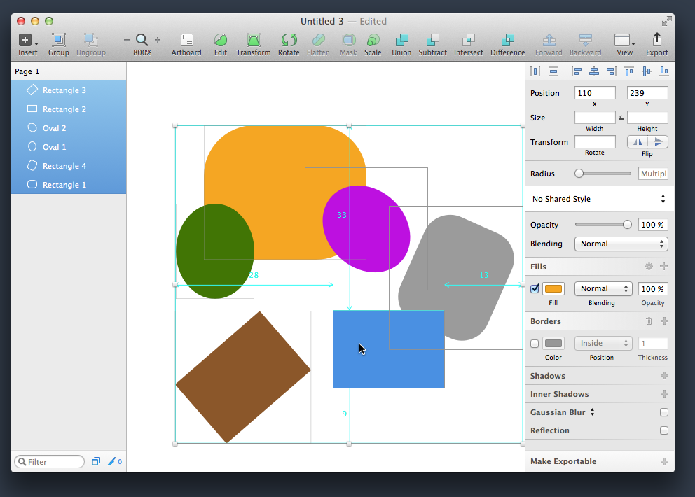
If you have selected several objects, then when you press the Alt key and hover over any of the objects, all four distances from it to the borders of the frame will be shown, limiting the entire selection of objects:
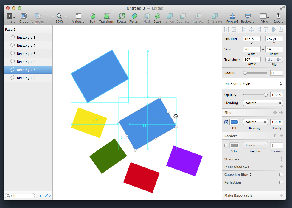
And even in the copy mode of an object, you can see similar dynamic values. Click Alt and start dragging the object. You will see the emerging smart guides, helping to place the duplicate in the right place. Without releasing Alt and the mouse button, press Shift - and now you will see a whole set of all possible distances to the edges of the original object:
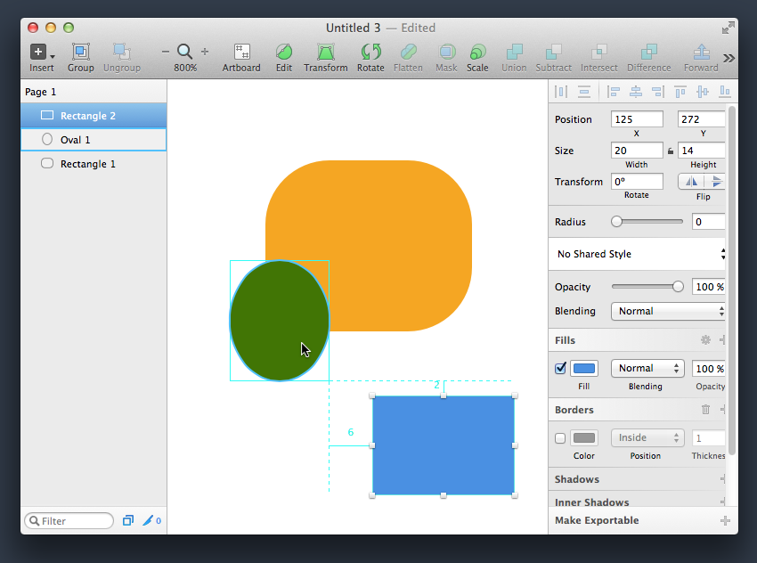
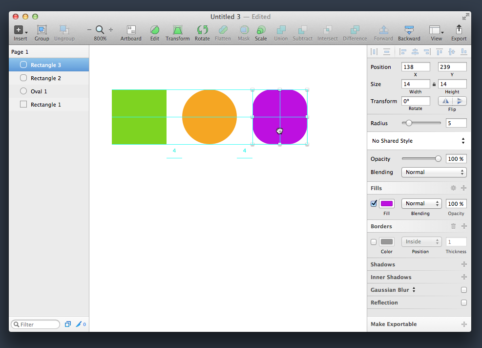
If you have placed two objects side by side, and you want to put a third one, then when it is moved at a certain moment, in addition to the smart guides, values in pixels will appear, indicating the same indents between each objects:
All these possibilities are truly impressive, because they are designed to optimize the layout of the layouts to the maximum.
That's all. In the next part of the review, we will continue to explore the useful stuff that is hidden in the depths of Sketch.
Source: https://habr.com/ru/post/226213/
All Articles