Switch to Sketch. Part 3
Let's digress a bit, and consider Sketch 3 in terms of usability.
')
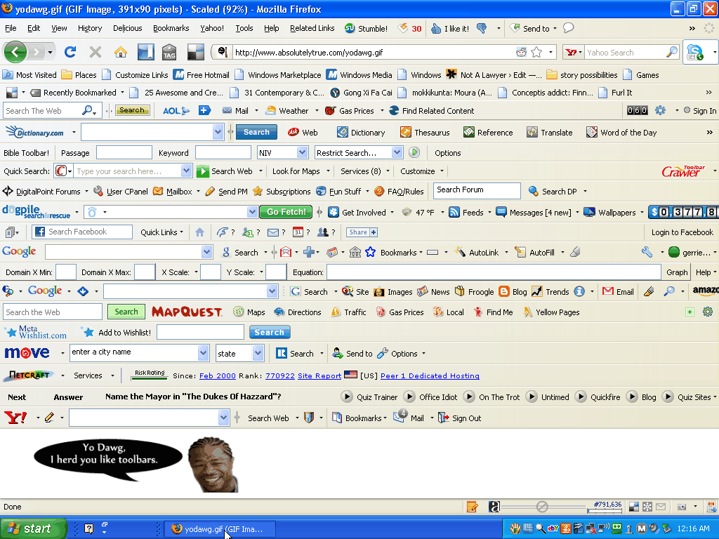
For a long time in the field of software interfaces, trends of maximum saturation of screen space with “useful” functions reigned. At some point, it reached its apogee, so that a whole meme called “toolbar hell” appeared:
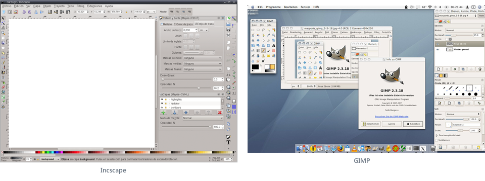
This, of course, is a joke, and in reality, such a fierce clutter with panels is almost never encountered. Although there are cases when audio editors or 3D-software demonstrate just such a hell in terms of usability:

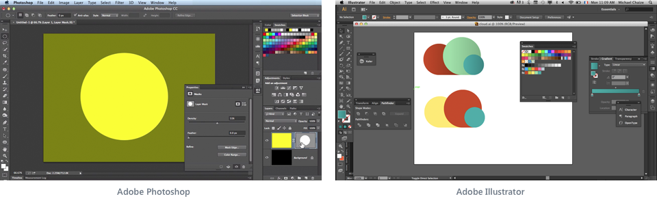
Of course, professionals, accustomed to working with these software monsters, no longer pay attention to such nuances. Moreover, there are cases when such users deliberately clutter up their programs, as if this is some kind of interface fetish. Yes, I myself am a sinner in this regard - my versions of Photoshop and Illustrator have exactly such panels packed with panels.
In order to somehow place on the screen references to numerous functions, developers are forced to go for a variety of tricks. Context menus appear, mnemonic icons are invented, panels are cluttered with tabs, pop-up windows are made movable and translucent, toolbars are joined to each other, the ability to hide and expand panels is added, and color differentiation of the interface elements
This approach has been practiced in Microsoft since ancient times. Both the Windows operating system and the Office package assume an abundance of settings and interface fits to the user's needs. Remember the era of skins? When almost every program came out with the ability to download or create their own "skins". Today, the interest in decorating individual programs has faded away, but the panel-toolbar anarchy is still in honor.
Apple has always had a different approach. Mac OS is almost impossible to repaint. On any Mac, the same version of this operating system will look the same. In addition, every year a trend towards simplifying the interface is progressing. The latest OS X Yosemite is flatter and simpler in design. Although I personally prefer the unobtrusive window design Mavericks.
In this regard, it was very curious about the Apple iWork office suite. The developers at some point decided that the current interface versions of Pages, Keynote and Numbers are too complicated, and made a risky step to simplify the design of these applications. Not everyone liked it, but most of the users accepted the innovation.
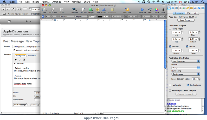
Here is how the program looked until 2012:
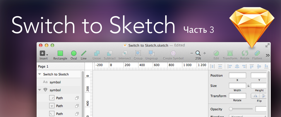
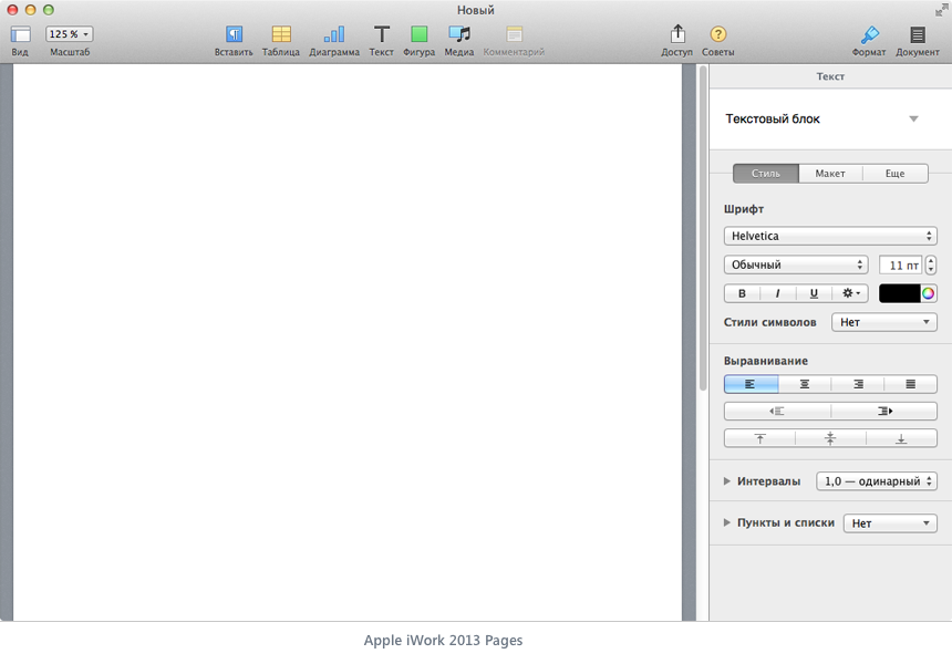
And then in Apple decided that the user absolutely no need for floating panels, additional toolbars and other blockages. There is only one upper toolbar with the most important buttons (which, if desired, can be customized), from where everything superfluous was transferred to the inspector panel. Actually, in this panel lies the reason for the indignation of some and enthusiastic responses of others. This panel is what is called non-removable. It can not be disconnected and moved somewhere. It is always on the right and always the same width. It can only be hidden by shortcut Cmd-Alt-I. But in it all that is necessary is located. Moreover, the controls vary depending on the type of edited content. In other words, the context-sensitive inspector has become a new trend in the design of programs from Apple. This is how it looks now:
It seems somehow even primitive compared to the same Microsoft Word from Mac Office 2011:
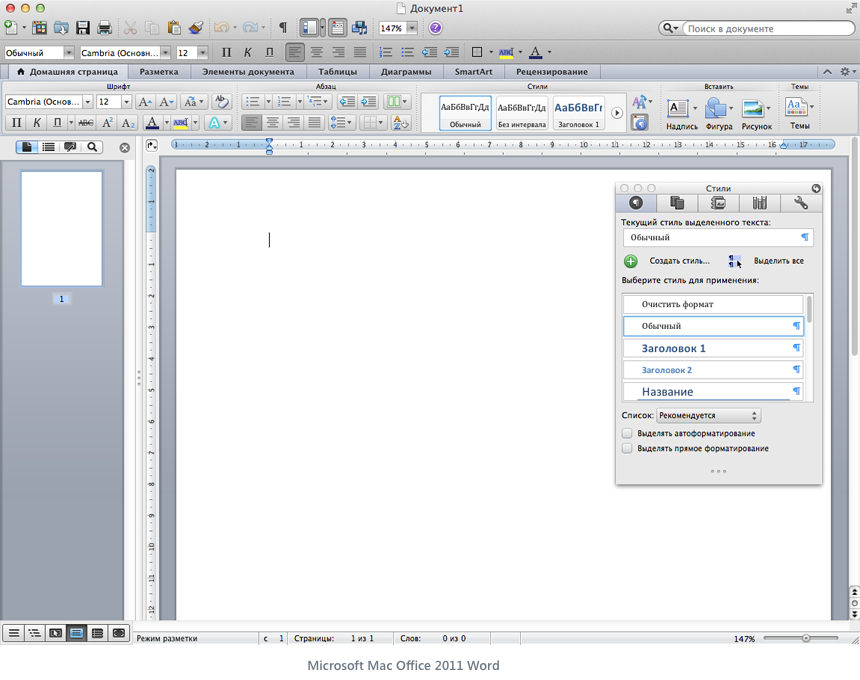
However, in Pages it is quite possible to do almost all of the same things that Word offers. It is easy to type and format any text with pictures, tables, graphs in Pages. And even more. After all, Pages has good opportunities not only for creating plain text, but also for quite complex layouts, which to some extent unites this program with powerful publishing packages. In any case, I came across some very advanced layout options that are unlikely to be done in Word, but I need to use the possibilities of InDesign or QuarkXpress.
In other words, with the seeming simplicity of the program interface from the Apple iWork suite, they can satisfy almost any ordinary user needs. Of course, Numbers can greatly lose Excel in data manipulation, but here we are not talking about deep power, but about everyday tasks.
Personally, the Mac Office interface depresses me with its congestion. But even he seems to be much simpler than the innovations brought into the fellow on the Windows platform. They say that getting used to the “ribbons” is quite simple, and there are quite a few people who consider this approach to be completely justified and convenient, but I’m not willing to do anything in the program if I see something like this:

OK. From the side it may seem like I'm agitating or trying to impose my point of view. I will not do this anymore. If you like ribbons and clever interfaces with an abundance of toolbars and panels - your will. After all, this is purely a matter of taste and habit. But to reflect on this topic is curious. In terms of usability, for example.
So back to the field of graphic editors. And what is going on there?
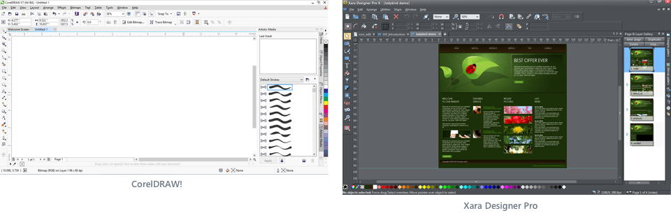
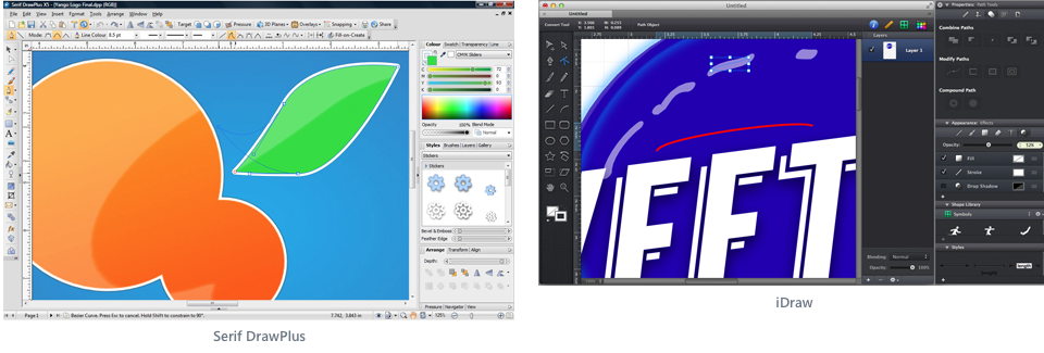
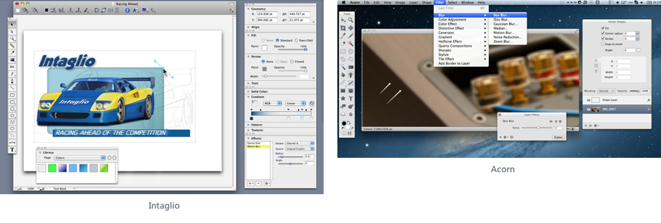
In the overwhelming majority of cases, we observe all the same adherence to the standards laid down a couple of decades ago. Panels and toolbars occupy half of the working space, full of icons, menus, sliders, buttons, and so on. Almost all modern graphic editors (raster, vector and mixed) in varying degrees, repeat the interface metaphors of Photoshop.
There is certainly a toolbar with tools (usually vertical to the left), a toolbar with control buttons (on top), and a set of various palettes for working with layers, fonts, colors, masks, etc. (on right). At times, the developers introduce some minor innovations (for example, they make the interface dark or change the position of the panels relative to the “canonical” Photoshop). But in general, all the same anyway they are similar to each other:

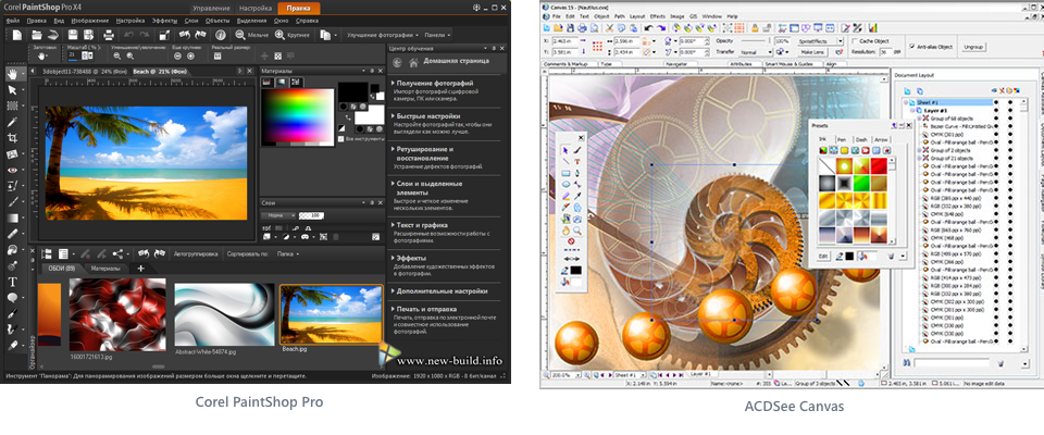
What a horror. And in this we have been working for years?
And finally, an editor appears, which in its capabilities is not inferior (and sometimes even surpasses) to competitors, and which sufficiently breaks established stereotypes and offers a simpler and more modern interface design:
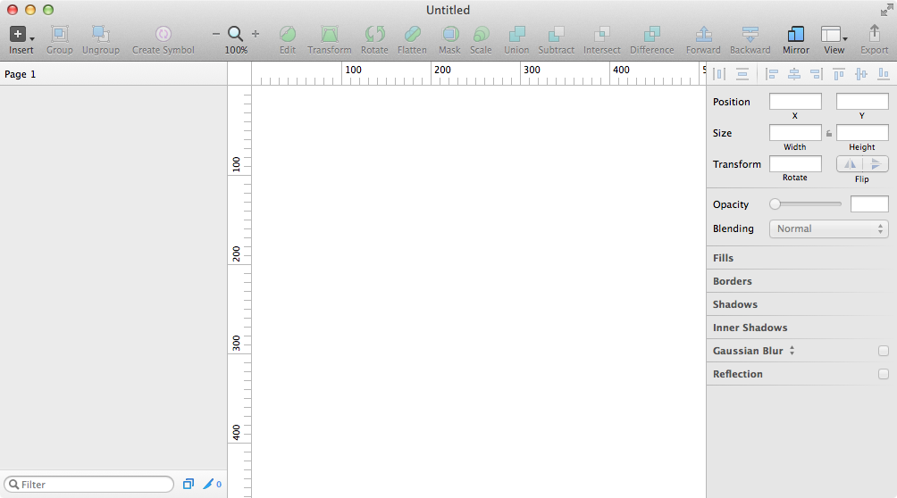
Simply. Elegantly. Yummy. But it is unusual.
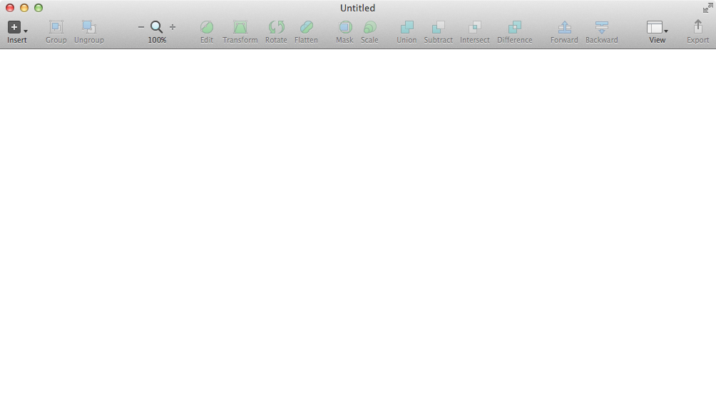
Moreover, to get started, it will be quite enough even for such an interface:
I think many may have questions like:
“Is it really a graphic editor?”
“Where's the toolbar with the tools?” Where are the settings panels? Where are the draggable palettes? ”
“And this crap can be something better than Photoshop or Fireworks?”
“And what, in this program, is it really possible to create modern interfaces of any complexity, draw photo-realistic icons and design fashion websites?”
I asked myself about the same questions when I first downloaded the Sketch demo. Well, according to my ideas, a program with such a short, frivolous interface can compete with the Great and Powerful Photoshop.
And at first I was extremely discouraged. Until you started trying to do something in Sketch. Then he read a variety of articles, studied tutorials, downloaded some source code (of which, I must say, a fair amount in the network, and sites with resources for Sketch grow like mushrooms after rain). And I gradually became involved. I will say more: I fell in love with this program. There is no other way.
And the reason is that the developers at Bohemian Coding have taken the path of Apple and made their package absolutely in the spirit of the latest versions of iWork.
That is, the maximum removed all unnecessary.
After all, what we see in any photoshop-like editor when creating a new document? We have not created anything yet, and we have panels with a choice of colors, fonts, brushes, gradients, etc. on the screen. That is, the metaphor of such interfaces, which arose at the dawn of the computer era, dictates an indispensable condition - the user must provide all the available tools at once. Stunned. Stun. Prove that we are not some kind of primitive trinkets, but a real adult package, standing on the same stairs with the Great and Mighty.
In this case, something will be inaccessible for clicking (grayed), and some control elements remain available all the time, although they may not be applicable to the current type of object. Which is completely illogical and often contributes to confusion.
Sketch uses a different, more modern and effective metaphor, in which there are seven main criteria:
1. The program does not have any own means for rendering the created content. All these functions are assigned to MacOS X. After all, in fact, this system has excellent technologies QuickTime, Quartz Extreme, Core Image, Core Animation, OpenGL and ColorSync. So why reinvent the wheel if the streamlined Apple engine does all the work? Plus, Sketch uses minimal non-standard interface elements at the very least, relying on a basic set of what is available in Cocoa. Actually, being a native Cocoa application, Sketch turned out to be small in size, loads the processor and memory very little, and it is smartly smart. Yes, and essentially speaking, Sketch is just a guide between your ideas and the powerful MacOS graphical environment. Unlike, for example, Photoshop, which has its own much-praised Mercury Engine, which is significantly less productive than Apple's system solutions. For this reason, Sketch is probably not very soon (if ever) released under Windows.
2. Panels can not be customized. There are only two of them (the layers palette and the inspector panel). They are always on the sides (layers on the left, properties on the right). They can not be unhooked and made floating. Can only hide for a while. All this allows the program to look the same on any computer, and it facilitates collaboration and the learning process, because in tutorials you see exactly the same thing as on your computer. The upper toolbar, however, allows, like all Apple programs, to customize the placement of control buttons to fit your needs. This toolbar is also impossible to unhook and move somewhere, but you can hide it. At first glance, such a rigid at first glance system of organization can frighten off, but in fact it perfectly disciplines, and most importantly, it fully fulfills the functions assigned to it: to give the user the necessary tools for working with objects.
3. The inspector panel is extremely context-sensitive. It shows exactly the properties that are available for this type of selected objects. No separate panels with effects, gradients, styles, fonts, size information, etc.
Everything is available immediately in one place and only as needed. Something can be changed immediately, for something (for example, the choice of fill) a small popup is called. All basic properties (fills, shadows, strokes, blur) can be added in any quantity and interchanged, in which case the inspector will be scrolled. If you enter some nested mode (for example, editing nodes on a vector form), the panel changes accordingly, and you can return to the higher level by pressing the Esc key. In other words, Sketch always knows exactly what you need at the moment and hides everything that cannot work at this stage for any reason. Just like two and two.
4. Most of all manipulations with objects are assigned to keyboard shortcuts and mouse operations. There are various manipulations that are possible only by pressing certain keys or by hovering the mouse, but there are no similar duplicate commands in the menu or in the form of buttons on toolbars. A considerable number of operations can be performed only in one way. What essentially distinguishes Sketch from Photoshop, where many functions are included at once with several options: from the menu, on the toolbar or shortcut.
5. Sketch is based on a layer or group of layers. Its varieties include: vector shape, raster image (and, at once, as a smart object in Photoshop), a mask (any vector shape can become this), a symbol, an artboard, and a slice. Any group can be perceived as a single object, as well as at any time you can get to the properties of any component of the group. Plus there are two types of styles: for ordinary objects and text. There is nothing more in Sketch. No selections, layer masks, channels, clipping paths, adjustment layers, smart objects, video layers, 3D objects, complayer layouts, note layers, etc.
6. Sketch has no toolbar. Rather, on the upper toolbar, you can organize buttons to quickly create the desired shape. But even they are not particularly needed, because they are completely replaced by the Insert menu or keyboard shortcuts. Completely absent: Picker Tool (yes, yes, good-bye unnecessary "arrow", but you have to get used to it), Select Tool (when you select a bitmap image, a rectangular selection and a "magic wand" will be available on the inspector), Zoom Tool toolbar plus shortcuts), Hand Tool (and why do you need a hand if the space copes well with panning panning?), Edit Tool (you can edit the curves by double-clicking or pressing the Edit button on the toolbar), Eyedropper Tool (press Ctrl-C and select color from anywhere on the screen), Crop, Brush, Gradient, F ill, Erase, Stamp, Dodge, Patch and what else happens in other graphics packages. Remember - you have a mouse cursor, which itself will tell you how and what to do with objects without any need to refer to a separate toolbar, clogged with icons. You just need to memorize a few important keyboard shortcuts.
7. Being a Cocoa application, Sketch allows you to drag any data that a program can take (for example, JPEG images or SVG graphics) straight from the Finder, Mail, Safari, or any other Cocoa program into the document. Accordingly, you can take out any set of objects from Sketch by dragging behind miniatures in the layers panel. You can, for example, move an object with all the gradients, shadows and blurring straight to the desktop or to the body of the letter in Mail. This will create PNG-files for each such object with the preservation of all levels of transparency. If you want all selected objects not to fall into separate PNGs, but to be a single whole, prior to dragging, create a group of them and click the Make Exportable button at the very bottom of the inspector. Moreover, all such drag-and-drop inside programs from within it happen instantly without any tedious waiting for the conversion process. Getting used to this amazing opportunity, you will completely forget about the file export window to disk.
Open to full screen, Sketch ultimately provides an unprecedented space for creative experimentation.
Having such freedom and such powerful tools in your hands, you will be limited only by the expanses of your imagination, available skills and ability to own all the capabilities of the program.
That's all for now. Well, in the next part of the review, we will look at the most important details of these Sketch features described above.
Source: https://habr.com/ru/post/226167/
All Articles